
❤️ Would you like to save this?
By saving, we'll email this post to you for later. Unsubscribe anytime.
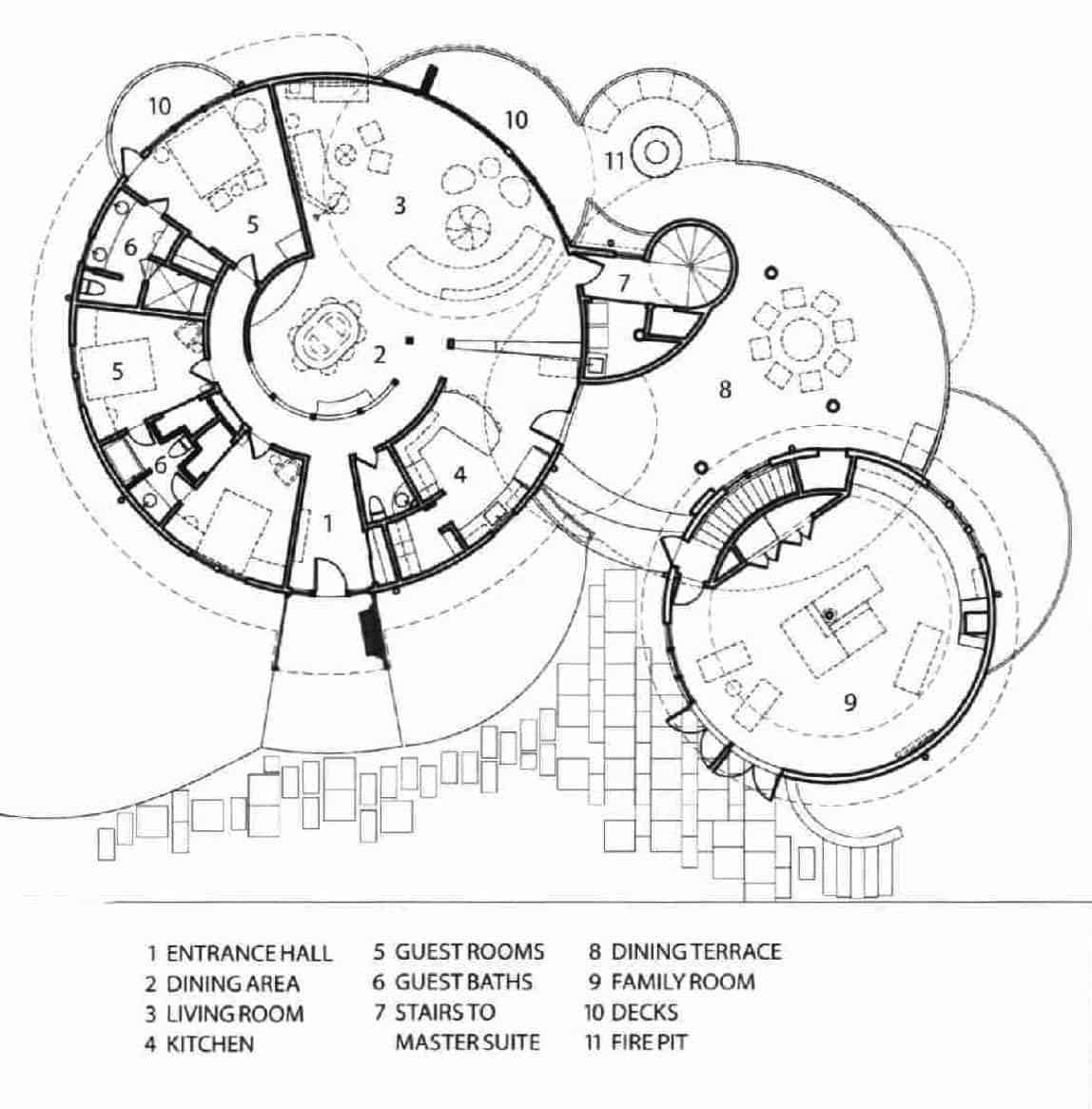
Architect Emily Summers re-designed this residence called Round House as her family vacation home, originally designed in 1968 by builder Don Price, located in Colorado Springs, Colorado. The Dallas-based designer along with an architect at her firm, Jessica Stewart Lendvay, who now has her own firm, not only created an addition to the home, but restored it to its original grandeur. Modern furnishings from the time period of when the house was originally built were used to decorate the spaces throughout, while fixtures and fittings were updated with current technologies. Expanses of glass helps to bring natural light in and maximize views of the surrounding Rocky Mountains and spectacular wooded landscape. The boundaries between indoors and out are blurred with the use of extensive terraces that extends the indoor-outdoor living areas.

As you approach the Round House, it reveals a circular, multi-level organic structure that is aesthetically magnificent. The goal of the project was to keep all of the concentric circles while at the same time enlarging and expanding all of the outside decks. Comprised of 6,000 square feet of living space, the circular volume may not be the most efficient way to build, but it is the most efficient use of space because you control the volume. The structure took two years to refurbish, read on for further details about this one-of-a-kind mid-century house…
RELATED: A magical oasis found in the Rainbow House
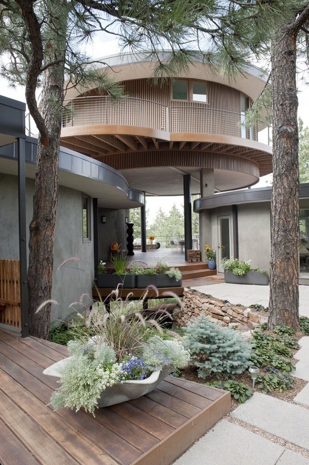
What We Love: The circular design of the structure of this home is visually eye-catching, one of the more unique homes we have featured here on One Kindesign. The outdoor terraces are spectacular, we can just imagine sitting outside around the fire pit, enjoying the fresh mountain air and taking in the sights of the Rocky Mountains… when can we come visit? What is your take, do you like the circular concept of the Round House?
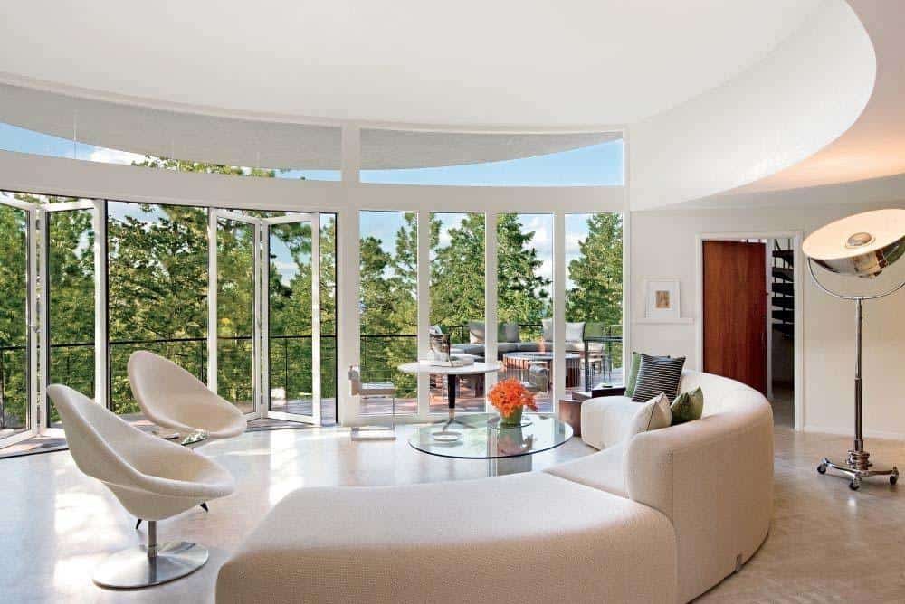
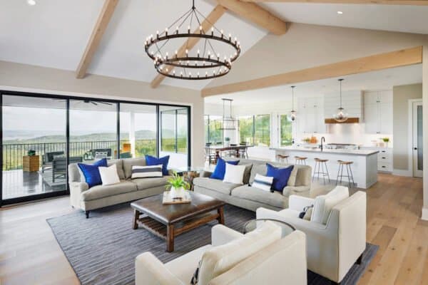
The designer had the living room ceiling raised three feet, added clerestory windows to further help to illuminate the space and installed Nana folding doors to open the space up to the outdoors.
Interesting Fact: The rounded sofa in the living room was original to the home, the designer had to have it cut into three parts to take it out of the house to have it re-upholstered.
RELATED: Hobbit home hidden in the hillside of Switzerland
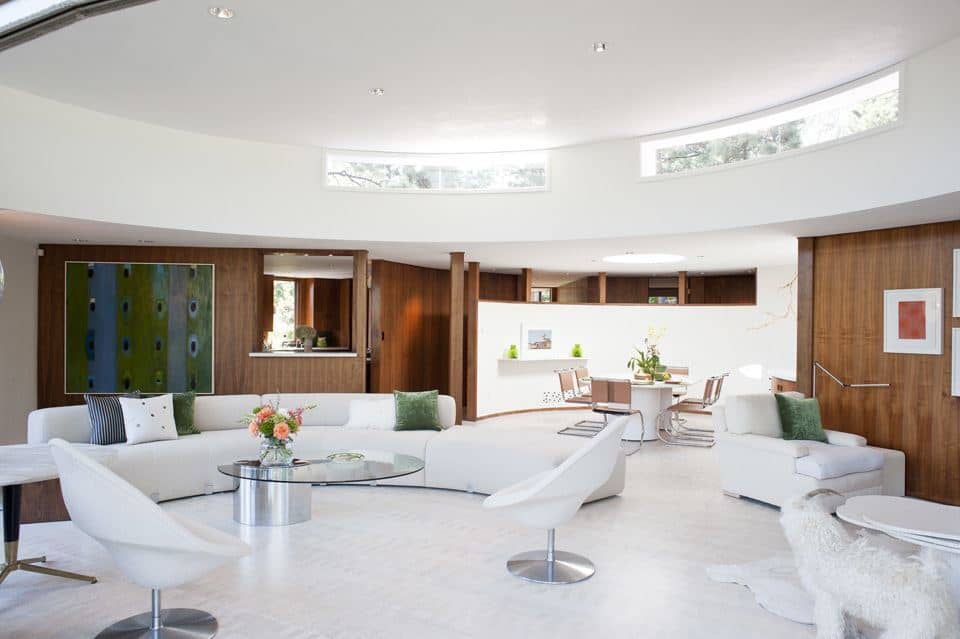
The walnut walls were restored, but the designer did not want to copy this same wood on the flooring, so instead she opted for bleached Douglas Fir wood (they were originally covered with shag carpeting).

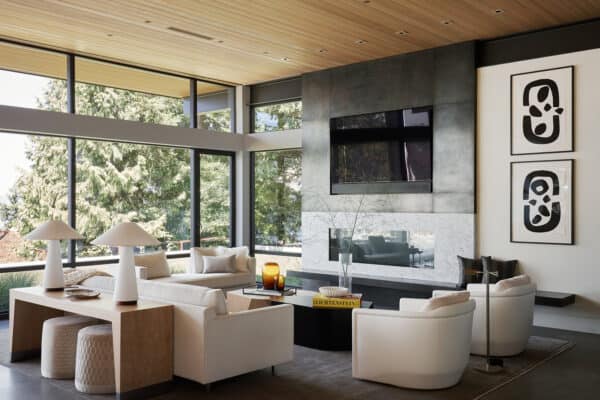
The living room features a light color palette that plays off nicely against a restored walnut wall. The designer picked up vintage items such as the table lamp and optical art prints that are from the year 1968, when the home was originally designed.
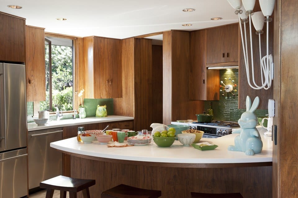
The kitchen displays a ceramic bunny cookie jar designed by Momoyo Torimitsu, adding a playful element to the space. The range, refrigerator, and dishwasher are sourced from Jenn-Air. The walnut cabinets in the kitchen were preserved, complimenting them with a green glass tiled backsplash. The circular shape of the bar counter was designed to mimic the circles of the structure.
RELATED: Cliff house buried in the mountain off the Granada coast
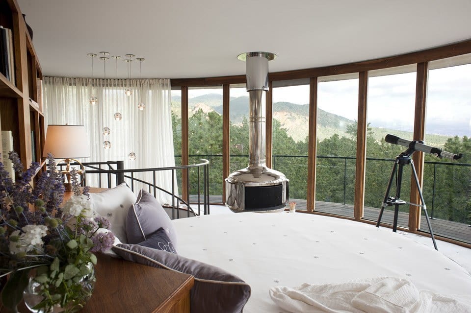
A free-standing stainless steel fireplace is just one of the wonderful features in this cool master bedroom that has a tree house feel. It is just steps away from a rooftop putting green! The original circular staircase is at the heart of the home, which can be seen in the corner of the bedroom. It is based on a Mies Van De Rohe prototype.
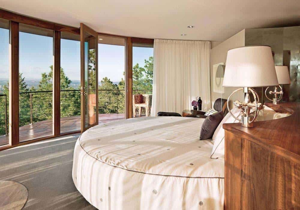
In the master bedroom, the custom designed bed is part of the original design of this home. Walls of glass line the perimeter of the room, while a private balcony showcases panoramic views through the pine and fir trees of the Rocky Mountains as well as the cityscape of Colorado Springs.
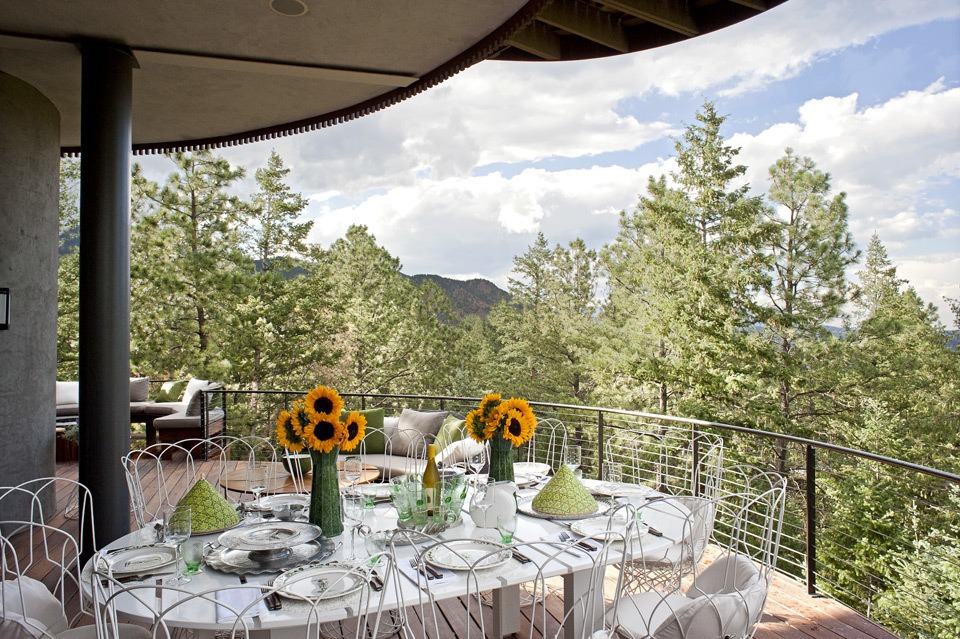
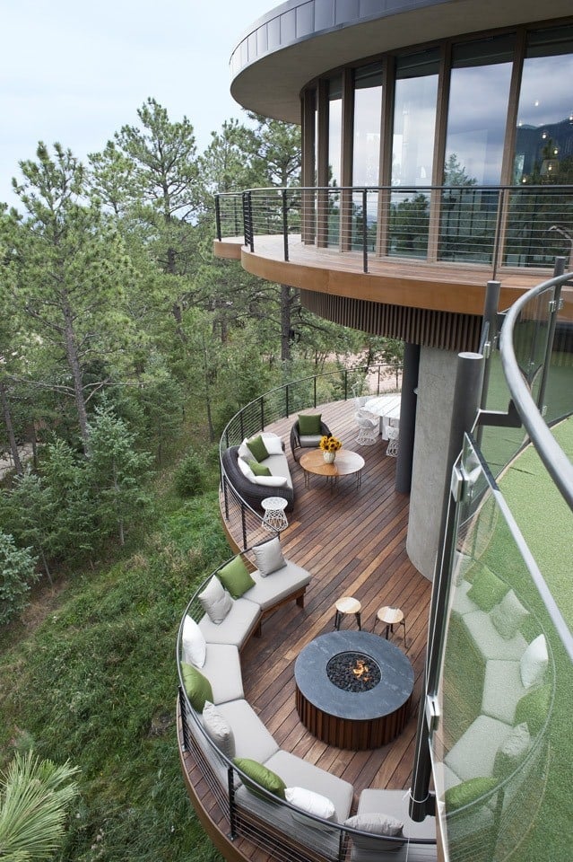
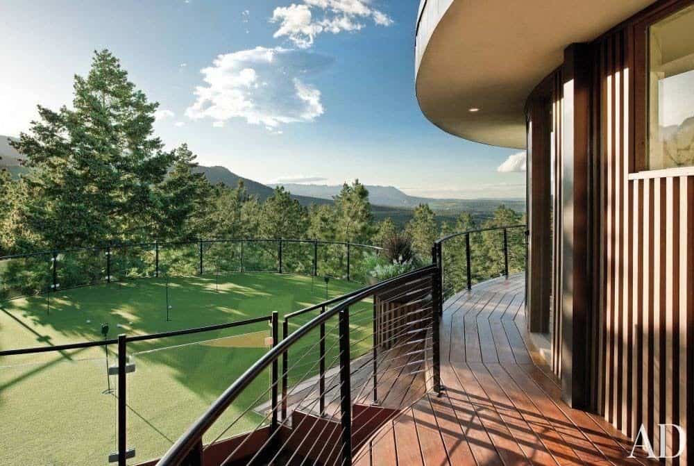
The designer had a putting green installed on top of the living room roof. Her husband and son are golfing fanatics, so this piece of the design project was the icing on the cake!
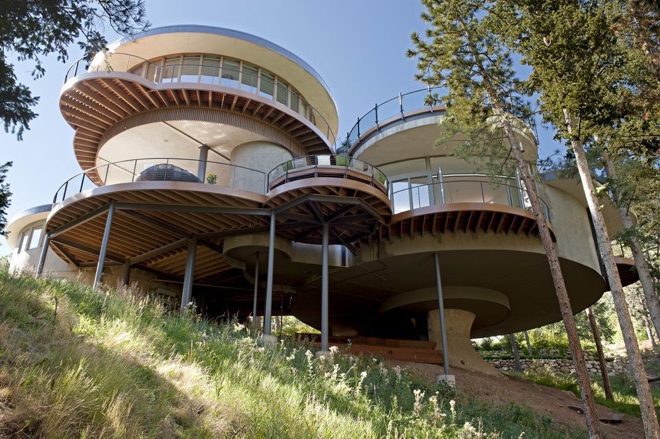
Photos: Courtesy of Emily Summers Design Associates / Architectural Digest




0 comments