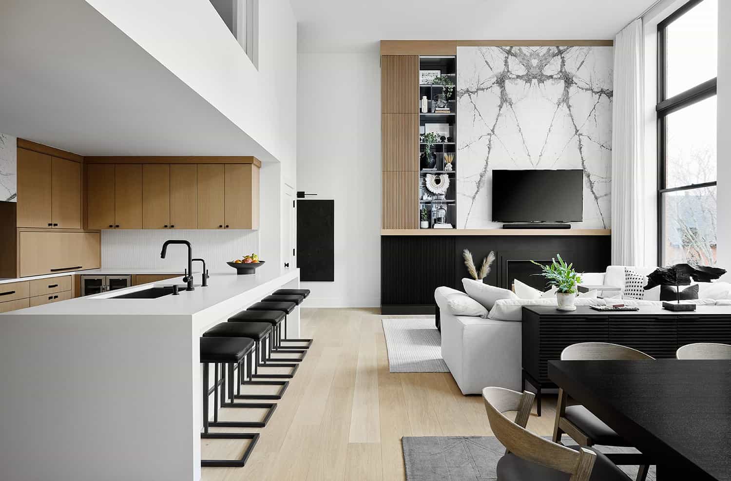
This stunning Japandi-style loft was designed by Devon Grace Interiors with construction by Domain, located in Lincoln Park, a community on the North Side of Chicago, Illinois. Japandi style is an infusion of Japanese and Scandinavian styles. The look is minimal, functional, warm, and calming. This is the designer’s personal home that she shares with her husband. The duo wanted their space to feel light and airy, modern and minimalist with natural materials throughout for warmth and texture.
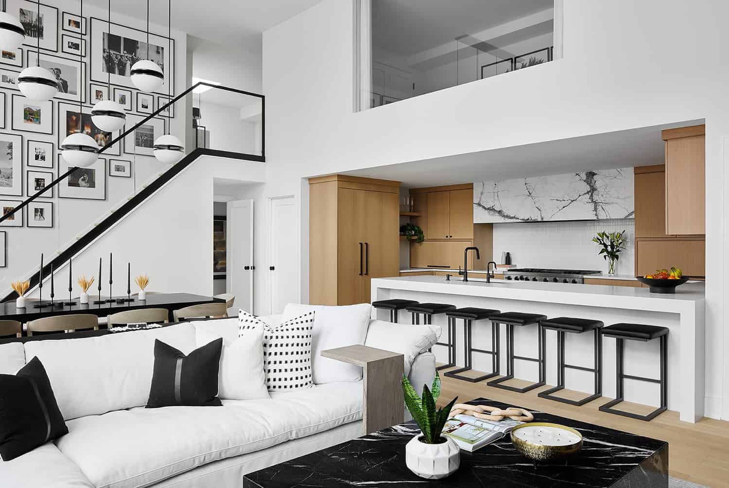
The loft is located in a historical building that was originally St. Michael’s High School and was converted into condos in 1987. The main living area is the heart of this home. The living and dining rooms are flooded with natural light courtesy of double-volume windows, and the kitchen feels like an extension of the space.
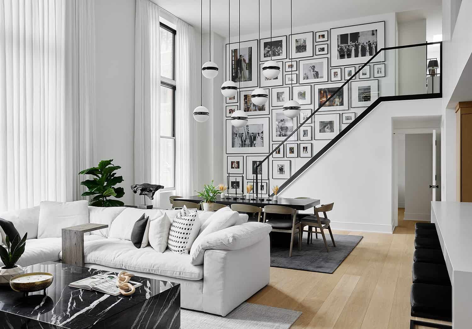
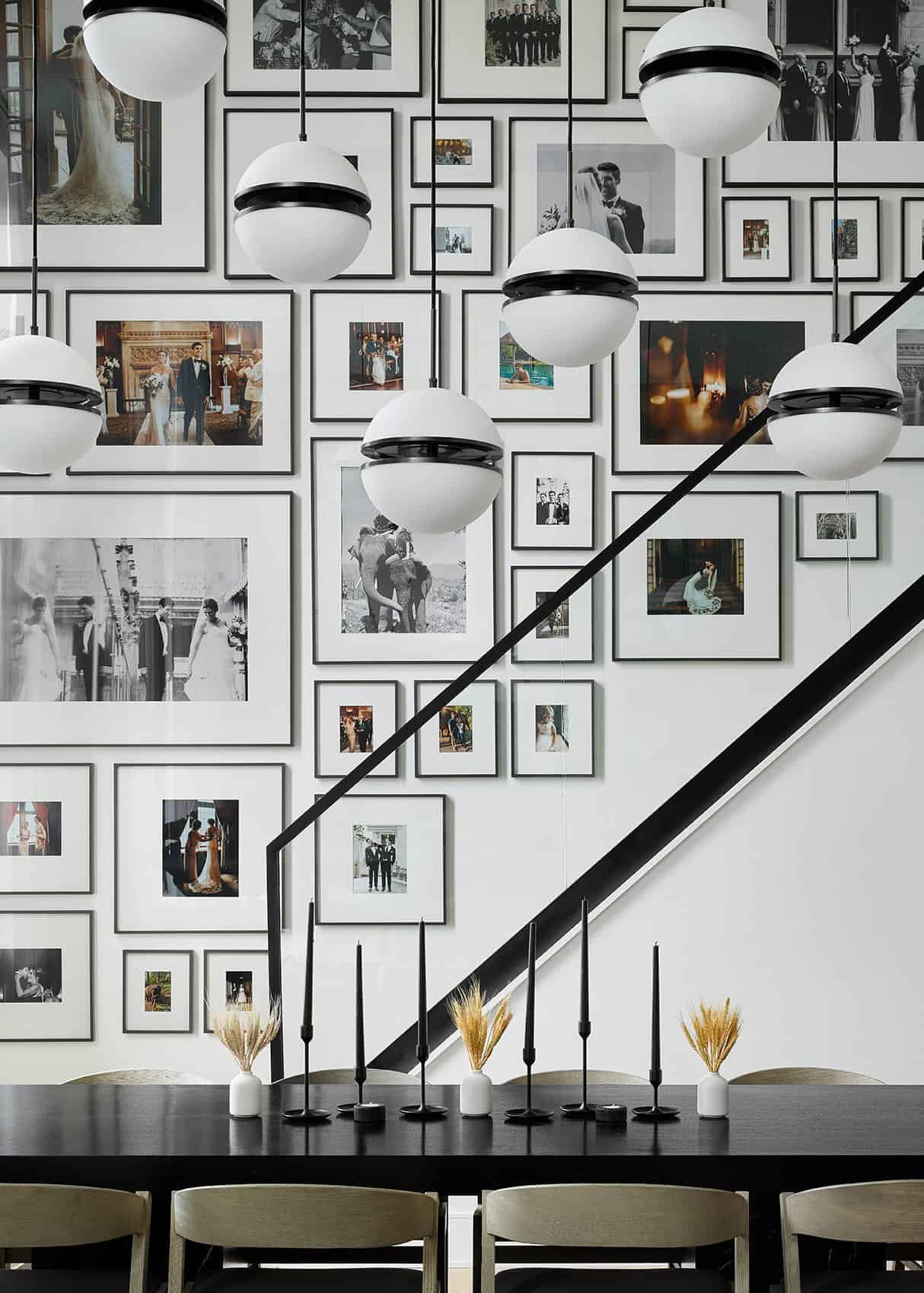
The furnishings were kept low-profile in the living and dining rooms so the spaces feel unified and modern. A dramatic gallery wall acts as an art installation in this home.
What We Love: This Japandi style loft has been beautifully reimagined with stylish living spaces in a black, white, and wood palette. The designer did a fabulous job of creating a luxe aesthetic throughout her home. Despite being modern, living spaces feel warm and inviting thanks to the use of wood on the flooring, the textured area rugs, and the personalized gallery wall. We are loving every detail in this home, there are so many clever design ideas.
Tell Us: What elements in the redesign of this condo do you find most inspiring and why in the Comments below!
Note: Be sure to check out a couple of other fascinating home tours that we have showcased here on One Kindesign in the city of Chicago: Step inside this absolutely stunning English arts crafts home in Illinois and Lincoln Park home is a stunning display of French-style architecture.
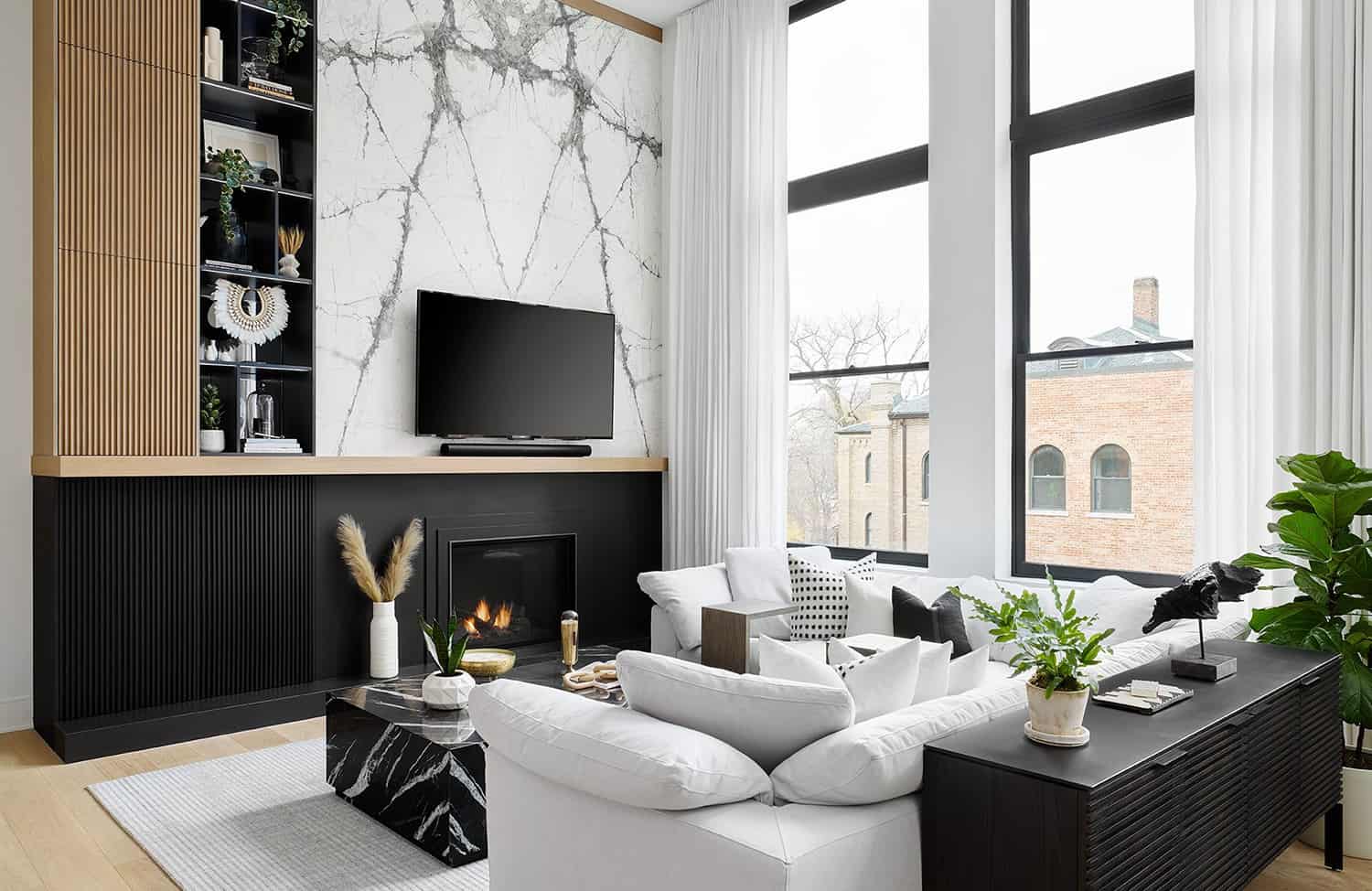
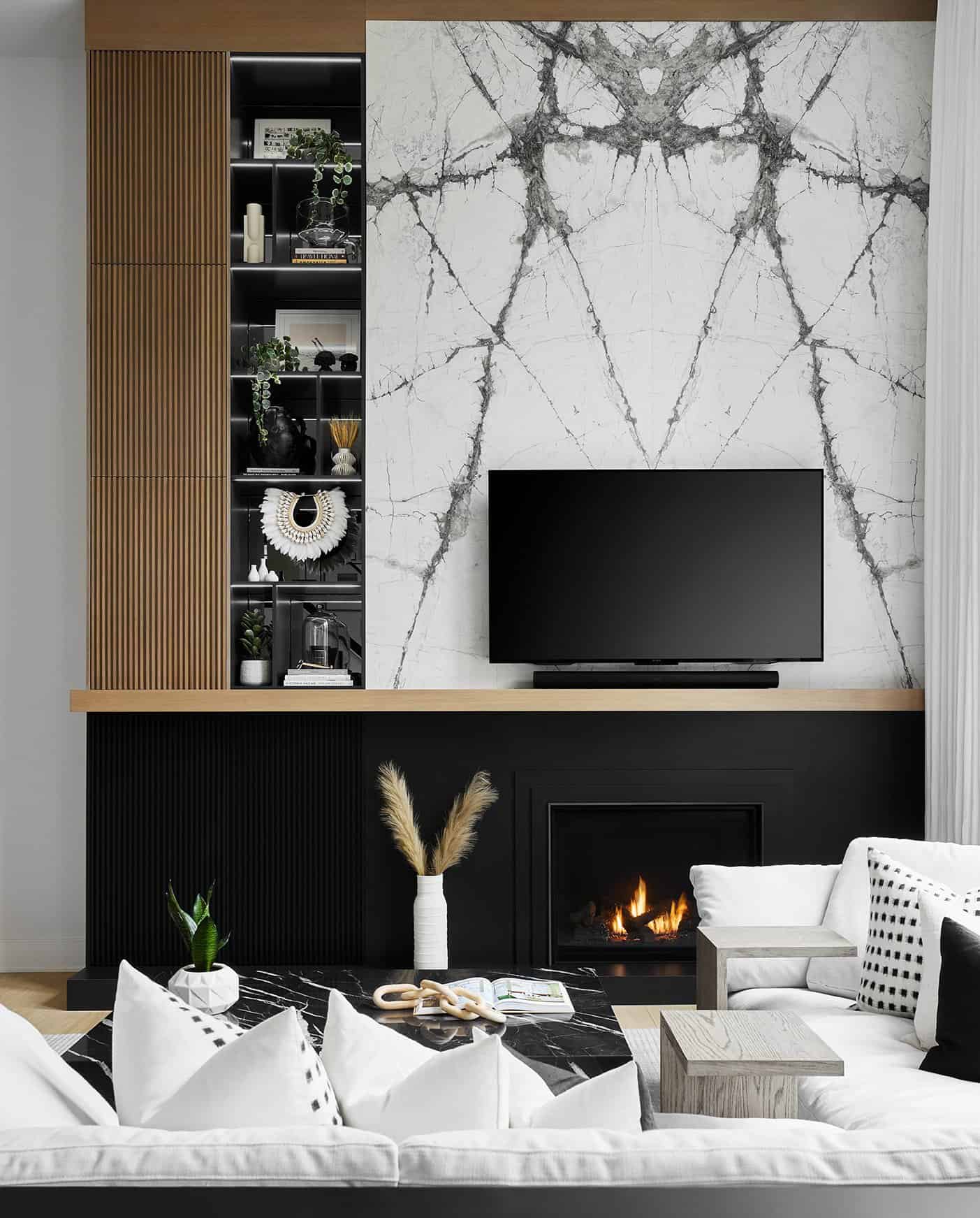
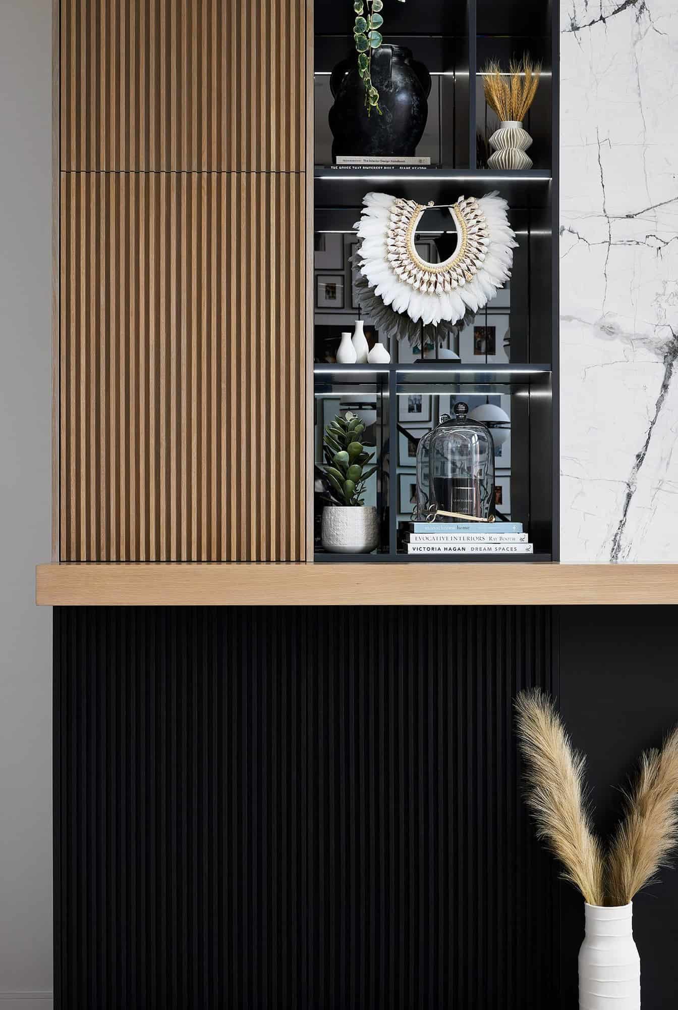
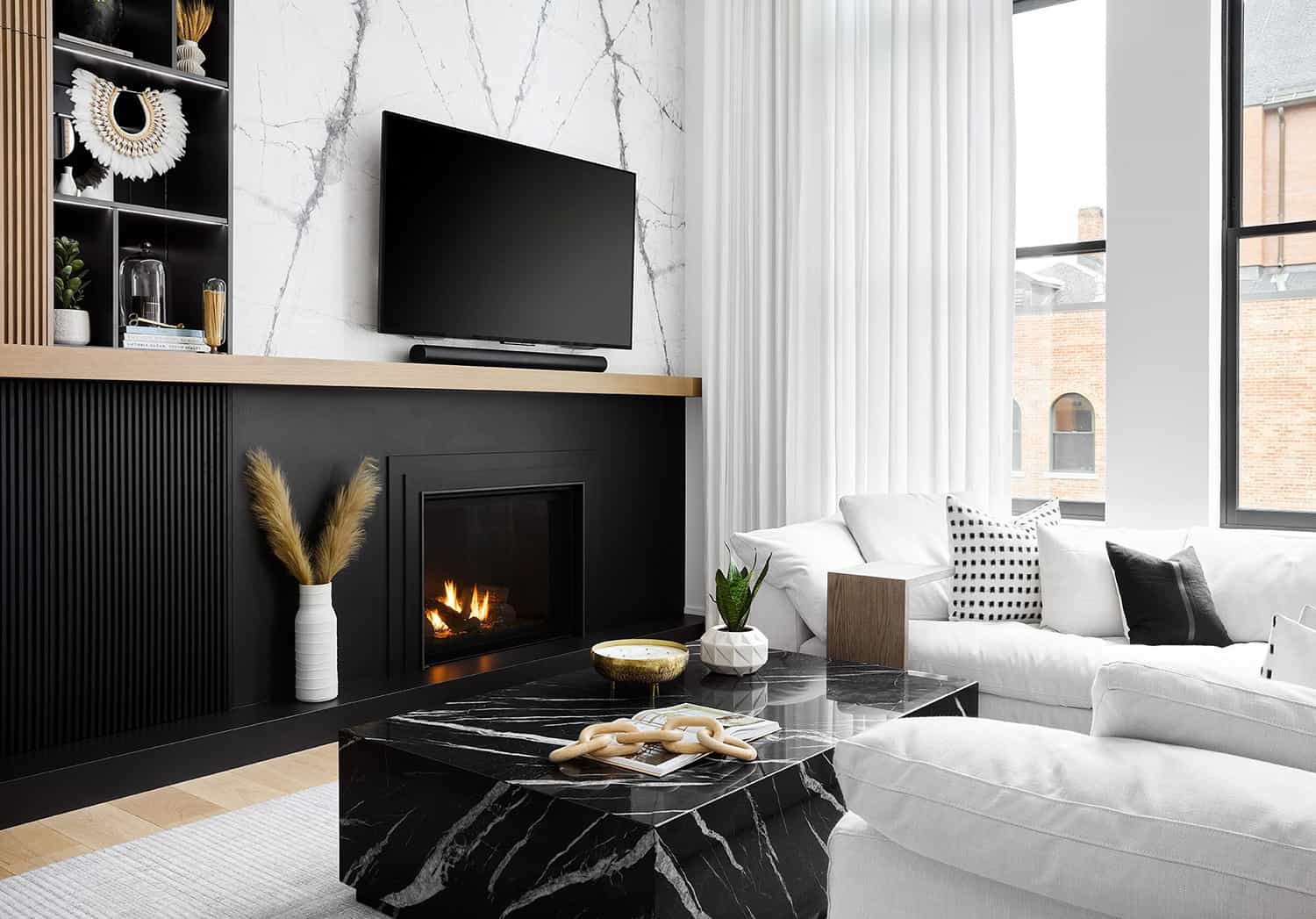
Above: The focal point of this living room is the dramatic fireplace wall. A book-matched stone is used behind the television, while a satin black porcelain wraps the fireplace underneath the mantel. The black is carried across the bottom with 4-foot wide fluted wood cabinets.
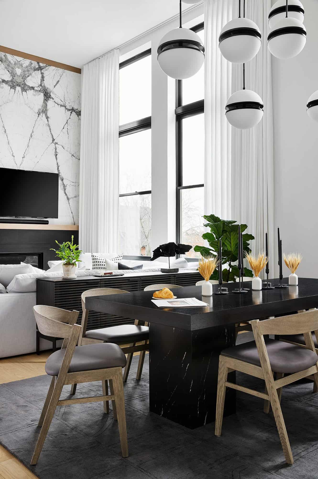
Above: Black marble stone was sourced from Terrazzo Marble and transformed into a custom plinth table by Beckerworks.
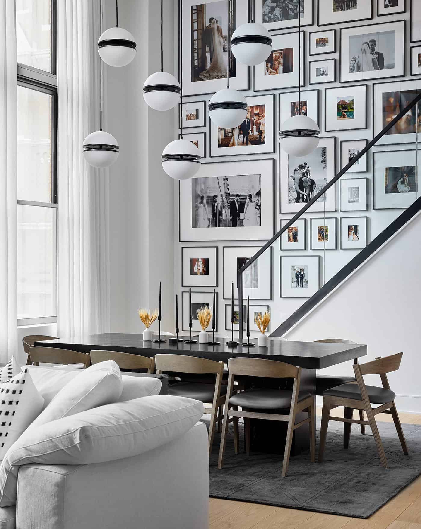
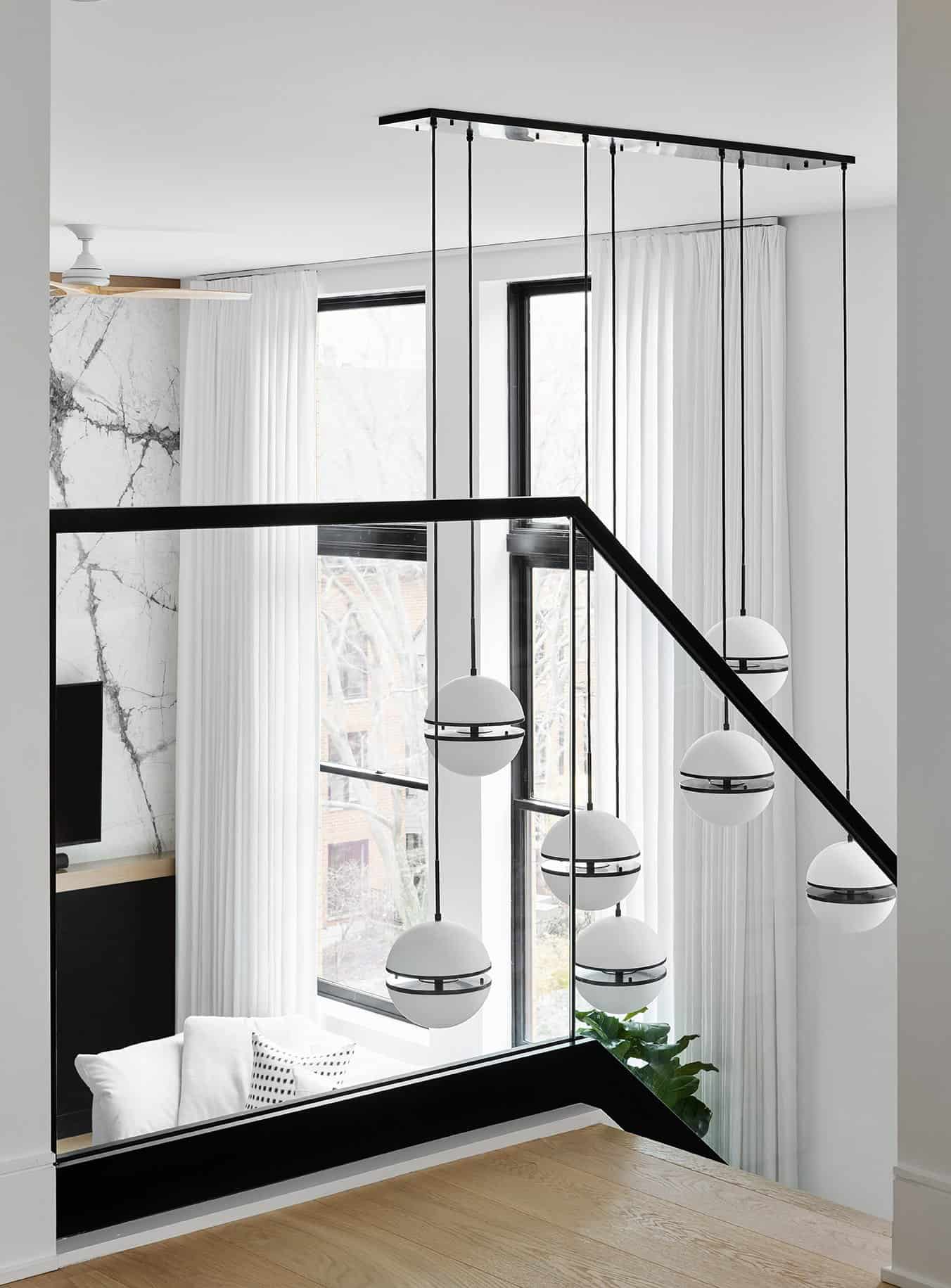
Above: Suspended above the dining table at varying lengths are oversized, sculptural globes that act as a light fixture installation while bringing the height of the ceiling down to a human scale. The gallery wall features a collection of images from the designer’s wedding and honeymoon. This wall can evolve over time.
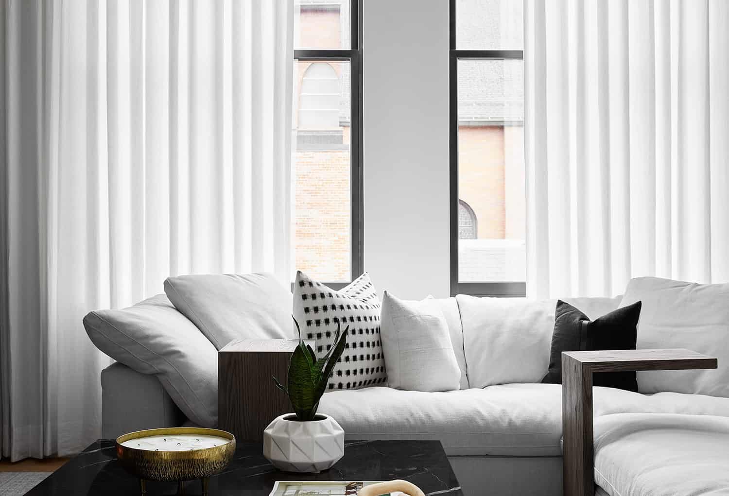
Above: The custom linen drapes were fabricated by It’s Oksana, bringing your eye all the way up to the ceiling. The dining table uses the same material as the black marble coffee table in the living room. It features pedestal legs and a rift-cut black stained oak top for a simple, modern aesthetic.
Above: Originally a two-bedroom, two-and-a-half bathroom condo, the designer opted to build over the kitchen and powder room to add a third bedroom and en-suite bathroom. A large picture window in the third bedroom helps to filter natural light into the room. There are blackout drapes for privacy when guests are visiting.
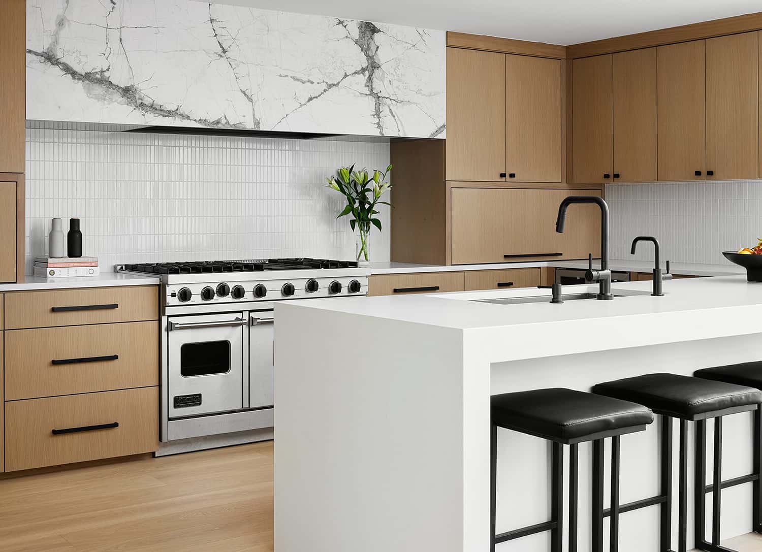
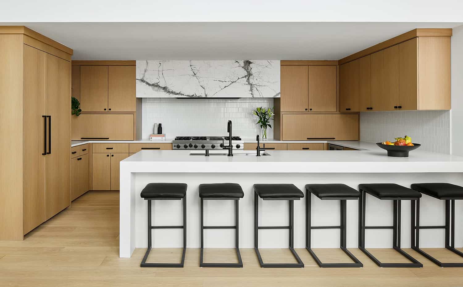
Above: The same stone used on the TV wall in the living room is repeated on the oversized yet simple hood, sourced from Terrazzo Marble Supply. The cabinetry is by Custom Cabinet Source, while the plumbing fixtures are from Brizo and Delta. The tile throughout this home is sourced from Artistic Tile, Ann Sacks, Tilebar, Porcelanosa, and Fireclay.
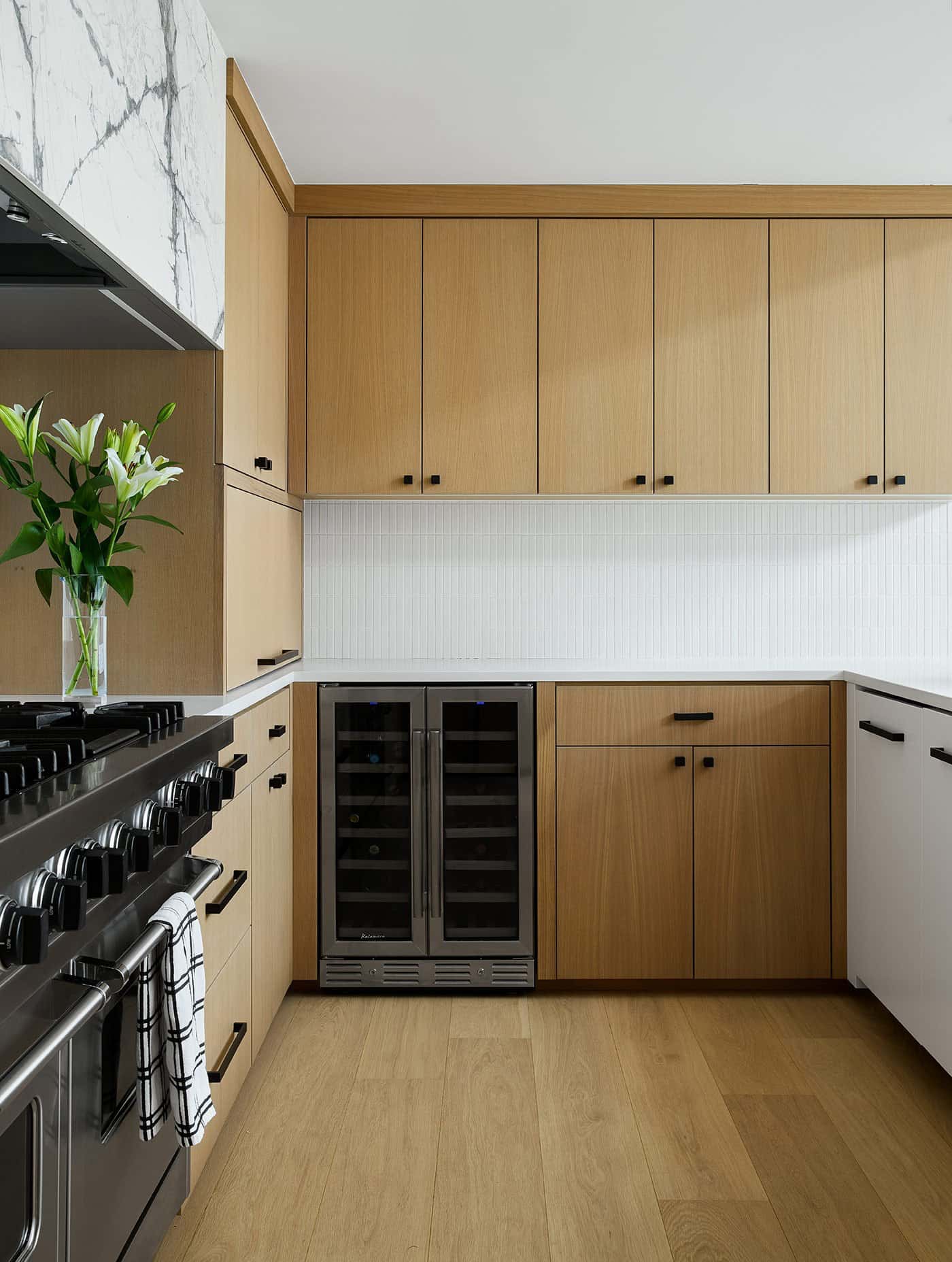
Above: The kitchen highlights the Japandi-influence, featuring rift-cut white-oak cabinets, a textured backsplash and oversized stone hood. The natural white oak Boen floor is engineered, sourced from Legno Studio.
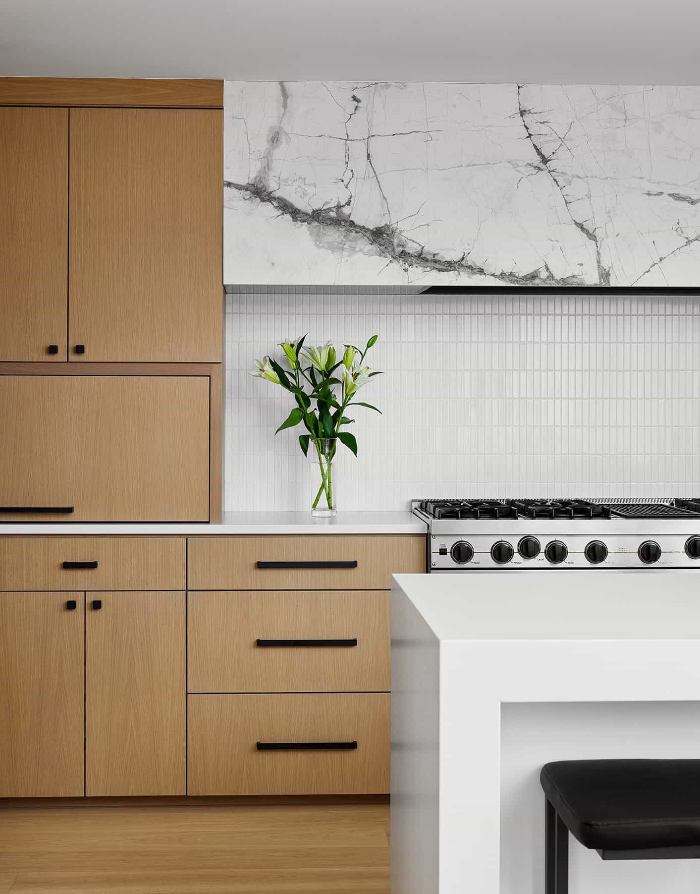
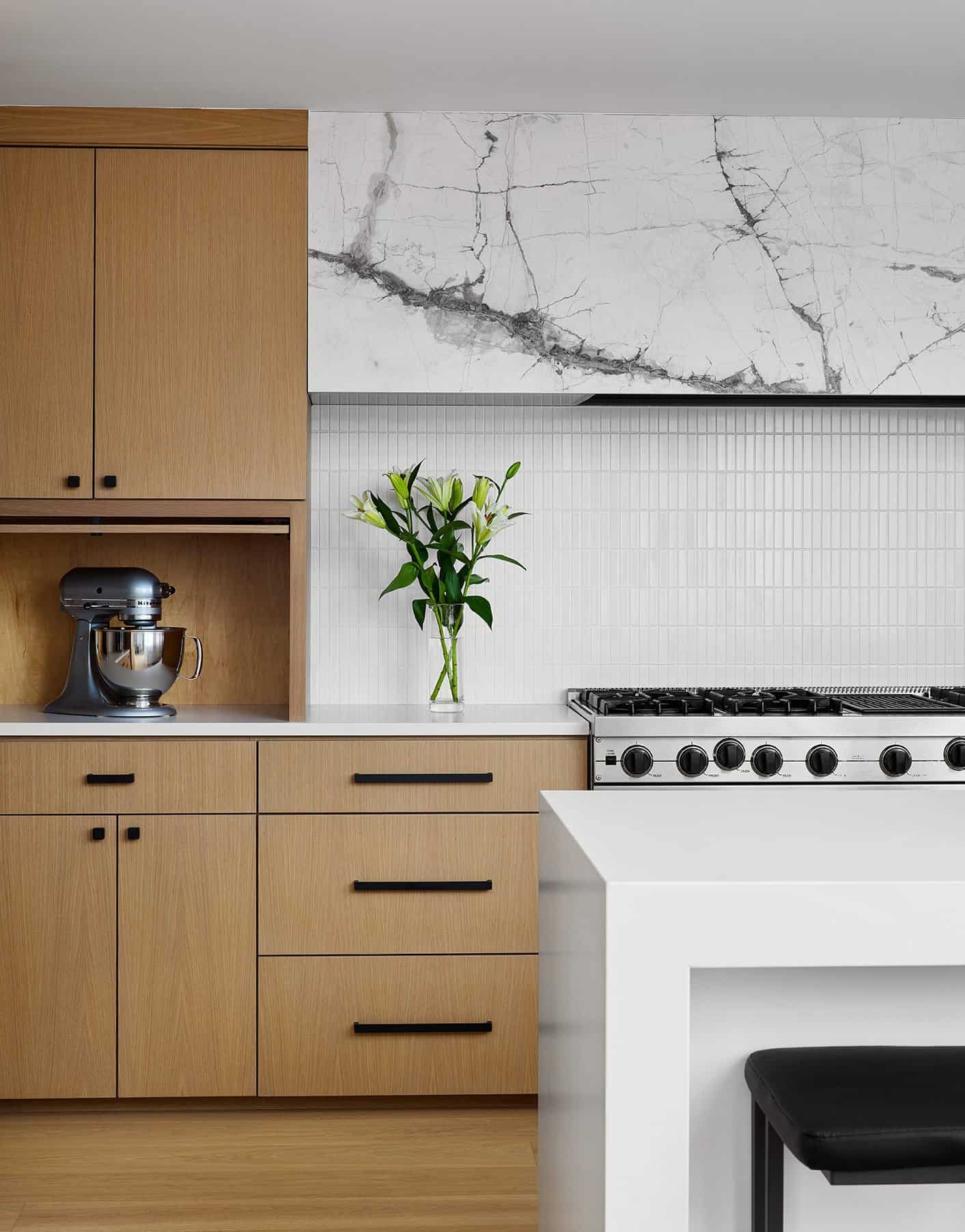
Above: There are two 4-foot-long appliance garages on either side of the range wall to keep clutter at bay.
Above: The kitchen backsplash is a ceramic tile that adds a soft texture to the space.
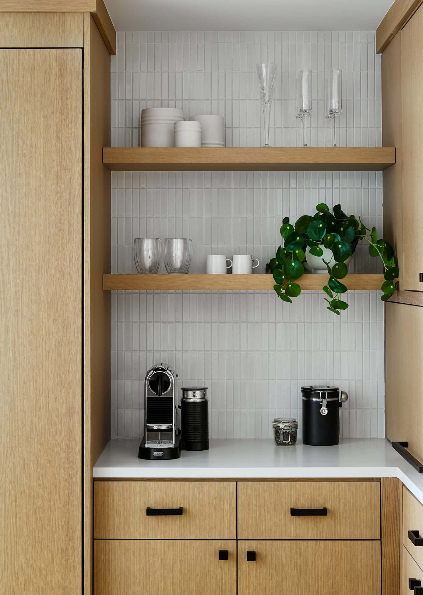
Above: Adjacent to the fridge is a coffee station with open shelves for convenience.
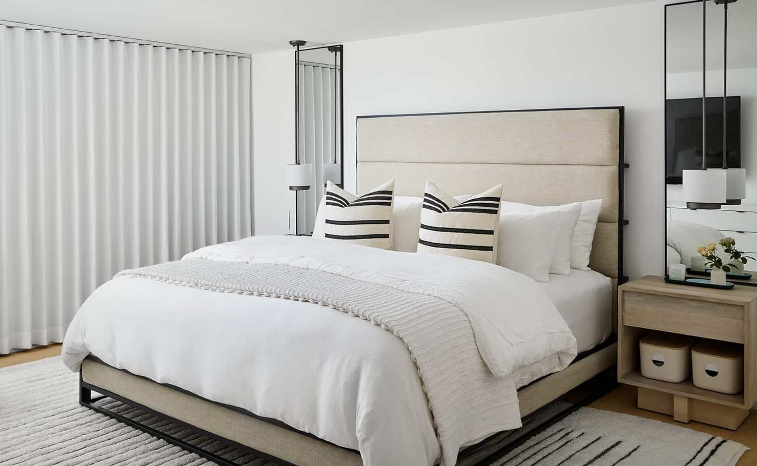
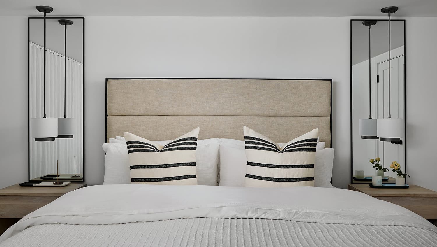
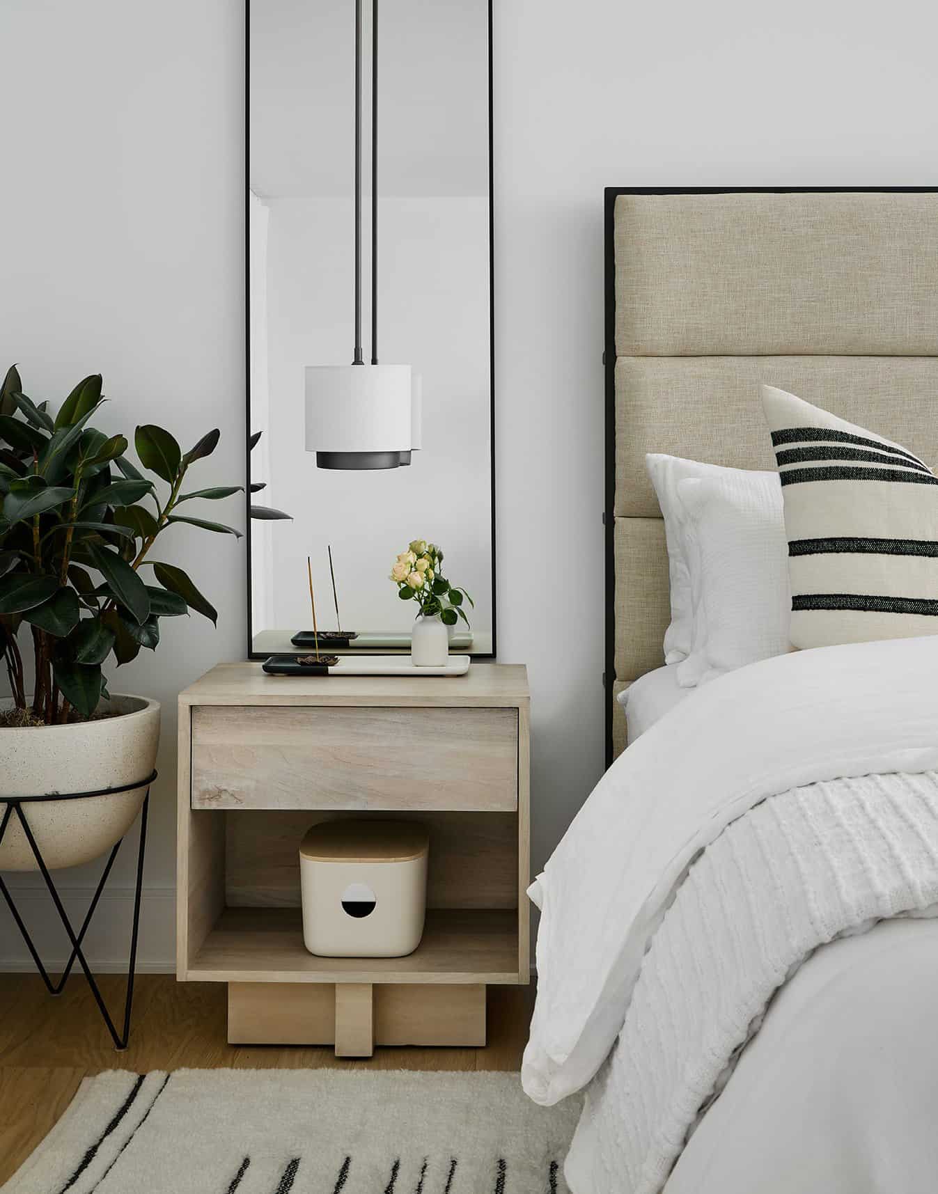
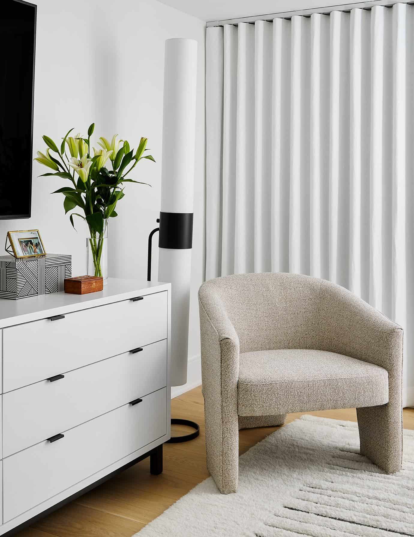
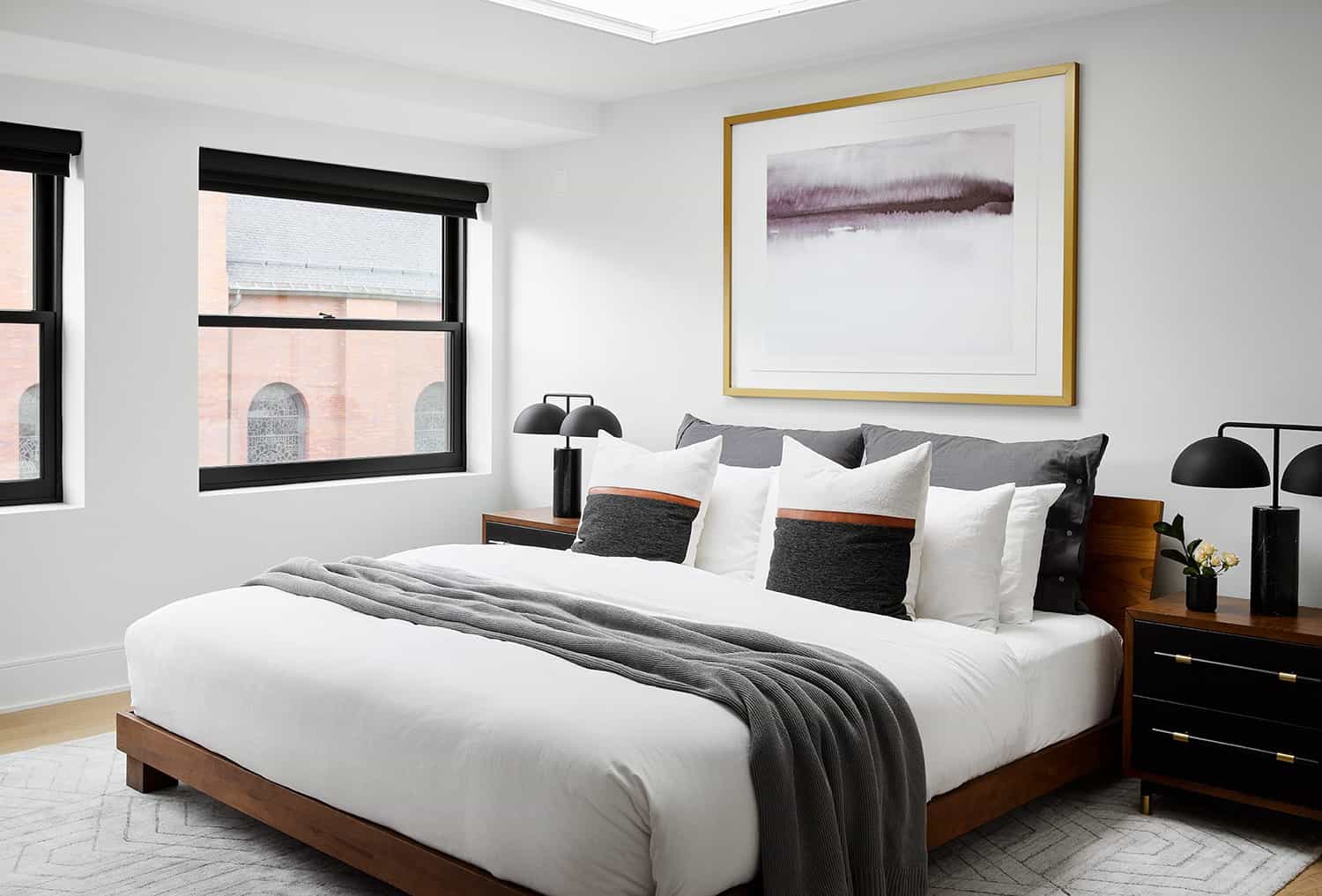
Above: The main bedroom of this Japandi style loft is located on the first floor and the ceilings are fairly low. To keep this space feeling bright and airy, the designer selected a palette of neutrals. The pendants are suspended above the nightstands to draw the eyes upward to create the illusion of taller ceilings. Tall mirrors on each of the nightstands help to further aid in this illusion.
Above: The palette is kept simple with natural textures and shades of white for a soothing, hotel-like feel.
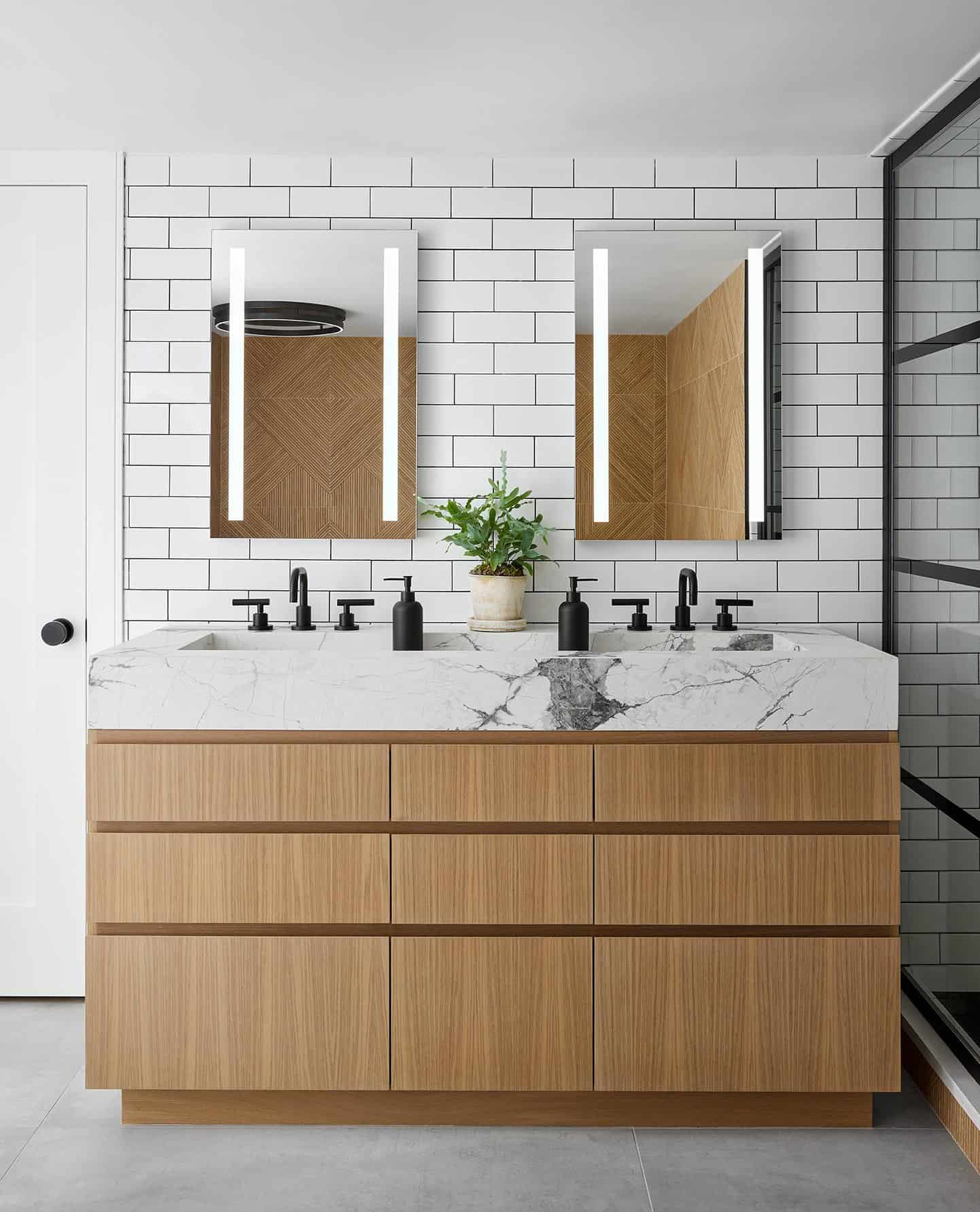
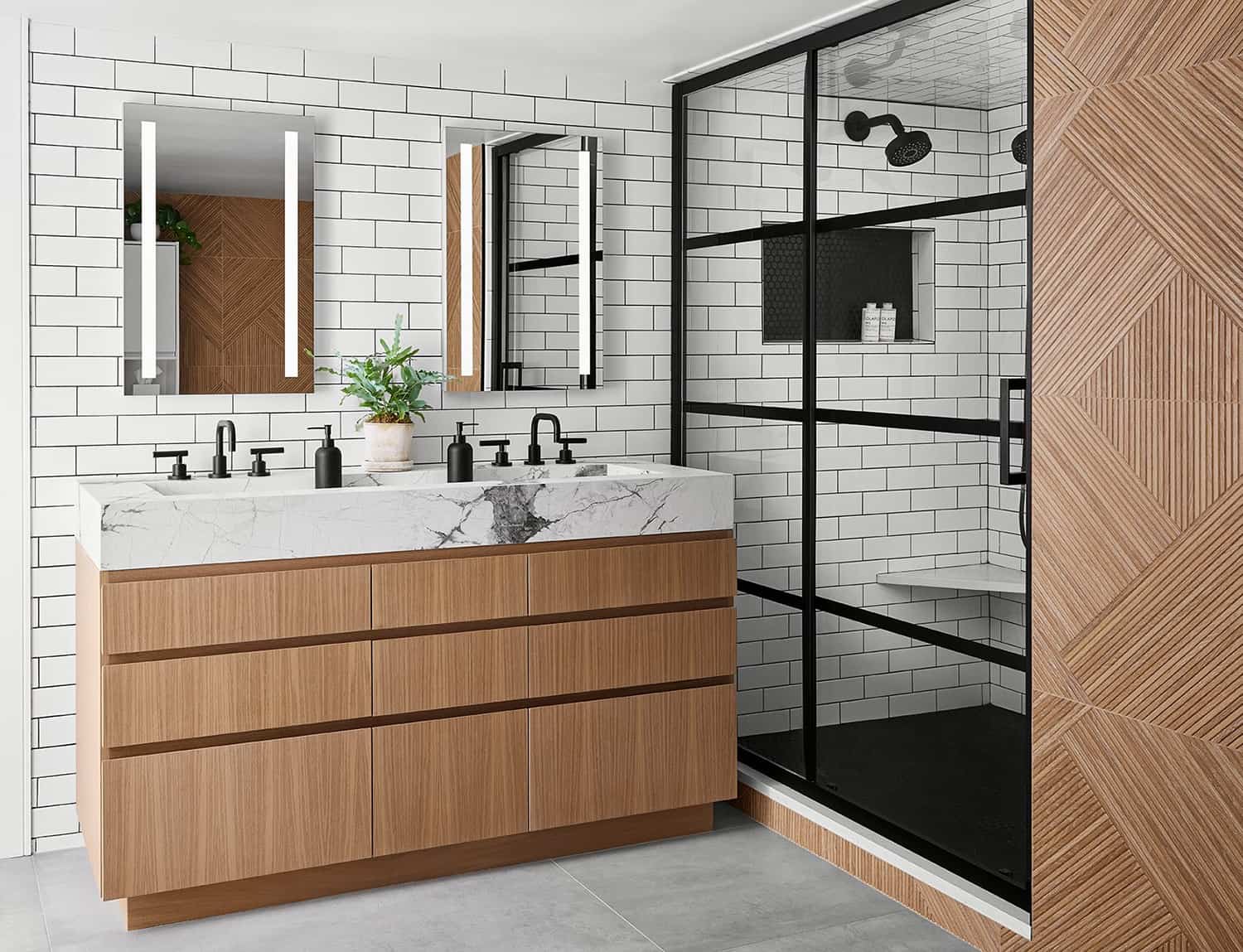
Above: In the main bathroom, the designer kept the original shower, as it had recently been renovated. She also kept the white subway tile that extends out of the shower behind the vanity.
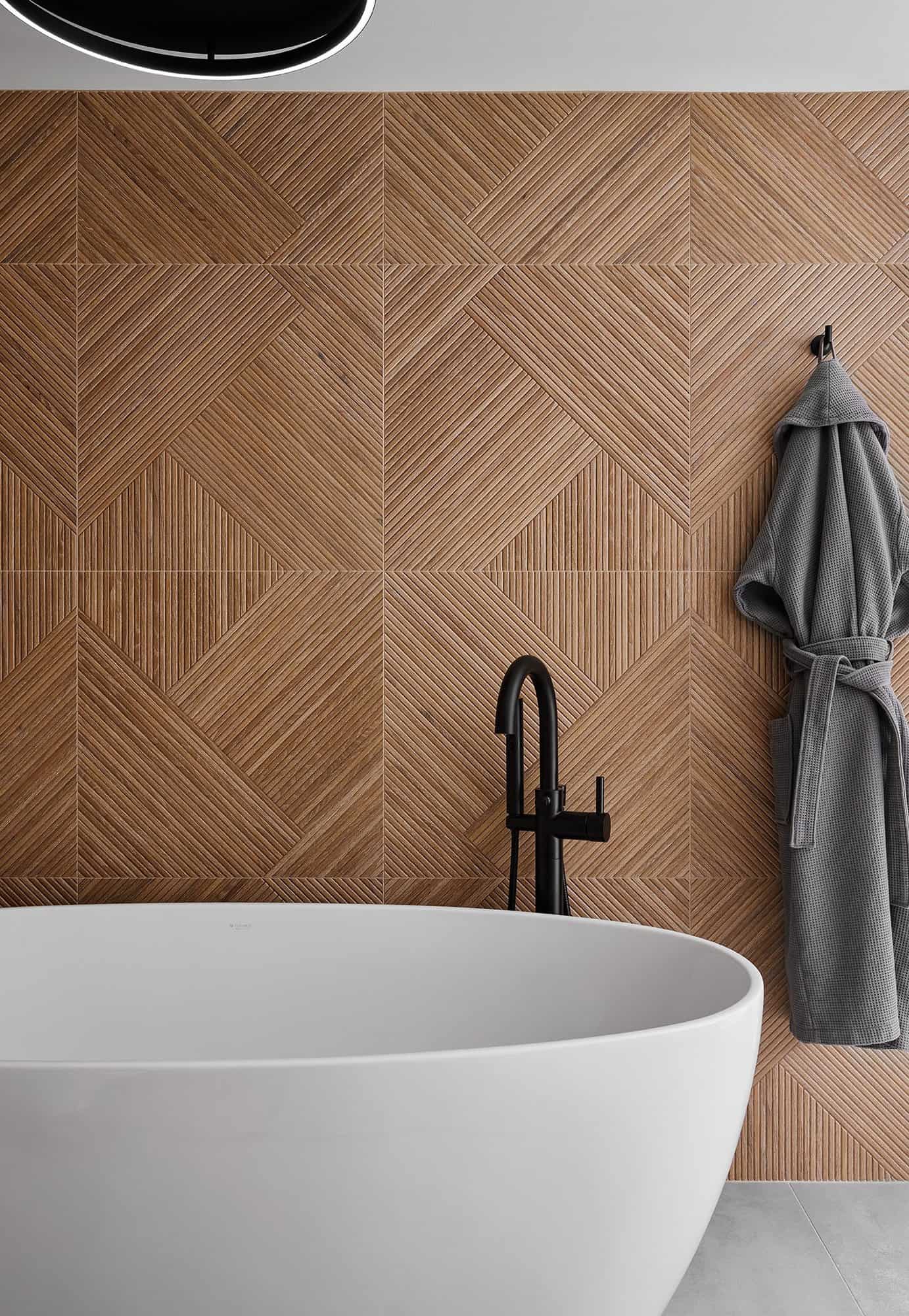
Above: On the wall, the Porcelanosa Noa tile has a sculptural wood look that is completely waterproof.
Above: The bathroom offers a Japandi spa-like escape. The Brizo Jason Wu tub filler adds contrast, however, the tile wall provides an artistic focal point.
Above: The glass stair rail was added into the new design, creating visual continuity between the two levels.
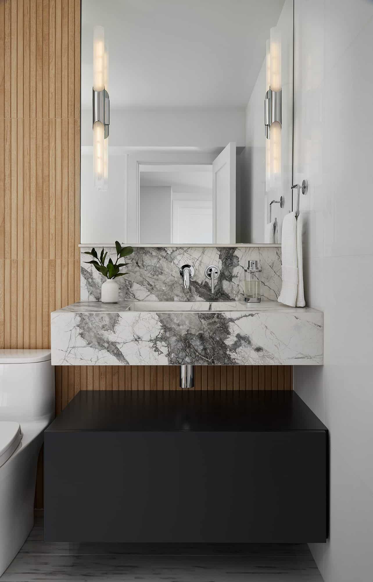
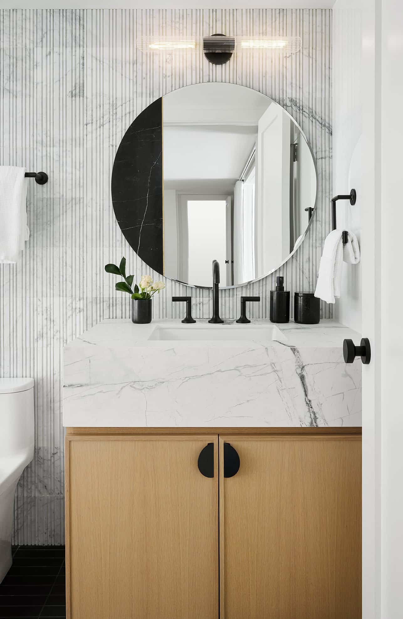
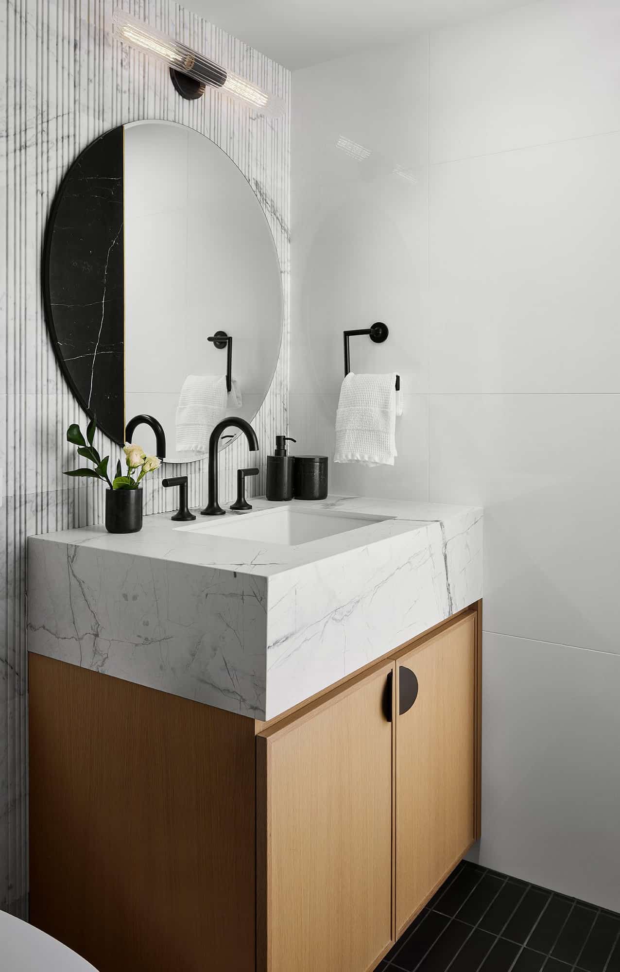
Above: The same stone used in the living room and kitchen can be seen repeated in this guest bathroom, along with the fluted wood-look porcelain tiles to add warmth to the walls.
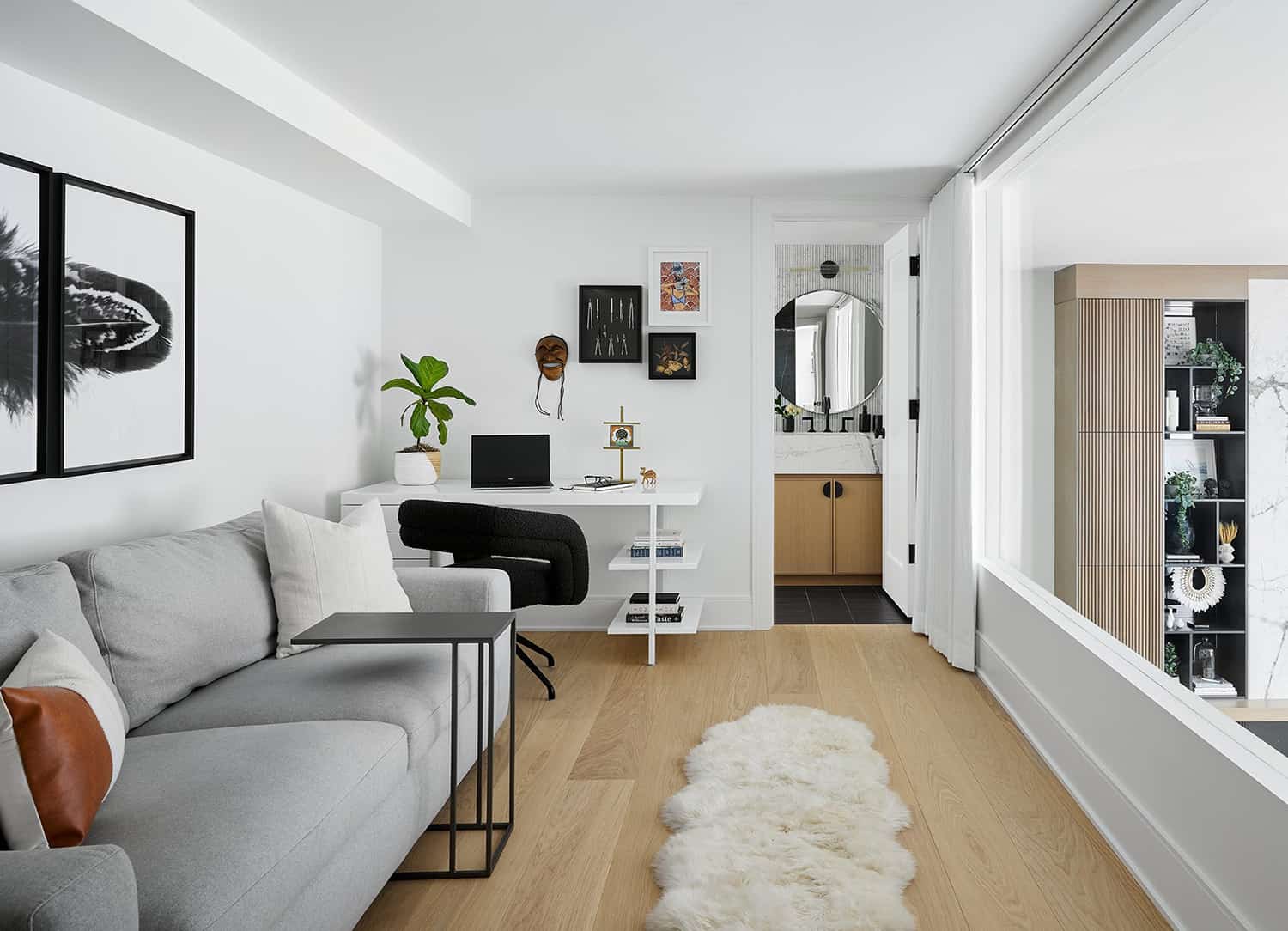
Above: This home office is located above the kitchen and feels like an extension of the living room with the expansive picture window. A pull-out sofa provides an extra bed for overnight guests.
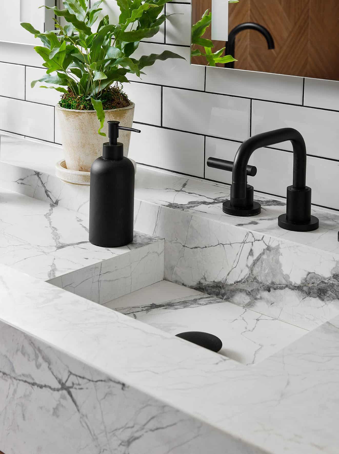
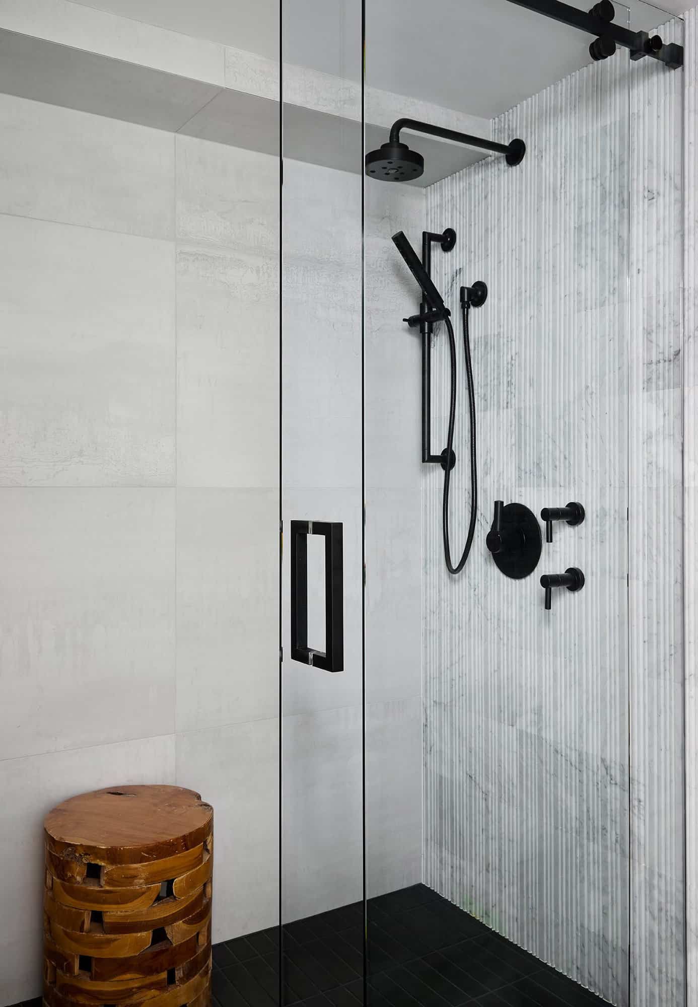
Above: Matte black Brizo fixtures provide a luxurious spa-like feel for overnight guests.
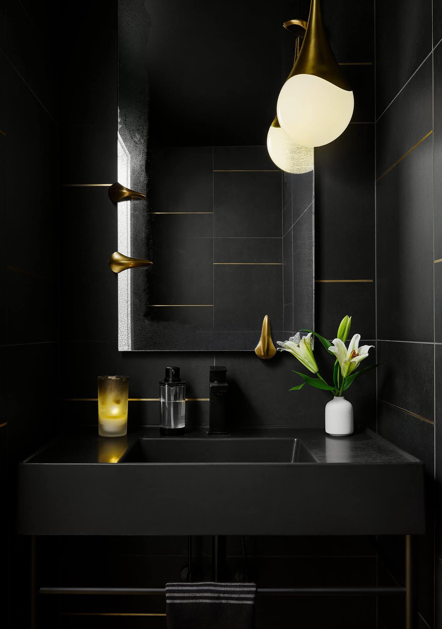
Above: The powder room features walls wrapped in a black and brass inlay tile. Even the ceiling is painted black, along with the vanity, faucet, toilet, and toilet paper! The antiqued mirror features brass talons that wrap around it to give a luxe, dramatic look. A suspended pendant light adds the finishing touch.
PHOTOGRAPHER Dustin Halleck
BEFORE THE RENOVATION
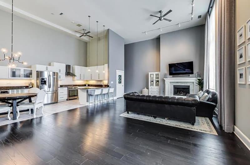
Above: The original unit was in decent condition, so the designer opted to donate all of the cabinets, countertops, appliances and light fixtures to Evanston Rebuilding, to be repurposed and not end up in a landfill.
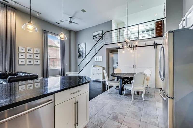
Above: In the kitchen, the laundry area was behind the sliding barn door. The designer decided to enclose the laundry room into its own space. All of the windows were replaced, while enhancing the third window by the staircase to make it the same size as the other two.


2 comments