
Benevolent climate and incredible views to the sea make this holiday home a privileged refuge in New Jersey. Designed by interior designer Mona Ross Berman, the 1960’s inspired beach house succumbs to the charms of white, with certain doses of color and geometric patterns. A novel decorative tendency which has been called California Surfer Chic, every corner of this summer house is located in front the sea. “I know that’s not a real design genre, but I didn’t want it to be cliche, the same version of an East Coast beach house you see a lot on the Jersey Shore,” says Berman. The ‘surfer’ part is a relaxed, laid-back feeling. The ‘chic’ is taking all those elements and distilling them in a new way. As a base, the color white, in reference to the sea foam, with a cascade of color, typical of the 1960s poured over it. The exuberance of oranges, yellows and turquoise are the means chosen to achieve dual environments where relaxation, rest and fun reach the same importance according to the time of day, the company or the mood. Via

Bright color and dynamic patterns bring the white living room alive. The Moroccan poufs are a Berman signature. “I use them a lot in living rooms,” she says. “They make great extra seating, especially for kids. And here, they give you a chance to get a shot of leather into the room.”

Electric colors bring zest and zing to a 1960s-inspired beach house. The starting point was the dining room table: Berman based her palette on the orange, yellow, turquoise, and white tabletop. “In a summer home you have greater license to have fun, be irreverent. The ‘surfer’ part is a laid-back feeling. The ‘chic’ is taking all those elements and distilling them in a new way.”

“The whole house is basically orange, yellow, turquoise, and white, with a tiny bit of pink here and there. The colors were inspired by that wild geometric pattern on the ’60s-style dining room tabletop,” says Berman.

Grass cloth makes a chic backdrop for family photos above the wet bar. “This living room is all about colorful accents. Even though there’s a lot of color, it takes a backseat. The base color is white-white walls, white fireplace, white sectional-so it’s easier to be around it all day long,” says Berman.

“The doors to the laundry room could have been a lost opportunity-just another pair of white doors,” says Berman. “But we felt they shouldn’t be an afterthought. Painting them orange made them very visible and special. They read as art.”

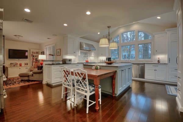
“The kitchen has a classic, timeless quality,” Berman says, “with a few fun pops of color to keep it from being staid and predictable.”

“The master bedroom has a very retro feel to it,” Berman says, “with the pink, tangerine, and lavender color palette, the paisley linen, and the zigzag Missoni-esque pattern on the floor.” The floor is painted Salmon Berry and White Dove, both by Benjamin Moore. The headboard is upholstered in Henry in Rose by Raoul Textiles. Pouf from John Derian.


“Powder rooms are places where you can gild the lily. We used a loud geometric in a bright ocean blue to give it a slightly over-the-top feeling.” Wallpaper is from Studio Printworks.

Katie Ridder‘s Beetlecat wallpaper gives the boys’ room a playful but “not overly cute” feel.

Strong color- Benjamin Moore‘s Fresno-“keeps the mudroom from looking like your everyday mudroom,” Berman says.
Photos: Jonny Valiant


1 comment