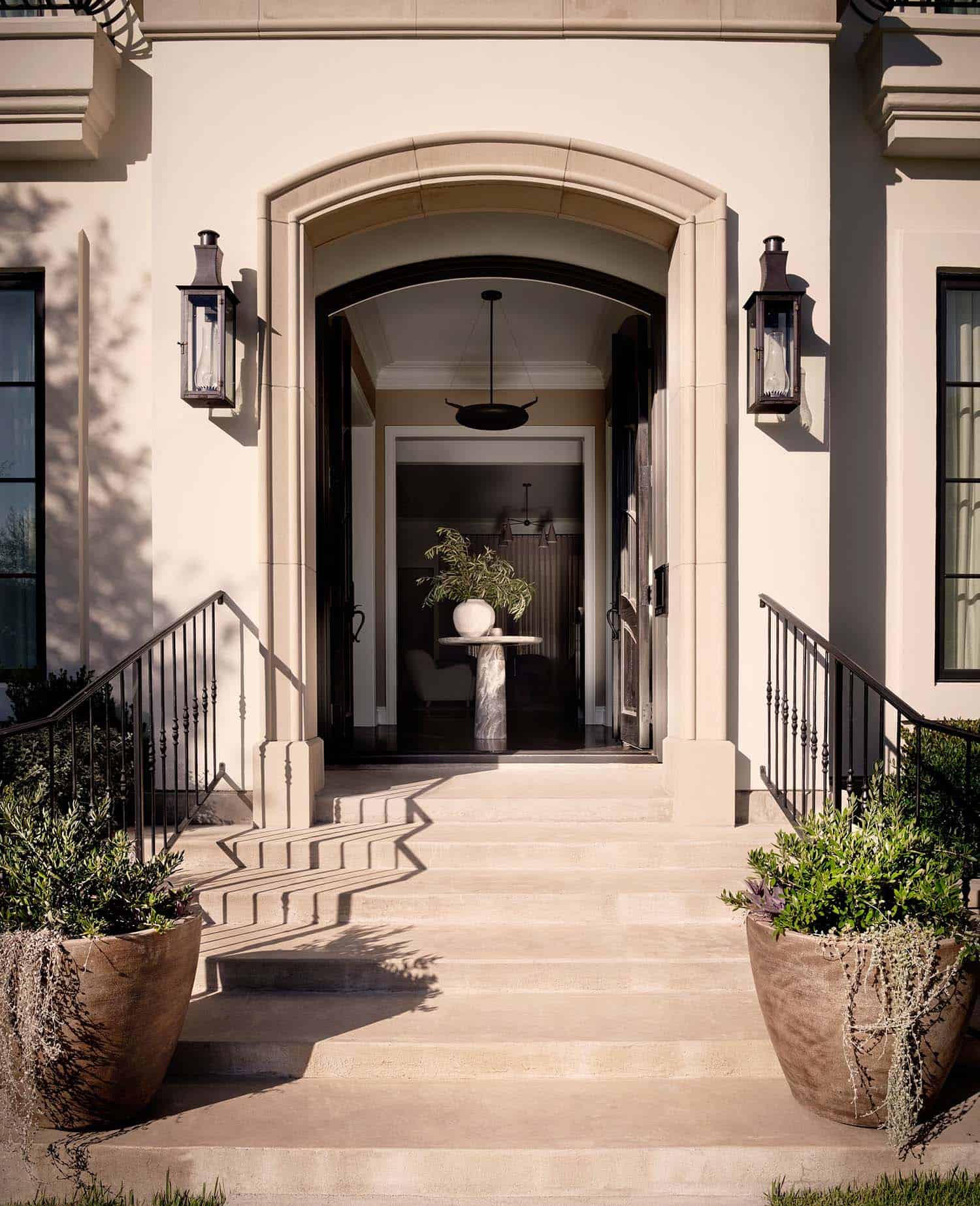
Ashby Collective has renovated a contemporary modern house to reflect the traditional surroundings of the older, timeless neighborhood of Tarrytown in Austin, Texas. They wanted the interiors to reflect their own personality while also giving a nod to the quaint neighborhood made up of classic homes with traditional architecture and design.
The young family, transplants from New York, brought on prominent Austin design firm Ashby Collective for the renovation (the design teams’ work has been published in the New York Times, Architectural Digest, Dwell, and more).
DESIGN DETAILS: INTERIOR DESIGN Ashby Collective, Cori Pfaff GENERAL CONTRACTOR Stew & Co.
“The home initially was all bright white, a typical new design, spec home, with very little character. It did have some great architectural elements and finishes, but it just needed a bit of a wow factor. We switched out all of the matching chrome hardware for a softer finish, changed all the light fixtures, and painted every inch of the house to warm it up,” says Cori Pfaff, Ashby Collective.
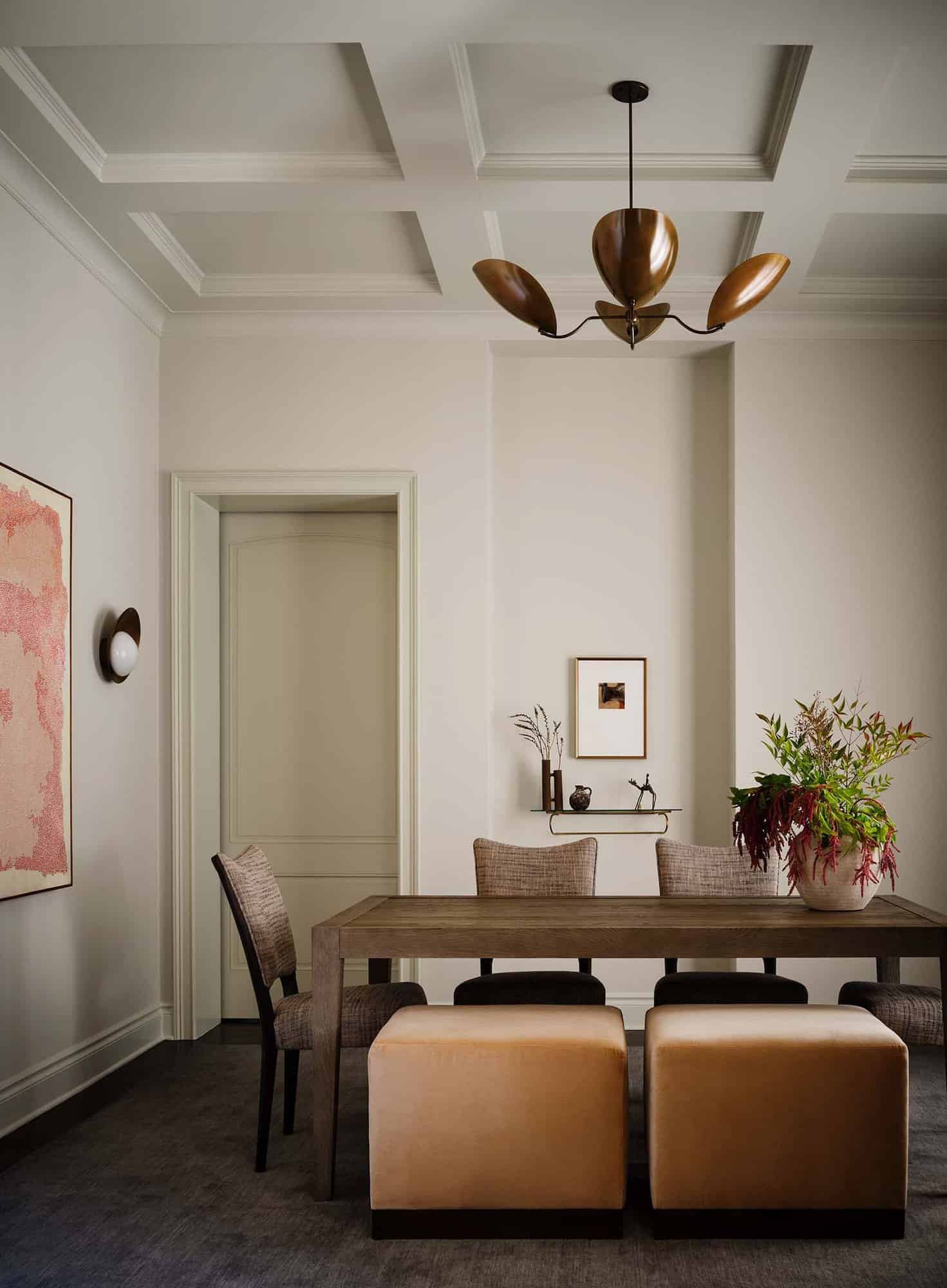
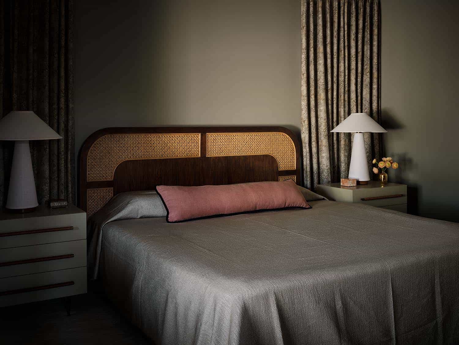
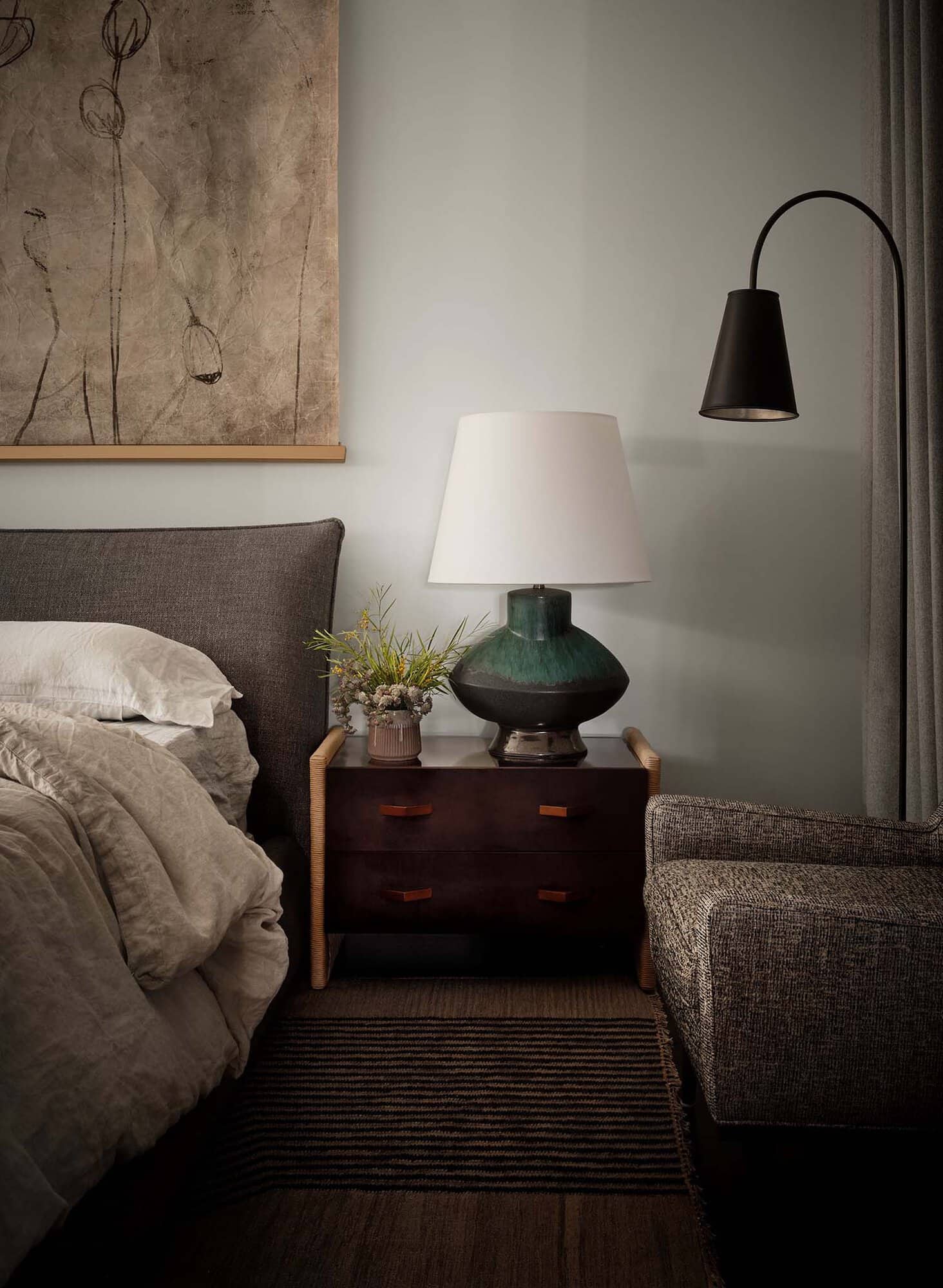
“For the furnishings, we played with a lot of textures and reupholstered retail pieces with luxe fabrics to make them feel more custom and one-of-a-kind. The client loves Heidi Calliellier, Amber Lewis, and Disc Interiors, so we used their designs as an inspiration.”
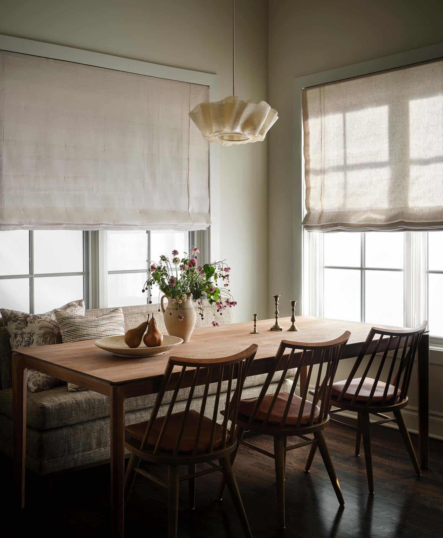
By layering in plush window treatments, and rugs, and mixing fabric textures and patterns, Pfaff warmed up the home, giving it charm without breaking the budget. The kitchen design was constrained as the structure and materials had to remain intact. Adding paint was an easy but huge upgrade.
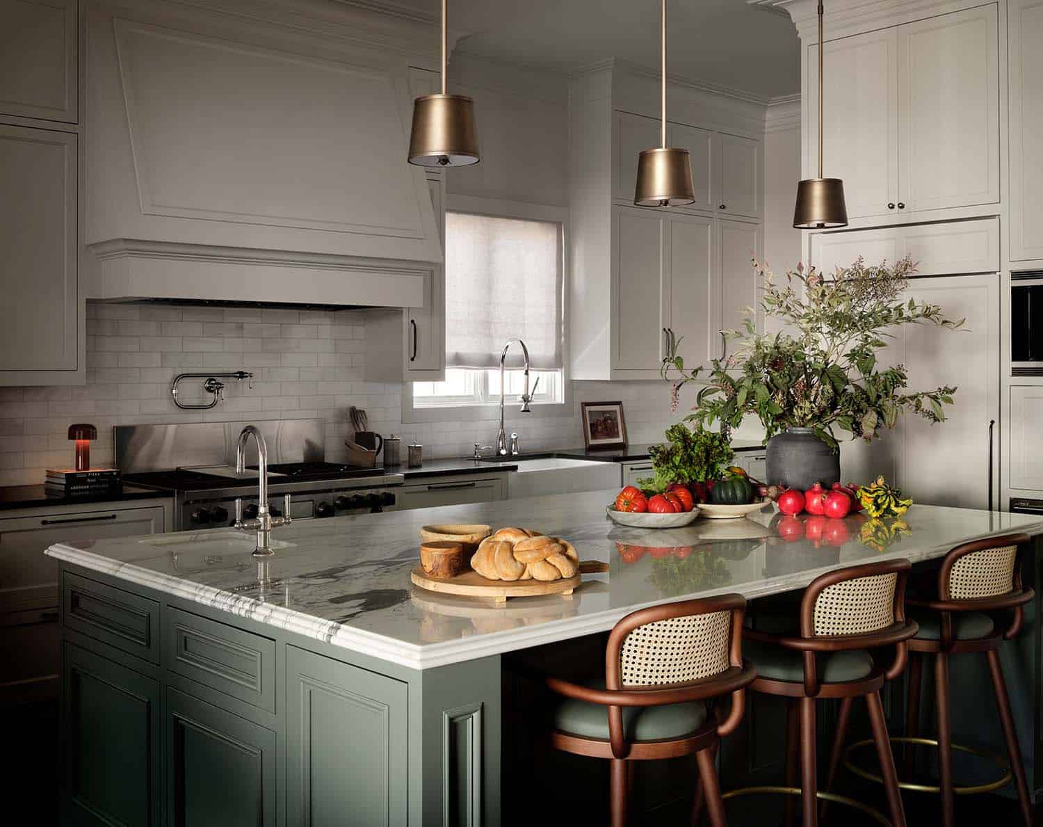
Materials and the process used in the kitchen: “The house had great bones, but no personality. So by layering in textures by adding plush window treatments, and rugs, and mixing fabric textures and patterns, we were able to really warm it up and give it charm. We were constrained with keeping the kitchen as it was structurally/materials so by adding in paint it was an easy/affordable huge upgrade! Even just changing the very bright white walls and cabinets to a warmer neutral color made a huge difference and really changed the soul of the house.”
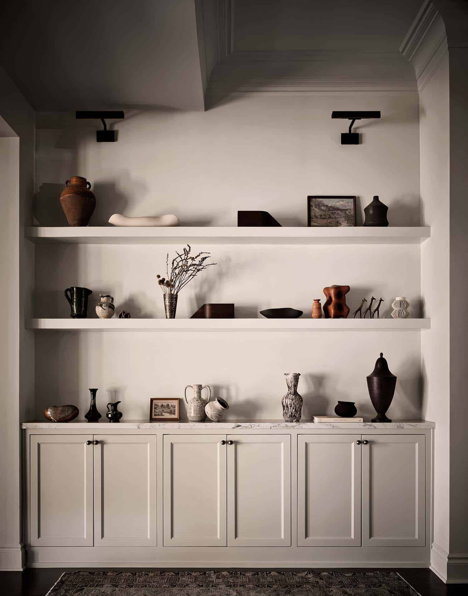
The cabinets/walls we used: Benjamin Moore Ashwood OC-47 and on the island: Ben Moore Rainy Afternoon 1575 ). “Breaking up the island with a fun pop of color makes the kitchen more inviting, it is a huge Kitchen so keeping it all white felt boring. Not pictured, but we also painted the entire butler’s pantry, floor to ceiling, the same color!” states the designer.
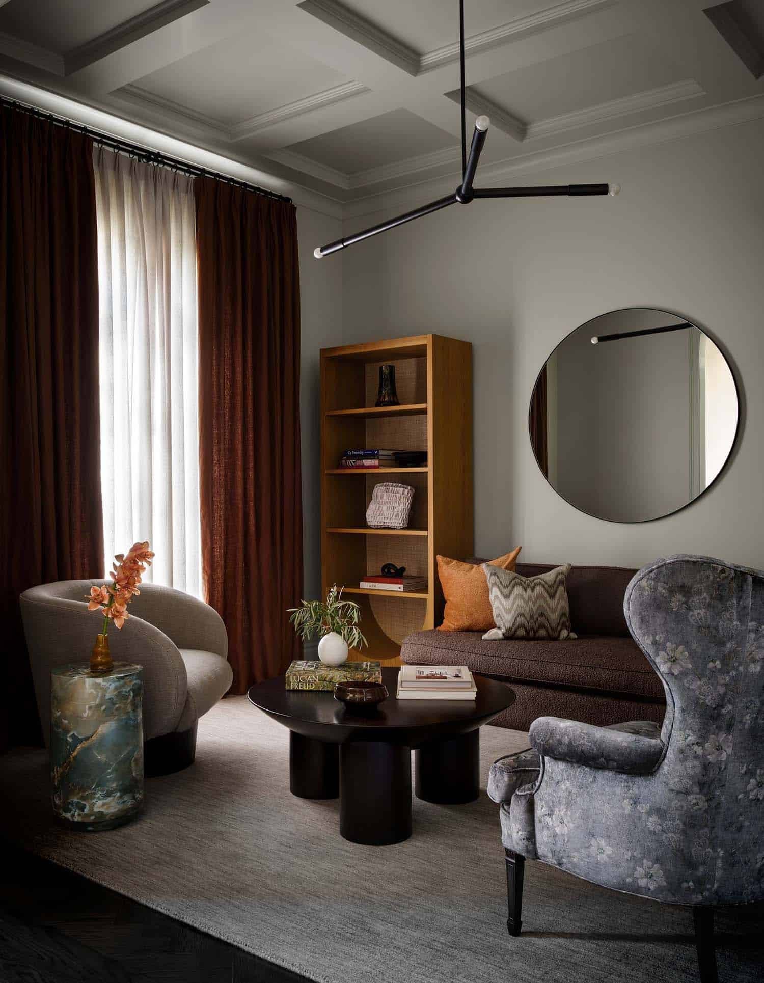
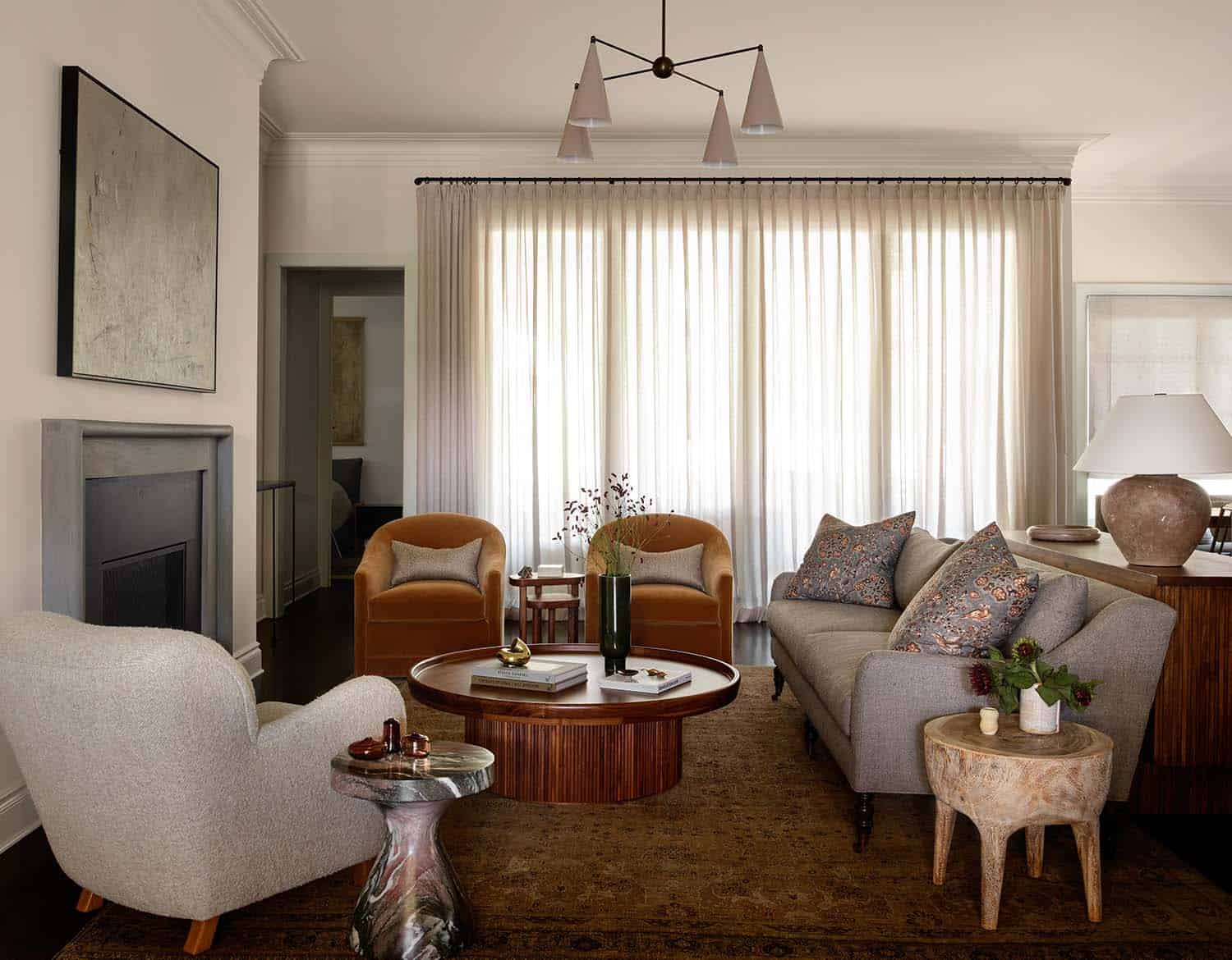
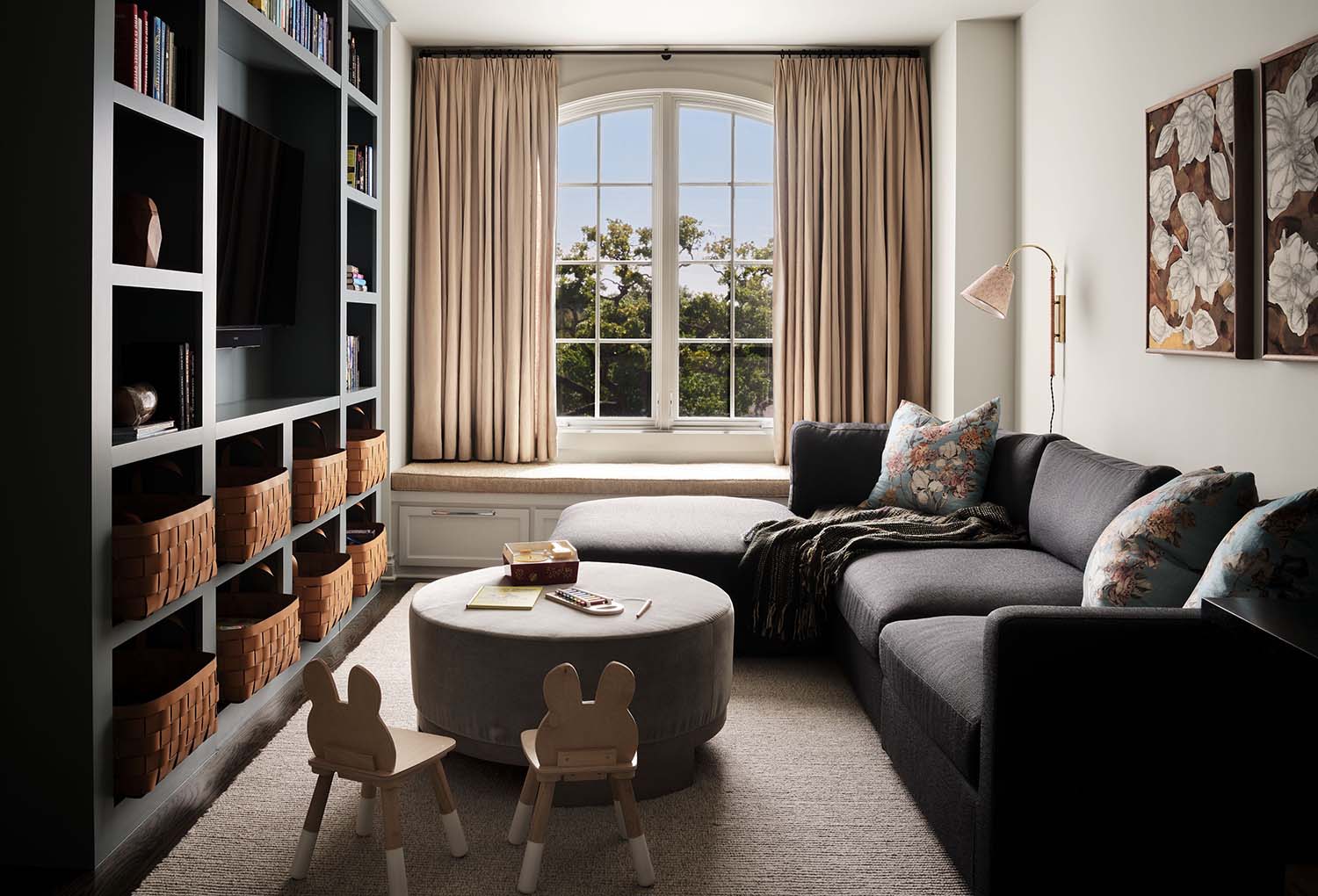
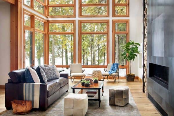
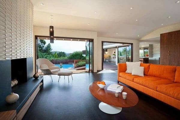
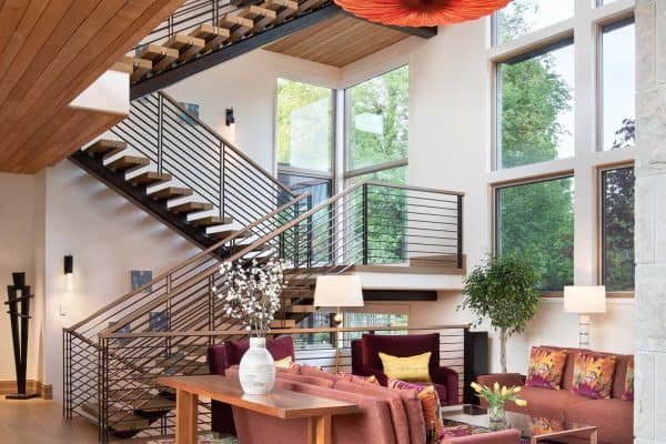
The designer chose to mix in some vintage pieces with new retail furnishings. “Not everything needs to be custom and take 20+ weeks to get!” says Pfaff. The design also notes that kid-friendly doesn’t mean it has to be boring or uncomfortable. Pfaff paid close attention to fabric content so that even though the family room is a kid’s space, it still feels sophisticated but safe for dirty fingers and spills.
“In the living room: I chose to mix in some vintage pieces with some new retail pieces since we were trying to stay budget and kid friendly. Not everything needs to be custom and take 20+ weeks to get! We reupholstered a lot of retail pieces to make them feel more custom and not something that anyone else would have. Kid friendly doesn’t mean it has to be boring or uncomfortable. We paid close attention to fabric content so that they felt sophisticated, but safe for dirty fingers and spills.”
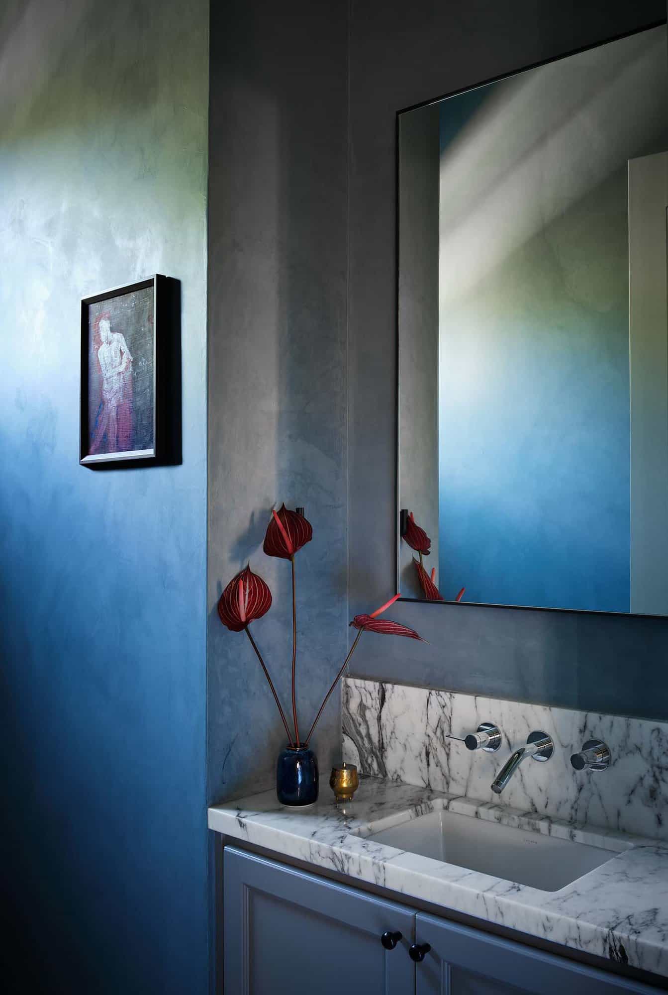
The design team gave the powder room a punch of character with a calming blue plaster treatment from Portola Paints & Glazes in Serene Roman Clay.
“All of the dream changes the client wanted to do in the beginning of the project were coming in really high (post-pandemic/supply chain issues) so we had to get really creative in how we were going to change the house without blowing the budget, so a careful curation of what was readily available was important for the house to not feel like we walked into a retail store and bought it all from one place, which is never the goal,” says Pfaff.
What We Love: Living spaces were designed to be warm and inviting with stylish designer furnishings and thoughtfully curated accessories and artwork that transform a house into a home. This home is now perfect for entertaining and everyday living for a young, modern family. Overall, we think the project team did a fabulous job of transforming this modern Texas house to reflect its beautiful traditional neighborhood better.
Tell Us: What details in this project do you find most inspiring? Please share your thoughts in the Comments below!
Note: Be sure to check out a couple of other home tours by Ashby Collective that we have featured here on One Kindesign: A stunning modern sanctuary in Texas surrounded by heritage oak trees and Mid-century modern house gets inspiring transformation in Austin, Texas.
PHOTOGRAPHER Clay Grier
One Kindesign has received this project from our submissions page. If you have a project you would like to submit, please visit our submit your work page for consideration!




0 comments