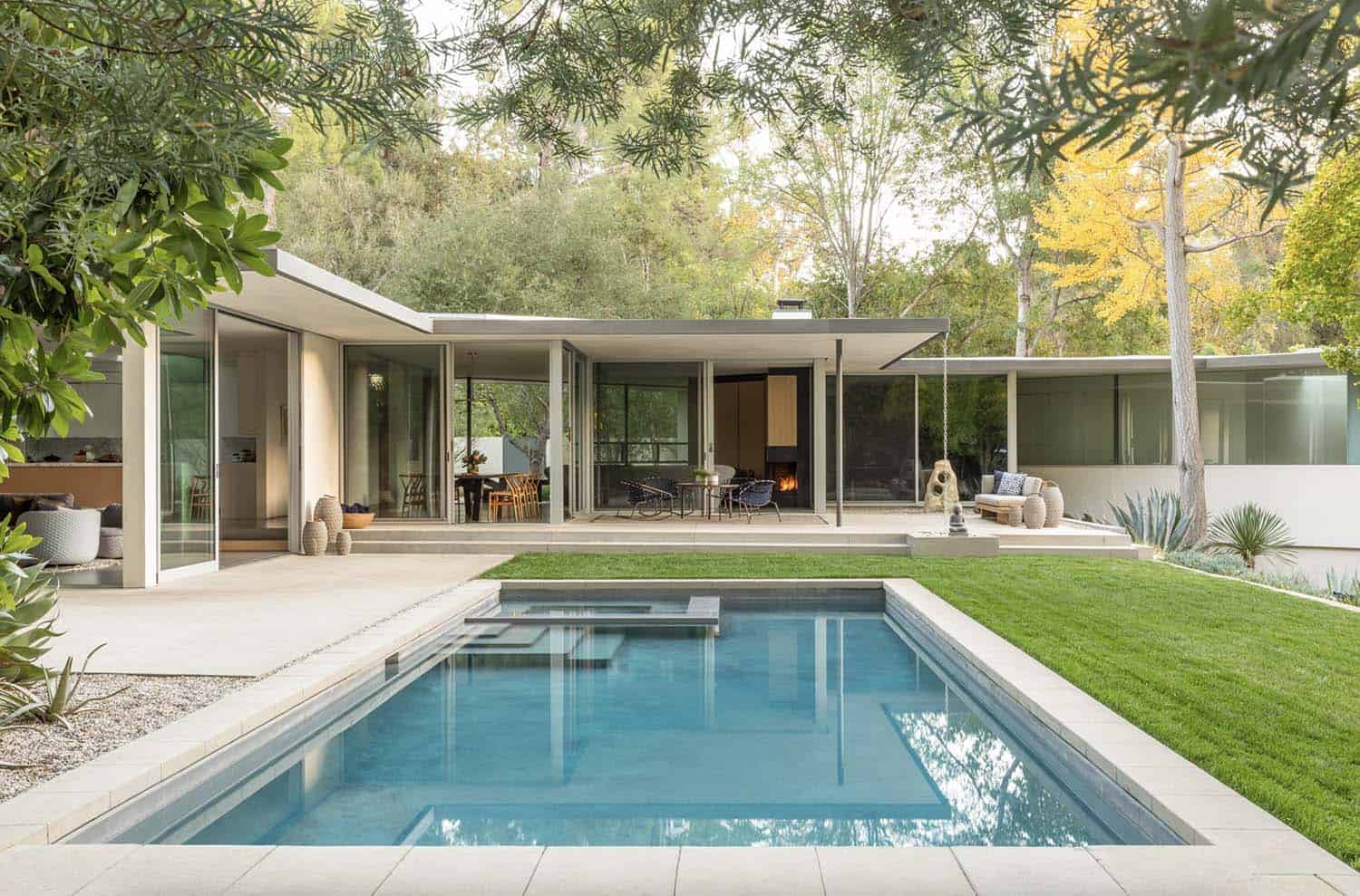
A 1960s midcentury hillside home underwent a remodel and addition by architecture firm Assembledge, nestled in the hills of the Fryman Canyon Estates area in Studio City, California. Originally consisting of 3,900 square feet of living space, this dwelling had remained a kind of midcentury time capsule until it was reimagined by the architects.
At the core of the original design was a saw-tooth floor plan that provided views in several directions. However, beyond this core, the floor plan was congested and connectivity throughout the home and site was limited. The homeowner’s request was to create an airy and light space throughout that maximized views of the surrounding landscape while drawing on the home’s already existing strengths.
DESIGN DETAILS: ARCHITECT Assembledge INTERIOR DESIGN Lisa Strong Design, Susan Mitnick Design Studio CONSTRUCTION Dobkin Construction LANDSCAPE Fiore Landscape Design
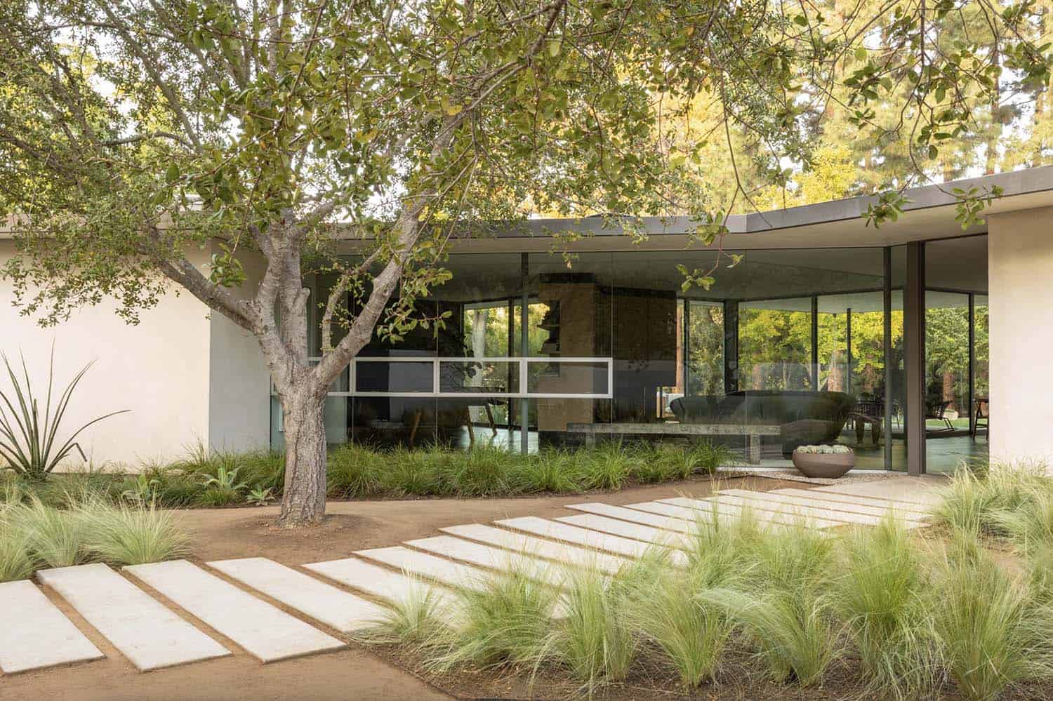
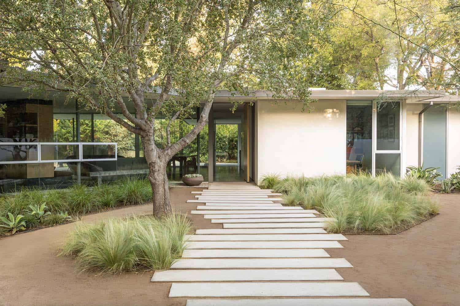
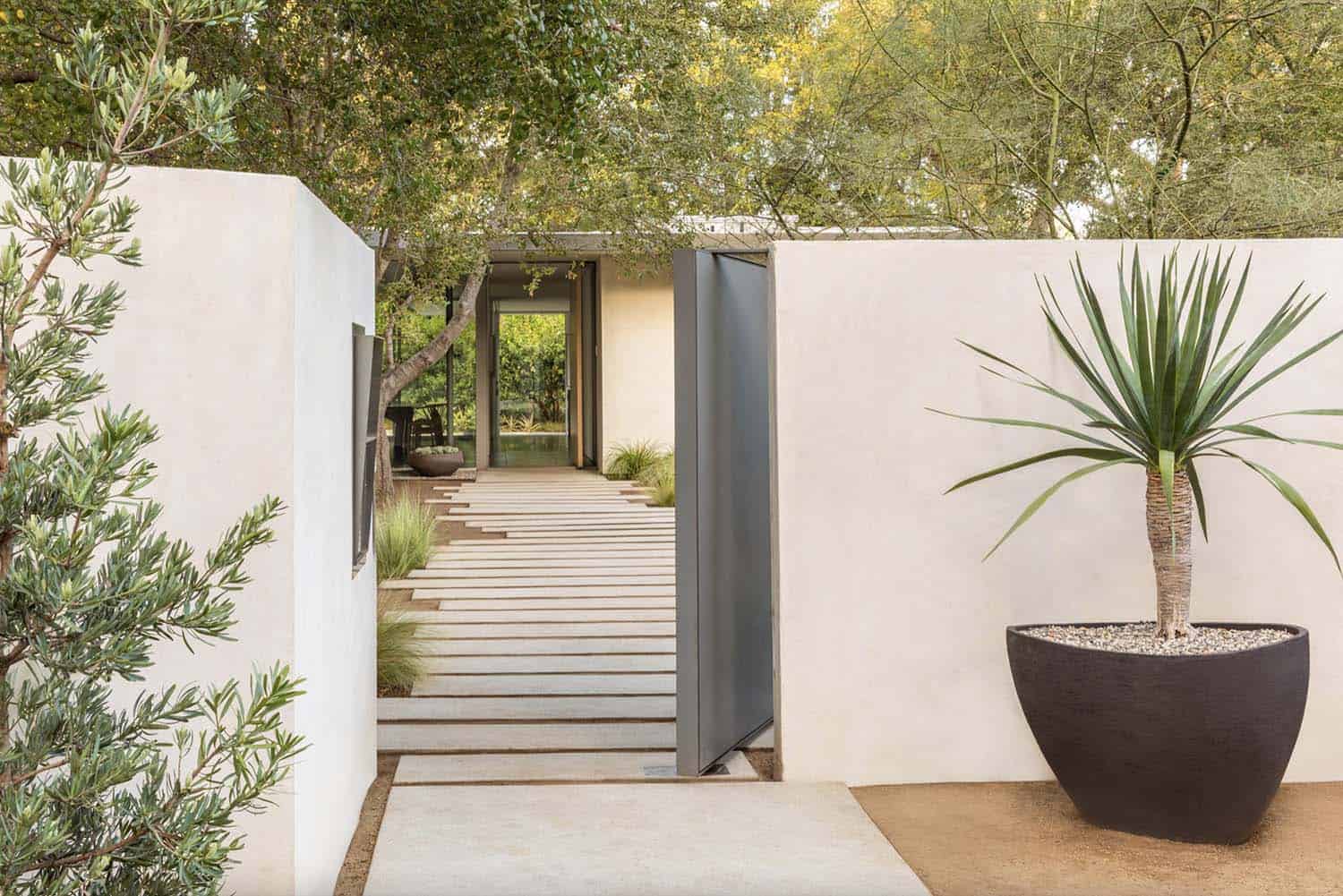
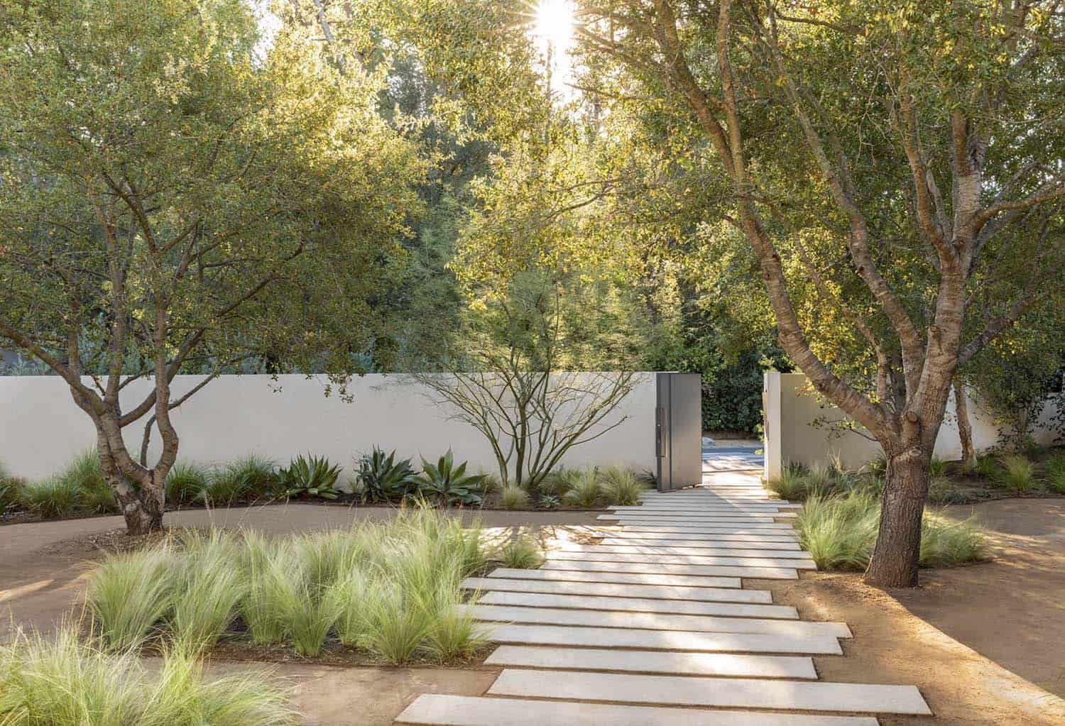
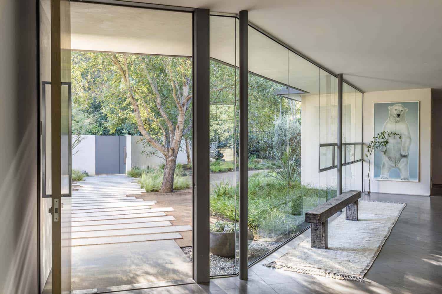
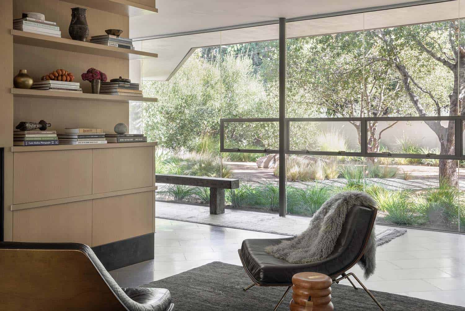
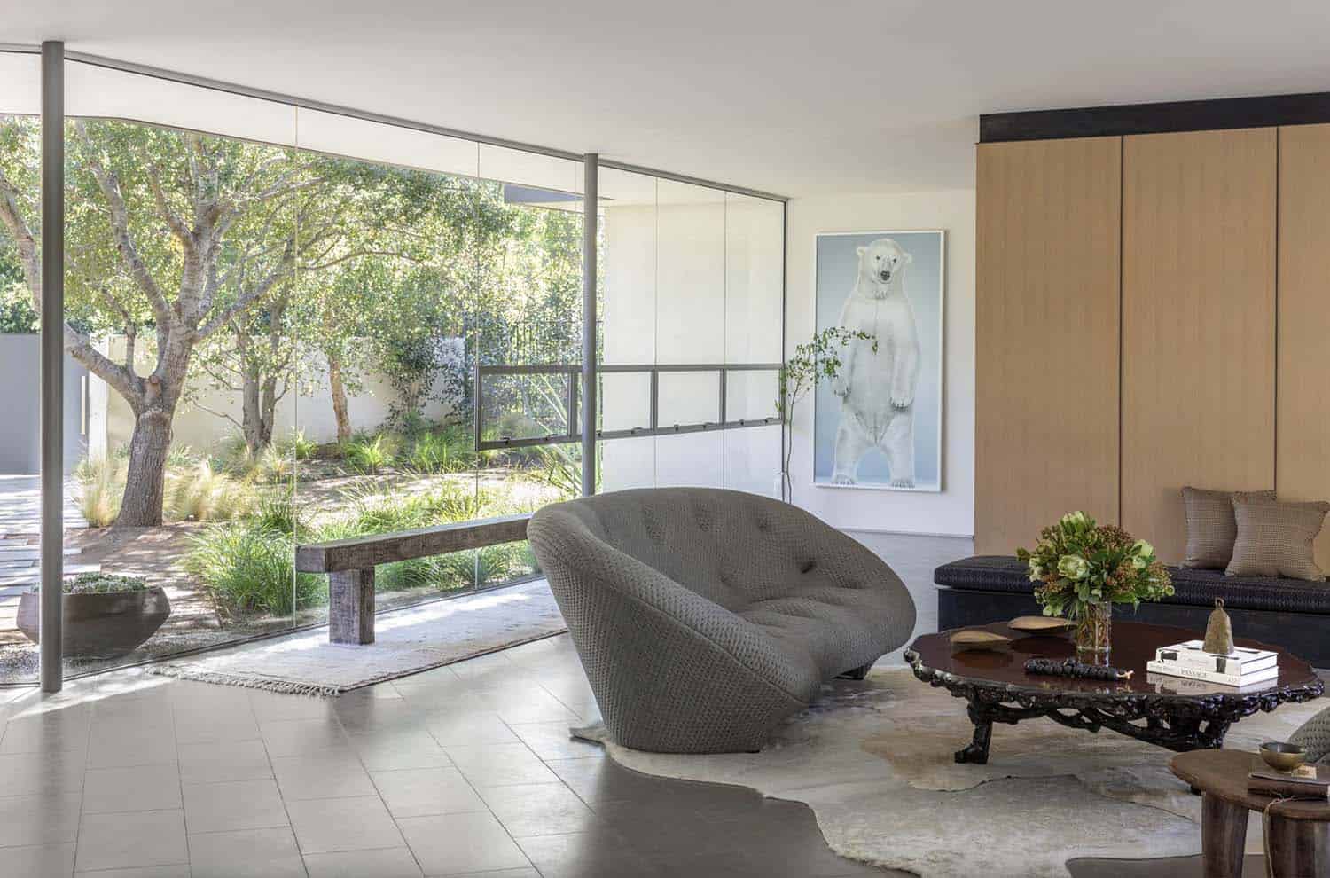
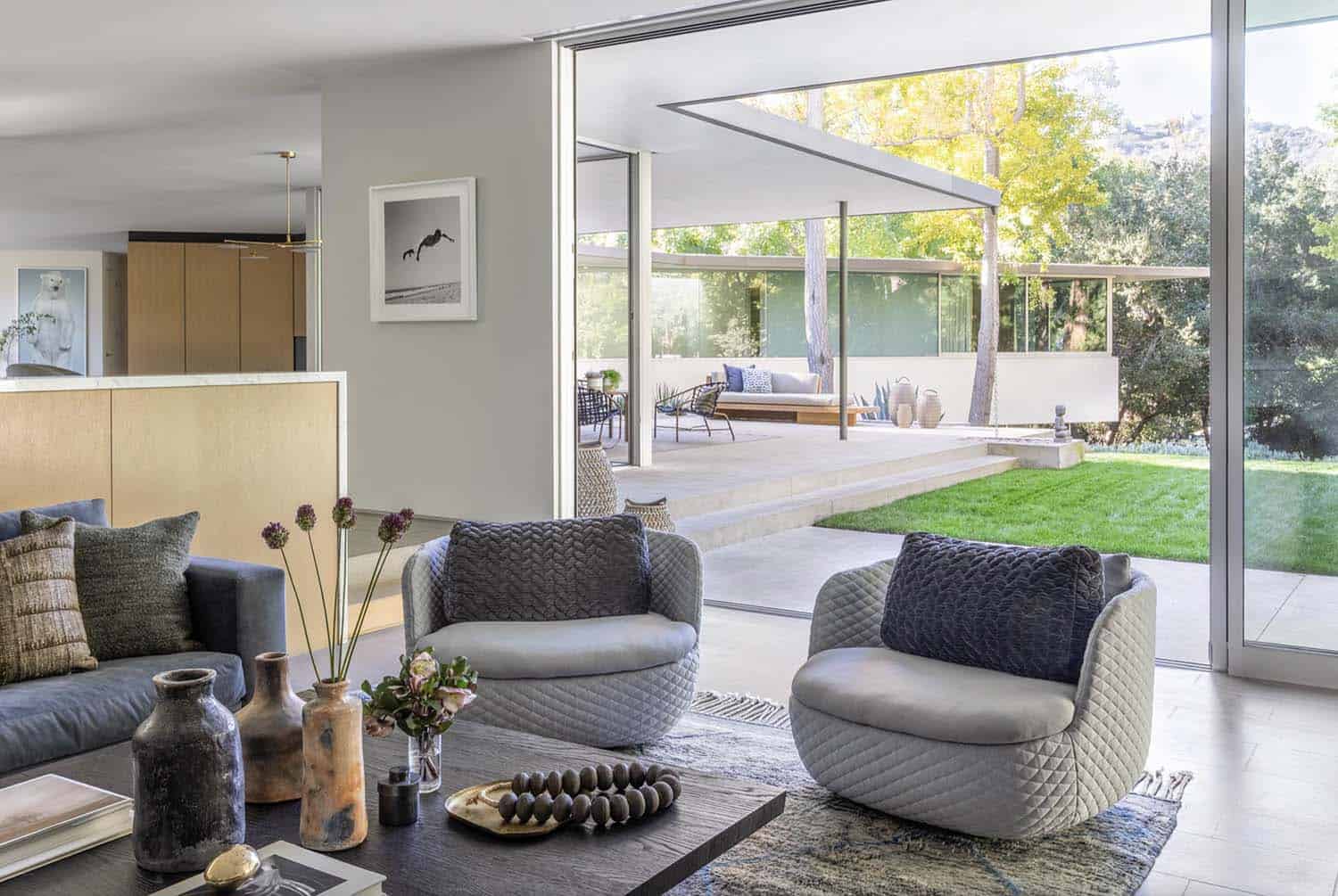
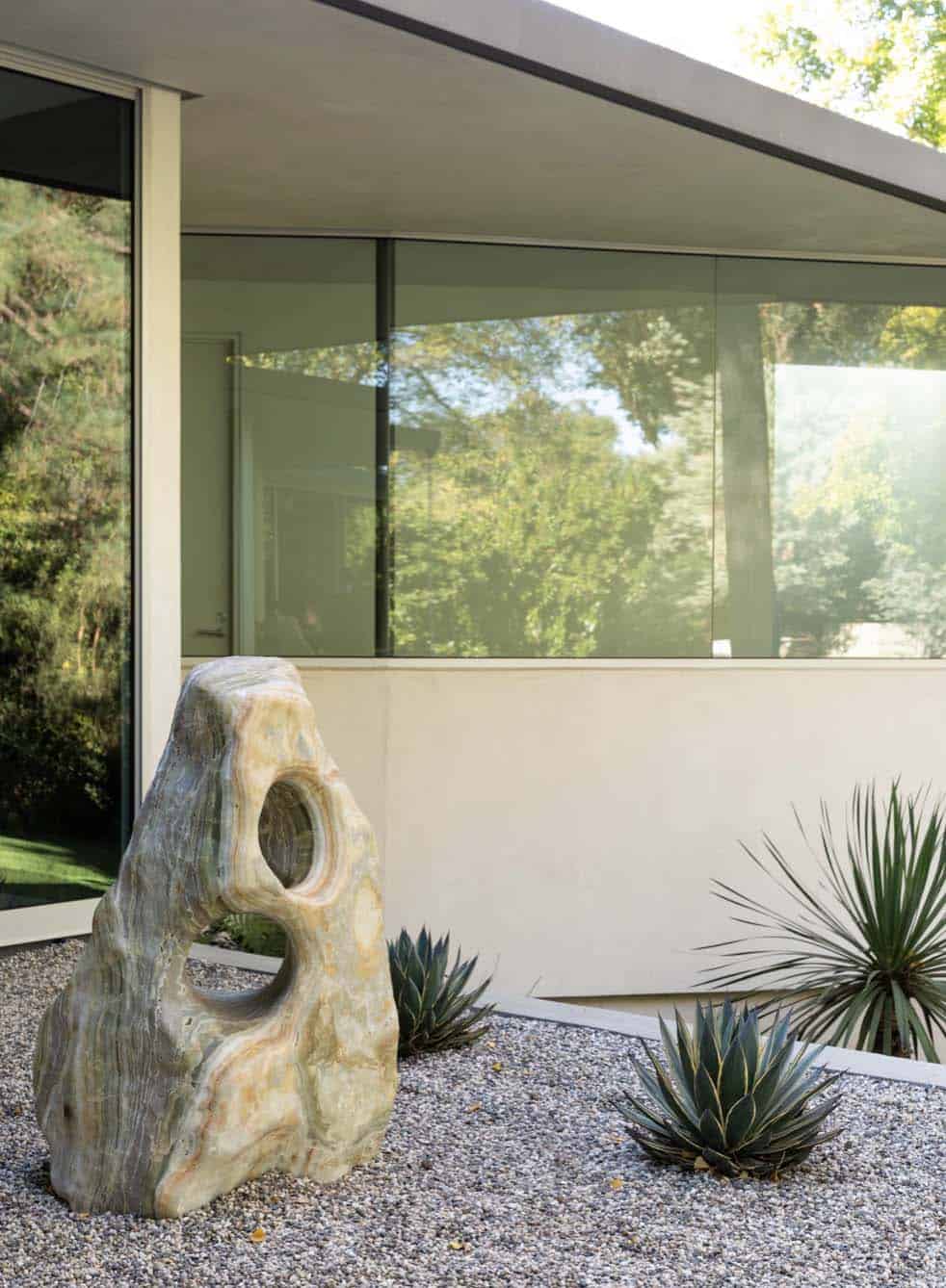
A meandering path of concrete panels, set amidst the landscaping and decomposed granite, leads to the entry of this 5,755 square foot house, comprised of a frameless glass wall with floatable four windows. The floor-to-ceiling windows and sliding glass doors on either side give the residence a sense of transparency, bringing in ample light and extending the living area into the surrounding landscape.
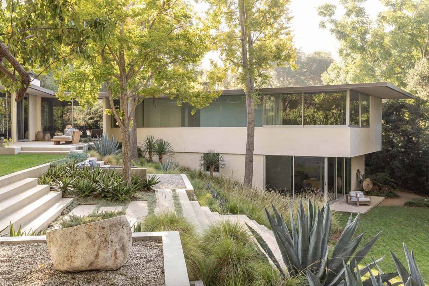
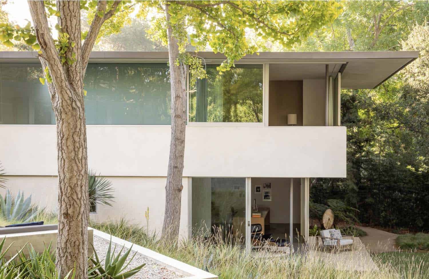
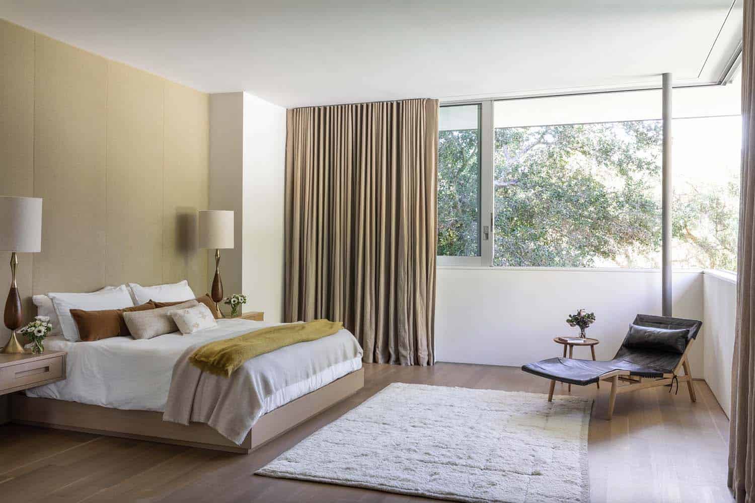
The two-story addition encompasses a new bedroom wing, extended toward the rear of the site on the main level, and new office space on the lower level, tucked below. Both take the advantage of the descending lot and are completely integrated into the hillside.
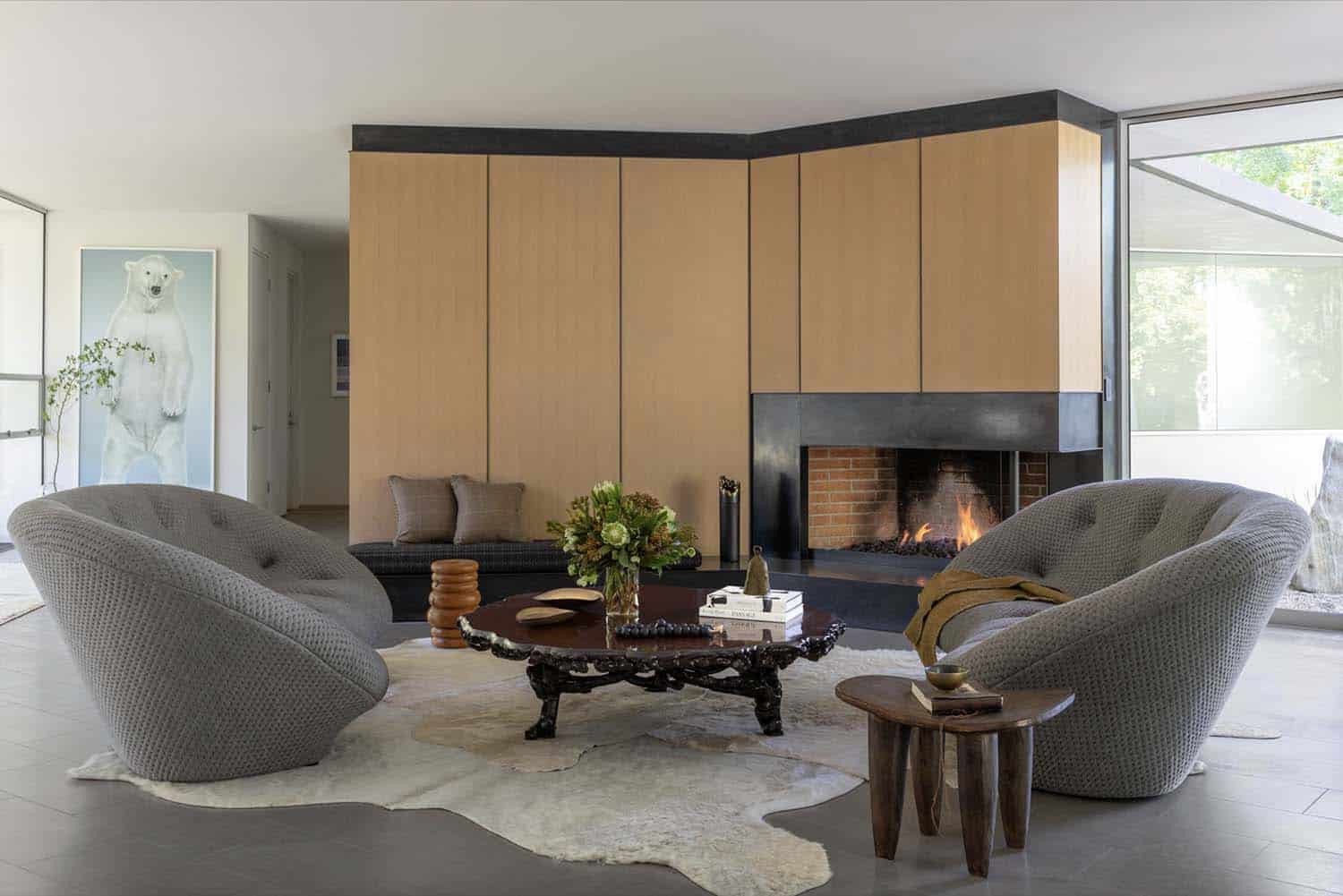
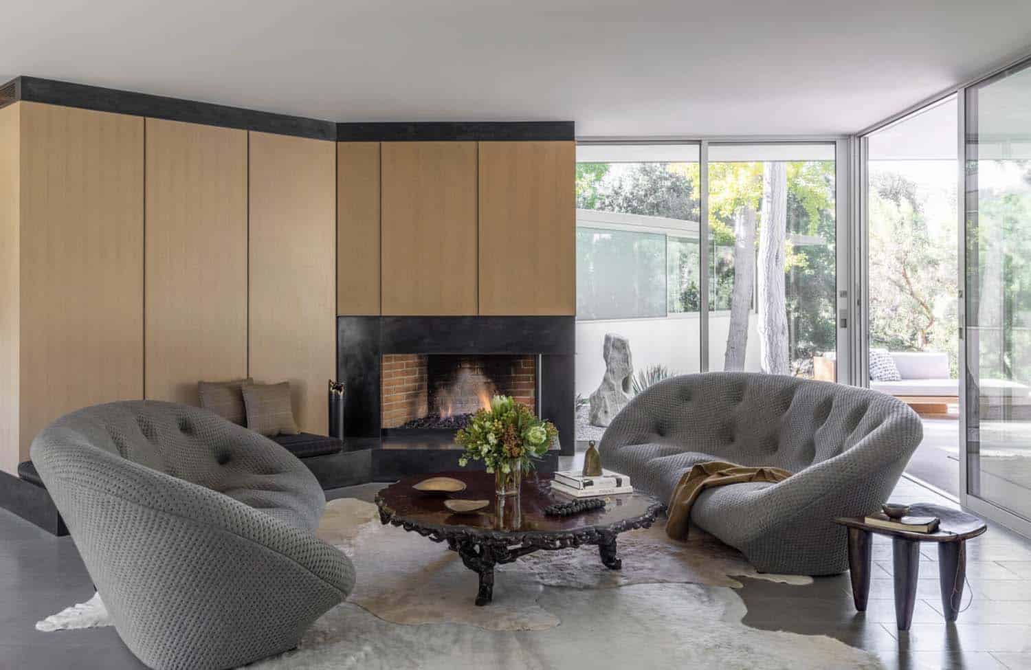
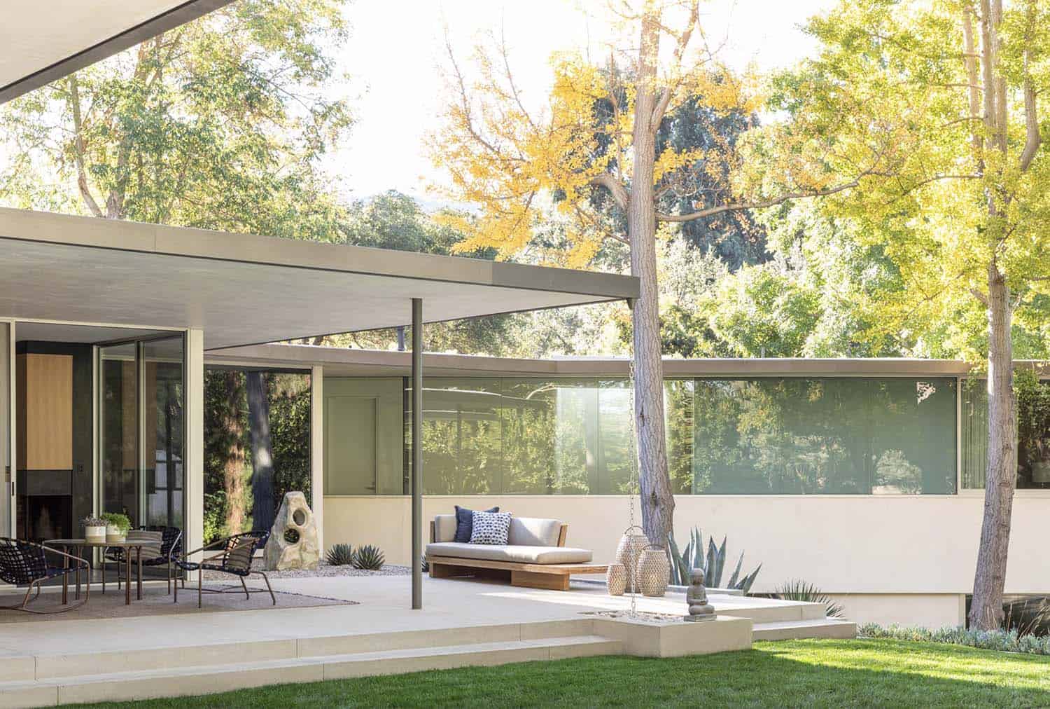
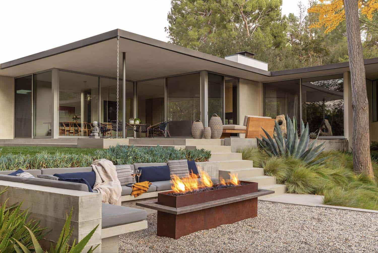
A minimalist palette of stone, hardwood flooring, and plaster mimics the qualities of the existing home while the thin roof plane keeps with the mid-century horizontal sensibility. Similarly, the thin roof plane maintains the mid-century horizontality while the broad overhangs protect the extensive full-height windows and sliding doors from the sun.
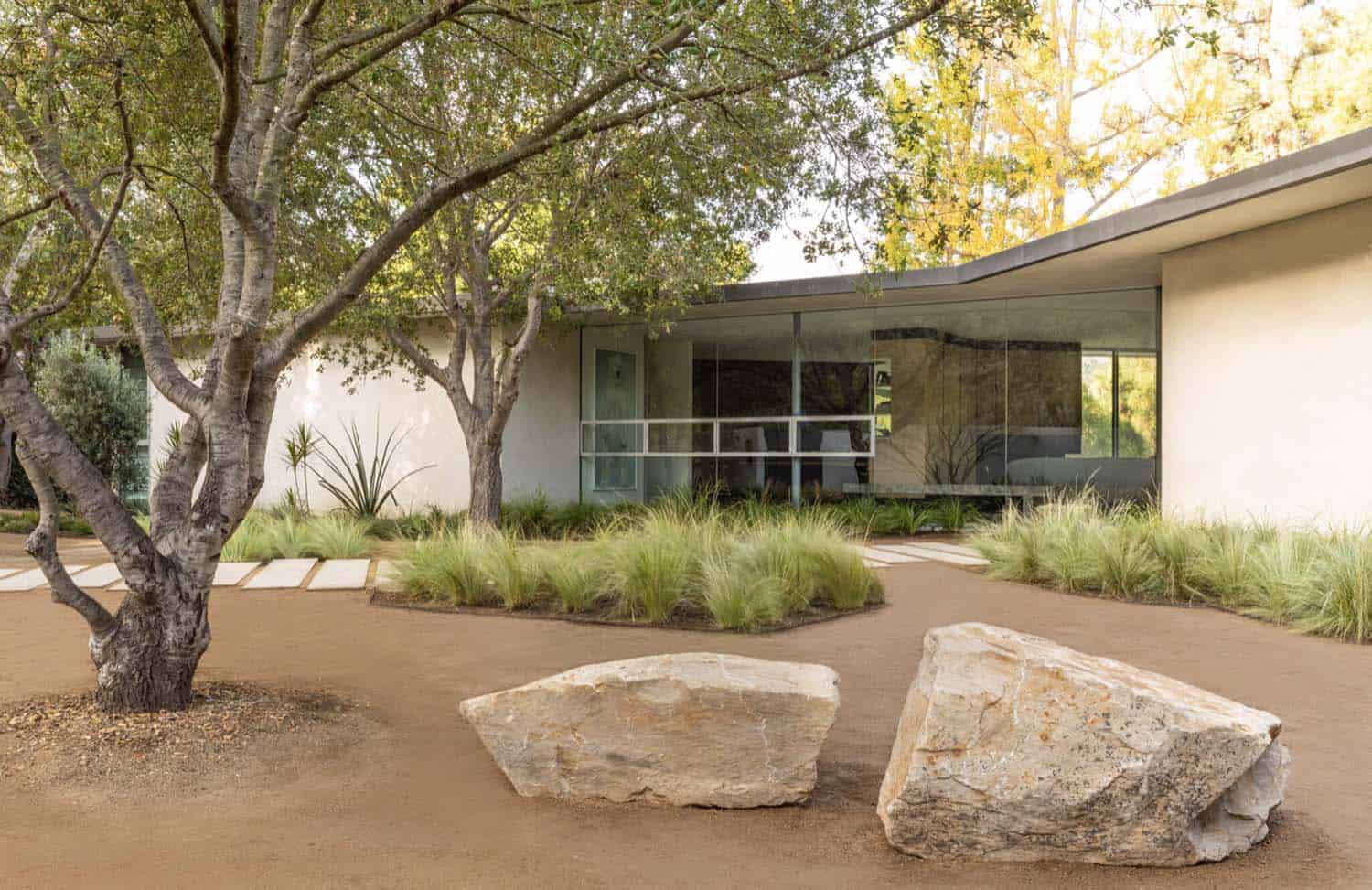
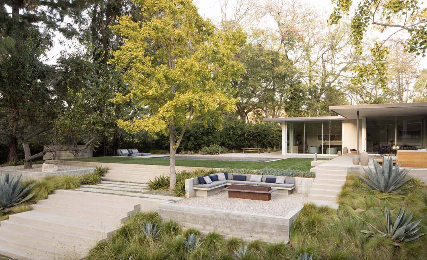
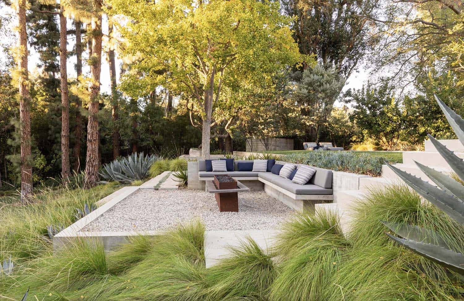
What We Love: This midcentury hillside home offers its owners a completely reimagined floor plan with a fabulous indoor-outdoor connection. The new interior layout meets the owner’s lifestyle needs with spaces reconfigured and expanded. On the outside, meticulous landscaping complements this home’s refresh with native plantings and comfortable spaces to relax and enjoy the beautiful surroundings.
Tell Us: What elements in this home renovation project do you find most inspiring? Let us know in the Comments below!
Note: Have a look at a couple of other incredible home tours that we featured here on One Kindesign in the state of California: A serene home merges with its breathtaking setting of Carmel by the Sea and Inside a stunning modern farmhouse retreat in California Wine Country.
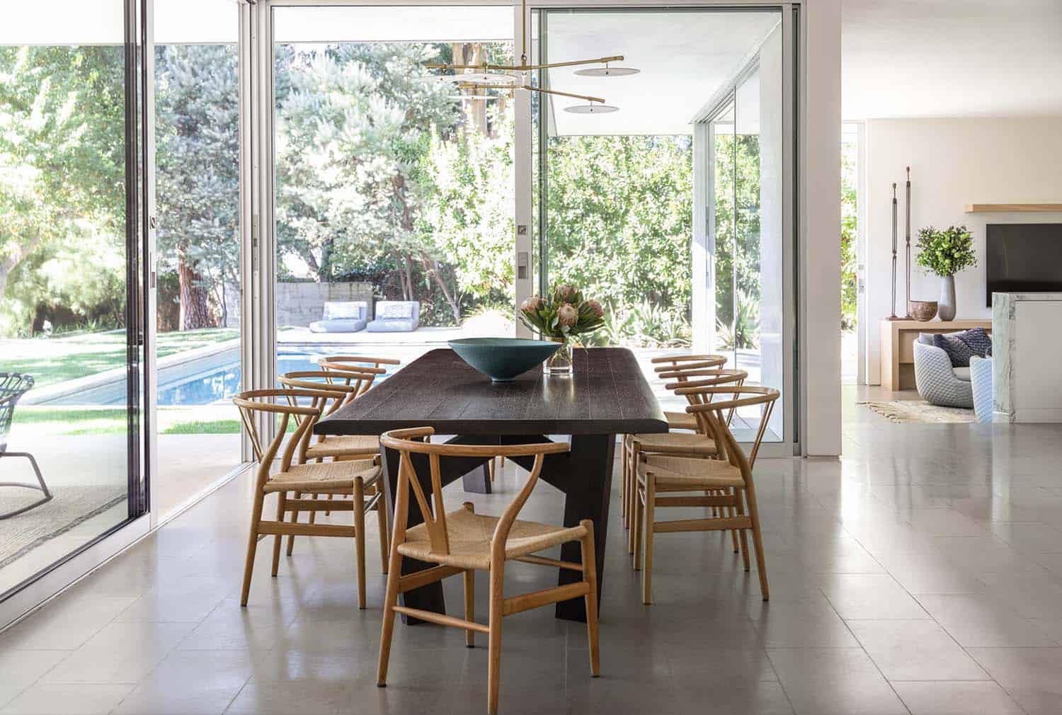
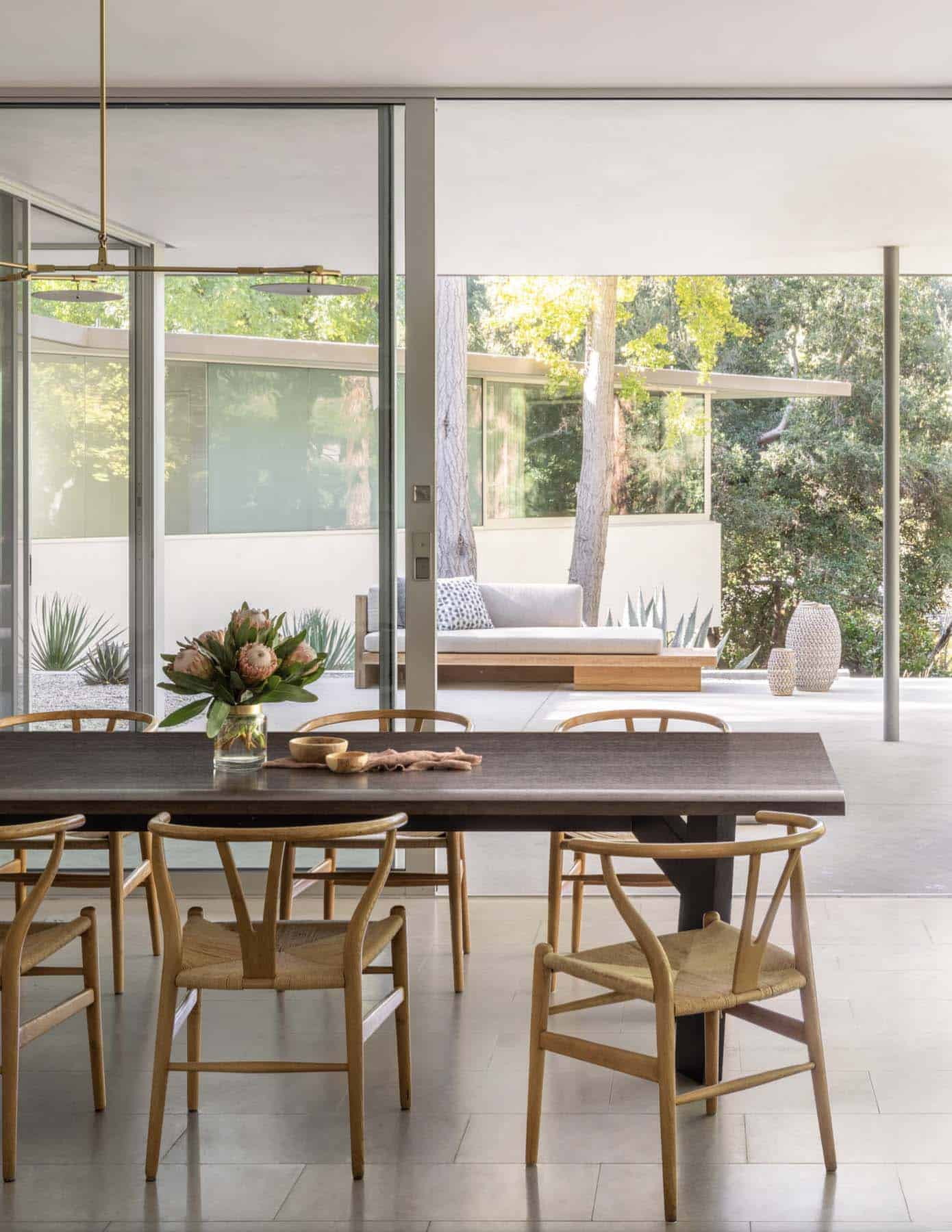
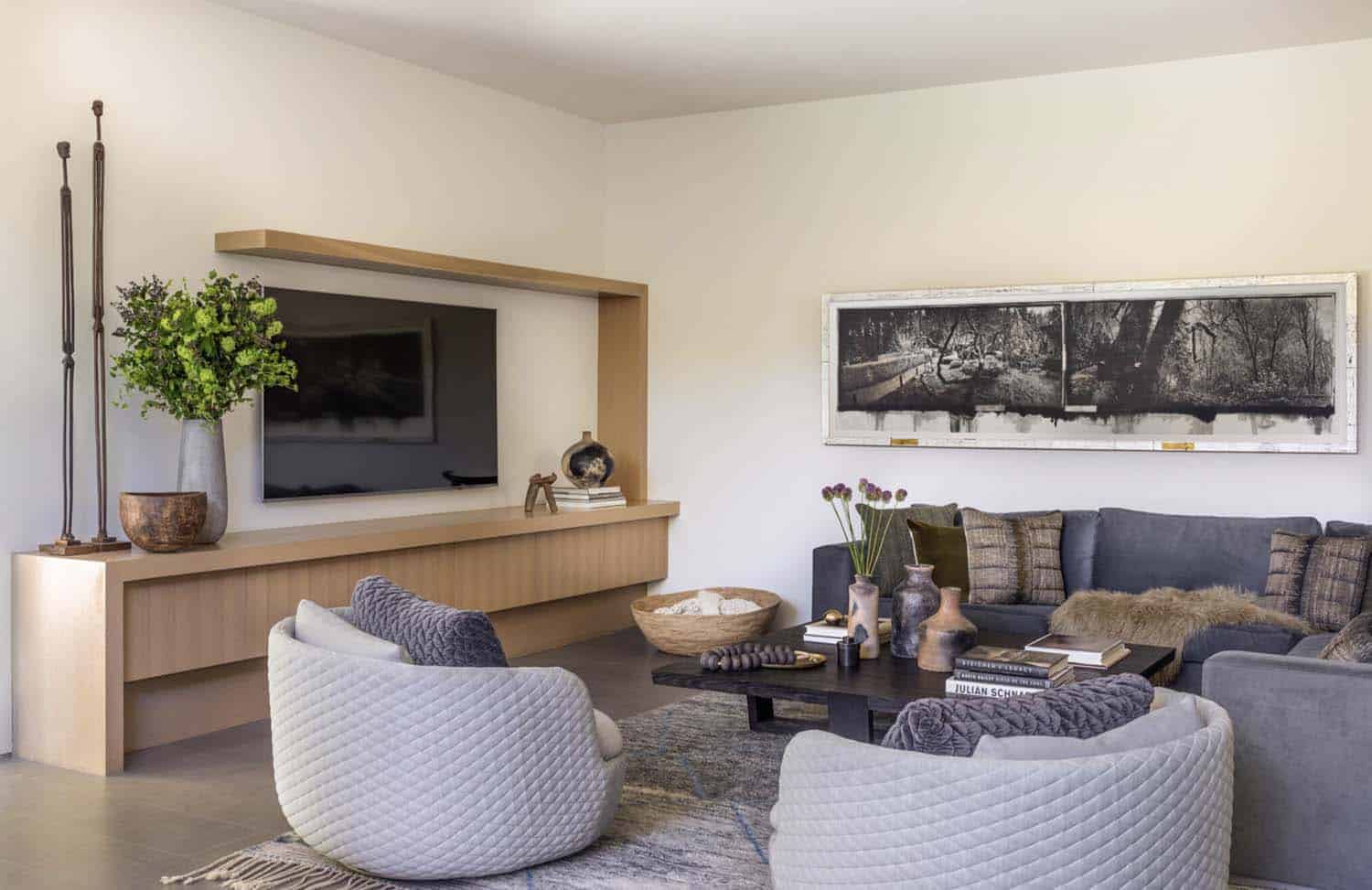
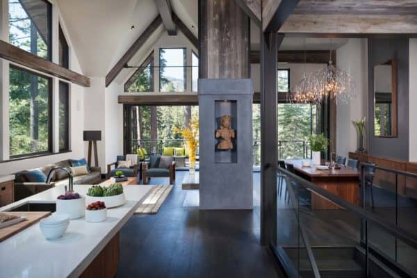
The living areas, dining, and kitchen are visually connected by zig-zag-sliding doors that open to the garden featuring a pool, that is sheltered by deep roof overhangs that mitigate sun exposure at the full-height window walls. The family room, adjacent to the kitchen, is dropped down a few steps, thereby separated yet seamlessly connected with the rest of the main floor.
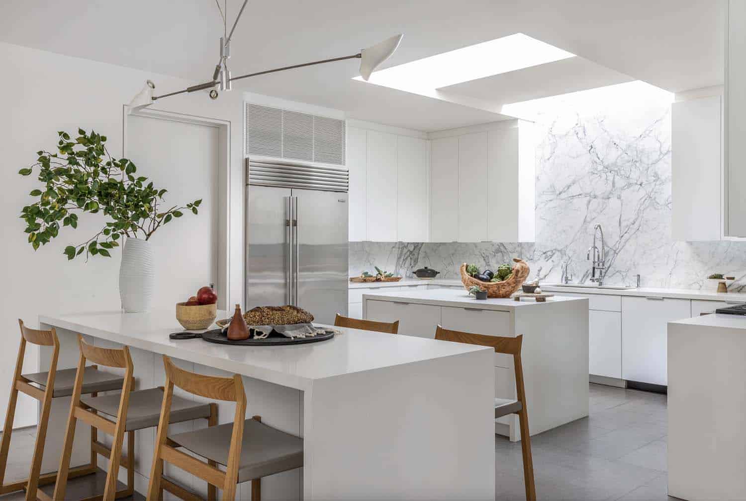
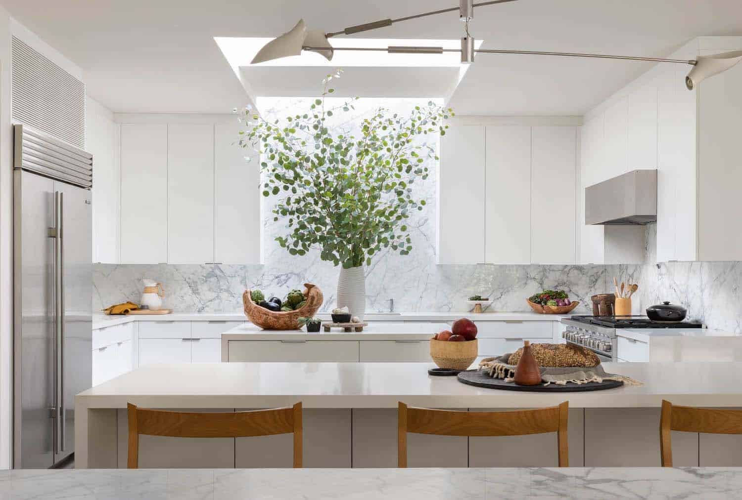
The kitchen was moved towards the heart of the home and rises slightly above the family room. This space features a pair of interconnected skylights above the center island and white marble walls.
PHOTOGRAPHER Lisa Romerein



1 comment