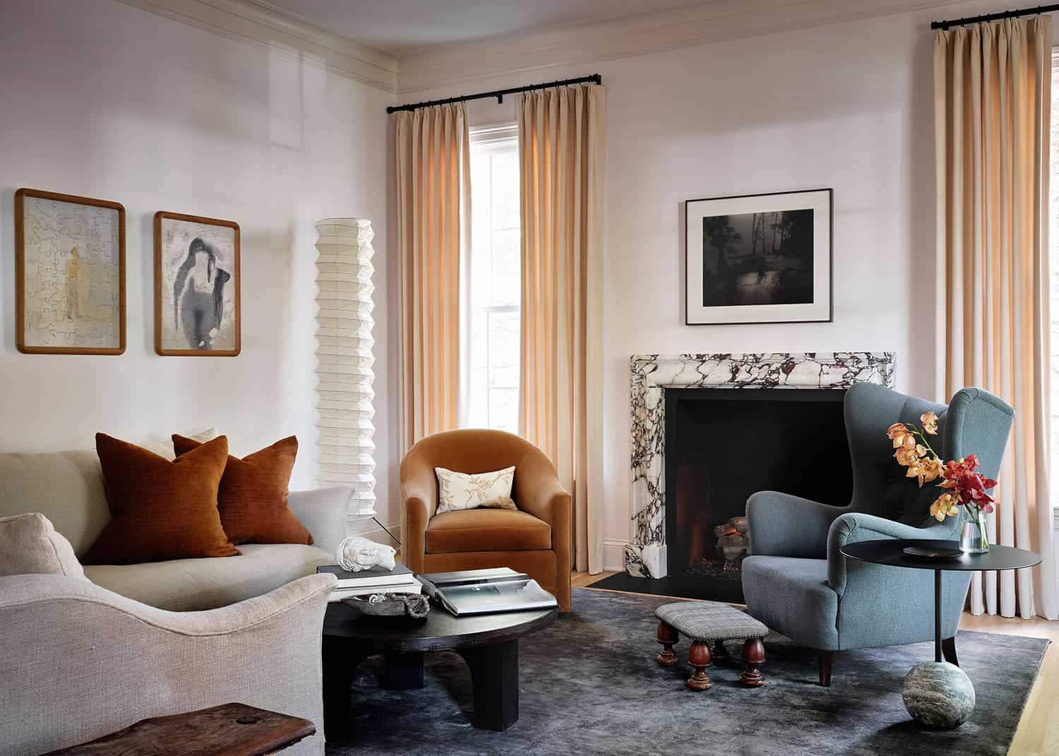
This traditional style home built in the 1930’s has undergone a beautiful renovation by Austin designer Anne Grandinetti of Mark Ashby Design. Classic architecture, pocket doors, and 80 year old moldings led the direction in the classic and elegant interior design.
This home reno took place during last year’s pandemic providing some challenges and new methods to getting the job done. What began as a kitchen renovation grew to a larger scope project that really transformed a stunning traditional home built in 1939 — located in Pemberton, a beautiful established neighborhood in old West Austin, Texas.
DESIGN DETAILS: LEAD DESIGNER Anne Grandinetti, Mark Ashby Design DESIGN ASSISTANT Lauren Gunn, Mark Ashby Design BUILDER Crowell Builders ARCHITECT Stouse Design PHOTOGRAPHER Clay Grier
“The clients reached out to us to start the project and soon after came lockdown. We met them, walked through the house one week before the Covid shut down. The rest of our meetings took place via Zoom. We spent the entire project under restrictions and still managed to pull off a beautiful remodel,” says Anne Grandinetti, Senior Designer, Mark Ashby Design.
Renovation of the 3,600 square foot traditional style home took just over a year. The same footprint was kept while the kitchen and main bathroom were completely gutted and redisgned. Architect Michael Stouse of Stouse Design joined the team to help Crowell Builders and Mark Ashby Design give a breath of fresh air to the traditional architecture.
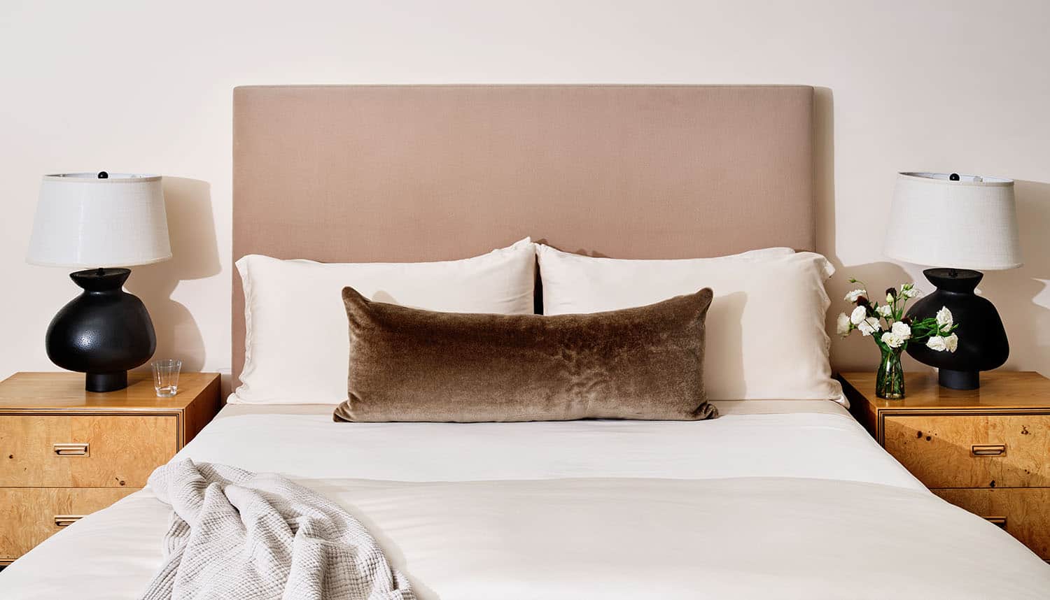
The homeowners, New York transplants, are young business professionals. They wanted a relaxed, refined aesthetic. A neutral color palette evolved with a keen mix of materials to achieve a warm, thoughtful home.
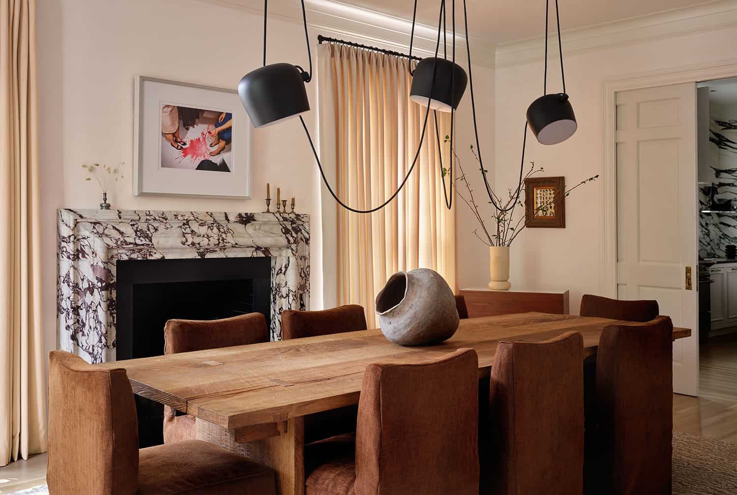
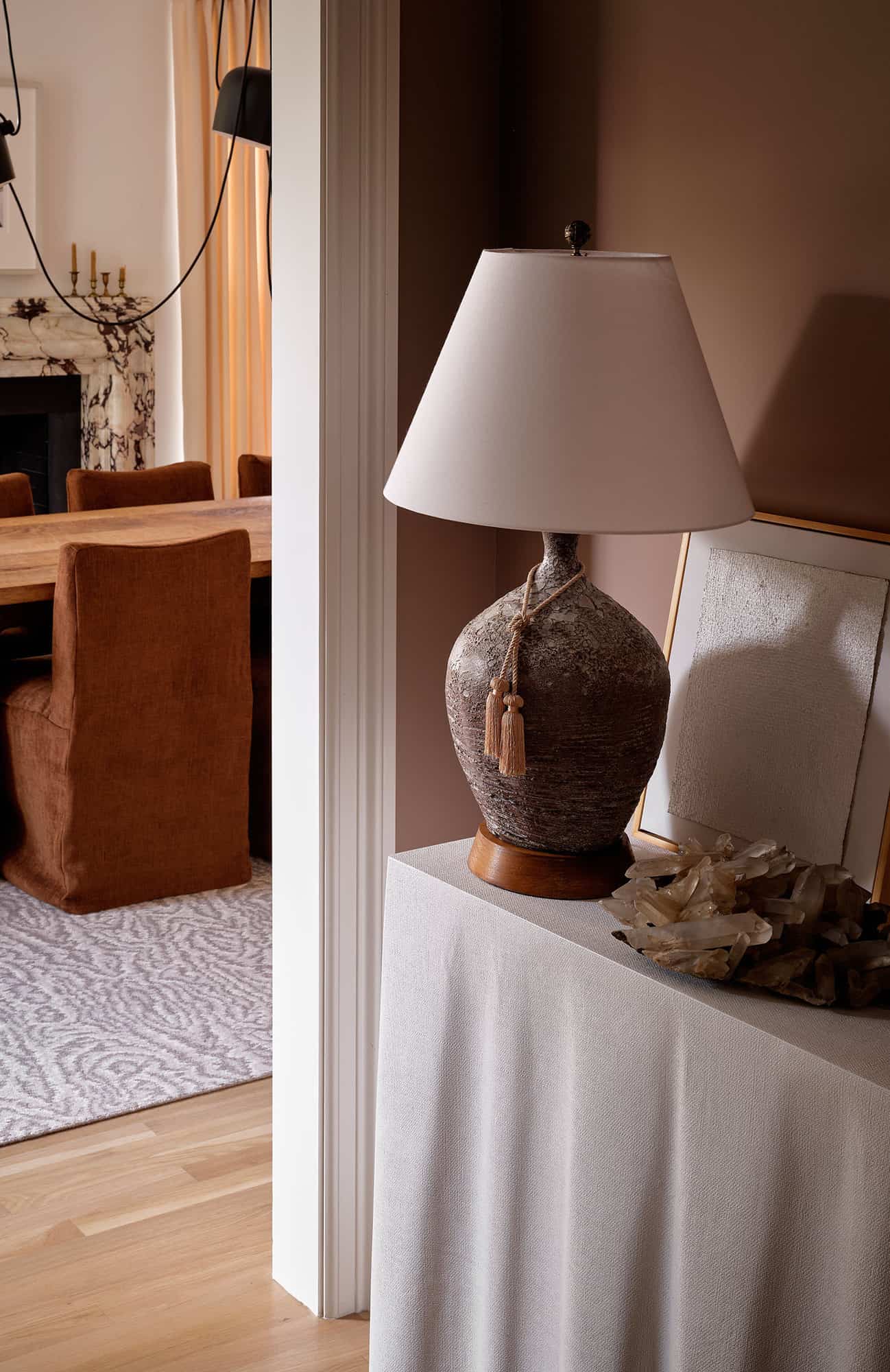
A small entry space was created, as the original plan dropped you into what is now the dining room, without a “greeting” moment. The Breccia Viola marble for the dining room fireplace was selected for its deep violet veining, which set the tone for our color palette. The Viola, paired with the terracotta dining chair slipcovers, makes a beautiful color combination.
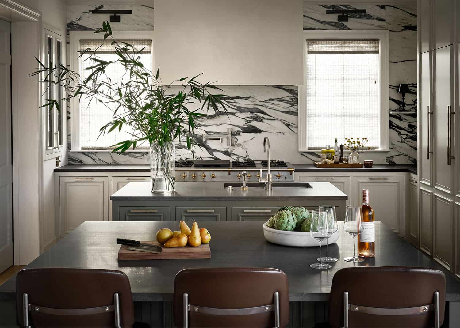
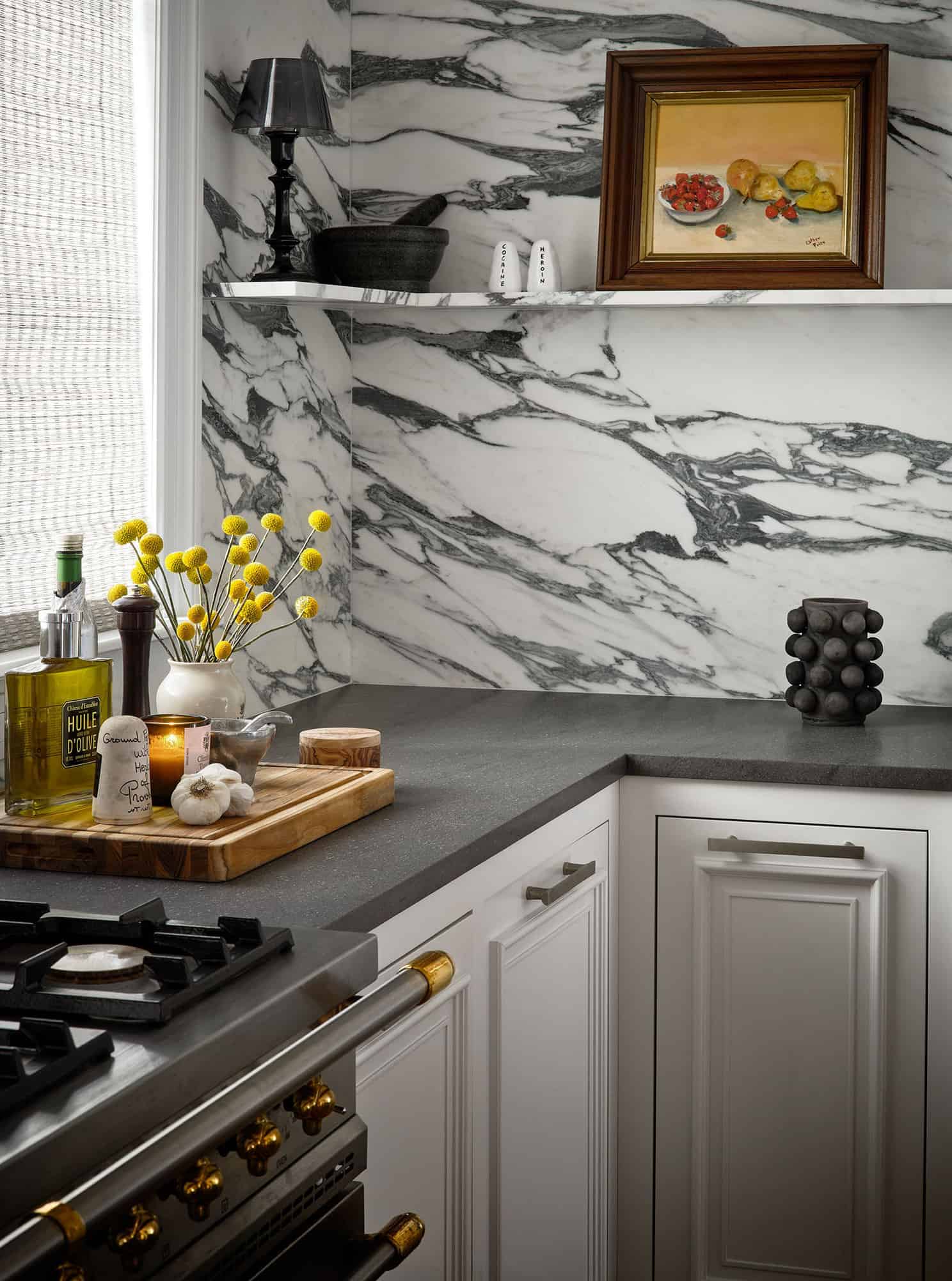
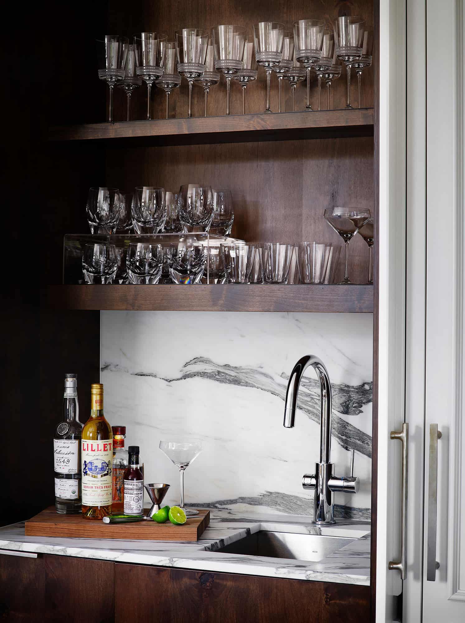
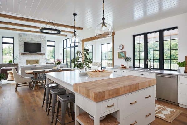
The kitchen was relocated to the opposing side of the room to accommodate space for more cooking and entertaining, double kitchen islands were incorporated into the layout. The stainless Lacanche range from France is a stunning anchor for the space. “We opted to keep the plaster vent hood simple, as to showcase the bold veining in the Arabescato Marble backsplash,” notes Anne.
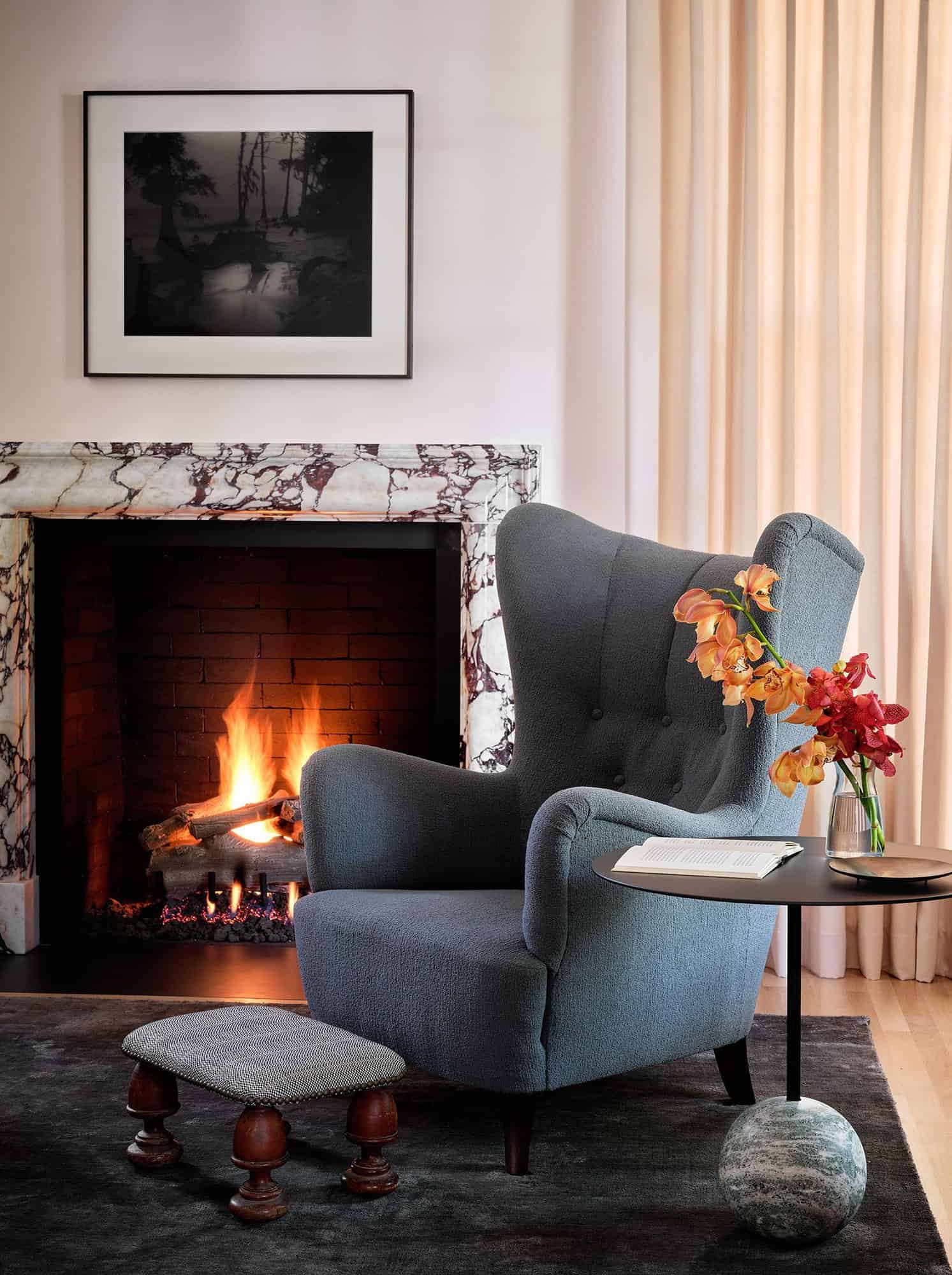
“We approached the design concept with a relaxed refinement. The original design concept was a touch of ‘London Townhouse.’ The homeowners prefer a natural color palette – so the hues are soft — no large patterns and bold colors. We let the stone work in the fireplaces and kitchen act as our statement pieces. There were very few rules. We let the design organically evolve. The clients understood the importance of high quality finishes and the beauty of mixed materials. This provided a strong foundation for us to build upon,” says Anne.
What We Love: This traditional style home renovation project showcases a warm and beautiful design that can be enjoyed for years to come. We are loving the relaxed atmosphere with elegant touches and the soothing color palette. Designer furnishings and luxe materials and finishes helps to create stylish living living spaces for daily living and entertaining.
Tell Us: What details do you find most appealing in the renovation of this home and what would you have done differently? Let us know in the Comments below!
Note: Be sure to check out a couple of other fabulous home tours that we have featured here on One Kindesign from the portfolio of the designer’s of this project, Mark Ashby Design: Fresh twist on the classic ranch style home in Texas Hill Country and Beautiful hideaway tucked into a secluded cove in Westlake, Texas.
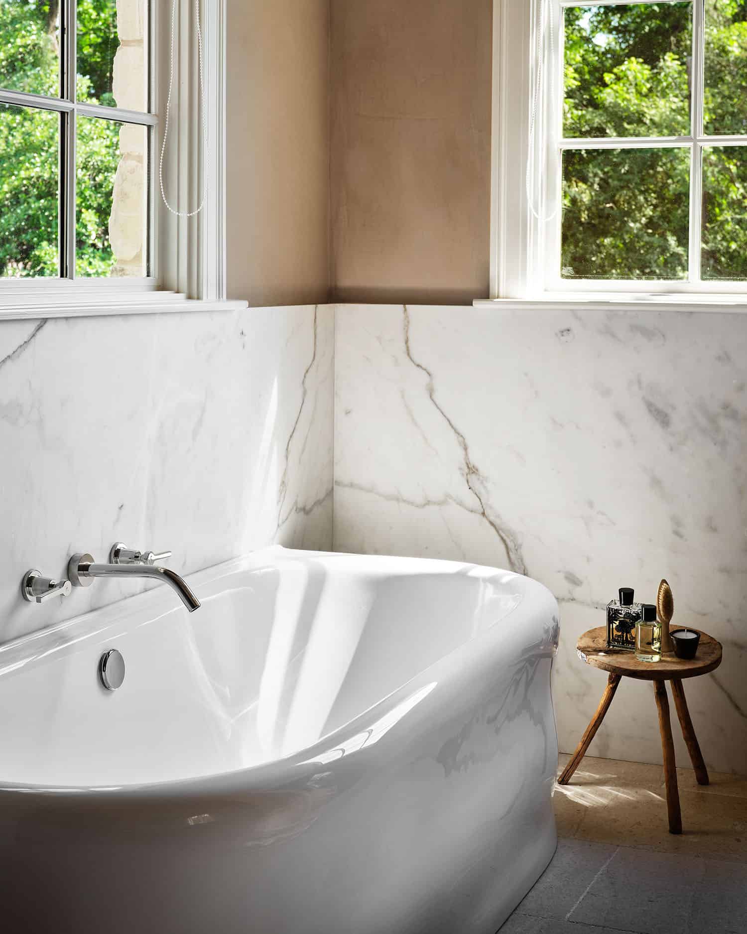
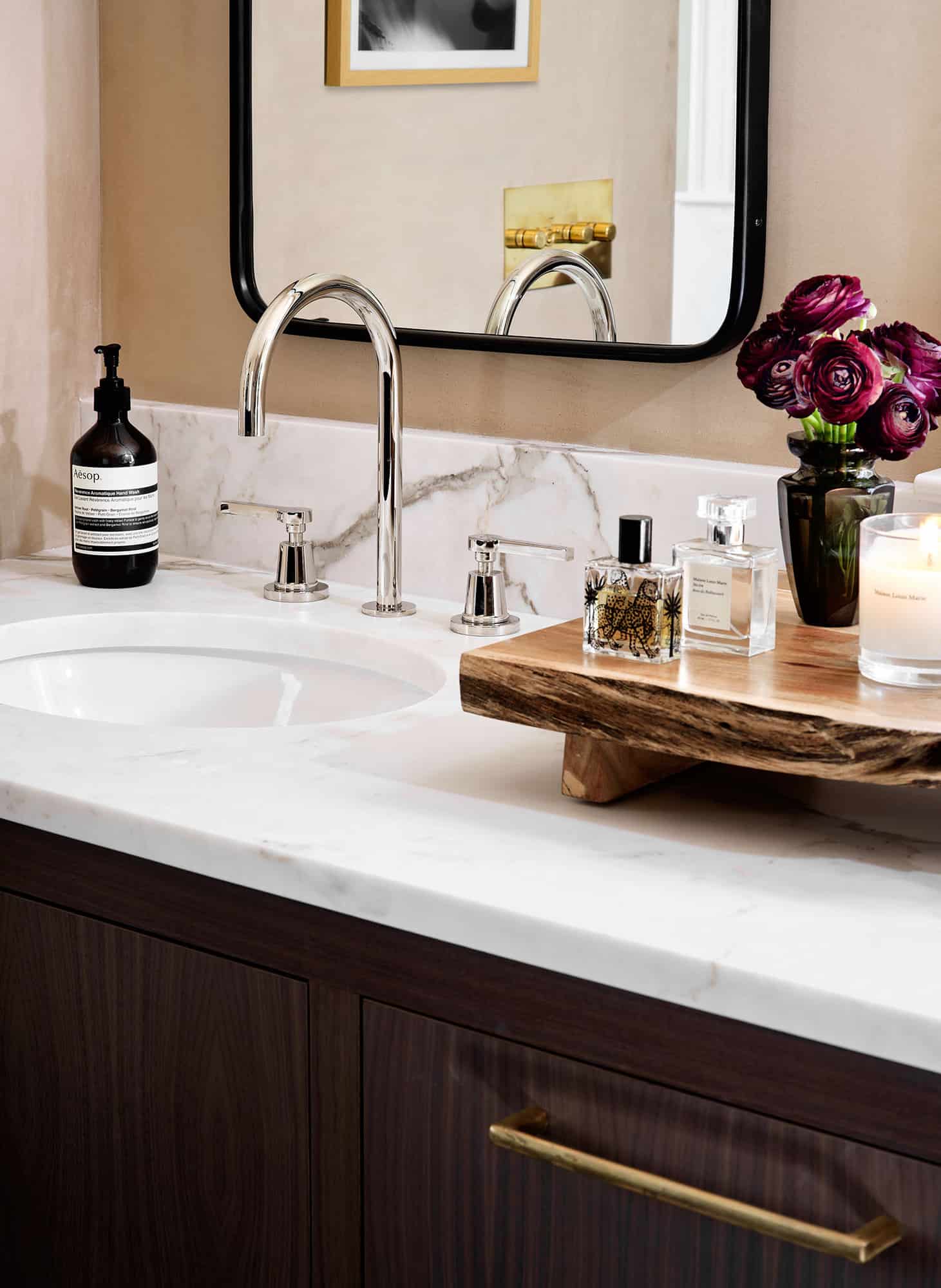
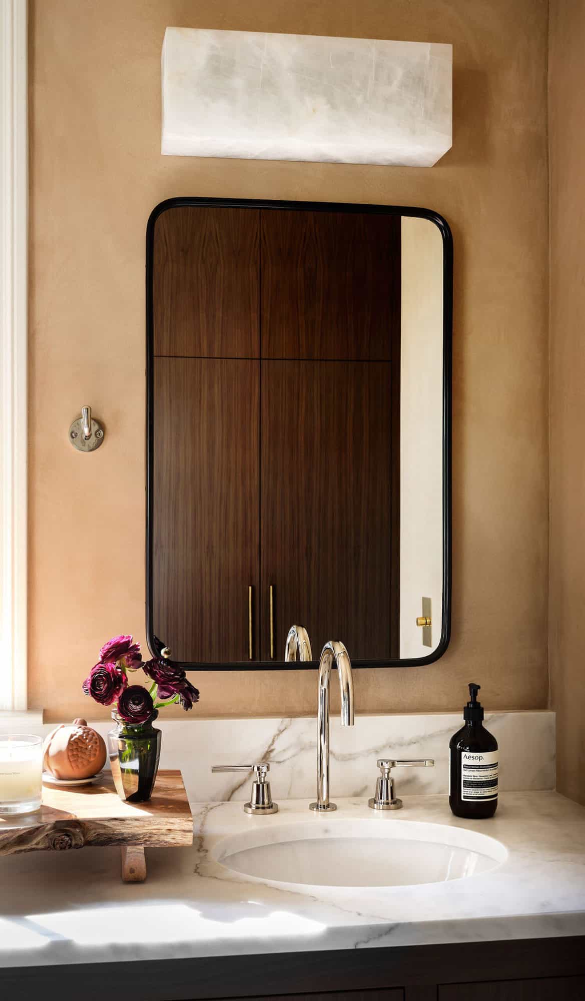
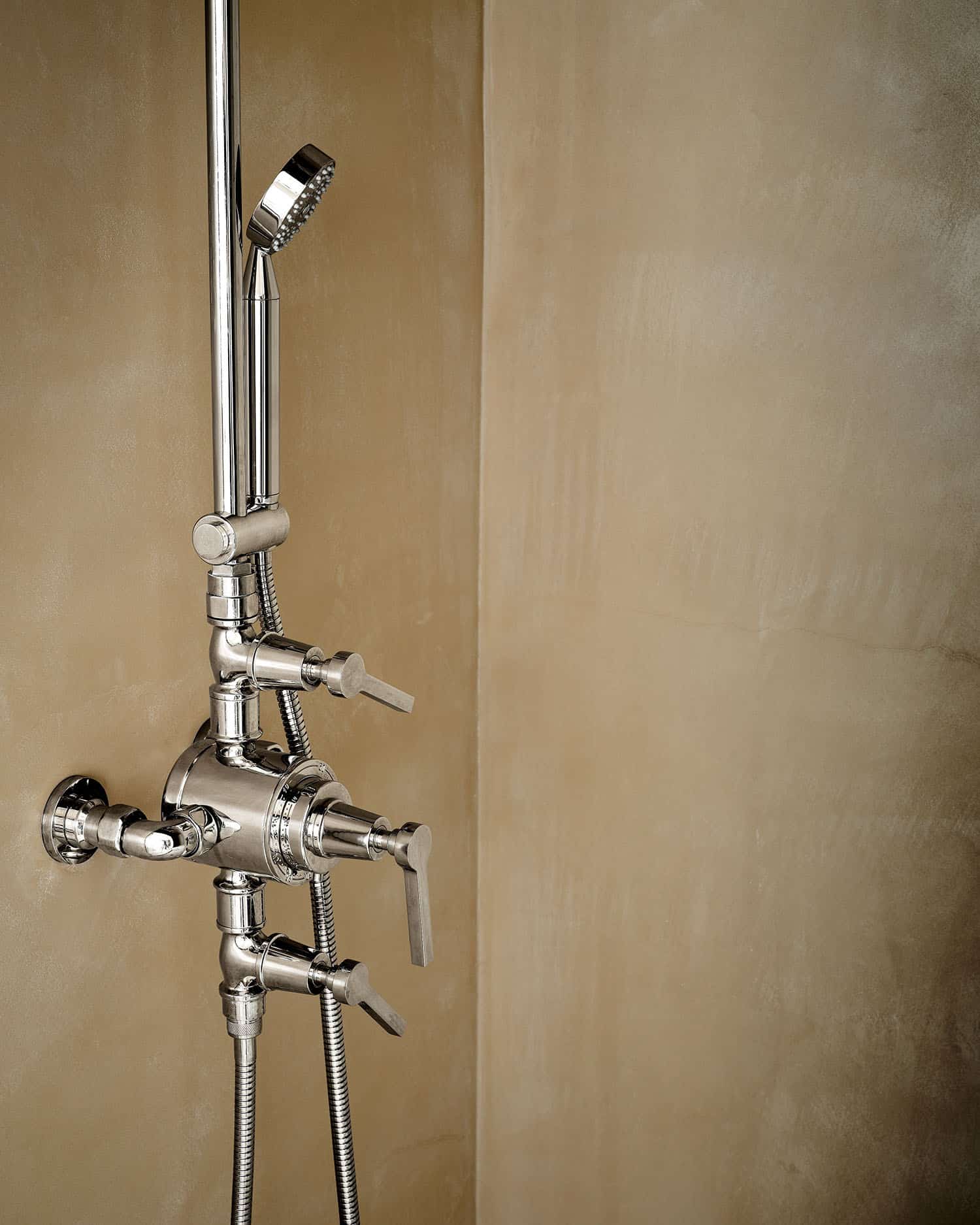
The main bath was redone and finished with plaster walls and ceilings, including the shower.
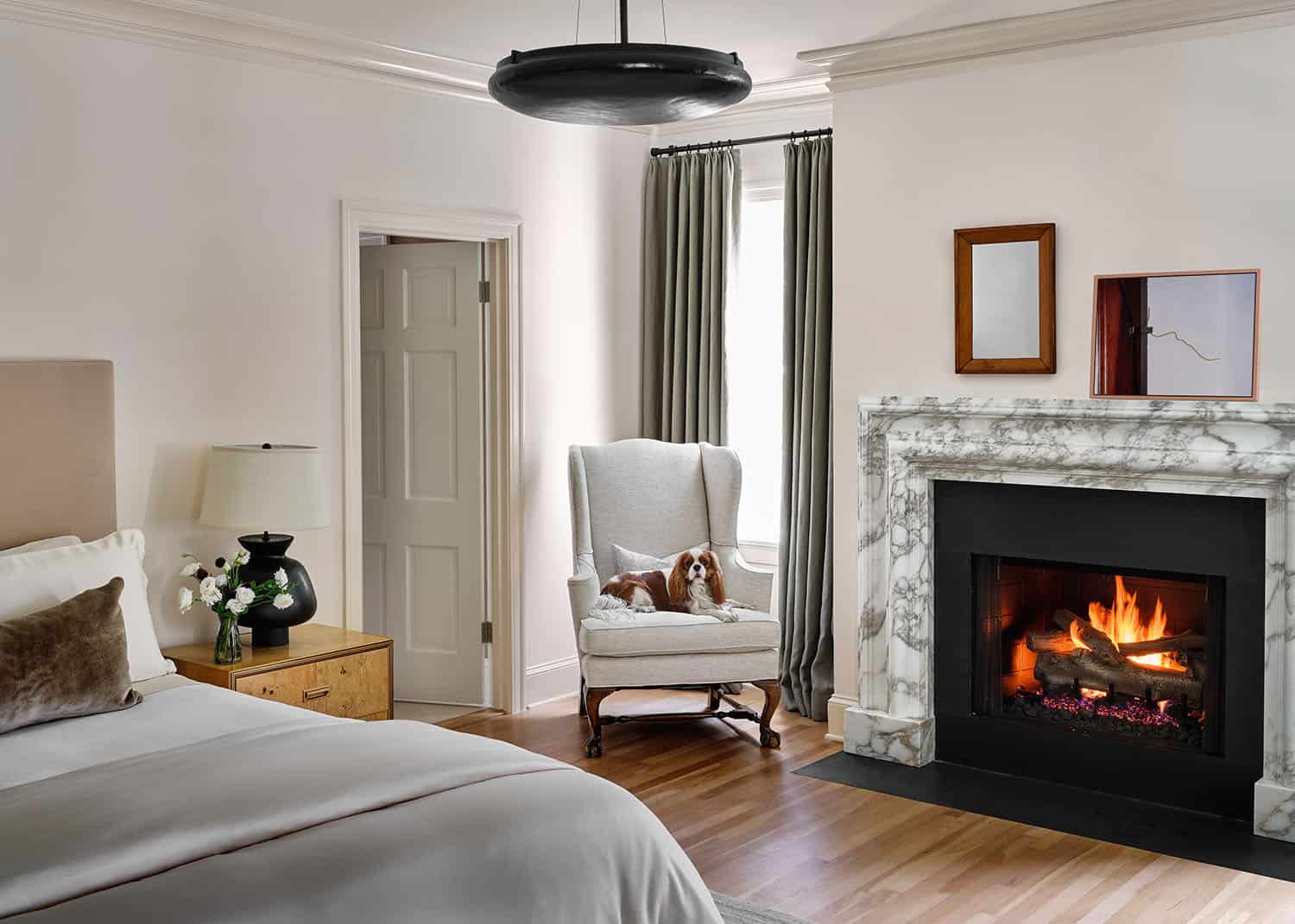
There is a nice reference to several design periods as details inherited from the home were left in place to pay homage to its former life such as the original moldings, pocket doors, ornate door knobs, and the original oak hardwood floors were refinished.
The fireplace surrounds were sourced from Ryan and Smith in the UK.
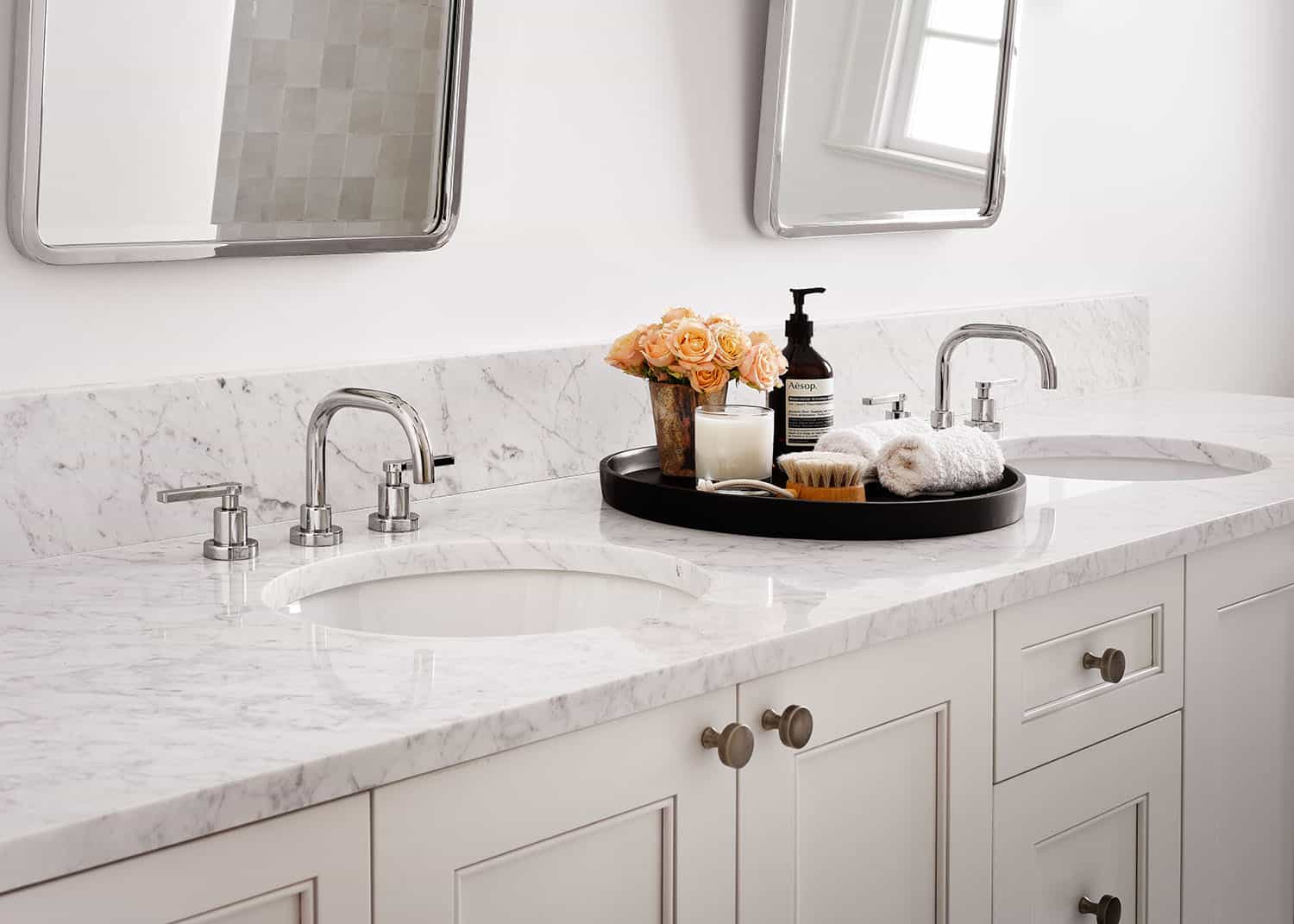
The walls and ceiling were covered in plaster in Farrow and Ball’s Smoked Trout, to compliment the veining in the marble back splash and counter tops in the baths. The design team extended the plaster into the shower and used solid walnut vanities in all the baths.
RESOURCES
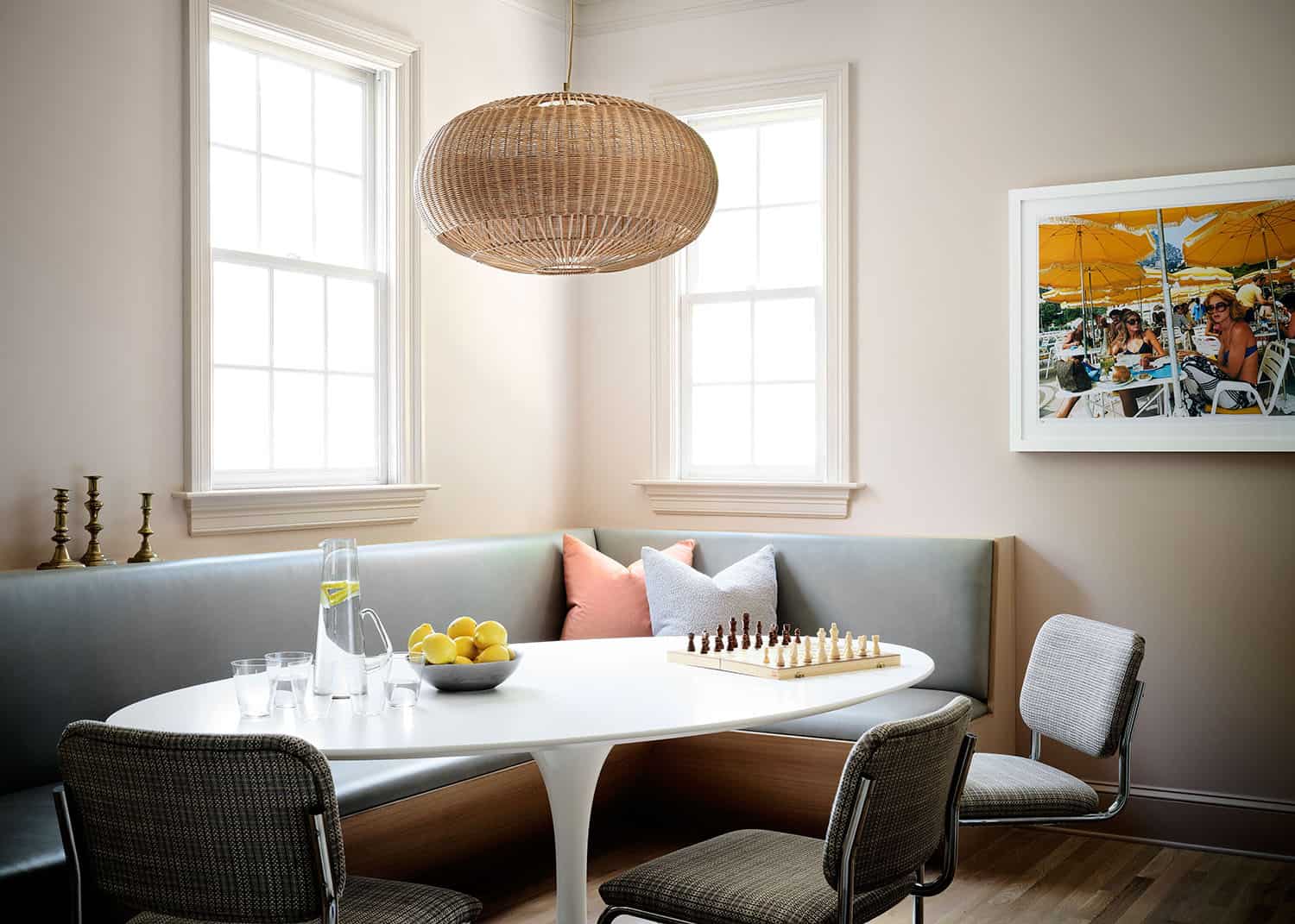
LIGHTING Flos Lighting (Dining Room). Forbes and Lomax switch plates, 1st Dibs. Kitchen Sconces – Circa Lighting – Breakfast light – SOHO Home
FURNISHINGS Custom furniture (In house work room). Vintage, Verellen dining chairs, 1st Dibs, Noir Furniture, Knoll (breakfast room). Custom Banguette vintage pieces sourced from 1st dibs, Chairish, local vintage shops.
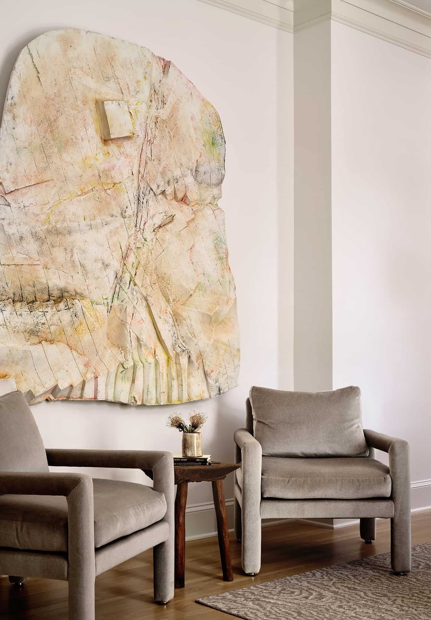
ART Dining room art: Justin Matherly for the Skulpture Project Munster for Galerie Eva Presenhuber. BDDW (living room art).
BATH AMENITIES & FIXTURES Signature Hardware from JL Hardware, Kelly Wearstler sconces from Circa Lighting
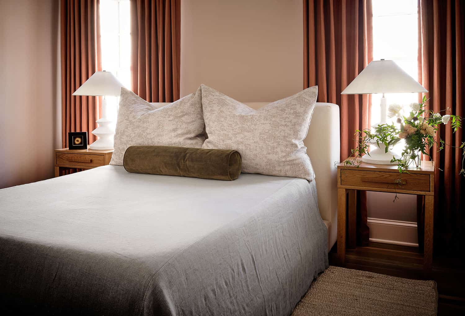
PAINT COLOR Farrow & Ball Smoked Trout, Benjamin Moore Nimbus, Benjamin Moore, OC Calm.
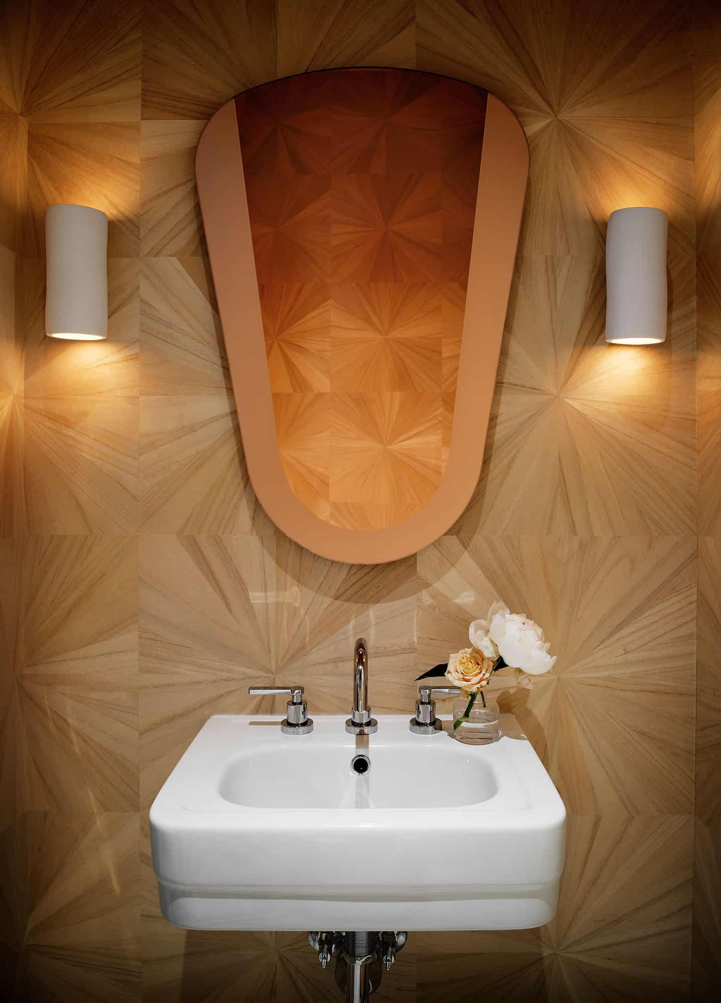
WALLPAPER Maya Romanoff




1 comment