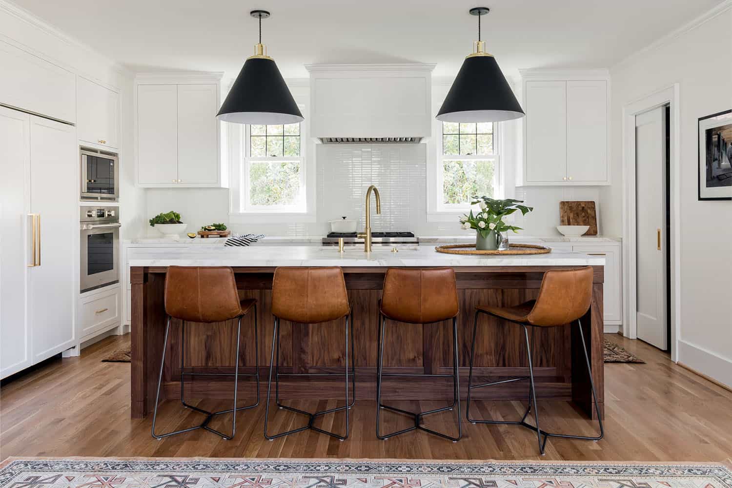
Built in 1925, this Colonial style home has undergone a renovation and addition by Paul Crowther Design along with Ainslie-Davis Construction. When the homeowners first purchased this house in Montlake, a residential neighborhood of Seattle, Washington, it was compartmentalized, outdated, and nonfunctional for their growing family. Interiors studio Casework was brought in to lead the creative direction for this project, as they had already worked with this owner on their previous home.
Project Team: Architect: Paul Crowther Design | Contractor: Ainslie-Davis Construction | Interior Design and Styling: Casework
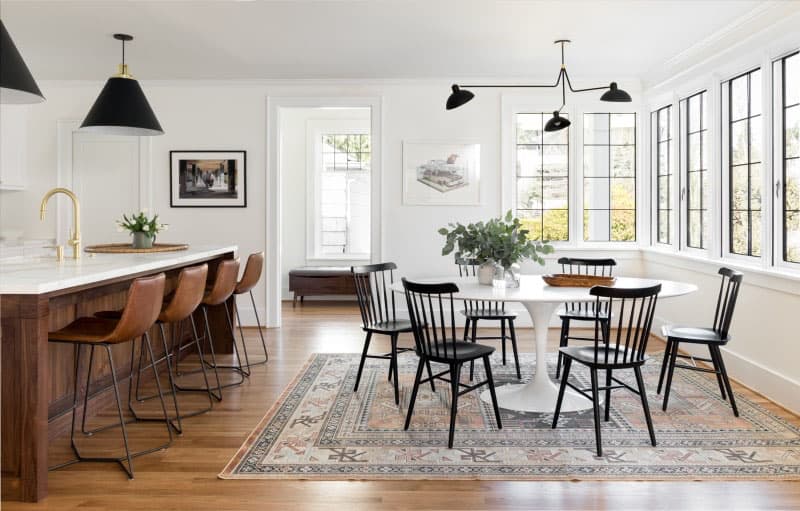
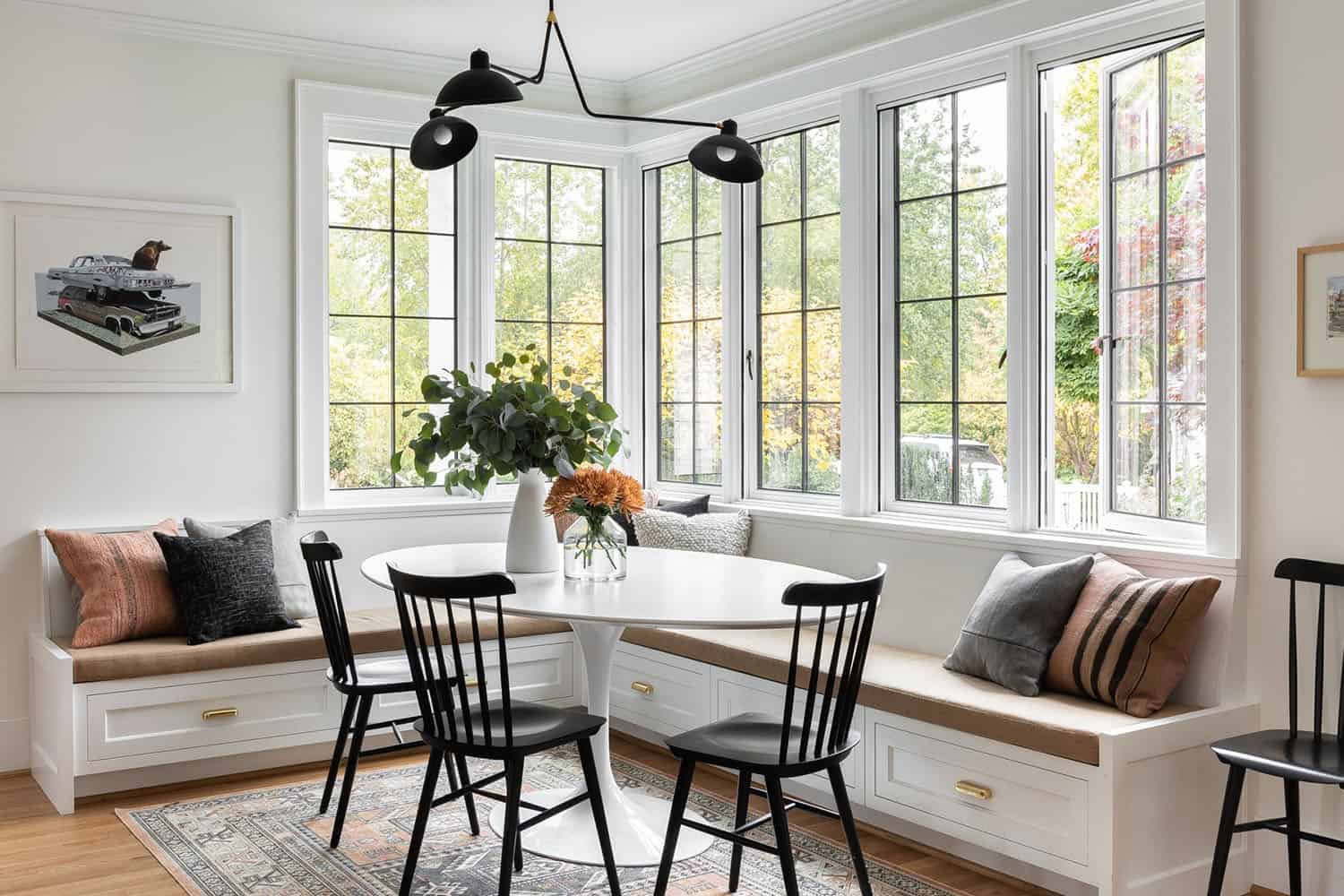
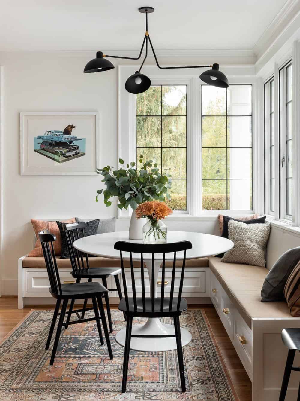
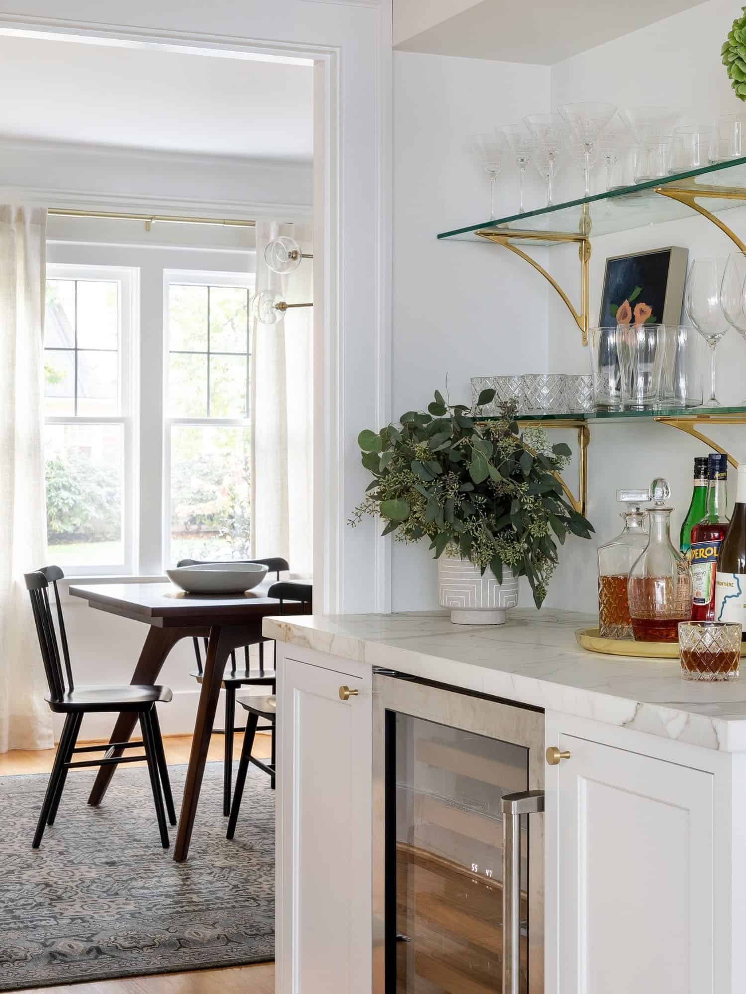
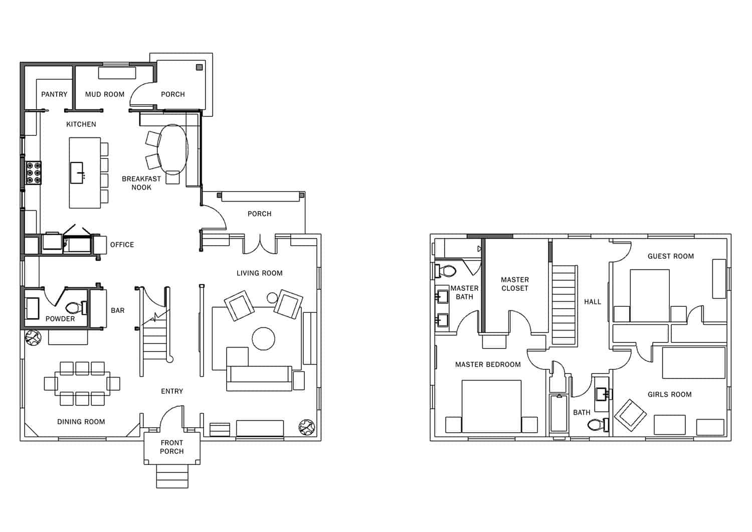
To expand the footprint of this home on the lower level (an additional 500 square feet was added to the footprint), the existing kitchen and powder bath were demoed. This helped to create an open and airy kitchen and breakfast nook, along with a pantry, mudroom and half bath.
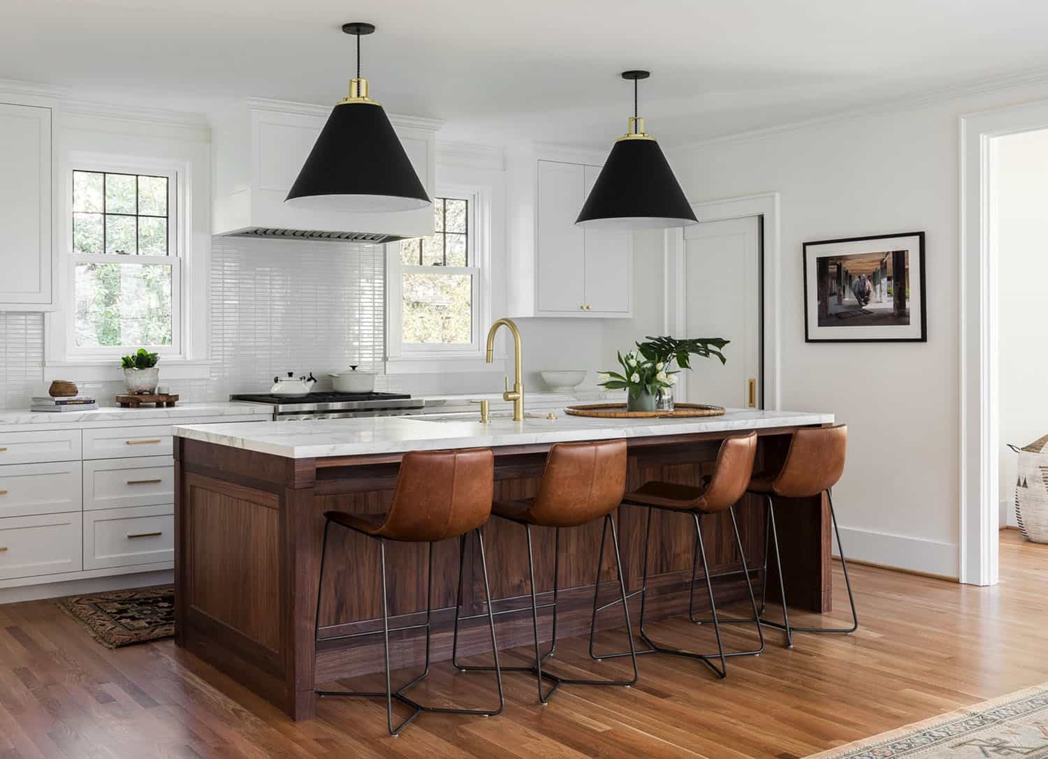
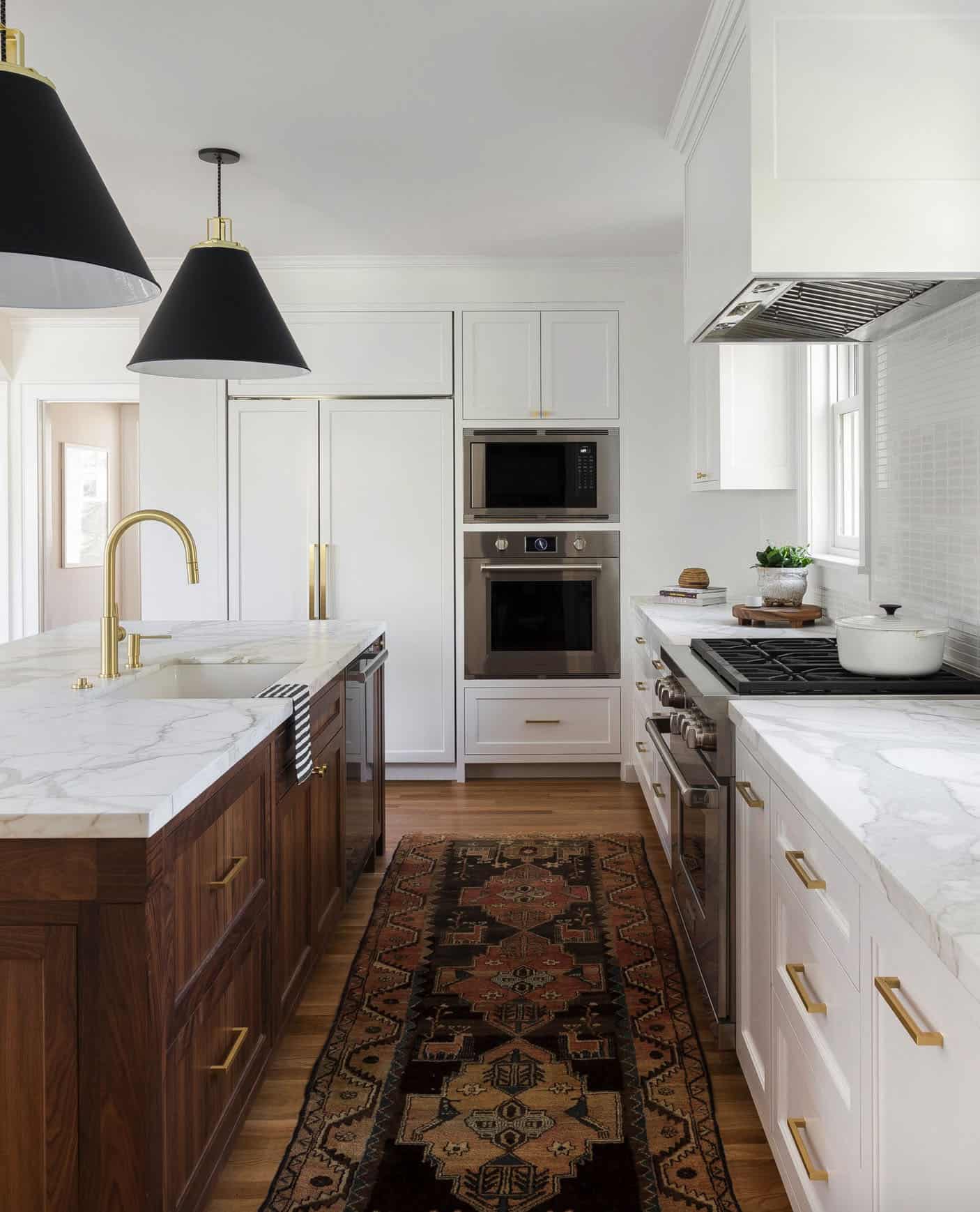
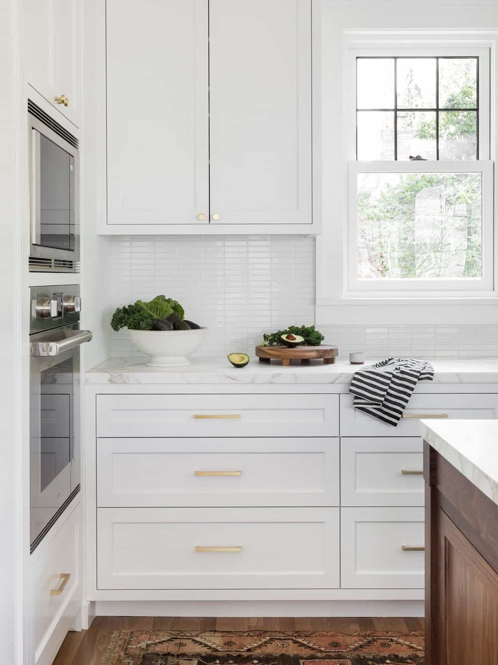
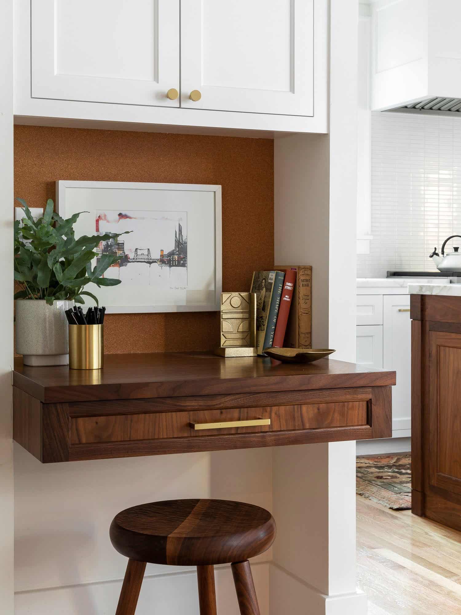
Above: The island is composed of walnut, topped with Calcutta Carrera Marble. White cabinetry is paired with brass accents — all perfectly complimenting the original oak flooring. The bar stools are from West Elm. Above the island are pendant lights sourced from Rejuvenation.
Above: The sink faucet is the Corsano Pull-Down Faucet from California faucets.
n
What We Love: This Colonial style home features a complete overhaul to the interiors with an expansion of the floor plan. Now the interiors reflect an open and airy feel with an eclectic design that is warm and inviting. The material selection, including the integration of walnut accents, helps to warm up the palette. Overall, this family home has a timeless feel that will be enjoyed for many years to come.
Tell Us: What do you think of the design style of this home? Do you think the project team was successful in renovating the interiors to create a relaxed vibe? Please share your thoughts in the Comments!
Note: Have a look at a couple of other Colonial style home tours that we have featured here on One Kindesign: Sumptuous Colonial home with traditional details in New Cannan and Home Tour: Beautiful Colonial Style Home In La Cañada, California.
For the interiors, the designer worked to create a cohesive palette that’s both warm, neutral and full of texture. Beginning with a base palette — wood finish, metal finish, stone, tile and expand from there. Textures were layered in, selecting rugs in each room that are in harmony with each other.
Design Process: The designer has a page for all the rugs, this way she can see how they all look together. This builds the palette, then fabrics and upholstery are then layered in on top. Playing with scale is important when working with a neutral palette. Mixing types of textures so nothing feels too much the same too.
To blend old with new, the interiors reflect balance, a common theme, contrast and practicality. Family and complementing the symmetry of traditional details were common themes throughout this home. The designer wished to balance and blend the sophisticated aesthetic of colonial style with relaxed Northwest vibes. She achieved this by layering in neutral textures, incorporating the owner’s modern art collection and remembering that kids live in this home too, so nothing is too precious.
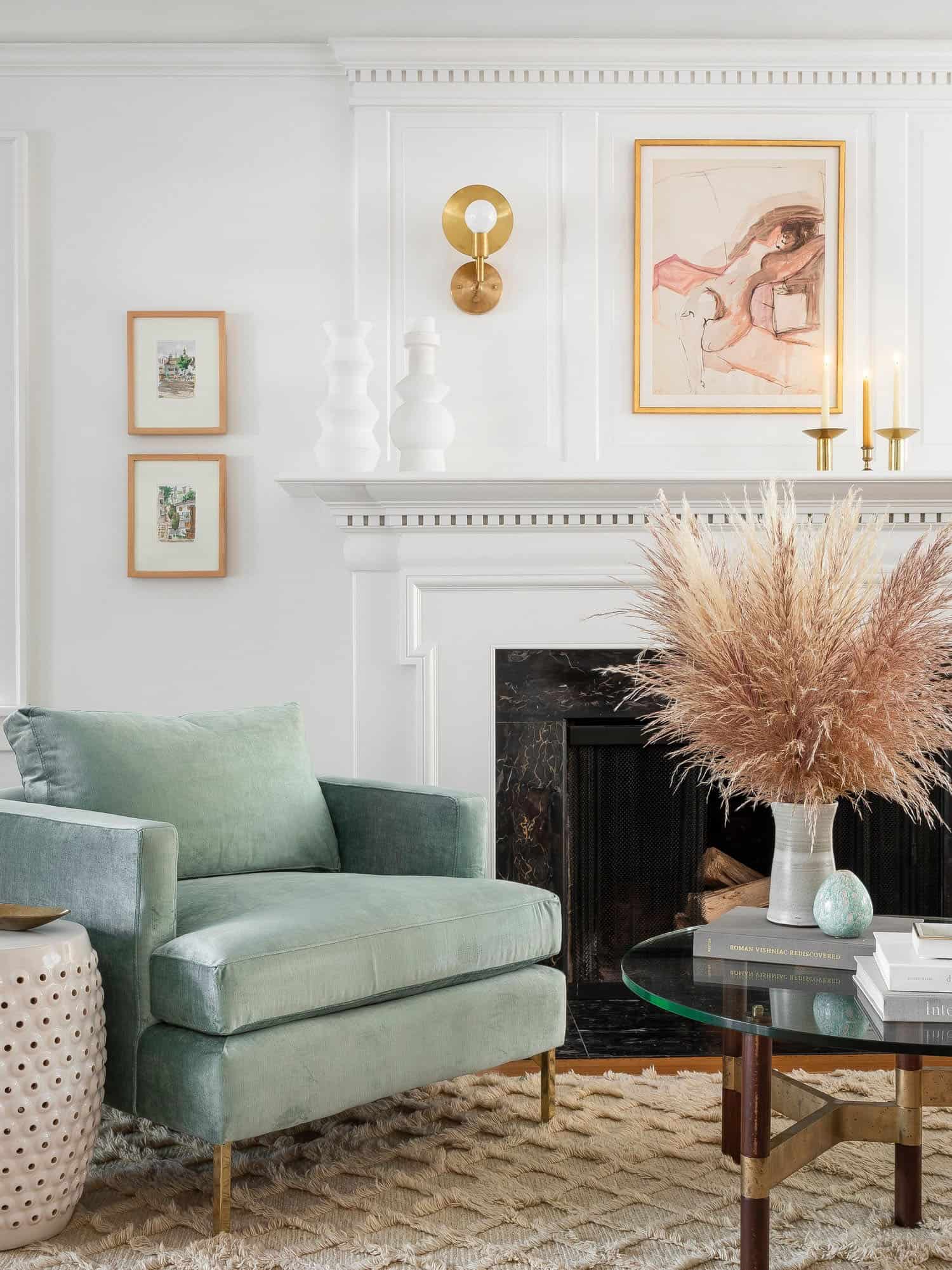
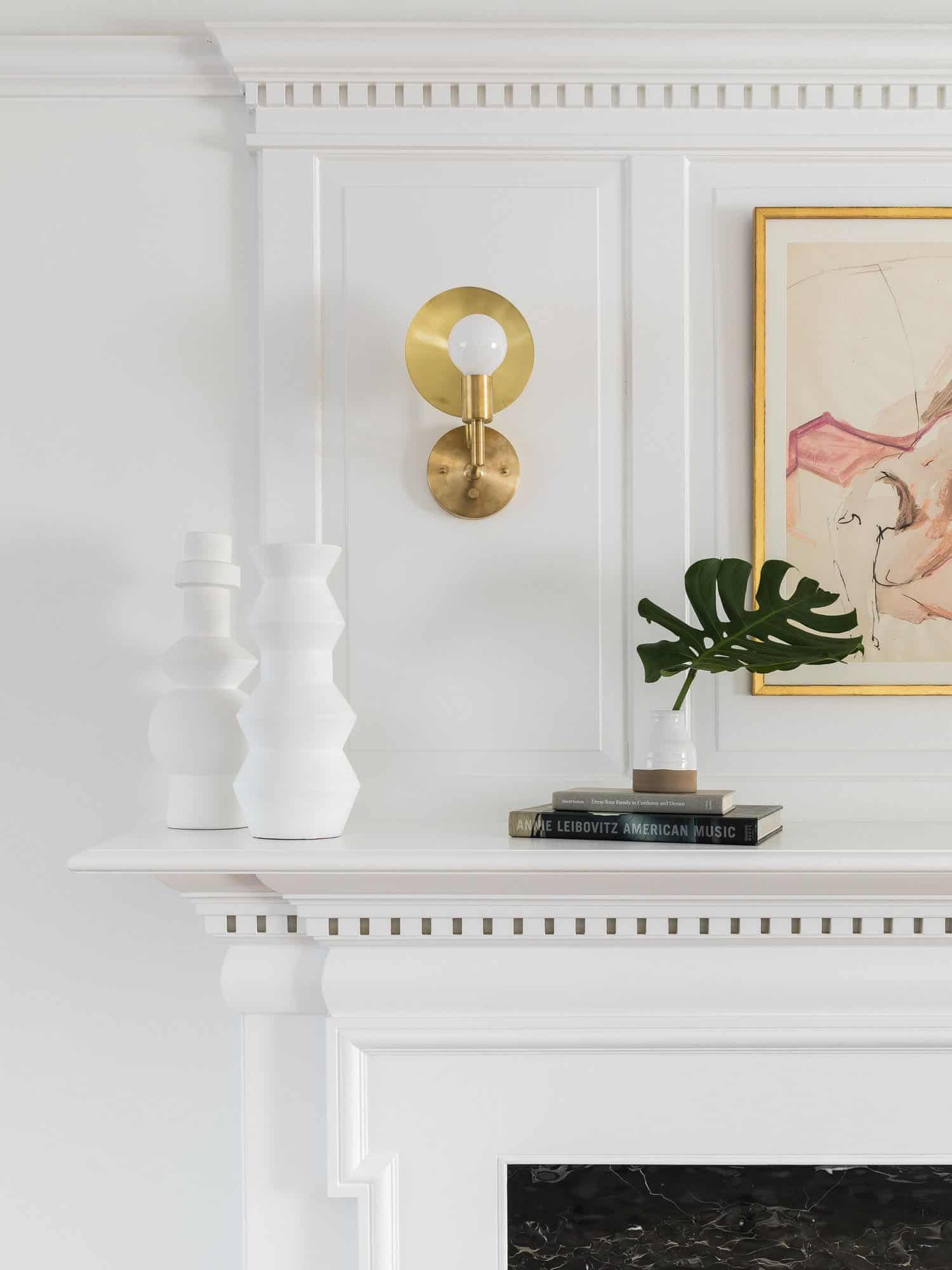
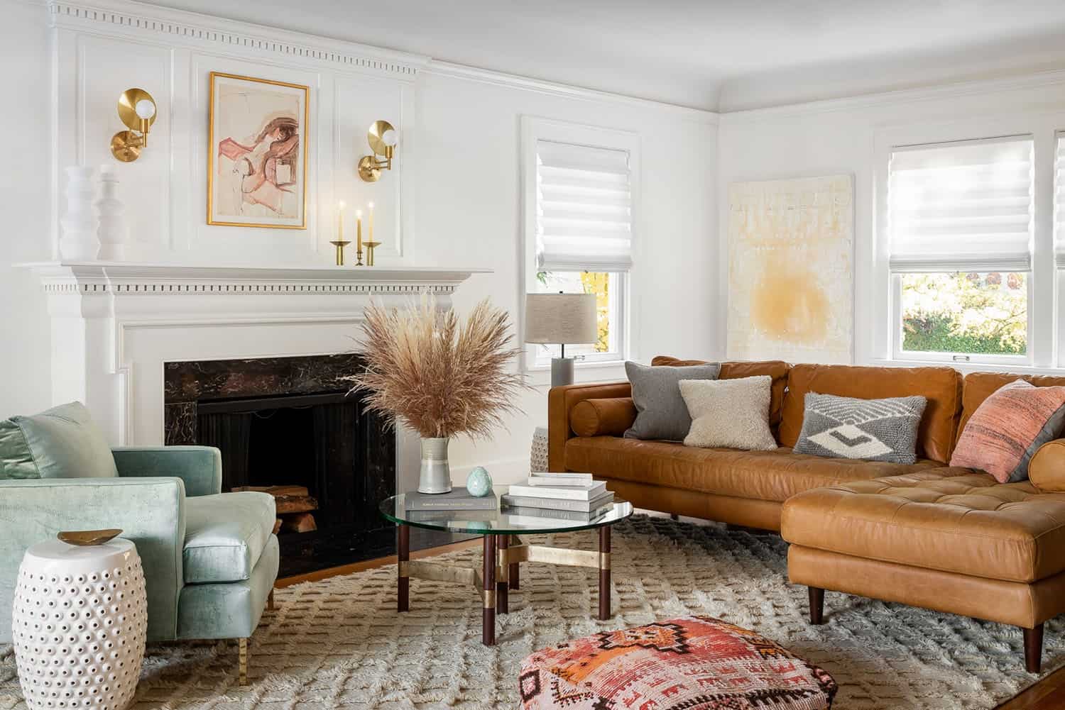
A light, neutral palette was incorporated to draw attention to the existing colonial details of the home. Like the coved ceilings and leaded glass windows that the homeowners fell in love with when they purchased the home. While retro features are charming, they also need to function. The family wanted to stay true to the Colonial style but with updates for today’s modern family. Modern furnishings and art were used throughout to balance the traditional details.
Above: The mid-century modern style sofa is the Sven charme tan sectional sofa, from Article.
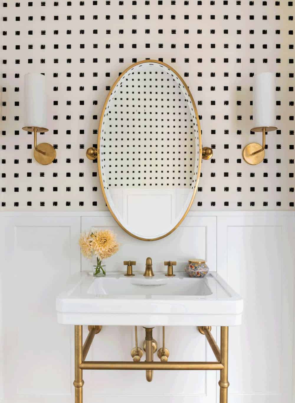
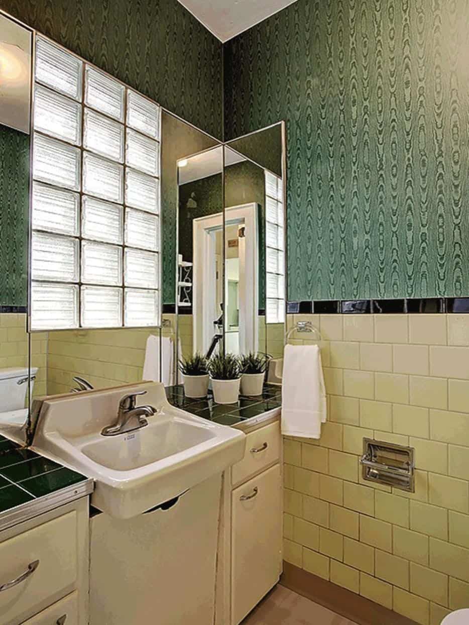
Above: The powder bathroom prior to the renovation.
There was no official master bedroom prior to the renovation. The existing four bedrooms and one separate bathroom became two bedrooms perfectly suited for the owner’s two daughters and a guest room, while the third became the true master complete with walk-in closet and master bath. There are future dreams for a second story addition that would transform the current master into a guest suite and build out a master bedroom and bath complete with walk in shower and free-standing tub.
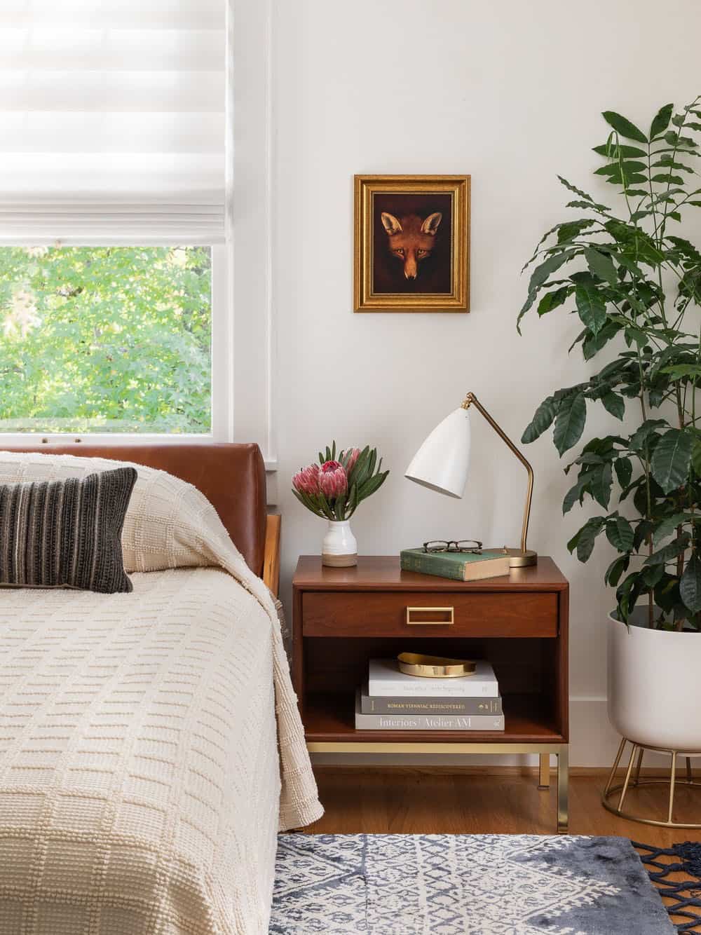
Above: In the bedroom, the table lamp is from Design Within Reach. The end table is vintage. On the bed, the coverlet was sourced from Schoolhouse.
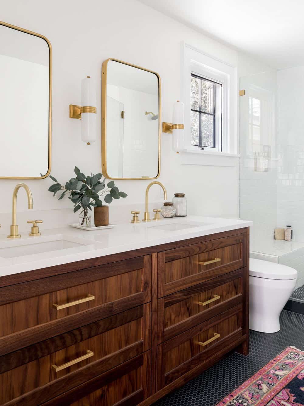
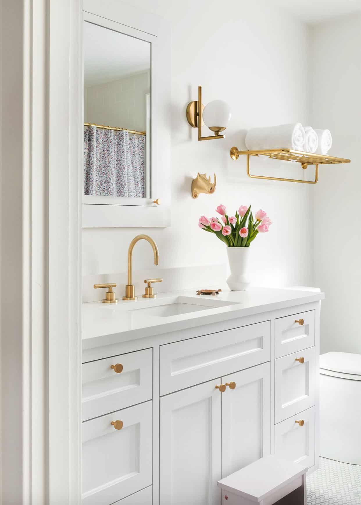
Above: In the bathroom, the cabinets are walnut.
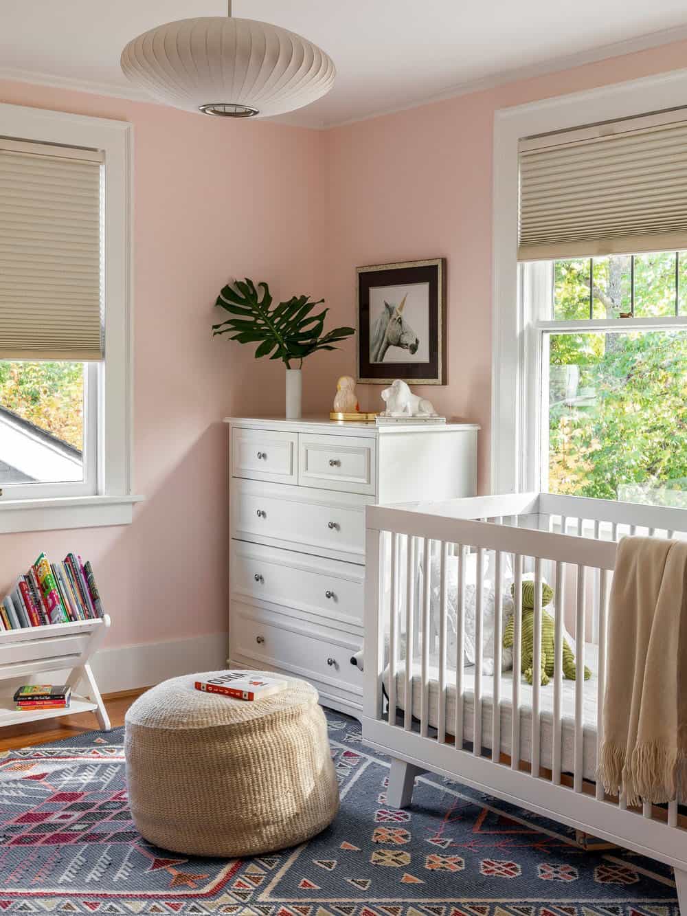
Above: The paint color on the walls of this nursery is Hint of Pink 884 | Benjamin Moore.
Photos: Haris Kenjar



5 comments