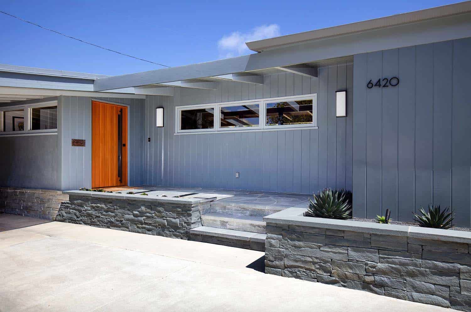
JWT Associates was responsible for completely renovating this mid-century modern home built in 1951, located in Los Angeles, California. The original home was nestled on a large property with a free-form swimming pool. On the interiors, vaulted ceilings were a highlight of the space, which were preserved. Prior renovations of this home did not honor the character its mid-century roots and needed to be corrected. The homeowners also wished for the interior to be more open and cater to their lifestyle needs.
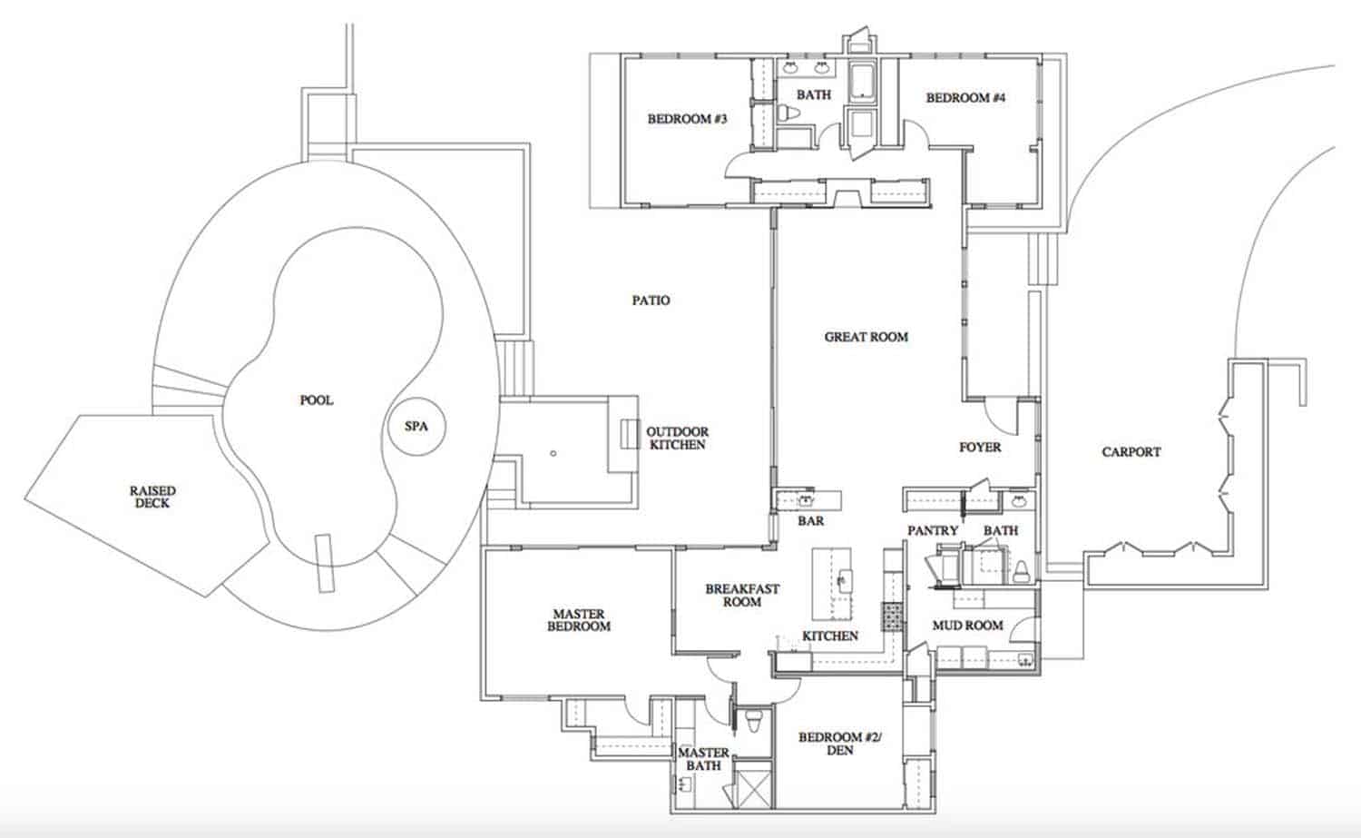
Renovations included improving the foyer, adding a carport entry and mudroom and taking down walls between the living/dining room and kitchen areas to create a spacious great room that opens to the backyard. The master bedroom suite and den were reconfigured, while the landscape and backyard/pool area were completely re-designed. The new layout encompasses 2,600 square feet of living space with four bedrooms and two-and-a-half bathrooms.
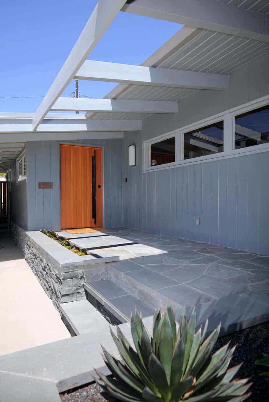
Above: After the renovation, the entryway into the home features a custom pivot front door and new bluestone walls. The beams and wood siding is original to the home. The original front door was moved to help widen the great room. This created a more gracious progression into the home and to the kitchen. The former foyer became an alcove off the fourth bedroom.
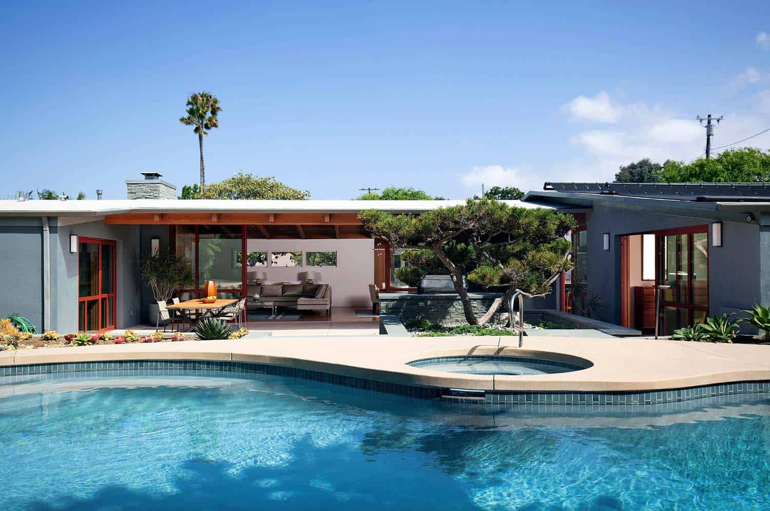
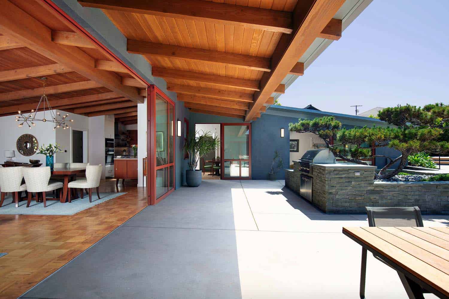
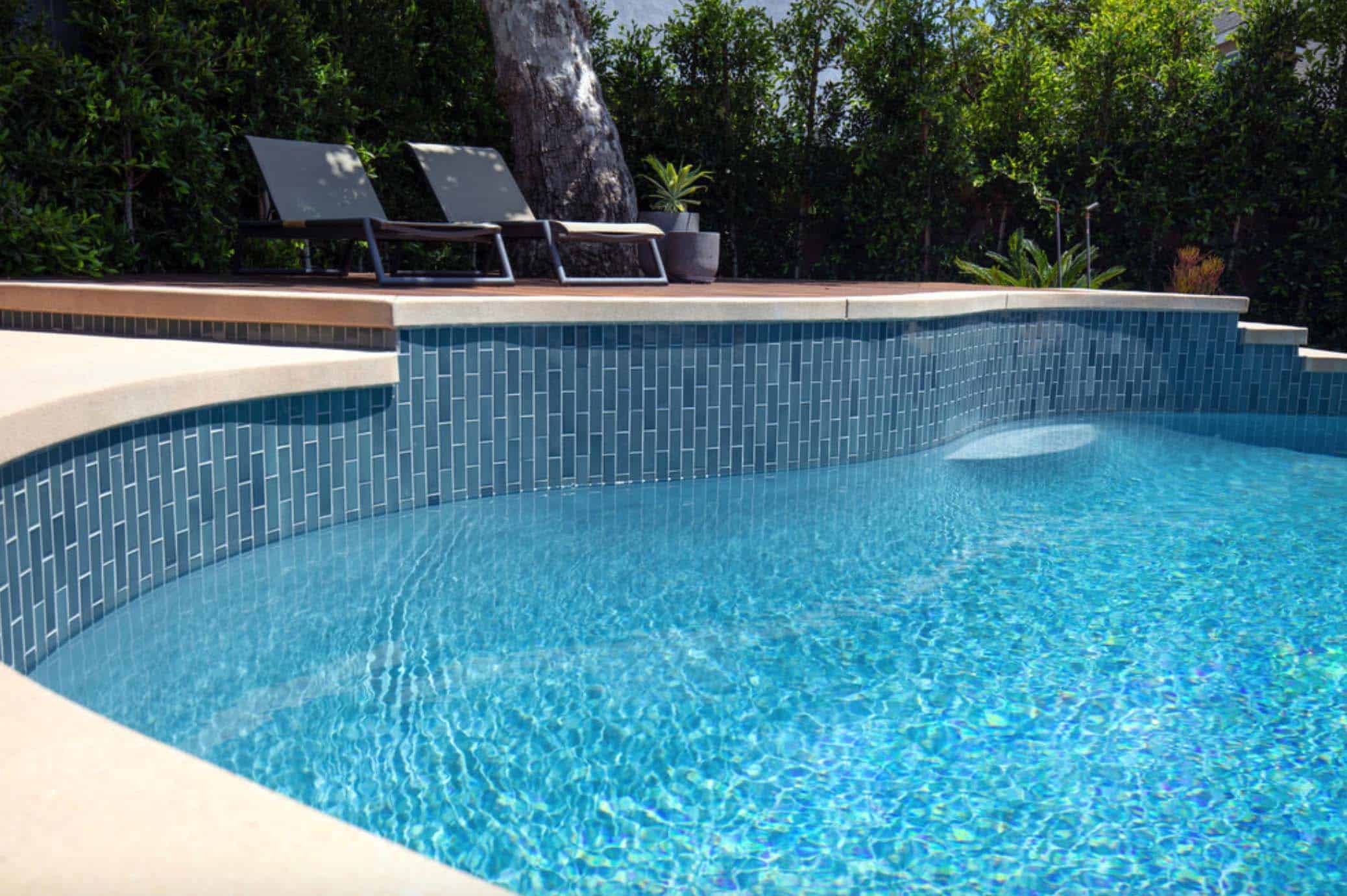
Above: Exterior renovations included resurfacing the swimming pool and applying Heath Tile. A new teak deck was added above the swimming pool. The project team also added an outdoor dining area and BBQ, which was centered around an existing cypress tree.
Interesting Fact: The architect’s had the homeowners live in the house for a year prior to making any renovations. This way their were able to discover what worked for them and what did not. During this time period, the architect worked with them on the floor plans.
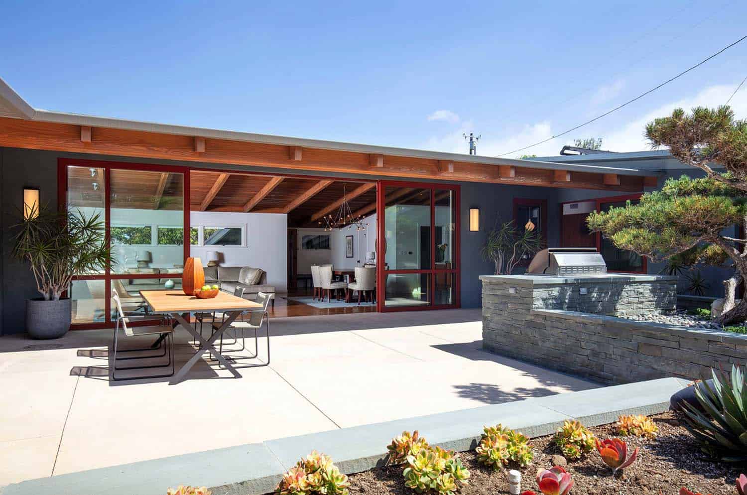
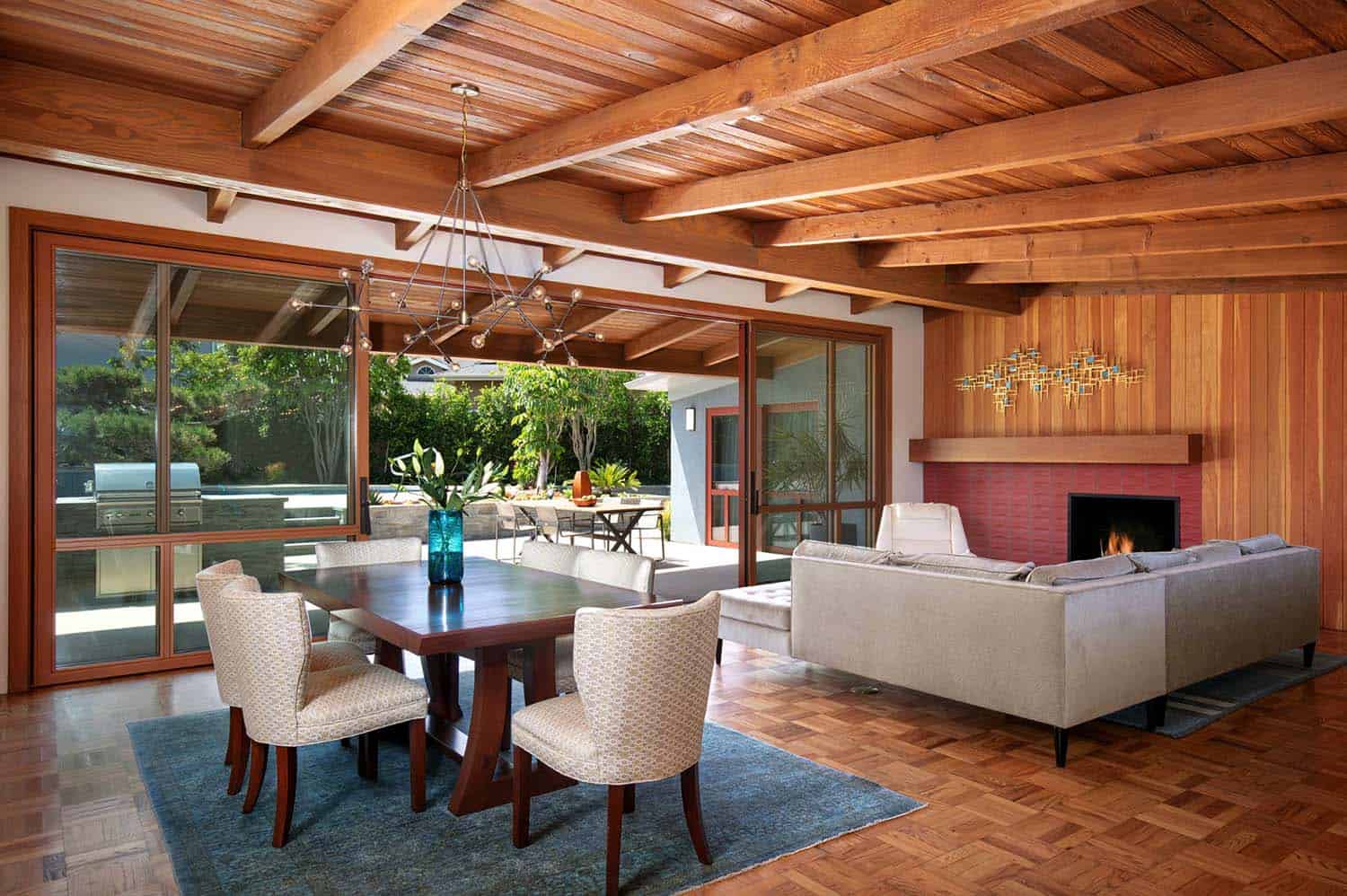
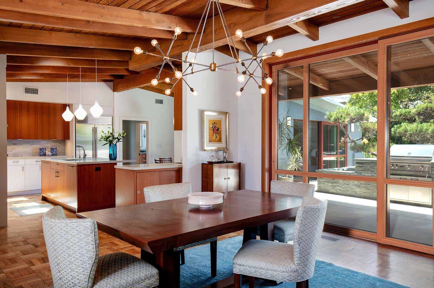
Above: In the great room, the architects custom designed a 25-foot wide set of telescoping doors (from Weiland) with a flush indoor-outdoor transition. The bluestone outdoor kitchen was designed around an existing Cypress tree.
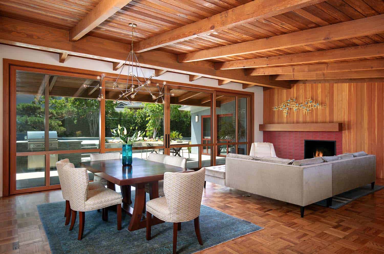
Above: The dining room chandelier is vintage. The parquet floor and wood ceilings are original to the home and were preserved in the remodel.
What We Love: This mid-century remodel features lovely, clean lines of sight — updated but kept the flavor of the best of the original style, private in front and open in back. Loving the preservation of the wood ceilings and parquet floors. The new layout offers an improvement of lifestyle for the homeowners, with a better flow of spaces and indoor-outdoor connection. Overall this remodel is wonderfully warm and tactile. The Heath Ceramics tiles are especially great at adding warmth and depth. The color choices are inspired.
Readers, what do you think of the this mid-century modern home remodel? Do you find the overall feel to be warm and livable? Please tell us why or why not in the Comments below!
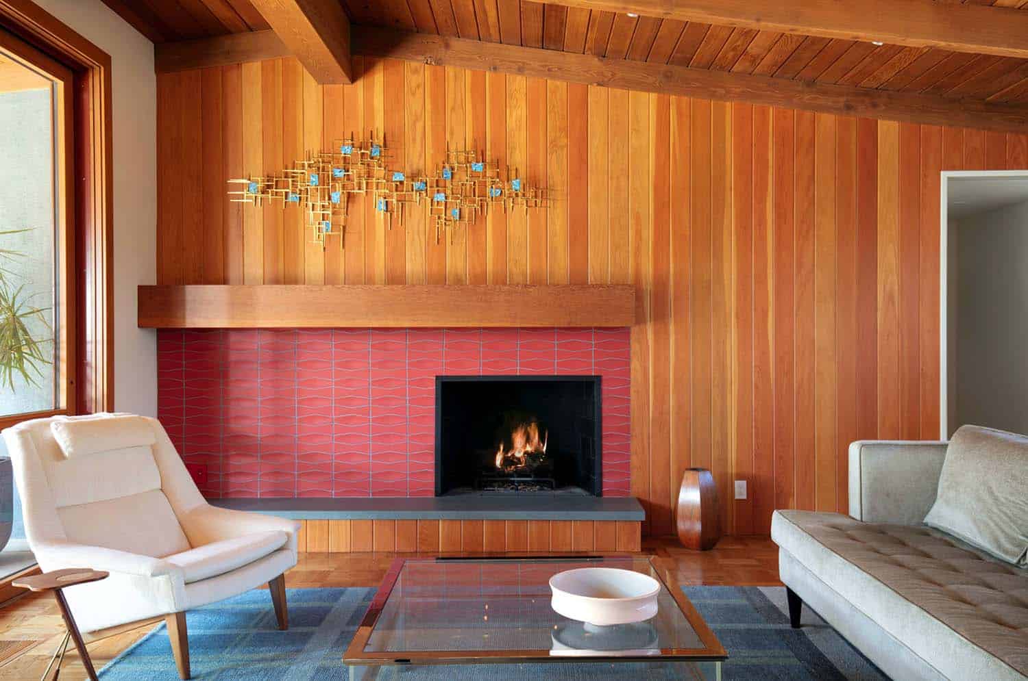
Above: The drywall was replaced with V-groove wood paneling, stained in a hue that matches with the floors and ceiling. The original firebox was preserved, while the surround features Heath Ceramics tile with a brick-like appearance. The hearth is bluestone. The mantel was salvaged from an original ceiling beam.
Above: A wall was torn down to open the dining room to the kitchen.
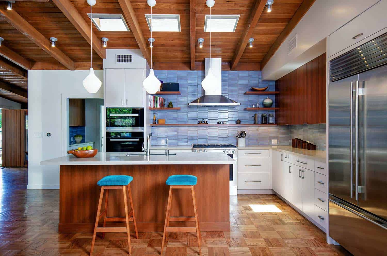
Above: The kitchen was last remodeled in the 1980’s and had a dropped ceiling. The ceiling was removed to create a new vaulted kitchen that opens out to the great room. The ceiling features operable skylights from Velux, which have solar-powered shades. This kitchen was reconfigured to be more spacious and allow for a center island. The floors originally had terra-cotta tiles, replaced with parquet flooring to match the original floors in the rest of the home. Double oven and range is Miele, while the fridge is Sub-Zero.
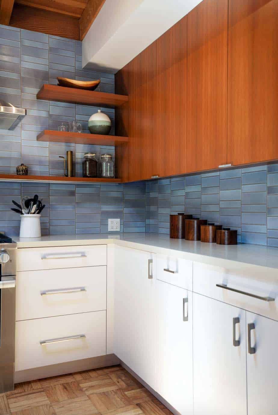
Above: Cabinets are custom (previously a white laminate). Backsplash tile is from Heath Ceramics.
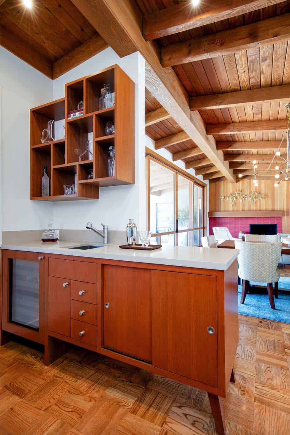
Above: A custom bar using a teak veneer creates a separation between the kitchen and dining area. The bar appears like a piece of freestanding mid-century modern furniture. The countertop is a white Caesarstone quartz. This piece also includes a sink and wine fridge. The upper shelving was custom designed by the architect.
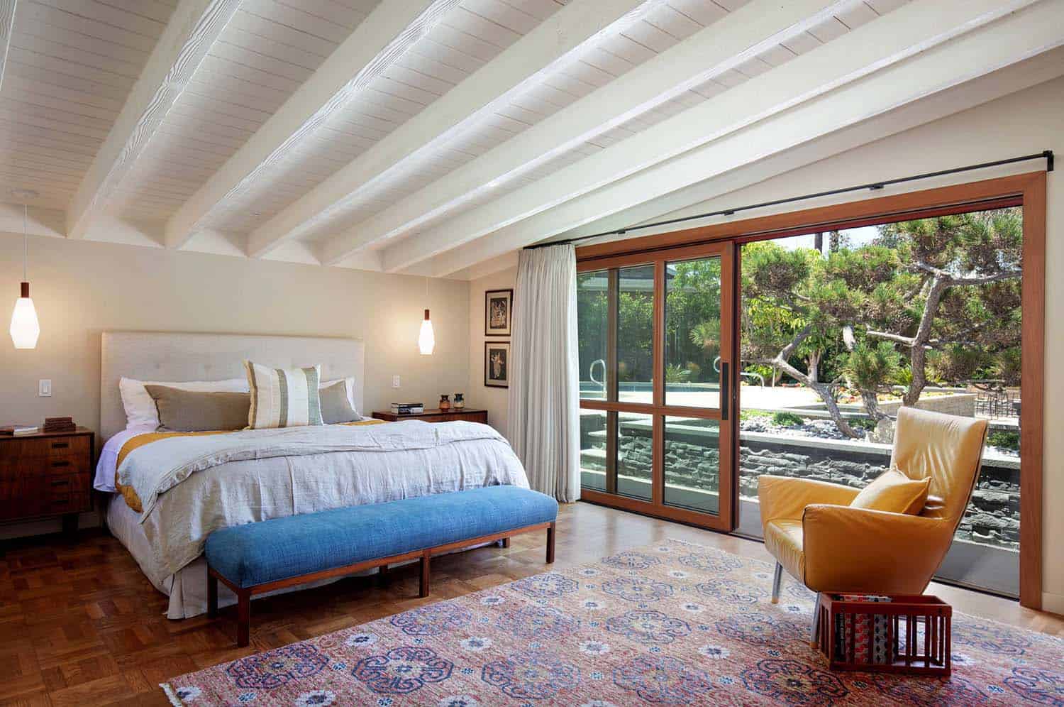
Above: In the master bedroom, the original ceiling was painted white, creating a bright and airy feel. The doors were custom designed, using the same system as the living room with sliding screens that pocket into the wall. The bedroom was made larger by moving the closet to the former bathroom space. The new bathroom sits in part of the former family room.
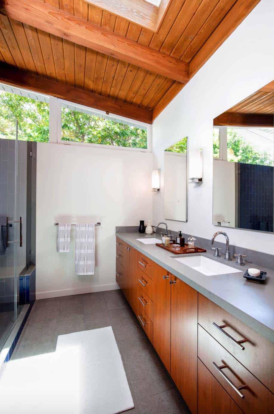
Above: In the master bathroom, this once dark and narrow space was enlarged. The original ceiling was exposed to create an open and airy space. A custom vanity features Caesarstone quartz countertops.
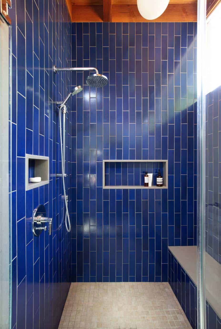
Above: The shower tiles are in a deep shade of blue from Heath Ceramics, while the integrated bench and trim are Caesarstone quartz.
Above: The former family room was turned into a den for watching TV. This also gives the house an official fourth bedroom.
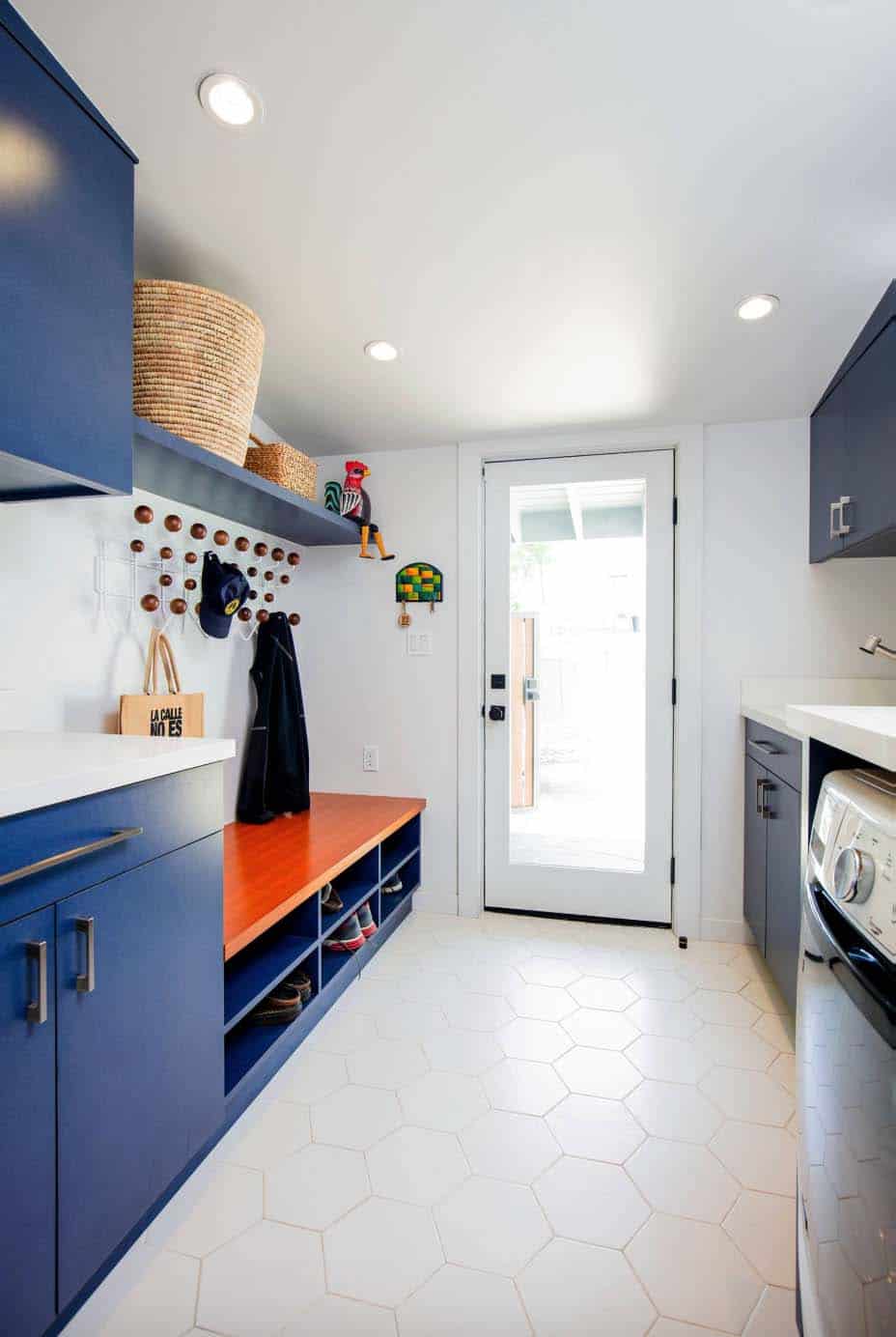
Above: The laundry room was an addition to the home, with custom cabinetry featuring blue laminate doors. Countertops are Caesarstone quartz, while the floor tile is from WalkOn Tile.
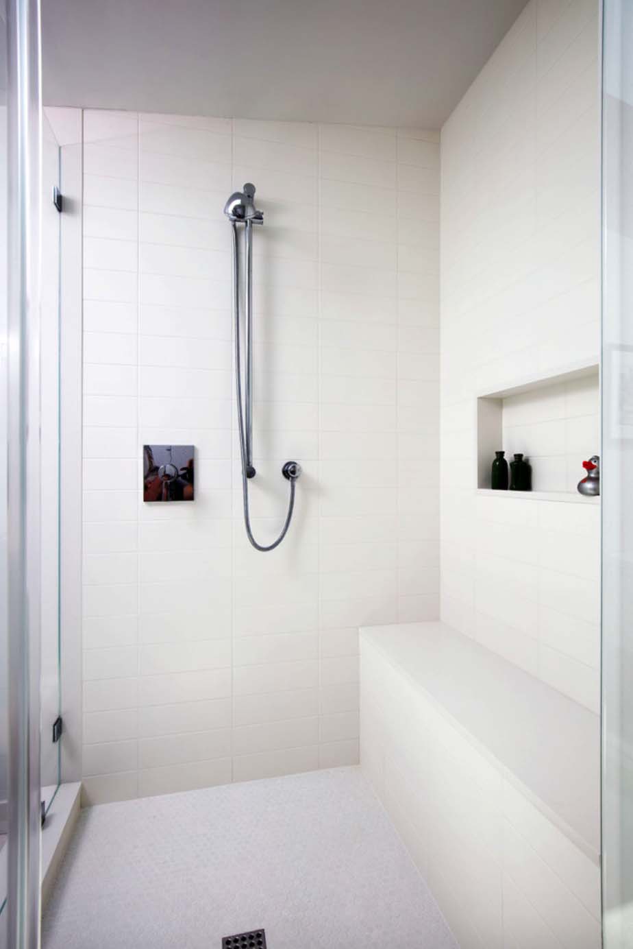
Above: The guest bathroom features an all-white palette. Walls and floor tile from WalkOn Tile, while the bench and trim is Caesarstone quartz. The shower fixtures are from Grohe.
Above: For the swimming pool, the coping was replaced, the interior was re-plastered and a new waterline tile from Heath Ceramics was added. The beautiful new deck is Mangaris wood.
Above: The shape of the original pool was preserved, yet it was contained with a new oval concrete pool deck.
Photos: Lee Manning Photography
BEFORE THE REMODEL:
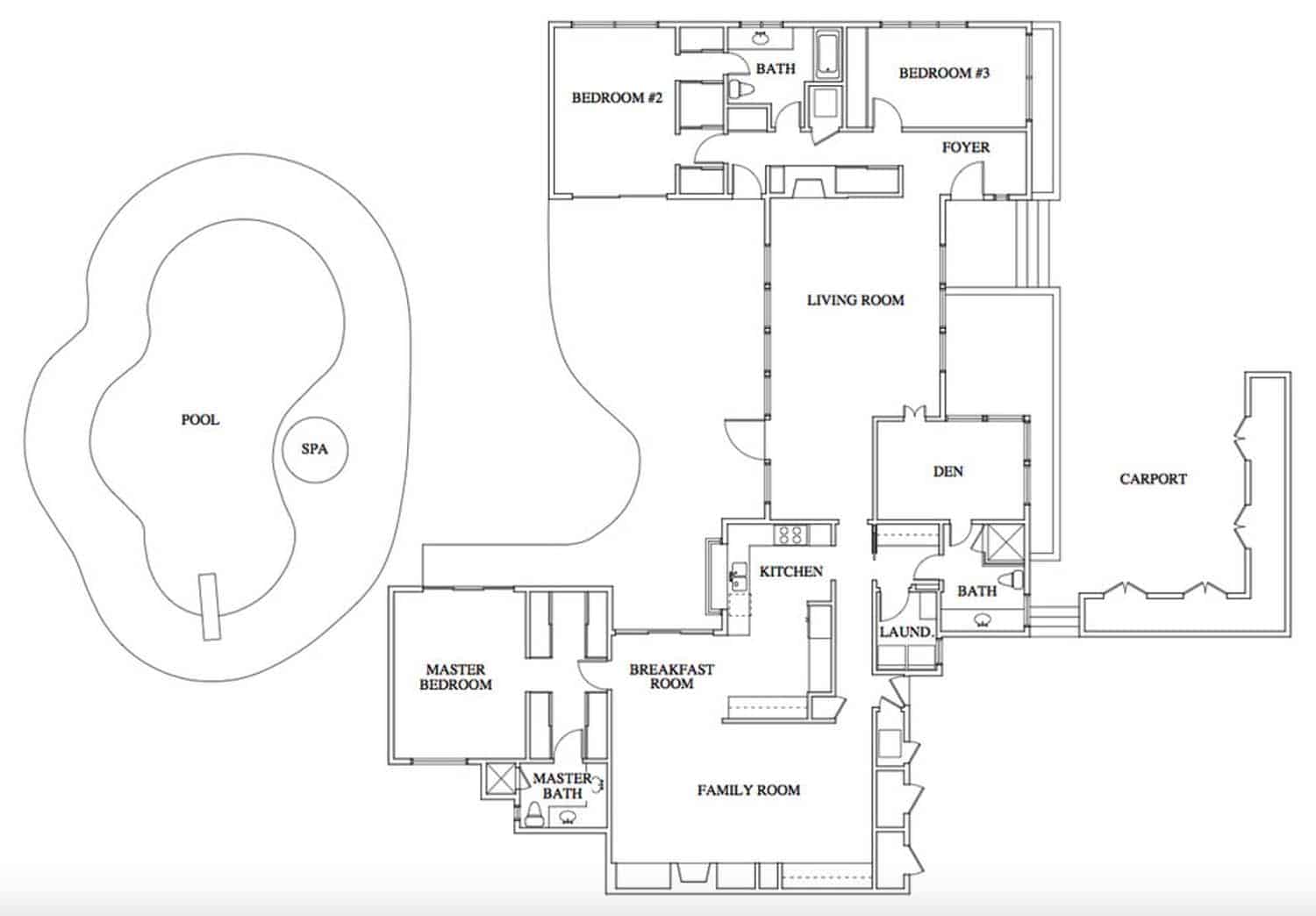
Above: The floor plan layout before the remodel was choppy and contained more circulation space than necessary. The living room functioned more as a long hallway to get to the kitchen and family room.





1 comment