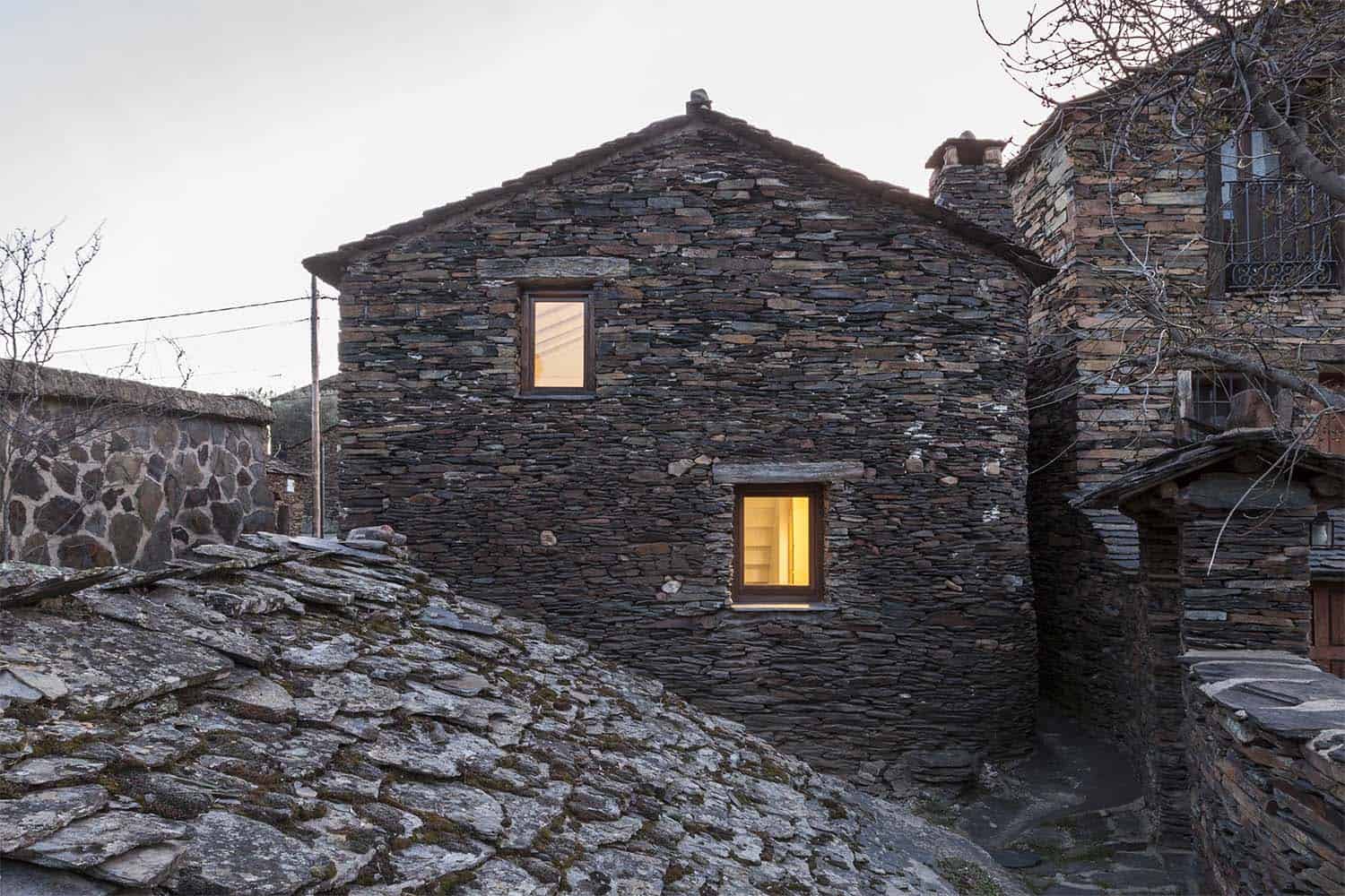
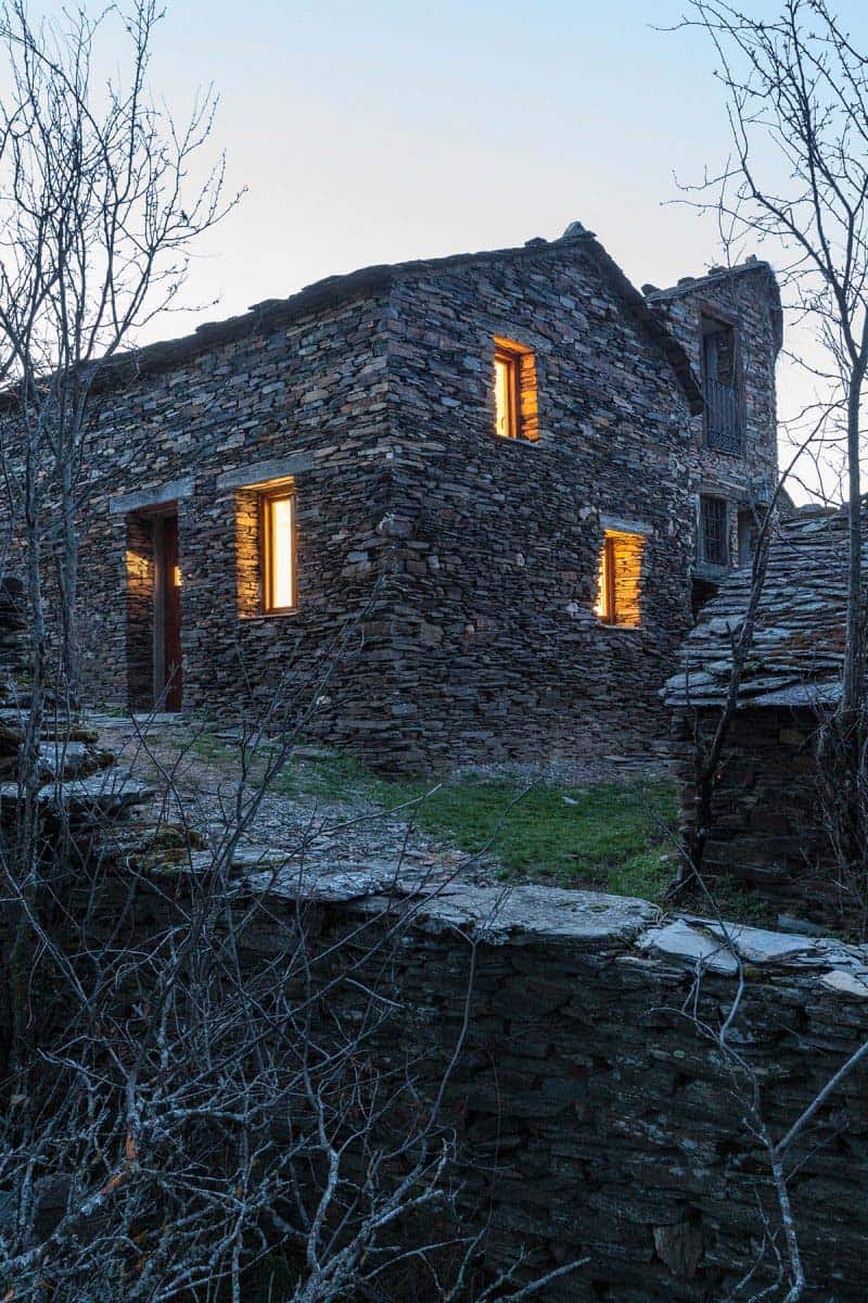
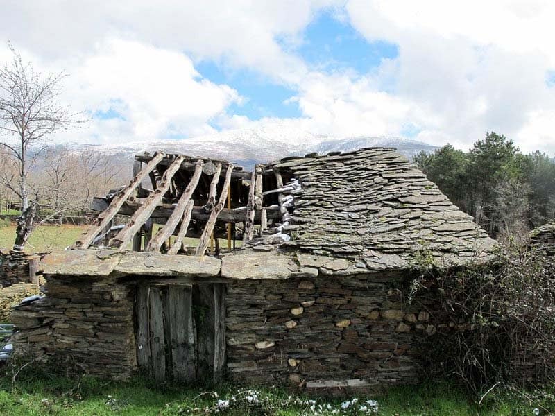
Overlooking the western slope of the Ocejón Peak, in the Sierra de Guadalajara, Spain is this stone refuge designed by architecture studio Ciria Alvarez. In this region we find towns known for their Black Architecture. This name refers to the color of the small farmhouse construction, with irregular black slate flakes and very few technical means. One of these farmhouses was almost in ruin and conquered the heart of a young couple who were looking for a refuge in the mountains.
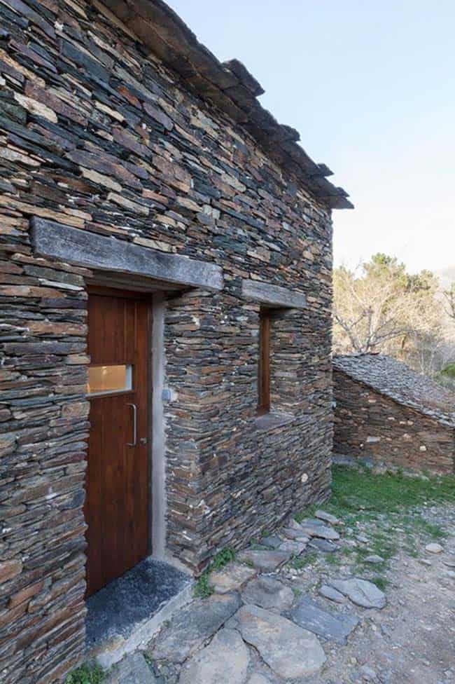
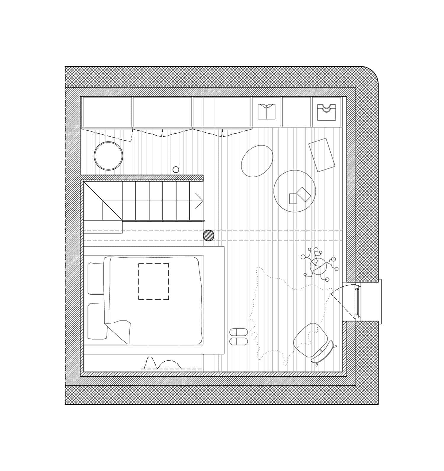
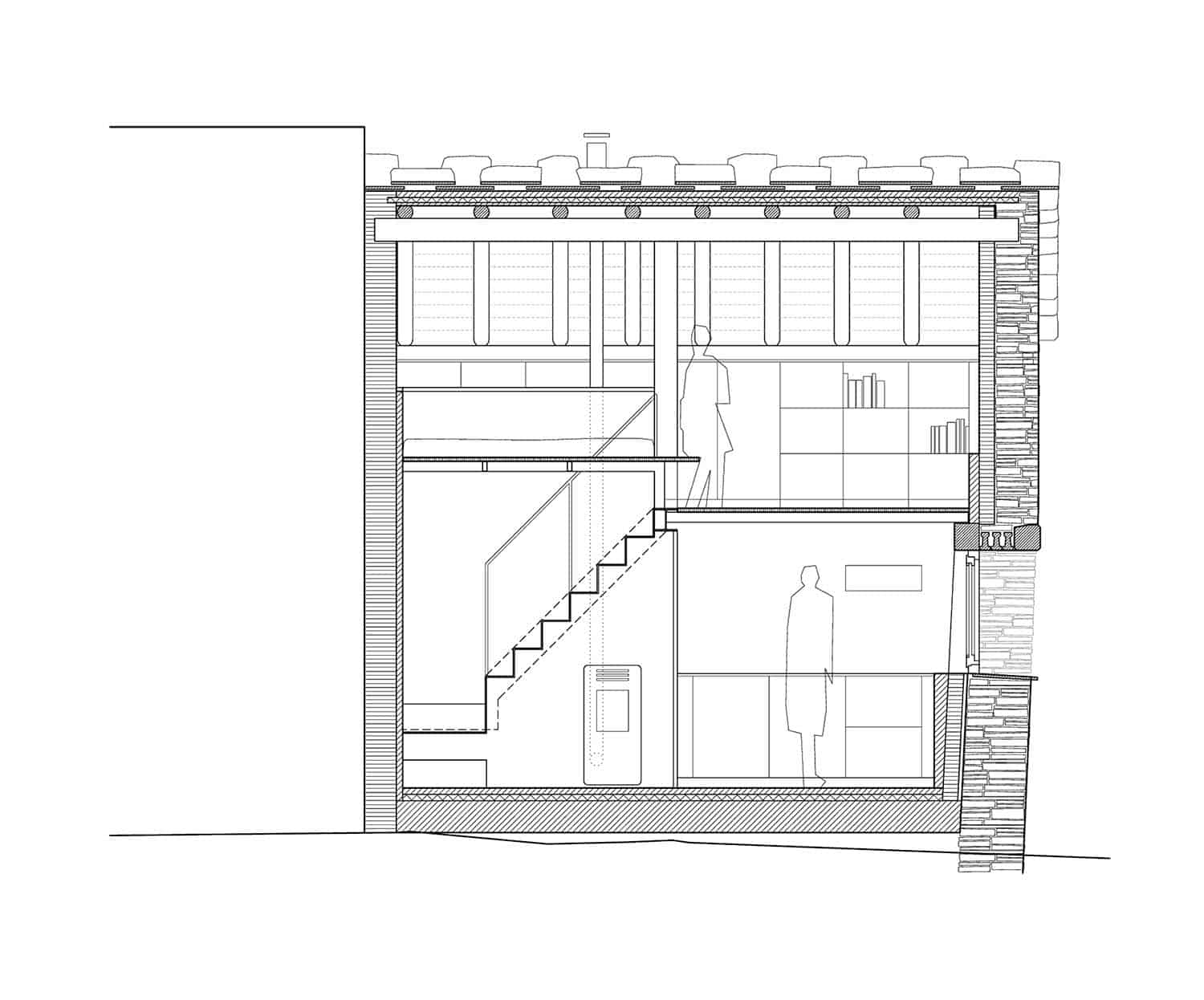
The architects rehabilitated, expanded and updated the old slate construction, preserving its original characteristics. The first thing they did was to restore the structure, securing the 70-centimeter slate walls that were still standing, raising again what had fallen and installing a new roof with finer flakes of this same stone, as is the custom in this region. Inside, they created a new level to extend the living space to 635 square feet (59 square meters).
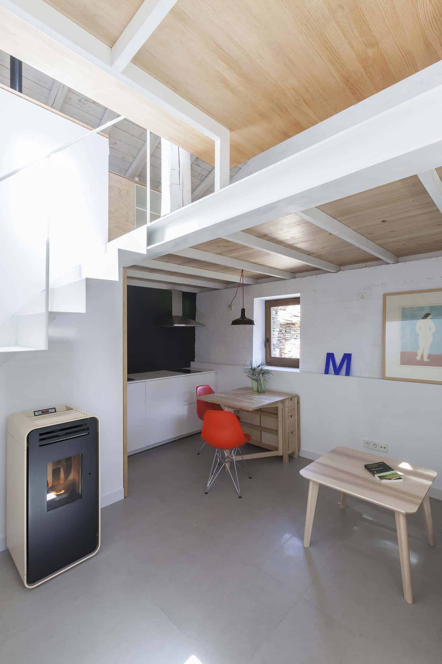
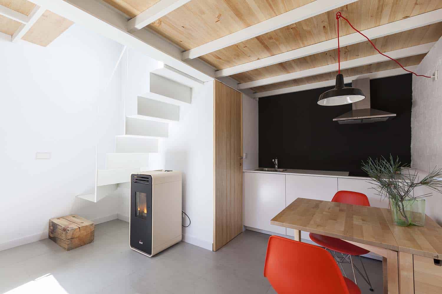
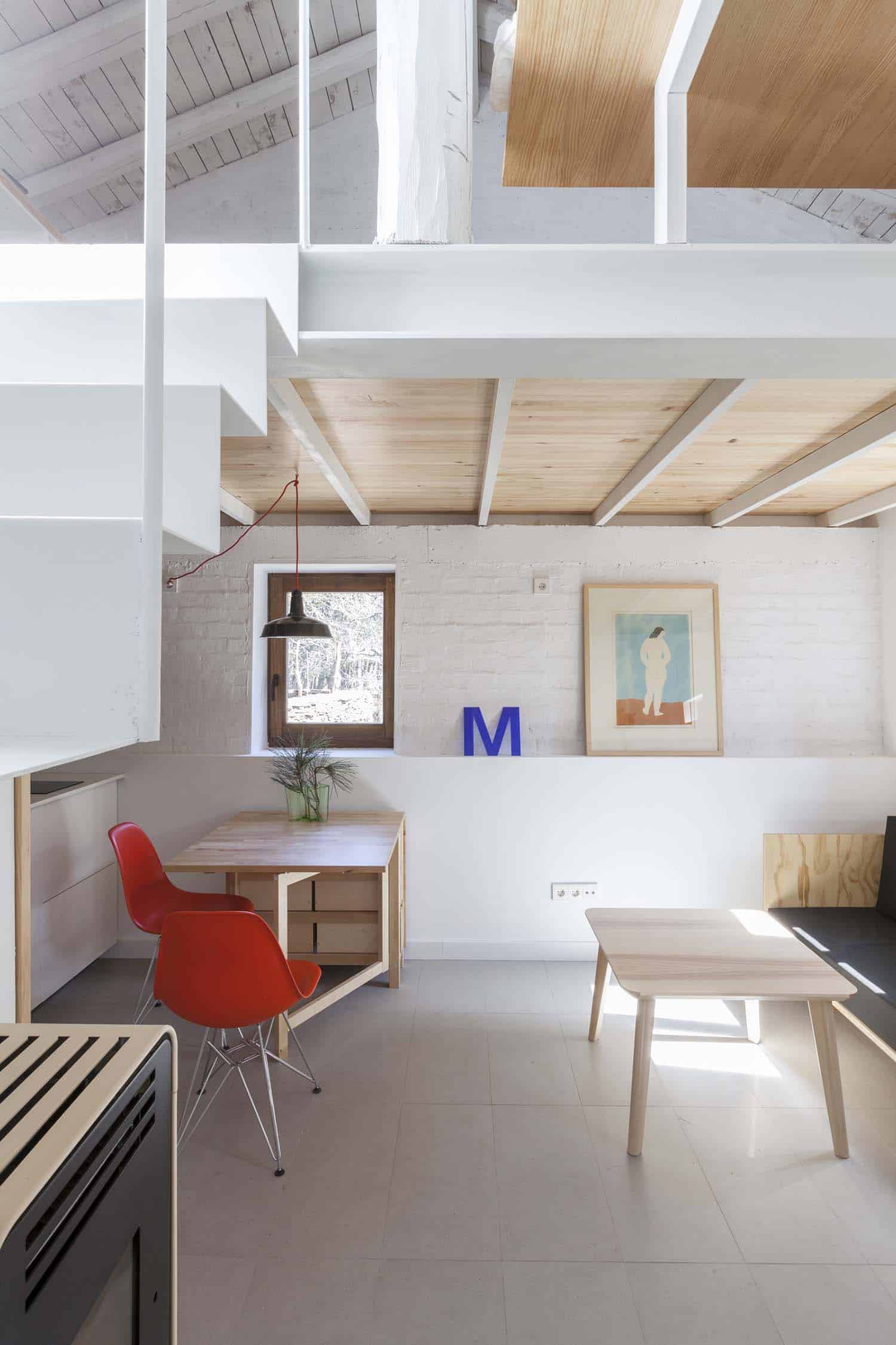
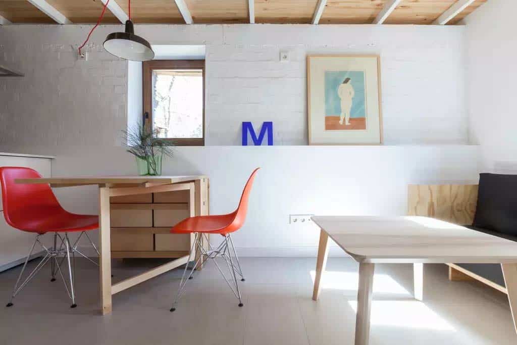
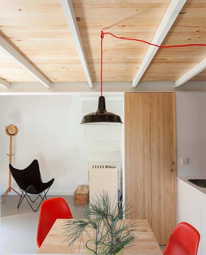
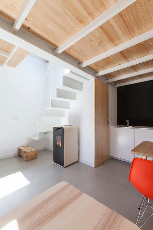
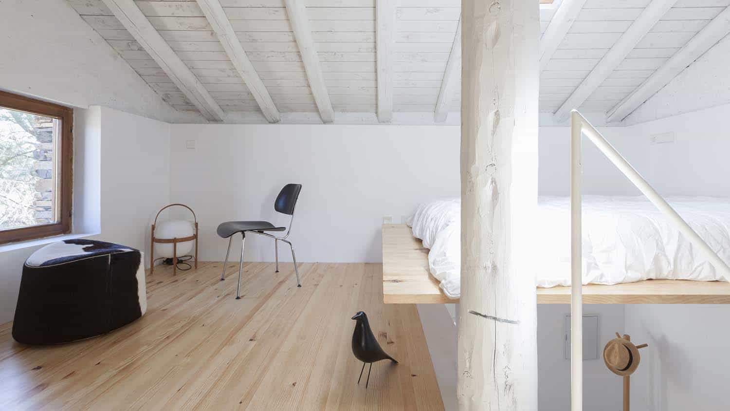
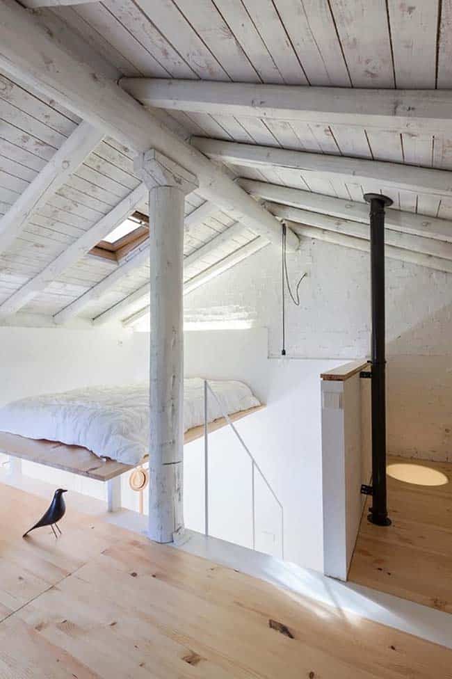
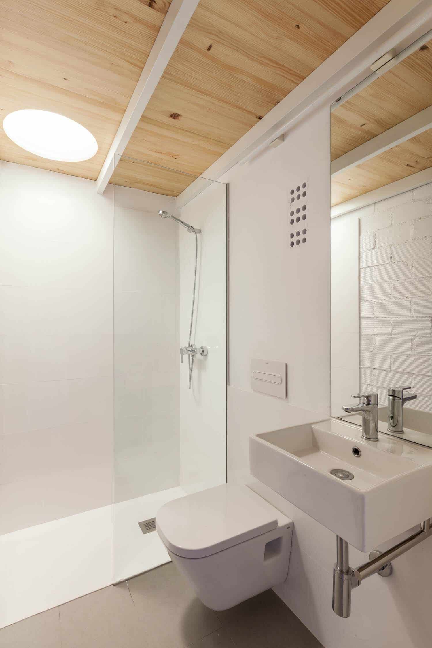
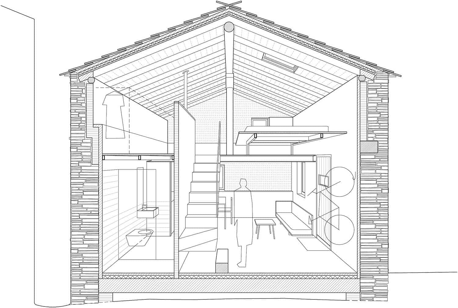
Upon entering, the white walls and design of the twentieth century, such as the BKF chair, designer pieces from Eames or the Mila basket lamp, contrast with the darkness and tradition of the facade, but makes us feel welcome. The interior features an open kitchen and living room and, after the addition of a partition, a bathroom with a skylight.
Although it was originally thought of as a weekend house, the couple that owns it has wanted to share this refuge and put it up for rent for short stays. “We would like the project to be understood as an example of contemporary intervention in the ethnographic and cultural heritage, which, together with the conservation of the natural environment, can contribute to the sustainable development of an area whose villages were left uninhabited in the 1960s,” explains the homeowners.
Need To Know: This home can be found for rent on AirBnB, accommodating up to two guests. The average nightly rate is $87.
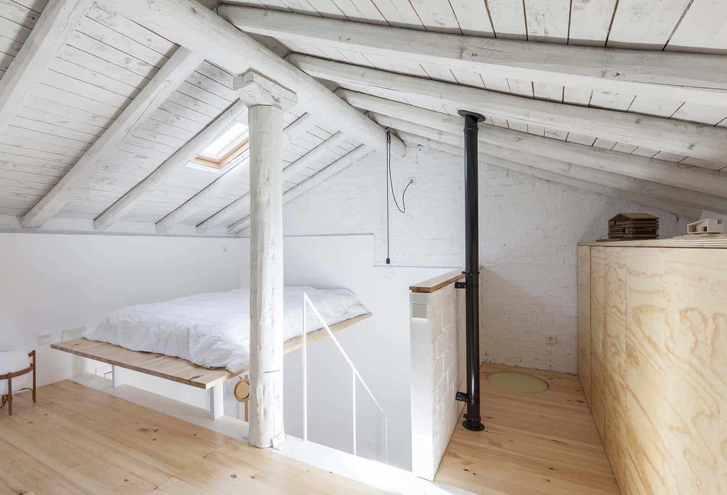
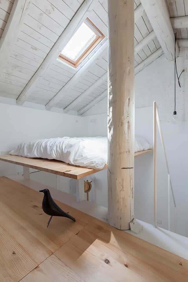
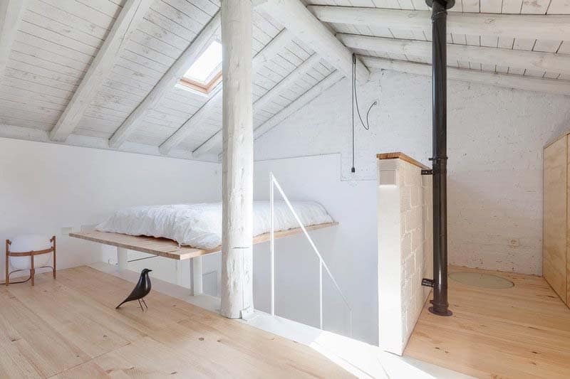
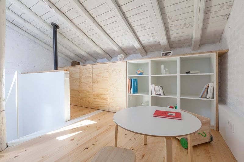
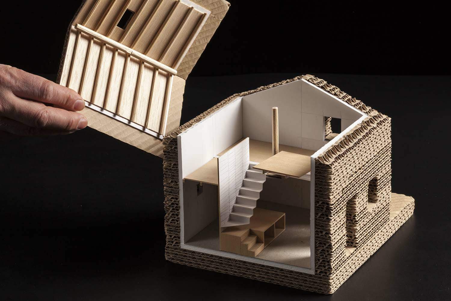
What We Love: This stone refuge offers a relaxing atmosphere to enjoy the tranquility in contact with nature at the foot of the Ocejón Peak. The interiors are light and airy, with a contemporary design that contrasts with the traditional exterior slate construction. The small interior layout is organized on two levels to feel more spacious. The living room, open kitchen and bathroom are on the lower level, while the study area and bedroom are on the upper level.
Readers, what do you think of this home? Would you stay here if you were on vacation in Spain? Share your thought in the Comments!
Prior to the Renovation
Photos: Fernando Andres





0 comments