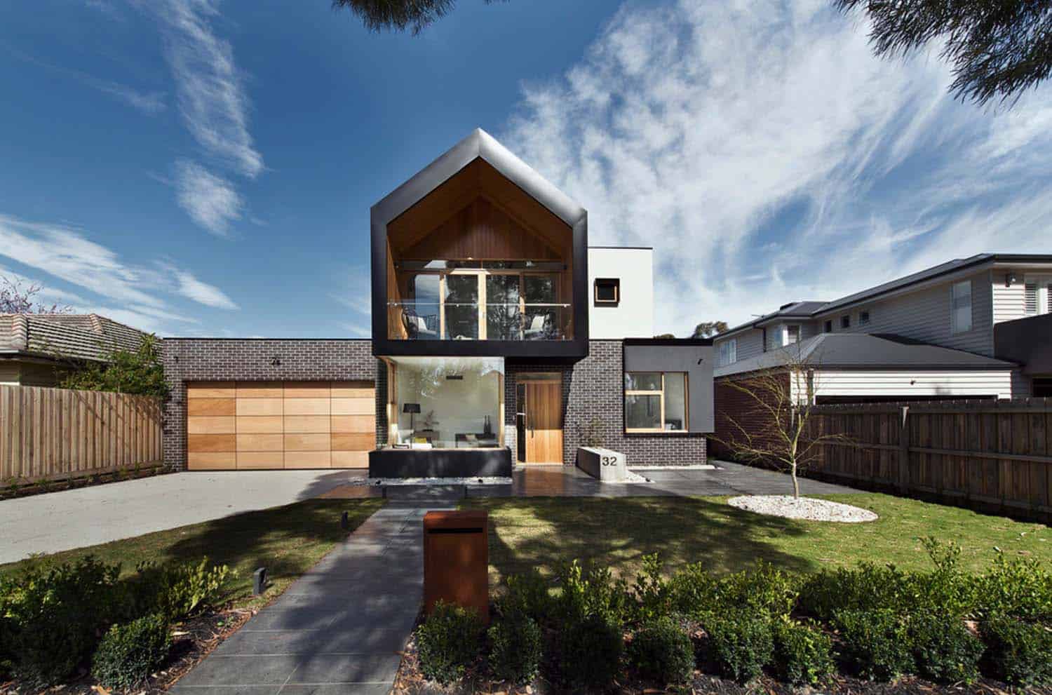
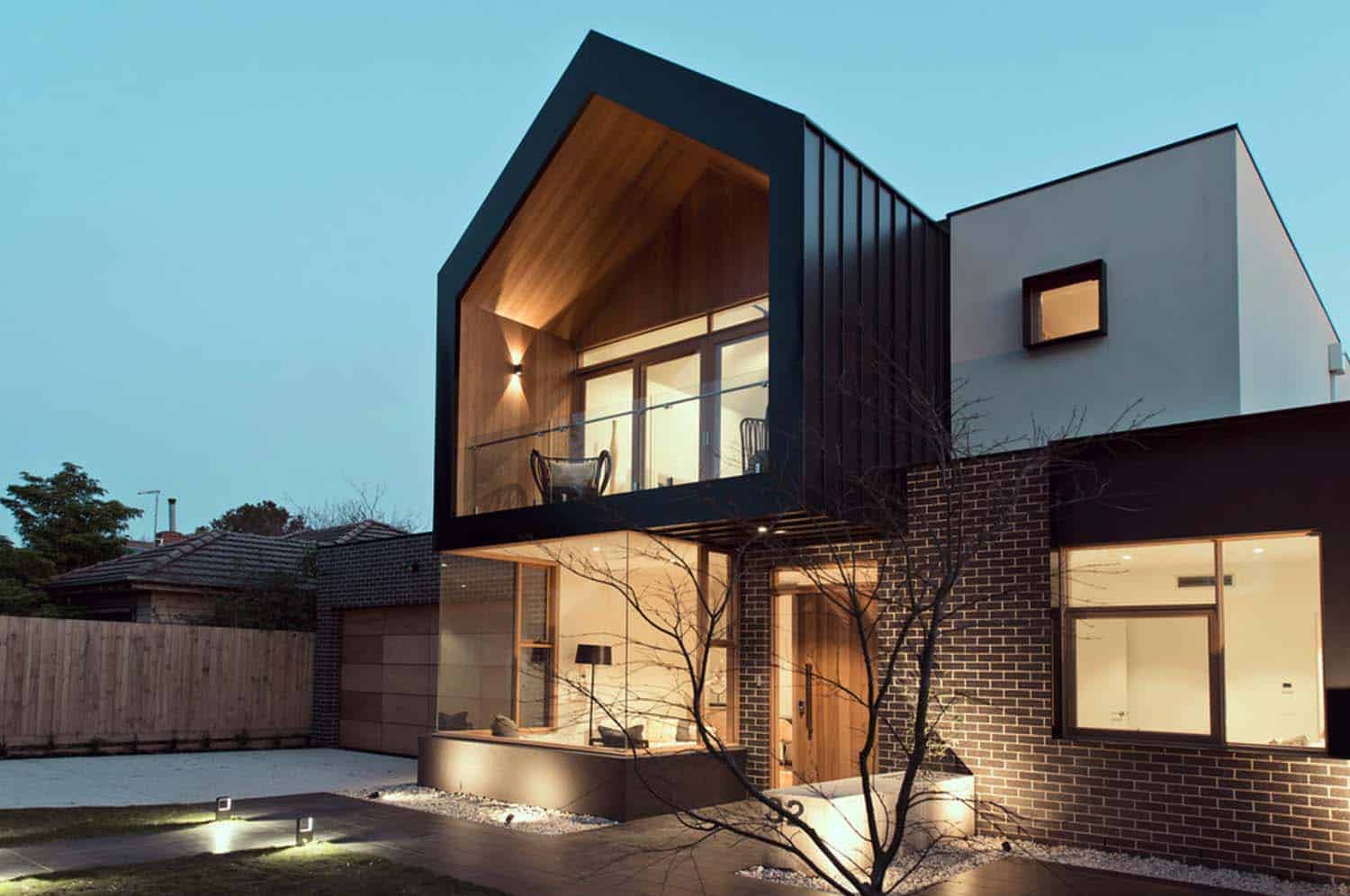
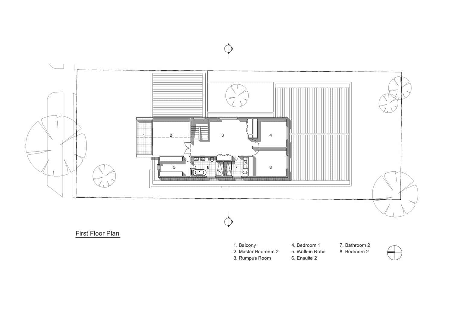
This striking modern home was designed by Alta Architecture in collaboration with R.Z.Owens Constructions, located in Melbourne, Victoria, Australia. Nestled on a quiet, suburban street, the residence was designed for a couple and their extended family (parents and future children). Encompassing 7,588 square feet (705 square meters) of living space, the homeowners requested five spacious bedrooms to accommodate their growing family.
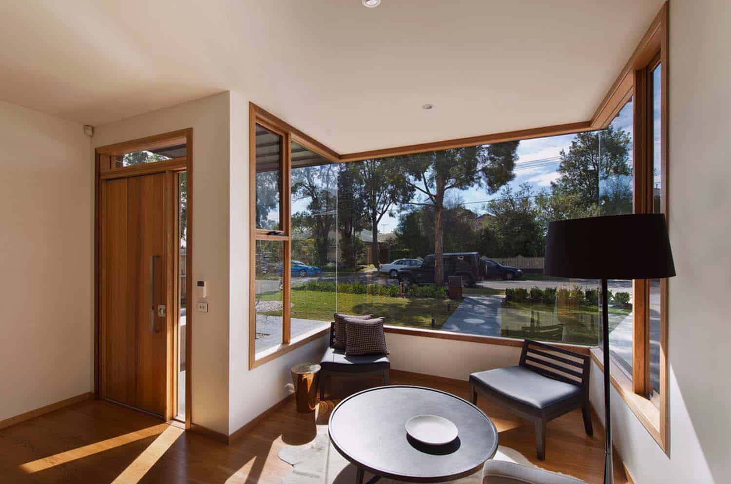
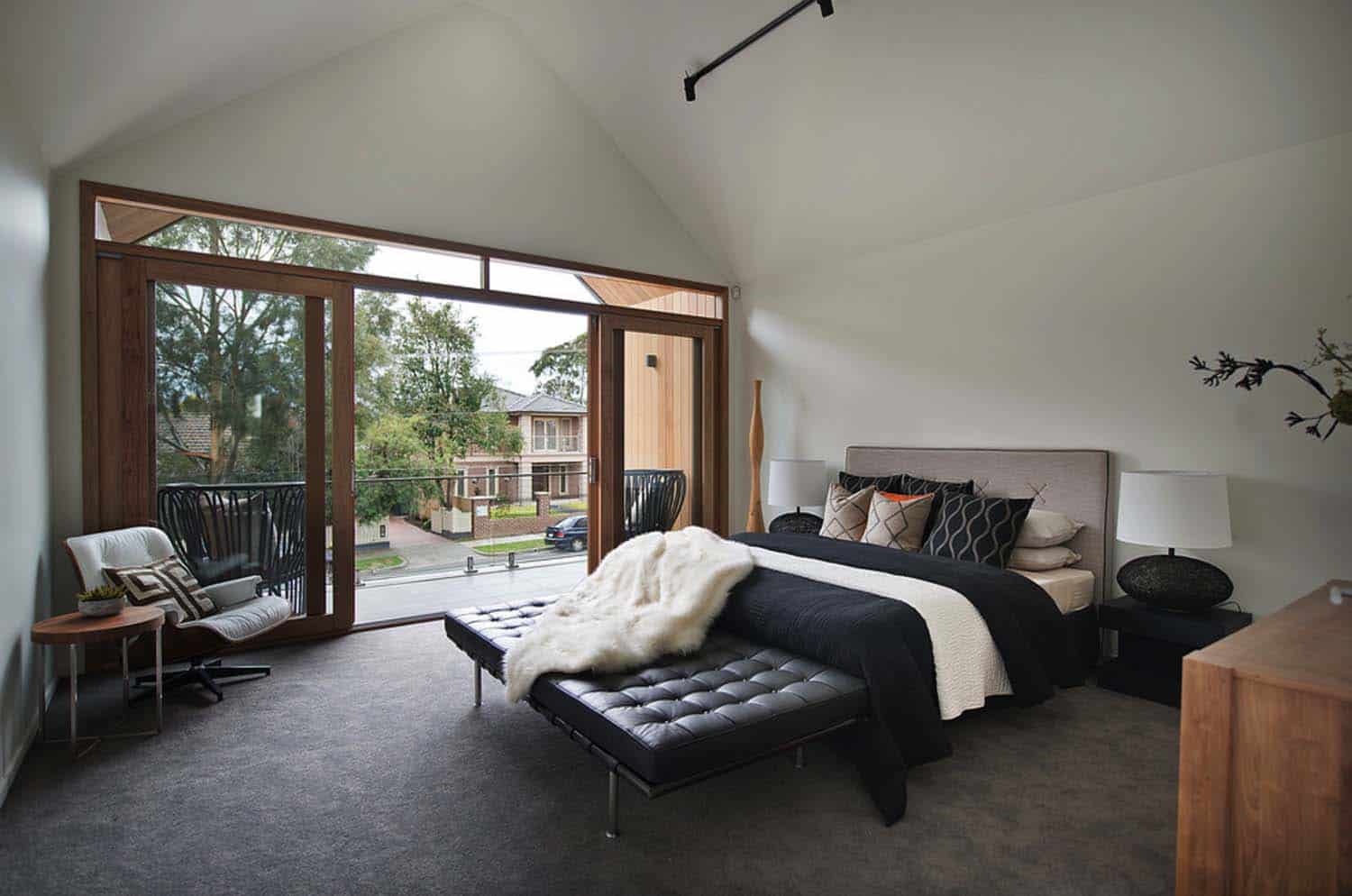
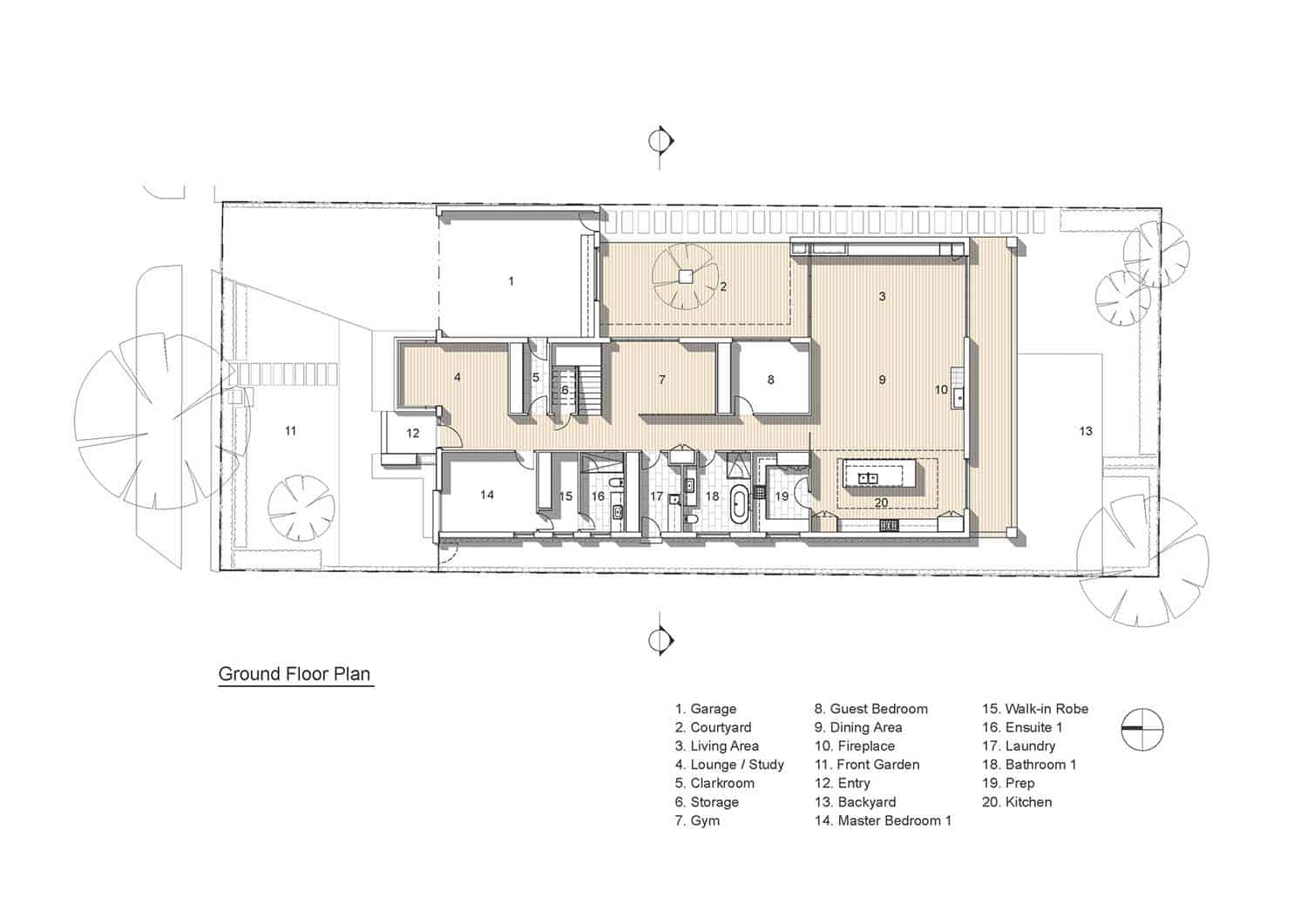
The homeowners were interested in large open spaces—both indoors and out, while maximizing natural light throughout. Despite a limited budget, the homeowners also wished for stylish fittings and fixtures—an ambitious project that required some ingenuity. The front facade is north facing, which was given priority to spaces that needed the most light—the lounge and two master bedrooms and walk-in closet. For function and overall curb appeal, the two-car garage was also designed with street frontage.
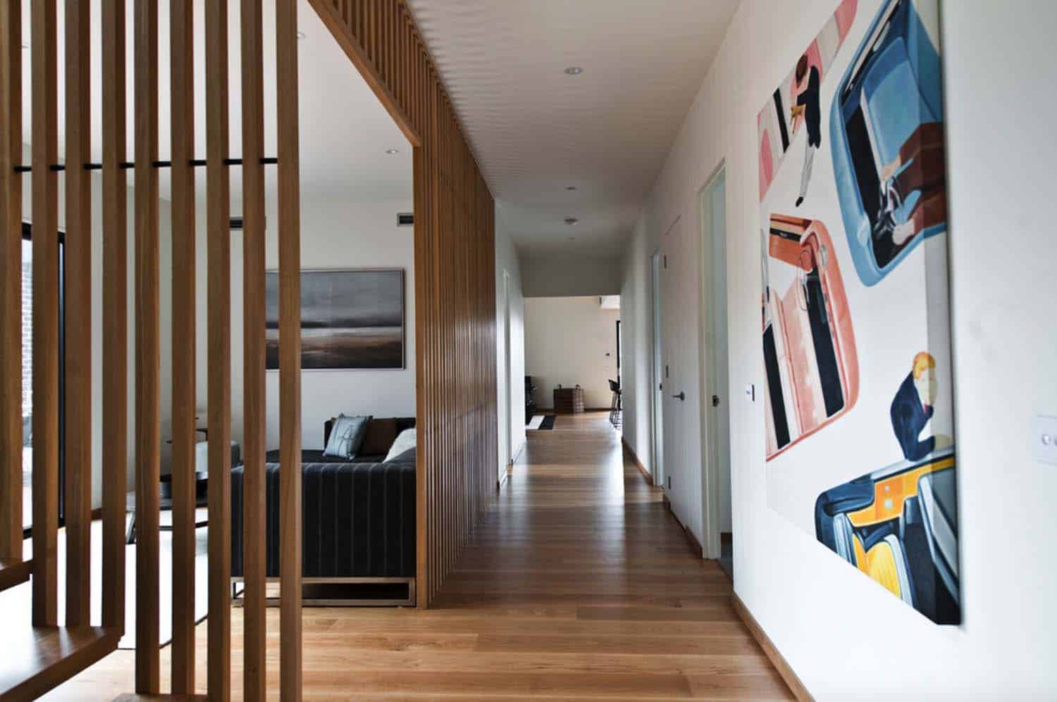
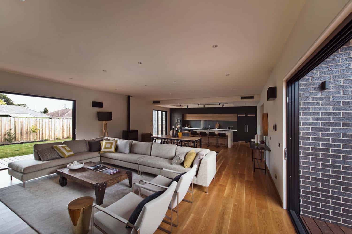
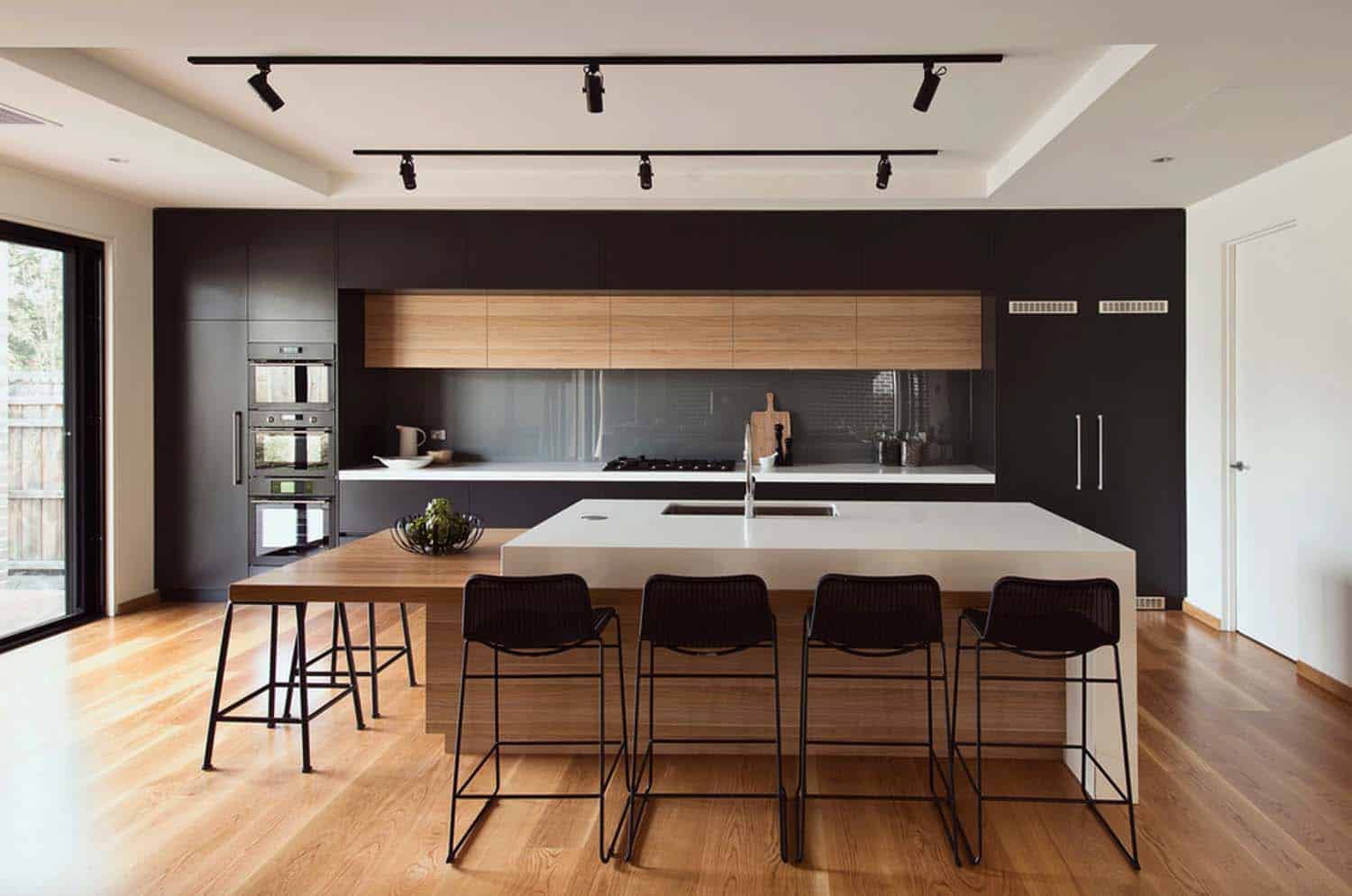
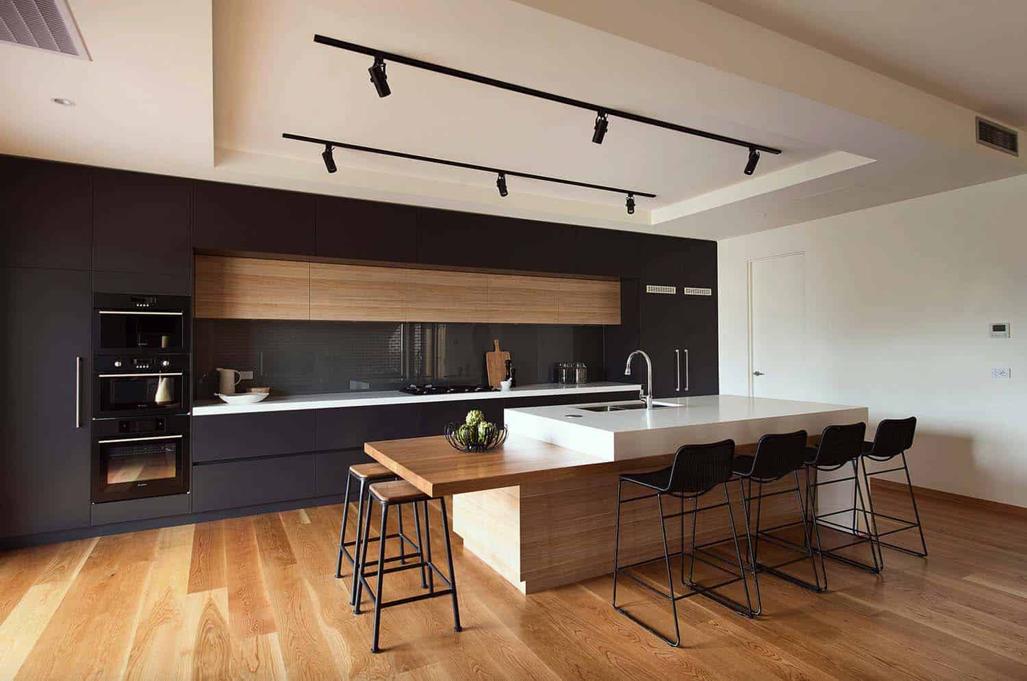
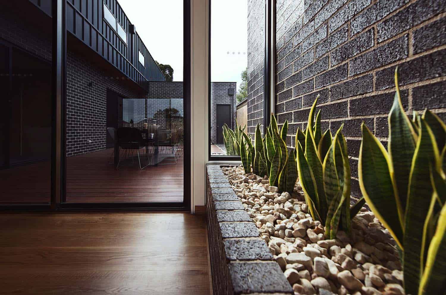
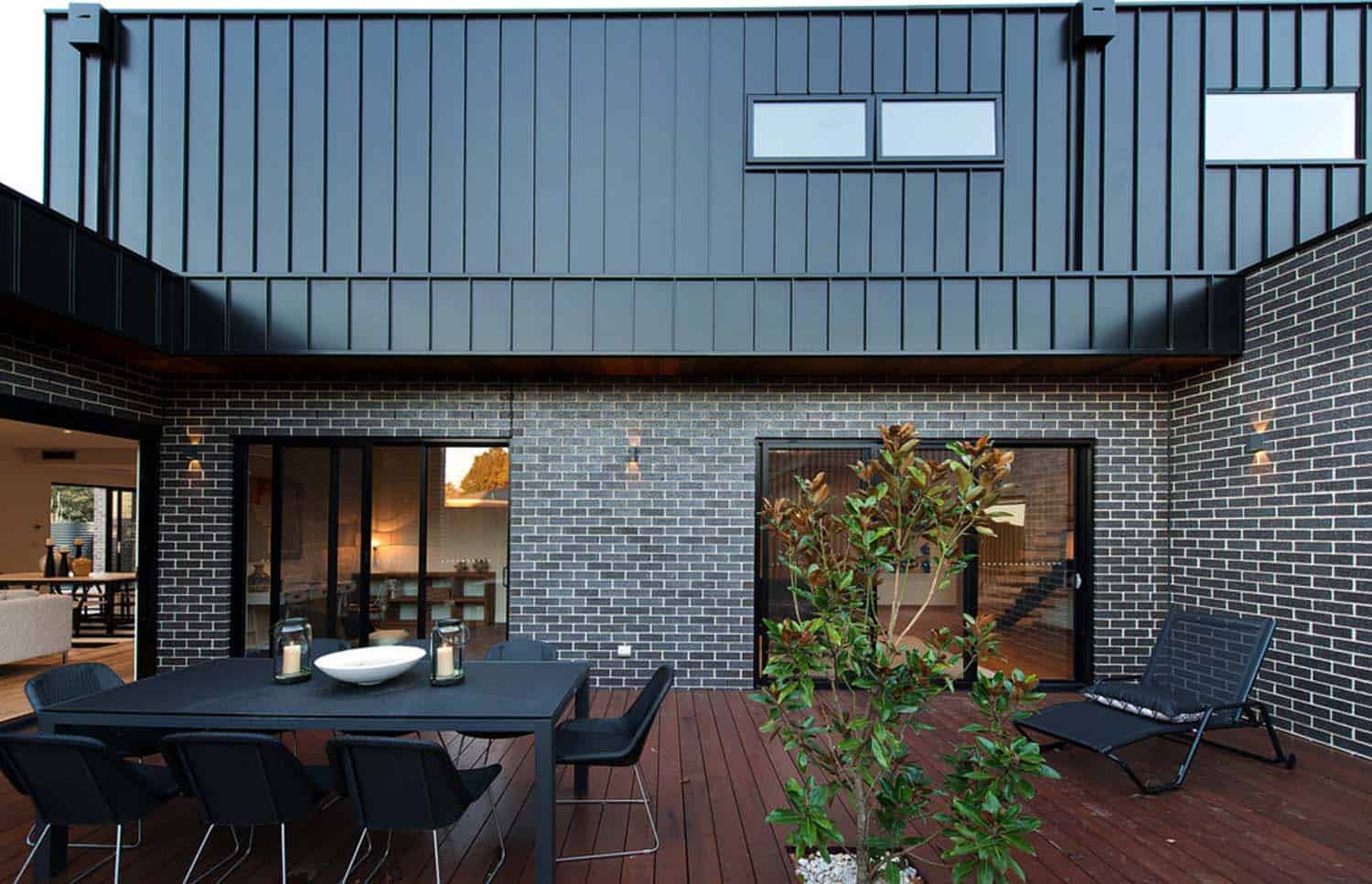
A central courtyard was designed behind the garage, which allowed for the dwelling to have a U-shaped footprint. This also helped to increase natural light into the interiors. To create the client’s vision of an open and spacious interior layout, the architects designed an open concept living/dining/kitchen.
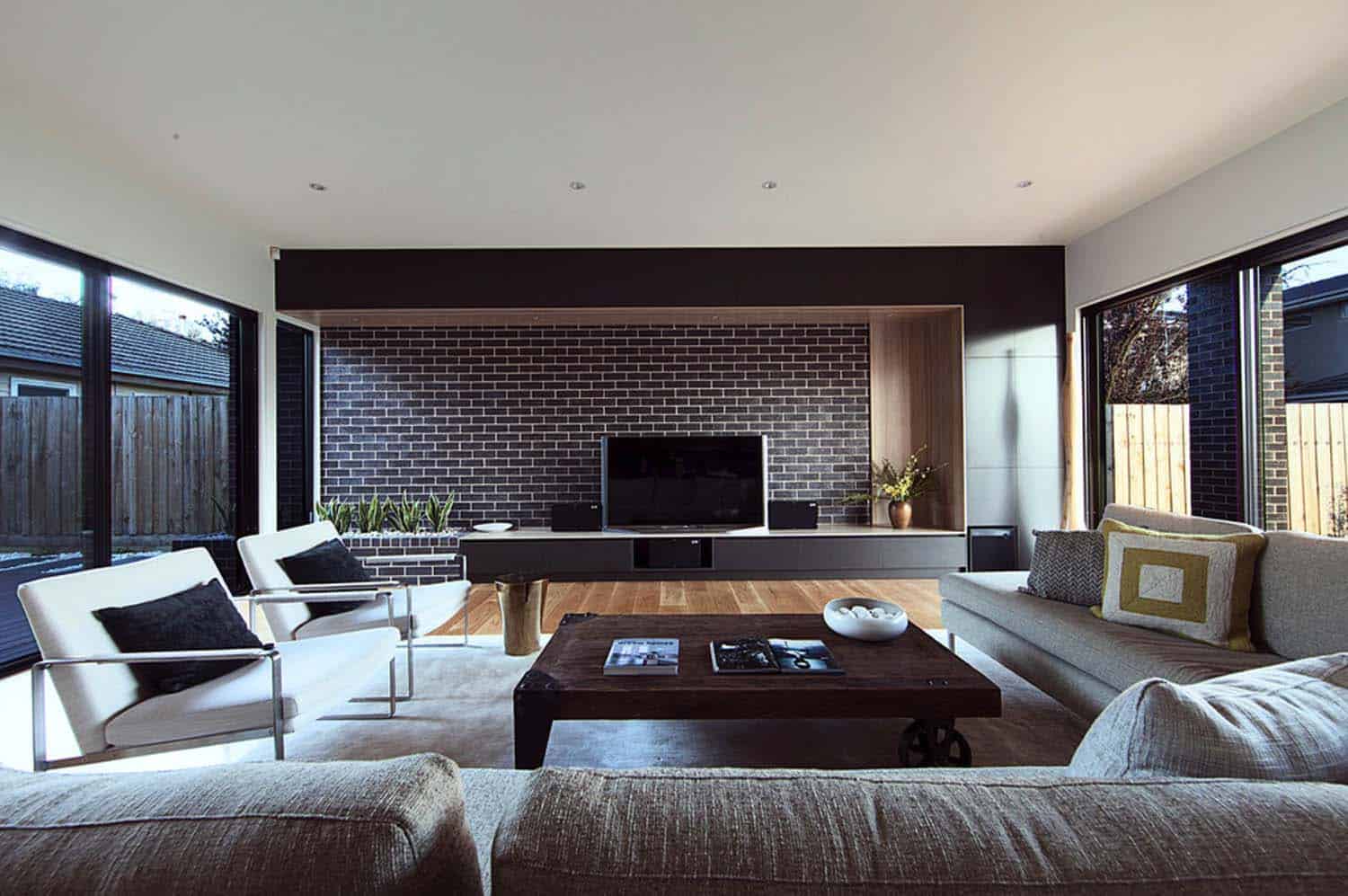
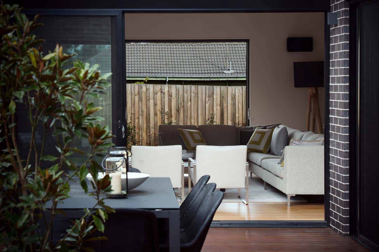
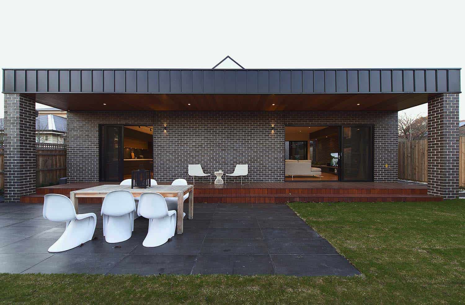
This area provides almost 1,000 square feet of living space, with walls of disappearing glass, blurring indoor-outdoor boundaries. This space connects to both the central courtyard and backyard, maximizing natural light.
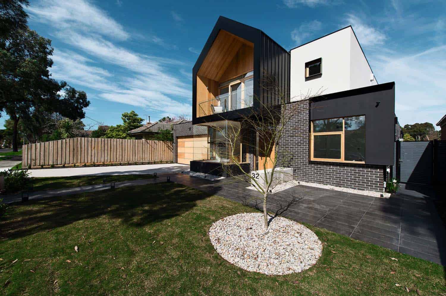
What We Love: This striking modern home was designed to compliment the neighborhood and cater to the homeowner’s lifestyle needs. Despite the tight budget, the overall aesthetics is very attractive, welcoming and livable. The design of the exterior facade with its contrasting materials offers great curb appeal—the earthiness of the brick, timber cladding, shiny metal and creamy white paint.
Readers, what are your thoughts on the overall design of this dwelling? It there any features that stand out to you or that you would have designed differently? Please leave your feedback in the comments below!
RELATED: Concrete and glass shelter with indoor-outdoor Aussie lifestyle
RELATED: Sensational family sanctuary positioned above the Yarra river
RELATED: Rammed earth house in Australia becomes a visionary design
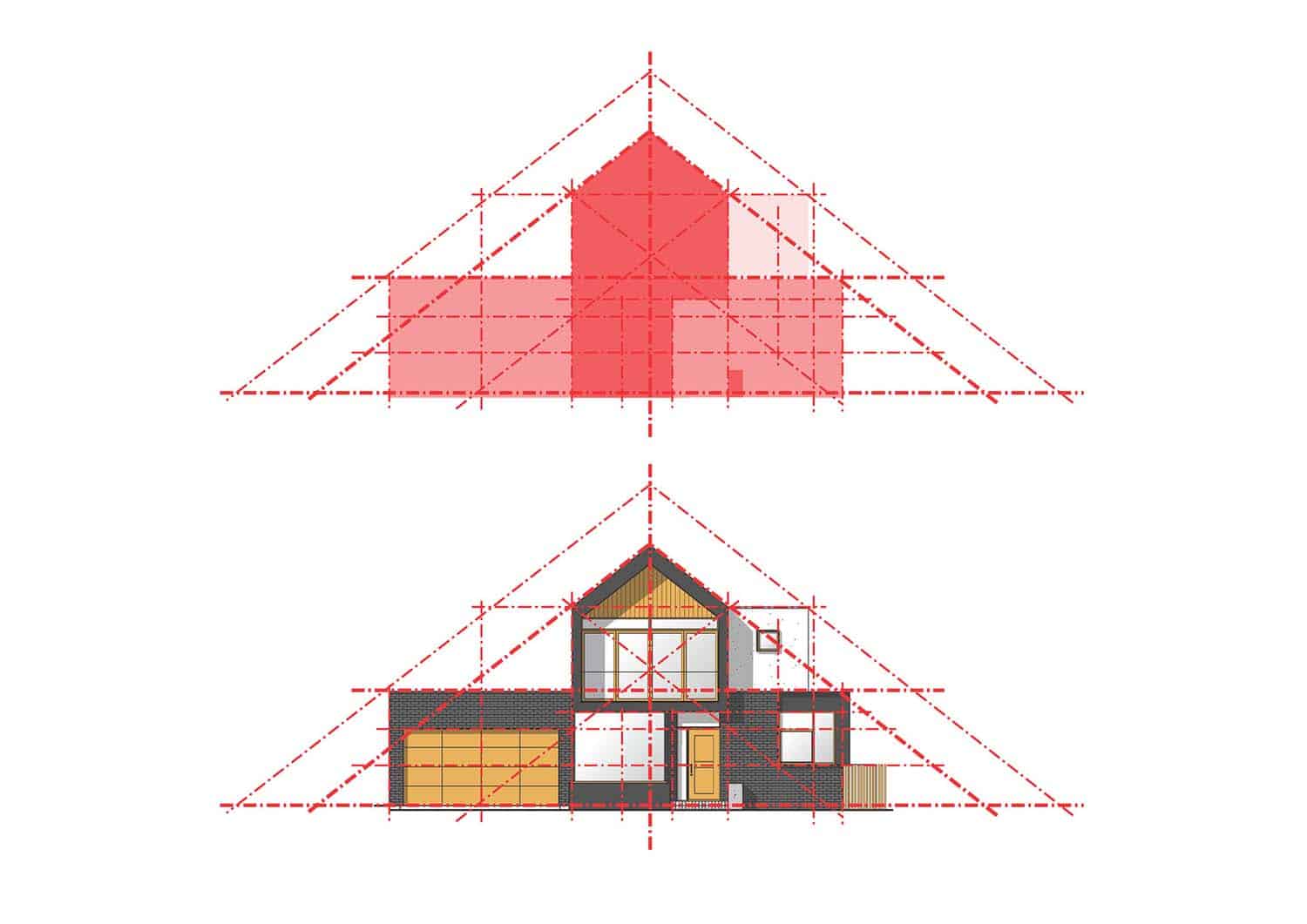
From the Architects: “After studying the neighboring structures of pitched and gabled roofs, a triangulated overall massing was selected to link it to its context,” states the architects. “Each façade element had its own articulation, whether it is the cantilevering of the upper floor balcony, the transparency of the large glass pane beneath it, or the small walk-in robe window with extruded frame.”
“The timber division lines of the master bed window, and the panelling of the timber garage door; all these elements were tied together under a unified colour scheme, and a loose geometric relationship which allowed one to read the underlying principles of such compositional structure, and yet not to be overwhelmed by its rigidity.”
Photos: Our Media Design Studio









1 comment