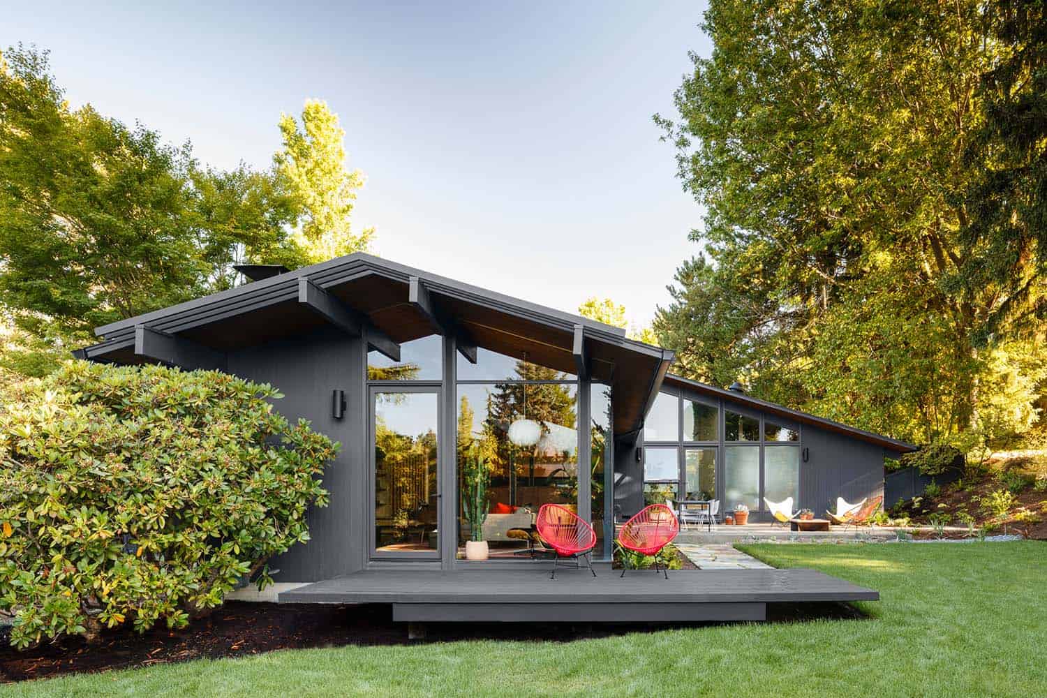
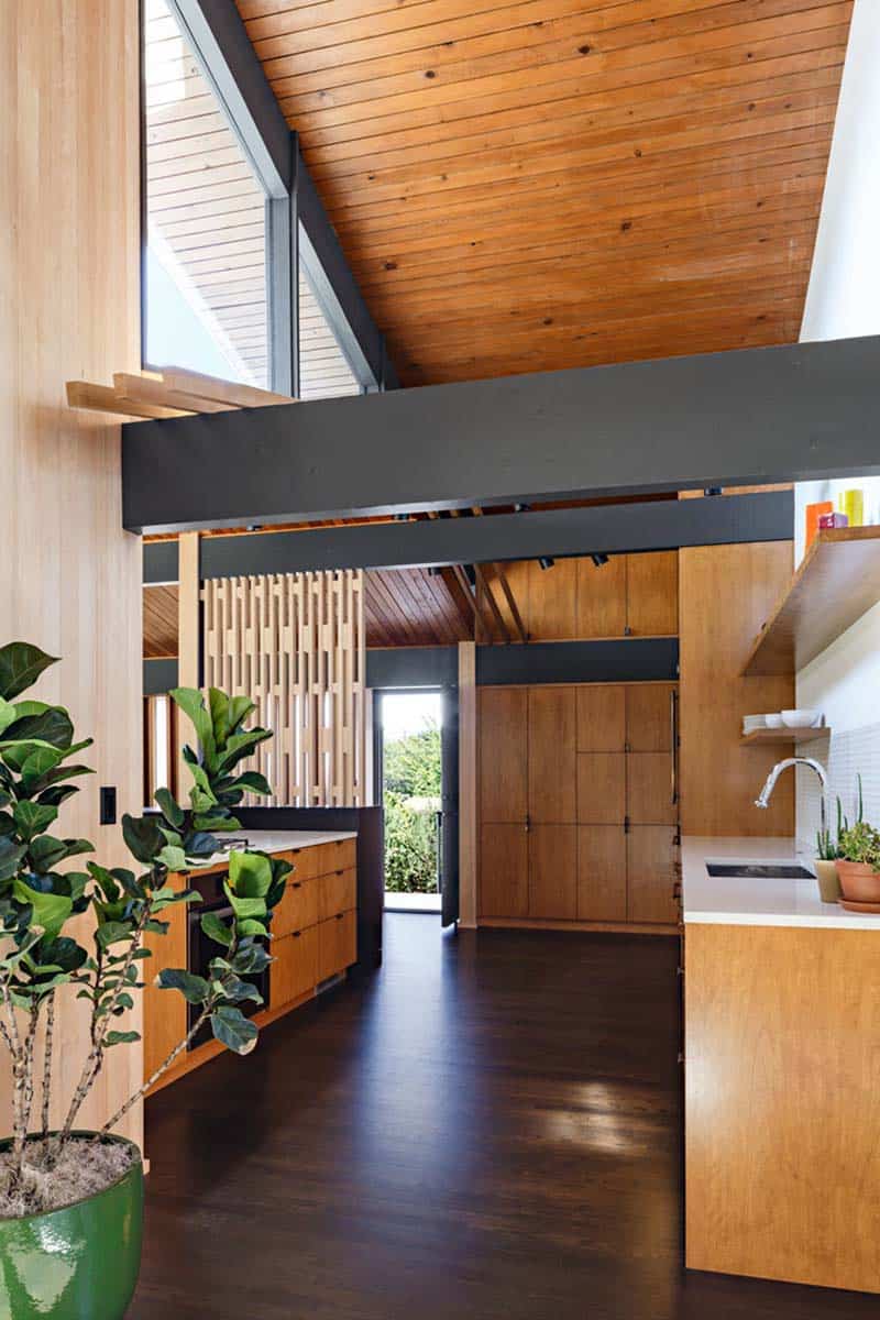
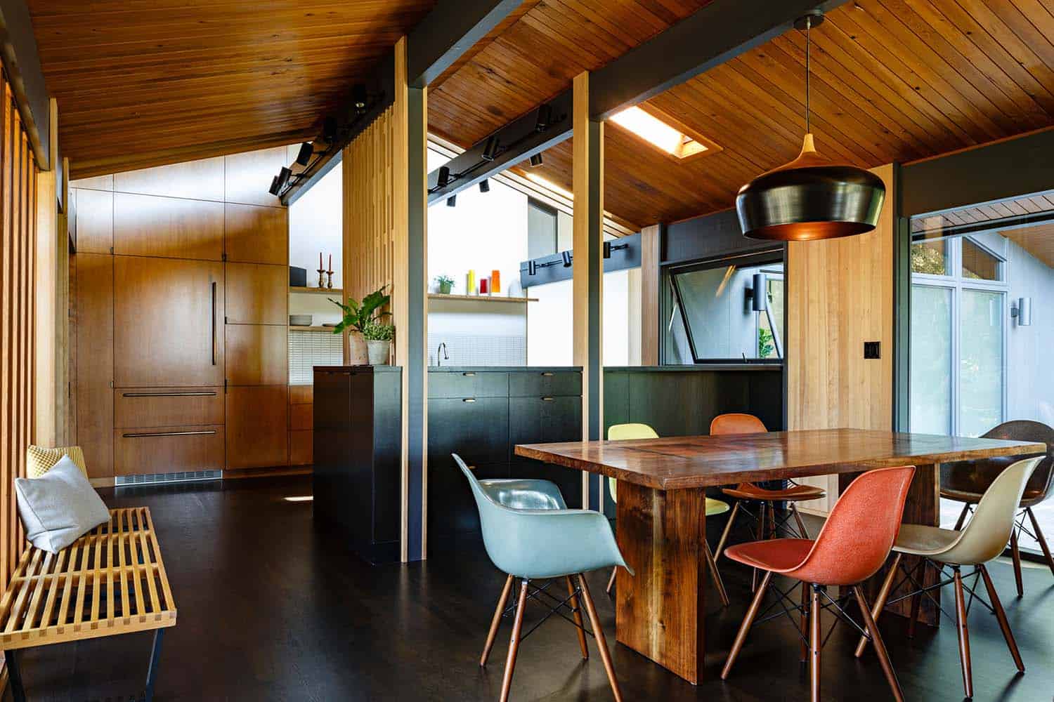
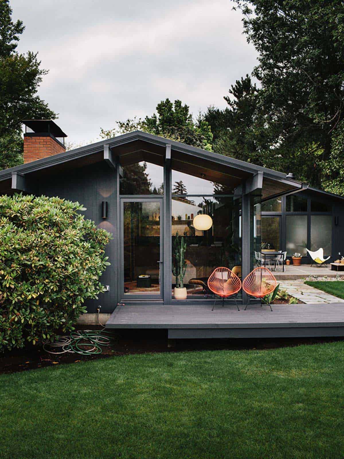
Jessica Helgerson Interior Design is responsible for the remodel of this stunning mid-century modern home by noted architect Saul Zaik, located in Portland, Oregon. The 1950s house had been poorly remodeled over the years, yet had some notable features to preserve, such as a sunken living room and expansive corner windows.
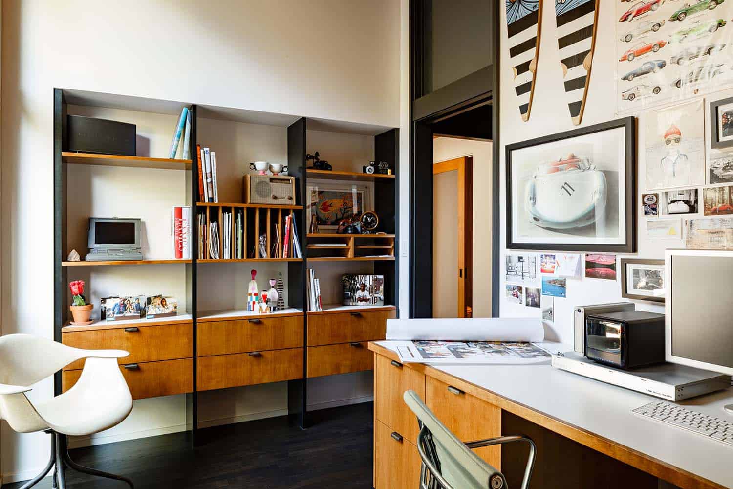
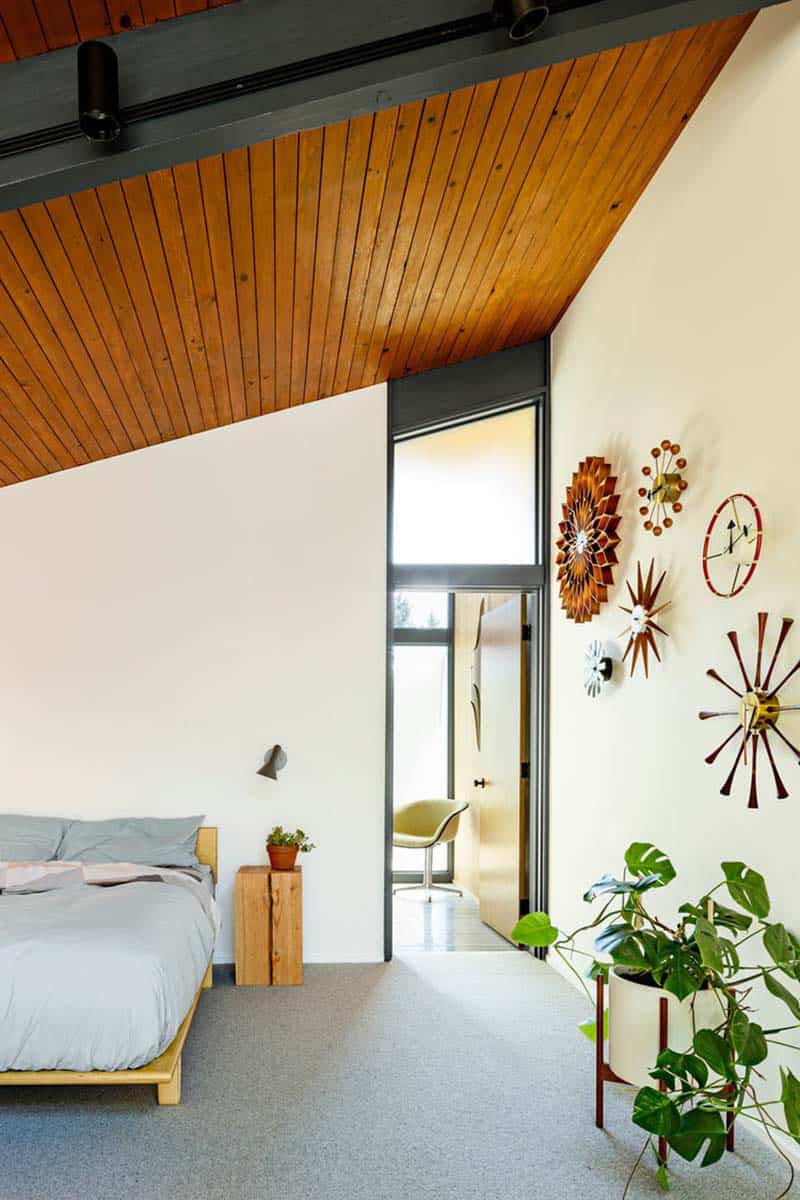
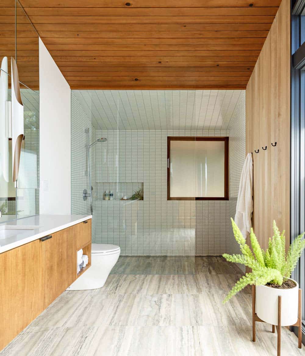
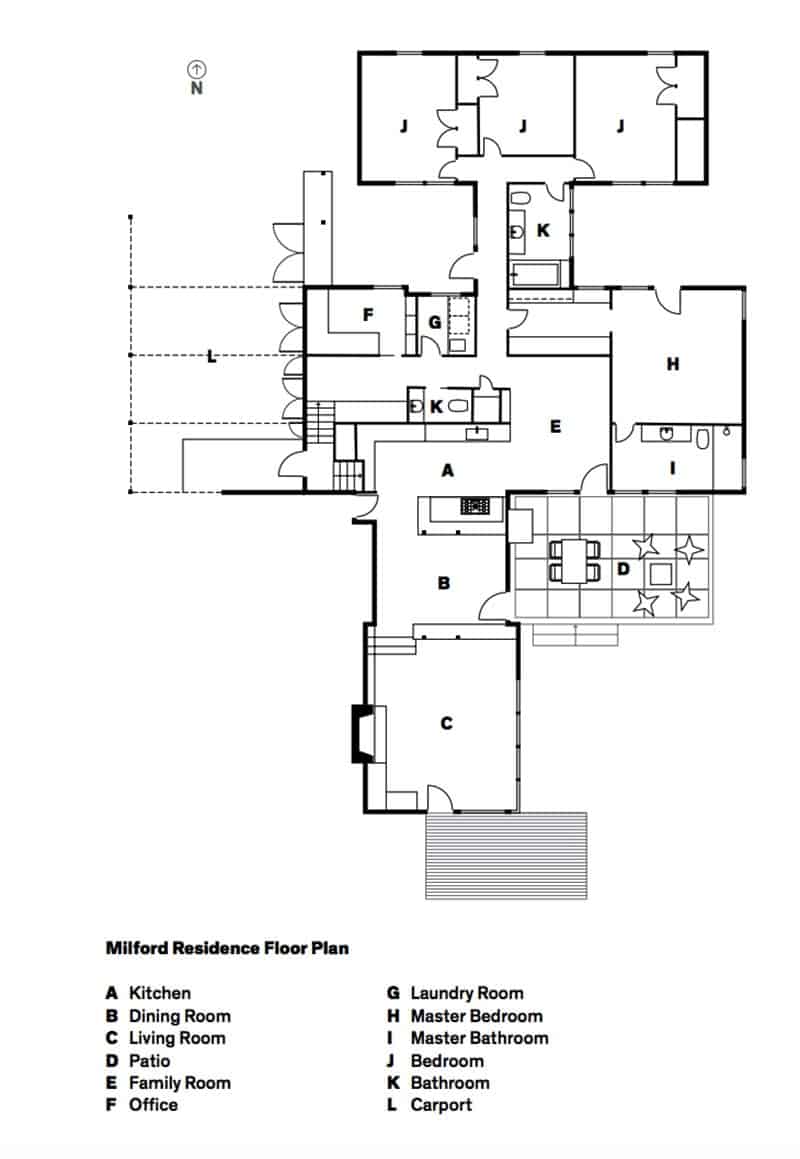
A past extension to this 2,600 square foot home included three bedrooms with aluminum windows and flat ceilings but didn’t match with the styling and details of the original character of the house. The renovation for a family with two young children encompassed relocating the master bedroom and bathroom to the back of the home and adding a mudroom, laundry room, and office.
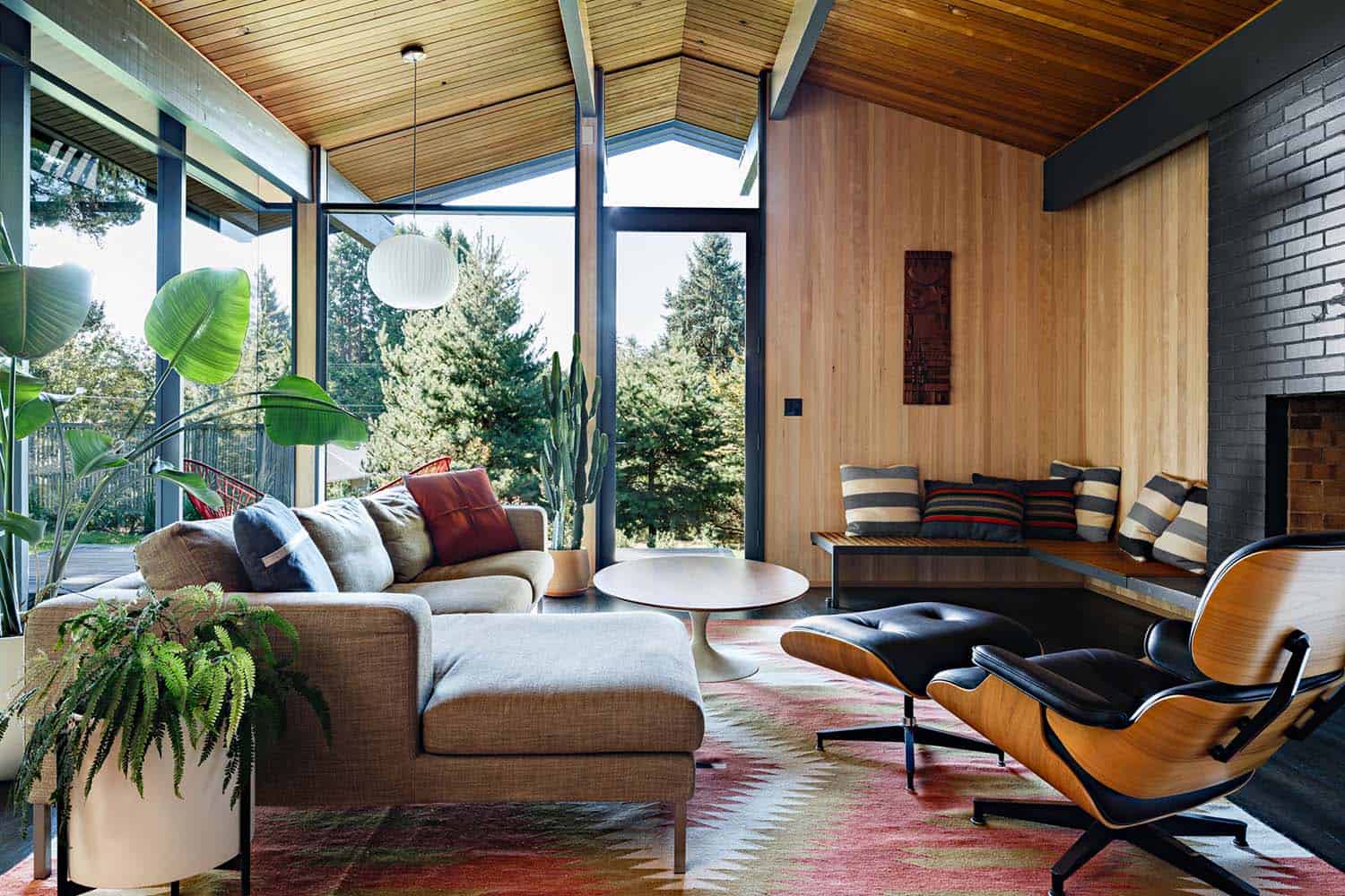
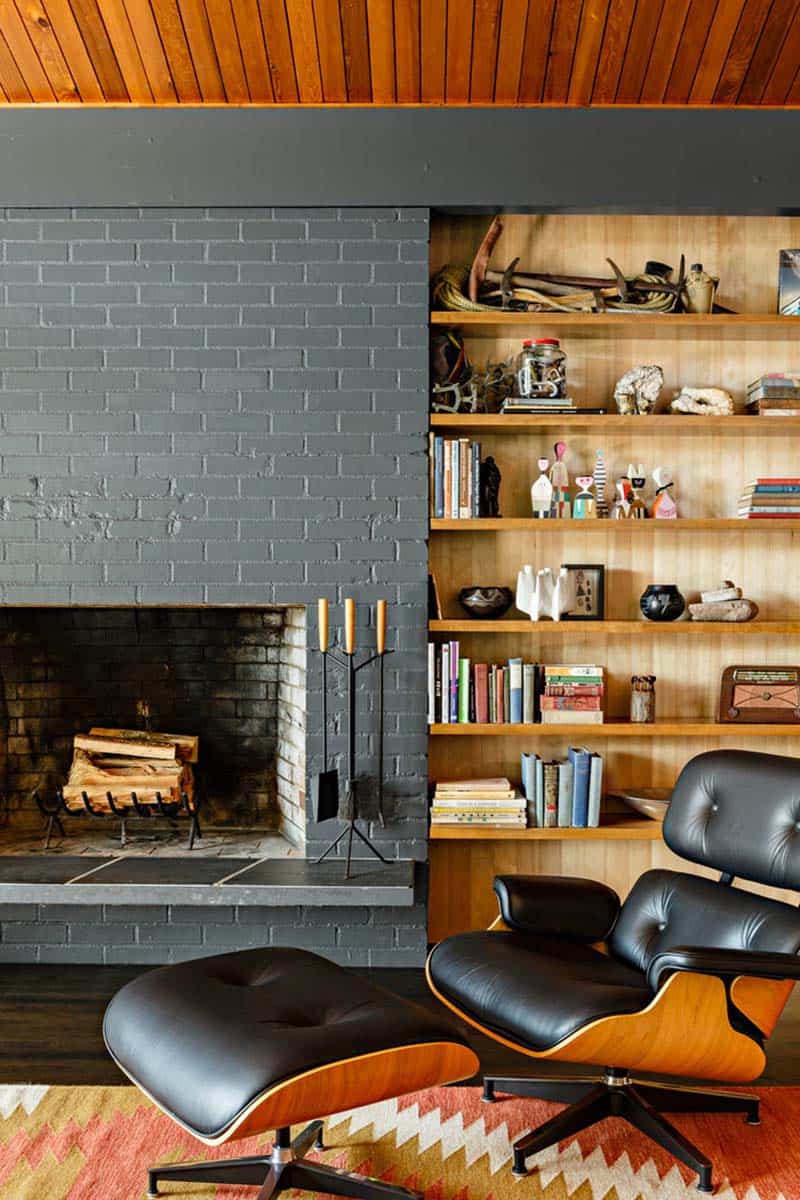
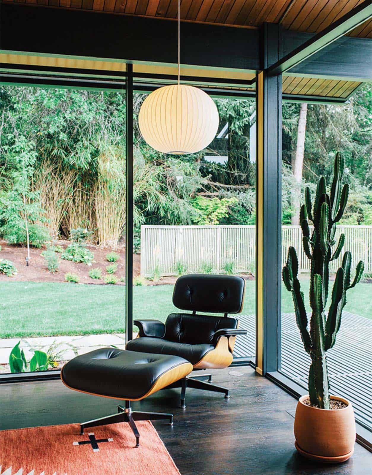
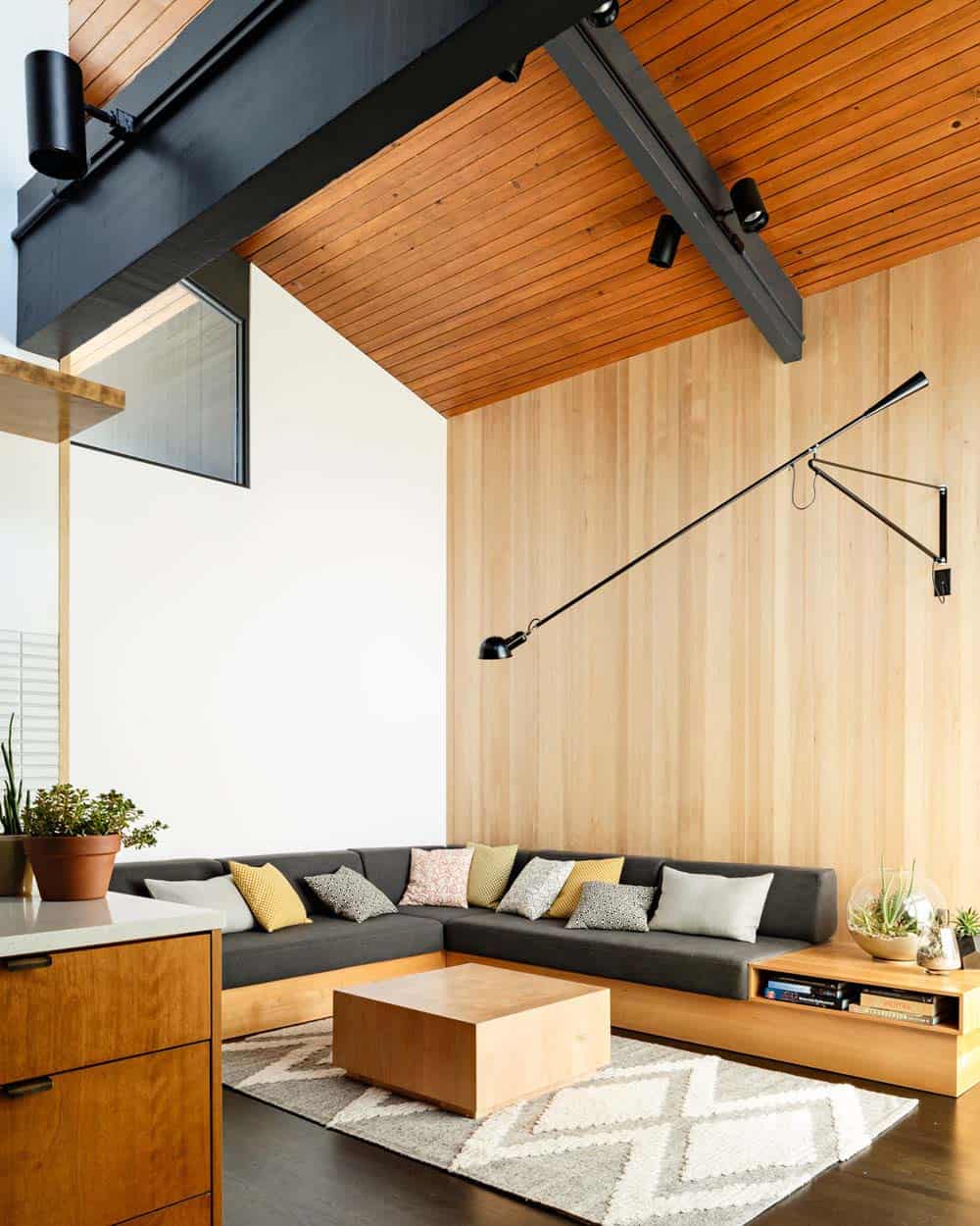
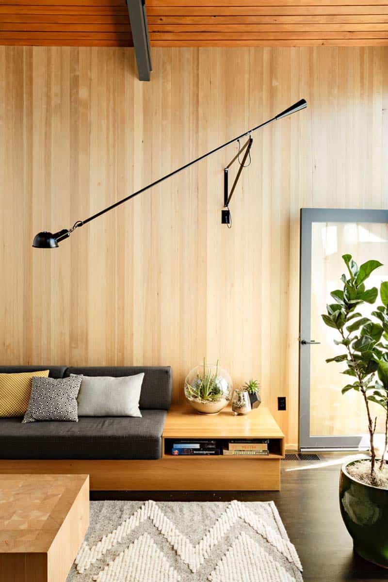
Above: In true mid-century fashion, a George Nelson Bubble Lamp hangs from the ceiling in the left corner of the room and an Eames lounge chair sits next to the fireplace. The glass walls are original features to architect Saul Zaik’s 1956 design. Material selections include Douglas fir on the ceiling, hemlock for the walls, and stained oak for the flooring.
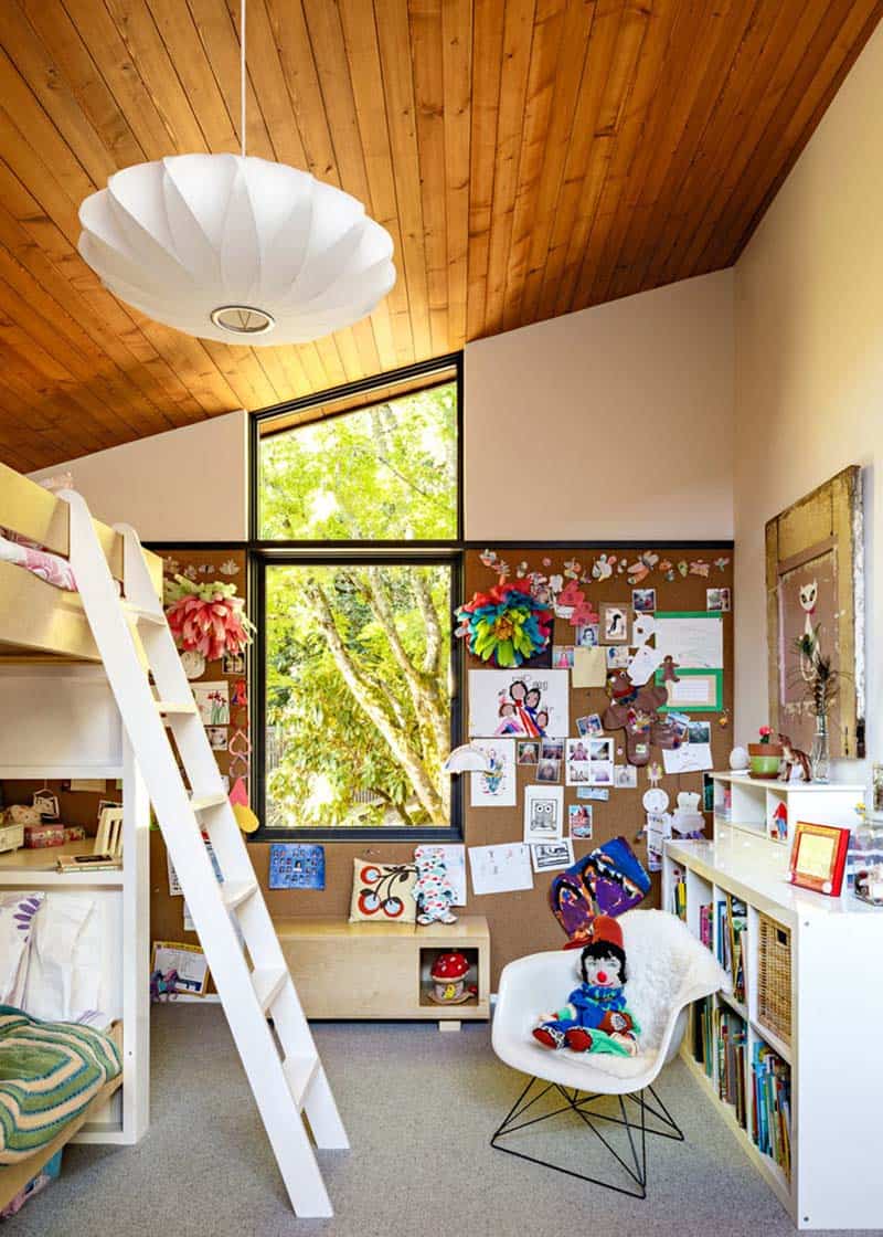
The family room was out of scale with the other rooms, so the proportions were reworked. Windows were upgraded throughout the home and vaulted ceilings were included in the addition. The goal of the remodel was to put back the part of Saul Zaik’s design that had been remodeled out of the house.
The result was a cohesively designed home where everything fit just perfectly. Every change the designer’s made, they pondered “what would Saul do?” Luckily the elder architect was still alive and came to the house to consult and bless the renovation. In the end, Zaik’s vision came to life, a fusion of indoors and out, with cozy, yet wide-open spaces that are both pristine yet casual.
What We Love: This fabulous mid-century renovation offers living spaces that invite you to relax and stay awhile. The way this home has been cleverly designed, it feels much more spacious then it actually is. With expansive windows inviting the outdoors inside, the interiors are flooded with natural light. Overall we are loving the simplicity of the design. It is warm and welcoming and authentic to the era of the house.
Tell Us: Please let us know your thoughts about this mid-century home transformation in the comments below, we love reading your feedback!
Note: Are you inspired by mid-century modern design? We have featured several here on One Kindesign, in case you missed them, have a look: Mid-century modern beach house retreat on Pender Island and Mid-century modern ranch house renovation.
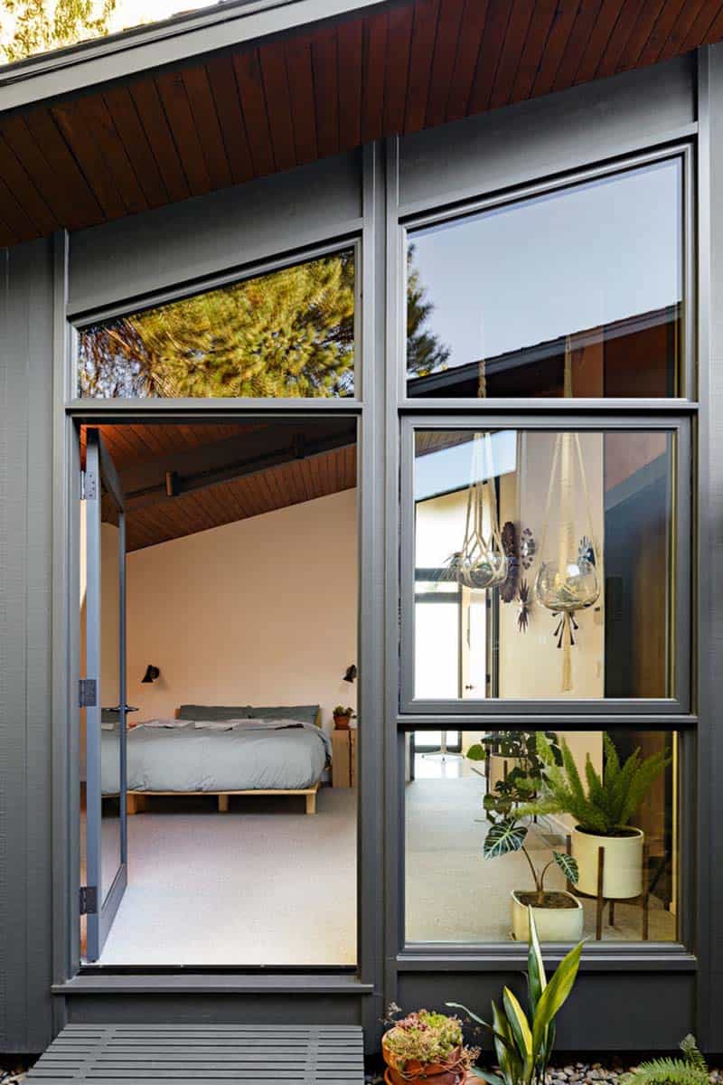
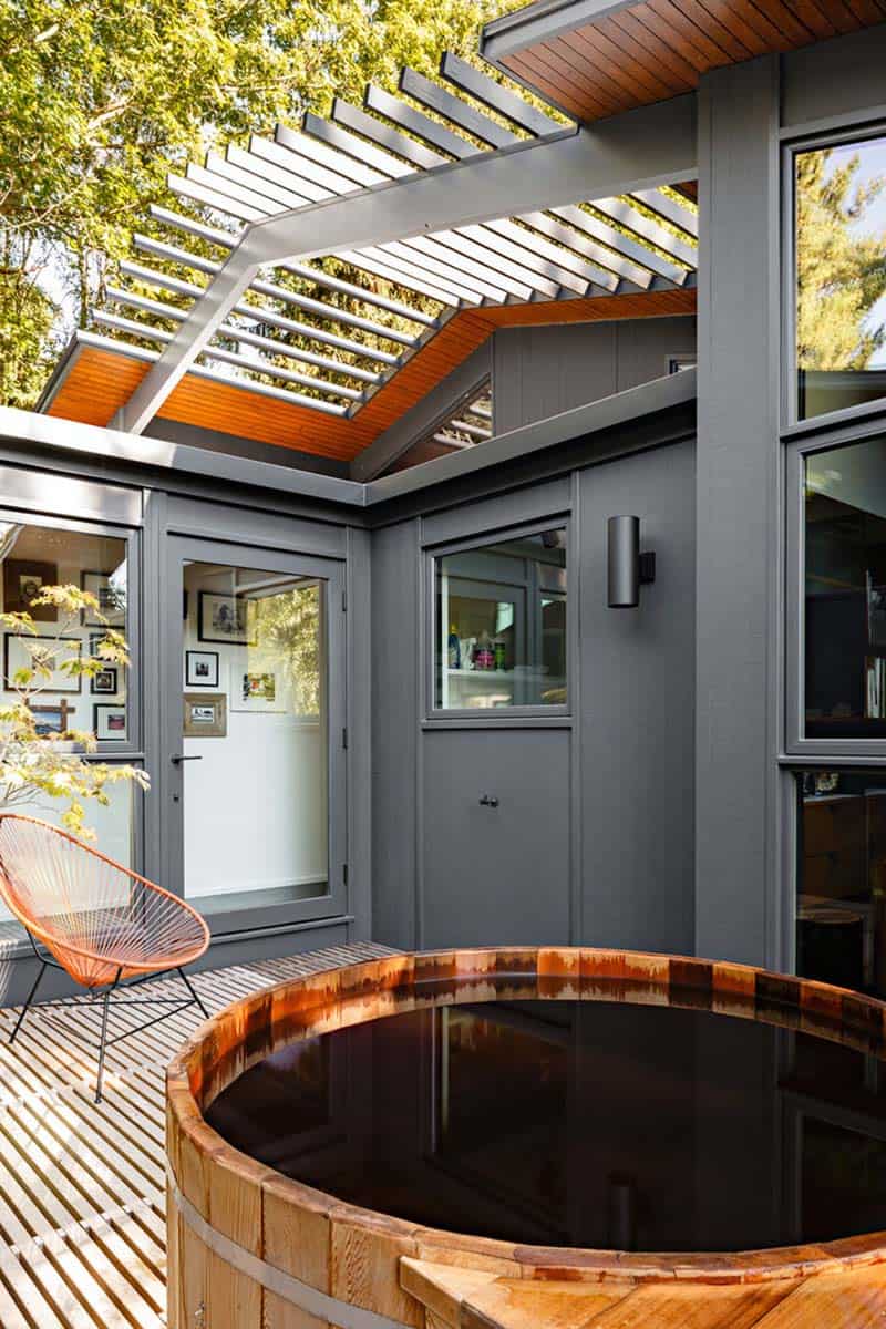
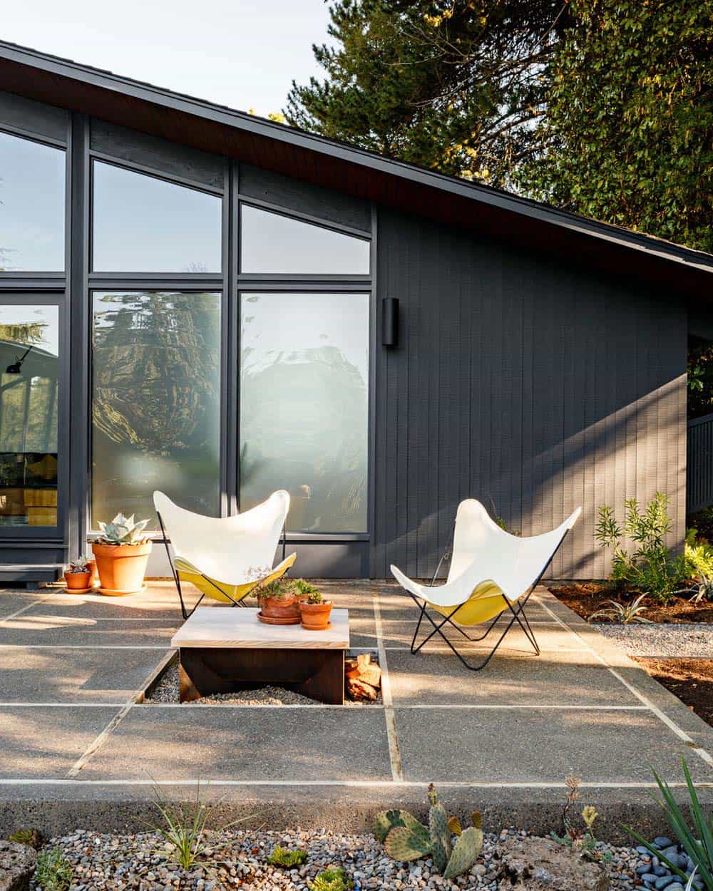
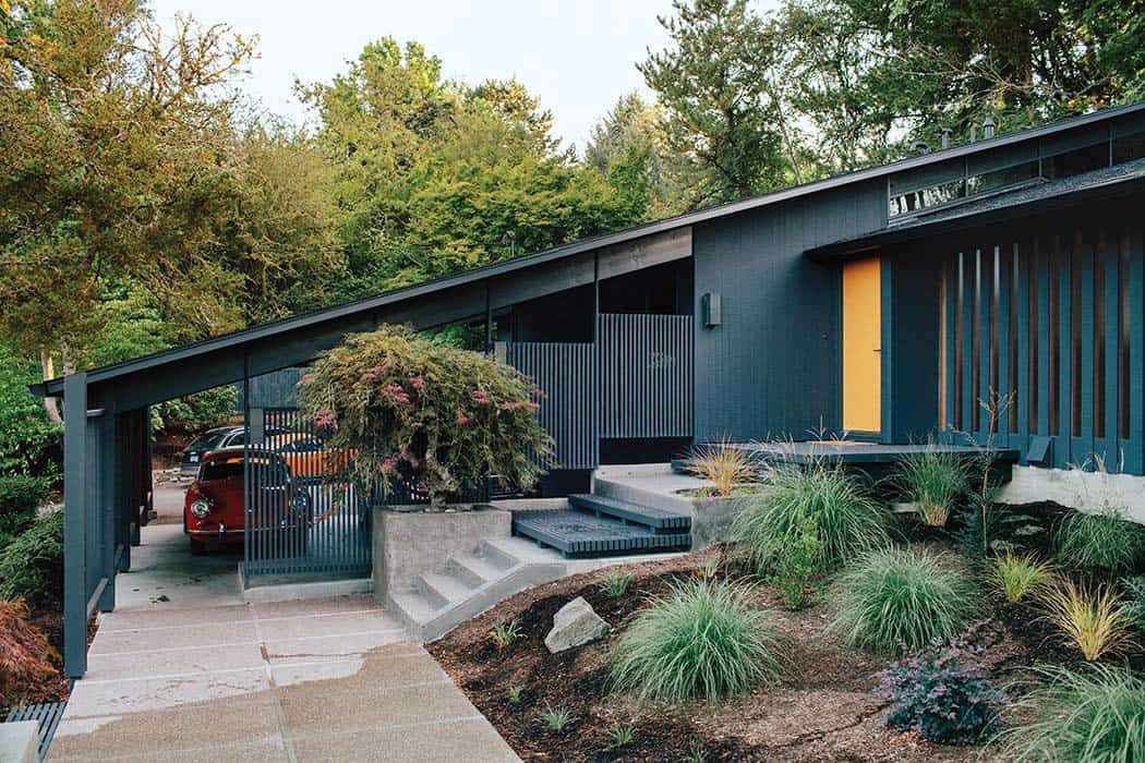
Above: The home features a crisp color palette of Benjamin Moore’s Wrought Iron for the exterior cladding and BM-Venetian Gold for the front door.
Photos: Lincoln Barbour


2 comments