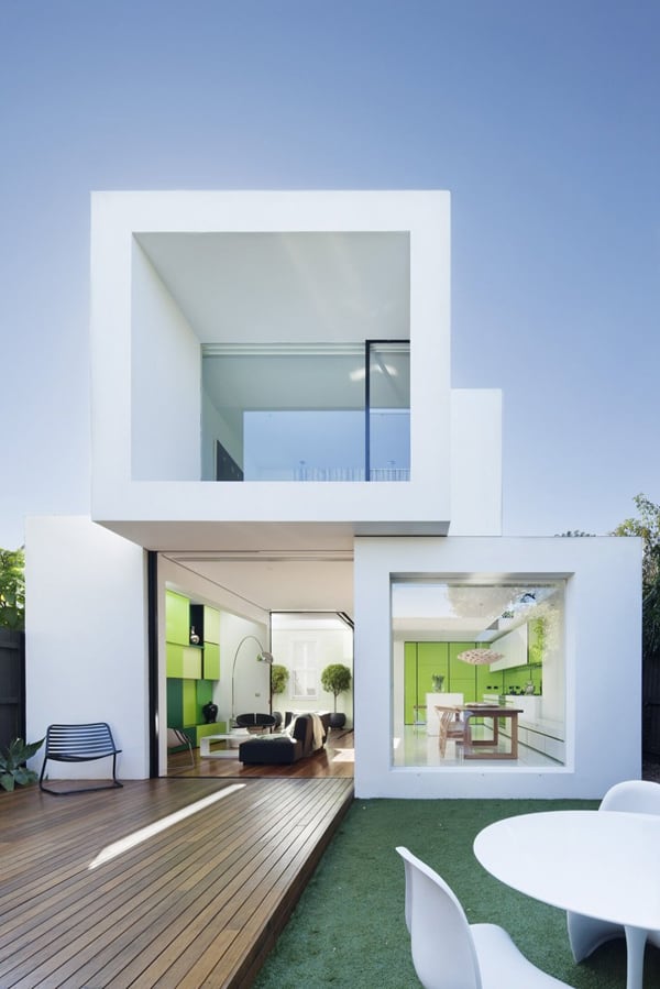
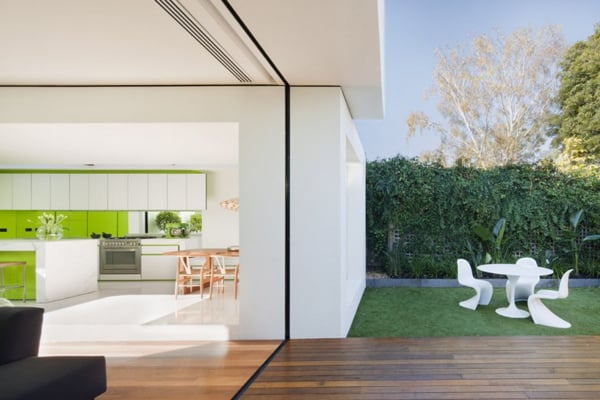
Shakin Stevens House was conceived as a functional and light filled home extending into nature by Matt Gibson Architecture + Design, located in Melbourne, Australia. The conceptual drive for the interior of this house is largely in response to a brief which crystallized into a need to be connected with ‘green’ space. Beyond the heritage front the project wanted to not necessarily increase floor area but to increase amenity. To make spaces feel bigger, more functional, to be light filled, and to visually extend & borrow from within and beyond the site.
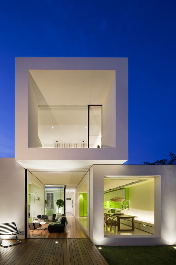
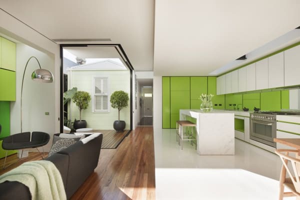
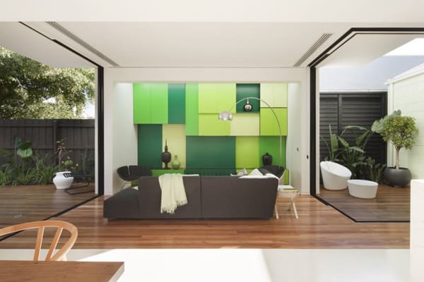
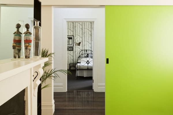
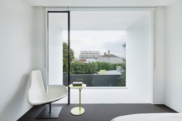
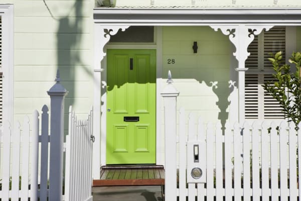
‘Shakin Stevens’ is not only about a colored front door but the experience of what’s beyond it. Conceptually beyond this green door, there are no doors; the newer space is about flow and continuity where delineation of space is soft and less finite than expected from the street. In a clear formal idea the rear composes 3 extruded white cubes that look essentially like they have been let go, landing like dice randomly on top of each other next to a Victorian ‘monopoly’) house. The 3 cubes, as with the existing villa, are composed so as to be immediately deciphered internally or externally and in clear programmatic zones all house different functions. The cubes which are opened at their ends (or sides where required) are utilized as devices to orchestrate views to green elements within the structure and to greenery within or beyond the site.
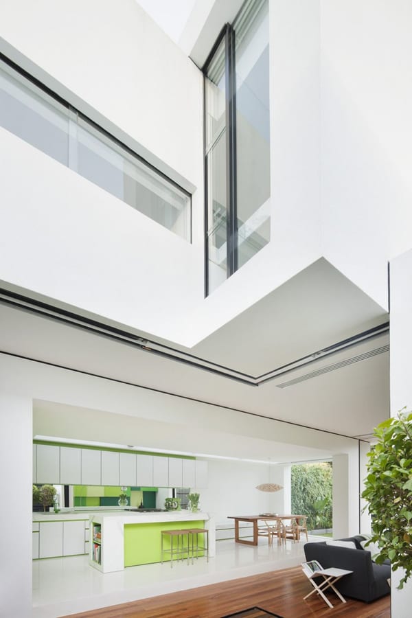
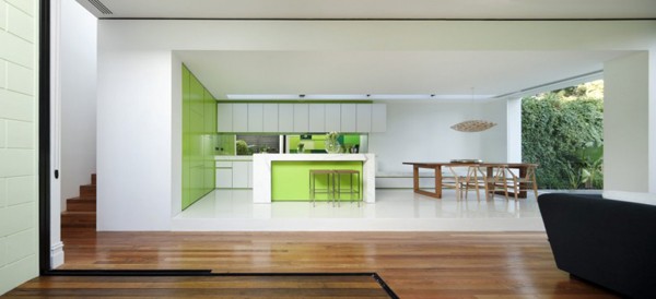
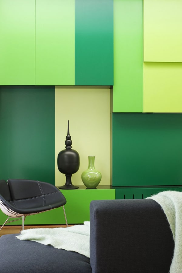
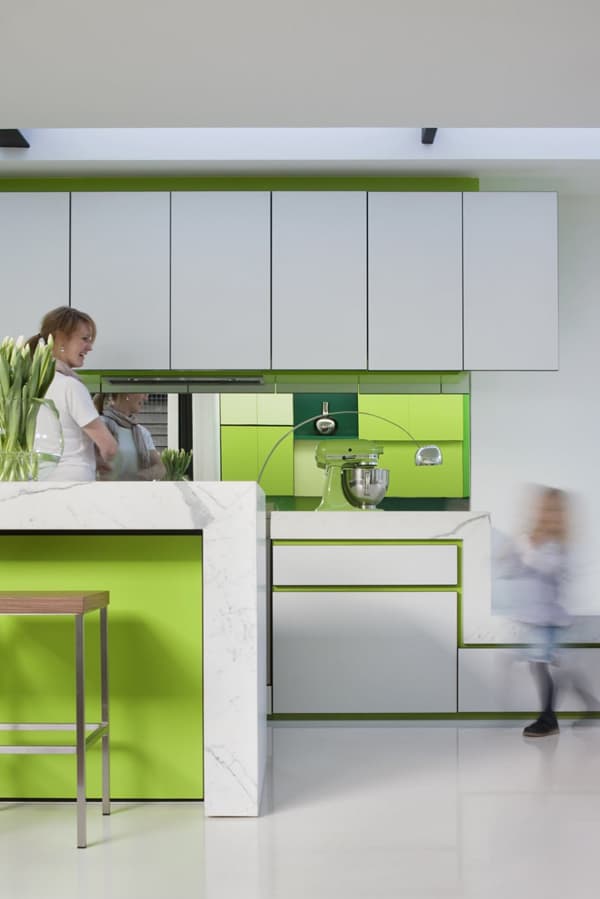
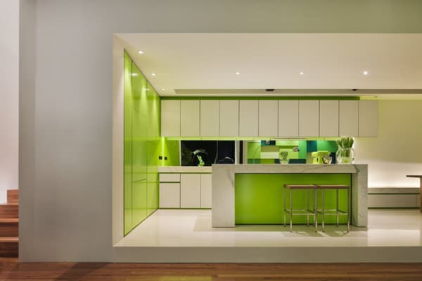
The client requested a predominantly white interior with a feature highlight color. Green became an obvious choice, working in combination with the proximity of the garden. The green spaces within and beyond the site became the focus with the white cubes acting as lens for these events – effectively assisting in bringing the green inside and dissolving barriers of enclosure. In this way interior, exterior, landscape & old and new – through color – all inform each other with equal importance.
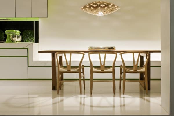
‘Shakin Stevens’ utilizes many ESD principles – retention of existing structure, orientation and configuration of new works, sun protection (eaves), exposed thermal mass, passive temperature regulation, low embodied energy construction techniques & materials, structural depth within walls for mass bulk insulation with R values, insulation of entire existing dwelling (floor, walls, ceiling), use of recycled timber flooring/decking. A grey water system, 2 side water storage tanks, fake grass & ‘succulent’ planting temper water usage whilst providing intrinsic features of the color scheme.
Beyond these this project is about providing a future robustness, better utilization of amenity and a more fuller embracing of its urban condition. They have borrowed what was previously laying dormant within and beyond their walls. This new layout provides for a sustainable model of space/s that can sustain user types (a couple, 2 couples, a family with teenagers, guests) through separation of sleeping zones about a flexible living zone that they can upsize (externally). This project embraces it’s ‘green-ness’. Color was a vital strategy in adding glow and clarity to this expression on a number of levels.
Photos: Courtesy of Matt Gibson Architecture + Design


0 comments