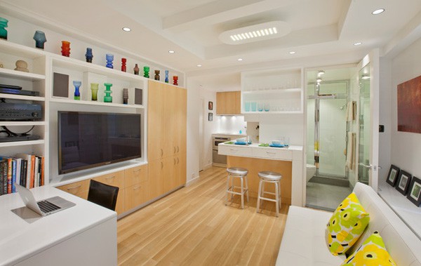
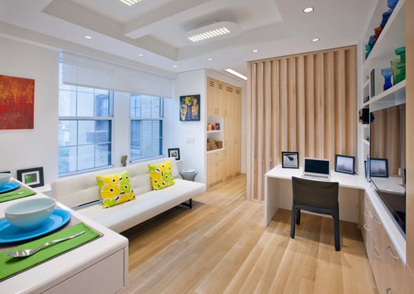
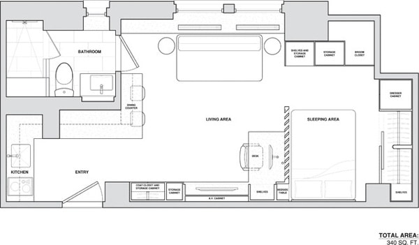
Micro Apartment is a 340 square foot studio apartment that has been designed by Allen+Killcoyne Architects, located in Manhattan, New York. The client is a Dallas-based retiree who wanted something close to his daughter and grandchildren, this studio is located in their building. He wanted a home that looked “clean, simple, elegant and timeless,” states the architect. Instead of creating one open room to make the space feel bigger, the architect established separate interconnected zones for living, eating, working and sleeping. The space also has large storage requirements with cabinetry that wraps throughout the space. All of this is accomplished in a tiny space without the need for multi-functional pieces. “The place feels bigger,” the architect says, “because you get three major rooms out of it. You don’t feel like you’re trapped in one box.”
“I really wanted to create rooms that flowed together, but at the same time, you had separate areas that defined different living spaces,” says the architect. It’s not the space that proves limiting, Killcoyne concludes. It’s the stuff you’re trying to cram into it. “If you can control the amount of things you own,” he says, “you can live in small spaces very nicely.” This is speaking from experience, as the architect has raised two children in a 650 square foot apartment.
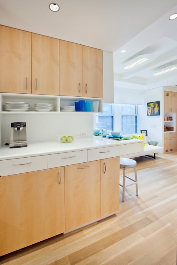
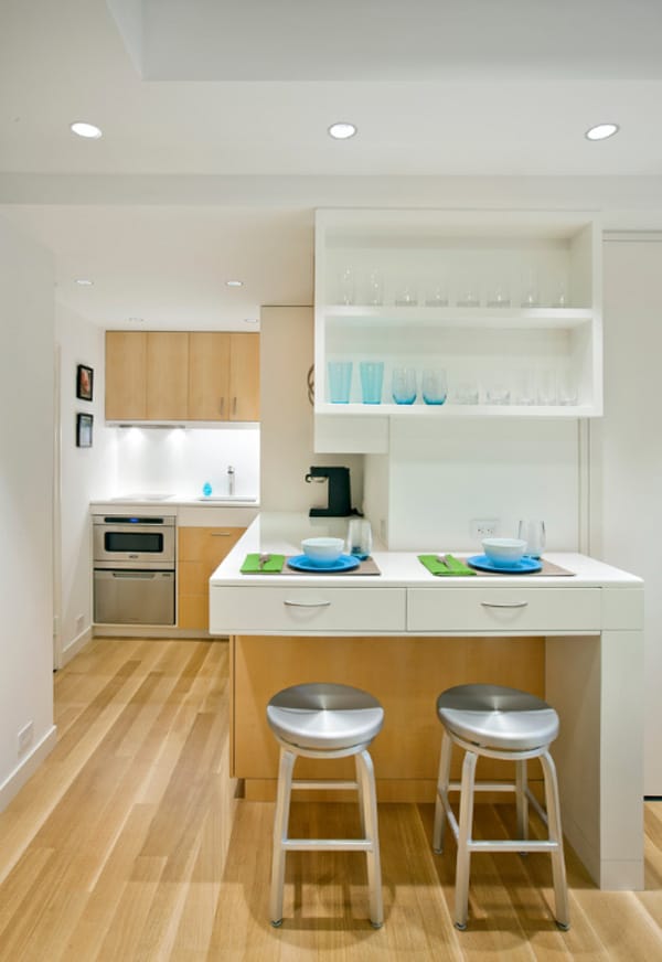
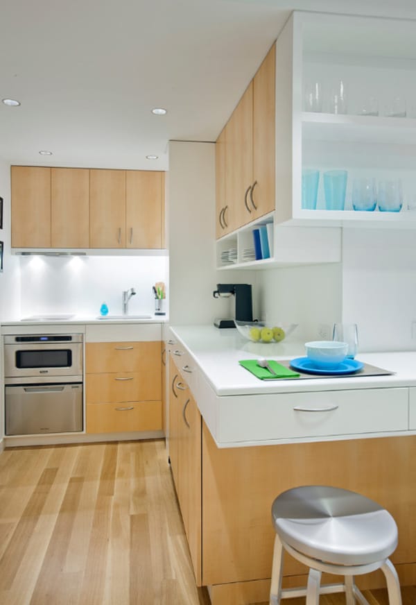
To maximize storage in the kitchen, Killcoyne set the counters at 41 inches (instead of the normal 36), allowing him to tuck an additional row of drawers under the top. A row of open shelves makes access to everyday items easy and keeps the cabinet faces from looking too closed off.
A discreet shadow line divides the cabinets from the ceiling, in lieu of space-hogging moldings.
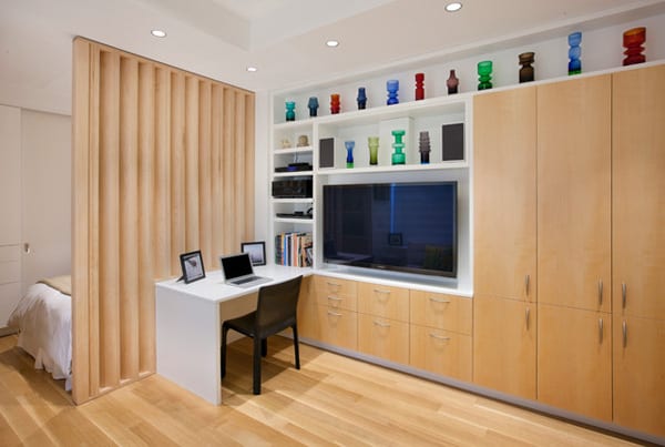
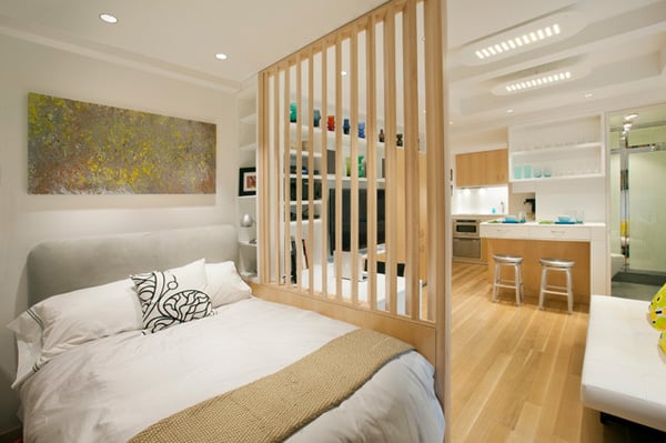
The bed is tucked behind a custom louvered partition, which shields the sleeping area from view unless you’re seated at the desk. The storage wall includes ample space for hiding clutter and holding electronics, while still offering room for displaying art and collectibles — the personal touches that keep the apartment’s precision from feeling too antiseptic.
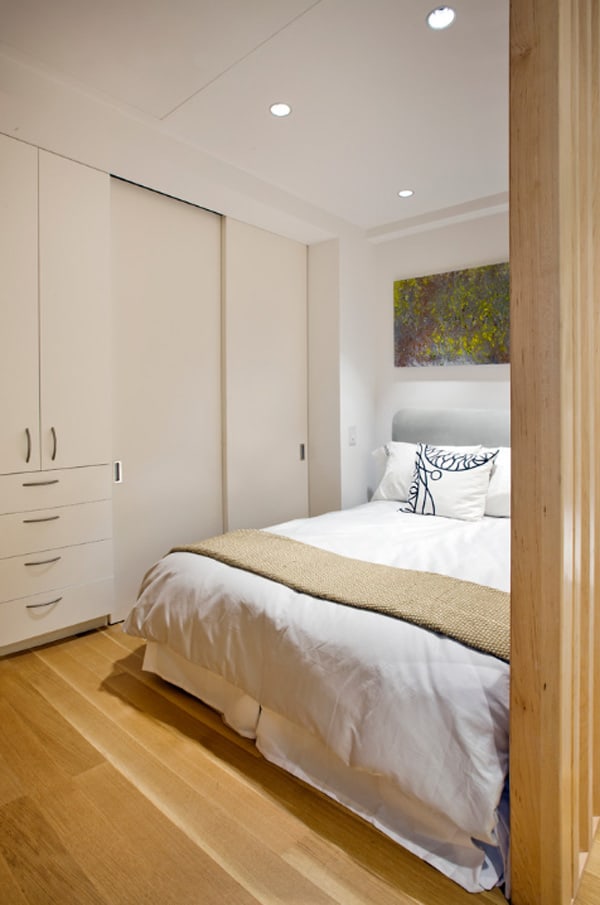
The sleeping area accommodates a queen-size bed, several storage closets and 10 linear feet of hanging space.When the owner said he wanted to include a large flat-panel TV here, too, Killcoyne realized the only place to put it was in the ceiling. If you look up, you’ll notice the outline of a trap door that flips down to reveal the screen.
The louvered wall makes the bedroom feel less claustrophobic, Killcoyne explains, while screening it from most angles of the apartment. The painting above the bed is by Thomas Hubben.
To ensure that spaces flowed smoothly, Killcoyne limited the palette to rift-cut oak floors, quartersawn maple cabinets and Benjamin Moore’s aptly named White paint. He lowered the ceiling around the perimeter to accommodate recessed LED fixtures, but left the center full height to help define the living area and maximize the vertical space.
While the kitchen is open to the rest of the space, it’s tucked away in the corner, “so you don’t feel like you’re cooking in your living space,” Killcoyne says. The homeowner doesn’t do a lot of cooking when he’s in residence, so appliances were limited to a microwave oven with a dishwasher drawer below, and a two-burner induction cooktop with a vent concealed in the bottom of the cabinet above.
This space also doubles as the entry hall; the front door is to the left of the oven.
The refrigerator and ice maker are hidden behind the wood doors underneath the counter, which is fashioned from a 1¼-inch slab of commercial white glass called Glassos. “Glass is fabulous, because it doesn’t stain,” says Killcoyne, who also used the material to cover the walls in the bathroom.
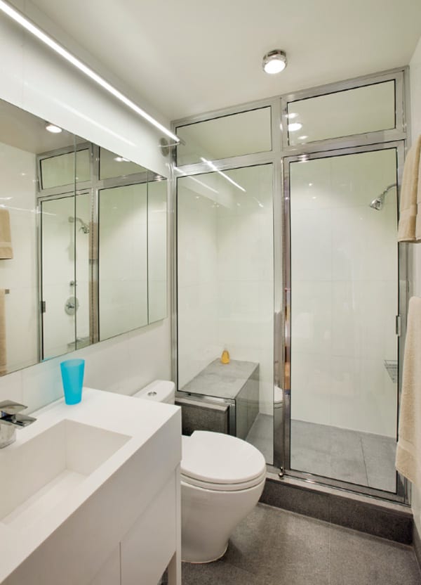
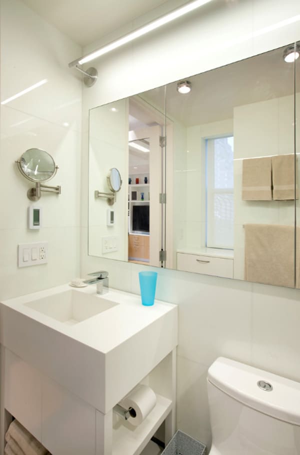
Thinner (¾-inch) sheets of Glassos cover the walls of the bathroom, reflecting light and making the space feel bigger. There’s an integrated Corian sink and a fully enclosed shower. (While it’s not a steam shower, it comes close when the transom windows are closed.) The floors are flame-finished granite.
The far-left mirror panel swings open to reveal a medicine cabinet. Even the toilet paper is tucked out of the way to preserve the room’s clean lines.
Photos: Courtesy of Allen+Killcoyne Architects



0 comments