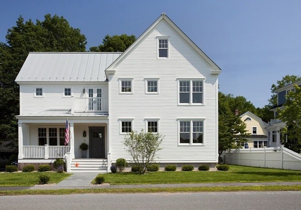
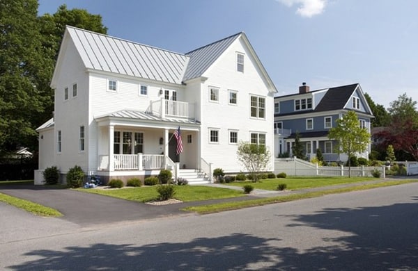
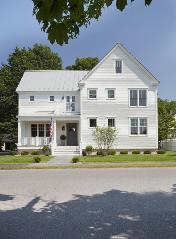
Concord Green Home is a transitional style green home which has been designed by ZeroEnergy Design, in collaboration with interior designer and homeowner Kauffman Tharp Design, located in a neighborhood of existing older homes in Concord, Massachusetts. This home is a walkable distance from the center of town. Among the design priorities of the homeowner was to be a healthy home with excellent air quality, to use Not So Big House principals to maximize space, to be energy efficient, and to anticipate future uses and needs as owners change. The design evolved from two iconic Massachusetts vernacular precedents: the farmhouse and the iconic Cape Cod and Islands style. The overall form is taken from the former, while the latter provided inspiration for details like the clean white trim. Both precedents also inspired “rough luxe” meets coastal interiors.
To maintain health and air quality, eco-friendly elements include a fresh air ventilation system with energy recovery, a whole house HEPA filtration system, radiant and radiator heating distribution, and low/no VOC materials. The home’s energy performance focuses on passive heating/cooling techniques, natural daylighting, an improved building envelope, and efficient mechanical systems, collectively achieving overall energy performance of 50% better than code. To address the site opportunities, the home utilizes a footprint that maximizes southern exposure in the rear while still capturing the park view in the front.
“A metal roof is the right place to invest, not only for its durability, but also for its aesthetic,” states the architect. Those little details you see at the edge of the roof are snow guards, which keep the snow from sliding off the roof into huge piles on the ground.
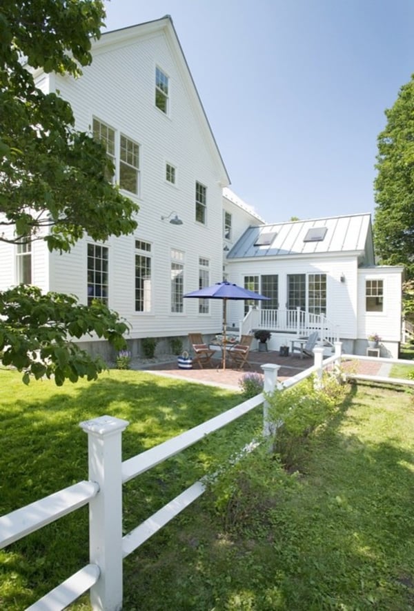
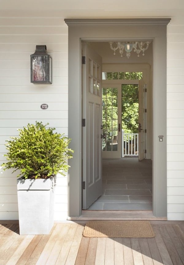
The front door opens into a hallway that extends from the front of the house to the back, providing a view to the backyard as well as a straight line to a door that leads to the patio. “It’s a ‘stone runner’ that connects the front yard to the backyard,” explains the architect. In fact, the same bluestone is used in the form of pavers on the front walk, covers the hallway, and then continues out on to the patio. This creates a strong connection from the front yard through the house and out to the back yard.
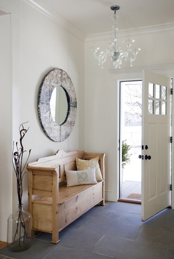
The entryway incorporates farmhouse touches like this bench, it also has an open, light and elegant style throughout, hinted at via the Murano glass chandelier. Healthiness begins at the front door; remove your dusty shoes and pop them into the storage bench so as not to track dirt indoors. Continuing the war against dust, dirt, pollen and other allergens, the first floor utilizes radiant heat flooring throughout. This kind of heating is a healthy alternative to forced air system because it helps keeps allergens from circulating.
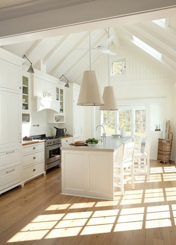
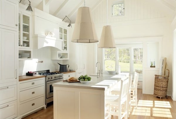
“The kitchen is the living center of home life these days, a place where everyone loves to spend time,” explains the architect. “We wanted to embrace this and celebrate the kitchen space. Thus, it has the cathedral ceiling, the views outdoors, and can be used in a number of ways.” Flexibility was built in, providing places for cooking, drinking morning coffee, gathering, having a meal or doing homework. The cathedral ceiling gives this kitchen an open feeling, making it seem larger than it really is. The skylights and glass doors let the light from the southern exposure flood the space. These doors also extend the kitchen out onto the patio, providing access both physically and visually.
Floors throughout the first floor are heart pine.
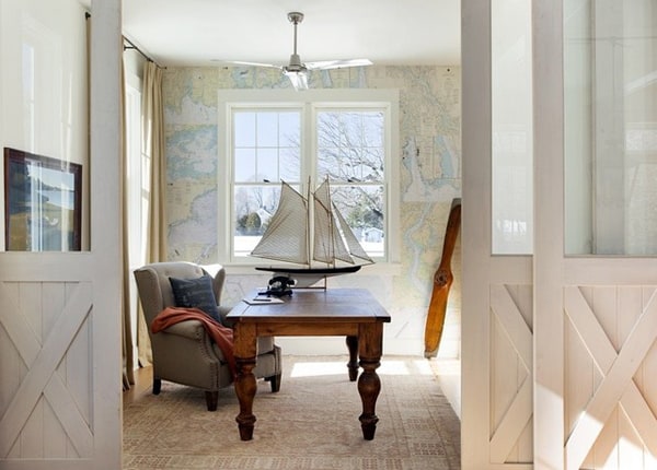
This nautical-themed space is in what’s known as an “away room,” which is a quiet spot that can be isolated from the rest of the house. Part of smart, sustainable design is to plan for the future and provide multiple uses within the floor plan. While a current owner needs an office, this room also connects to a full, ADA-accessible bath and can serve as a first floor bedroom if their needs should change or if future owners have different needs. The doors have been outfitted for window treatments for privacy should this change ever take place.
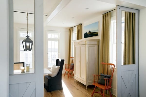
These doors provide a farmhouse vernacular detail on the bottom, and the glass on top allows the away room to share natural light with the dining room. When necessary, they can close off the away room, but they can be opened to make both spaces feel larger.
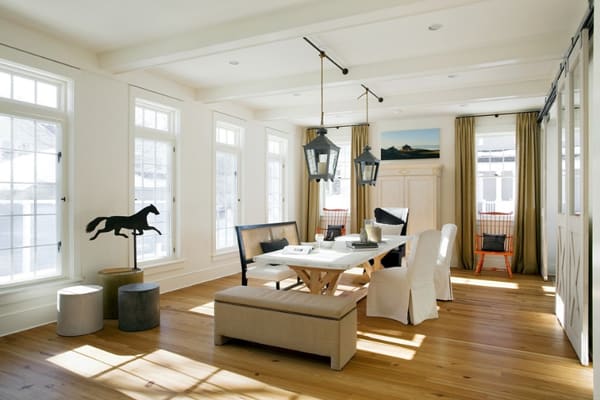
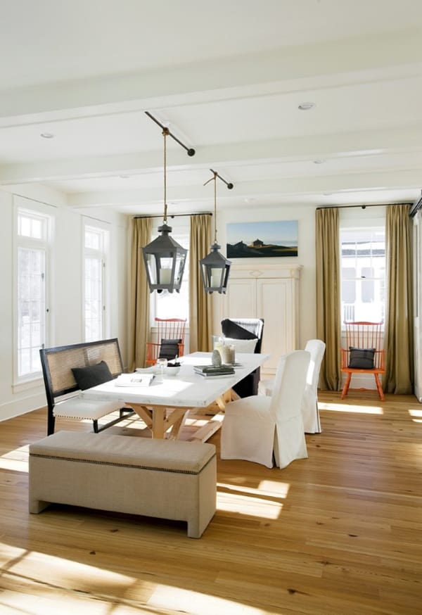
Kauffman Tharp scored the candle lanterns from Vagabond Vintage and gave them a makeover that began with “a paint wash that looks like zinc,” she says. “We tied them with thick, rough manila rope to plumbing pipe that spans between the ceiling beams (I did a bronze paint wash on the pipes to match the curtain rods). Battery-operated pillar candles from Restoration Hardware have built-in timers.”
Tip: “Hang natural linen draperies high and wide at the windows to add verticality to the space, while blocking none of the natural light,” Tharp advises.
The large custom Belgian linen pendants make a style statement that stands up to the scale of the ceiling, yet blend with all of the natural textures and colors in the room. While the heart pine counters lend a farmhouse feel, the island’s counter is a more contemporary concrete surface. The island is 10 feet long and incorporates a Shaw’s Original Farmhouse sink, re-purposed cabinets, and a pair of Miele dishwashers on one side, as well as seating on the other side.
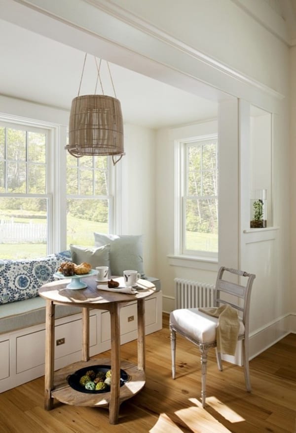
This nook is “a really great informal and comfortable way to incorporate more seating into the kitchen; seating that has a view outdoors,” states the architect. As a bonus, it includes extra storage under the cushioned bench. As for the nook’s furnishings, Kauffman Tharp says, “I love to use items intended for a completely different purpose in a whole new way. I was attracted by the texture of this basket I found on sale at West Elm. I turned it upside down, hung it with jute twine, and paired it with $9.99 spot lights from IKEA “High style for low money. Fun.” The antique table is from Spain. Kauffman Tharp fitted it with an iron bowl on the bottom shelf, which once held hot coals for warming one’s feet.
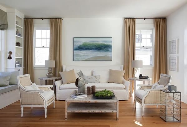
The furnishings in the living room have a bit of Belgian flair, industrial touches, and the overall feeling of an elegant yet relaxed coastal getaway. “Industrial and vintage elements keep it interesting,” Kauffman Tharp says. “I repurposed an old glass pie display as a side table with seashells inside, and the rusted tin chimney piece from France acts as a quirky foil on the low table.”
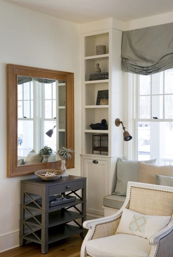
Similarly, seating areas and built-ins were designed for the living room. “The furniture and what would be happening between the windows and walls was always part of the plans.” A large mirror in the living room makes the space feel larger and reflects light and a view of the park.
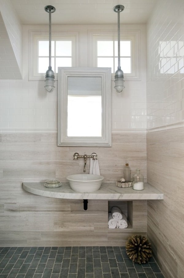
This bathroom borrows light and space from the staircase. It is tucked underneath the staircase (hence the slanted ceiling), and it borrows the natural light from a seating area on the landing.
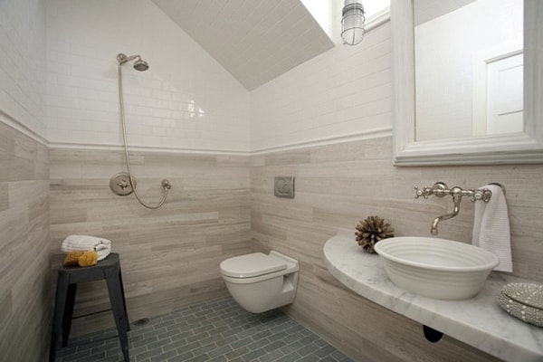
What would usually be a first floor powder room has instead become a full, ADA wheelchair-accessible bathroom complete with a shower. “The bathroom is detailed like a big shower; a European-style wet room,” Horowitz explains. “The walls are completely covered in tile, and they slope toward a floor drain. Because the room is so beautifully finished, you don’t feel like you are walking into a big shower stall,” says Horowitz. A few eco-friendly moves include a dual-flush toilet and using a piece of scrap marble for the counter.
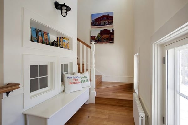
“We were always looking for moments and opportunities to create space and make the best of everything,” Horowitz says. The storage bench and recessed reading shelf create “a nice place to sit down with a book; the windows were placed low to work well on the facade; from the bench they provide a view out to the playground that is at eye level.”
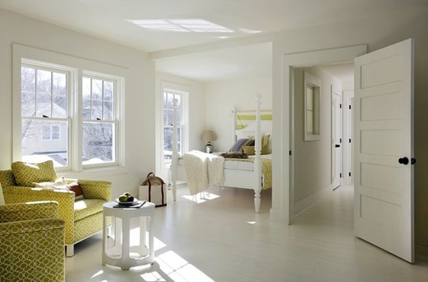
Creating a special, cozy alcove for a bed creates a comfortable space just for sleeping, and leaves a lot of other space to use for “sitting space, play areas, dressing and storage” the rest of the day.
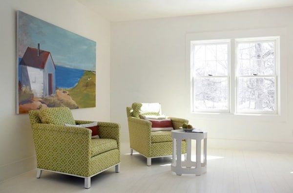
By preventing the bed from hogging up the whole room, a comfortable seating area in the master bedroom provides a relaxing place to read. The painting is by Tharp, and the fabric on the chairs is by Lee Industries, known for sustainable practices.
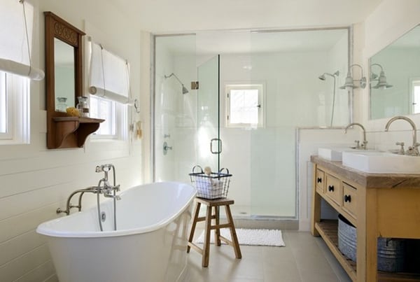
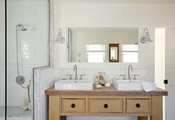
This vanity was fashioned from an antique kitchen worktable. This was not an easy task: The top was crooked and it needed to be plumbed. But it was well worth the effort, as it adds that unique European farmhouse touch to the room. The sinks are from Signature Hardware and the faucets are made by Rohl’s.
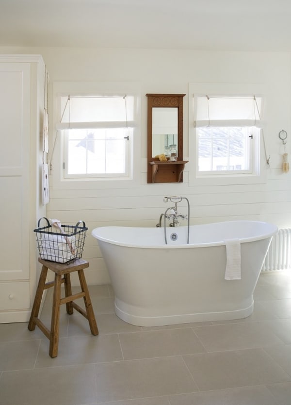
Although you can’t see it in the photos, this master bathroom also incorporates a laundry room. “Laundry rooms used to be placed in basements, then they moved to the first floor, and today, we realize it’s most convenient to have it on the same floor as the bedrooms, where we put our clothes away,” Horowitz explains.
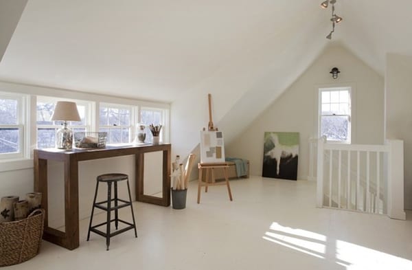
The metal roof helps to keep this area cooler in the summer, reflecting the warmth from the sun. This room is another flexible space that can be used as a studio, home office, exercise room, playroom or extra bedroom. All of the mechanical necessities are tucked underneath the other gable, leaving this space open and usable.
“If you ask me whether it is better to finish a basement or an attic, I will vote attic every time,” Kauffman Tharp says. “Dark and dank vs. sunny and breezy. Which would you choose?”
“I have always dreamed of living on the ocean, and yet we love this town. So, I designed the house to live like a vacation home. Why not get that feeling every day of the year?” Kauffman Tharp says. “The interiors are relaxed, use natural materials and connect with the outdoors — barefoot simplicity meets casual elegance. These are the things that we all love about a vacation home, and I help my design clients build those features into their own homes.”
Photos: Eric Roth


1 comment