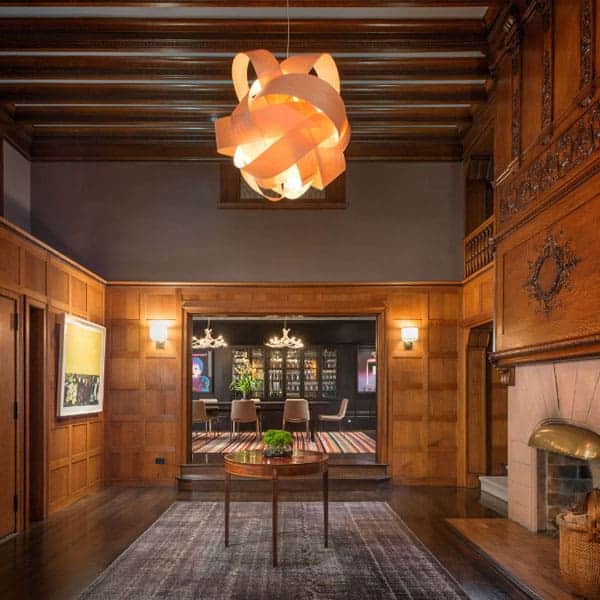
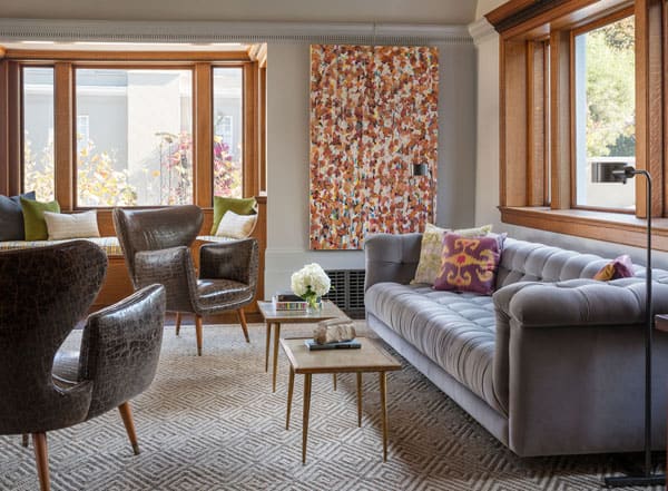
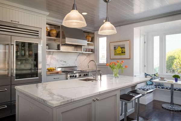
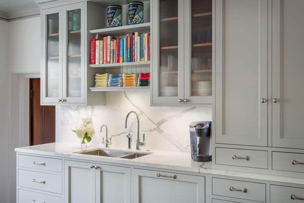
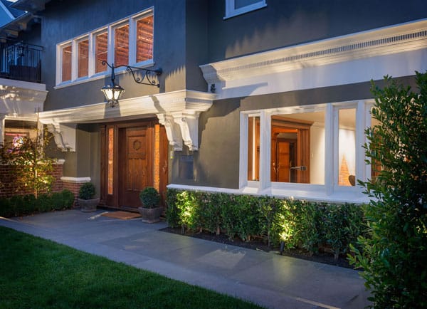
This century-old Pacific Heights, California property is the home of David Fraze and Gary Loeb, who hired Sutro Architects to transform it back to its glory. The historic home built in 1897 had excellent craftsmanship and once contained servants quarters, passageways (to ensure the owners and servants never crossed paths) and workspaces both upstairs and in the basement level, which was all given a new identity, transformed into additional living spaces while keeping the historic character of the building still intact. The kitchen was once a prep space for the servants, but was too small for two men who enjoyed cooking. The owners wanted a space that was more casual and comfortable where they could relax and entertain friends as well as display their significant modern art collection. The home features traditional woodwork and details, the couple used inspiration from old Parisian apartments that have traditional spaces and have been renovated and decorated with modern art. Interior design firm John K. Anderson Design was brought on board to coordinate the 6,982 square foot home’s colors and furnishings. “What drove my part of the project was getting the right neutral backdrops for the artwork,” says Anderson. “We spent at least four months on the wall colors alone.” The vibrant artwork is electric against a palette comprised of mostly grays. Via
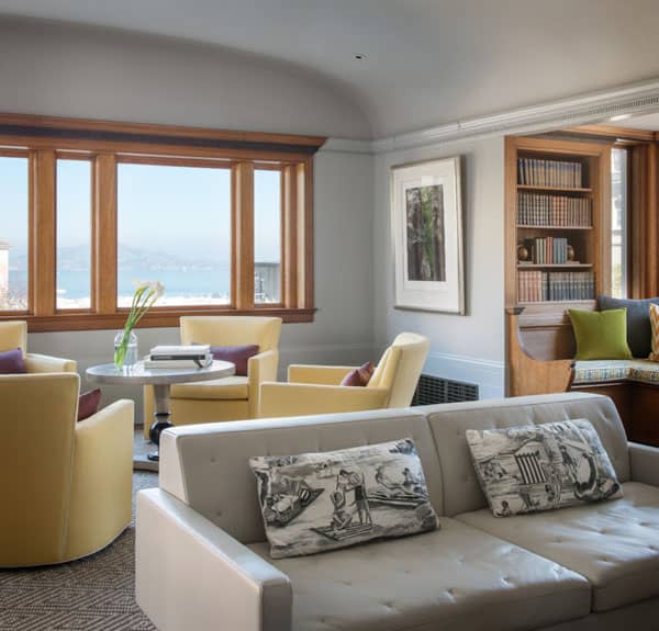
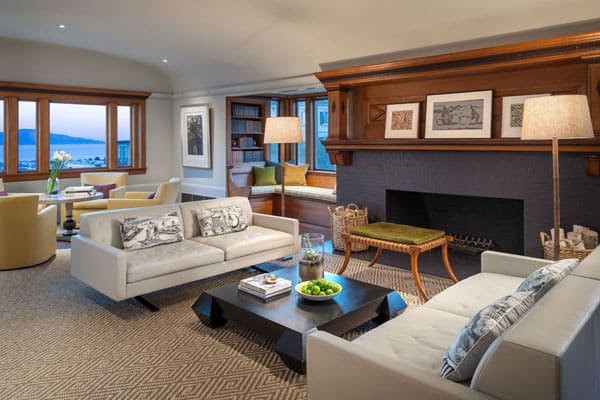
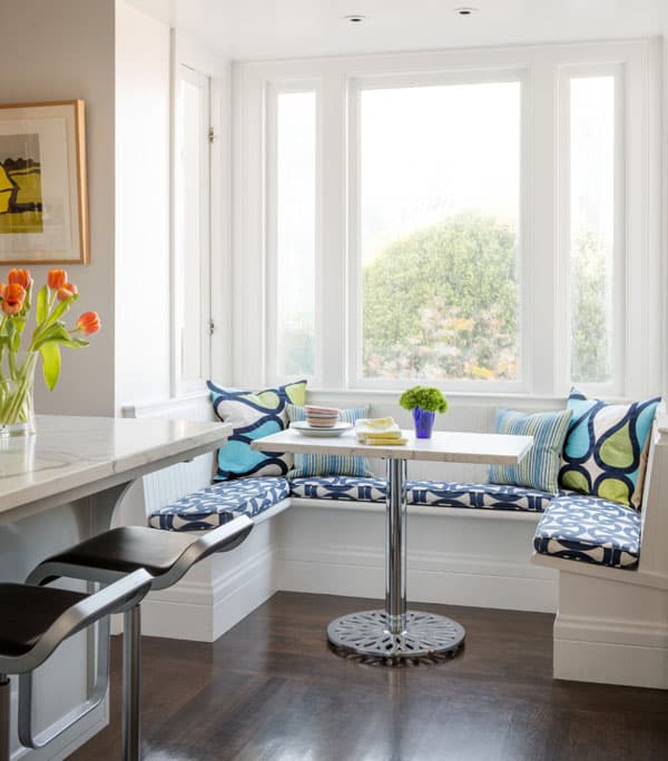
Windows were inserted to open spaces up to the jaw-dropping bay views.
“The existing woodwork was beautiful but very oppressive,” says the designer. “In the living room, the baseboard was tall, and it made the room seem low-ceilinged.” Anderson solved the problem by painting the walls, ceiling and upper and lower moldings all the same color—Benjamin Moore’s Smoke Embers—in order to elongate the room. Painting the never-before-covered woodwork took some panache, but as Anderson puts it, “You have to respect the past, but also make the home work for the clients and their needs now.”
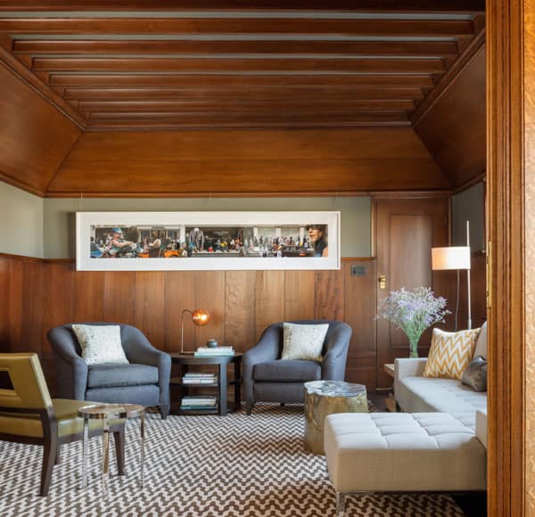
The redwood paneling in the media room is original to the 1897 home. A contemporary chromogenic print by Dale Yudelman takes the room into the 21st century.
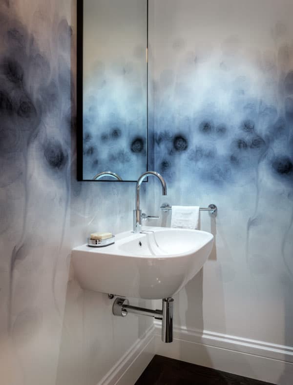
Although the rest of the house has references to the past, the powder room on the first floor is overtly modern. “We added this bath, and because it was a new element and not visible to the rest of the space, we felt we could go a little crazy,” says Loeb. The couple was drawn to Trove’s Auva wallpaper, which was recently selected as a permanent addition to the Brooklyn Museum’s decorative arts collection.
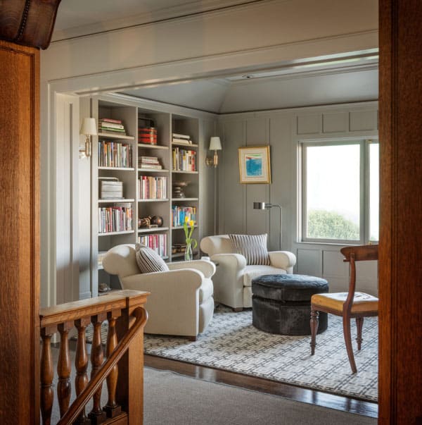
“This was once a very small, closed-off room,” says architect Stephen Sutro. “It was likely a nursery. By removing the wall that separated it from the stairs, we allowed light to pour into the hall and stairway.” The new open space gives the owners a place to enjoy a book and the view.
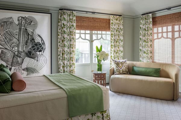
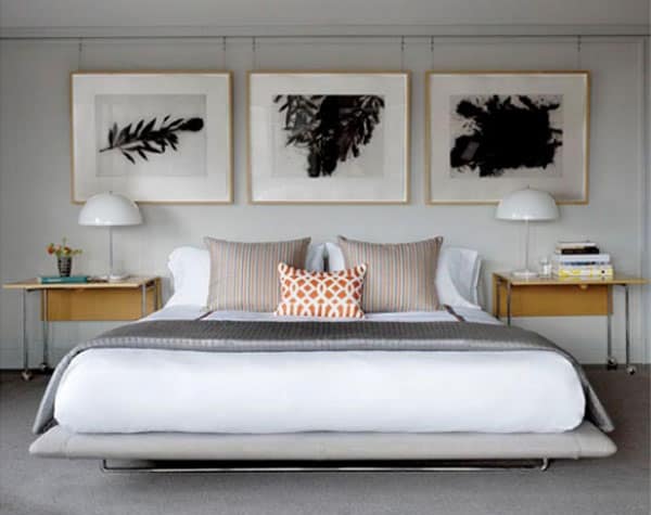
In the master bedroom, a picture rail molding gives Fraze the ability to display his art collection and the flexibility to change it easily and often.
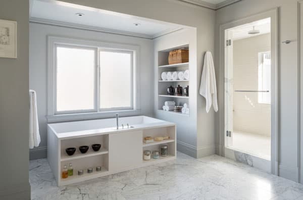
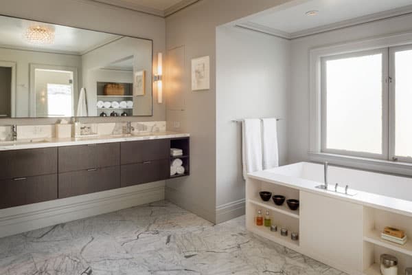
The unique Xline tub by Agape features display shelves and is positioned to allow bathers to soak and enjoy the view.
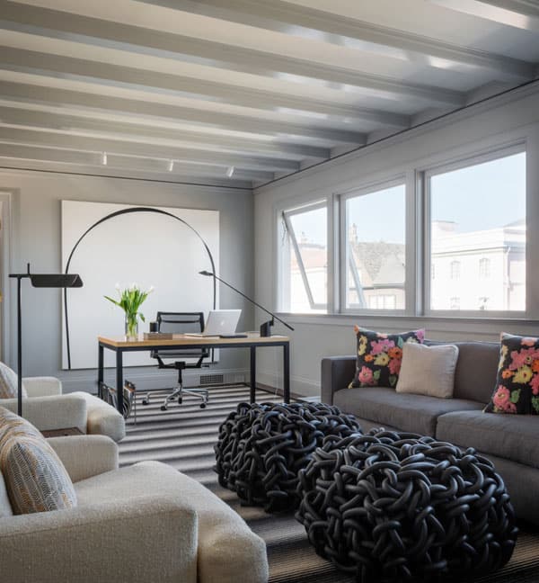
Fraze’s upstairs study gives him a place to contemplate and build his art collection. Behind the desk is a piece by British artist Ian Davenport. The black-and-white artwork, made by puddling paint painstakingly on an oversize canvas, illustrates the unifying factor in Fraze’s collection: All the works are created using interesting processes.
Photos: Aaron Leitz Photography



0 comments