❤️ Would you like to save this?
By saving, we'll email this post to you for later. Unsubscribe anytime.
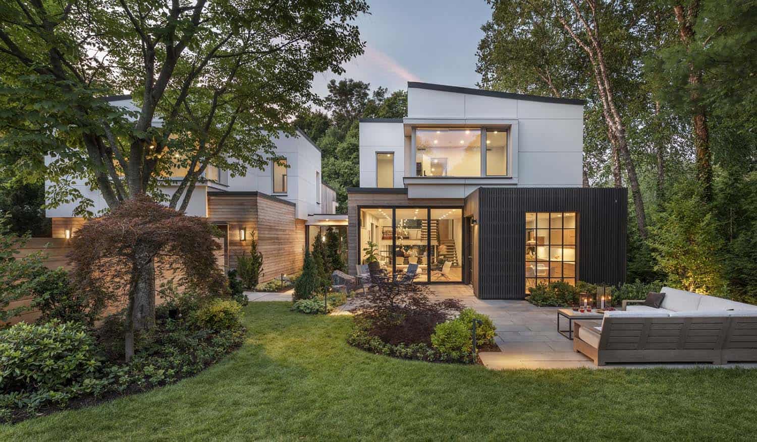
ZeroEnergy Design is responsible for reimagining a 1960s split-level into a beautiful contemporary house located in Belmont, Massachusetts. When a family first moved into their eccentric mid-century modern abode, they knew this would not be their forever home. They opted to rebuild in phases, retaining the essence of the midcentury style while crafting a composition better suited to contemporary living.
The original 1960s house had two separate wings, informing the decision to approach the project in phases, allowing the owners to reside in one section while the home was being remodeled. The design kept a similar footprint with the creation of two distinct wings connected by a central corridor.
DESIGN DETAILS: ARCHITECTURE ZeroEnergy Design INTERIOR DESIGN ZeroEnergy Design BUILDER Auburndale Builders LANDSCAPE DESIGN ZEN Associates FURNITURE Montage Modern

The central corridor serves as the formal entryway into the home and offers a striking perspective overlooking the abutting Mass Audubon sanctuary beyond. This new design honors this original view and the result is a rewarding memento of the original home.

The original dwelling had striking angular shed roofs. In a nod to the mid-century modern character, the architect cleverly adapted these angles to create tapered forms in the structure’s new massing. Another ode to the original design was the reinterpretation of the existing split-level design.

The move enabled the architects to connect the living space at the front of the home to the family room at the back, as well as to the leafy views beyond. Due to the sloping grade of the site, the living spaces at the front and rear of the dwelling tie out to the grade, with their living spaces extending outdoors.

The design of the central living space allows visual connections to other spaces and views throughout the home. On the east wing, the split-level design connects two living spaces, along with views of the tree-lined Mass Audubon sanctuary abutting the rear of the property and the south-facing front yard.

Inside or out, this home blends and flows into its surroundings, outfitted with large glass doors, generous windows, and oversized sliders at several key connection points. As one approaches this 7,000-square-foot (expanded from 2,660 square feet), six bedrooms, and seven-bath home, they are welcomed by a glazed corridor with views and a connection through to the woods beyond.

One of the owners’ priorities was to create a connected central living space – made up of the kitchen, living, and dining area – that also provided ‘a place for everything and everything in its place.’ The design therefore connects all three areas while intentionally not functioning as one giant great room and provides ample storage for the family of five.

The central portion of the kitchen is open to the living area while the other half is hidden, a clandestine zone for dirty dishes while hosting guests. The formal dining area is next to the living area with views to the front, back, and side of the house, but shielded from the working area of the kitchen.

What We Love: This reimagined split-level house has a more contemporary design than the original, boasting a beautiful open and airy layout with higher ceilings, expansive windows, and sliding glass doors. We love the seamless indoor-outdoor living experience of this home and how it greatly improves the family’s lifestyle needs, including the in-law suite with a kitchenette for their visiting family from overseas.
Tell Us: What details in this reimagined family home do you find most appealing? Let us know in the Comments below!
Note: Check out a couple of other amazing home tours that we have highlighted here on One Kindesign in the state of Massachusetts: A historic mill is the anchor of this beautiful New England seaside home and A family home in Massachusetts gets a bright and airy makeover.

Materials in this home include natural and black-stained cedar siding along with fiber cement panels on the exterior, and white oak, steel, and slate on the interior.


The breakfast nook is in an alcove off of the kitchen with views and a connection to the south-facing patio beyond, yet screened from the living space.


The family room at the back of the house boasts dual oversized sliding doors at its corner that open the space to the backyard patio, playspace, and views of the Mass Audubon sanctuary beyond. These outdoor connections allow the family to view, utilize, and appreciate all parts of their luxurious property and its scenic surroundings.

The connection of this home is enhanced by the open riser stair and glass guardrail, which creates clear sight lines between the two levels and the natural surroundings. The central living space connects to the family room below, the mezzanine multi-purpose room above, and the outdoor spaces.

The house is laid out such that there is an adult-only wing on the west – primary suite, guest studio, and office – and a kid’s wing on the east – three children’s bedrooms, three bathrooms, and a giant lower-level playroom.


The home was designed before the pandemic, but the owners were ahead of the curve in planning for a suitable work-from-home environment. The office, located over the garage and a half-level up from the primary suite, provides an isolated space to get work done with a heavenly corner window overlooking the front of the property and the tree-lined street.

With family overseas, the couple’s mindset was to create an independent living space for their relatives to visit comfortably for extended visits. The result was the creation of a private guest studio in the west wing of the house – a combination suite with bedroom, bathroom, and kitchenette – equipped with a mobility-friendly bathroom and generous access to the outdoors.

It is positioned at the lower grade at the back of the sloping site, allowing for a walk-out condition and the possibility of an accessible entrance. Located a half story up in the split-level configuration, the placement of the garage was dictated by the grading at the current driveway.

The home’s desirable location in Belmont provides a rare combination of a dense suburban neighborhood with a remarkably deep lot. This provided an opportunity for a larger front yard to afford protection from road noise and an equally deep back yard, both an asset for owners with three active children.

The architects worked with landscape architect ZEN Associates, who installed mature trees and plantings to buffer the property from neighboring houses while also making it feel established on day one. Whether the adults are enjoying a drink on the front patio or the kids are kicking soccer balls in the backyard, the property feels completely private and protected from the outside world.


PHOTOGRAPHER Nat Rea


0 comments