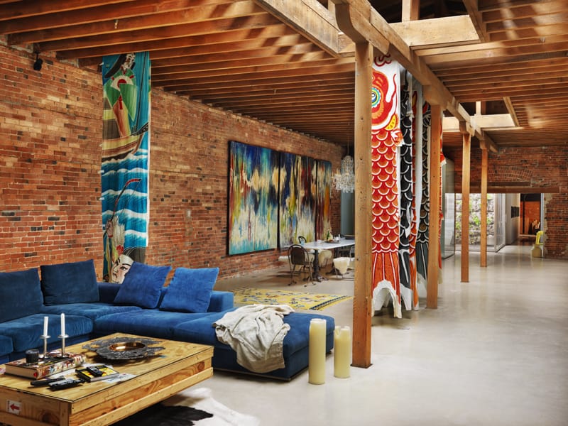
This incredible project consisted of a seismic upgrade and restoration of a heritage building in Vancouver, British Columbia’s historic Gastown District, and a loft interior design project. Designed by architect Omer Arbel, the loft is organized around a new courtyard open to above, inserted into the heritage fabric of the building, allowing light into the centre of the very deep plan. All other interior elements are rendered crisply using precisely machined elements, conceived to stand in strong contrast to the rough heritage fabric of the existing shell.
The owner is a bachelor who became deeply invested in Gastown before its rundown warehouse spaces became fashionable. He asked designer Omer Arbel for a home that would “just let the space be itself.” The space, though, had been practically abandoned, used as rough storage for an appliance vendor. Arbel was handed a mess of clumsy interior walls and years of spider webs. His task: preserve the history that lurked there, all while overlaying it with a real, functional living space.
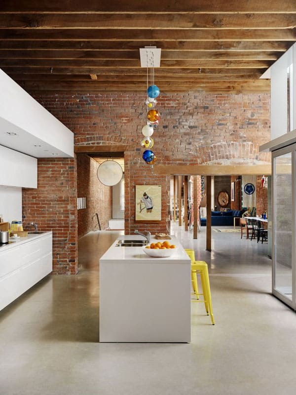
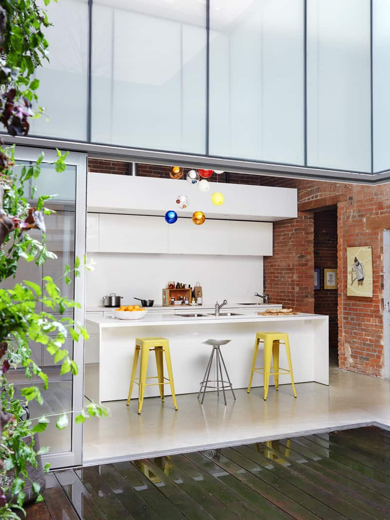
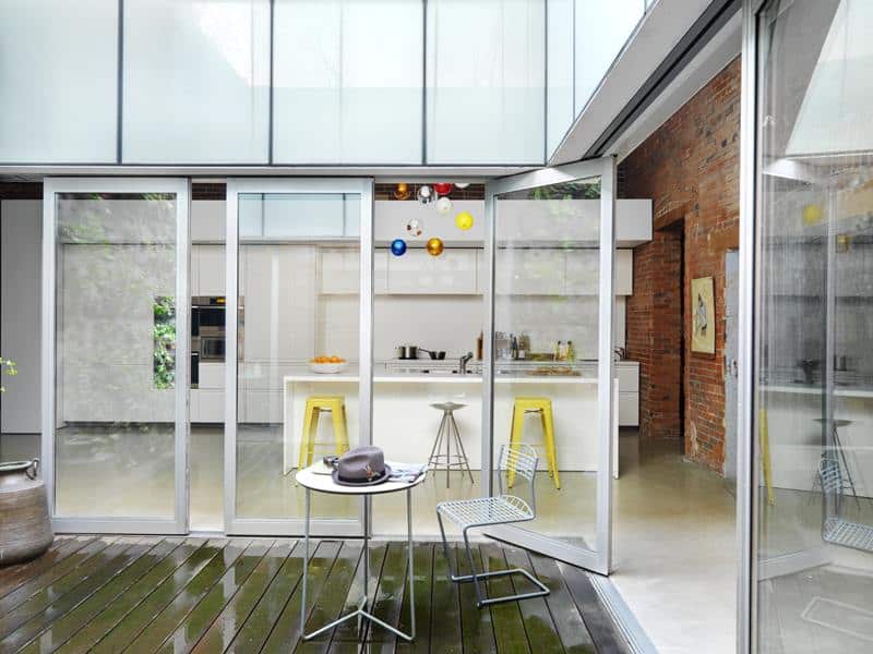
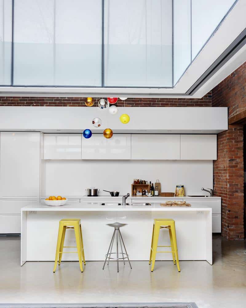
The architect created a walled courtyard that only looked up to the sky in the heart of the loft, with light and breezes spilling through its open top into the home and, when three of the courtyard’s walls roll away, one might easily stroll from room to room via a happy cube of garden. “This was a cavernous space in a not-so-pretty neighborhood,” Omer says. “We decided to concentrate on light and create a sort of cube of nature in the middle of the floor plan rather than open up the views to the streetscape.” The streamlined custom-design kitchen faces the chic courtyard.
Large hanging fish kites catch the light in the living room.
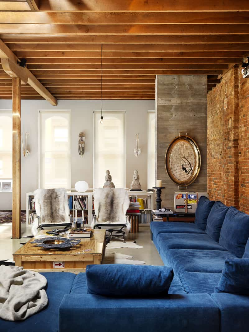
The home is a completely open floor plan, there are no walls to break off the living space, kitchen or dining area, save for a couple of paper “soft walls” by Molo, which accordion, shift or disappear depending on that day’s whims. Against a surround of vintage brick, the kitchen’s crisp white millwork hovers, with space above and below to emphasize a box-within-a-box effect. One is constantly aware, here, of contemporary design as a sort of complement to the original warehouse. Look up and you will see a network of original Douglas fir beams, lit up to dramatic effect by a set of skylights. There’s a five-foot volume between the beams and the building’s actual ceiling—another clearly defined envelope.
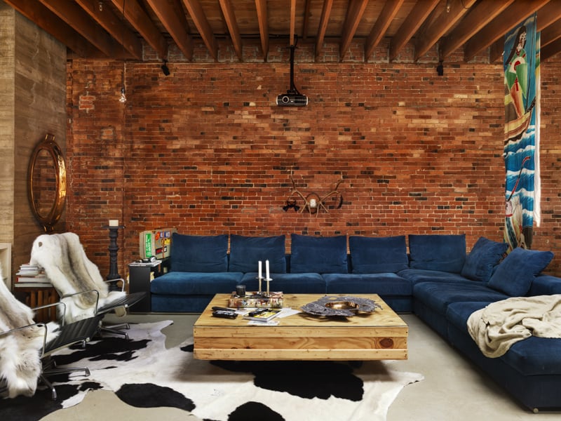
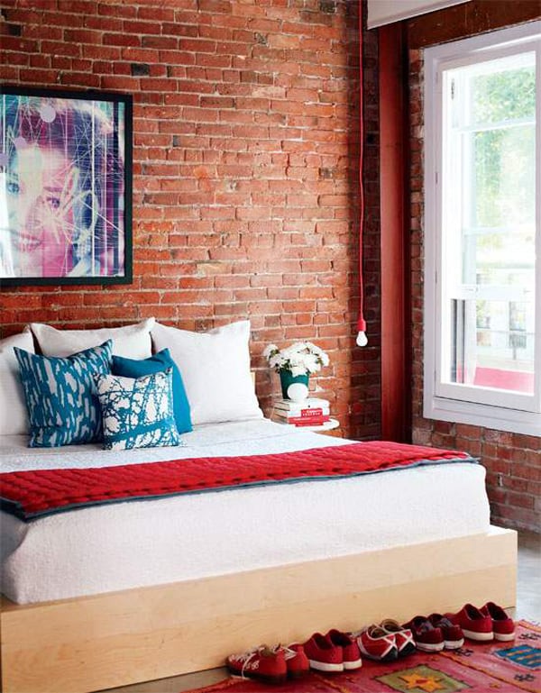
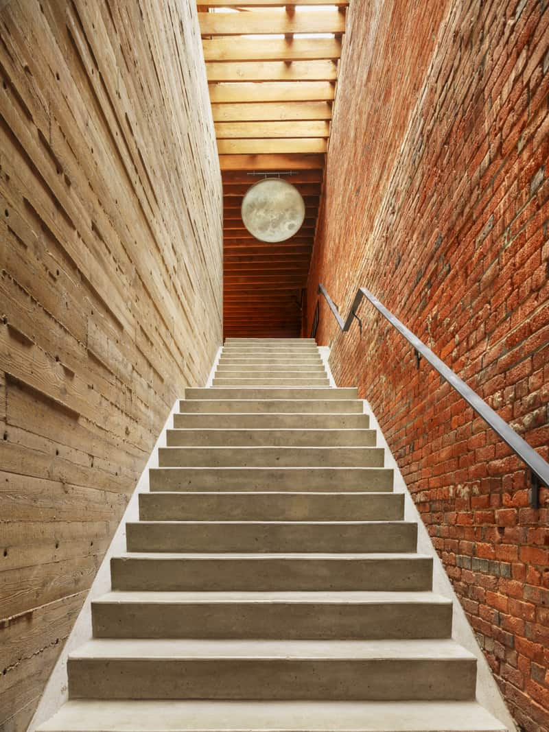
An inexpensive IKEA bed and funky artwork blend seamlessly into the functional space. Those walls, original to the loft, were left deliberately raw. “We sandblasted the bricks but kept them rough,” says Omer.
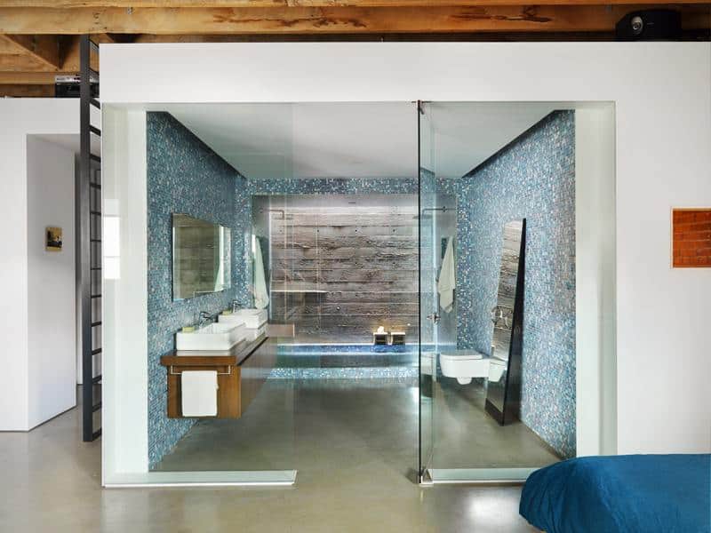
Arbel can create structure when it’s called for; he’s justly happy with the bathroom, where a vanity area, a tiled shower and a halo of light at the shower’s rear make up a set of three nesting boxes.
Photos: Martin Tessler


0 comments