❤️ Would you like to save this?
By saving, we'll email this post to you for later. Unsubscribe anytime.
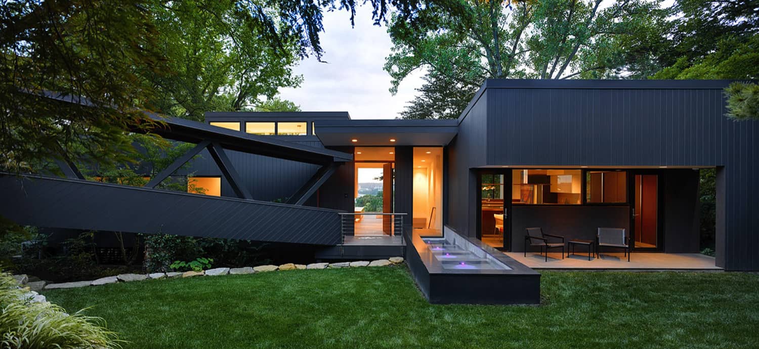
Architectural studio Drawing Dept is responsible for the extensive renovation of a midcentury modern home built in 1952 by noted modernist architect, Carl Strauss. Nestled into a wooded hillside of Cincinnati, Ohio the existing dwelling survived while adjacent homes were demolished to make space for large mansions in this desirable neighborhood.
Its greatest asset lay tucked behind the front door, where panoramic views of the city and river unfolded to the unsuspecting visitor.
Over time the house suffered an insensitive addition, poorly executed ‘improvements’, and over 60 years of exposure to Cincinnati weather.

After extensive redevelopment of the plan, the house was stripped to the exterior studs revealing the basic volume of the exterior shell. Several subtle, architectural interventions celebrated the intentions of the original Strauss design. Horizontal and vertical mullions were removed from the glass wall in the main living space.

A roof lantern was rebuilt and made taller to provide more light into the bathrooms and the 1970s ‘green house’ addition was replaced with a simple extension of the existing roof line.

Each additional intervention strengthened the house’s relationship with the site. A new interior stair connected the first floor with the redeveloped backyard. The existing pool was integrated into a larger outdoor living space that boasted a new spa, outdoor kitchen and fireplace.

Every room, material, and detail was meticulously designed to create a house that was quintessentially mid-century and quintessentially modern.

What We Love: The renovation of this midcentury modern home provides a sleek and attractive aesthetic. An indoor-outdoor lifestyle is embraced with the large second-story deck and outdoor kitchen and dining area, a swimming pool, and lounging spaces. Floor-to-ceiling windows frame idyllic views of nature and beyond to the city skyline. We are especially loving the redesign of the kitchen from dark and cramped to bright and airy with views of the outdoors.
Tell Us: What are your overall thoughts on the design of this dwelling? Let us know in the Comments below!
Note: Take a look at a couple of other incredible home tours that we have highlighted here on One Kindesign in the state of Ohio: Beautiful Bridge House Suspended Across A Ravine In Ohio and Stunning riverside house renovation in the Chagrin Valley.


There are a total of three bedrooms and four bathrooms in this home.


BEFORE AND AFTER THE RENOVATION

PHOTOGRAPHER Ryan Kurtz Photography


2 comments