
❤️ Would you like to save this?
By saving, we'll email this post to you for later. Unsubscribe anytime.
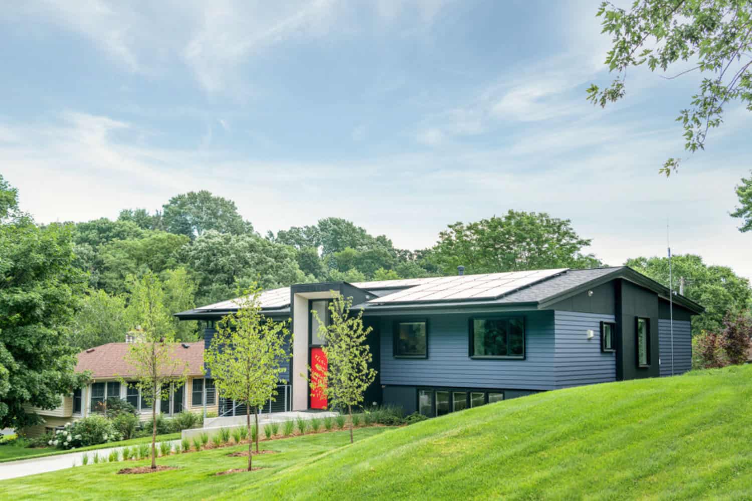
SALA Architects was commissioned to renovate this beautiful split-level, midcentury home located in Golden Valley, a city in Hennepin County, Minnesota. Empty nesters who have lived in their house for over 20 years wished to stay connected to their neighborhood.
They worked with the architect to craft a home that allows them to pursue their interests in art and books, and that they are excited to come home to every day. This luminous 1960s home encompasses 1,687 square feet of living space with four bedrooms and two-and-a-half bathrooms.
Project Team: Architecture: SALA Architects | Construction: Showcase Renovation | Landscape Design: TerraVista Landscape and Design

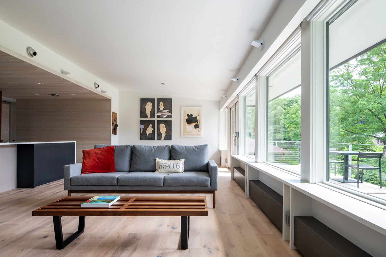
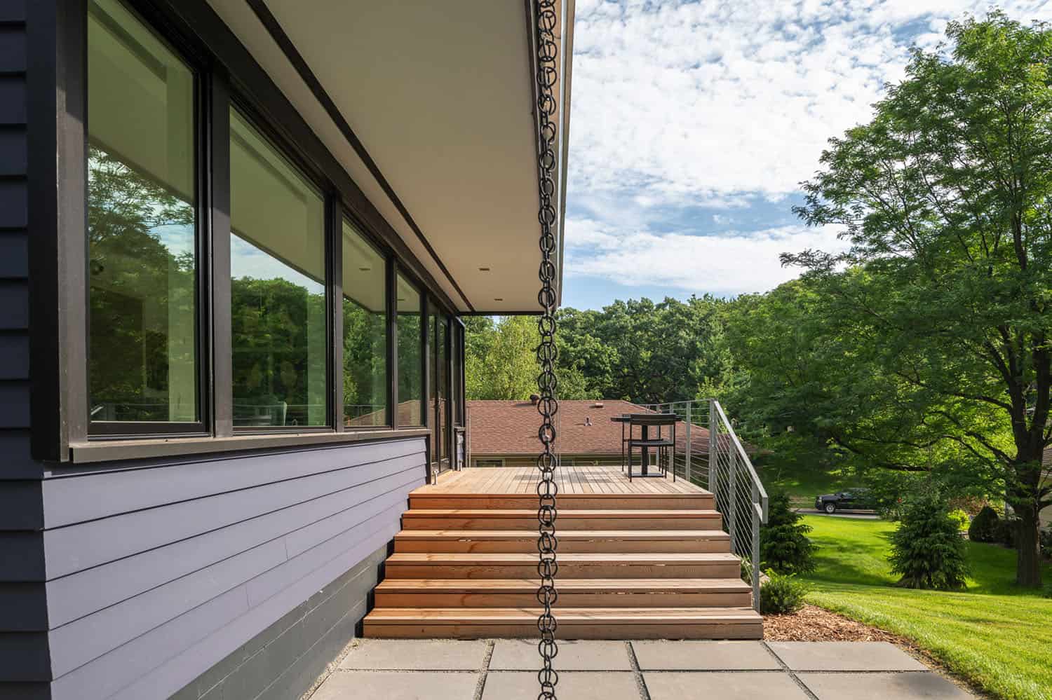
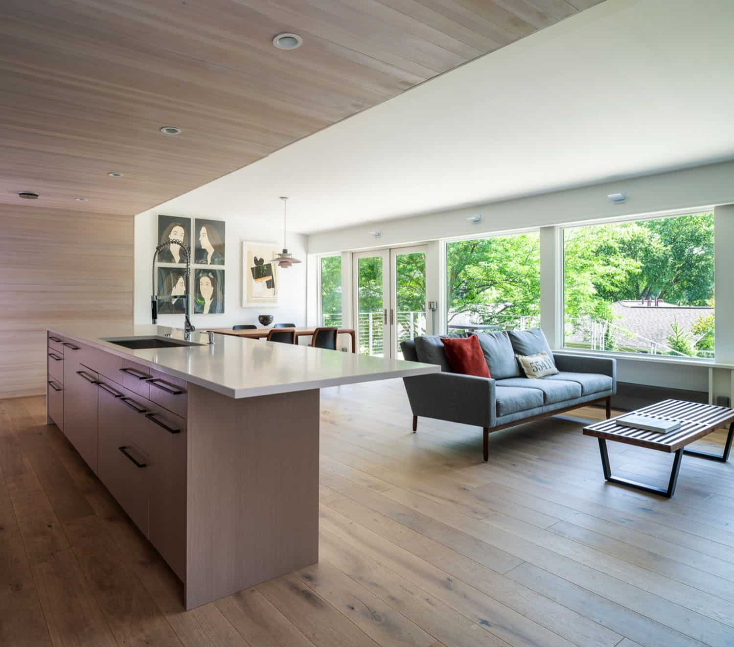
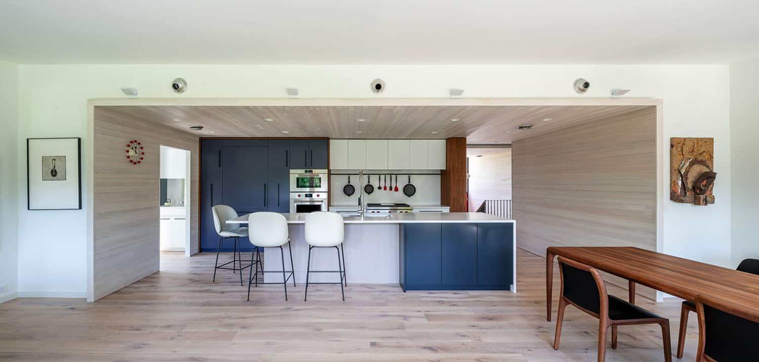
This renovation project accentuates and enhances the modern split-level characteristics of the home. The basic bones were kept in place, while a dramatic new entry and a more open floor plan were established. Bedrooms and bathrooms were renovated to provide more spacious and updated accommodations.
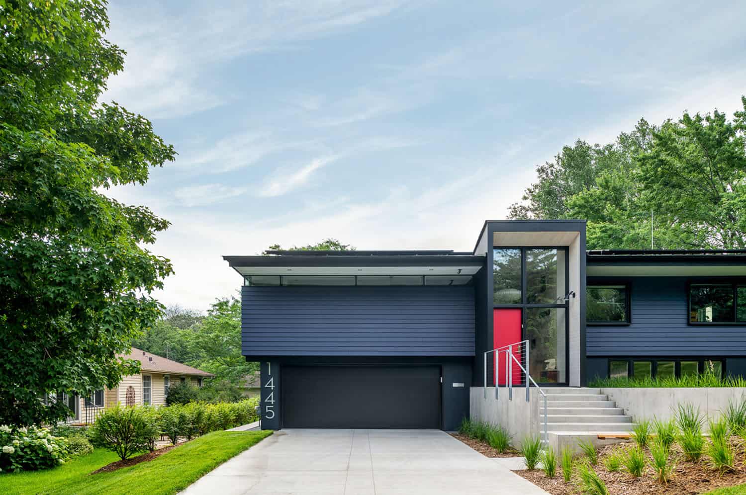
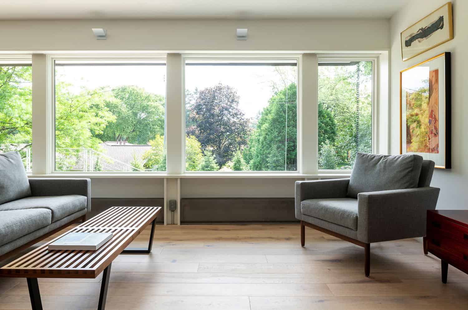
The home also incorporates many sustainable design elements, from an electric car charging station and solar panels to new windows, improved insulation and upgraded air infiltration rates.
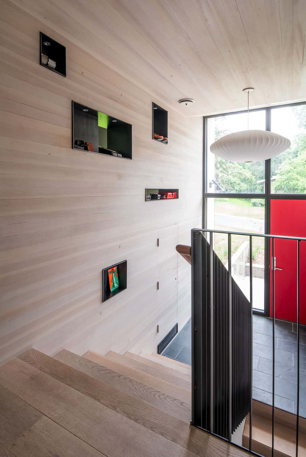
The “spectacular sanctuary” requested by the clients was established by converting an unused front living space to an intimate library space, and creating a large-scale curio cabinet from blackened steel boxes set within the tall wooden wall of the front entry space and stairway that allows the owners to display a rotation of collectibles and artwork.
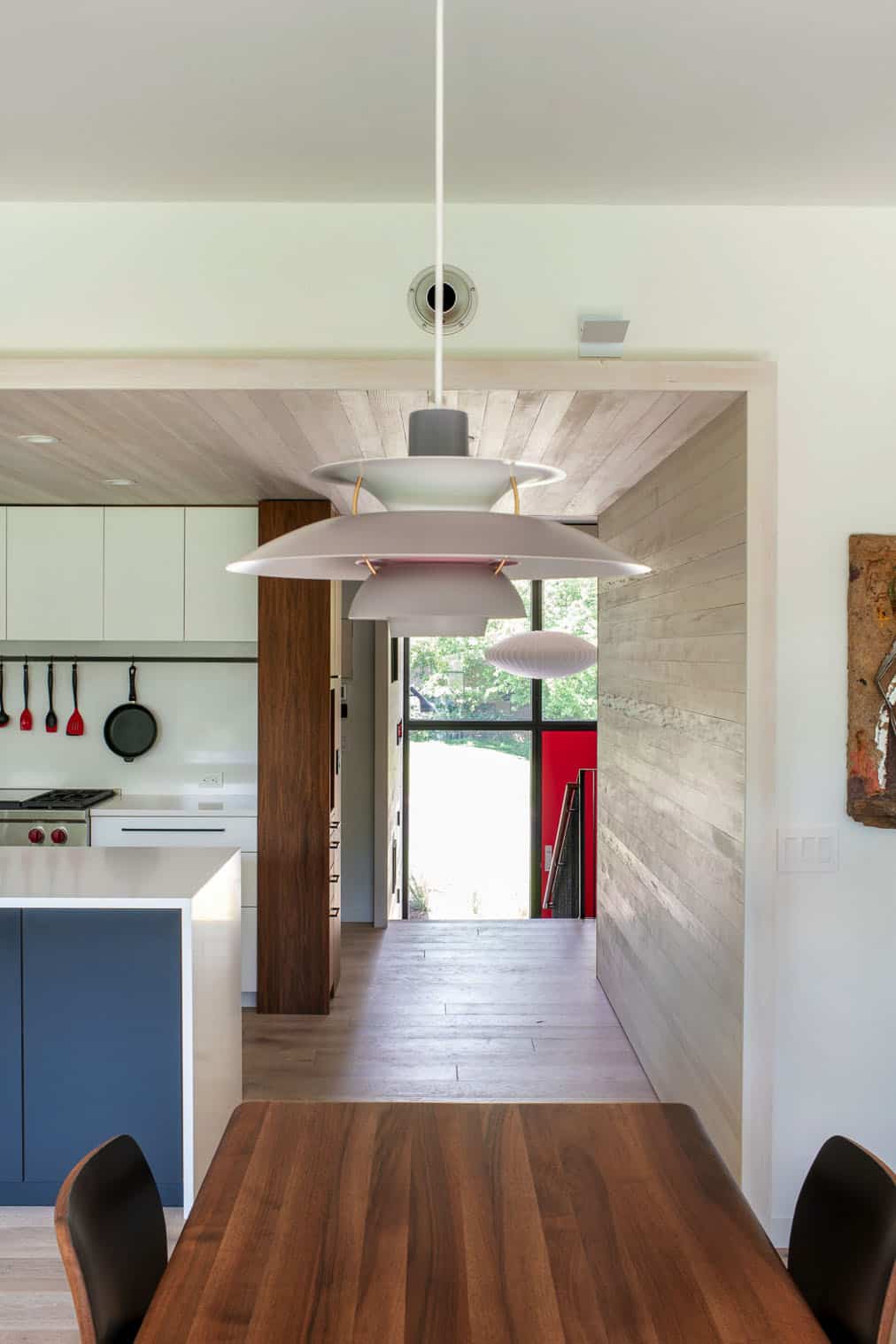
The home uses its material palette as a luxurious, neutral base for the homeowner’s collection of art, books and ephemera.

What We Love: This split-level, midcentury home offers its inhabitants a transformed atmosphere to relax and enjoy their neighborhood that has been their home for over 20 years. With more spacious and updated accommodations, the resulting design provides an exciting place to come home to.
Tell Us: What do you think of the overall transformation of this home? Do you think the architects were successful in creating a bright and inviting living spaces? Let us know in the Comments!
Note: Have a look below for the “Related” tags for more inspiring home tours that we have featured here on One Kindesign from the portfolio of the architects of this home, SALA Architects.
RELATED: Dreamy lakeside getaway nestled on the shores of Lake Minnetonka

RELATED: Frank Lloyd Wright designed home boasts inspiring renovation in Minnesota


RELATED: This lakeside haven provides a spectacular family retreat on Lake Huron


Above: The metal surround is custom made by a local metal fabricator and has a gas fireplace insert behind it.


RELATED: 600-square-foot off the grid cabin surrounded by wilderness in Minnesota
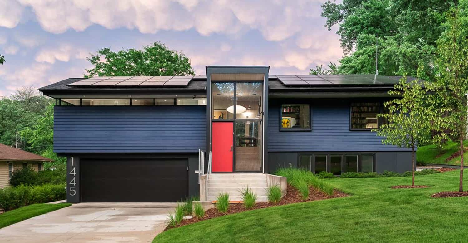
Above: The color of the exterior facade is a custom color mixed for this project from Sherwin Williams paint. If you’re looking for a premixed color that is close to this one, Naval SW 6244 – Sherwin-Williams is a good choice.

Photos: Chad Holder Photography


5 comments