
Photo: Craft Photo and Video
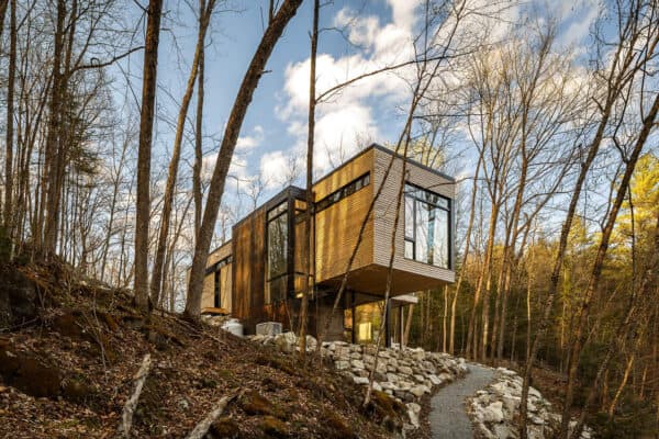
SMPL Design Studio has reimagined this sophisticated, yet playful cottage bringing Scandinavian flare to beautiful Niagara-on-the-Lake, a charming town in Southern Ontario, Canada. The dwelling is situated on a beautifully landscaped corner lot, just minutes from the downtown core.
A compelling transformation, simply rejuvenated a 1980s residence, melding a coordinated blend of Scandinavian influence externally, and playful sophistication within. Continue below to see the rest of this home along with a question and answer with the architects of this project.

Photo: Craft Photo and Video
The exterior creates an intimate connection with the locale by crafting a balance of neutral wood tones through the vertical siding of its scenic lake. The interior palette layers hues of oyster and sand, weaving an organic visual continuation of the exterior, with its vertical lines and organic shapes.

Photo: Craft Photo and Video
The unique layout provides a flow ideal for cooking and entertaining, with the kitchen at the center, and all adjacent spaces — such as the built-in breakfast bar and the designated coffee station — branching from it. The updated and reimagined double-sided fireplace unifies separate living and dining areas.

Photo: Craft Photo and Video
A triangular second-floor addition and, uniquely shaped angled ensuite, elevate this home into a functional, stylish, and calm escape from urban rigors.

Photo: Craft Photo and Video
What We Love: This Scandinavian-inspired house on Niagara-on-the-Lake provides a completely reimagined
Tell Us: What are your thoughts on the design of this dwelling? Are there any details you would change? Let us know in the Comments below!
Note: Be sure to check out a couple of other home tours that we have featured on One Kindesign in the Canadian province of Ontario: A warm yet inviting modern lake cottage in Canada used for entertaining and An amazing compact modern prefab cabin on Lake Muskoka, Canada.

Photo: Craft Photo and Video

Photo: Craft Photo and Video

Photo: Craft Photo and Video

Photo: Craft Photo and Video

Photo: Craft Photo and Video

Photo: Craft Photo and Video

Photo: Craft Photo and Video

Photo: Craft Photo and Video

Photo: Craft Photo and Video
Describe how this home best made use of the available space, in terms of layout and lot.
The design of this home capitalizes on the existing space within an original single-family dwelling, while the addition works within the triangle-shaped corner lot located in Niagara-on-the-Lake, Ontario. Originally constructed in the 1980s, the home underwent a thoughtful redesign to optimize its layout for modern living. More usable space was gained through the demolition of several partition walls that kept previous living areas visually and programmatically separated from each other, creating a new open-concept floor plan while working with the existing walls. To strategically create several different zones across the main floor, living and working spaces are cleverly incorporated to separate certain functions and streamline circulation in the kitchen area, enhancing both efficiency and usability. The breakfast bar and tucked-away coffee bar are prime examples of this zoned activity, providing ease of access to prep space and providing spatial separation between rooms while maintaining visual connections. The existing central fireplace and chimney, once a divider between the dining and living spaces, have been reimagined to enhance spatial flow. Clad in linear black brick, the fireplace feature creates a visual focal point while maintaining continuity between the two areas.
Describe how the function of the home was designed, specific to the client’s needs.
Repurposing certain spaces on the main floor to better serve the needs of the clients is where this renovation becomes very successful. A hidden pantry utilizes existing deck space at the rear of the house to provide concealed functional storage. A coffee bar also brings new life to what was previously an awkwardly laid-out full bathroom next to the staircase. The clients recognized that a bathtub was not necessary on the main floor where they entertain and work frequently, allowing us to refresh these spaces with features that were previously not able to fit into the house. In the living and dining rooms, the clients wanted to maintain the integration of these areas provided by the existing double-sided fireplace. The renovation delivers on this request by elevating the fireplace wall with a dark vertical tile to create a focal point for the main floor. The living and dining rooms are further integrated through the removal of the drywall on either side of the fireplace, creating both a visual connection and an opportunity for users to flow freely through both spaces.
What makes this home appealing in terms of its exterior in relation to its surroundings; and interior elements including color schemes, fittings, furnishings, and architectural features?
This home’s seamless integration with its serene surroundings through the use of Scandinavian design motifs and thoughtful interior design elements elevates the project as a whole. The exterior design of the home effortlessly complements its scenic lakeside locale by using clean lines that encourage a minimalist aesthetic, harmonizing with the natural beauty of the landscape using a light wood siding. Vertical lines and organic shapes bring exterior design elements within the home through the repetition of vertically oriented tiles for both fireplace and backsplash, as well as slat wall accents and a rounded breakfast bar. The fireplace’s sleek black brick adds drama and visual interest while maintaining continuity between different areas of the home. The contrasting tones of light birch wood and black accents create a sophisticated yet inviting ambiance. Oyster and sand tones enhance the warmth of the space, while metal mesh cabinet inserts and playful wallpaper add character and texture to more intimate details within the kitchen, powder room, and primary bedroom. Overall, the interior design reflects a careful balance of style and comfort, making the home an inviting retreat that brings nature from the outside in.
What innovative features make this renovation stand out?
Innovative features of this home can be identified using our studio’s acronym: sustainable, modern, practical, and livable. The preservation and enhancement of the existing two-sided fireplace, which serves as a symbolic and functional anchor for the main floor, showcases our design studio’s commitment to sustainability in both new-build and renovation projects by minimizing construction waste and celebrating the inherent character of the space. The newly added hidden pantry feature adds innovative storage and kitchen prep spaces to the renovation. Cleverly concealed yet easily accessible, this addition maximizes storage space while maintaining a clean and uncluttered aesthetic. Practicality emerges in this design through the updated flow of spaces and layered task lighting options. Intensified lighting created by sconces and hanging light fixtures in the kitchen and dining areas encourages more meticulous activities such as cooking or eating, while ambient pot lighting throughout the living room and hallways encourages relaxation and flexible entertainment. Lastly, the enhancement of livability is exemplified by the addition of a tucked-away coffee bar, elevating daily rituals. This thoughtful renovation and addition not only organizes spatial functionality but fosters a sense of coziness for the clients.
How does this renovation integrate the new space into the existing space?
While the renovation did not overly alter the existing program of the first floor, it completely opened up, connected, and optimized the spaces on the ground floor to provide a new streamlined day-to-day living experience. At the home’s main entrance, a walk-in coat closet and a small office replace what was previously a bedroom on the main floor, maintaining the integrity of as many existing walls as possible while adding practical amenities that cater to modern lifestyles. The kitchen layout incorporates a breakfast bar and coffee bar as well as a hidden pantry, strategically placed to separate certain functions and streamline circulation in the kitchen area. Not only does this strategy optimize space utilization, but it also enhances efficiency, making everyday tasks more convenient and enjoyable. By repurposing existing rooms and adding new features, the upper floor addition maintains continuity while enhancing the overall functionality and appeal of the space. Entering through a walk-in closet and library area to the addition of the primary bedroom with a vaulted ceiling, creating a sense of openness and grandeur. By seamlessly integrating the new space with the existing layout, the renovation creates a cohesive and harmonious environment that enhances residents’ overall quality of life.
Describe any challenges overcome in the renovation, including construction issues, and by-law restrictions.
In this renovation and addition project, the clients were very open to adding playful design elements such as wallpaper and lighting to reimagine their current home. Trusting our design firm and the renovation process enabled the success of this project; integrating design elements such as metal mesh cabinet inserts elevates the harmony of all aspects of the design, allowing each feature to provide its character while working across a unified composition. While the clients were fantastic to work with, the project’s only challenge manifested through the clients’ desire to keep the double-sided fireplace between the dining and living room. Since the recladding of the fireplace and chimney in the dark tile increased the feature’s visual presence, finding a double-sided gas insert that fit proportionally with the space was important to the design. Although the process was time-consuming, the end result connected both spaces successfully while sitting comfortably within the allocated vertical fixture.
PHOTOGRAPHER Craft Photo and Video
One Kindesign has received this project from our submissions page. If you have a project you would like to submit, please visit our submit your work page for consideration!


0 comments