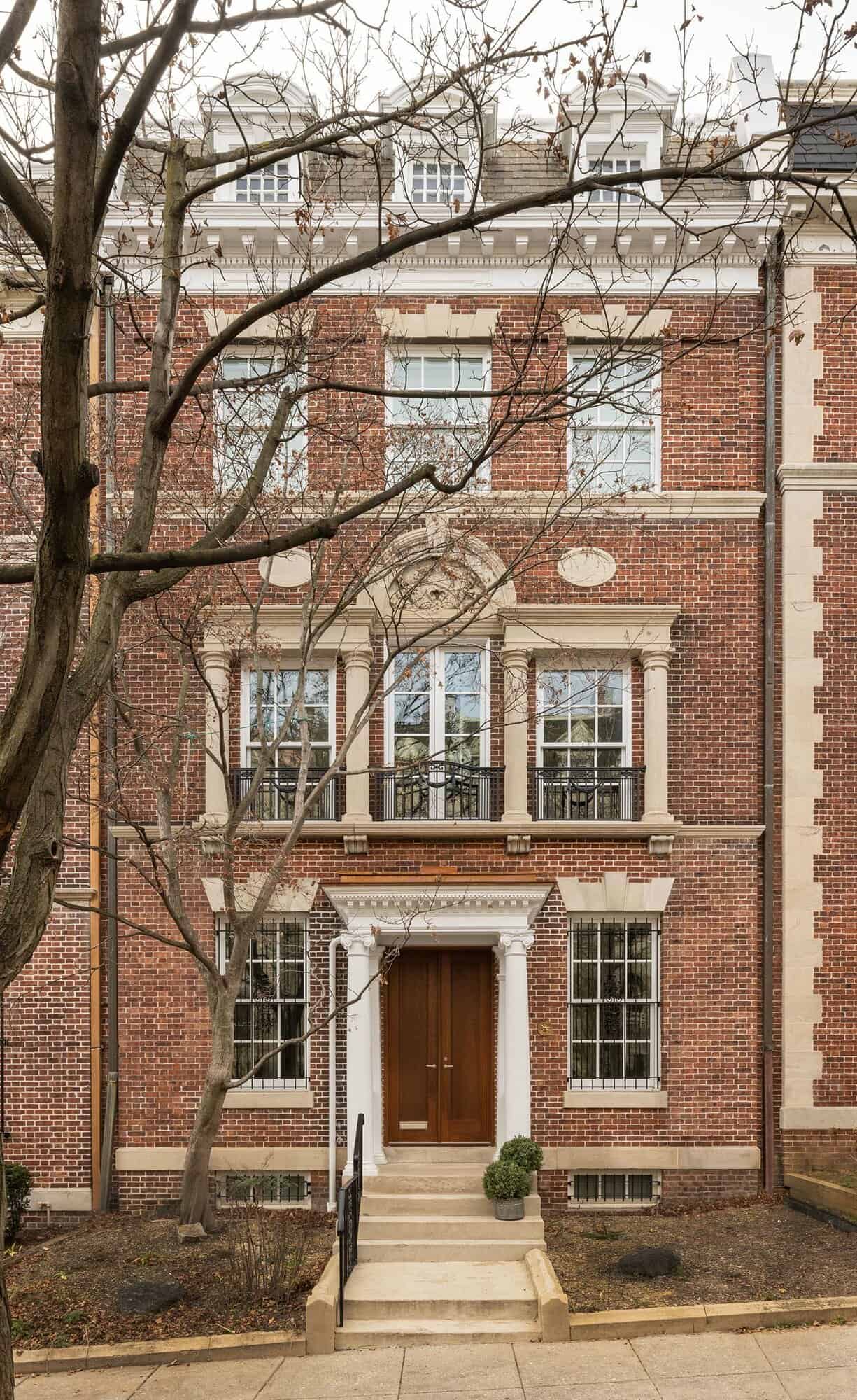
Fowlkes Studio is responsible for the modern renovation of a 1909 townhouse in the Kalorama neighborhood of Washington, D.C., which is known for its historic, millionaire mansions on tree-lined lanes overlooking Rock Creek Park.
Text description provided by the architects: “Empty nesters Tabandeh Farahbaksh and Bahram Pourmand wanted to be closer to the action — and their kids — after decades in the suburbs but they did not want to give up the scale and elegance that they were used to in Potomac, Maryland. The 5,750-square-foot five-bedroom, five-bathroom Kalorama townhouse they found fit half the bill.”
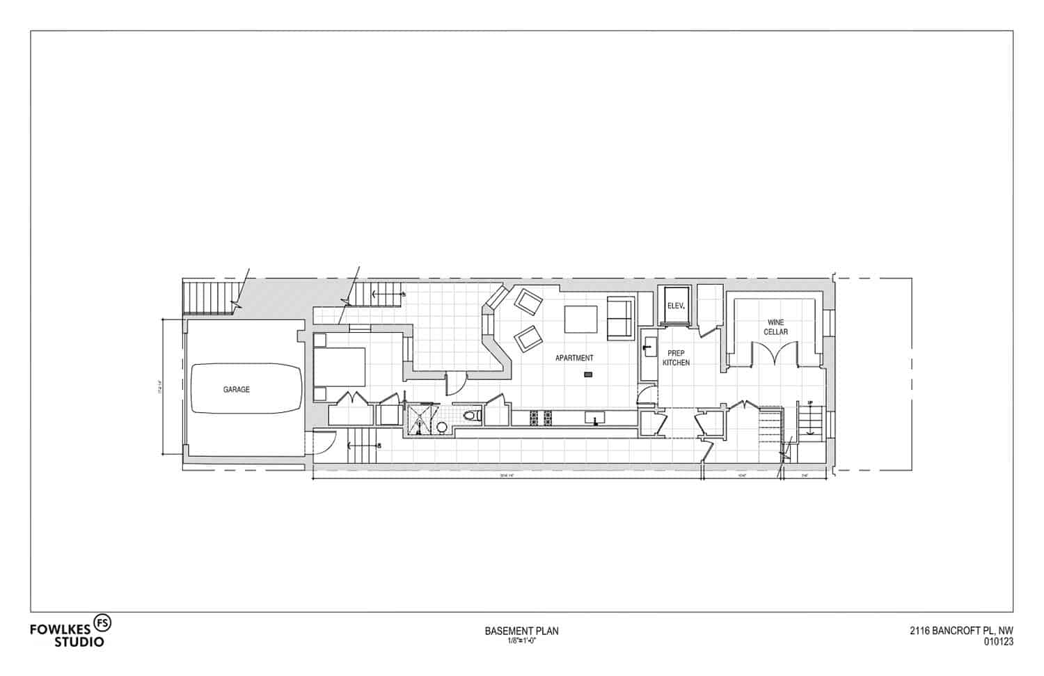
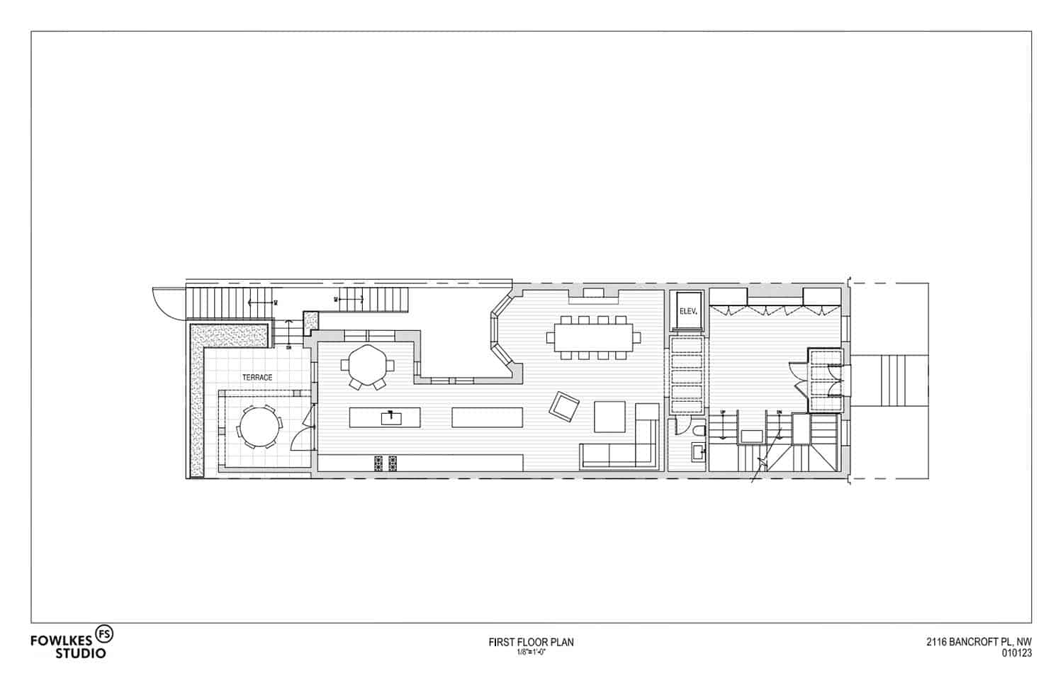
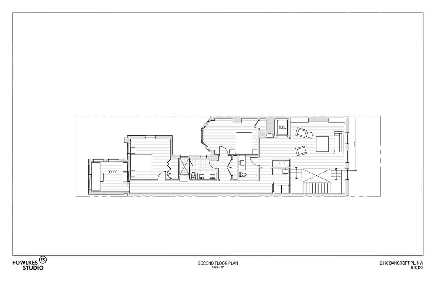
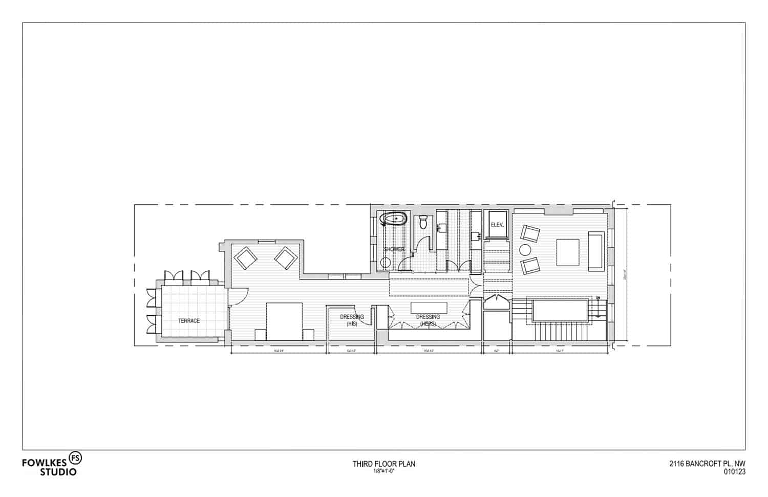
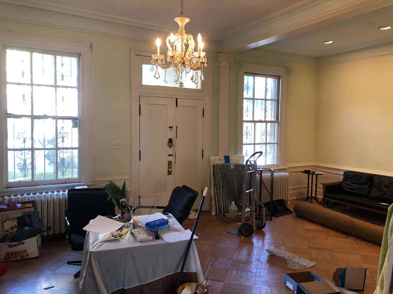
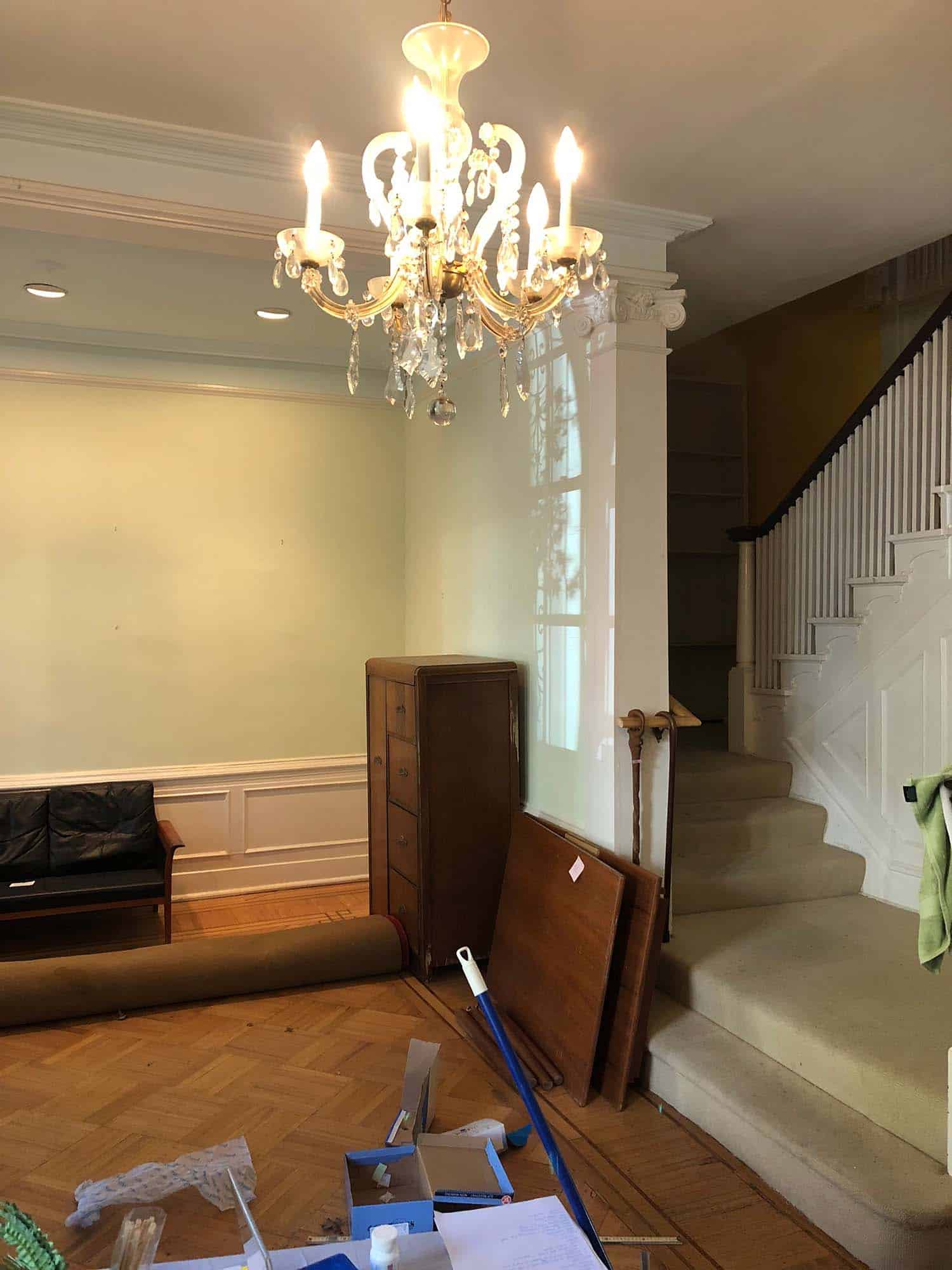
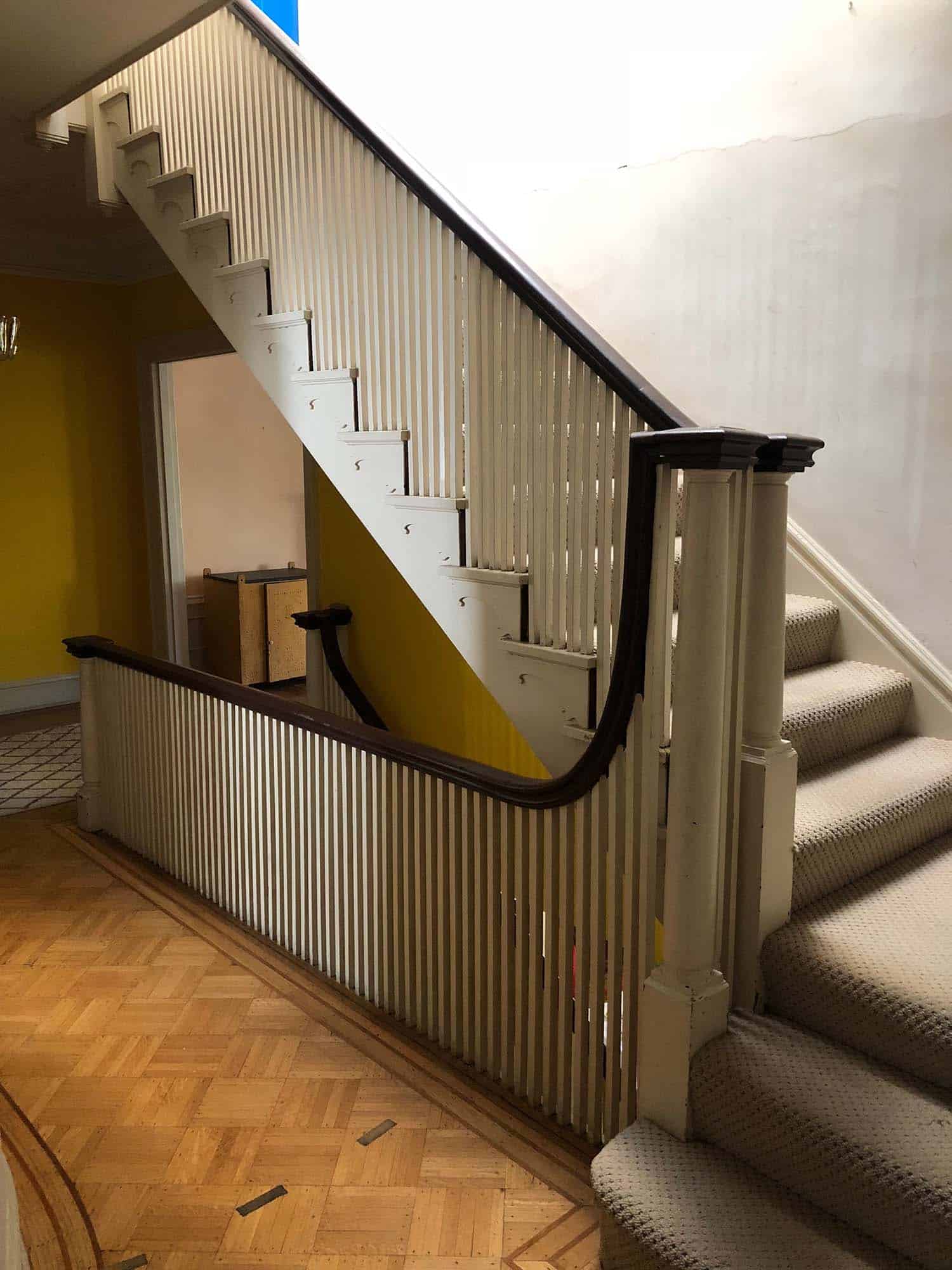
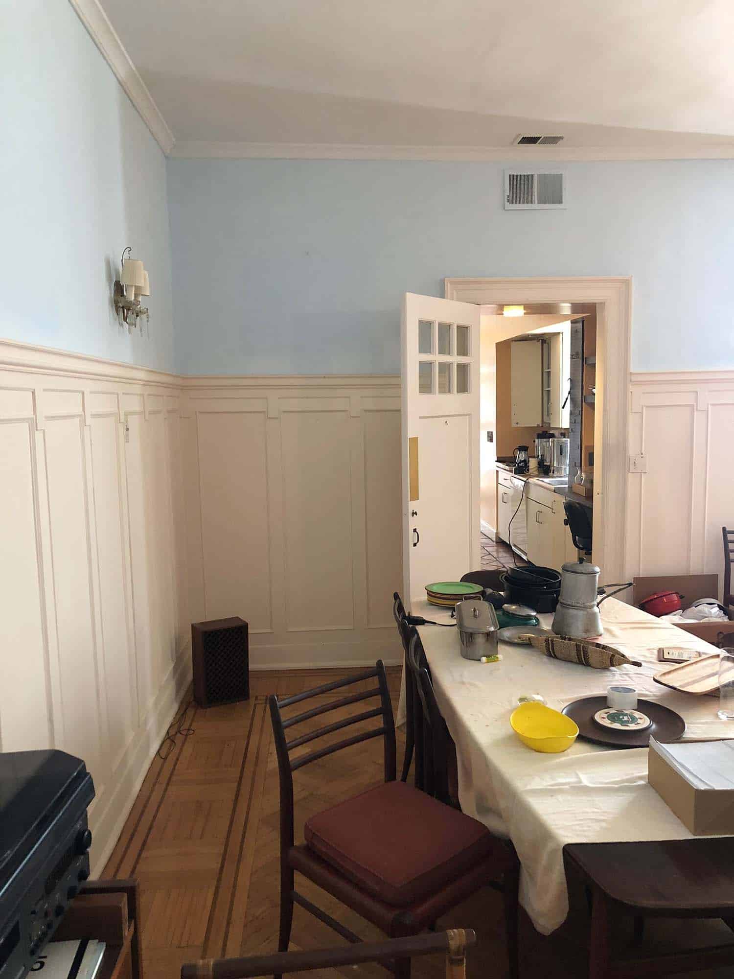
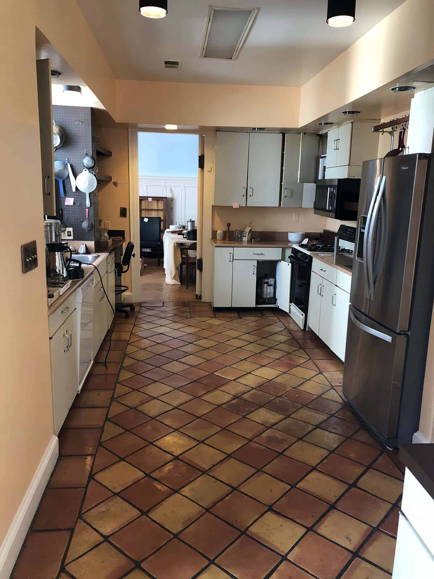
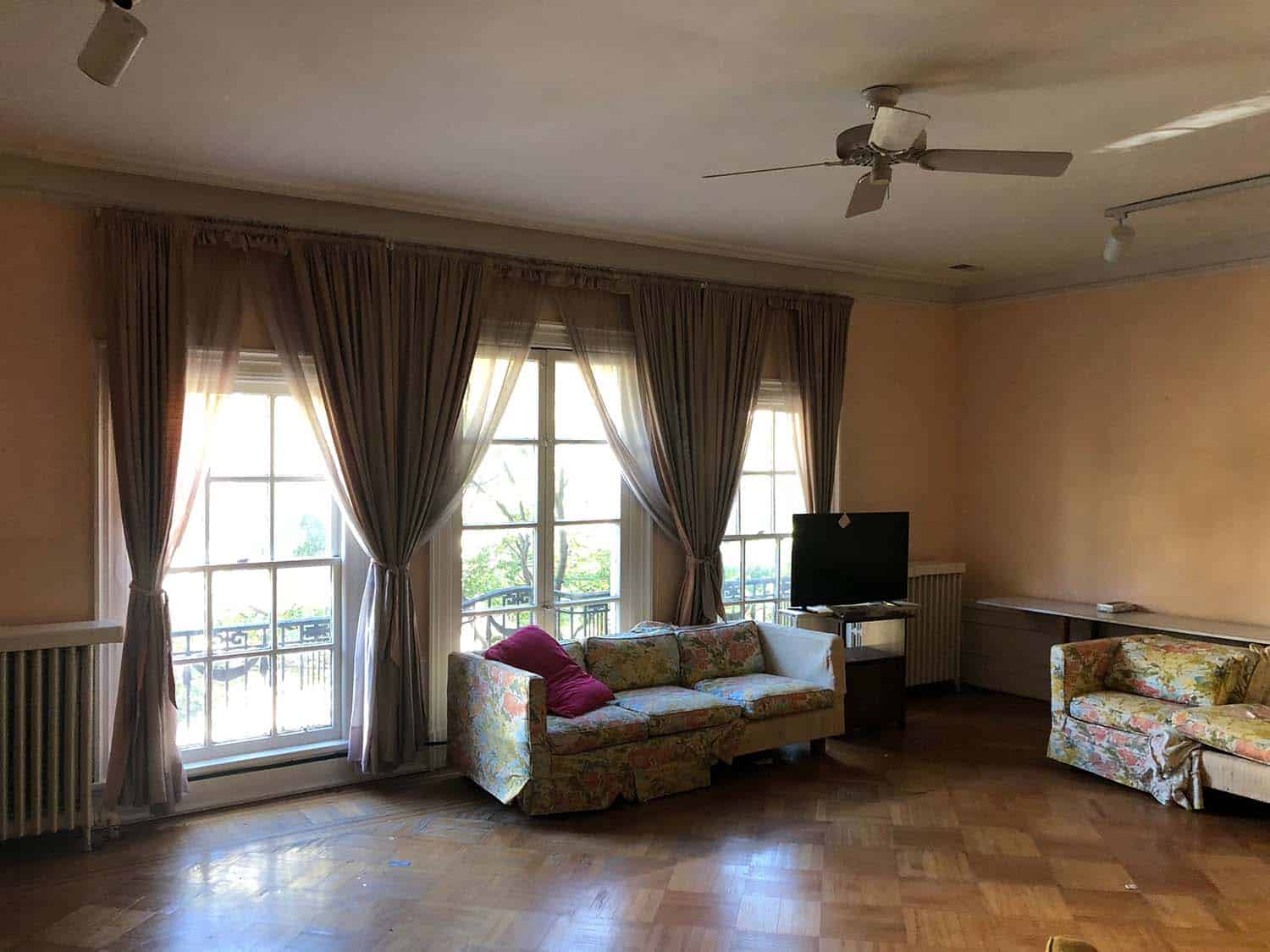
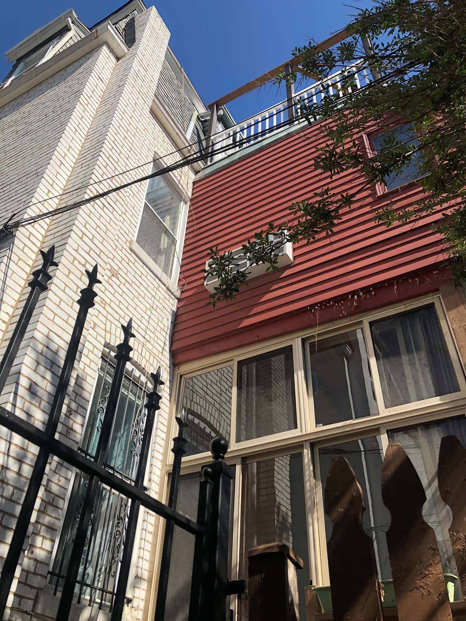
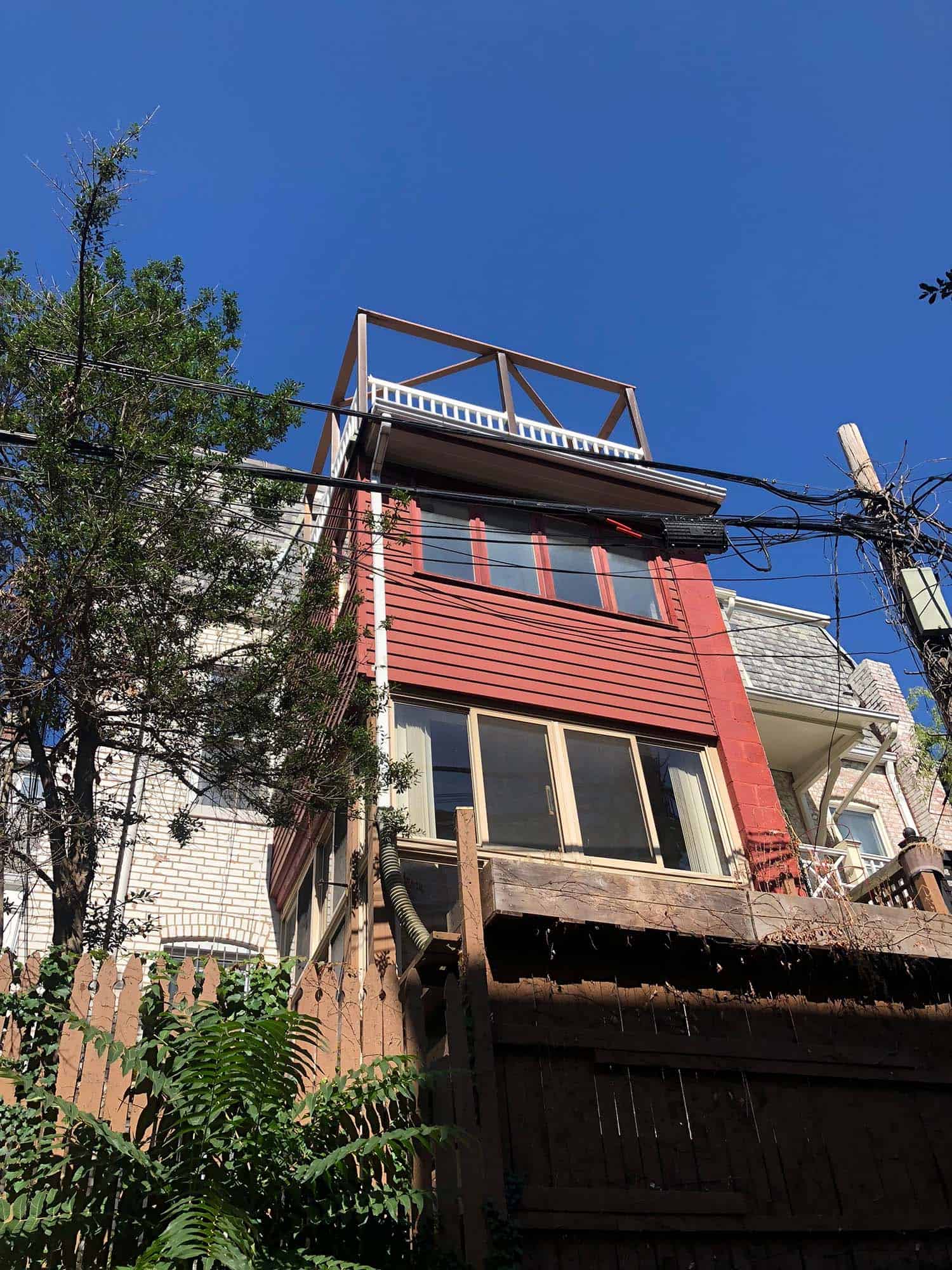
Continue below to see the floor plans and the images prior to the renovation of this historic townhouse…
It was 25′ wide and had 10′ ceilings — ampler than a typical DC row house — but it had not been touched in decades. The rear addition was falling apart, the garage was too small to fit a car, the floors were worn down, the kitchen was dark, the rooms were small and the grandeur and sophistication that the house exhibited from the street were absent on the interiors. The entire building would need to be reimagined with a larger garage, a newly constructed addition, and a full reorganization of the interior spaces.
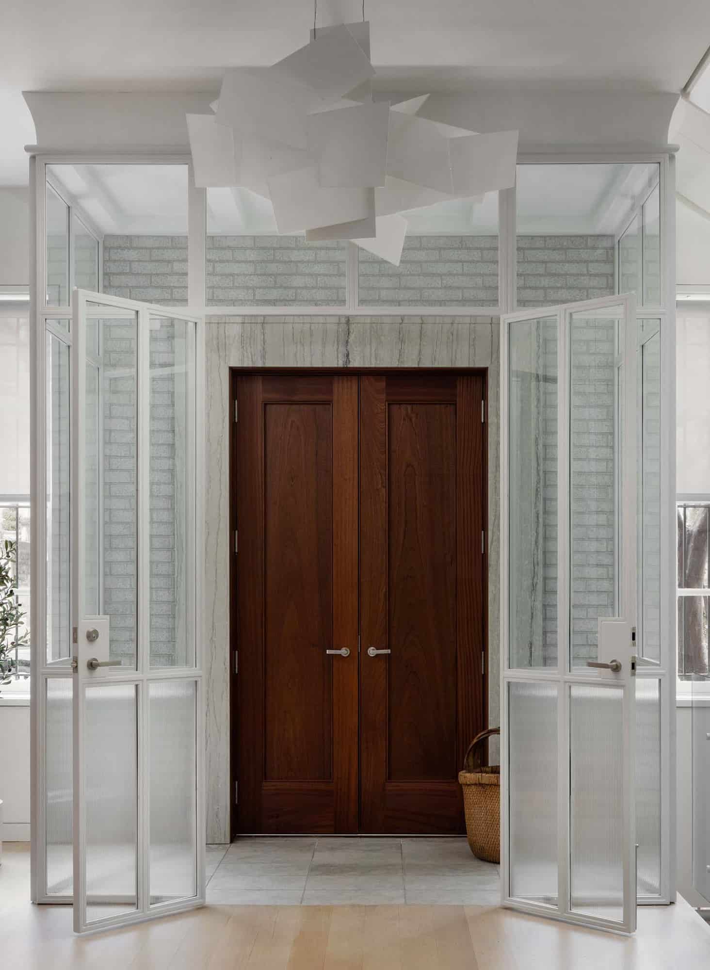
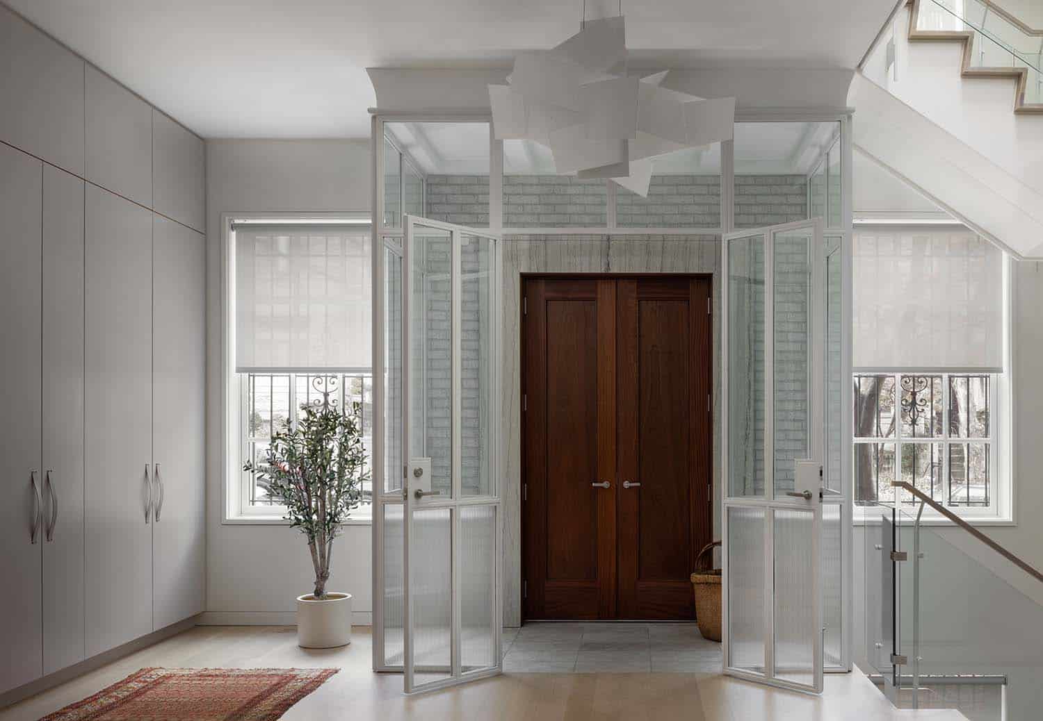
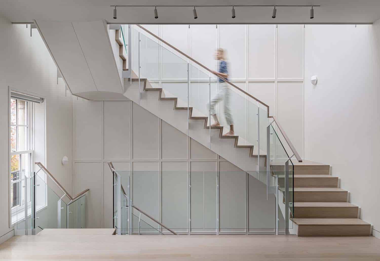
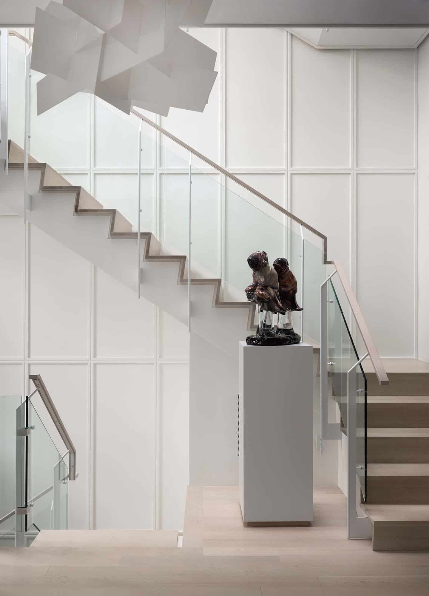
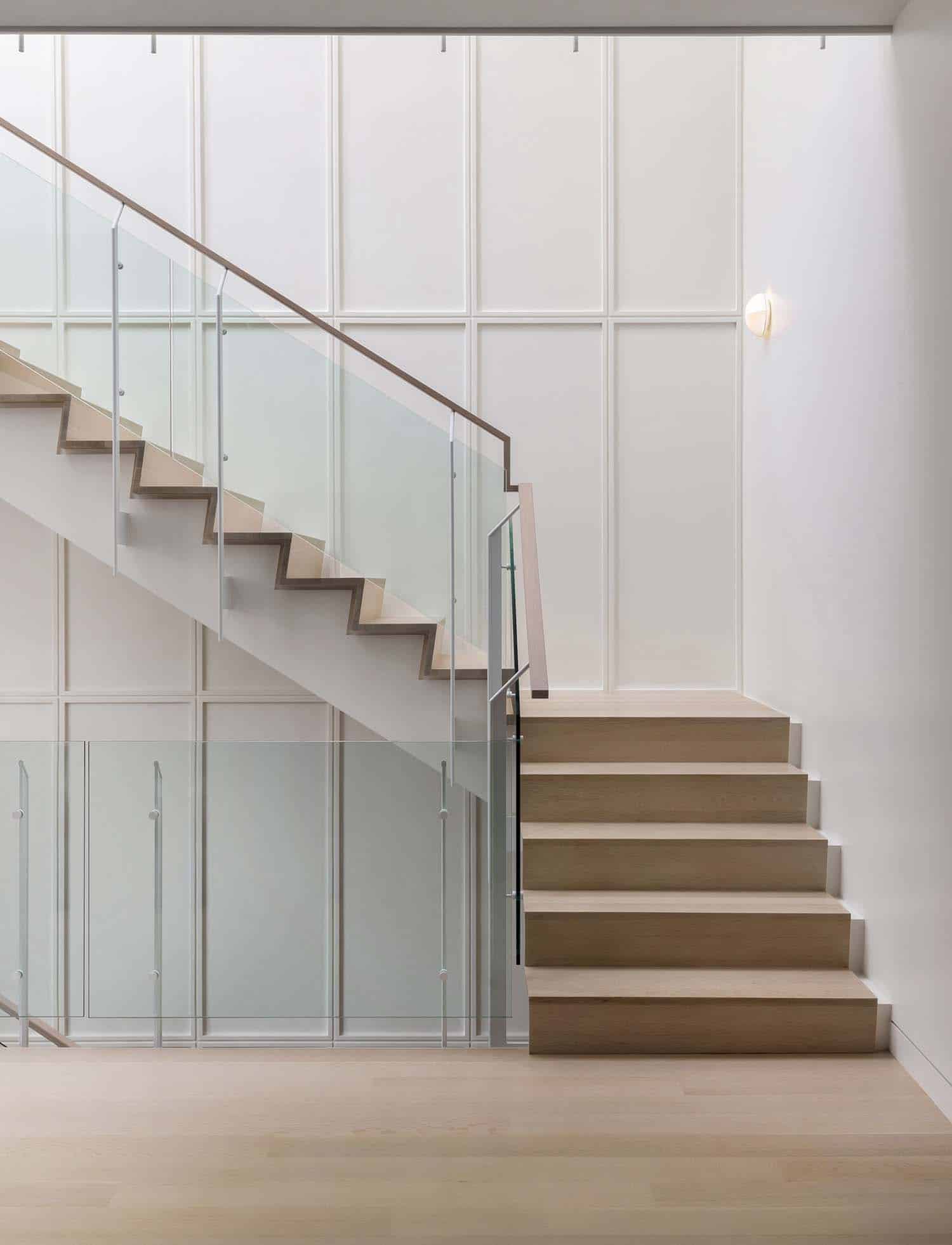
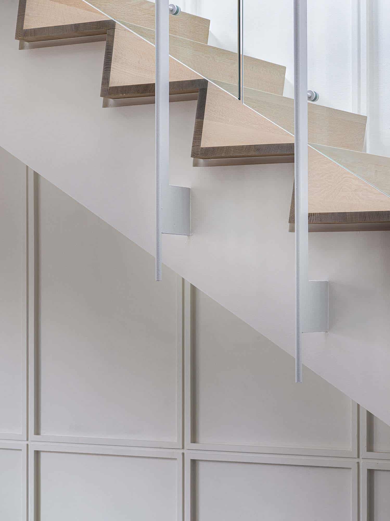
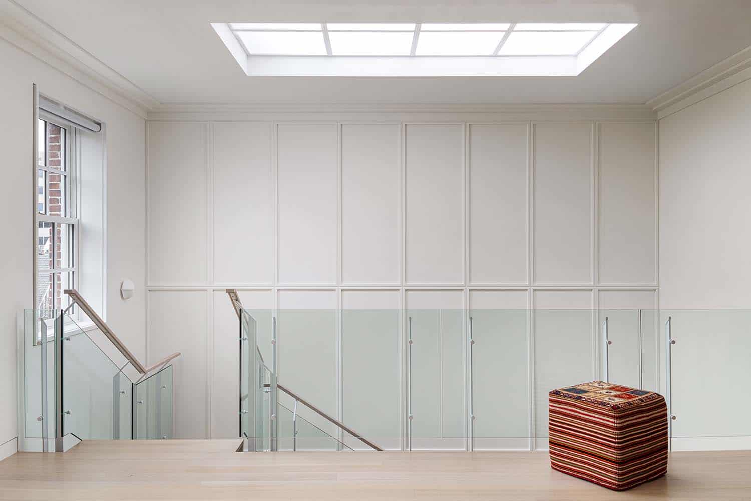
The husband and wife team behind the DC-based firm Fowlkes Studio was brought in to create a gracious stair in the front of the house that vertically linked a glamorous entry experience to sitting rooms on the second and third floor. The sitting room on the second floor would be adjacent to guest bedrooms and office and the sitting room on the third floor would serve as the primary suite.
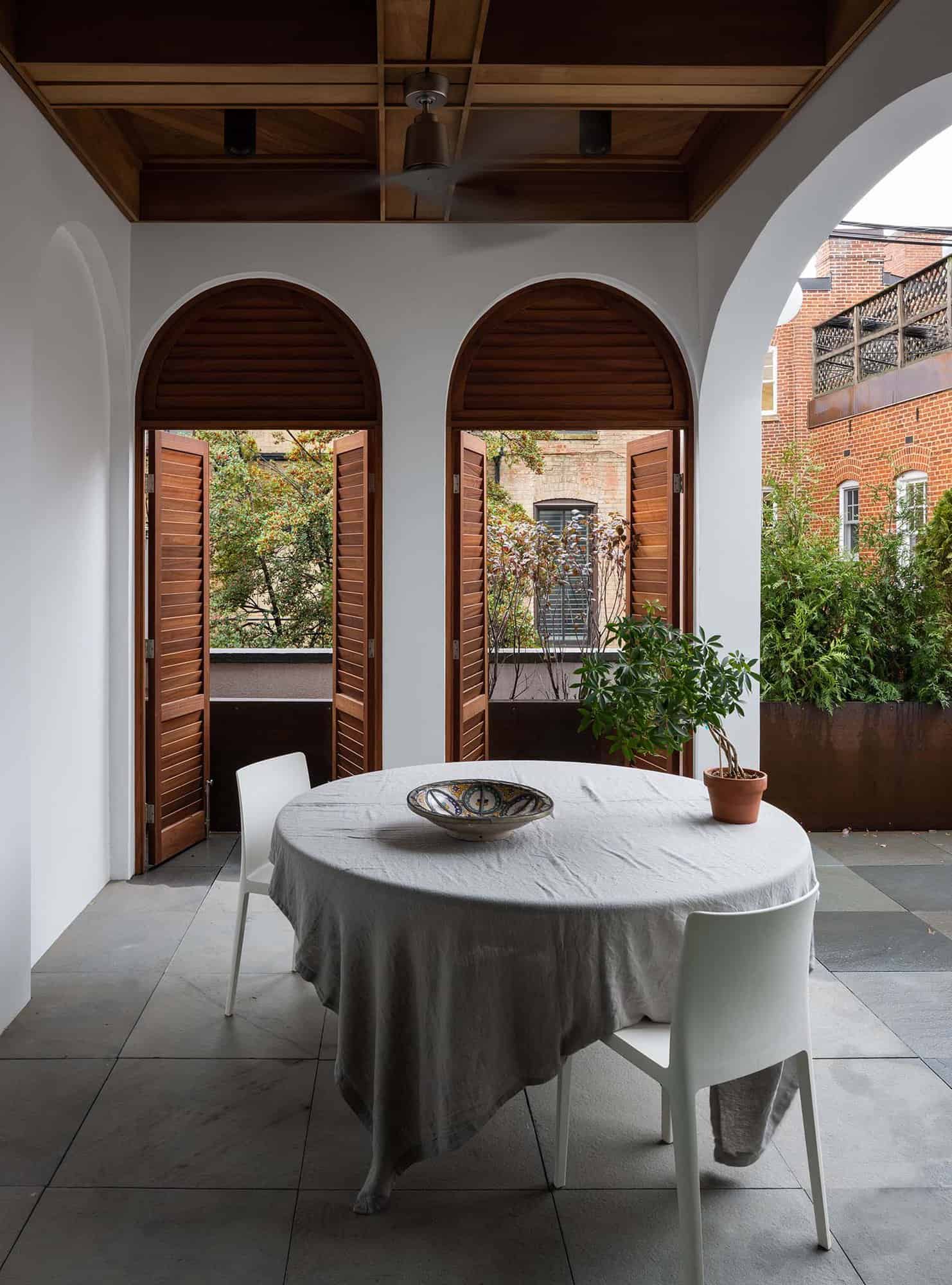
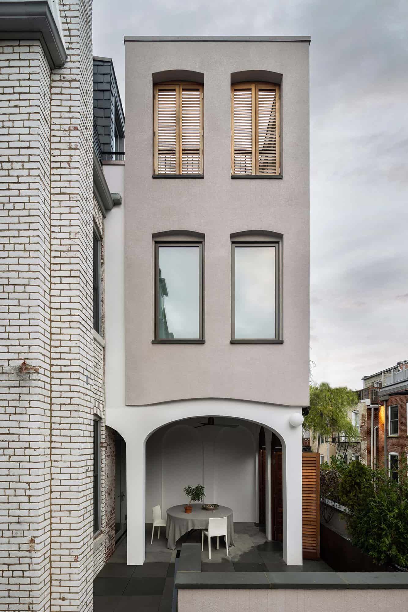
On the first floor, beyond the entry room would be an open living-dining followed by a kitchen at the rear of the building, which spills out onto a terrace on the roof of the expanded garage with custom steel planters around its perimeter. The addition, which is experienced as its own autonomous structure, hovers over the terrace supported by piers.
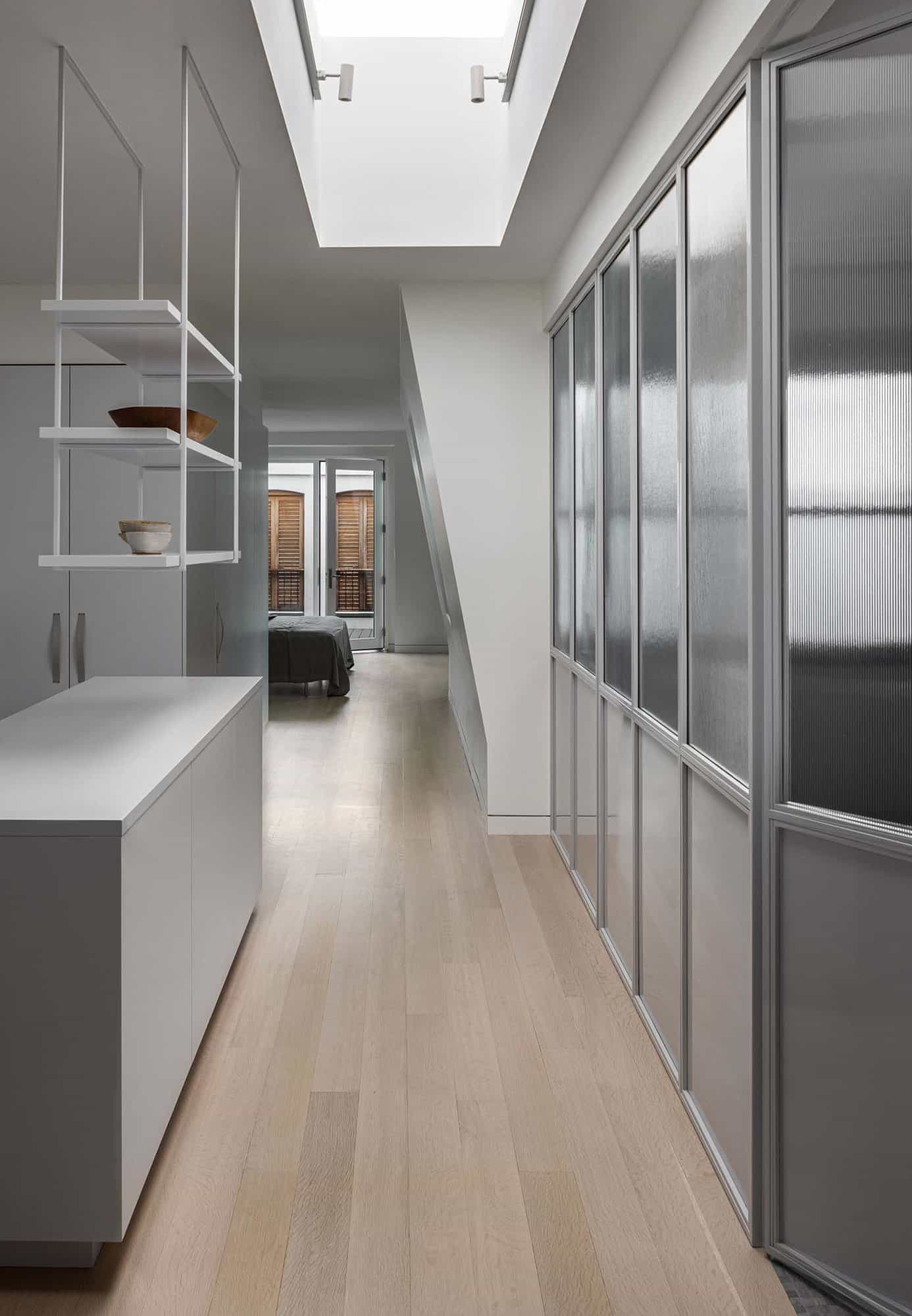
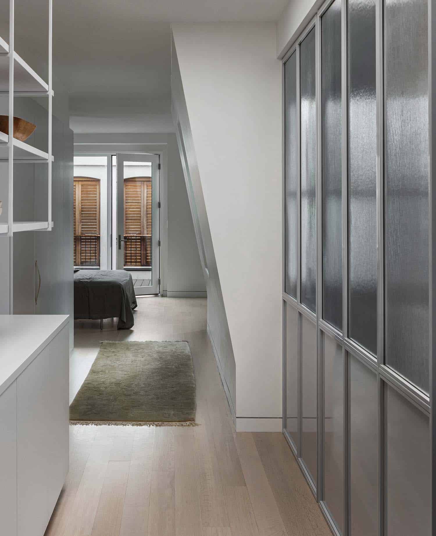
On the second level, the addition houses an office and on the third level, the addition contains a walkout roof deck connected to the primary bed chamber. The roof deck is open to the sky but surrounded by walls with shuttered openings to protect the bedroom from views from the rear alley while still allowing the sun to filter into the suite.
The clients adopted a timeless aesthetic by juxtaposing the refinement and luxury that one would expect in the neighborhood of embassies and stately residences with a material grittiness.
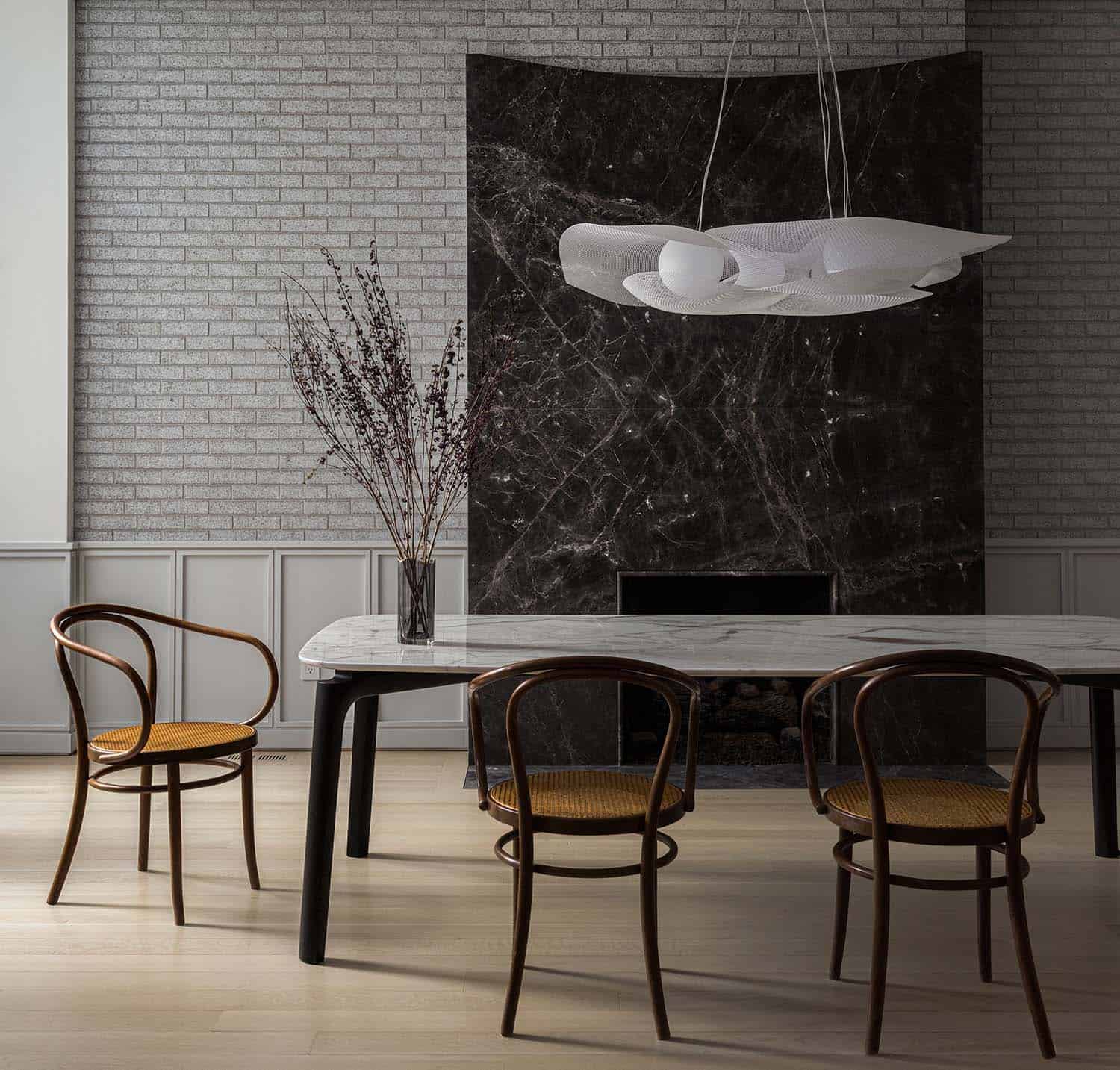
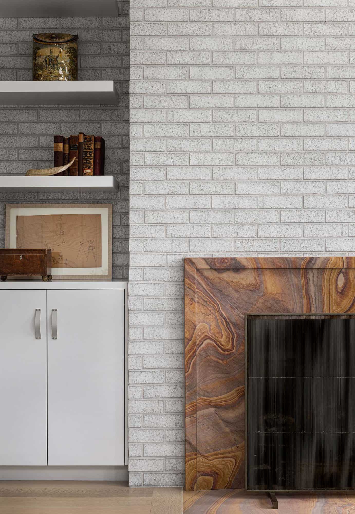
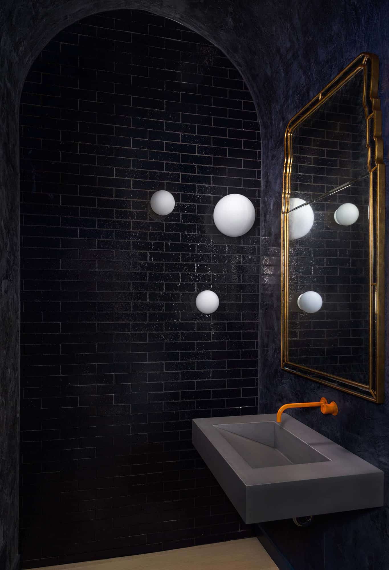
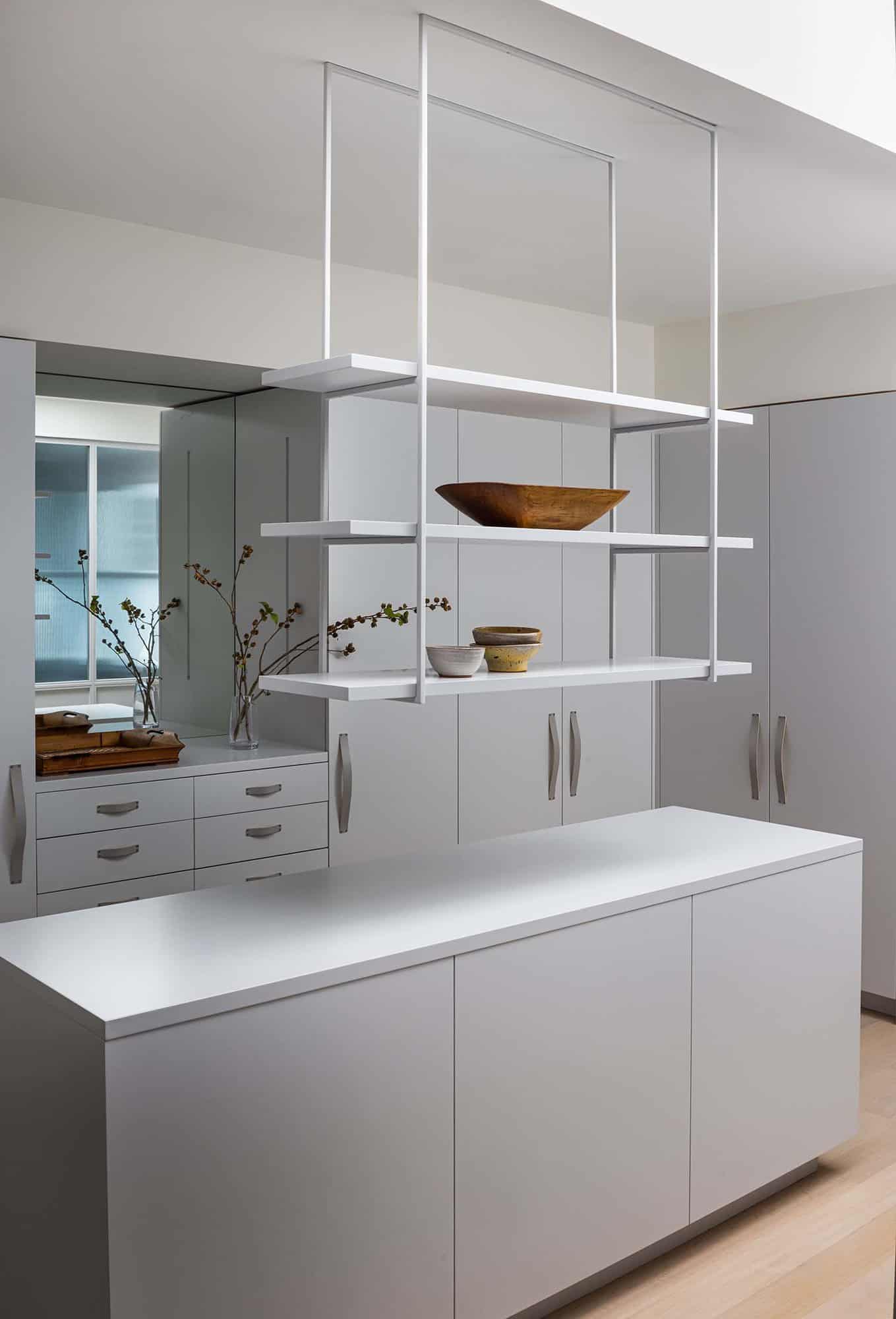
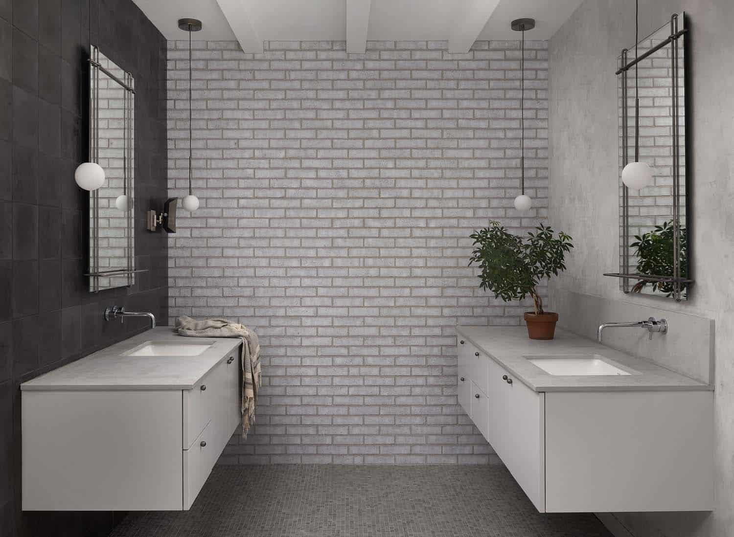
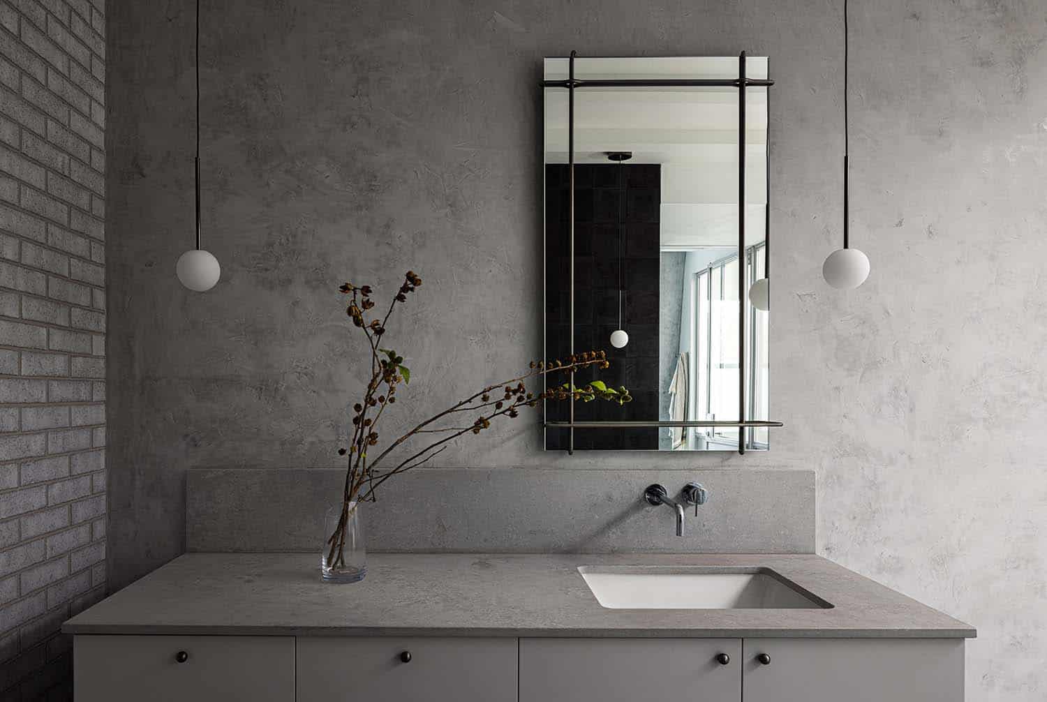
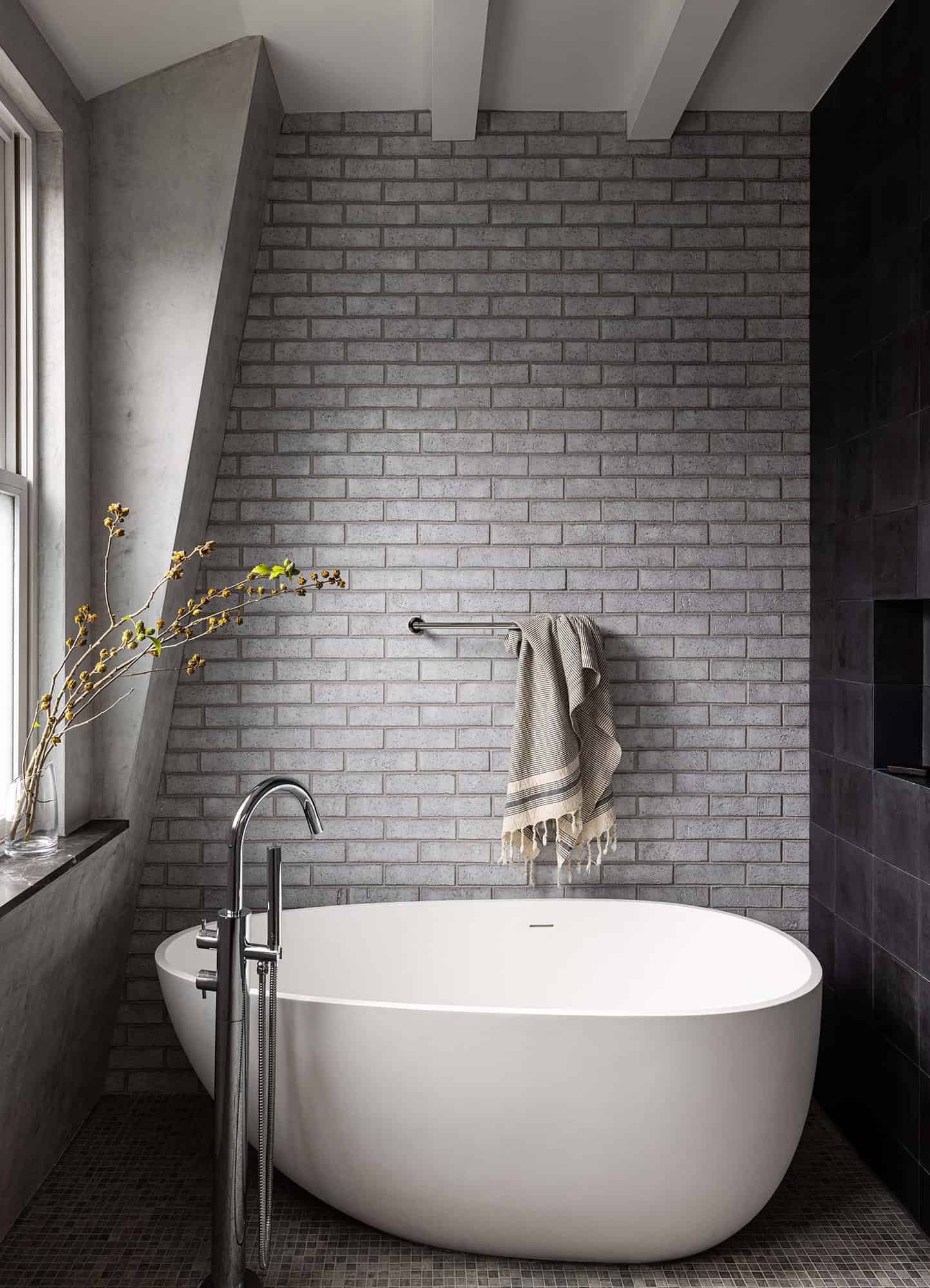
The smooth plaster finish of the addition stands in contrast with the flaking painted brick of the original house. The inside faces of the perimeter walls were covered in a glazed brick which contrasts with sumptuous stone fireplace fronts, finely crafted cabinetry, and artisan plaster.
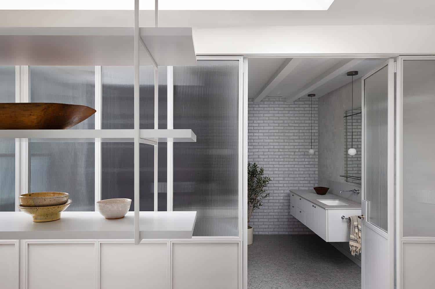
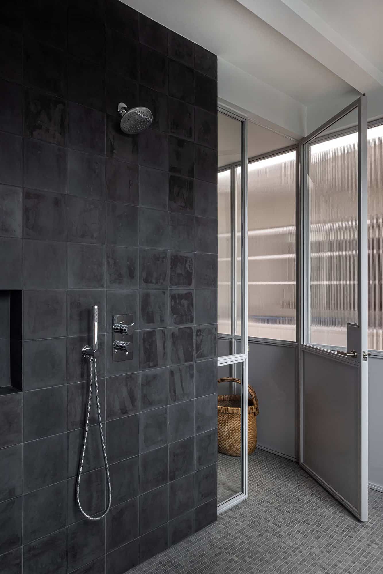
What We Love: This historic townhouse has undergone a striking modern renovation to provide empty nesters with a luxurious and timeless new home. A grand entryway welcomes guests into the home where a gracious new staircase connects all the levels of this opulent townhouse. We are especially loving the owner’s bathroom with its spa-like feel and beautiful soaking tub to relax at the end of a long day.
Tell Us: What do you think of the overall transformation of this historic townhouse? Let us know in the Comments below!
Note: Check out a couple of other fascinating home tours that we have highlighted here on One Kindesign in the U.S. capital of Washington, DC: Light-filled contemporary home renovation in Washington, DC and Stunning pre-war row house renovation in Capitol Hill.
BEFORE THE RENOVATION
One Kindesign has received this project from our submissions page. If you have a project you would like to submit, please visit our submit your work page for consideration!



6 comments