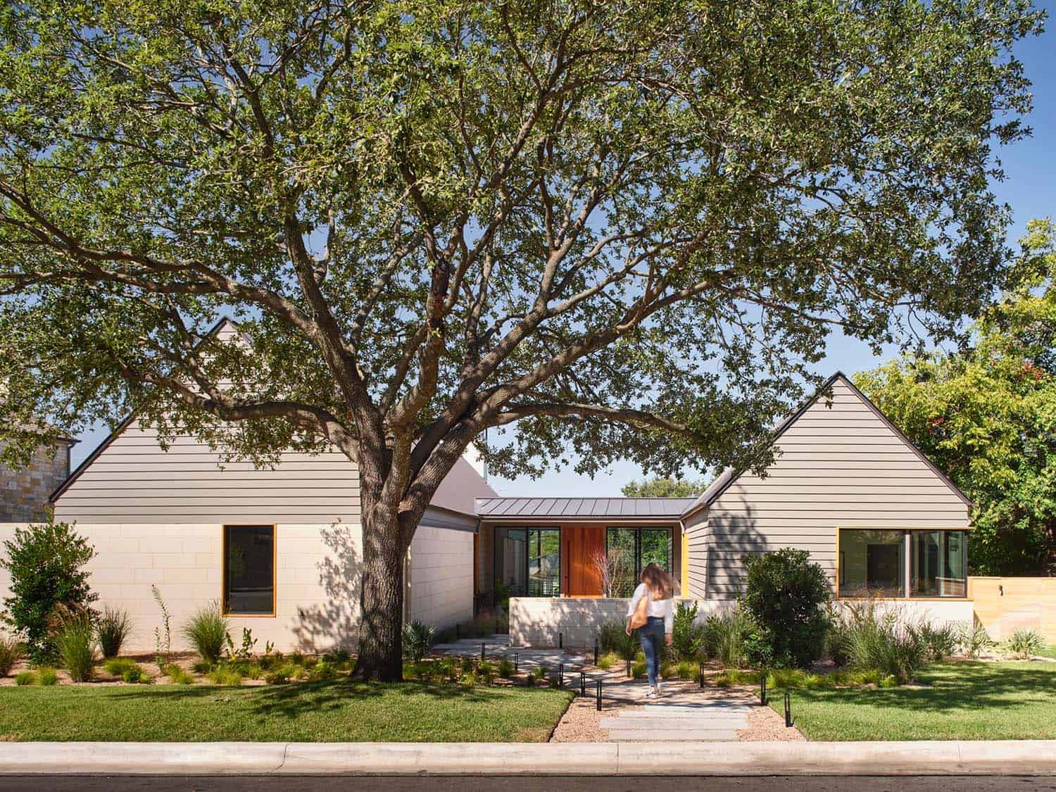
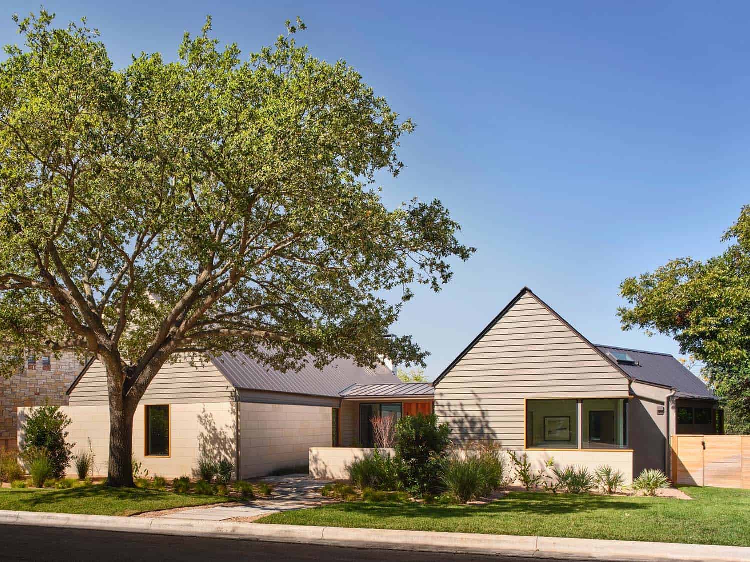
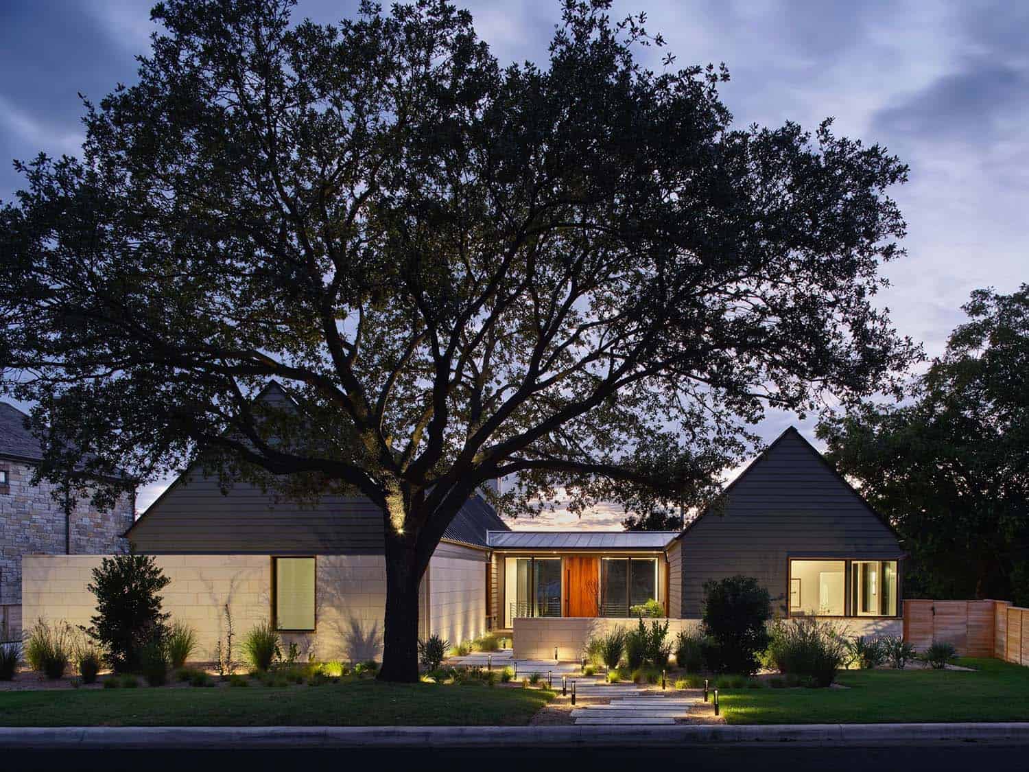
Designed by architect Clayton Korte this spectacular modern home makes the most of its steeply sloped, leafy site in a neighborhood of Austin, Texas. The owner’s vision was for a refined retreat notable for fluid spaces and artful details.
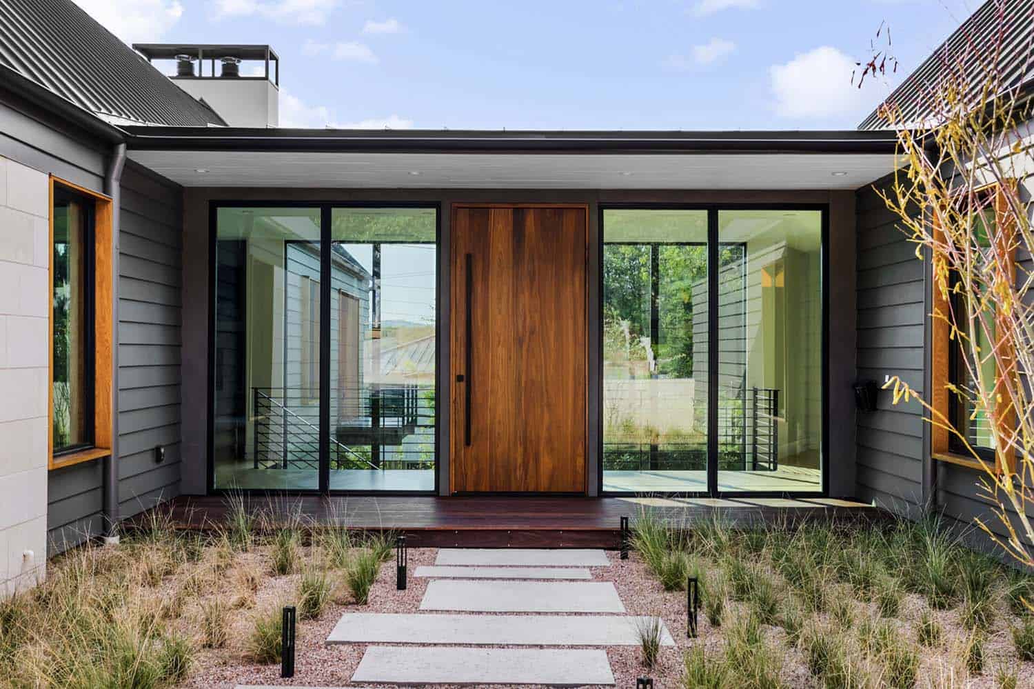
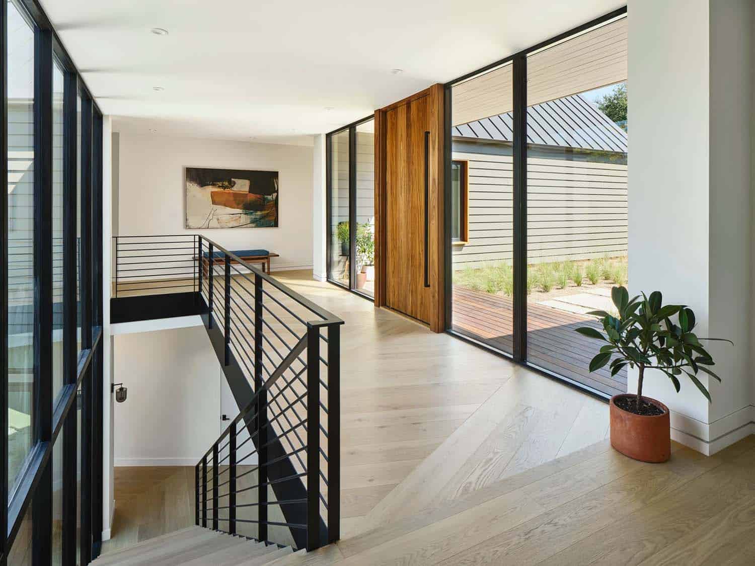
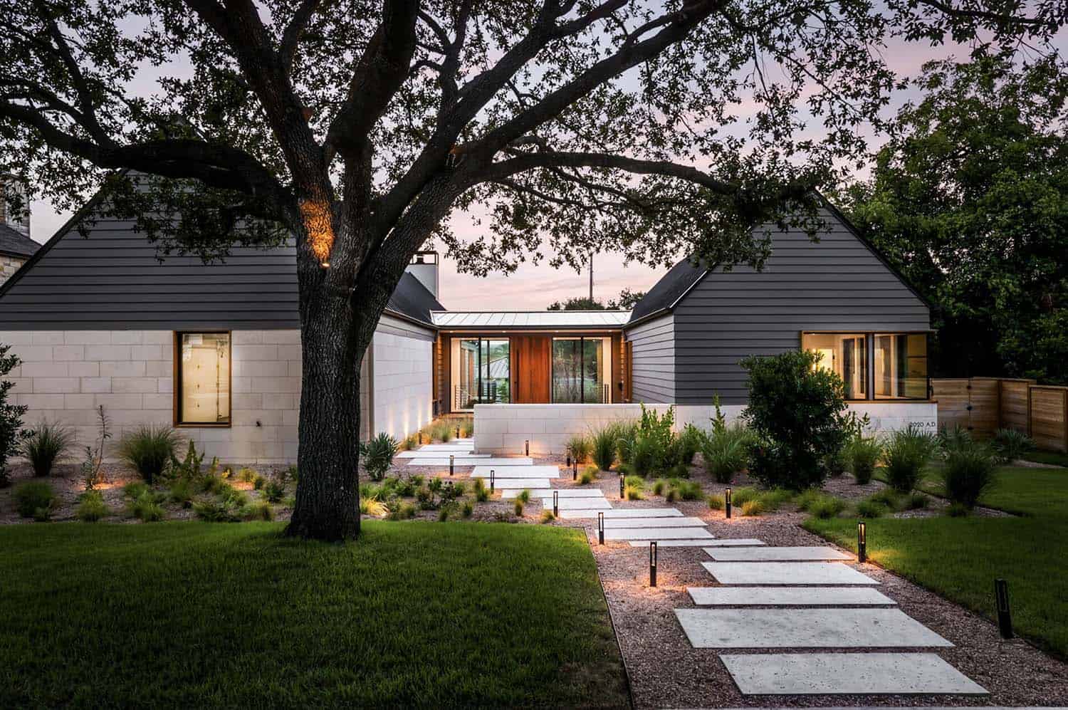
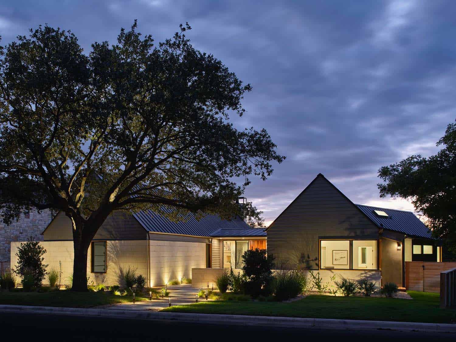
Throughout the house, the flow of spaces is informed by natural light; rooms open one after another and draw one forward to discover what comes next. Two deceptively simple single-story gabled structures are connected by a glass entry foyer through a formal entry court.
DESIGN DETAILS: ARCHITECT Clayton Korte GENERAL CONTRACTOR Next Custom Homes STRUCTURAL ENGINEER GOGO Structural Engineers MEP ENGINEER Design-Build by Installer LIGHTING DESIGN CK & Owner
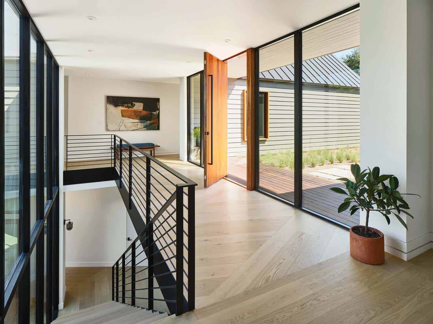
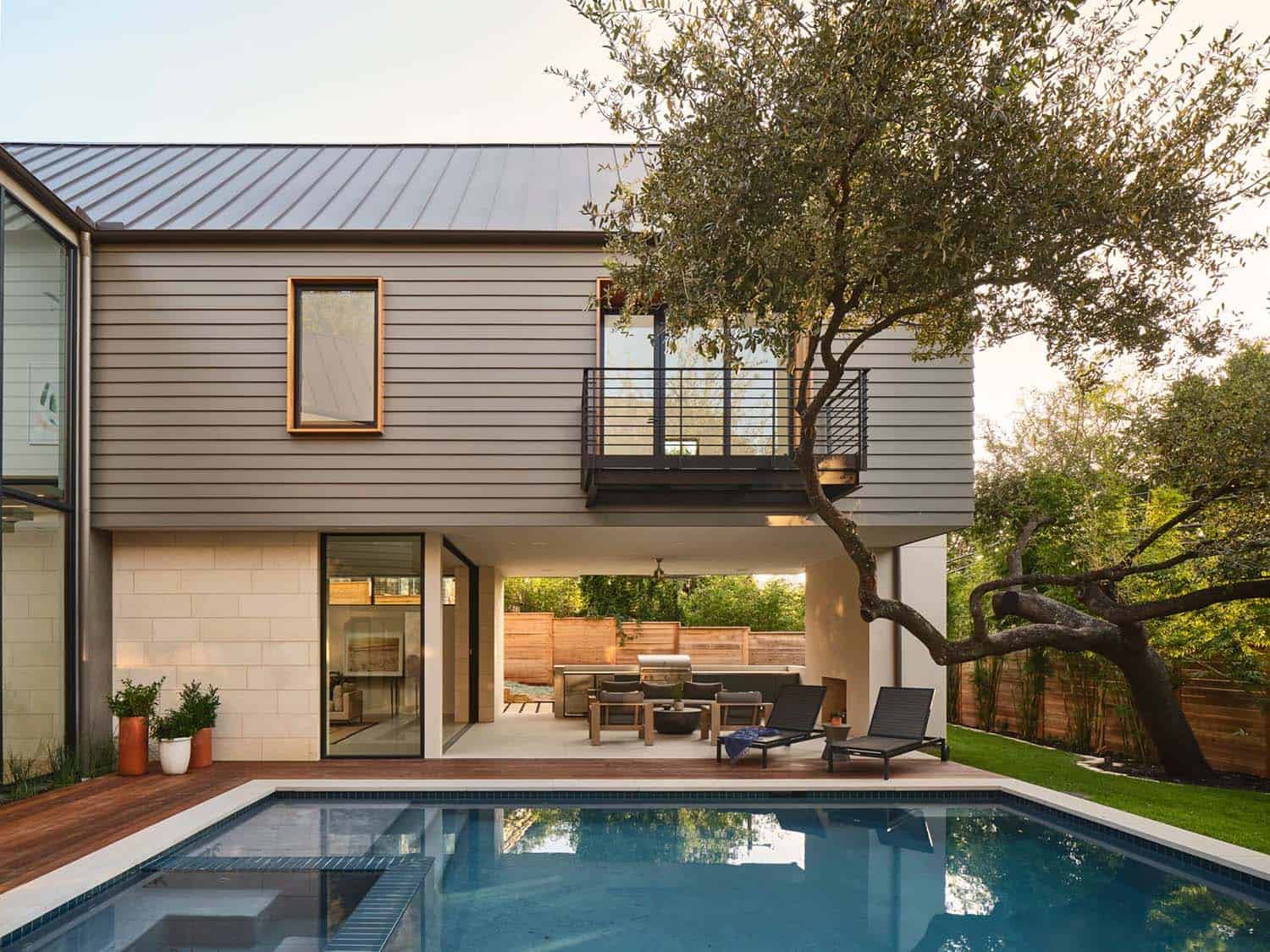
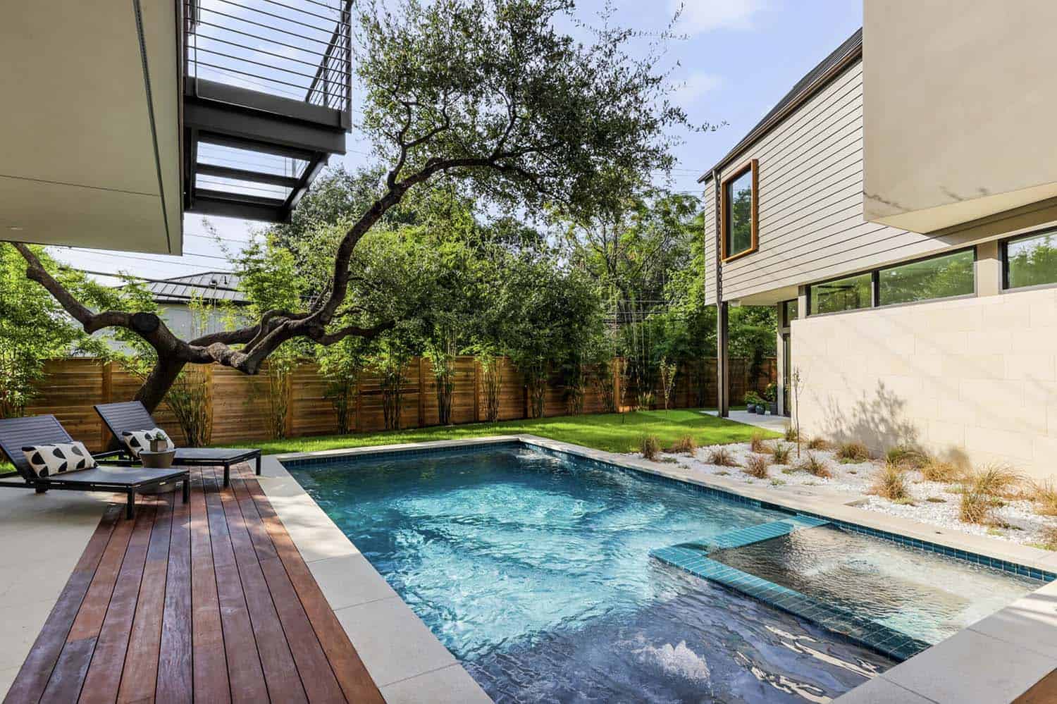
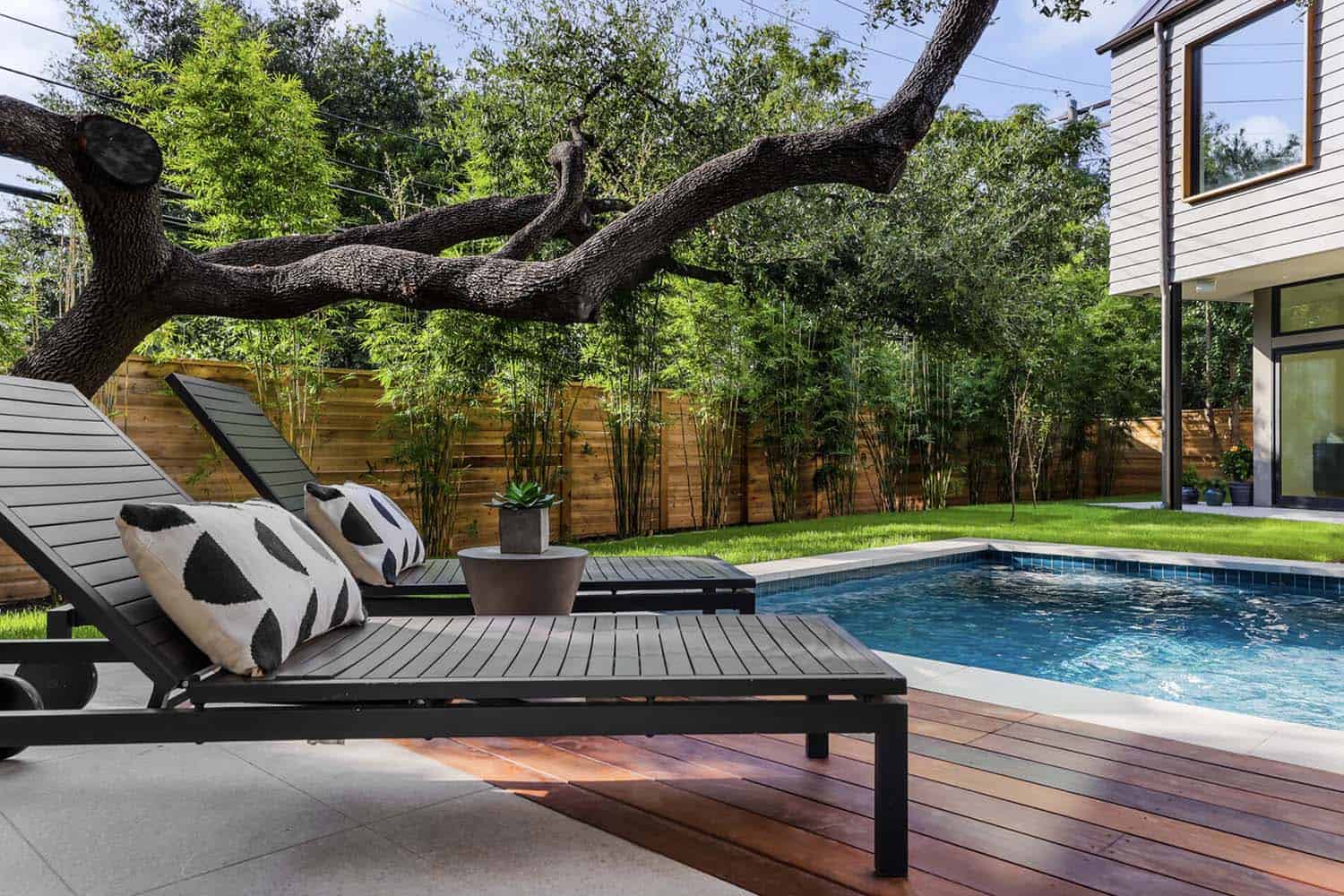
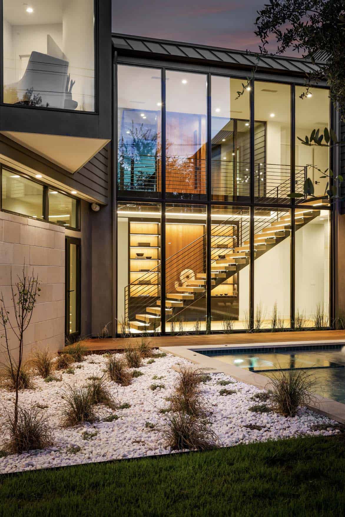
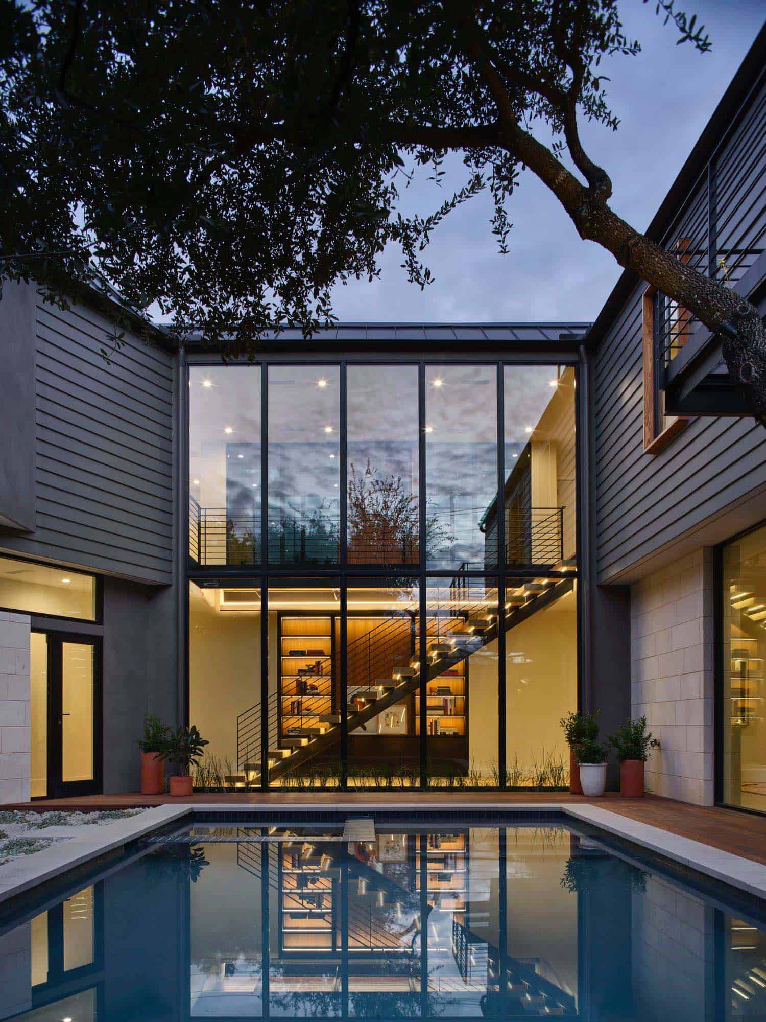
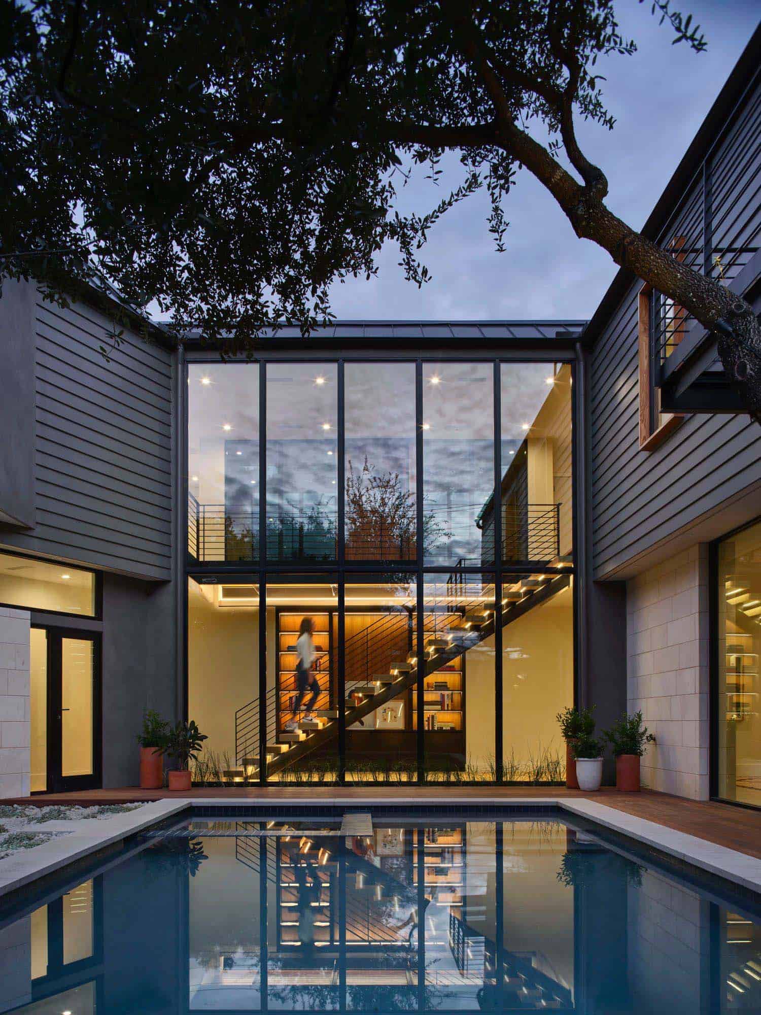
The foyer greets guests with a unique oak wood floor pattern and reveals an outdoor living oasis with a pool at the sunken rear yard while bridging public and private wings on the main level.
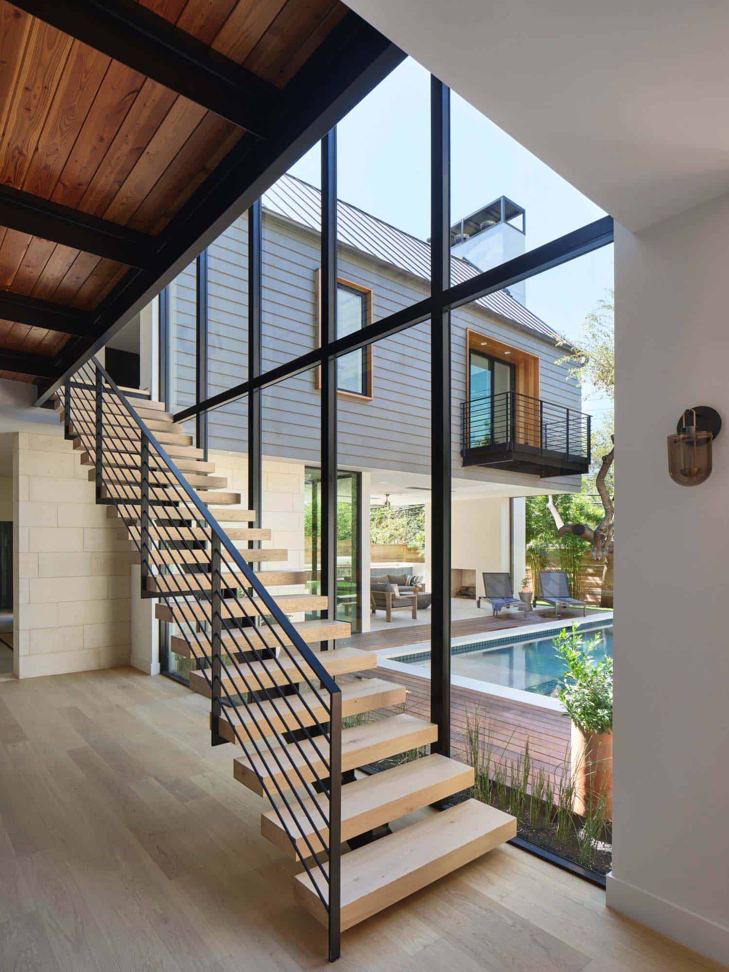
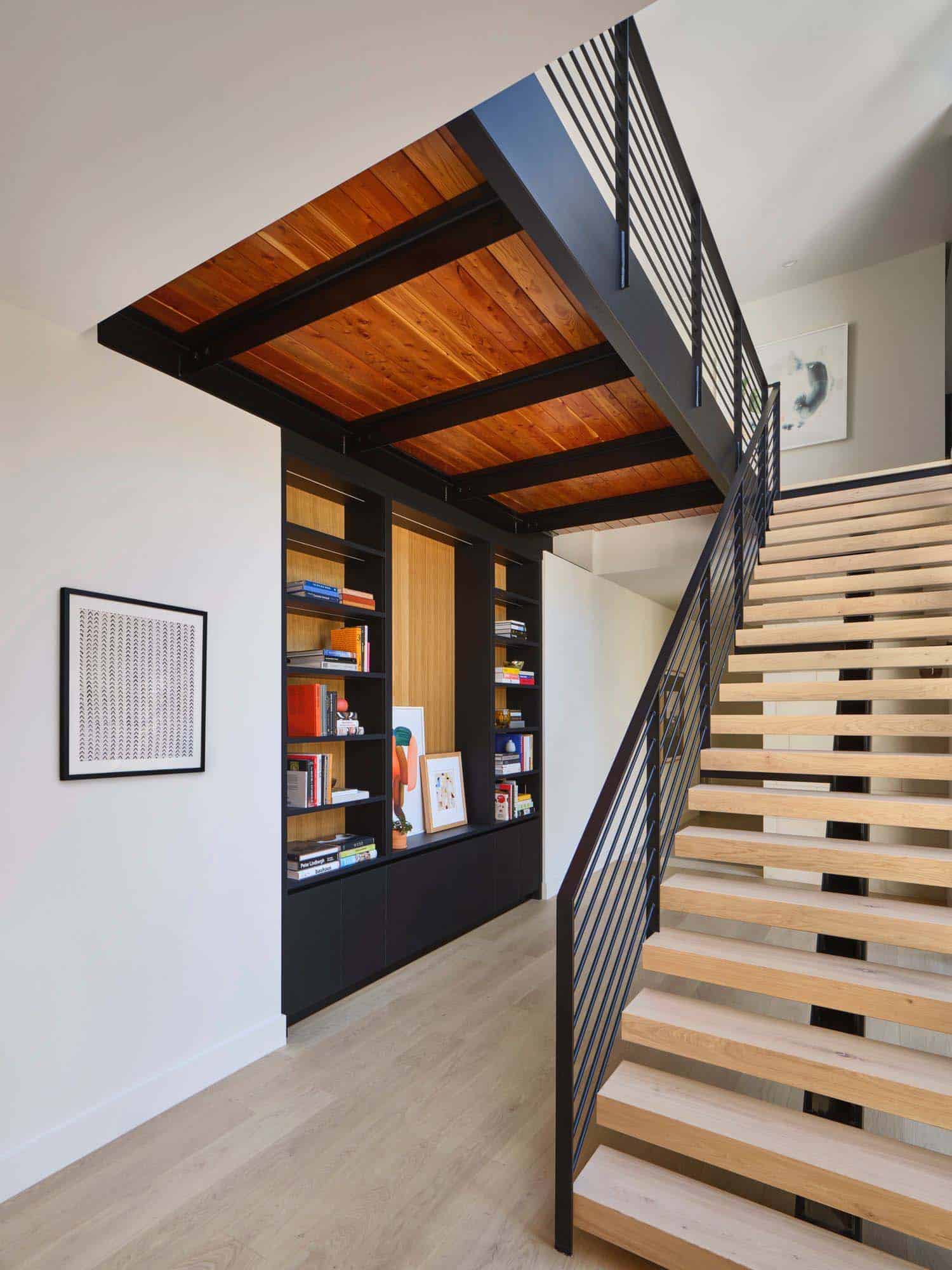
“As the city of Austin continues to grow,” notes Paul Clayton, AIA, Principal at Clayton Korte, “this residence evokes a modern simplicity while respecting the history of the surrounding Clarksville neighborhood. From the street level, one sees a seemingly single-story home, but an open tread entryway stair leads down to generous gathering spaces and bedrooms tucked below. The unfolding spaces provide a sense of discovery for residents and guests.” The home includes a three-car garage.
What We Love: This modern home in Austin provides a fantastic indoor-outdoor living environment that helps to flood the interiors with natural light. Spread out over two levels, this home offers an idyllic floor plan with the main living spaces separated from the private living spaces. On the lower level, is a fabulous entertaining space with the family room connecting to a spacious outdoor area with a sparkling pool. Overall, a thoughtfully designed home for contemporary living and entertaining.
Tell Us: What are your overall thoughts on the design of this home? Let us know in the Comments below, we love reading your feedback!
Note: Be sure to have a look at a couple of other amazing home tours that we have showcased here on One Kindesign in the state of Texas: Mid-century modern house renovation in Texas boasts striking details and Breathtaking Texas Hill Country home designed with timeless aesthetics.
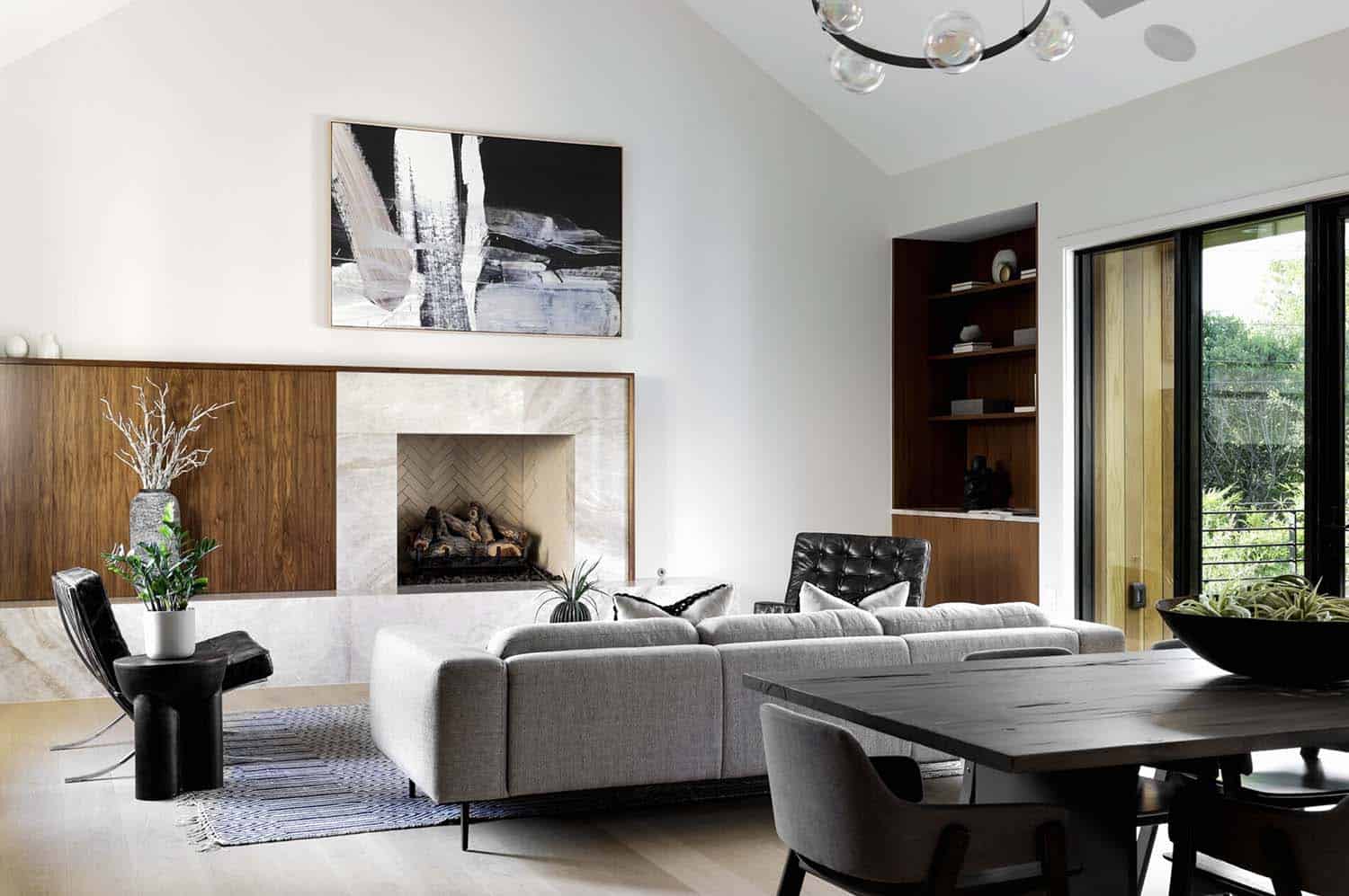
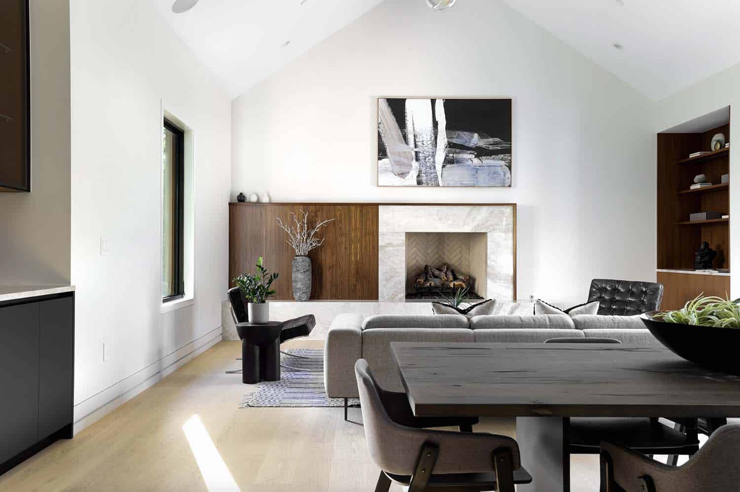
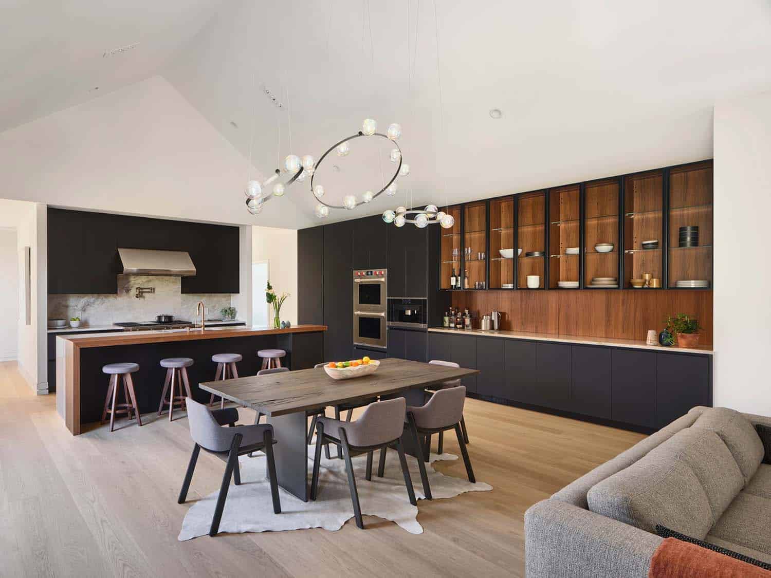
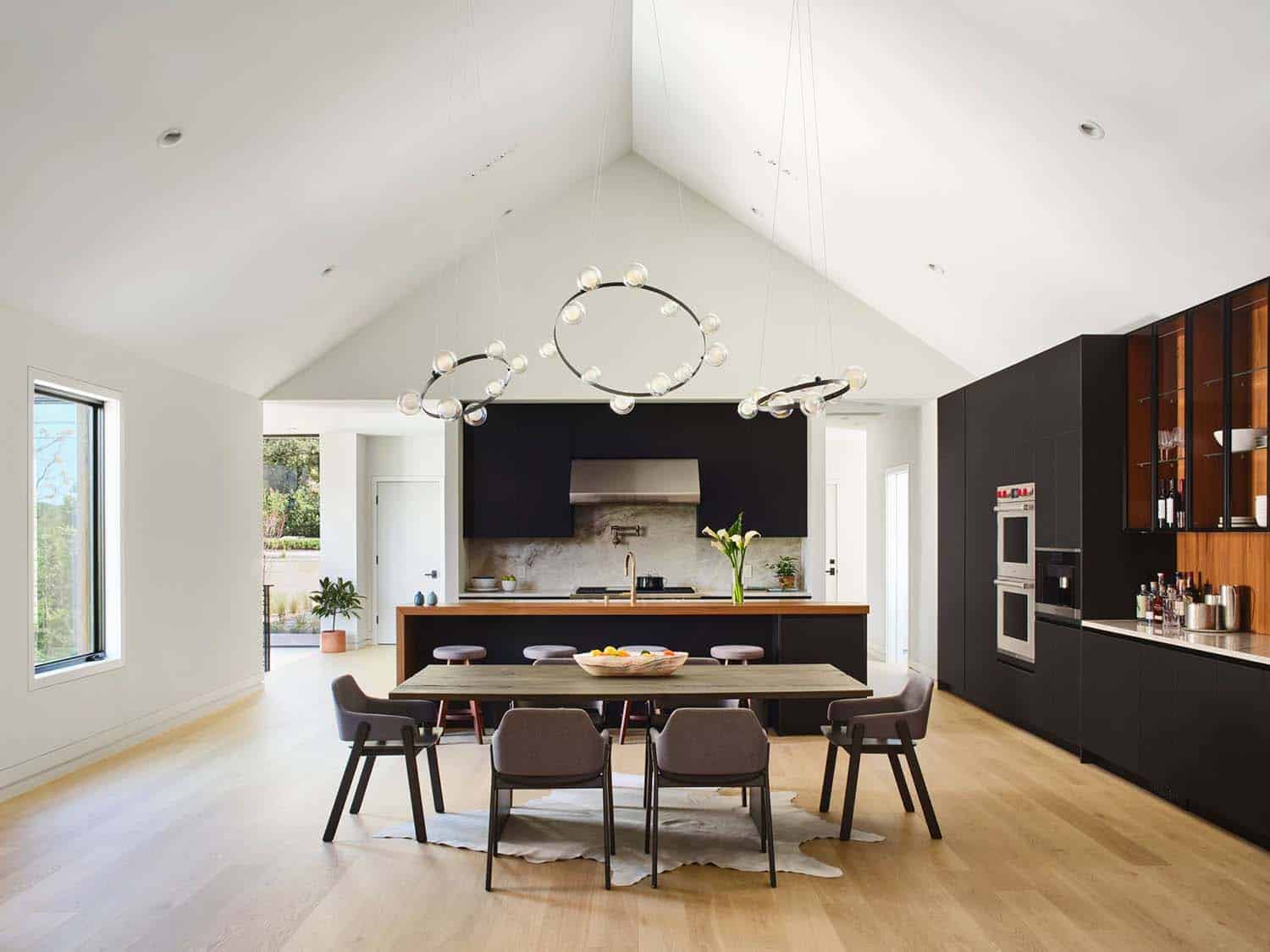
The public wing features a vaulted great room combining kitchen, dining, and living spaces, with a balcony overlooking the pool below.
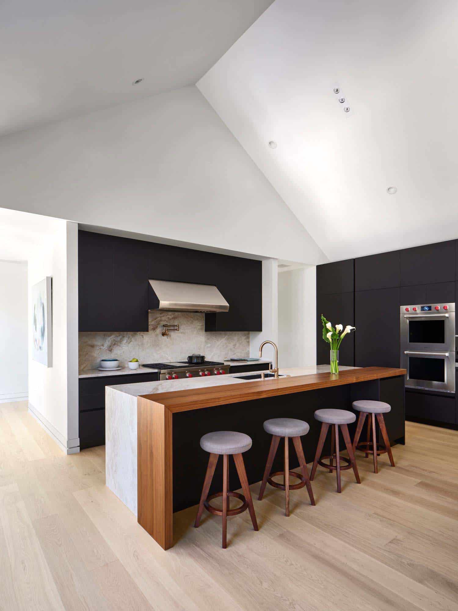
A neutral interior color palette draws attention to bold details, such as the stained black cabinetry and beautiful marble-wood waterfall island.
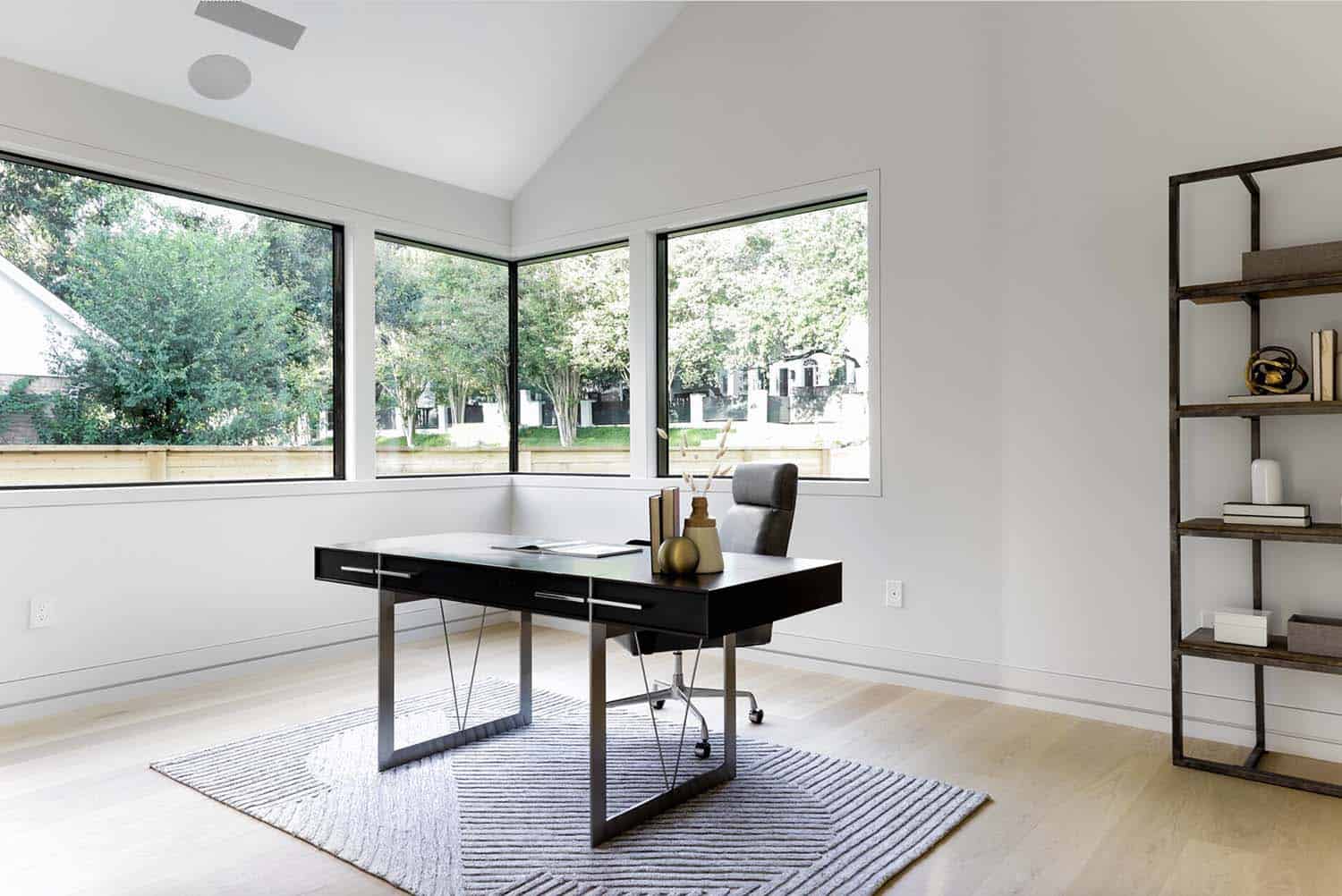
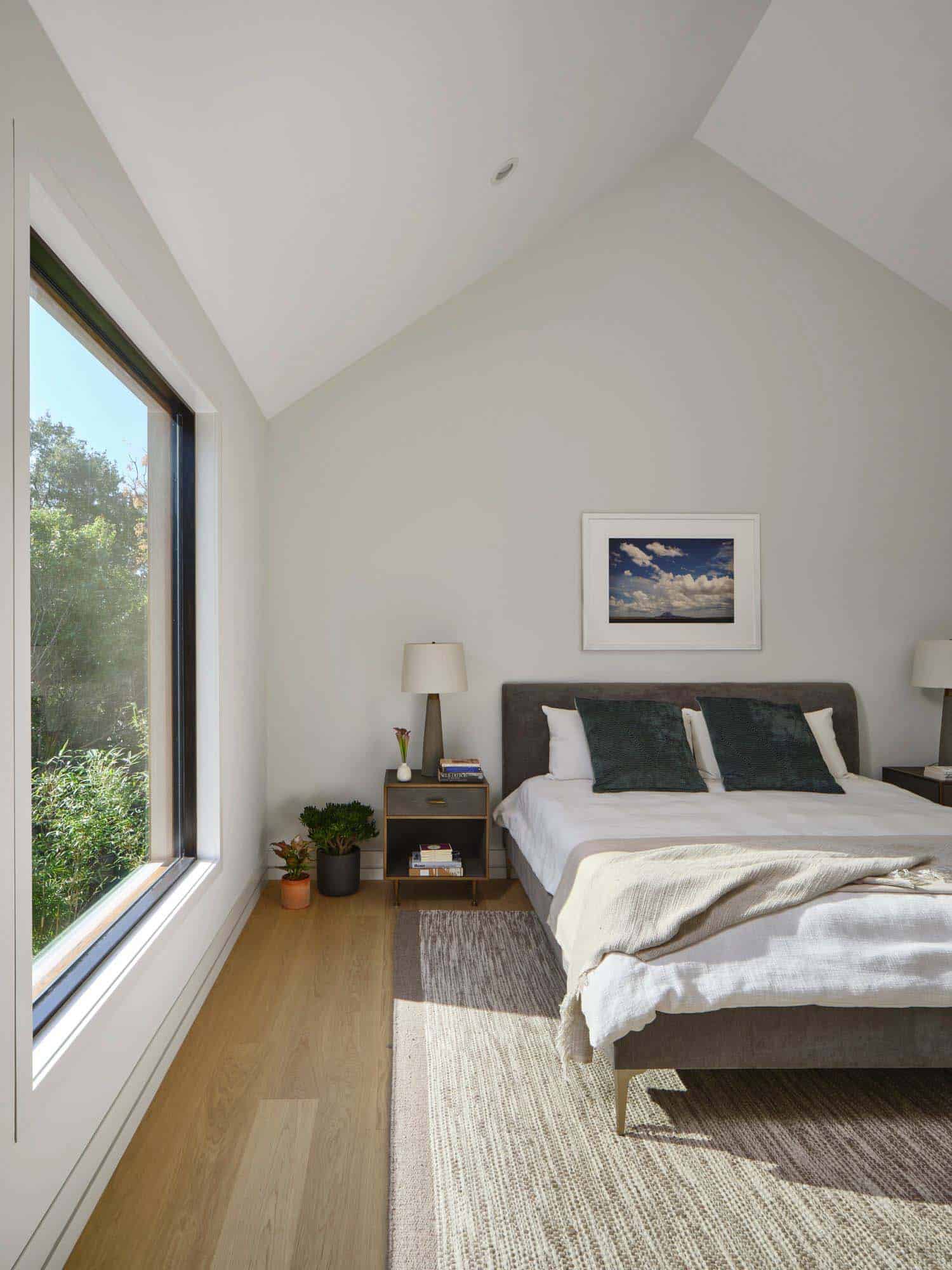
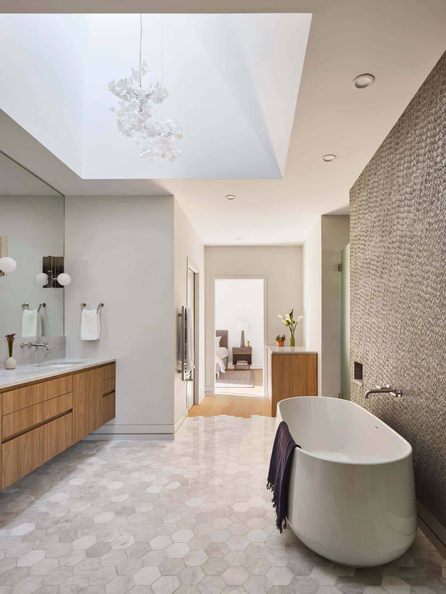
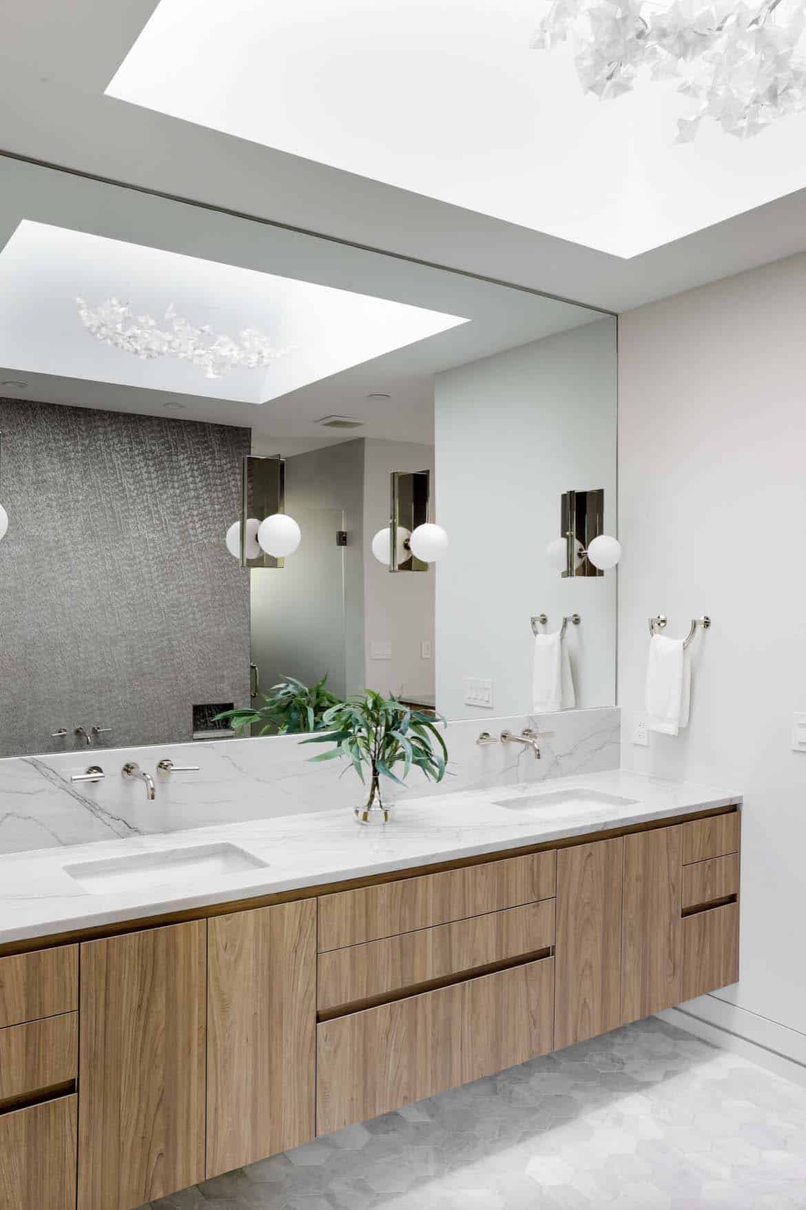
As light and shade change throughout the day, the afternoon sun pours into the master suite, which is located in the private wing opposite the balcony, through large bedroom windows and a skylight in the bathroom.
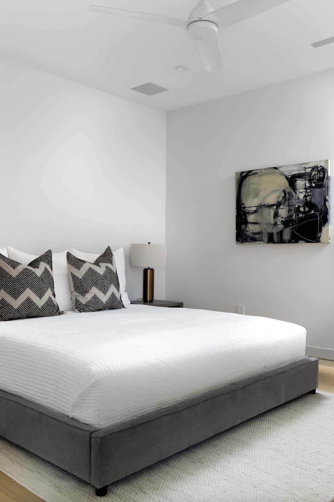
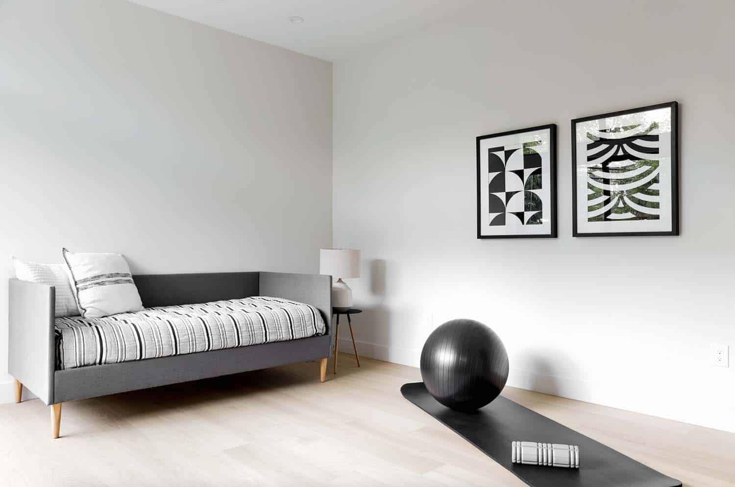
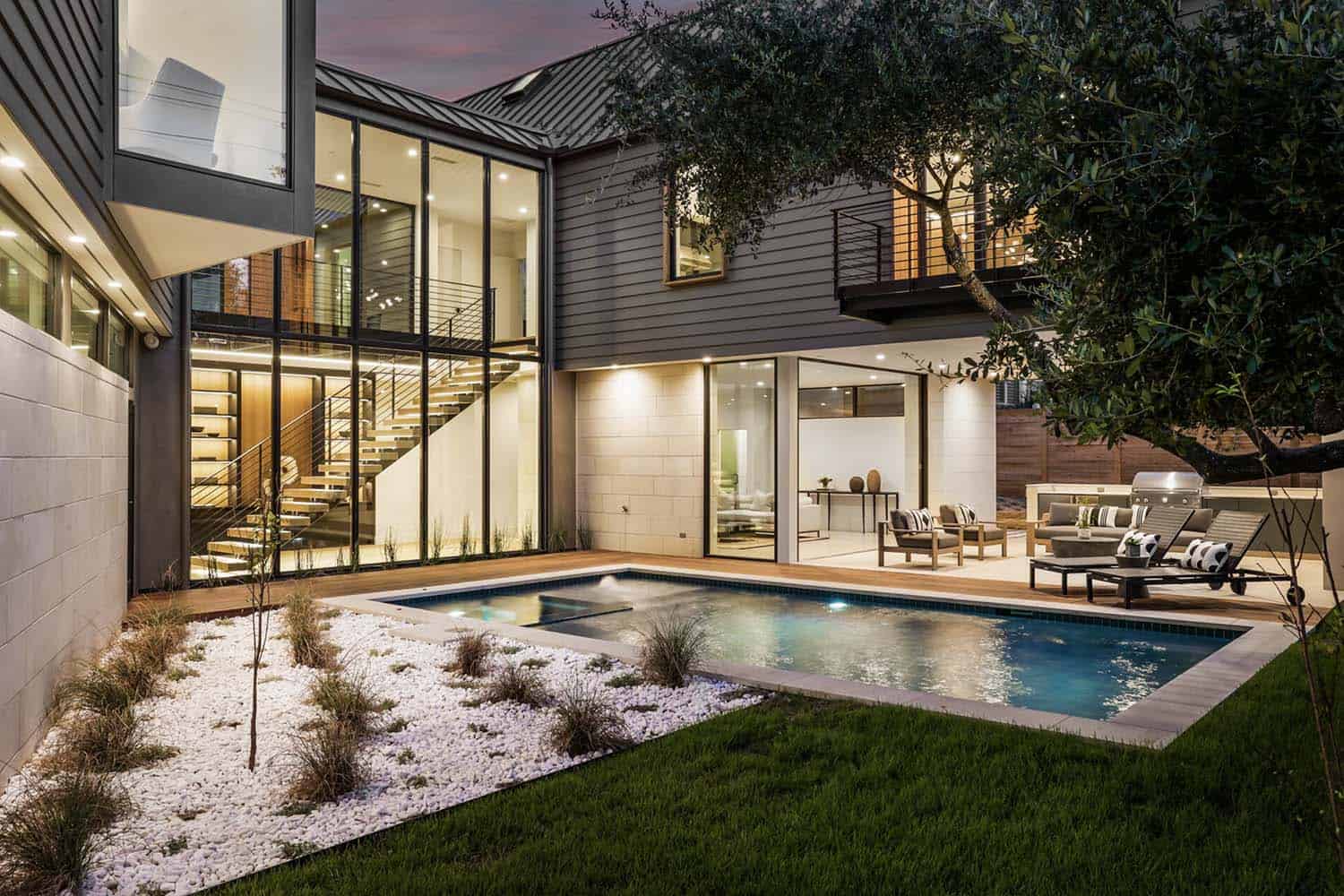
A central, delicate open tread stair leads to guest rooms and a large family room on the lower level.
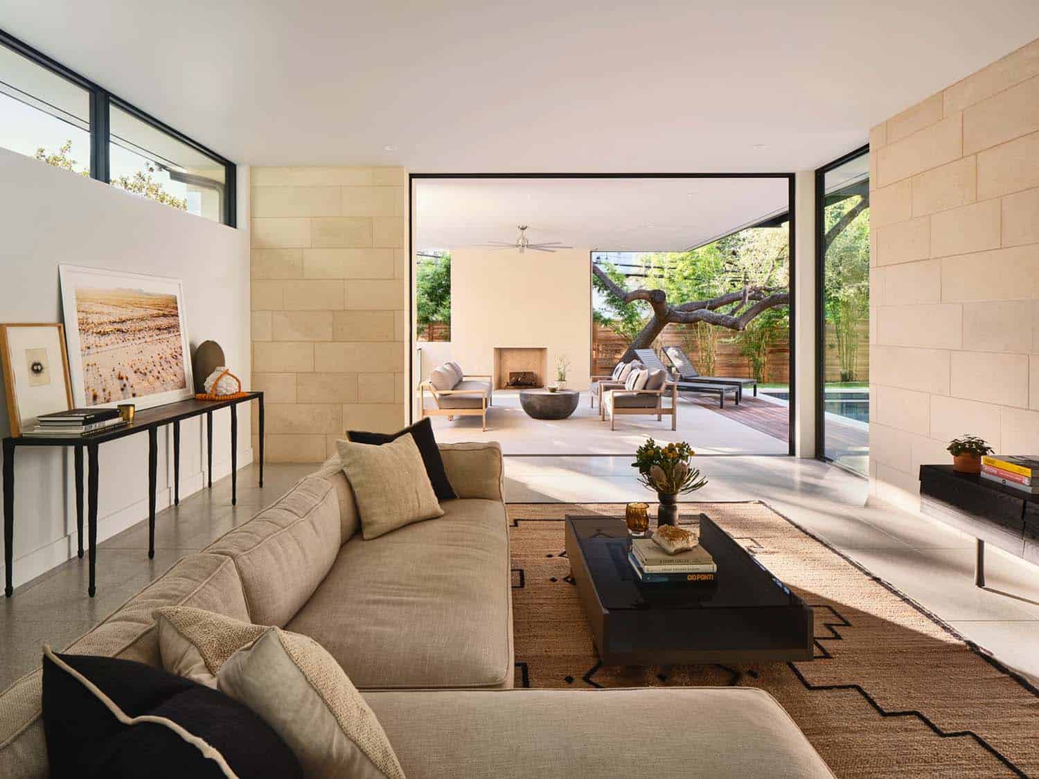
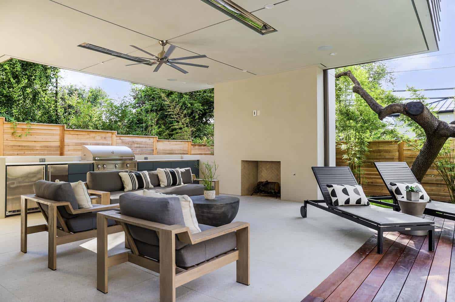
The family room seamlessly extends through disappearing glass doors to a covered outdoor kitchen (440 square feet of covered space), patio, and pool — perfect for easy entertaining.
PHOTOGRAPHER Andrea Calo
One Kindesign has received this project from our submissions page. If you have a project you would like to submit, please visit our submit your work page for consideration!








1 comment