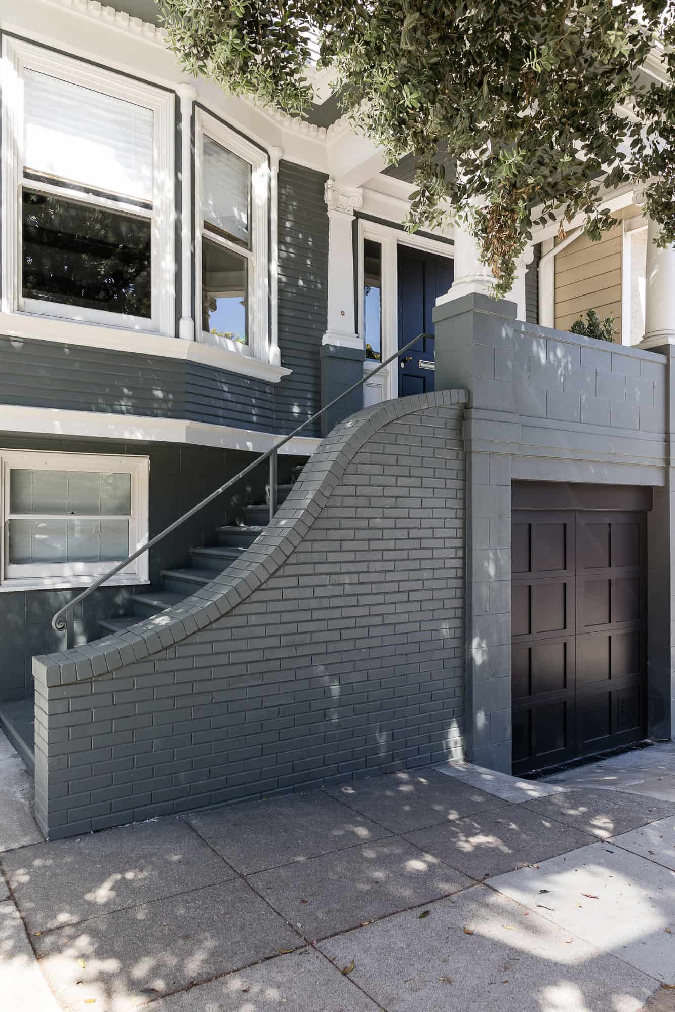
This historical house constructed in 1910 was renovated by Mindy Gayer Design in coordination with Sven Lavine Architecture, located in the Sunset District, a neighborhood in San Francisco, California. The homeowners wished to preserve the historical charm of the architecture while creating an elegant and highly functional modern dwelling.
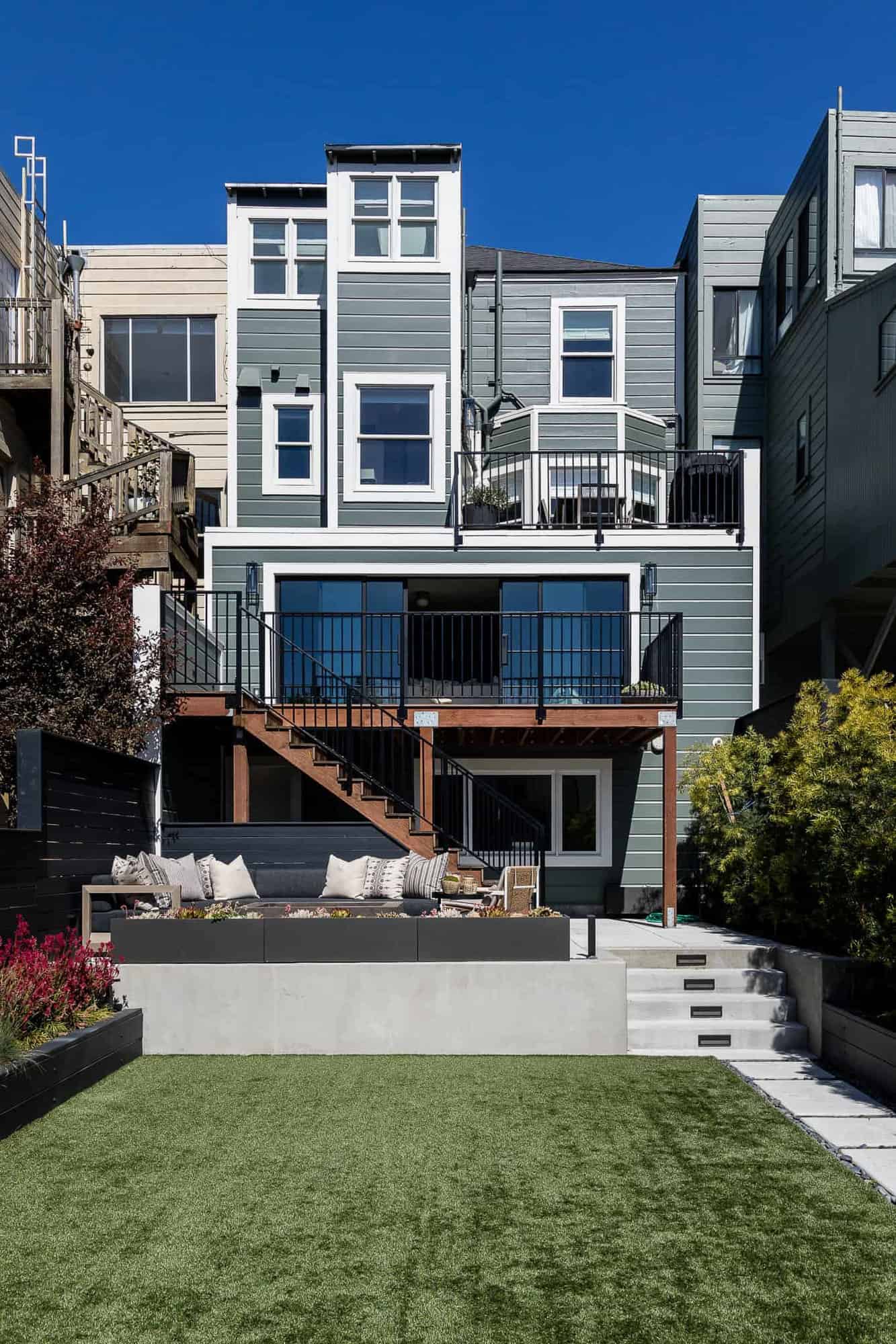
The result is a blend of Victorian architecture and updated finishes that match the uniqueness of this family of four. Playful patterns and pops of color help to keep this abode feeling fresh. A functional multi-level layout ensures it’s a space that the homeowner will enjoy for many years to come. The exterior facade of this historical house was completely preserved, aside from a fresh coat of paint. Continue below to see the rest of this exciting home transformation…
DESIGN DETAILS: ARCHITECT Sven Lavine Architecture INTERIOR DESIGN Mindy Gayer Design Co. CONTRACTOR Hive Builds LANDSCAPE DESIGN Ferdinand Castillo Landscape Architect CABINETRY Eckhoff Furniture Manufacturing
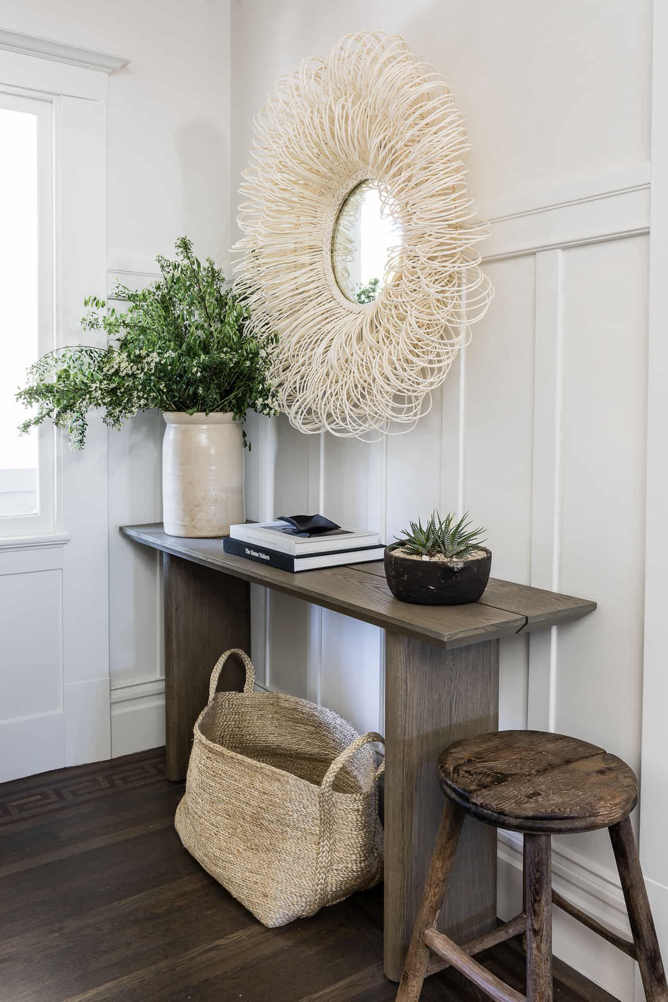
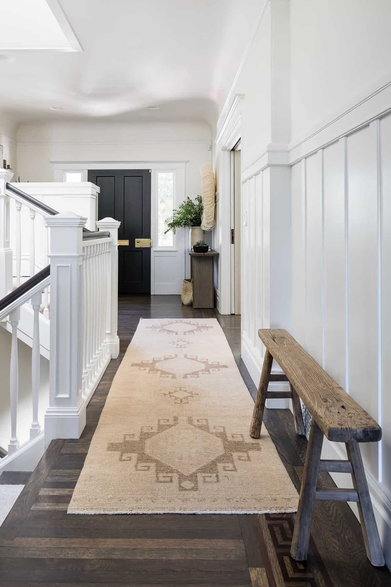
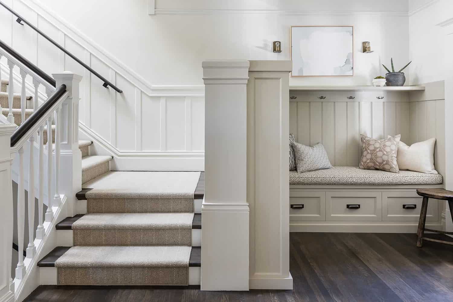
Above: In the entryway of this historical house, the designer created a console vignette to greet visitors. Beadboard paneling was added to the walls for character along with drawers and cabinets for functional storage.
What We Love: Every detail in this historical house renovation has been beautifully preserved or refinished to create a wonderful atmosphere. Family-friendly elements are mixed with sophisticated details with day-to-day living and entertaining in mind. The designers did a fabulous job of transforming this dwelling into a timeless aesthetic that will be surely enjoyed by this young family for years to come.
Tell Us: What design elements in this home do you find most inspiring? Let us know in the Comments, we love reading your feedback!
Note: Check out a couple of other fabulous home tours that we have showcased here on One Kindesign in the state of California: A childhood home in Newport Beach gets a stunning transformation and See this stunningly beautiful lakeside summer escape on Upper Gull Lake.
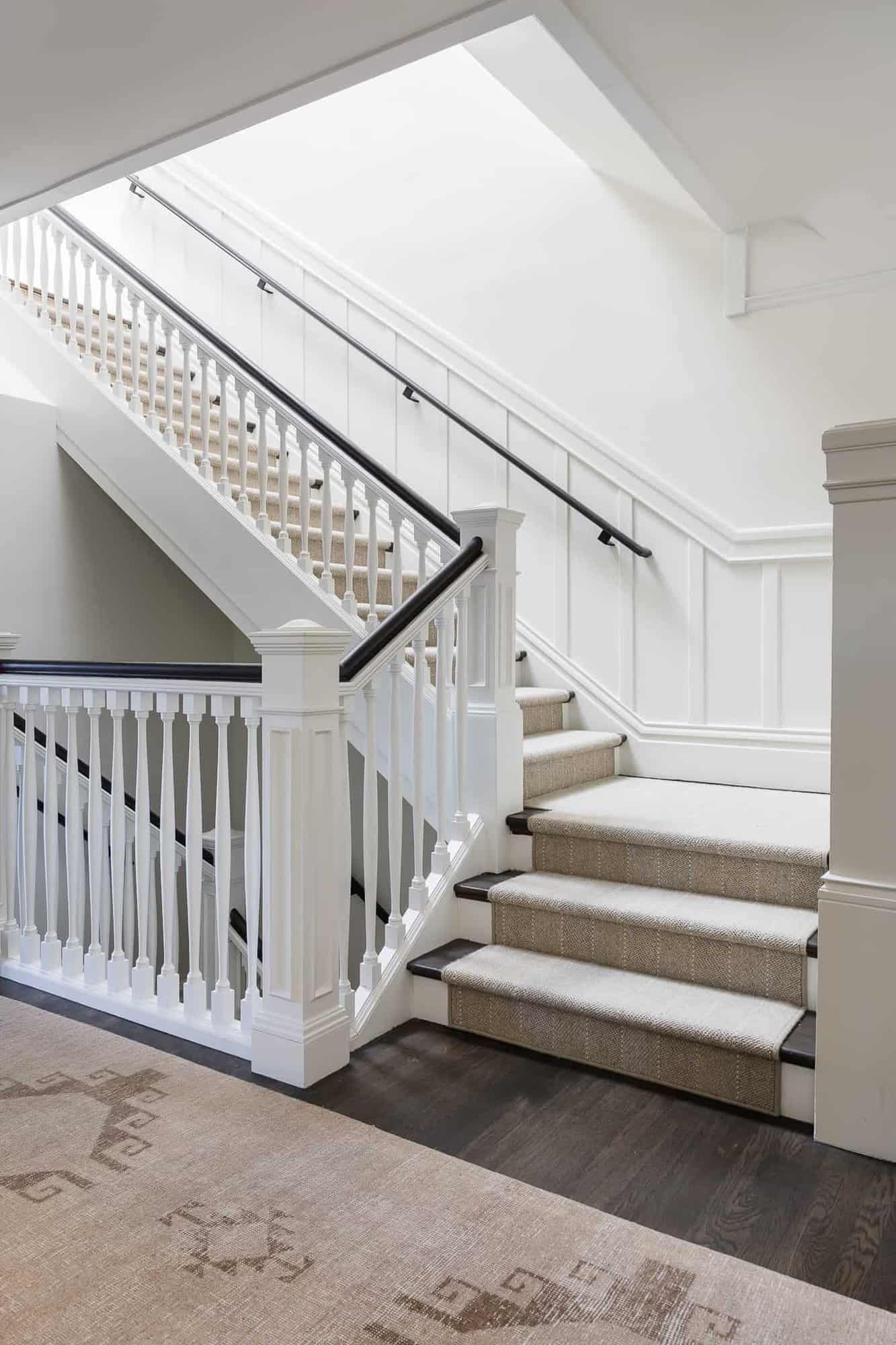
Above: The staircase is original to the home, updated with a fresh coat of stain and new finishes. The hardwood flooring is also original to the home, restained in an attractive greyish hue.
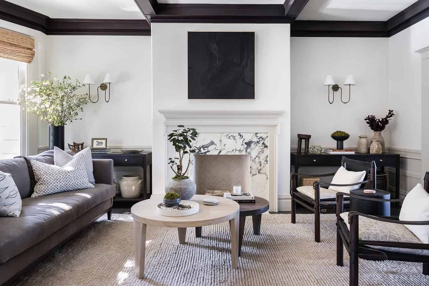
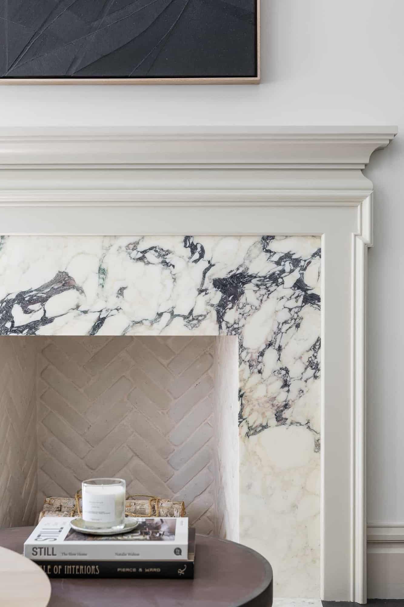
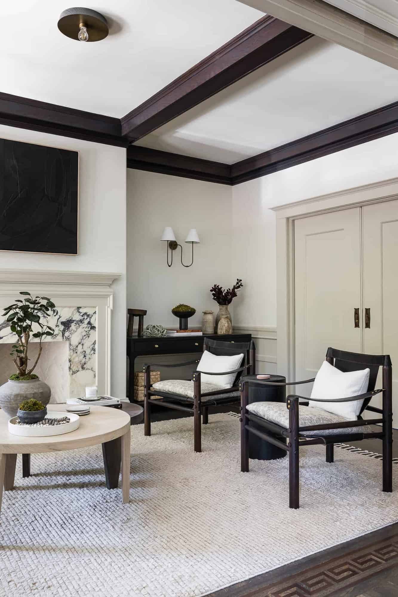
Above: This inviting living room was originally created to be closed off. The homeowners liked the intimate feel of the space and opted to keep the layout the same instead of an open concept. The original fireplace was dark and heavy, so the designer transformed it into a light and modern design.
Above: The living room is used as a place to hang out with family and friends but is also kid-friendly with darker finishes.
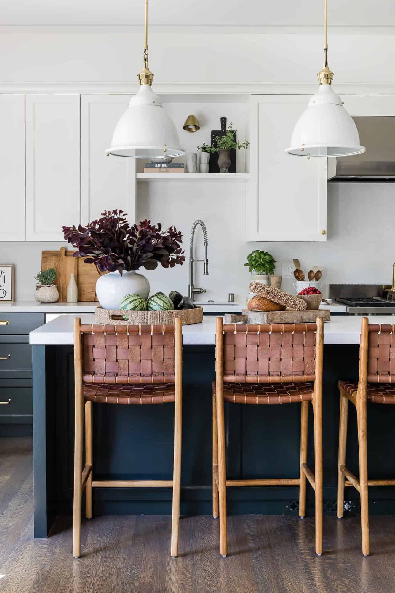
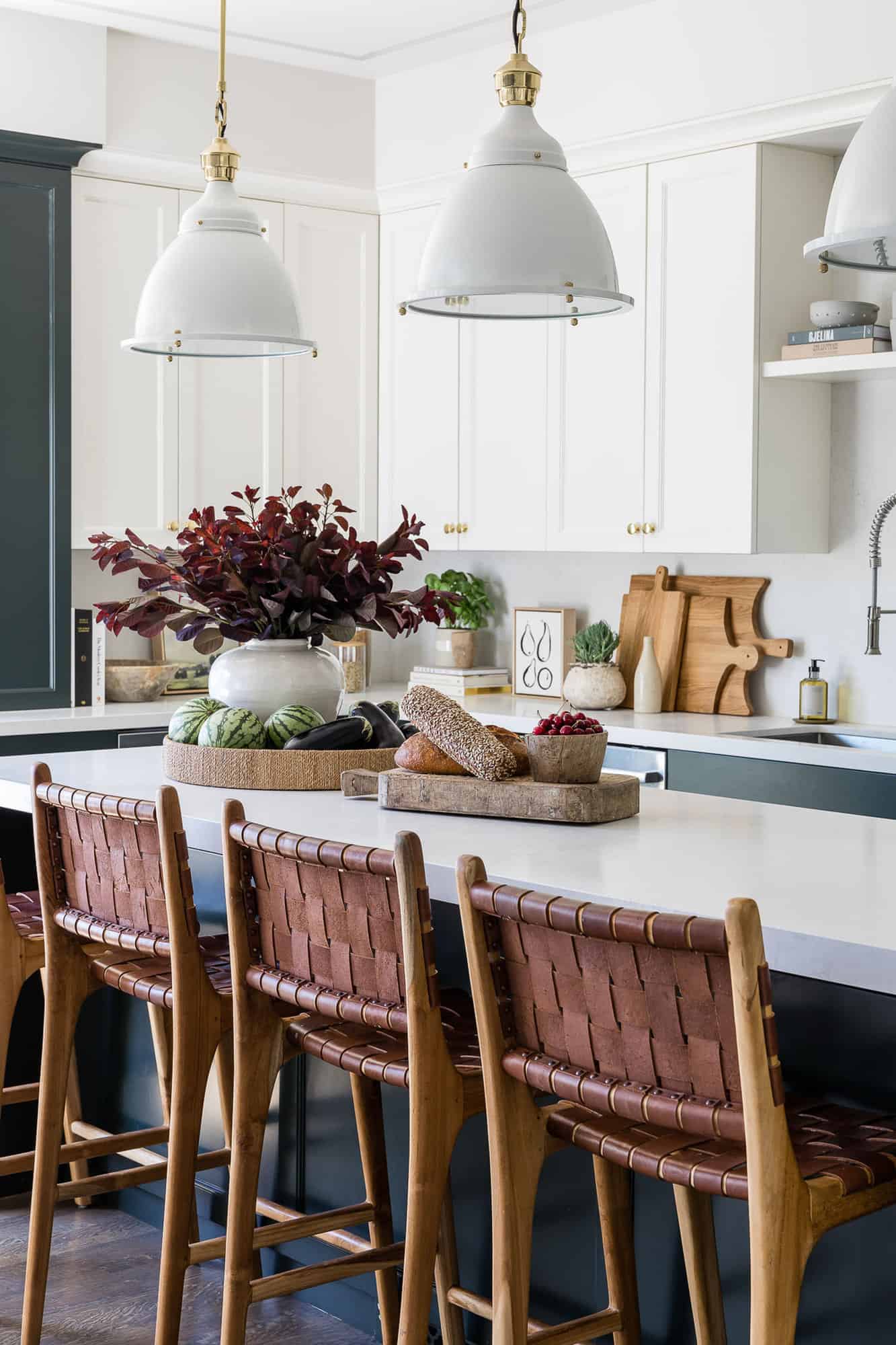
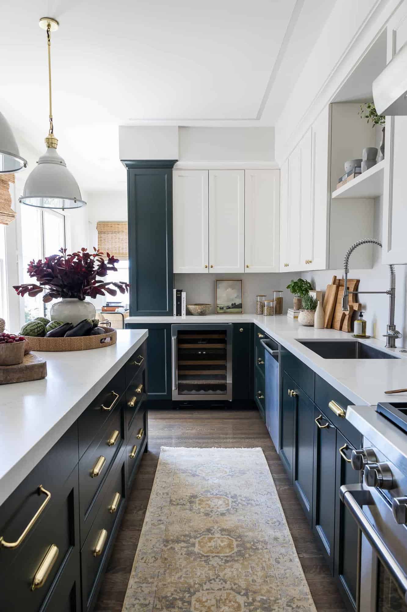
Above: The key objective when designing this kitchen was to make it the central hub of the home. The owners desired the appearance of a commercial-grade kitchen, so the designer integrated stainless steel elements throughout this space.
Above: A contrast of light and dark was established in the green paint hue of the lower cabinets paired with the warm white upper cabinets. The woven leather counter stools, layered accessories, and wood tones bring warmth into this space.
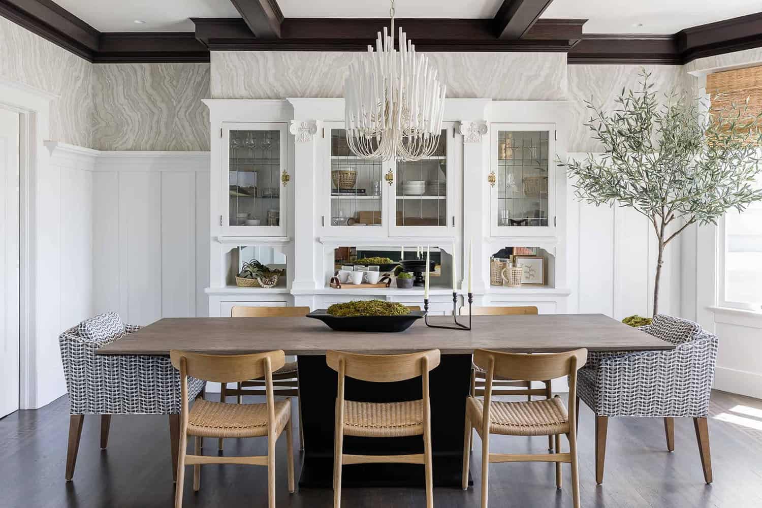
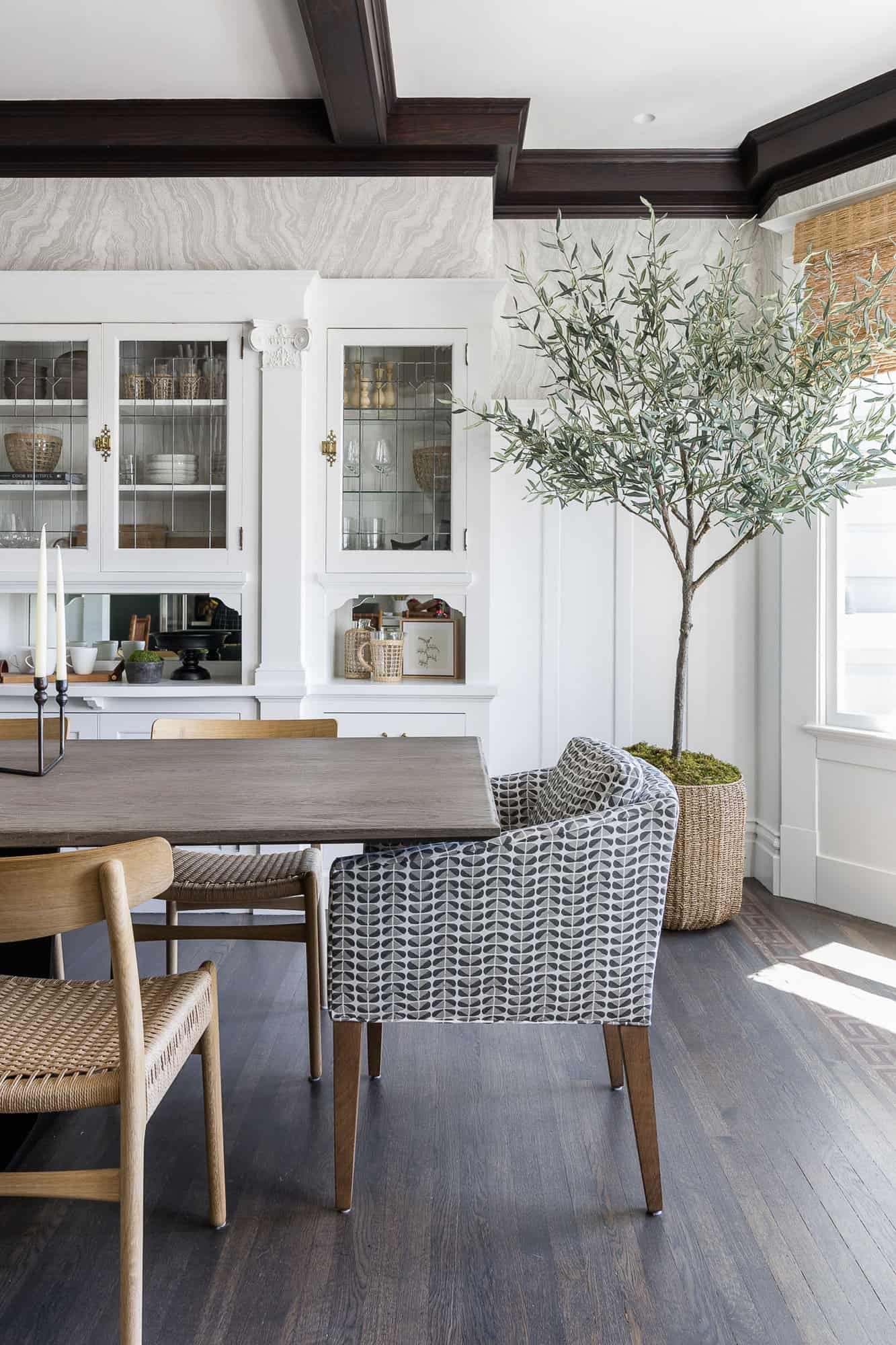
Above: Natural light streams in through the original bay windows of this welcoming dining room. To give this space a collected feel, the designer mixed a variety of wood finishes. The built-in dining hutch was original to the home, featuring beautiful detailing, moulding, exquisite hardware, and leaded glass.
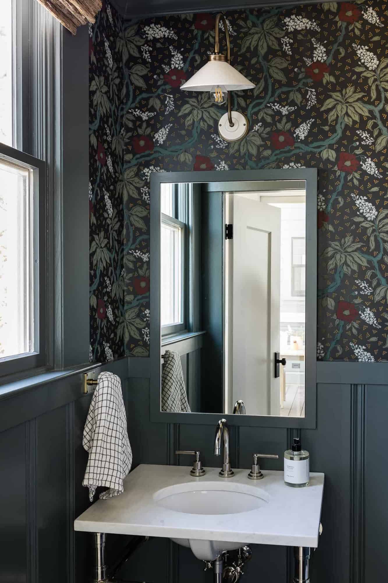
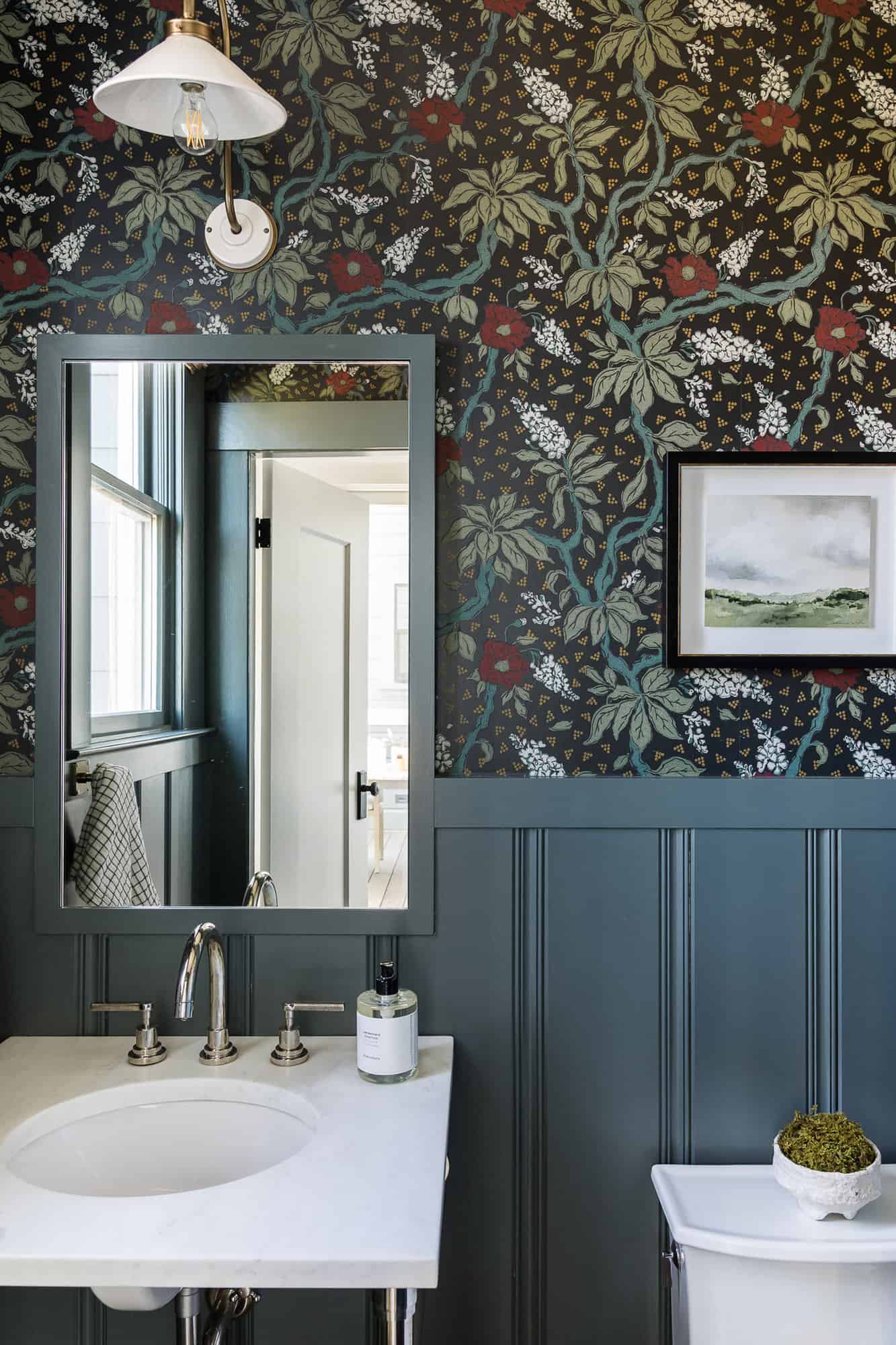
Above: This charming powder bathroom is located just off the kitchen and is in keeping with the darker color scheme of the kitchen cabinets.
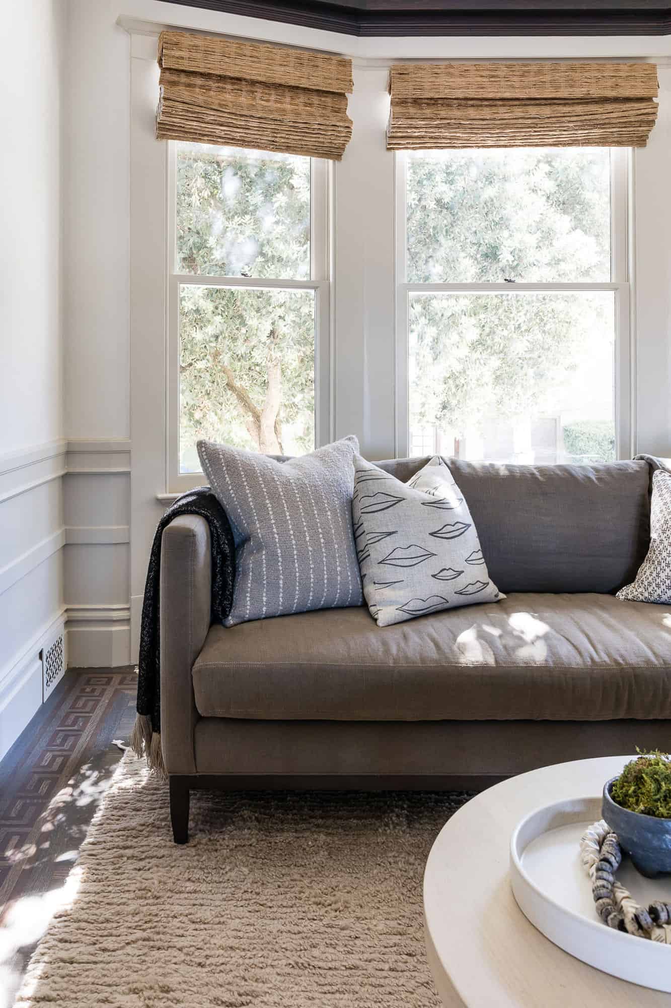
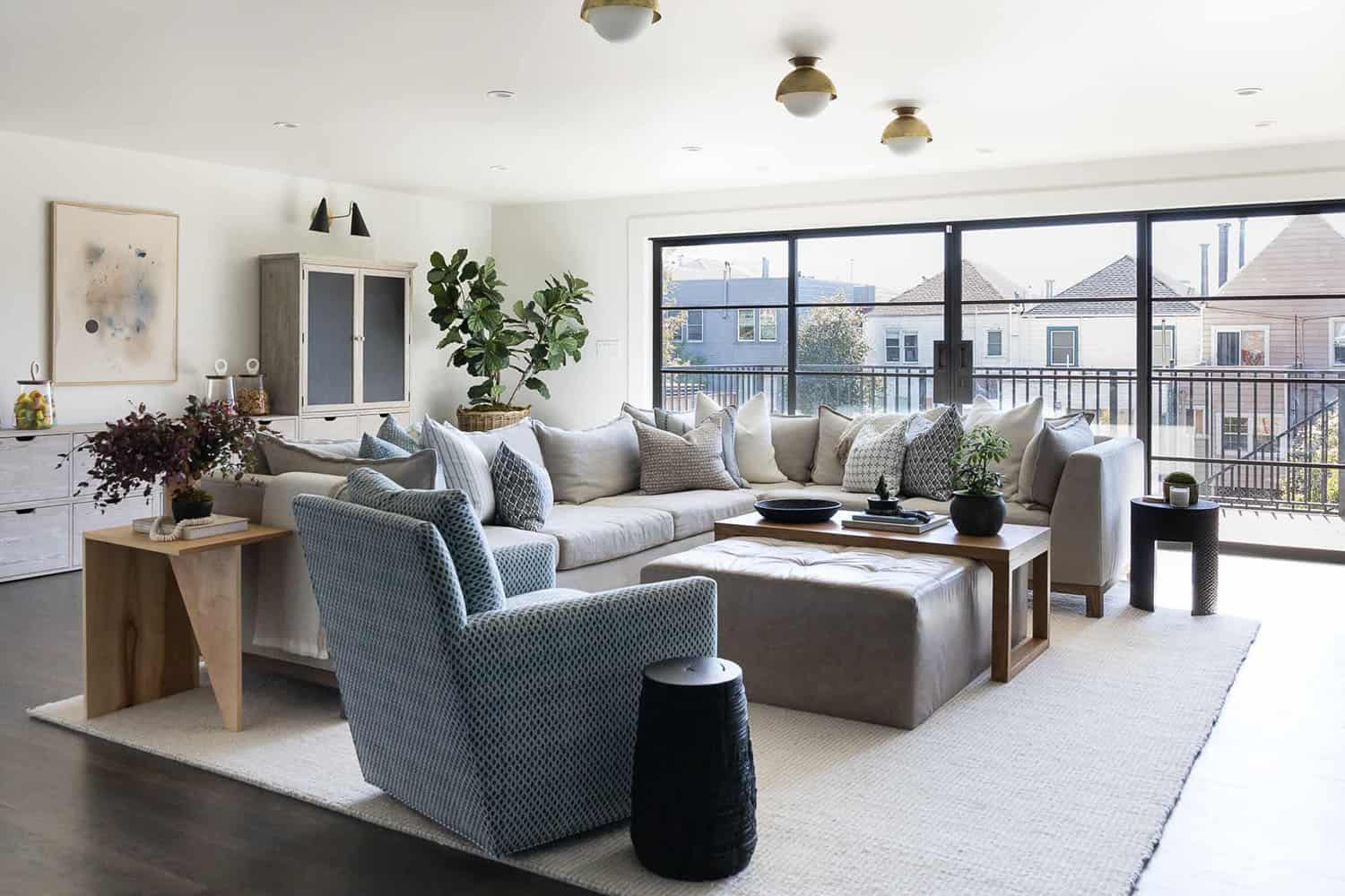
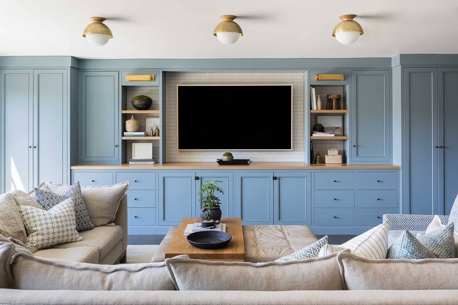
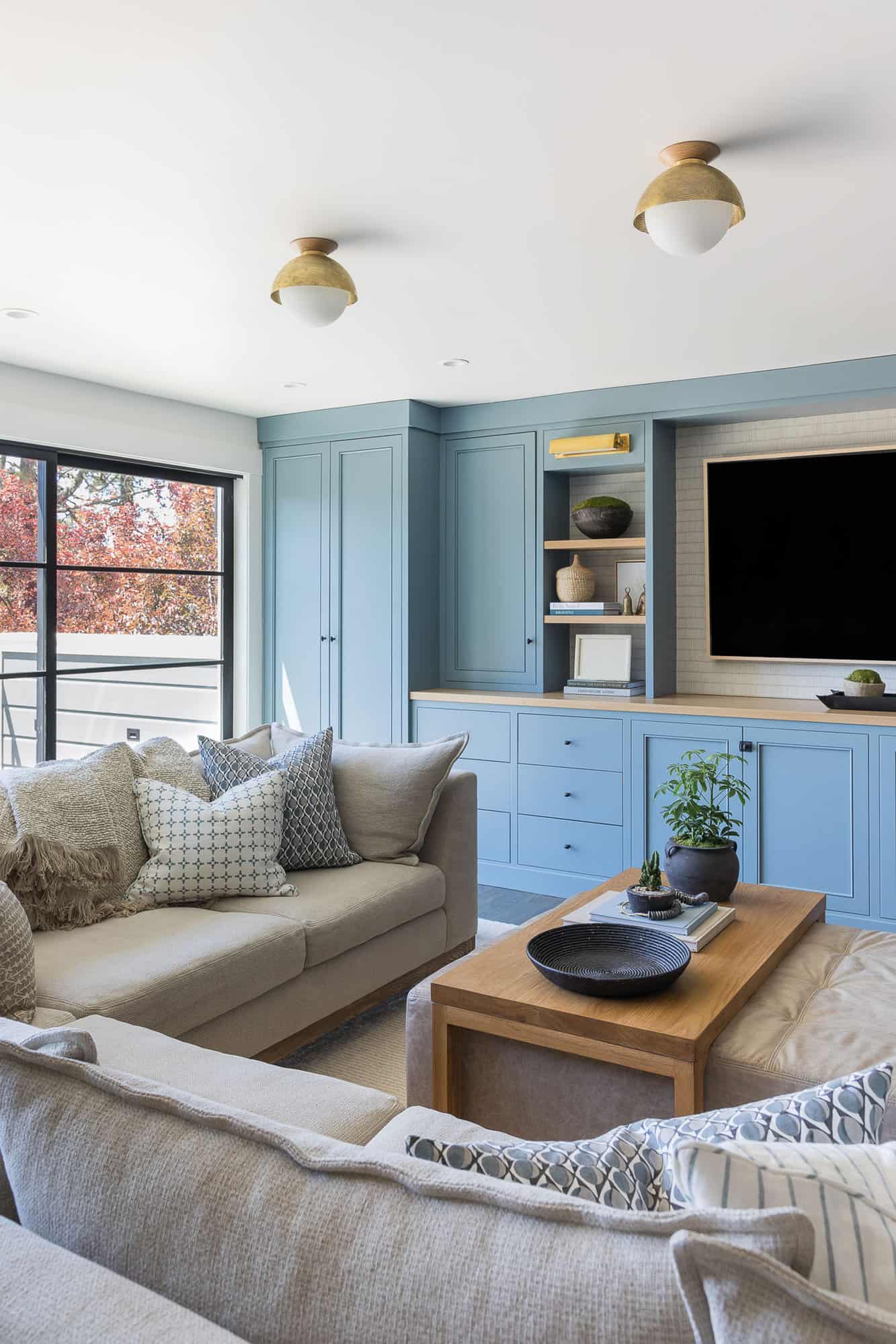
Above: This cozy lounge space is used as the daily family hangout area. Prior to the renovation this space felt dark and closed off, so the designer was tasked with making this space feel light and airy. To address this dilemma, the designer selected upholstery and fabrics in a light hue. A pop of blue was added to the wall-to-wall built-in media cabinets, featuring plenty of storage for games, puzzles, books, and blankets for family movie night.
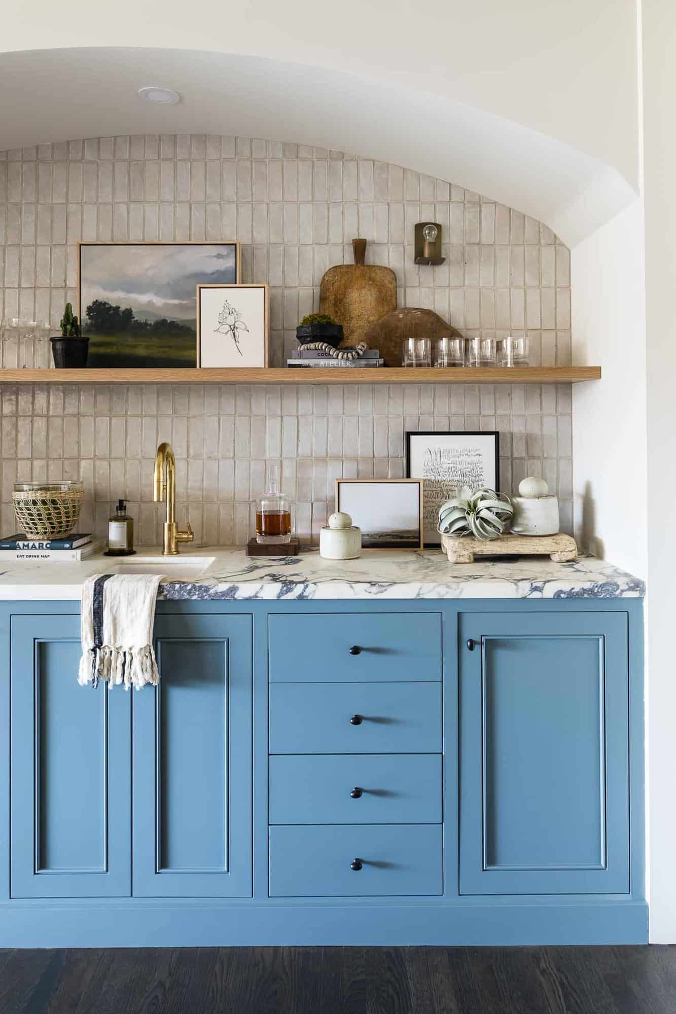
Above: This wet bar is located just off the family room. The designer used the same blue as the media cabinetry in the family room. The attractive backsplash is a Moroccan zellige tile. The countertop is leftover material from the living room fireplace.
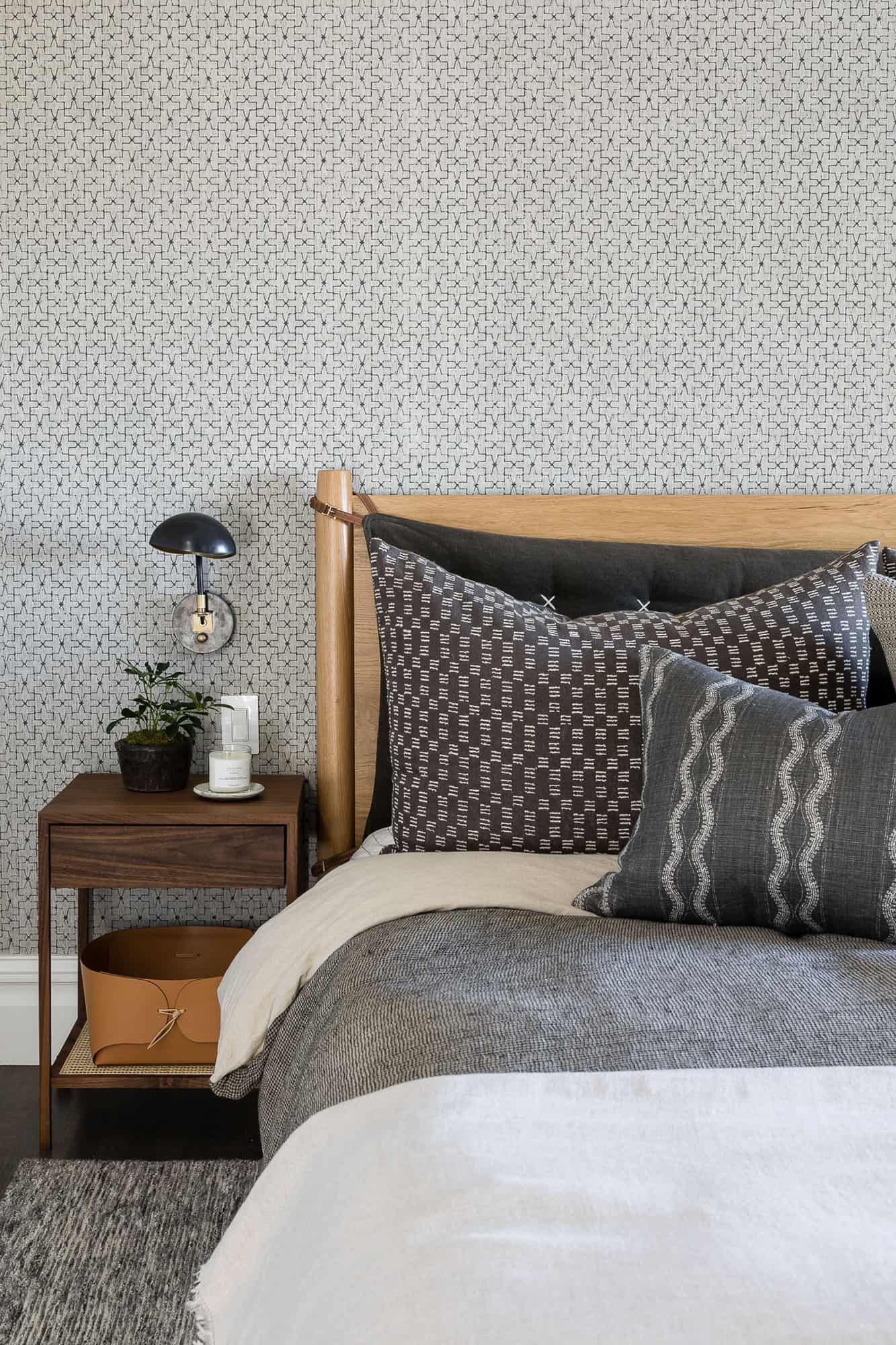
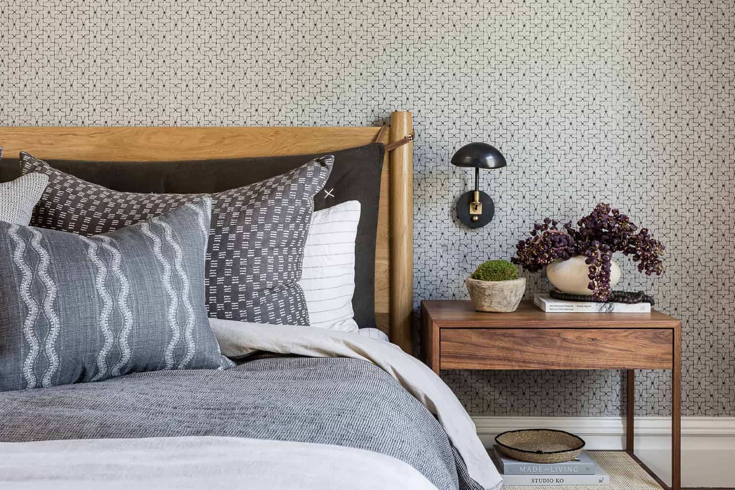
Above: Since the main bedroom gets plenty of natural light, the designer opted to create a dark and moody color scheme. An accent wall is covered with a textured patterned grasscloth wallcovering. A beautiful mix of black, charcoal, and wood tones can be found in this space.
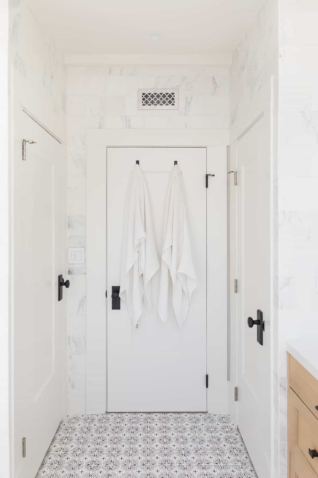
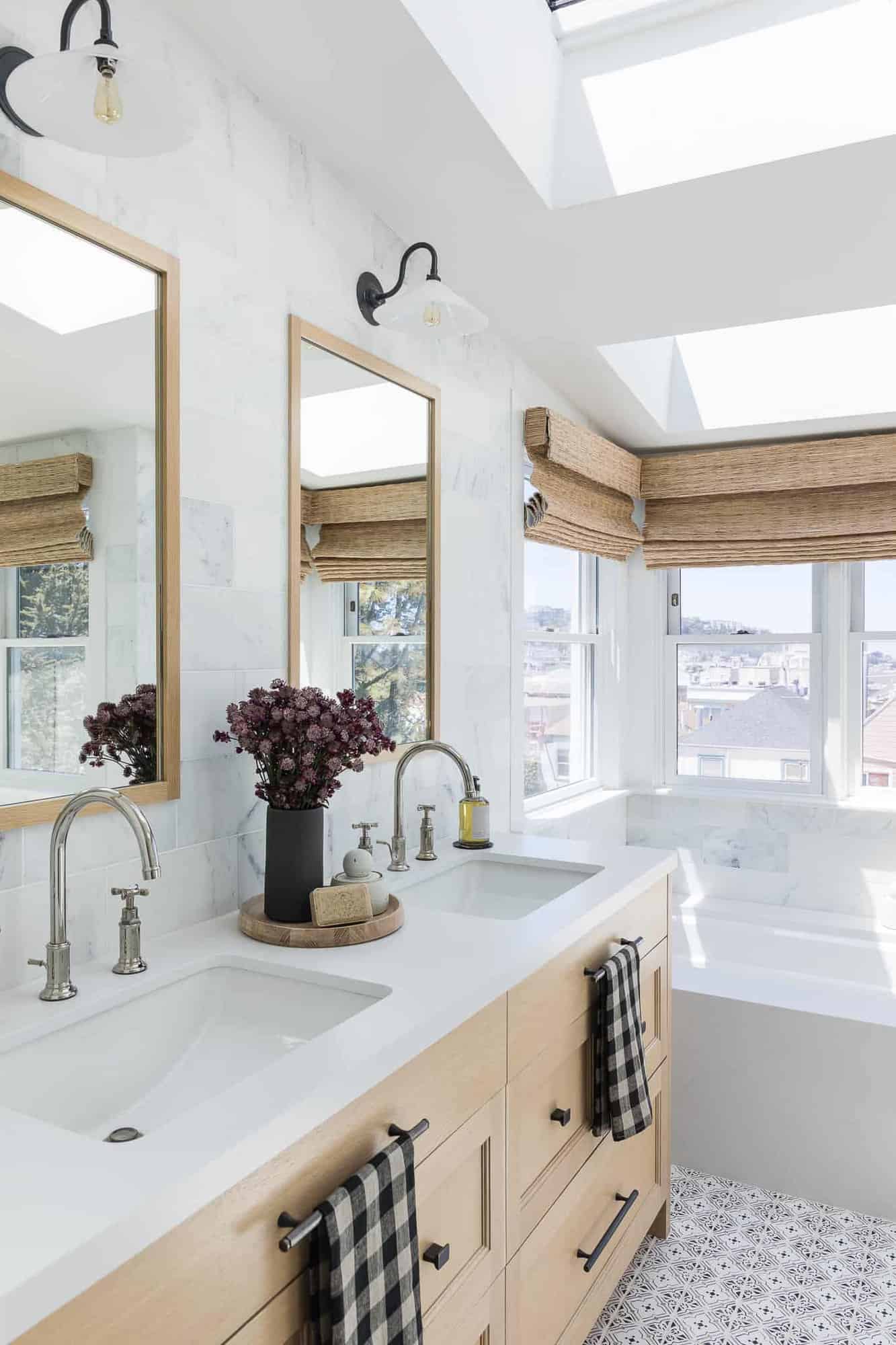
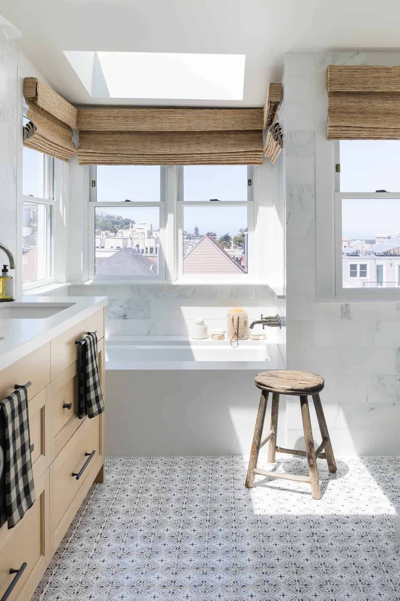
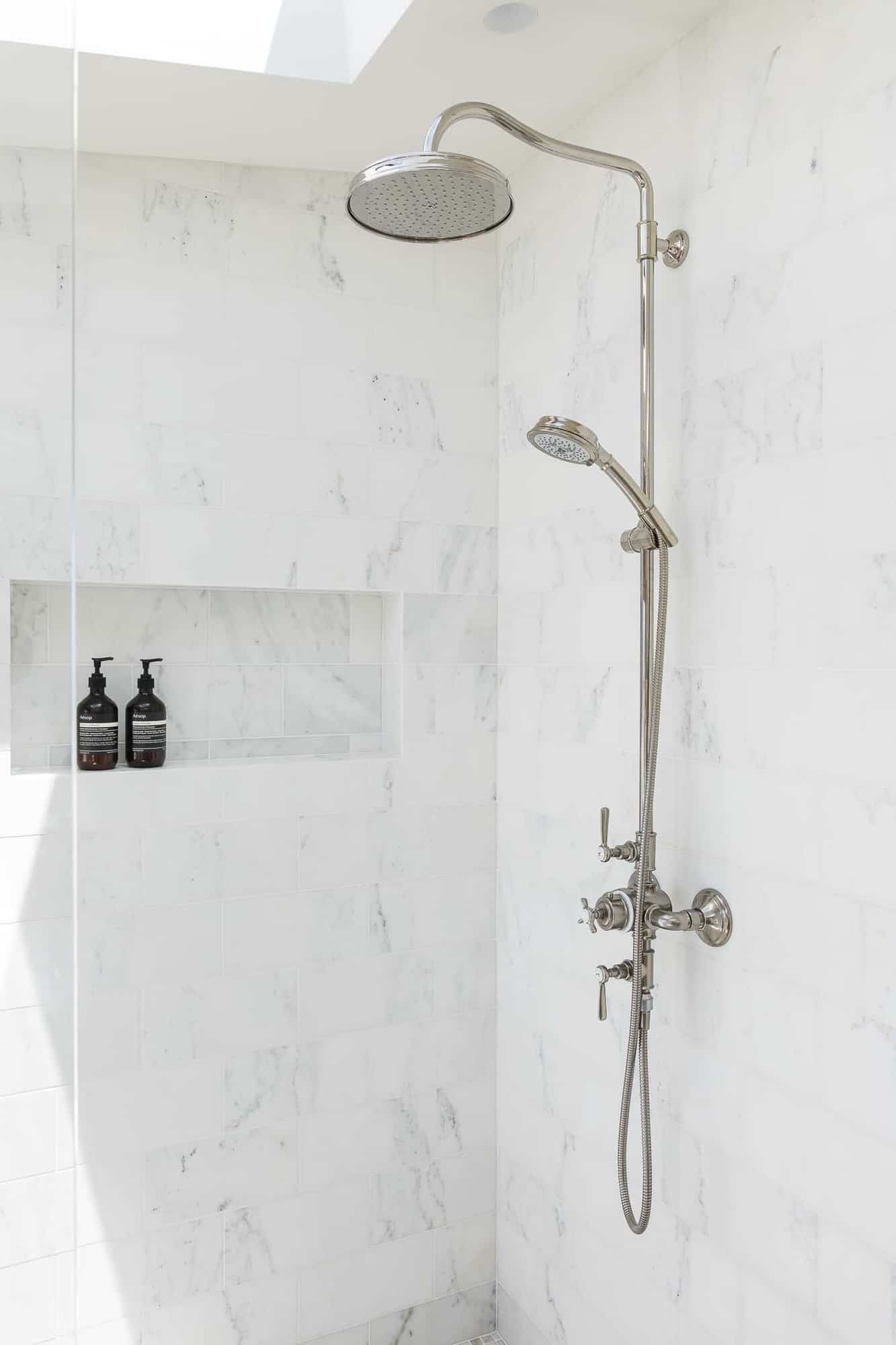
Above: In the bathroom, large windows frame views of downtown San Francisco. The owners desired their space to feel fresh, playful, and sophisticated. To achieve this aesthetic, the designer selected Calacatta marble tiles for the wall, custom white oak cabinetry, and hand-painted terracotta tiles for the floor.
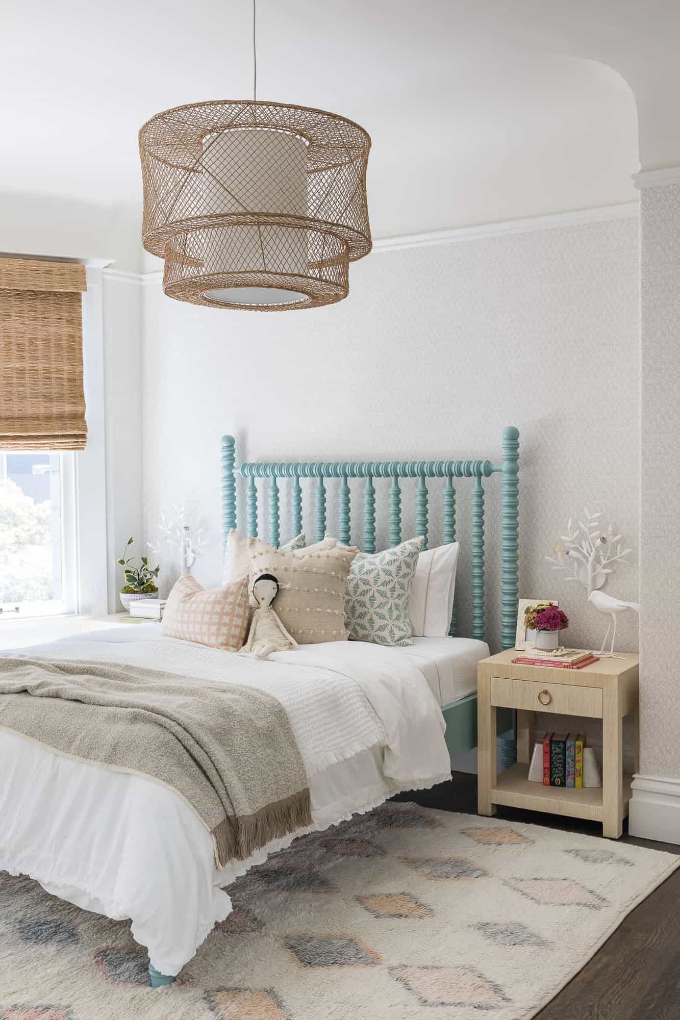
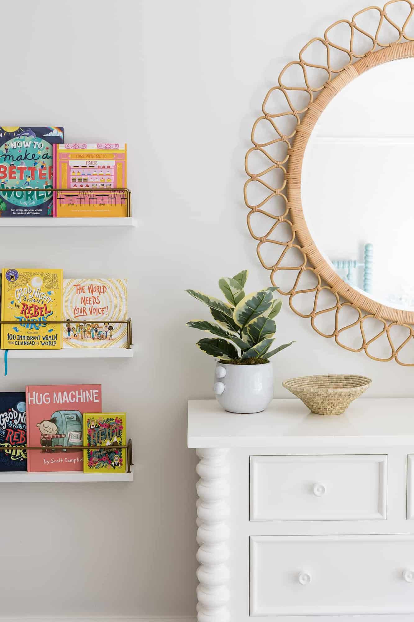
Above: In the girl’s bedroom, the designer wanted to create a space that would work for her well into her teenage years. There is also a cozy reading nook in this room.
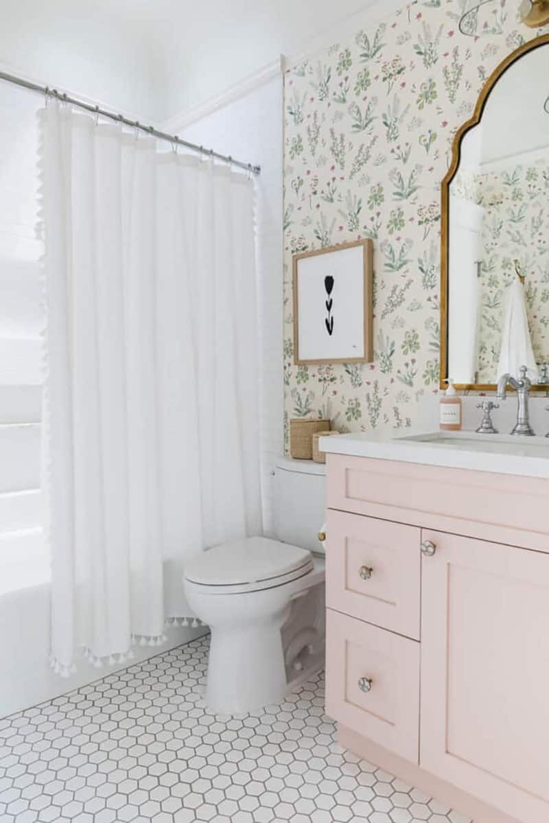
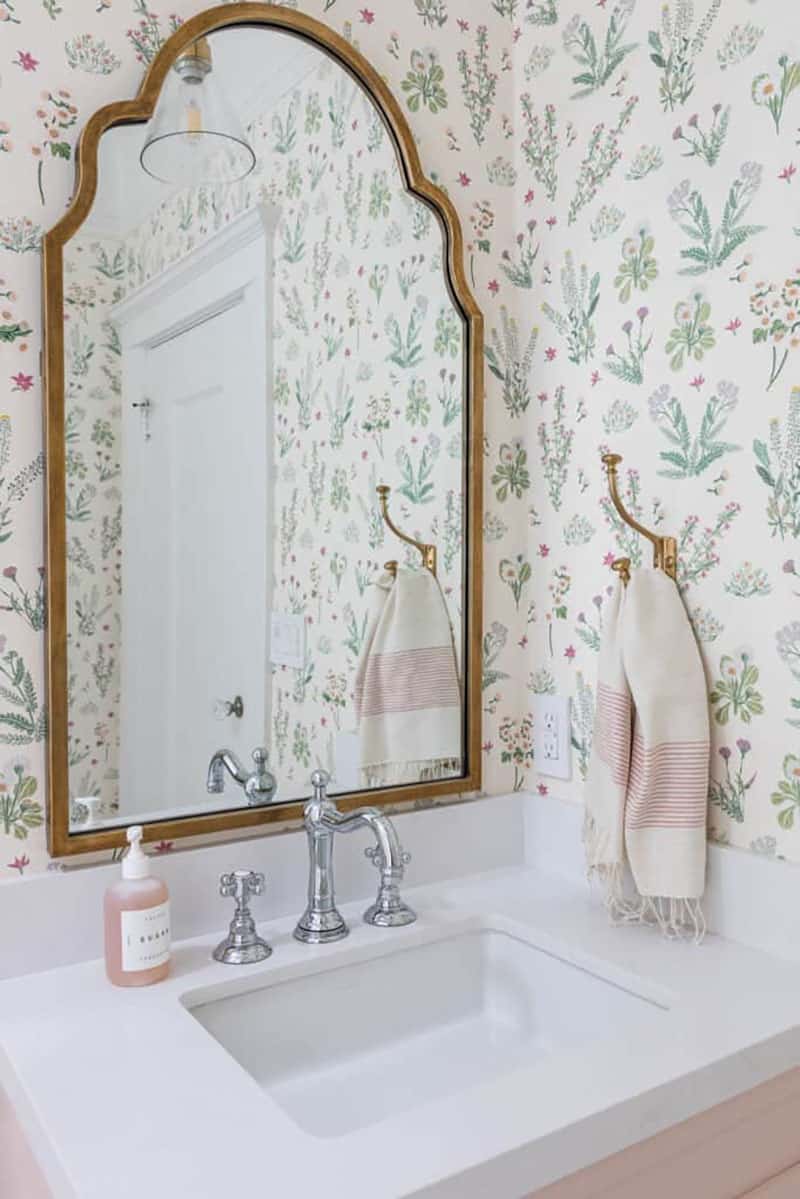
Above: The girl’s bathroom also got a makeover with a pretty pink vanity, floral wallcovering and pretty accessories.
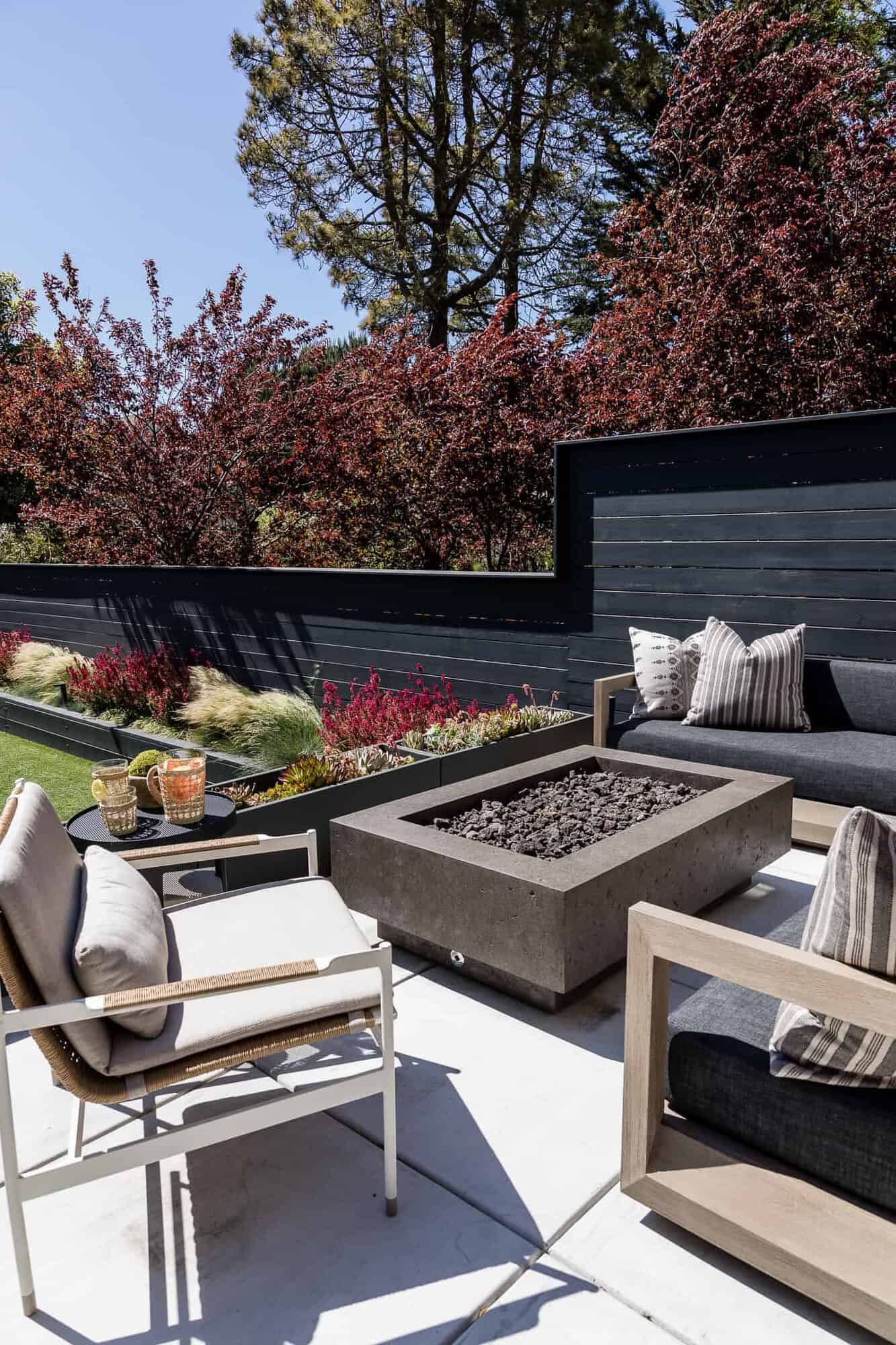
The outdoor landscaping was completely reimagined. The homeowners wanted a nice backyard space for their kids to play. Entertaining spaces include a cozy lounge area along with an outdoor dining space conveniently located just off the kitchen on an upper deck. This outdoor space features original elements mixed with new construction.
PHOTOGRAPHER Vanessa Lentine



1 comment