Mark Ashby Design in collaboration with Shiflet Richardson Architects designed a modern sanctuary amongst a grove of heritage live oaks and elms, located in Austin, Texas. The project is entitled “Modernist Treehouse”, a contemporary new build encompassing 3,600 square feet of living space and an abundance of outdoor living areas nestled among two enormous live oak trees.
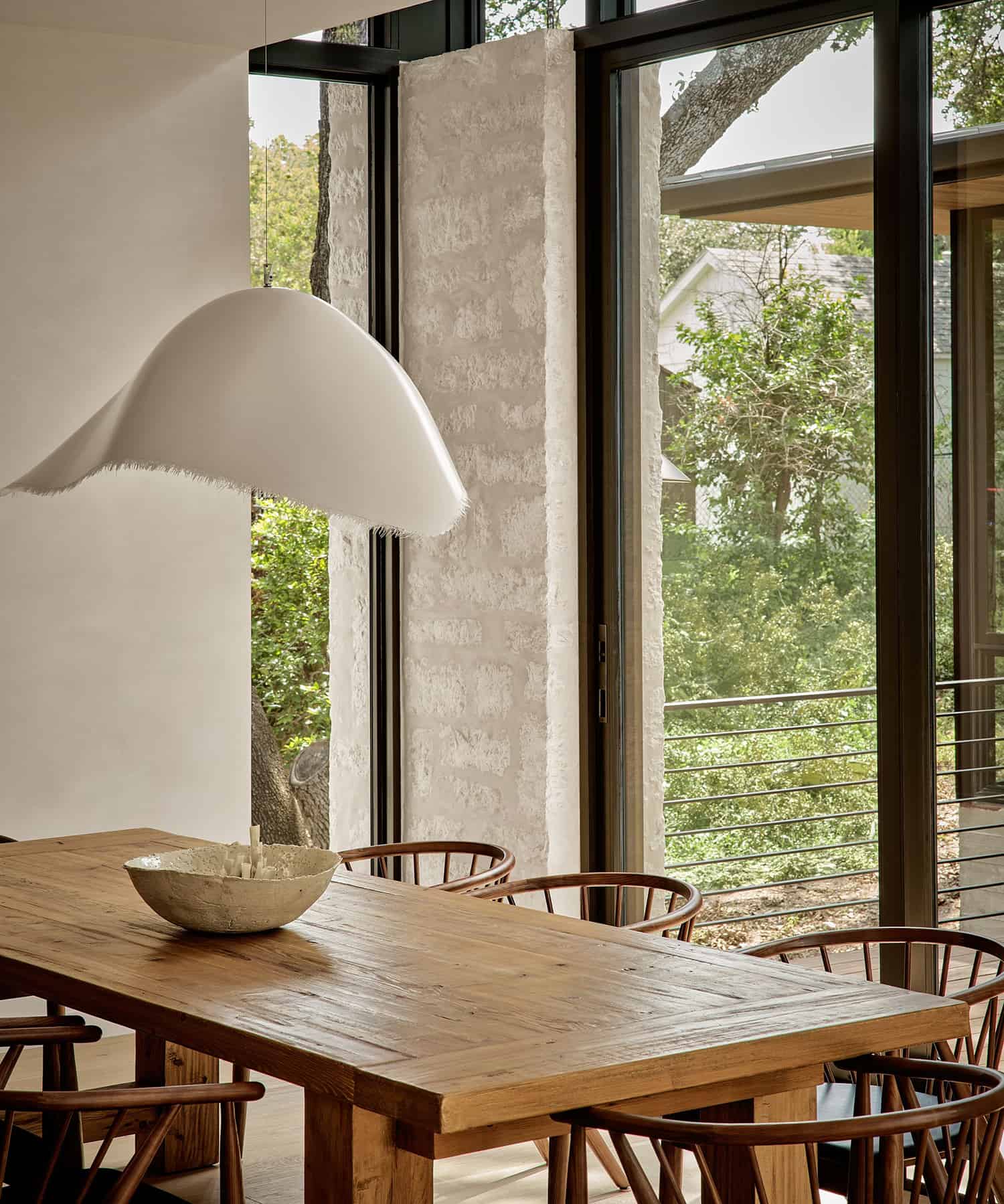
The build and design process took three years to complete. The homeowner wanted a clean, modern sanctuary with a calm minimalist aesthetic, so the design team set out to give the home a comforting Zen-like vibe. One of the key factors was an enhanced connection to the environment — a lush hillside and old-growth tree canopies.
DESIGN DETAILS: ARCHITECT Shiflet Richardson Architects INTERIOR DESIGN Mark Ashby Design BUILDER Dwight Dow Construction LANDSCAPE ARCHITECT David Wilson
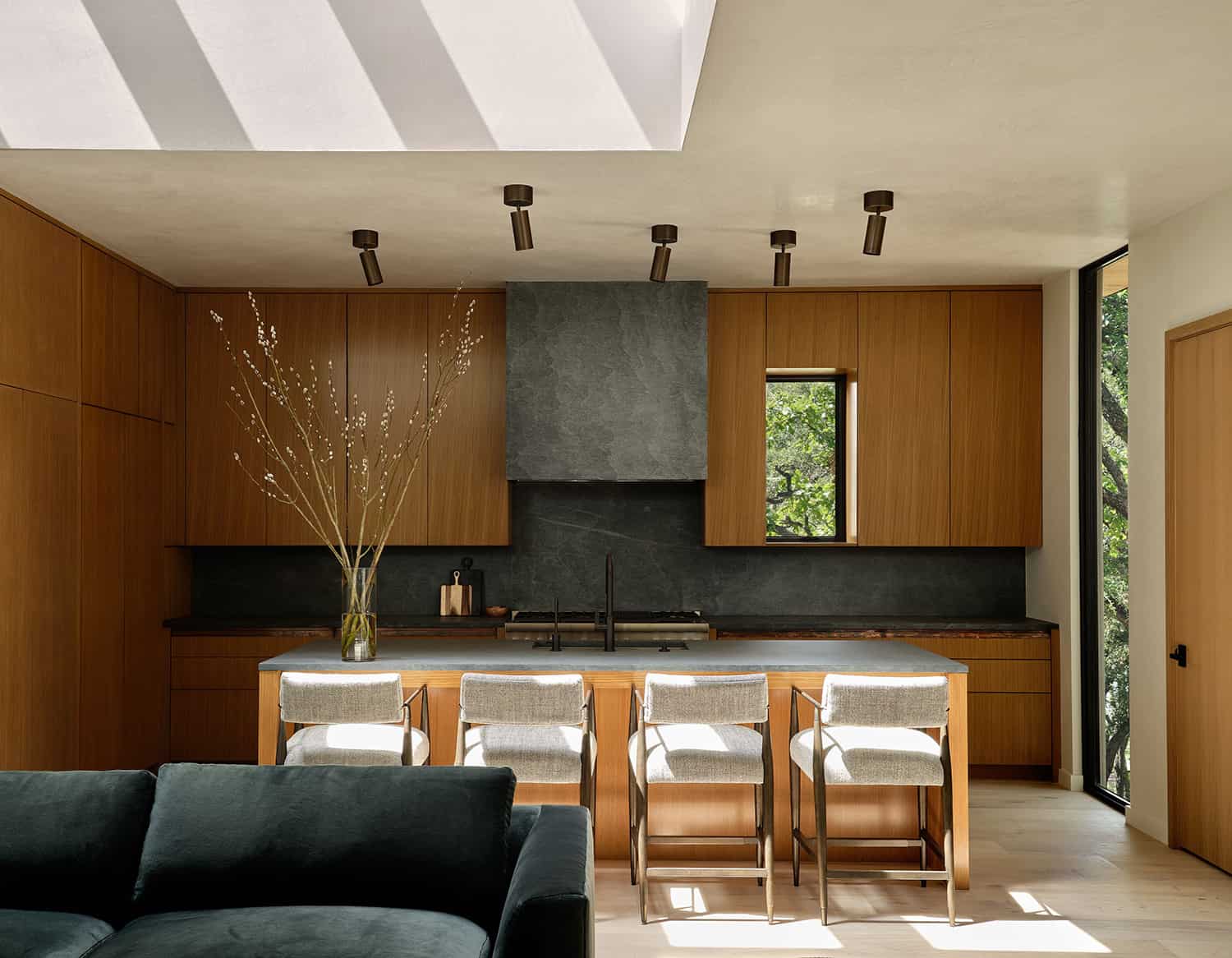
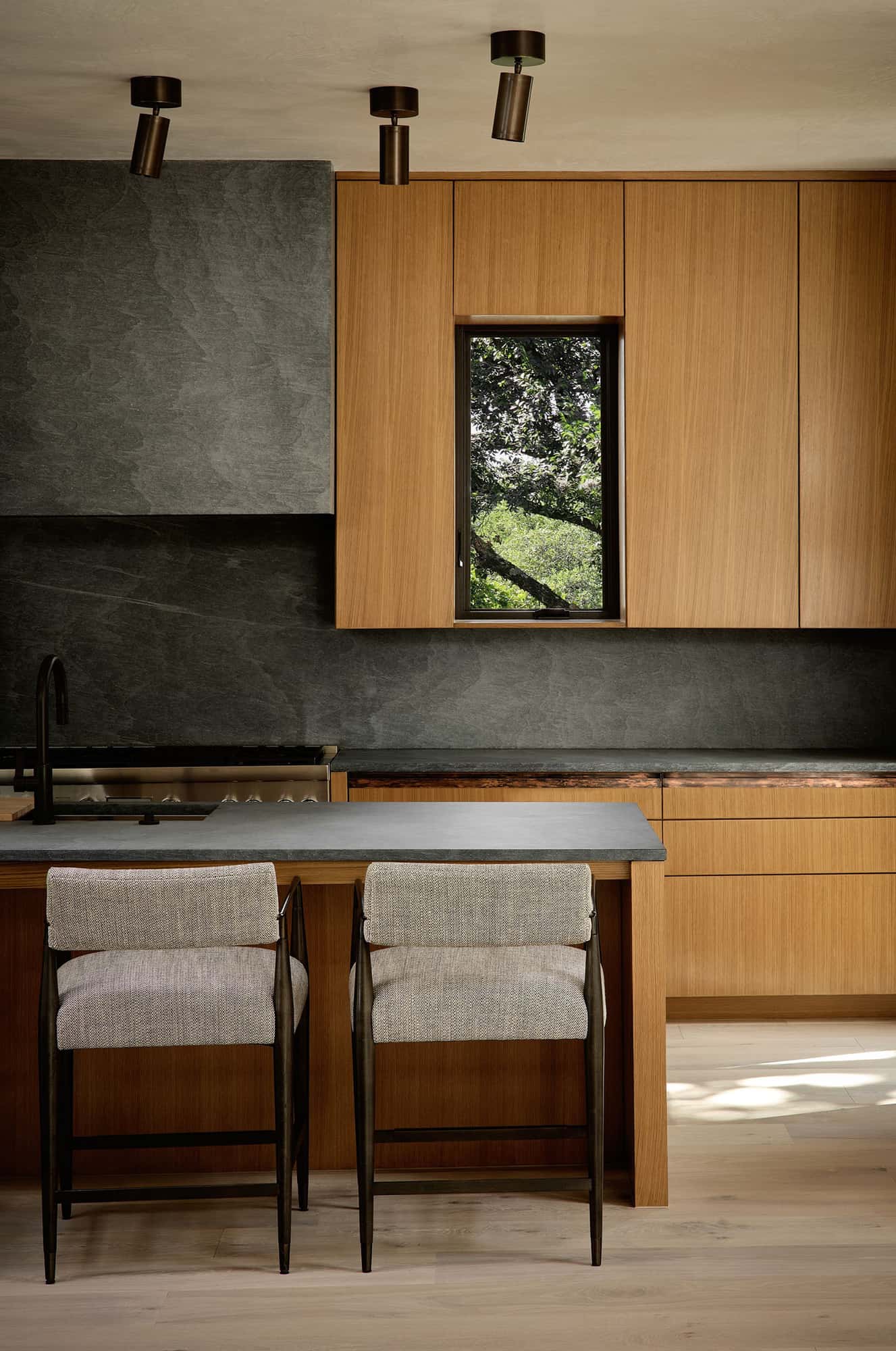
The kitchen is centered with a giant picture window, the designer choose panel-ready appliances so that the stainless steel didn’t overpower. The countertop stone is Pietra de Cordoza and the lighting was designed to help with tasks while adding a small decorative element rather than pendants — which would have interrupted the views to the outside.
“This home has a childlike sense of adventure — living in the trees – but with an air of sophistication. It was established early on that each room in the house should have a strong connection to the site — a steep sloping gradient dotted with majestic live oak and elm trees,” says Mark Richardson, Shiflet Richardson Architects.
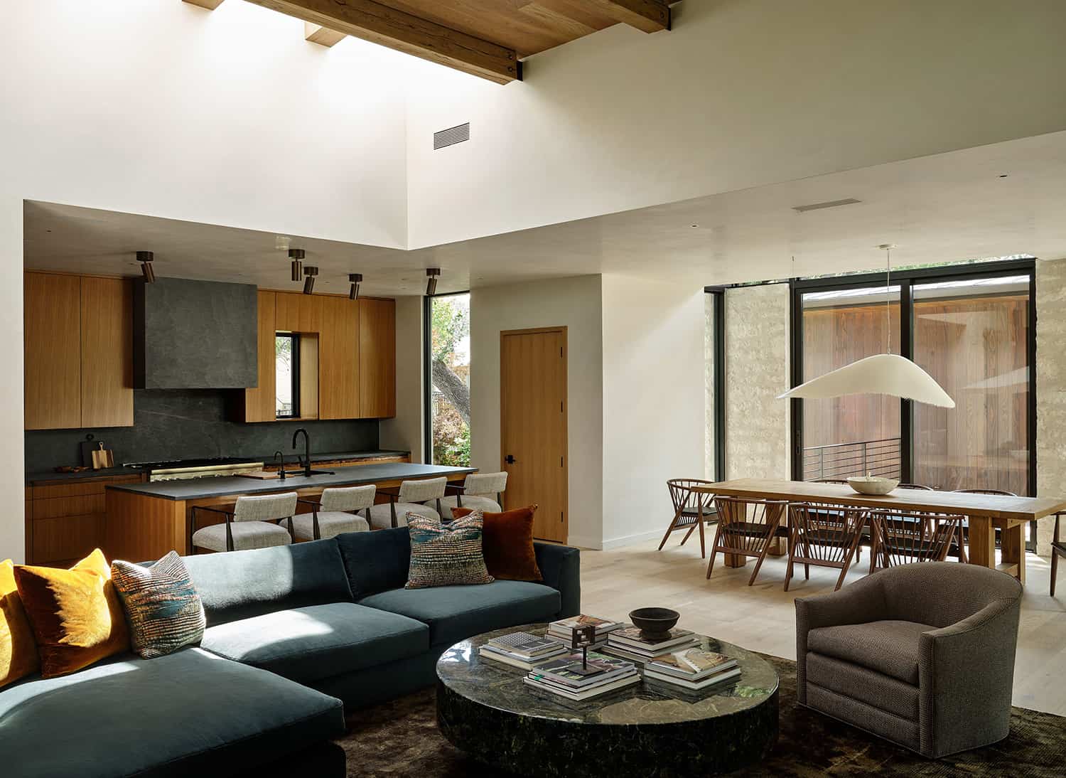
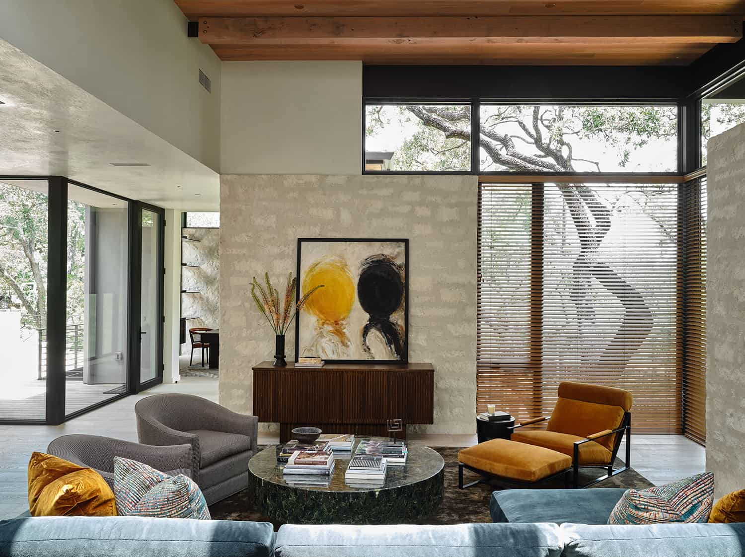
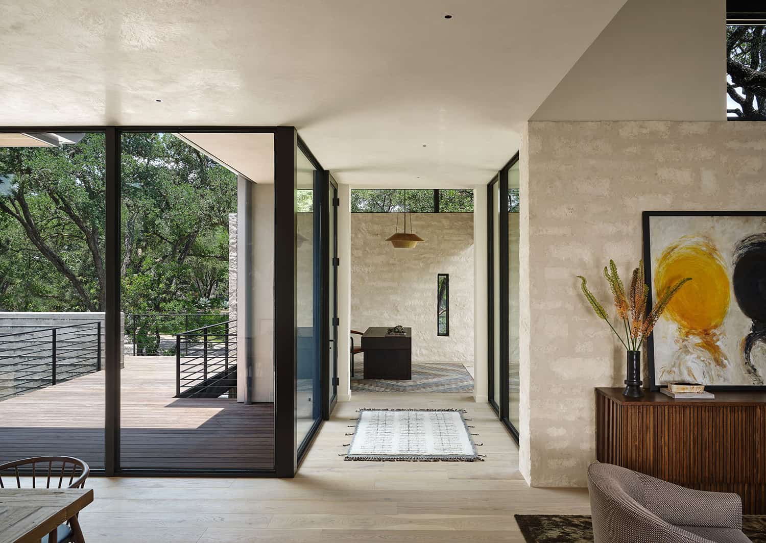
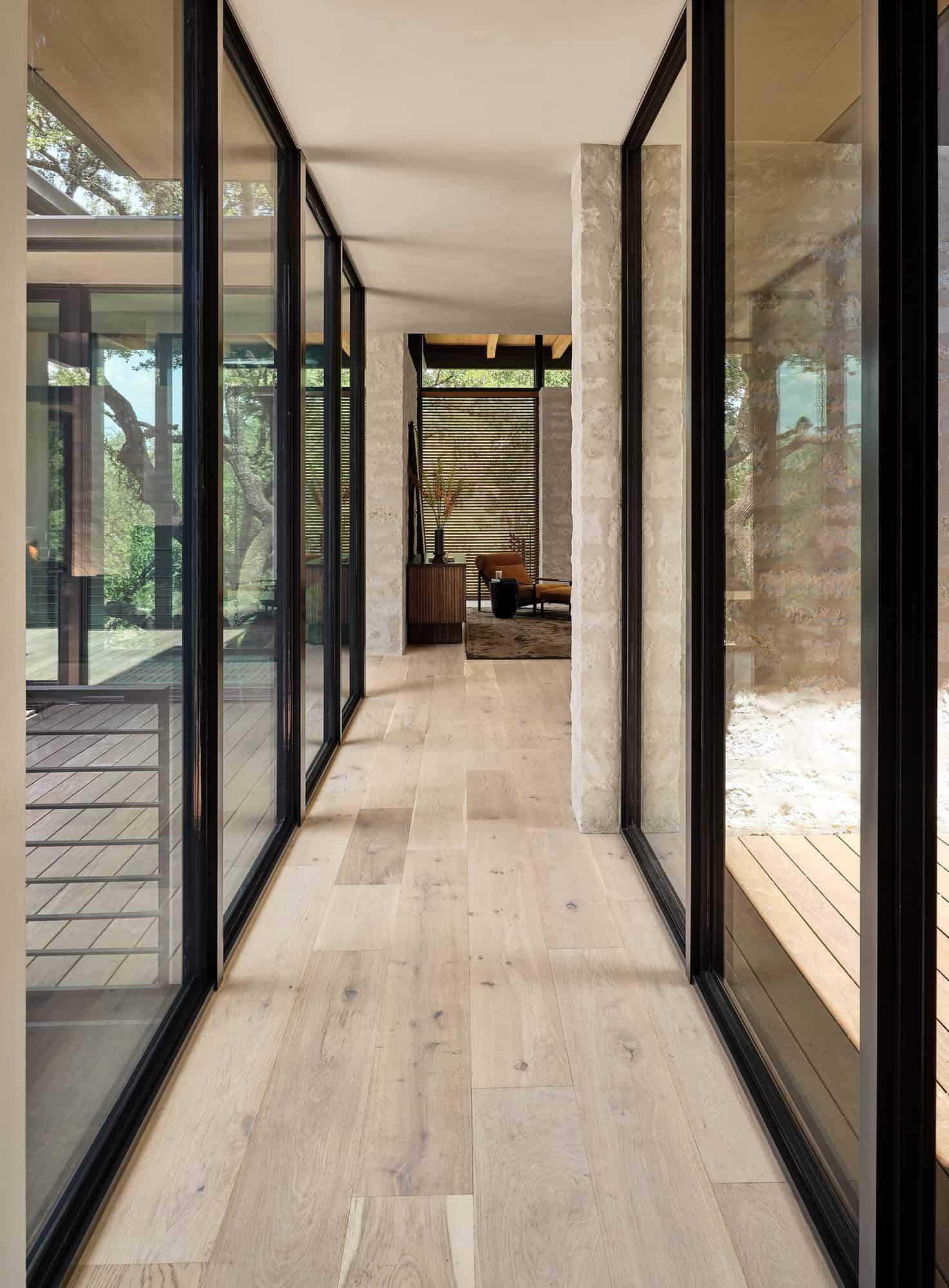
“We anchored the main living area of the home (kitchen, living, and dining) between the two heritage live oaks. Bedroom and study ‘wings’ extend from this central hub, weaving out amongst the tree canopies with glassed connectors. The result is a beautiful series of spaces that feel open yet private, comfortable, soothing, and totally connected to the pristine environment.”
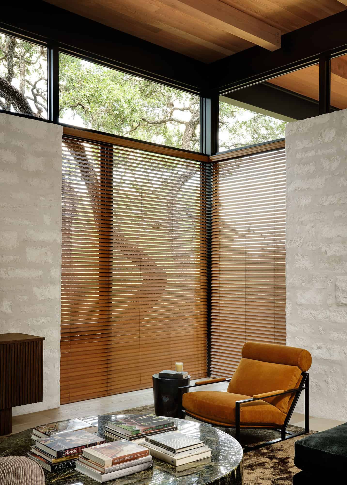
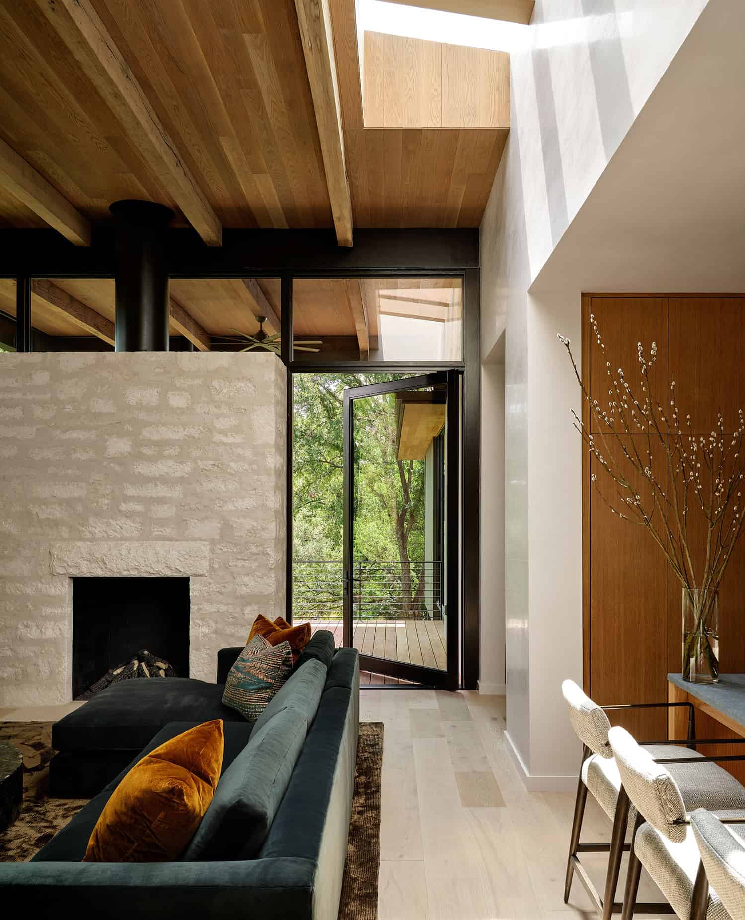
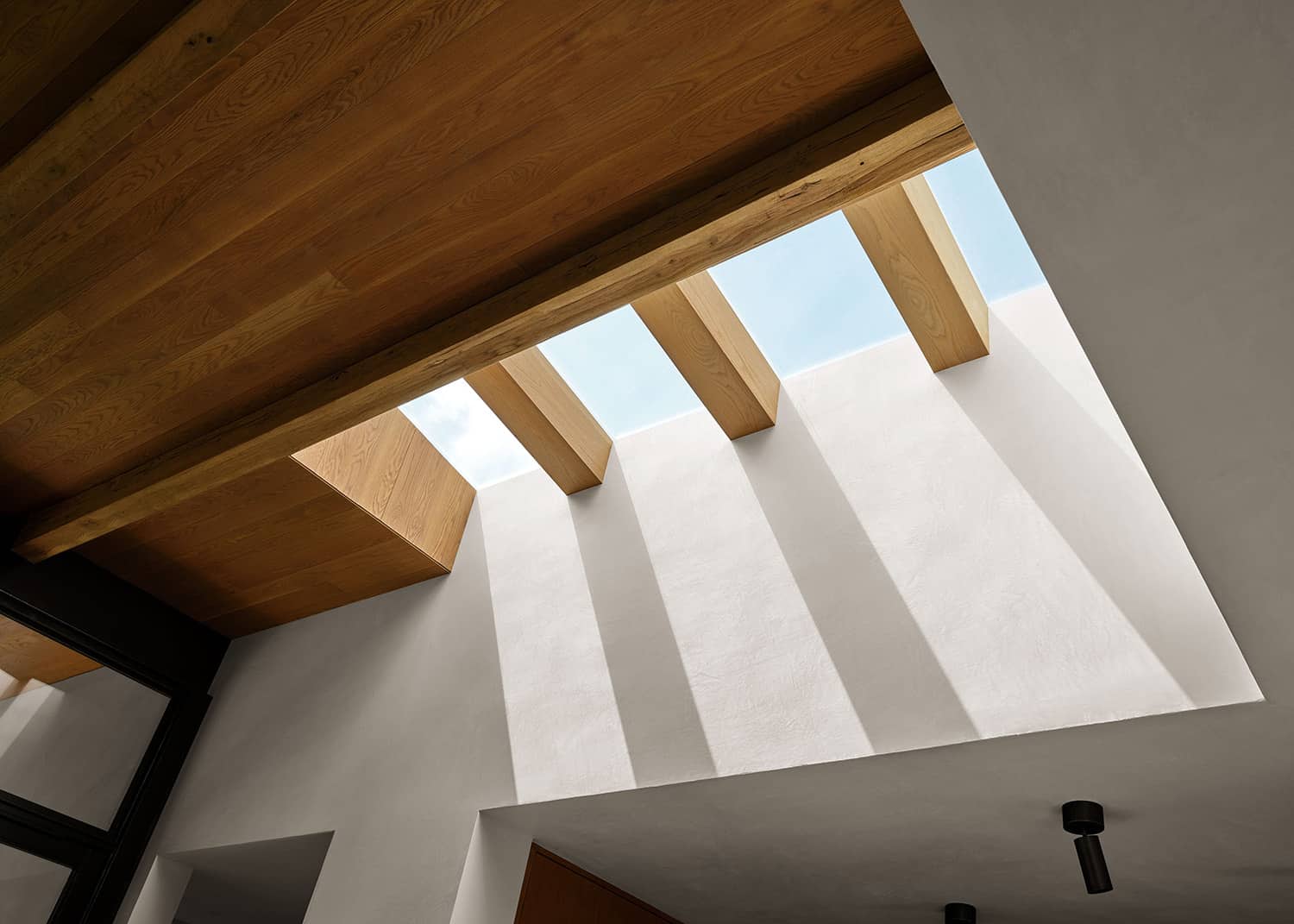
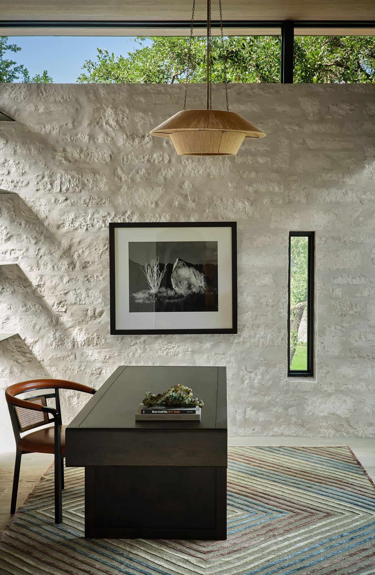
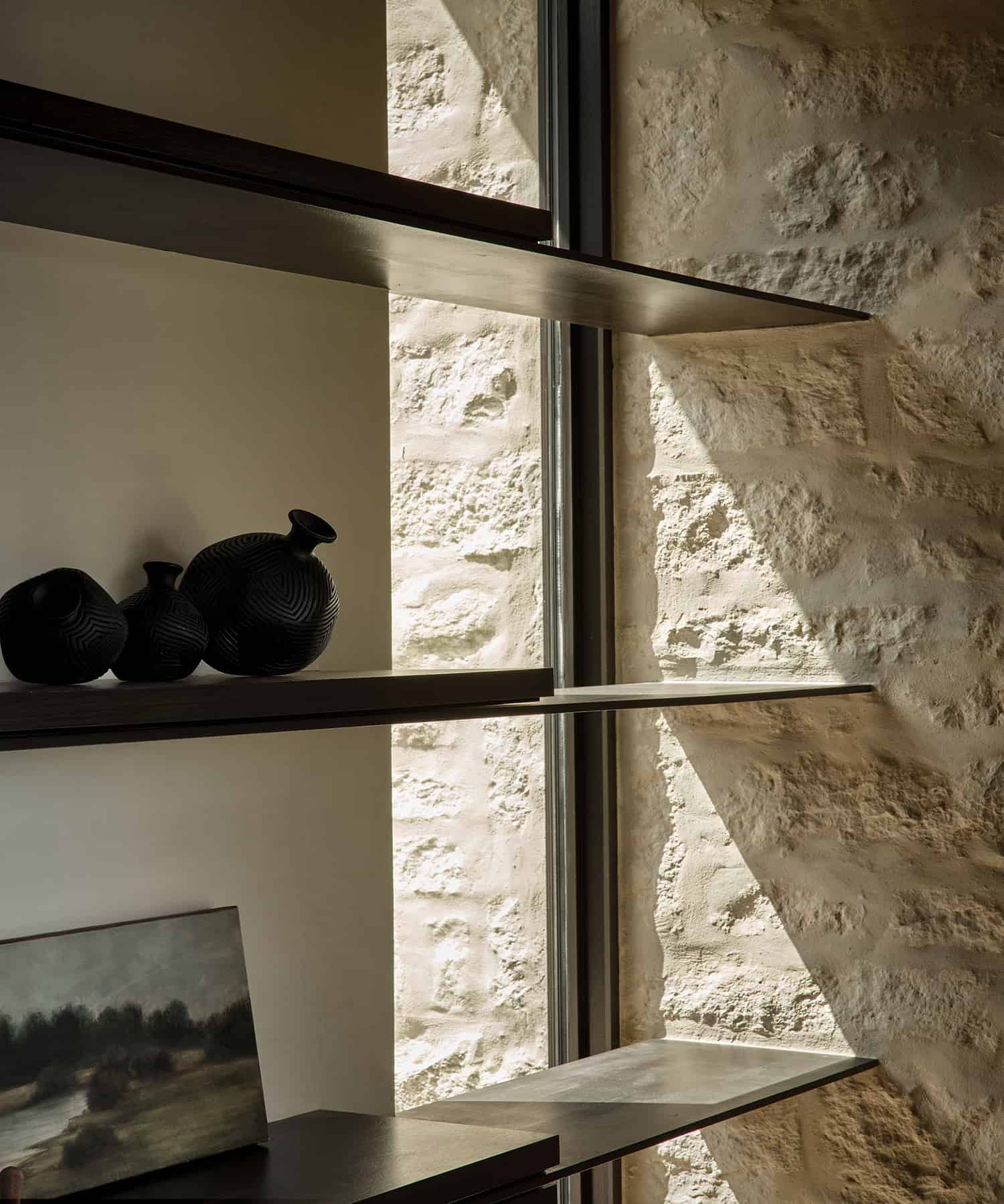
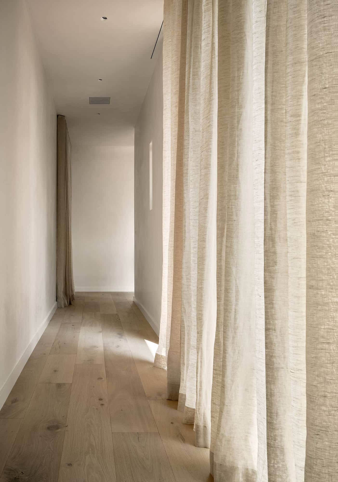
There are beautiful architectural angles that allow moving sunlight to pour inside the house creating patterns across the ceilings and walls. “We really wanted to play with the different levels of light that comes through the house,” says Christina Simon, Mark Ashby Design. “We used soft, neutral curtains to filter the light in a refined and graceful way – while the steel shelves in the office create strong linear shadows formed by the architectural skylight above.
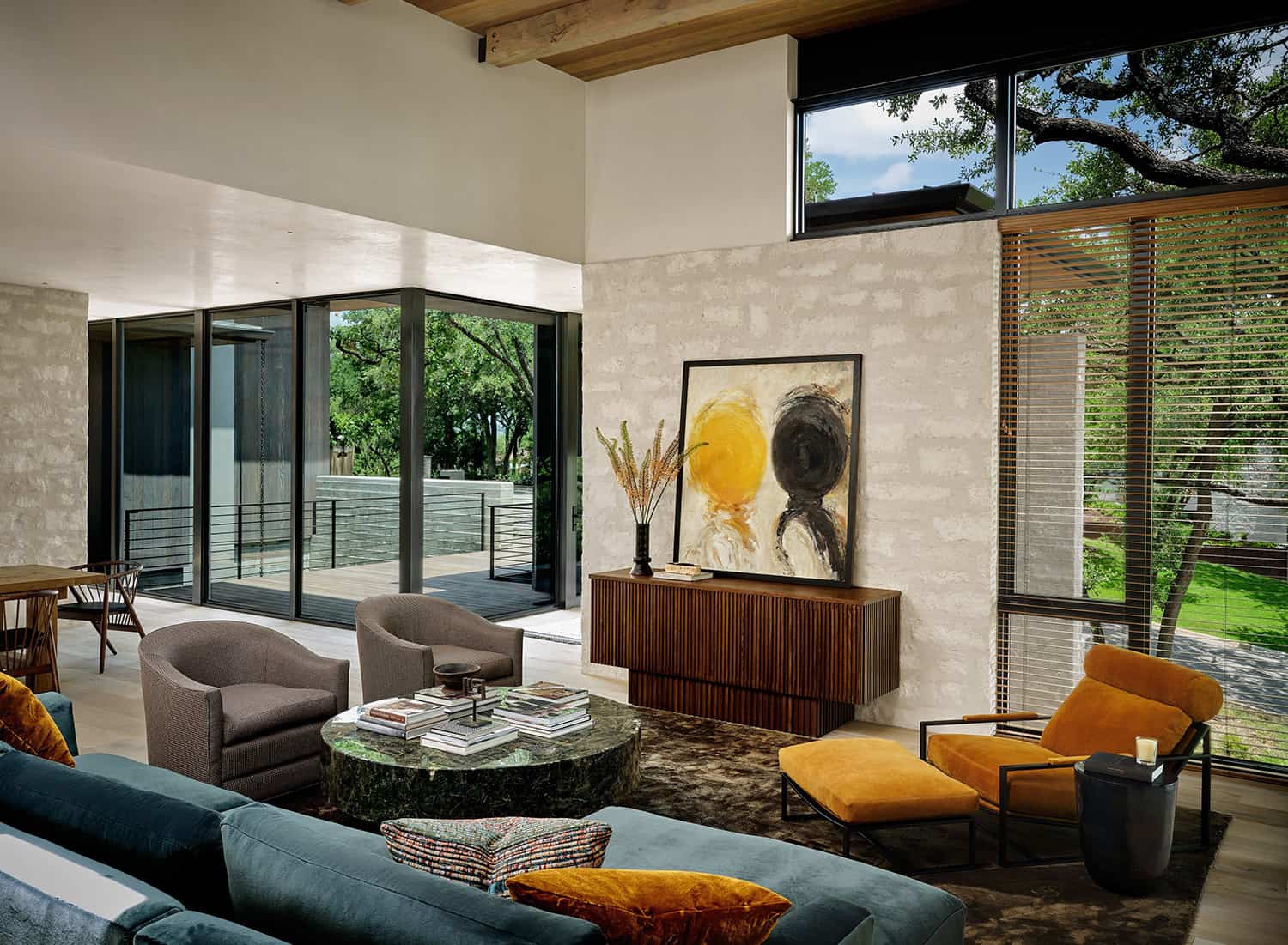
This look is also mirrored in the effect the natural-wood blinds cast — creating shadowed stripes that move across the wall. We used a lot of wood throughout the design as a way to create a neutral, cohesive palette capturing texture and shadow versus creating design contrasts. The effect is an overall relaxed simplicity which is found in Japanese minimalist design – which we studied for this design plan.”
Christina and the design team used plaster on the walls throughout to reflect the natural light that pours through in unexpected spaces. The stone surround of the fireplace and the hearth are cohesive with the house exterior, all made with natural Limestone. The fireplace, centered in the living room, is surrounded by windows in order to showcase the incredible heritage live oak trees.
“The design challenges were mostly based on the edit. How to refine the look, keep it quiet, but not lose the design, and how to create continuity without being boring. Many times, we questioned our use of materials that appear over and over again, worrying it wouldn’t look thoughtful. We had to stick to our guns and let the space hold its own. A few helpful layers, some changes in wood stain, some textural rugs help keep interest so the results are artful and refined,” says Christina.
What We Love: This modern sanctuary is surrounded by large oak and elm trees to provide a treehouse-like feel to this home when looking through expansive windows. Clean lines and contemporary furnishings lend an appealing aesthetic and an overall relaxed vibe to this striking home. We are especially loving the wonderful indoor-outdoor connection and wood accents throughout this home to bring inviting warmth.
Tell Us: What details do you find most appealing in the design of this Texas home and why in the Comments below!
Note: Be sure to check out a couple of other amazing home tours that we have showcased here on One Kindesign from the portfolio of the designer of this home, Mark Ashby Design: European style home in Texas with a mid-century modern twist and Stunning rustic modern home nestled on beautiful Lake Austin, Texas.
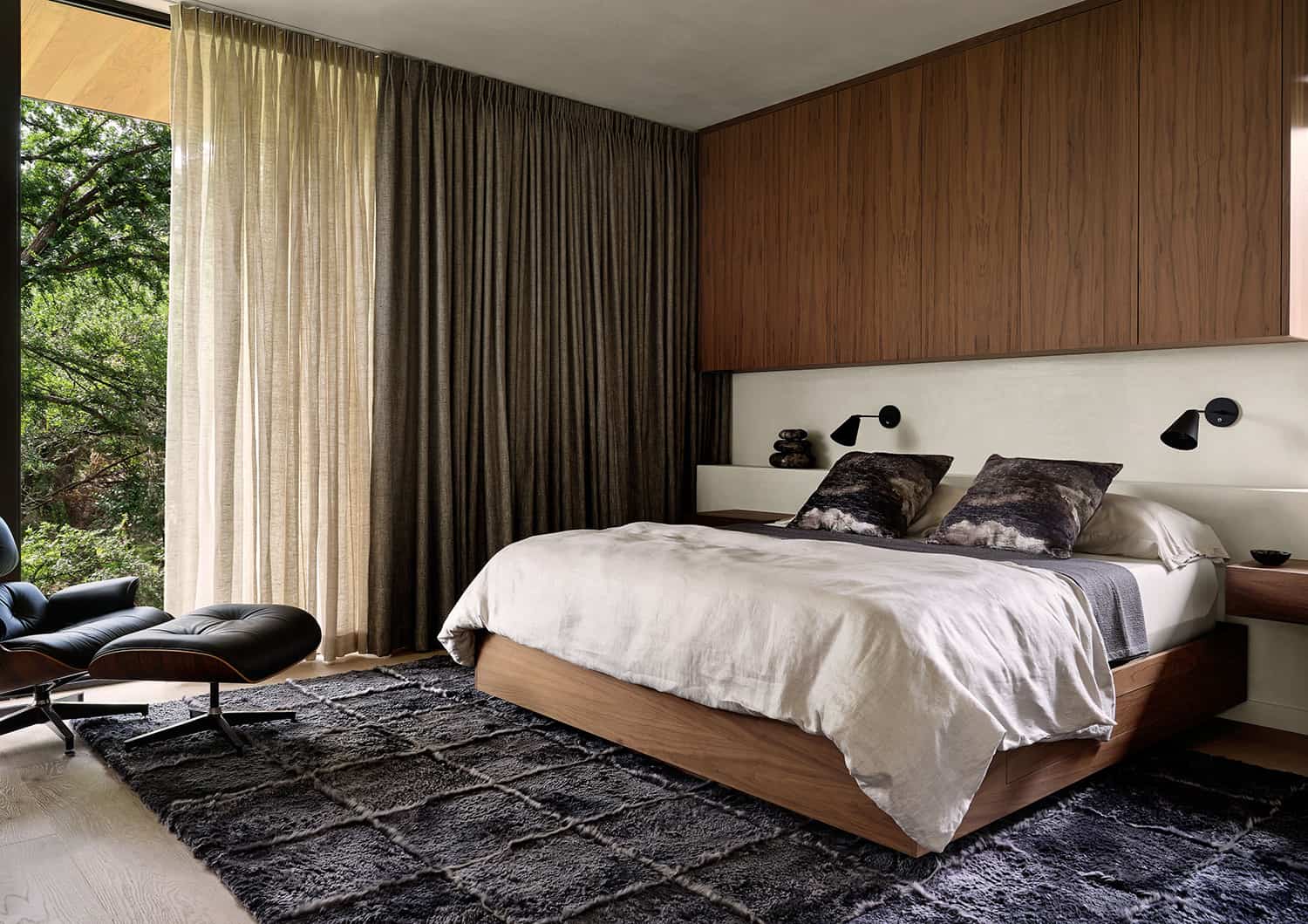
In the owner’s suite of this modern sanctuary, warm fabrics emerge from otherwise clean and built-in furniture – full of storage with trap doors and hidden compartments. The built-in was custom designed entirely for the owner and all of the items that needed to be stowed and out of sight. The bedside tables float on a plaster shelf which creates a space for additional surface area.
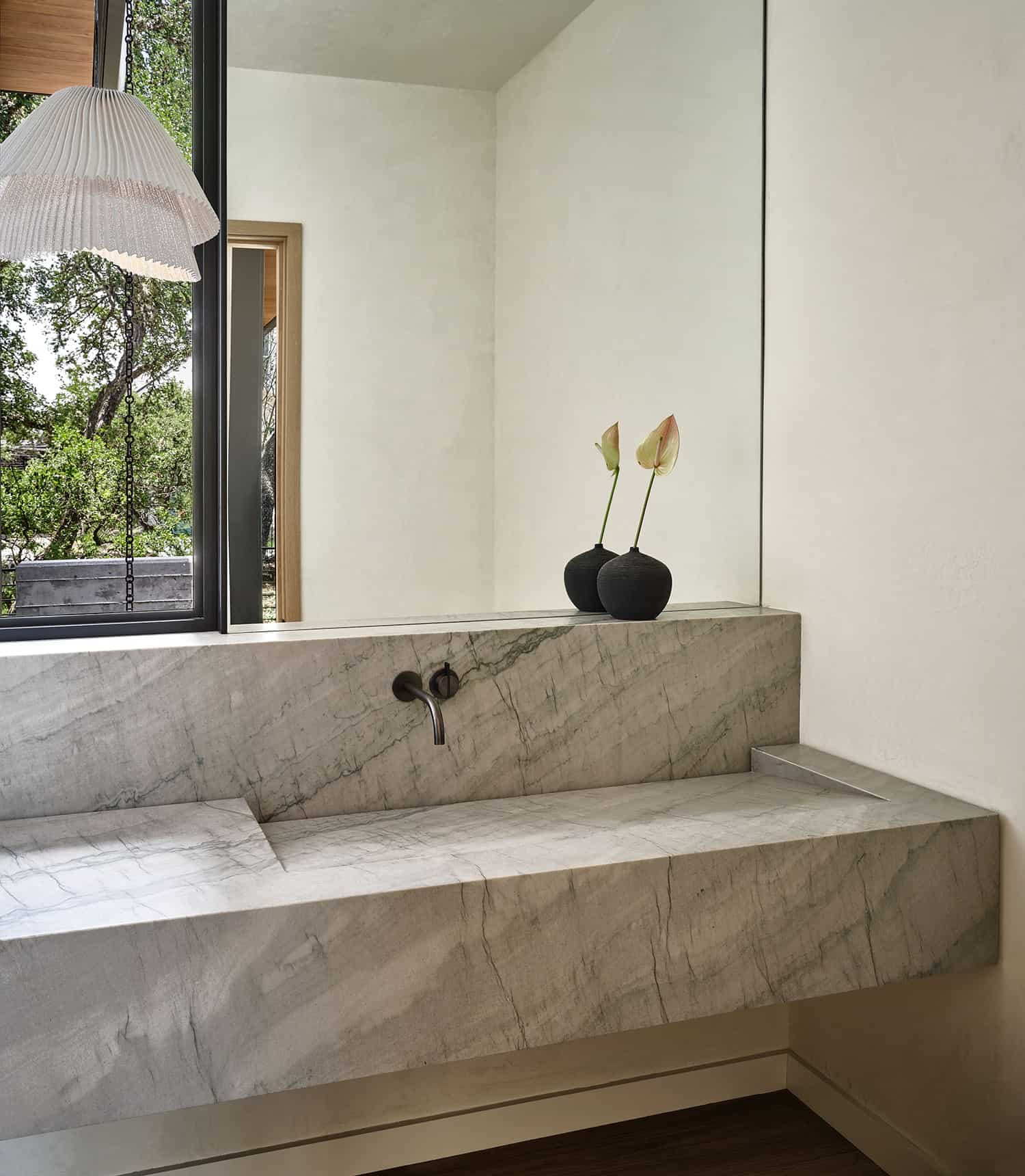
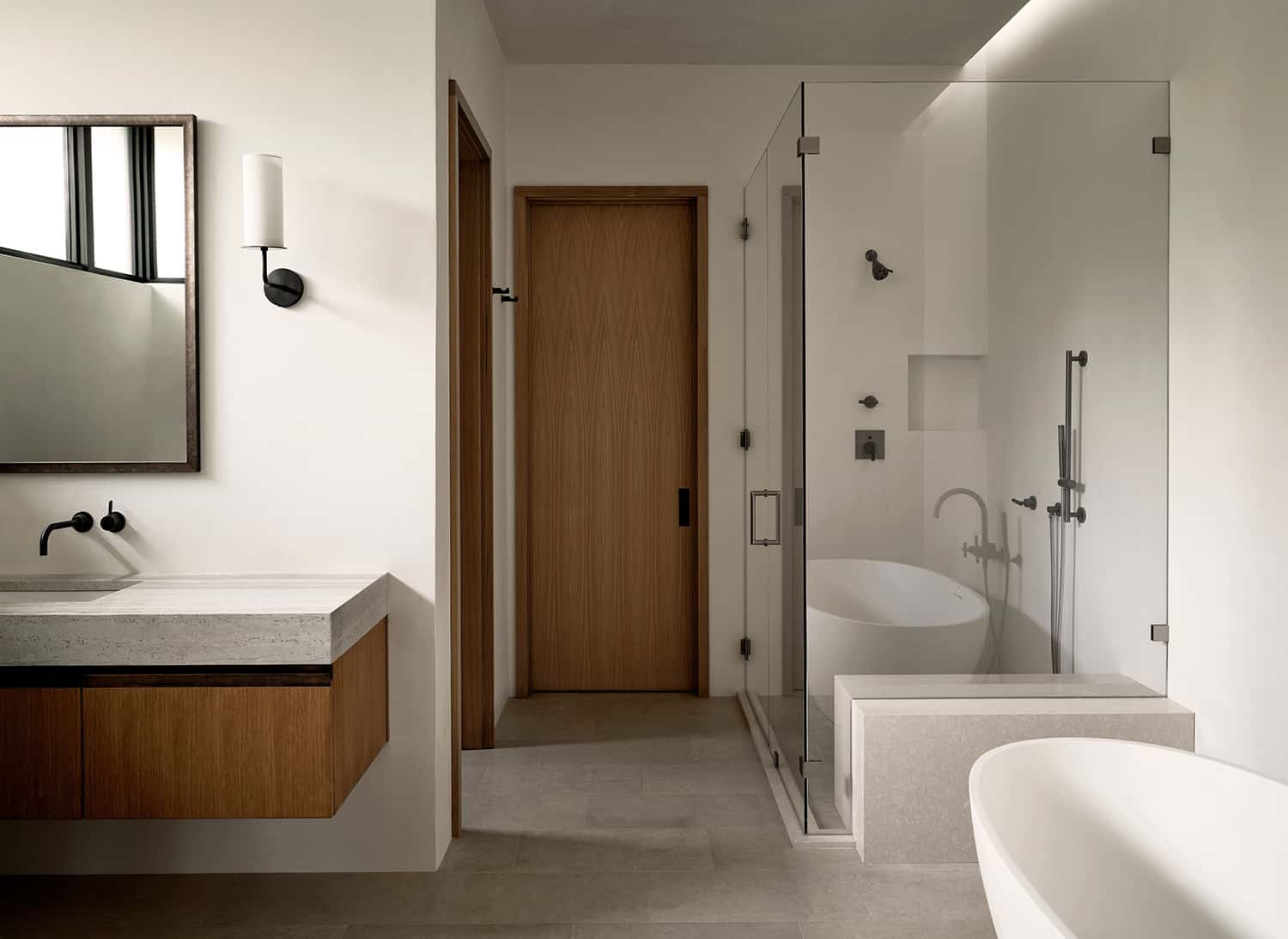
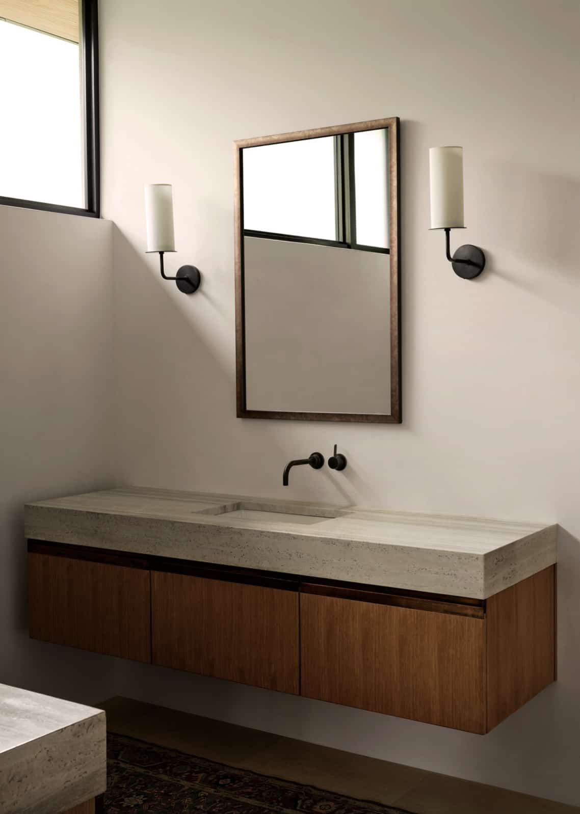
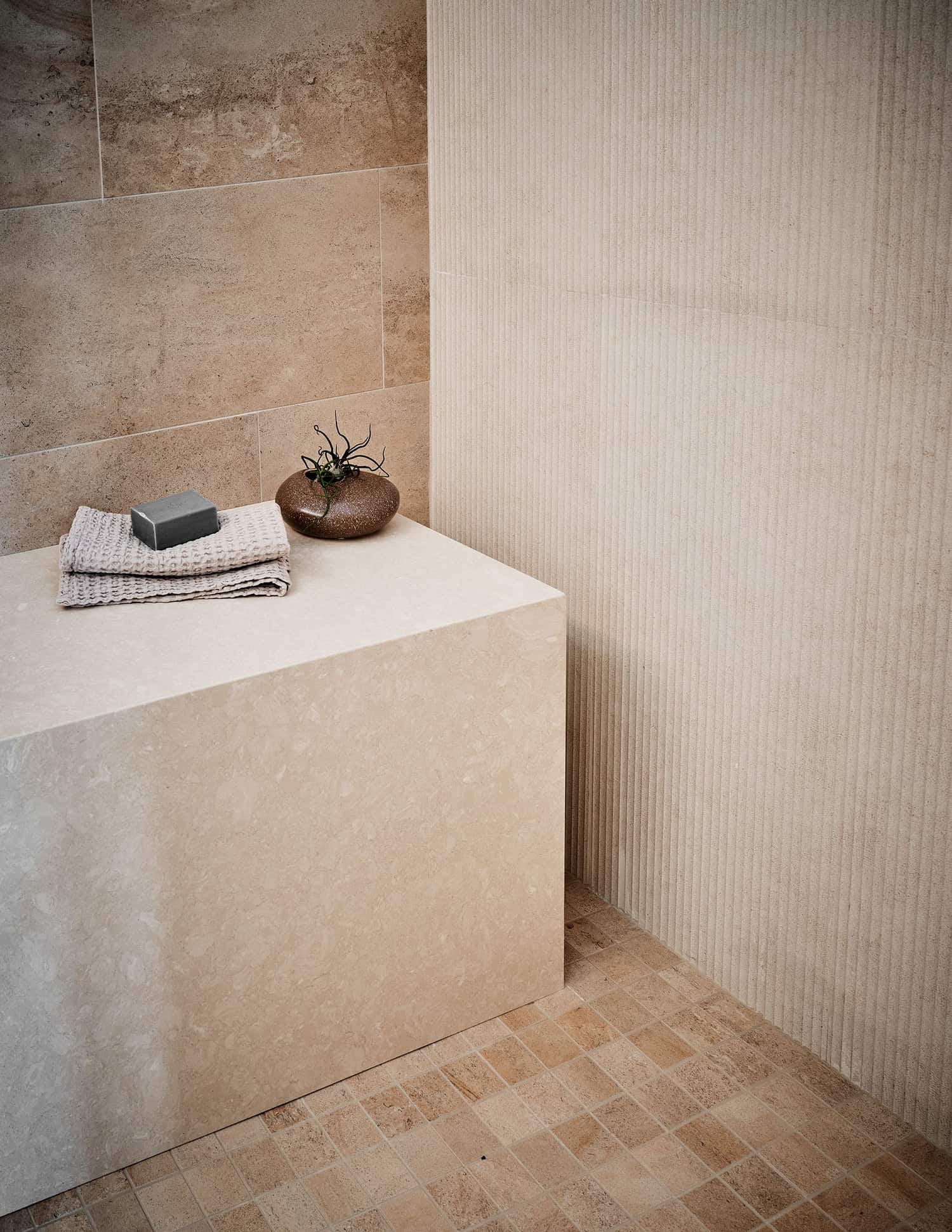
The main bath has a plaster walled shower that continues throughout matching the rest of the homes’ plaster walls for a continuous flow. The sinks are made of travertine, cut on thick miters.
PHOTOGRAPHER Clay Grier
One Kindesign has received this project from our submissions page. If you have a project you would like to submit, please visit our submit your work page for consideration!


0 comments