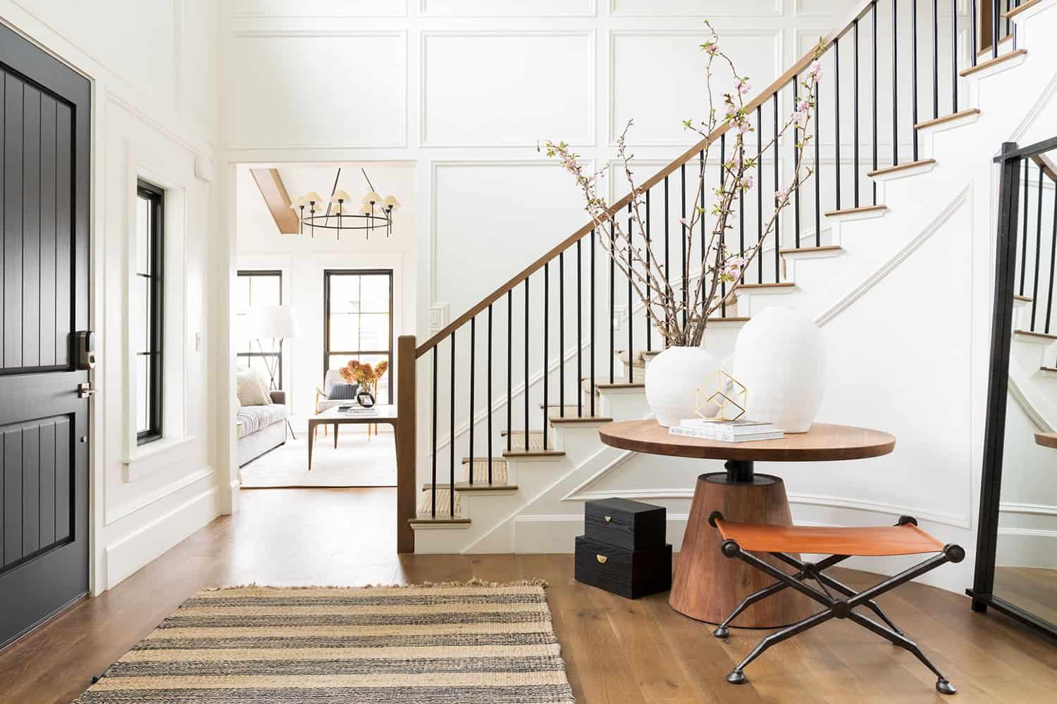
This gorgeous transitional-style home has been completely renovated by Studio McGee, located in Layton, Utah. The original dwelling was traditional in design and needed a major overhaul. The design team streamlined the home and changed the materials to the owner’s style tastes. Inside, the home features a mix of warm woods and black accents that sets the tone for the entire home.
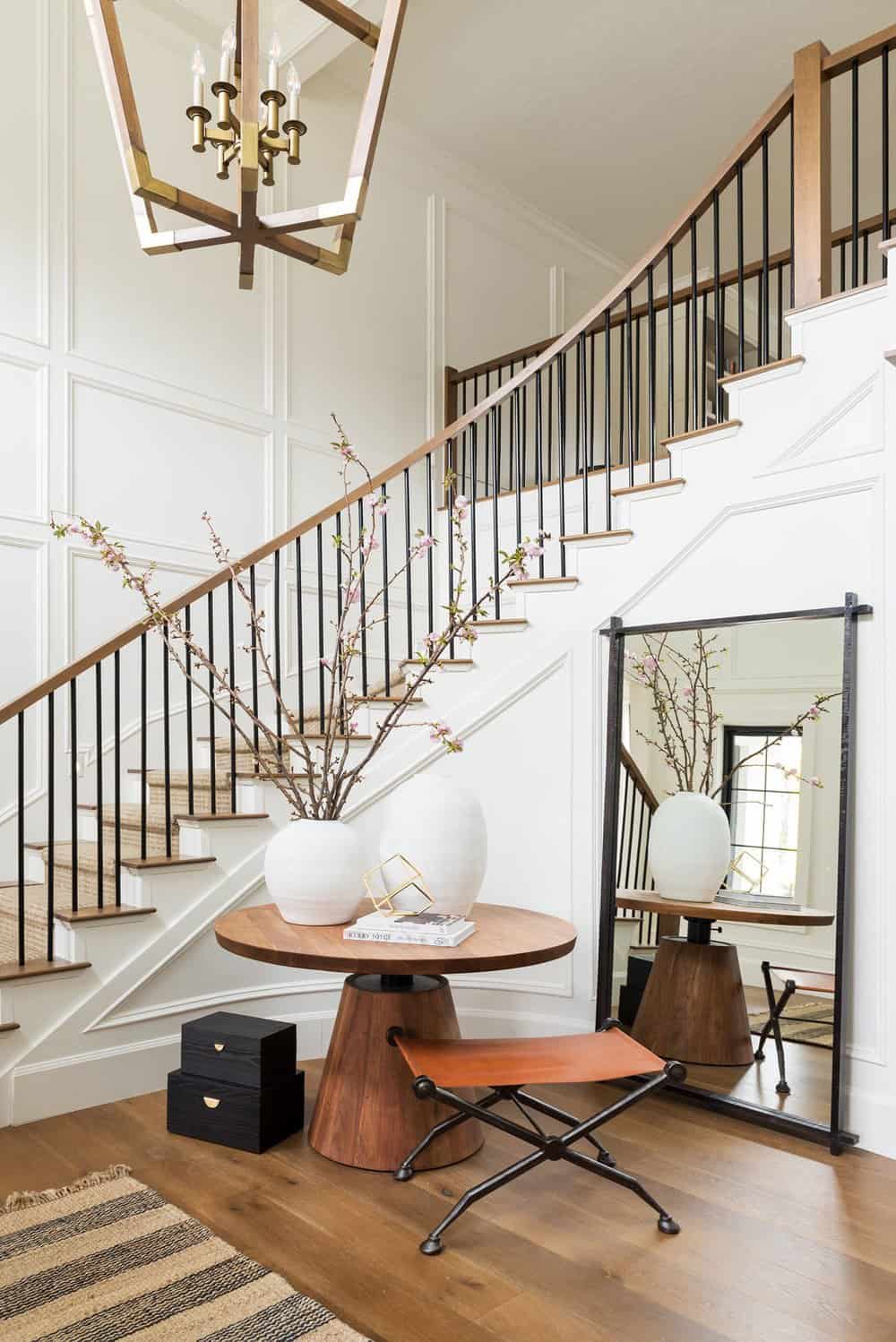
There was paneling on the walls before the update, but the designer opted for floor-to-ceiling paneling for a fresh new look in the entry. A curved, round staircase is grounded with a big, round table. The table is layered with a stool and a mirror behind it along with tall vases and beautiful vases that draw your eye up towards the ceiling fixture.
What We Love: This renovated home in Utah features warm and cool tones mixed together to create a beautiful balance throughout the interiors. The designer did a wonderful job of transforming a traditional home into a fresh and contemporary aesthetic that is inviting and cozy. We are especially loving the living and family room concept, where the spaces are separate yet feel connected with a cohesive color scheme and dual-sided fireplace.
Tell Us: What design element in this home do you find most inspiring and why in the Comments below!
Note: Be sure to check out a couple of other amazing home tours that we have featured here on One Kindesign in the state of Utah: Inside a mountain modern dream home boasting luxe details in Utah and Dream House Tour: Modern design meets cozy farmhouse style in Utah.
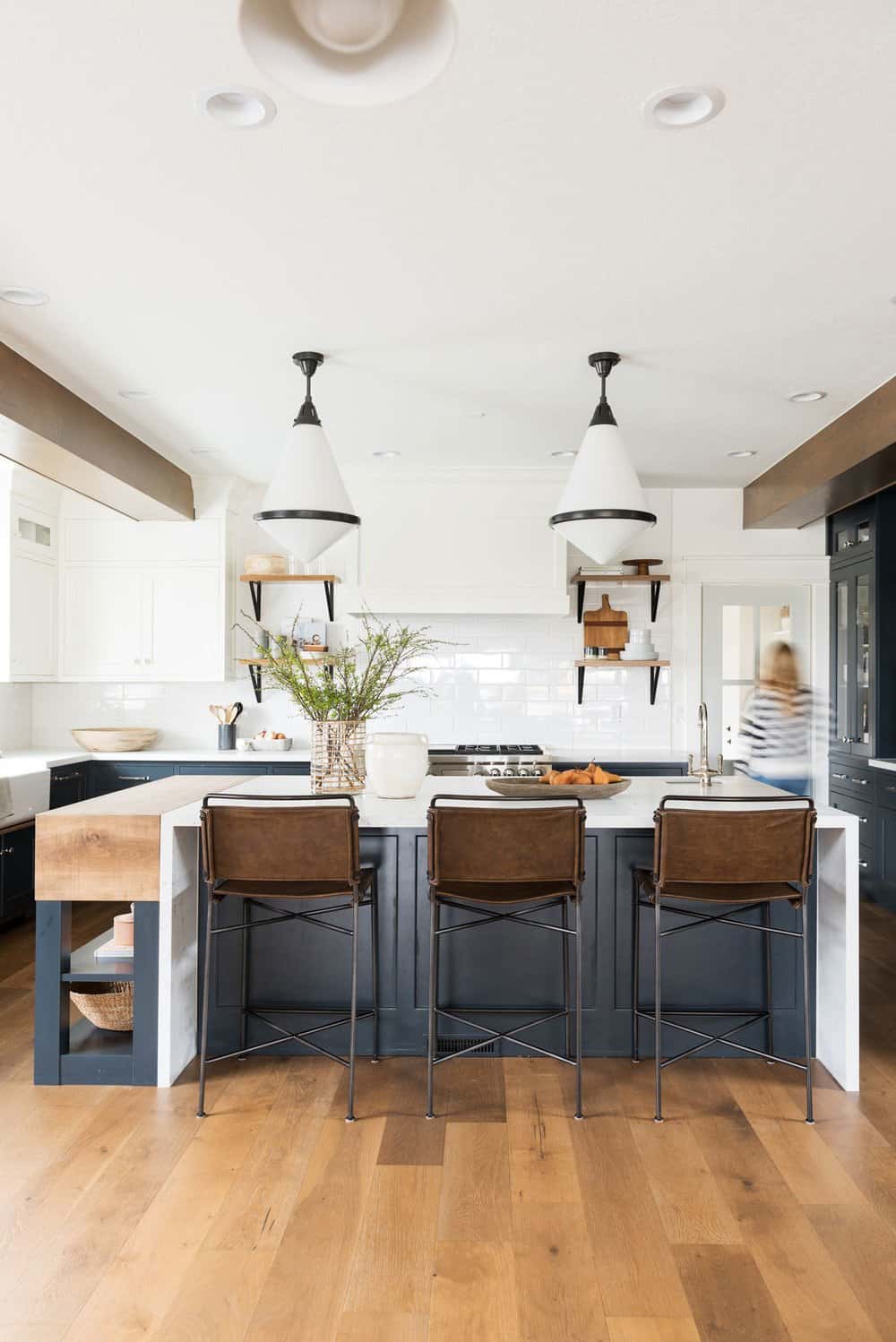
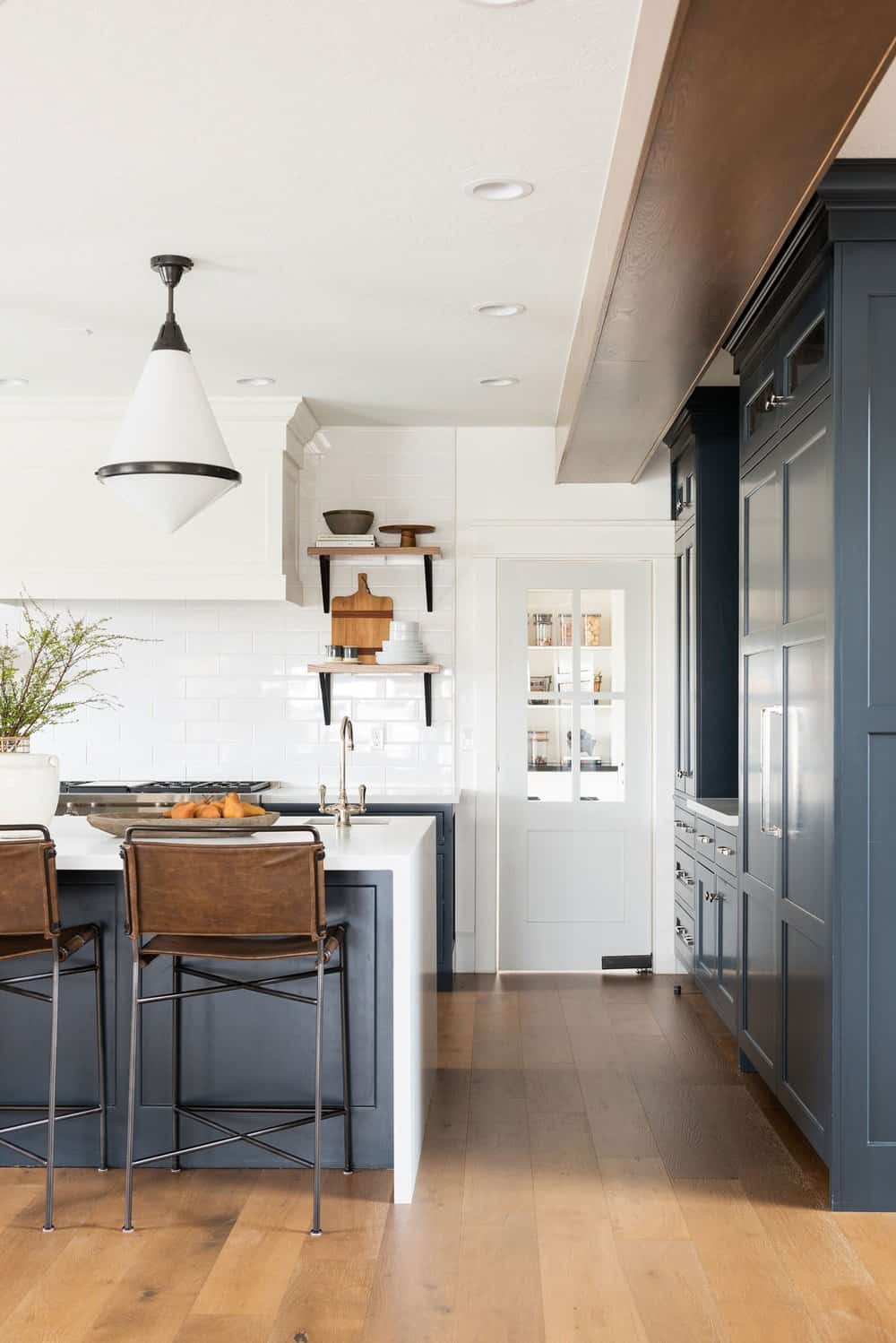
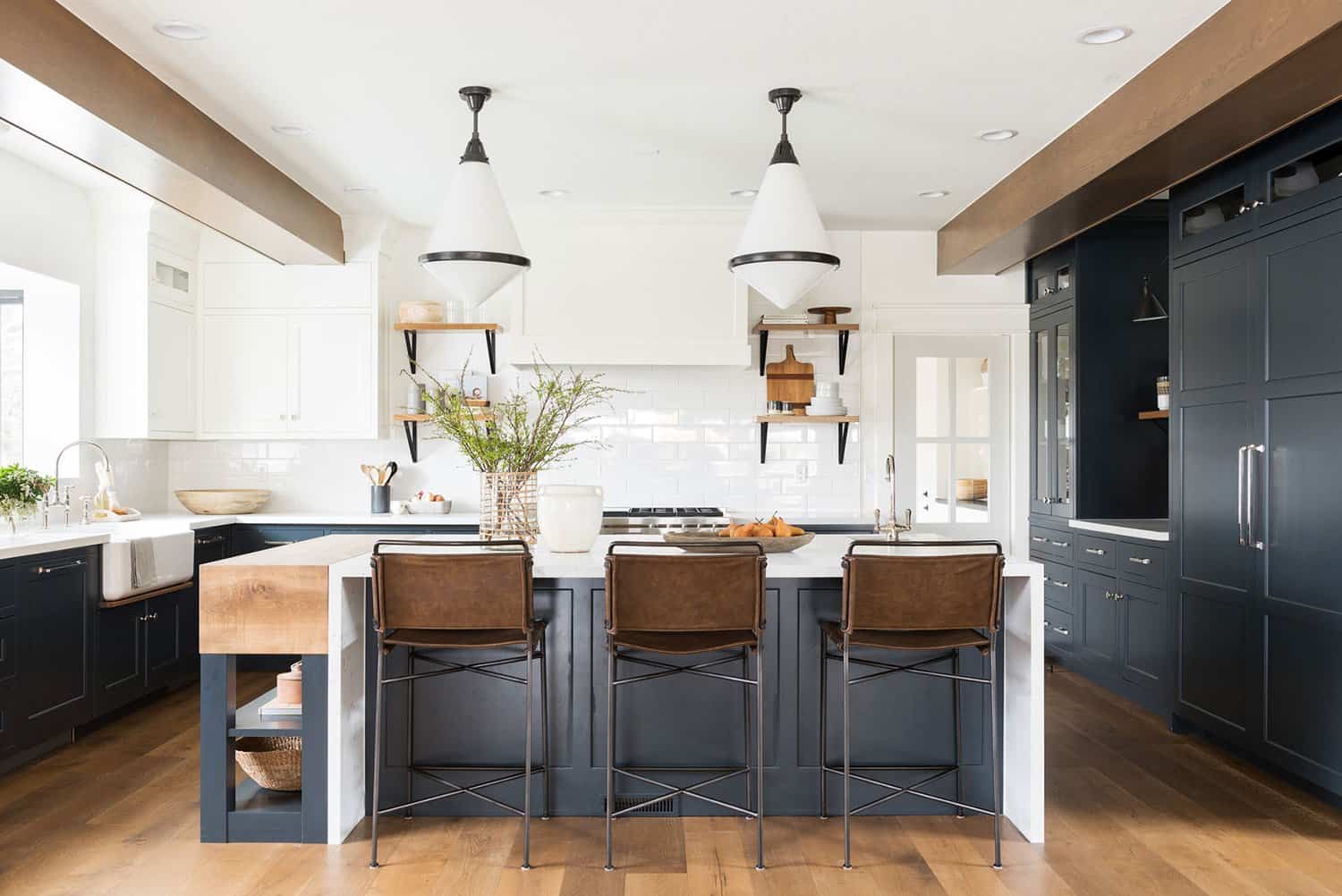
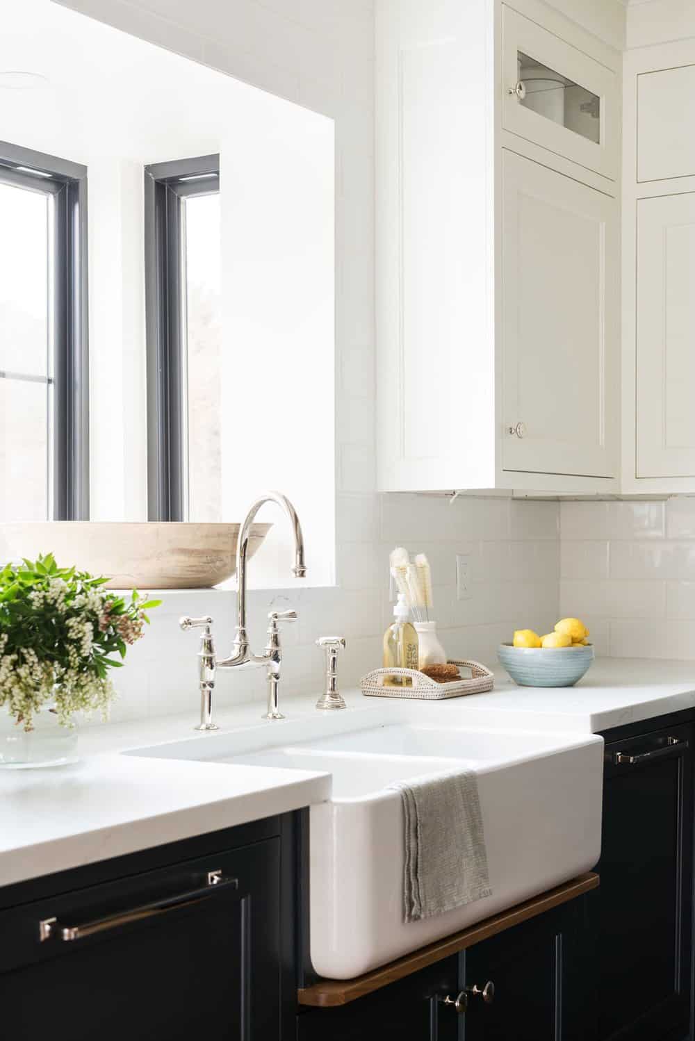
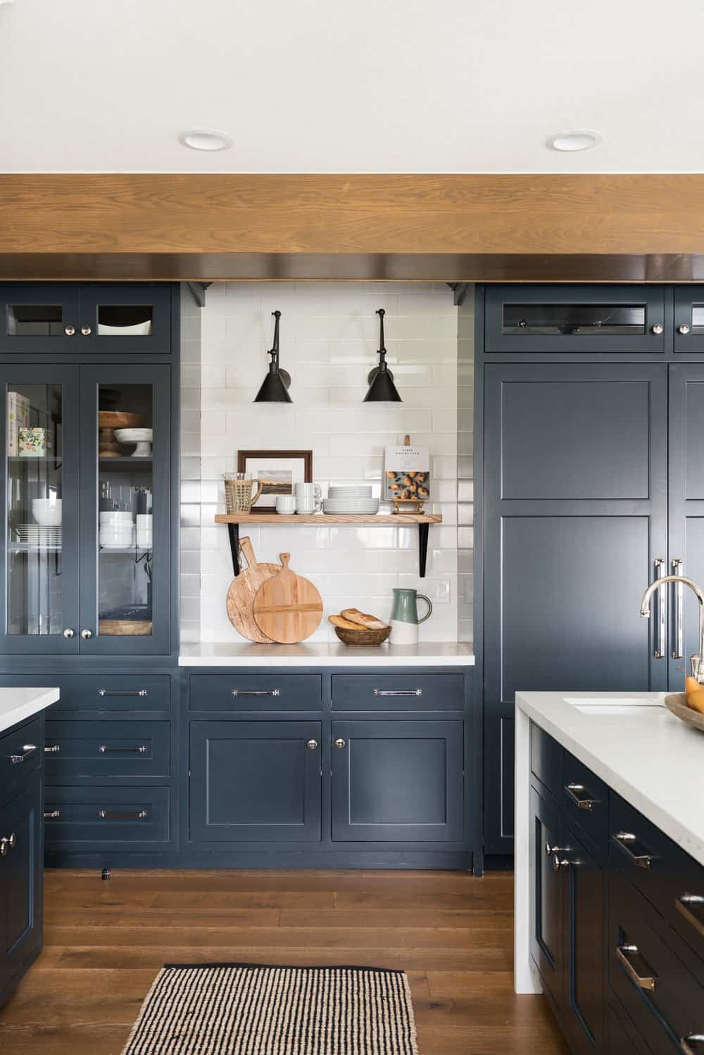
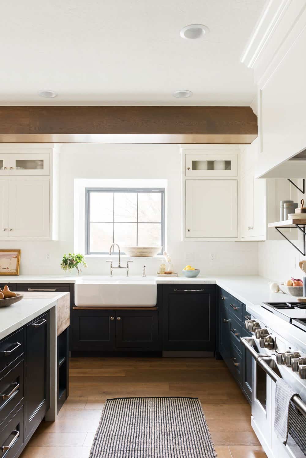
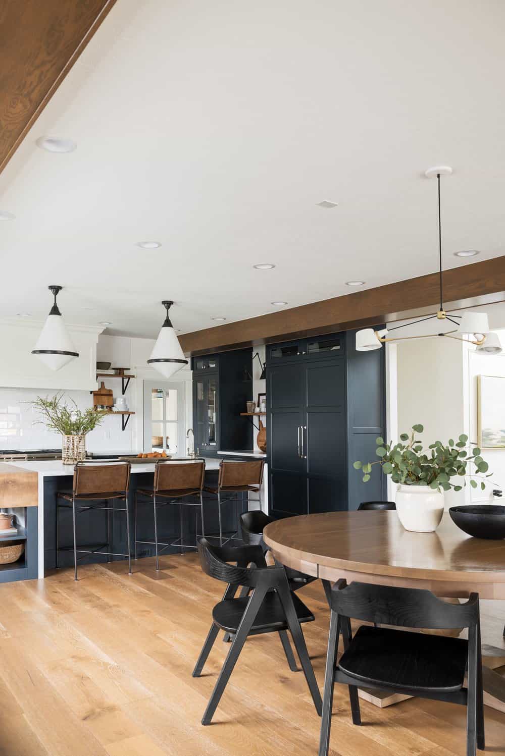
Above: The kitchen before the remodel was an L-shape with an island in the middle and a fluorescent light fixture on the ceiling. The designer completely changed the layout by getting rid of the peninsula and creating a more expansive island. The ceiling height was increased after demolishing the drop-down ceiling. This exposed two massive structural beams, which were creatively concealed by wrapping them with stained wood.
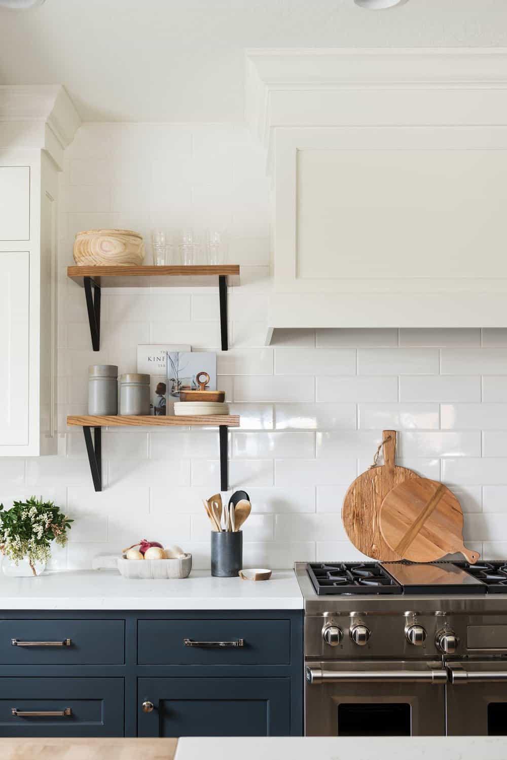
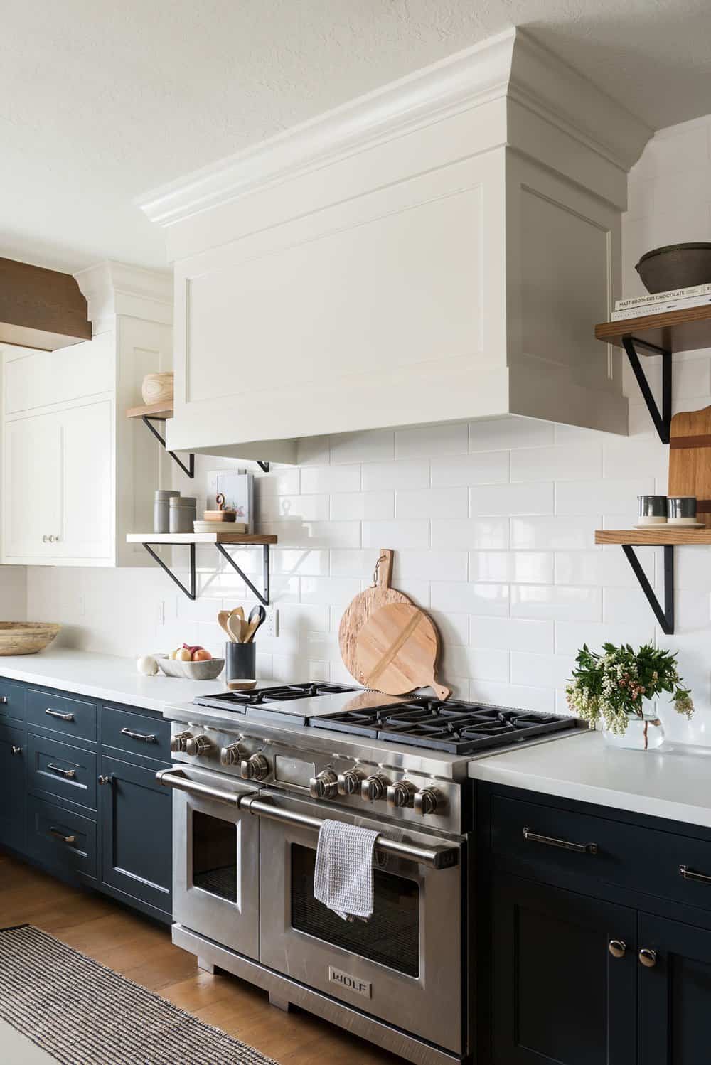
Above: Symmetrical floating shelves on either side of the hood create a focal point in the kitchen. The island design features a waterfall countertop and a thick butcher block counter at the end with open shelves for displaying bowls, books, and other decorative pieces. The overall effect creates a “wow” factor when you walk into the kitchen. FYI: The pendant lights over the island are the Visual Comfort Gale Pendant.
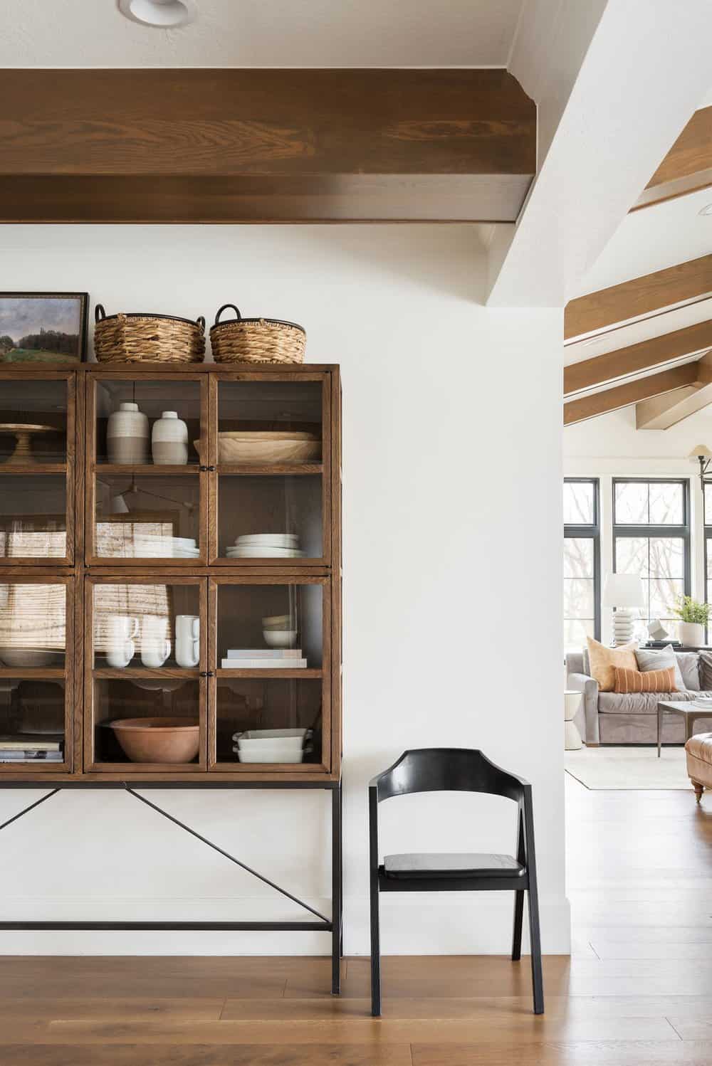
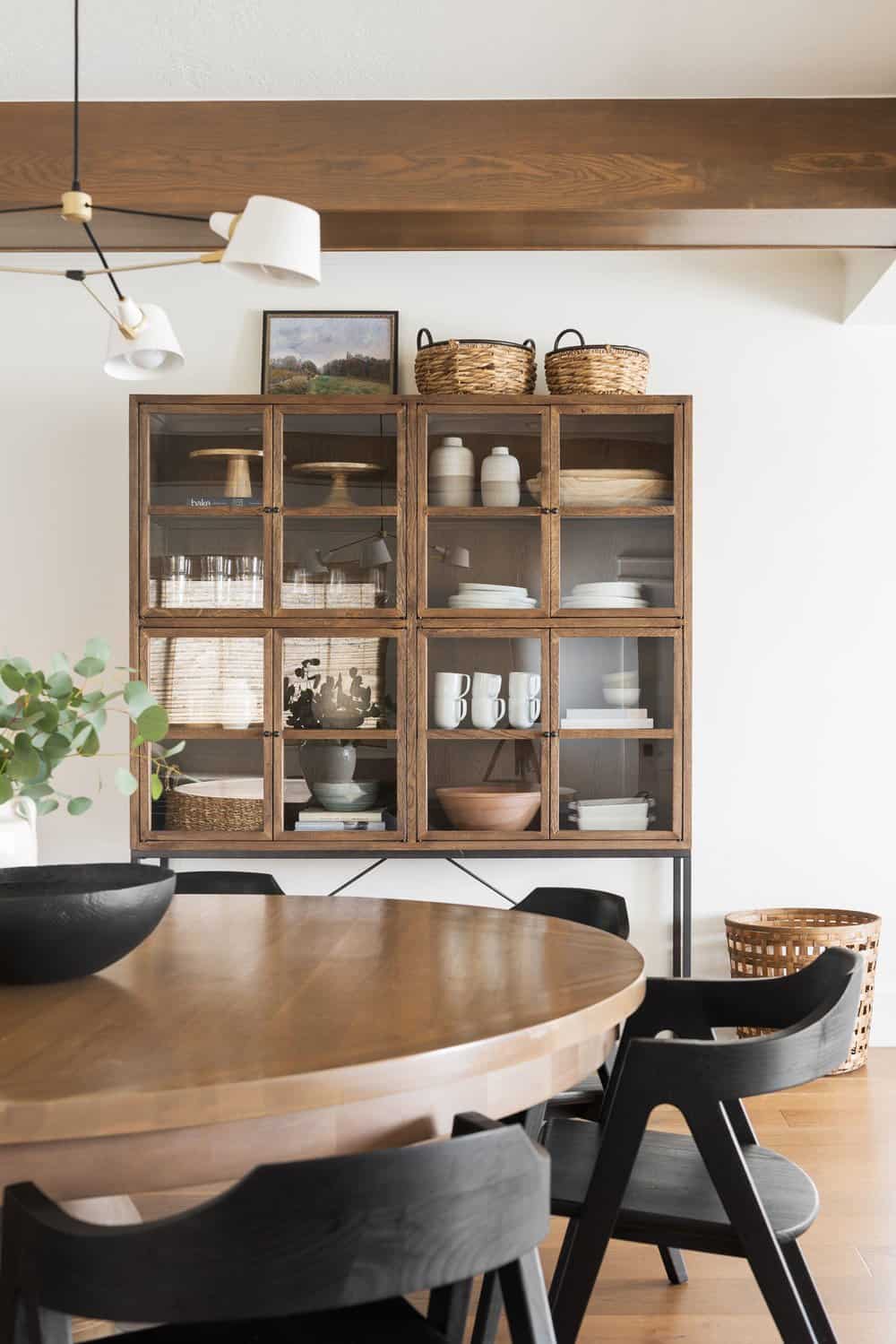
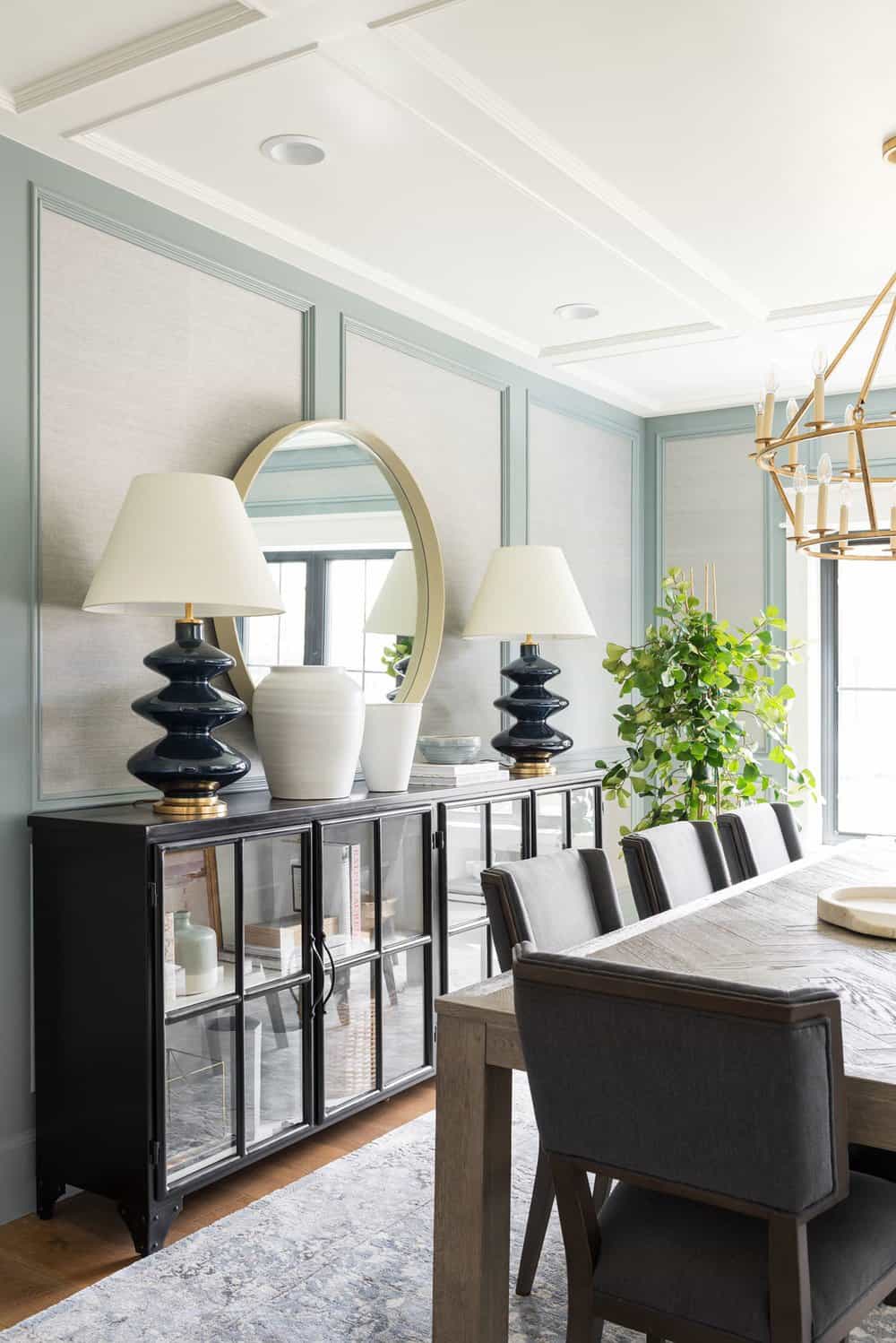
Above: In the dining nook of this renovated Utah home, a glass-front cabinet is filled with treasures. One of the designer’s favorite styling tricks is to add things on top of these types of cabinets to add a lot more life to a space.
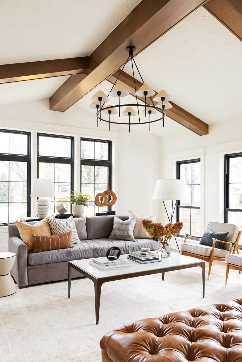
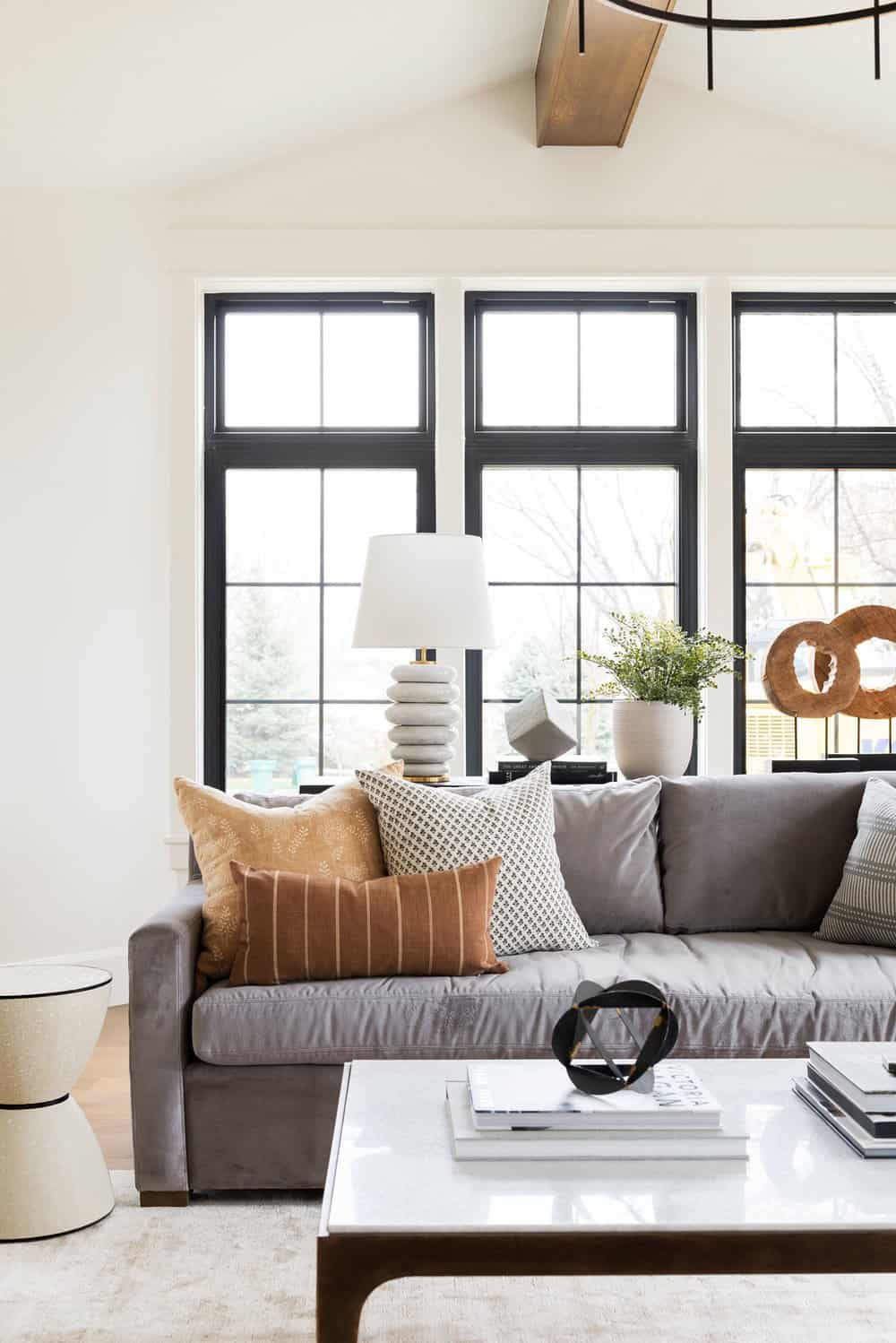
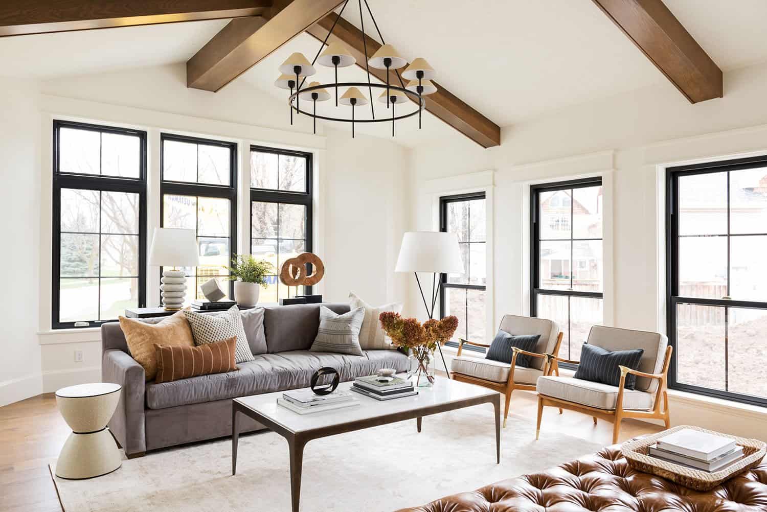
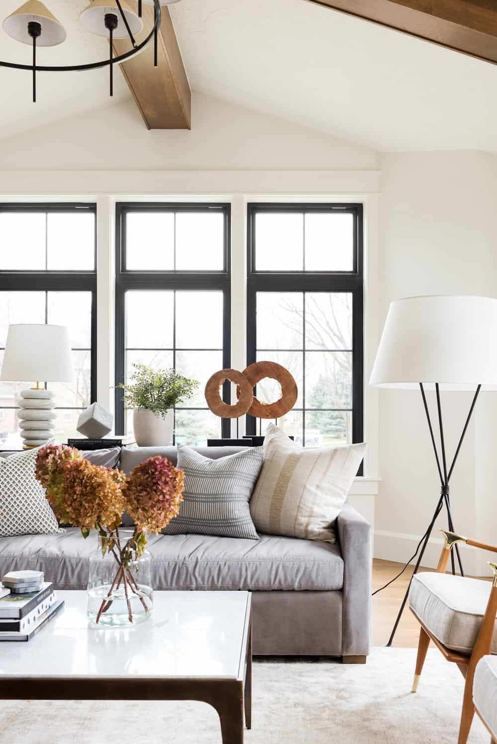
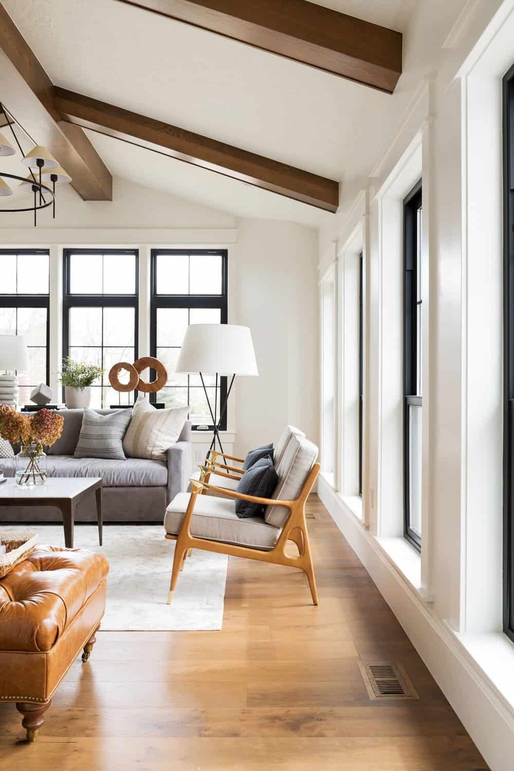
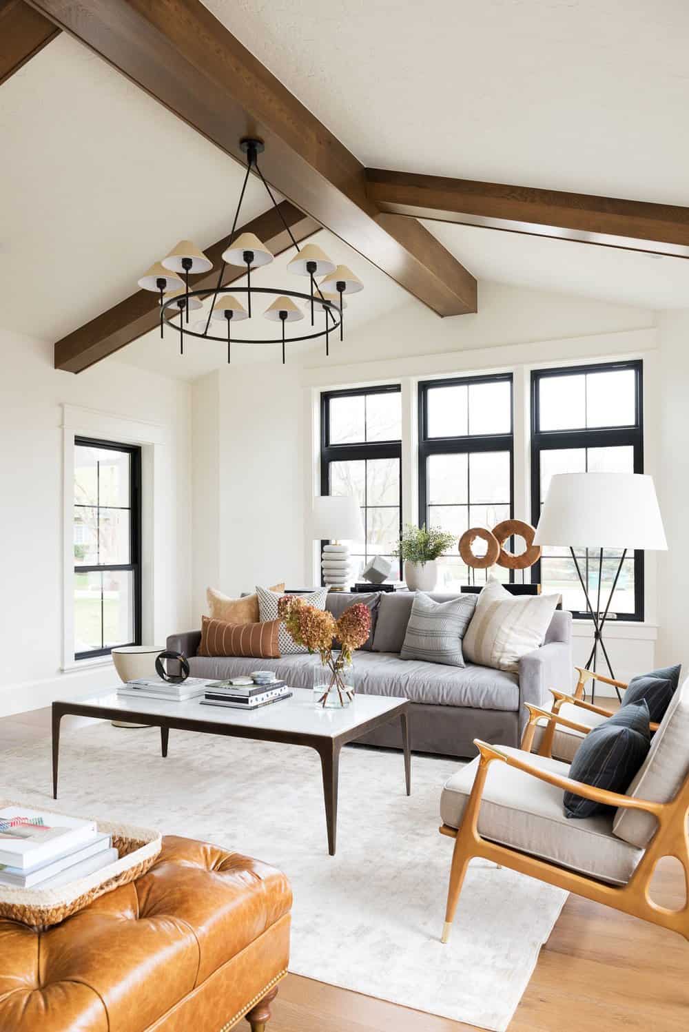
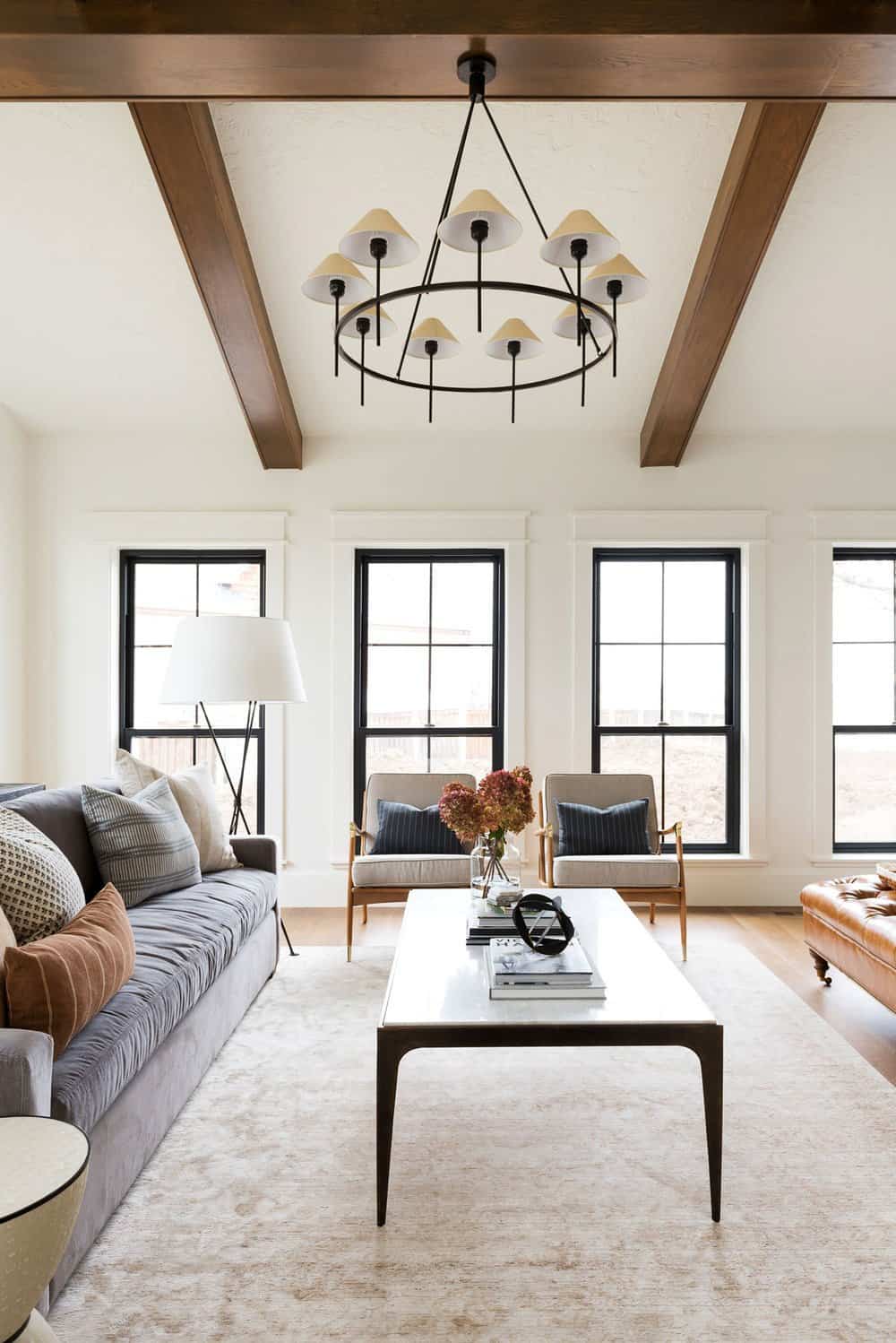
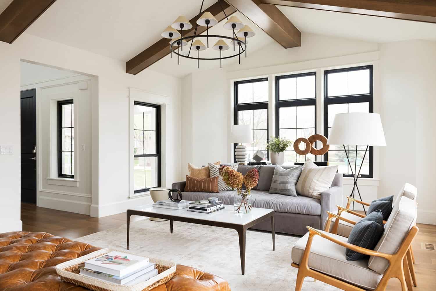
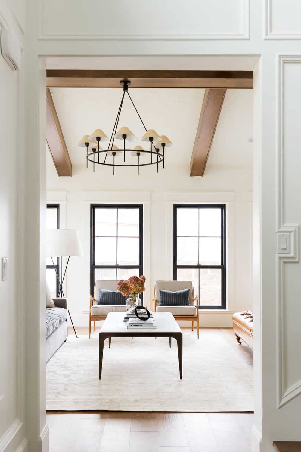
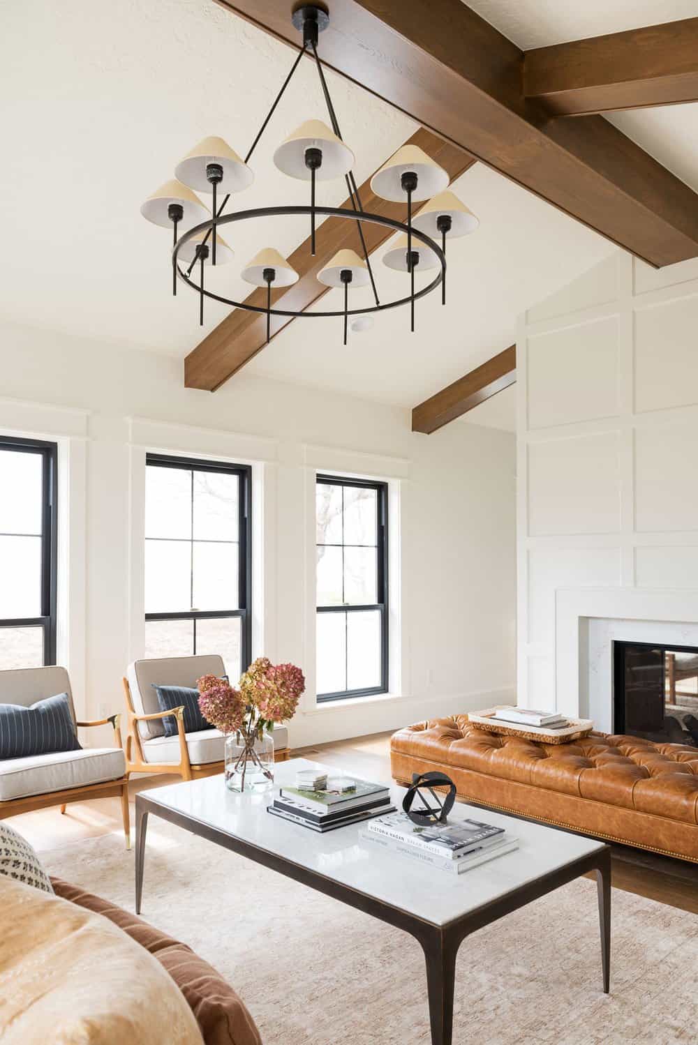
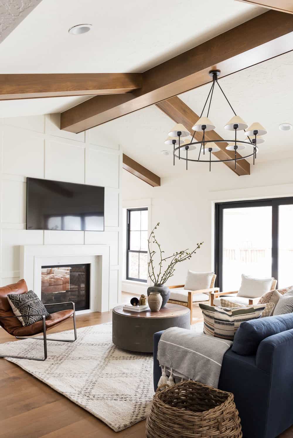
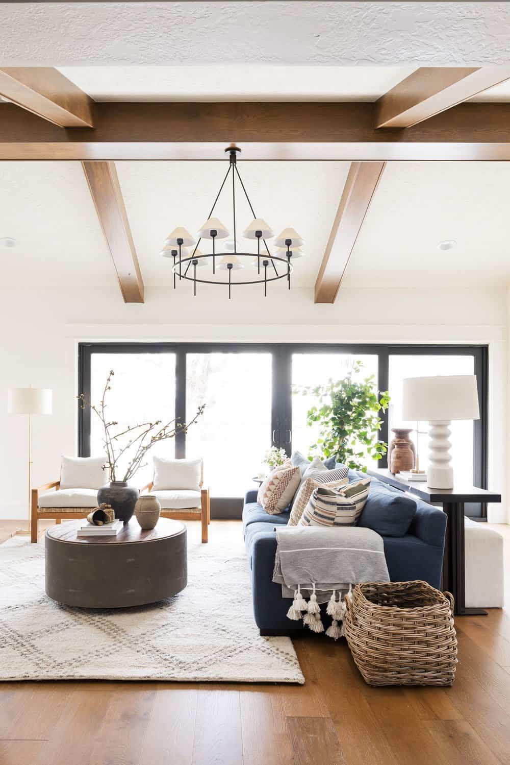
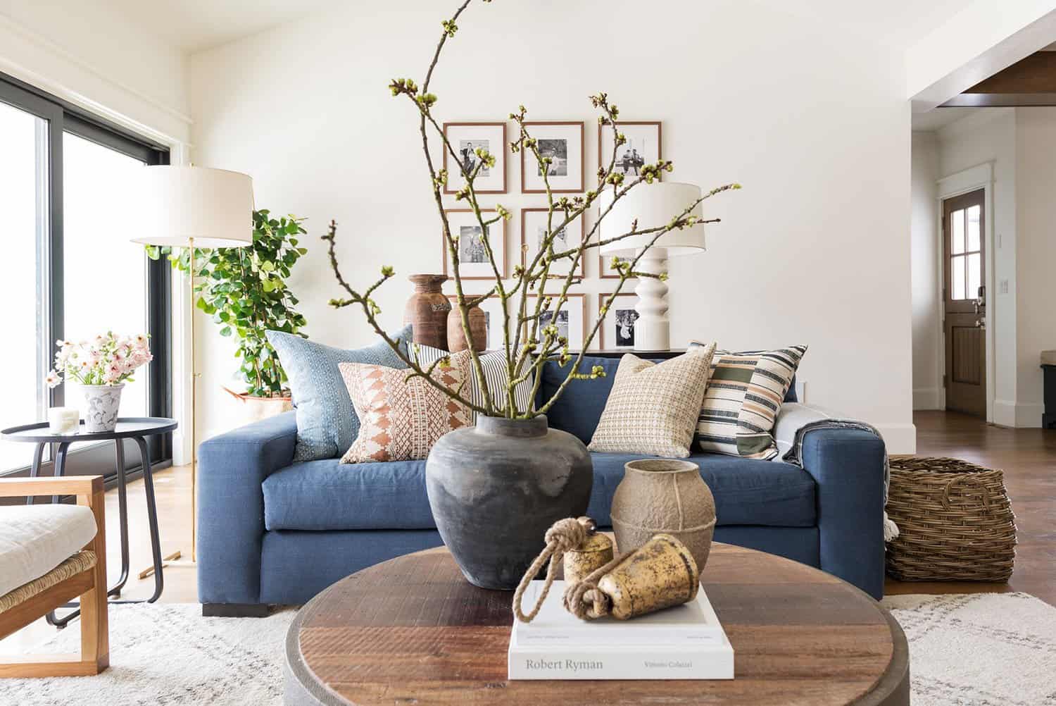
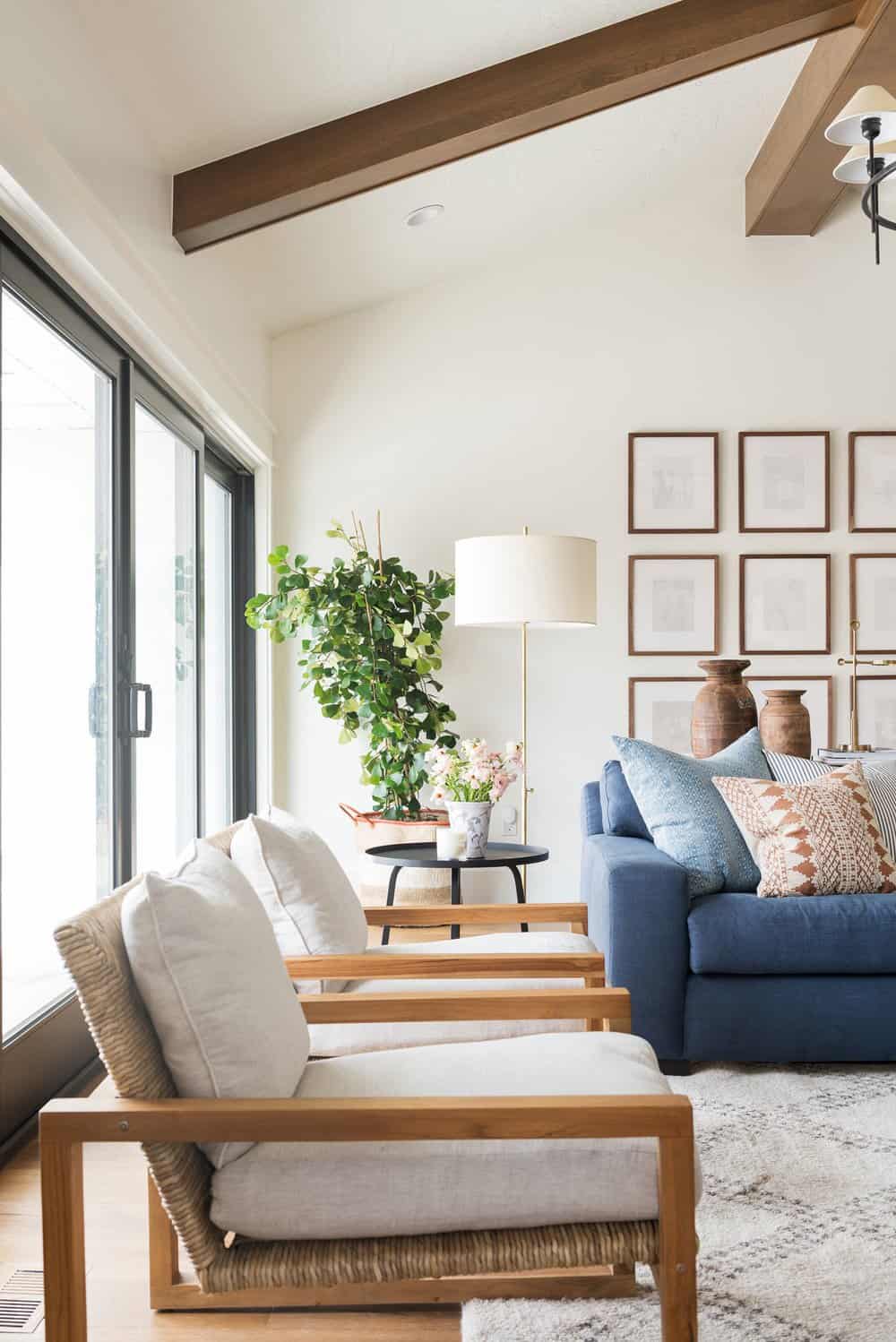
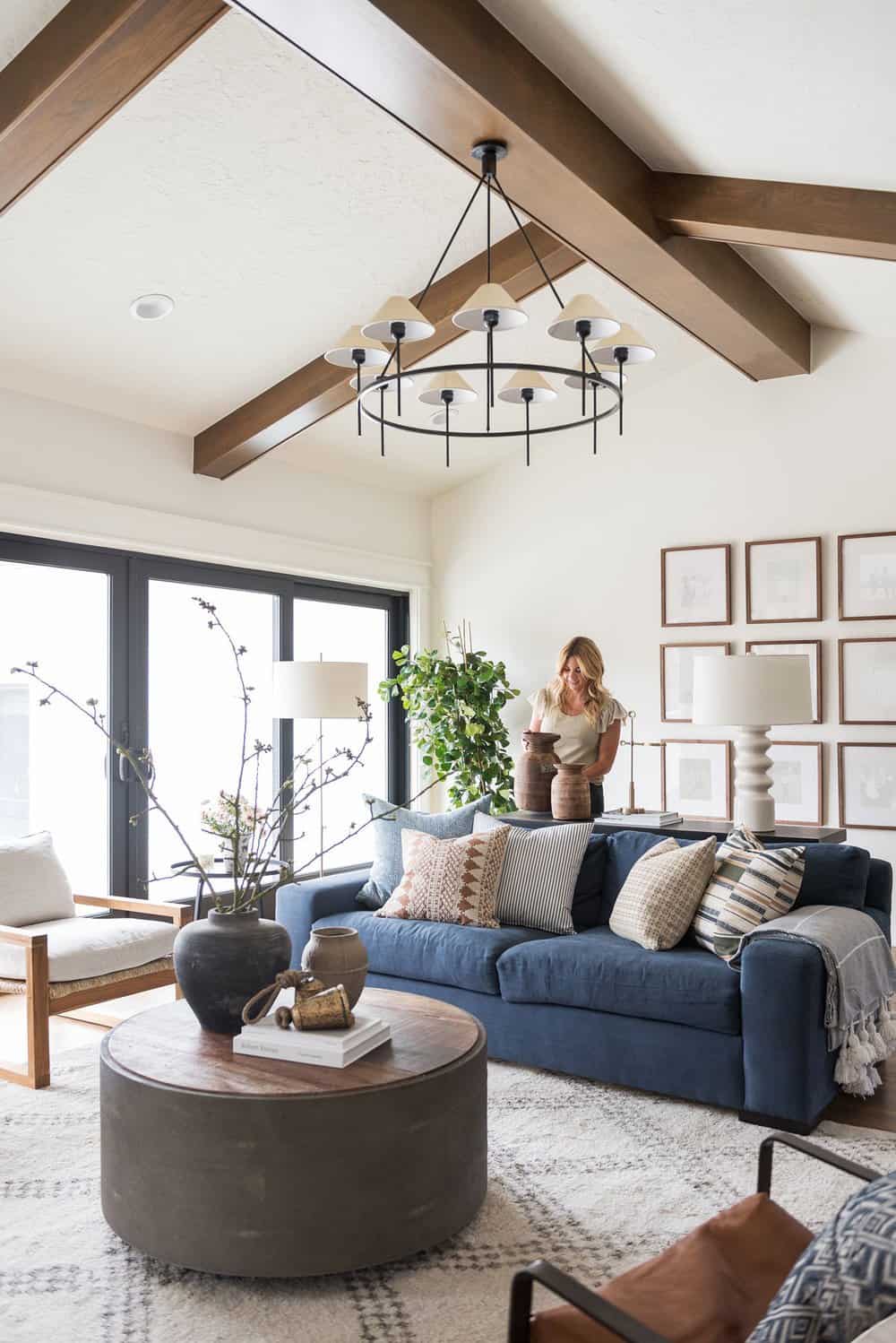
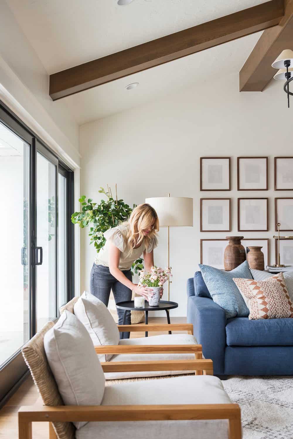
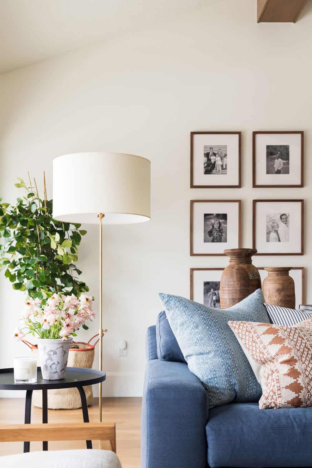
Above: The family room and living room were designed to feel like their own space yet flow really nicely together. This was done by creating a consistent color palette of warm tones mixed with ochre, and blue accents, mixed with brass, marble, and a layering of textures.
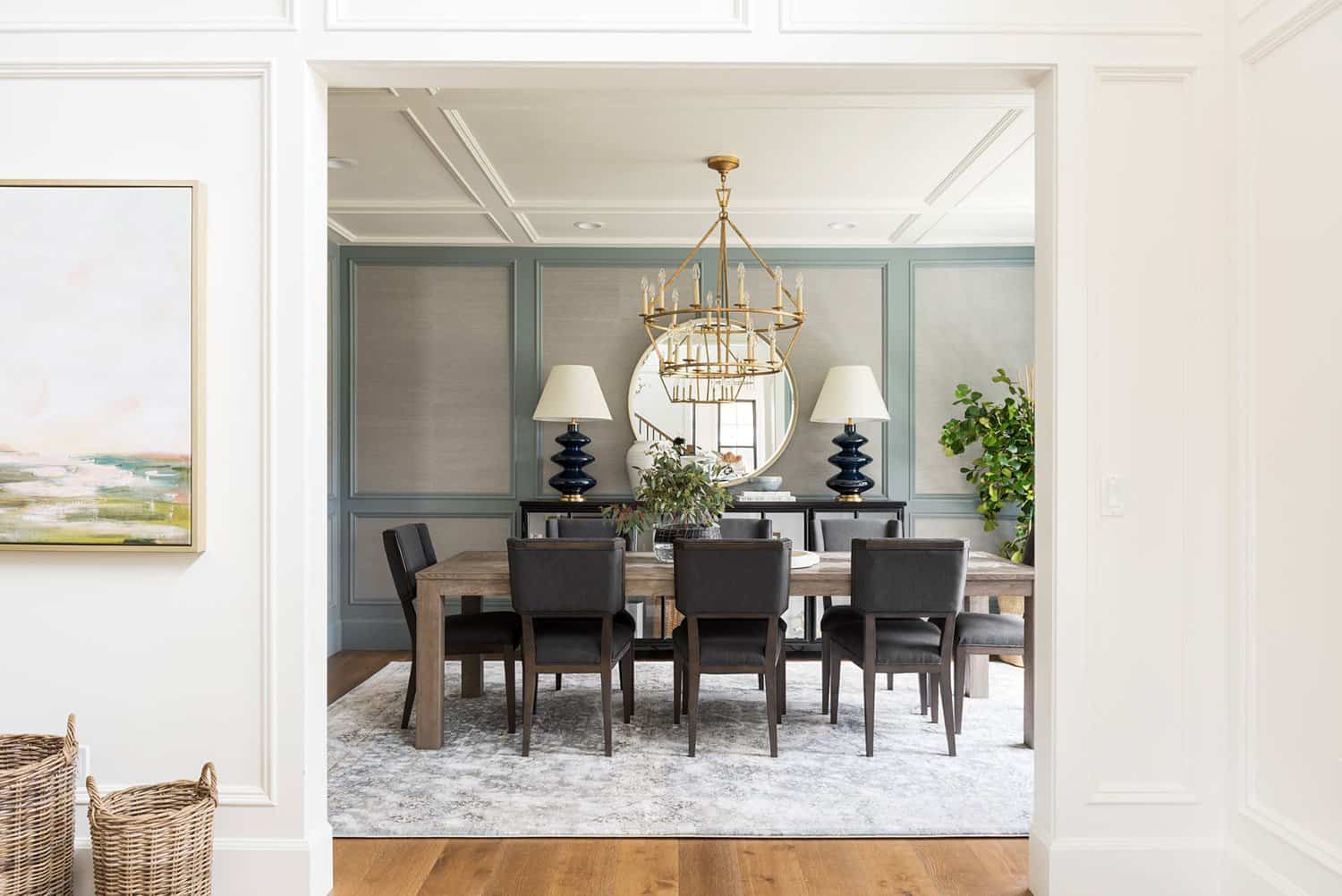
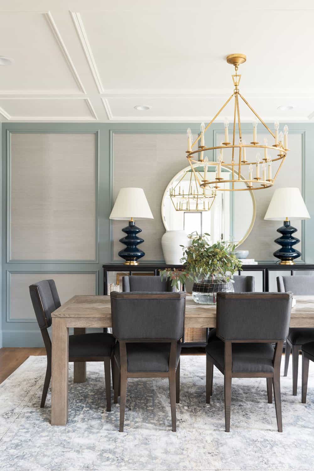
Above: The entry opens into the dining room, accented by an abstract landscape painting. The blue tone of the artwork is tied into the blue paneling on the dining room wall. The paneling is painted and mixed in with a grasscloth to create an elevated aesthetic.
Above: The family room and living room stayed in the same location for the remodel, yet the spaces underwent a huge change spatially. There used to be a wall separating them. The fireplace stayed in the same location, however, there were two built-ins on either side that were knocked out to open the space up. This allowed for this grand, dual-sided fireplace with a formal living room and a more casual family room.
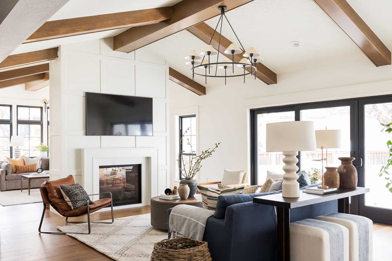
Above: The fireplace design of this renovated Utah home was given a streamlined look with paneling and a stone surround. Dark beams along the vault line of the ceiling were carried in from the kitchen. Symmetrical chandeliers can be found on both sides of the room.
Above: On the TV side of the room, the designer created a wonderful gathering area with a sofa and chairs along with a sofa and stools layered underneath. A tree was added into the corner to add height and life in the back of the room.
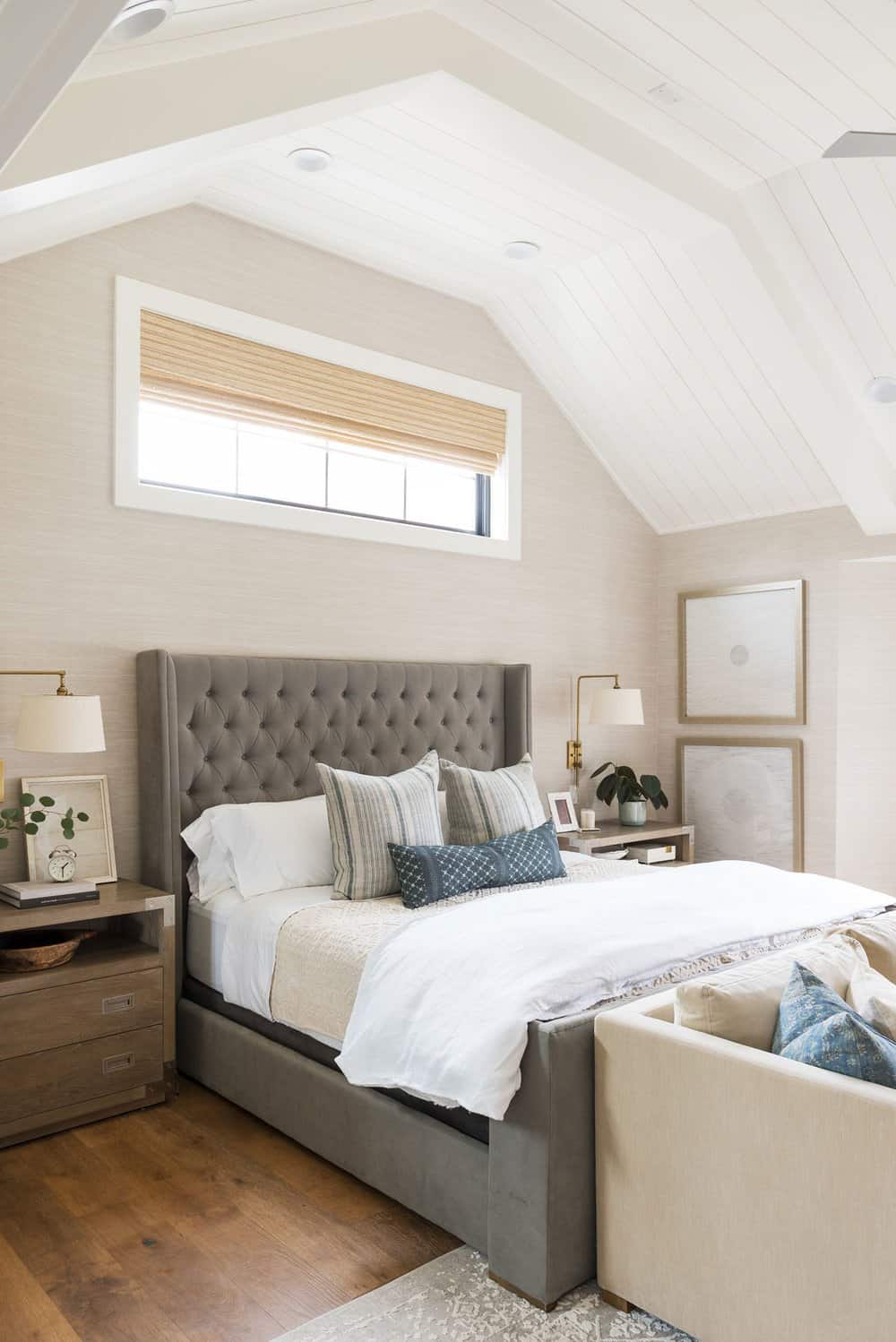
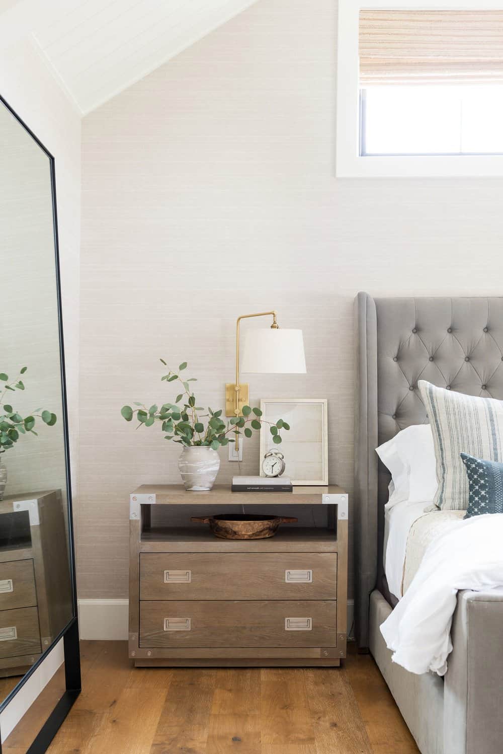
Above: In the primary bedroom, the designer started the project by adding fresh linens to the client’s existing bed. The walls were treated with a beautiful grasscloth wallcovering. The color palette is gray and white, with lots of layers, which was also carried into the bathroom.
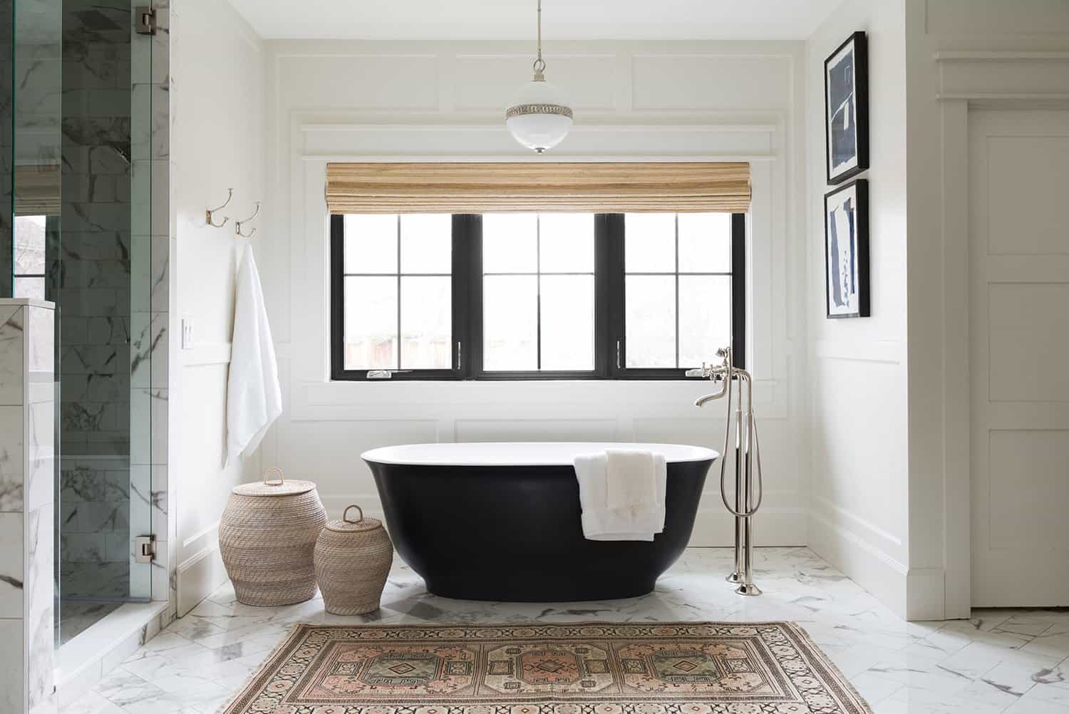
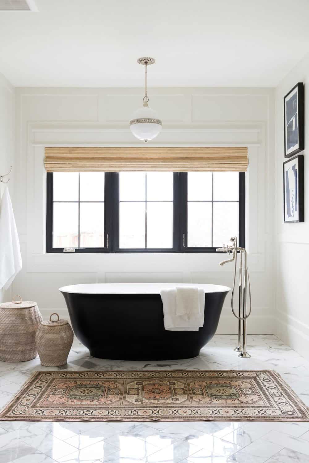
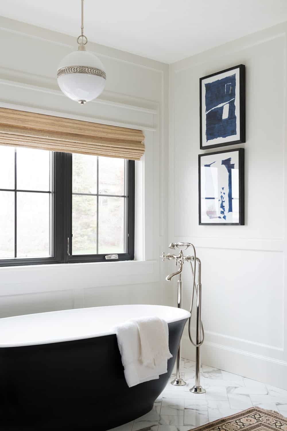
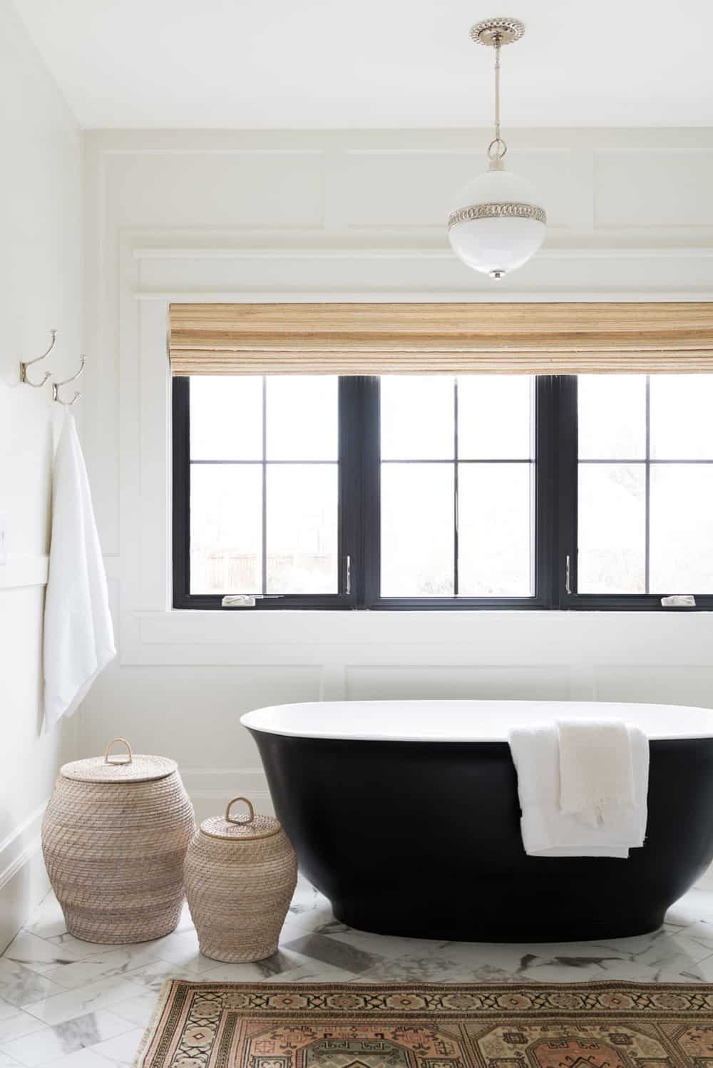
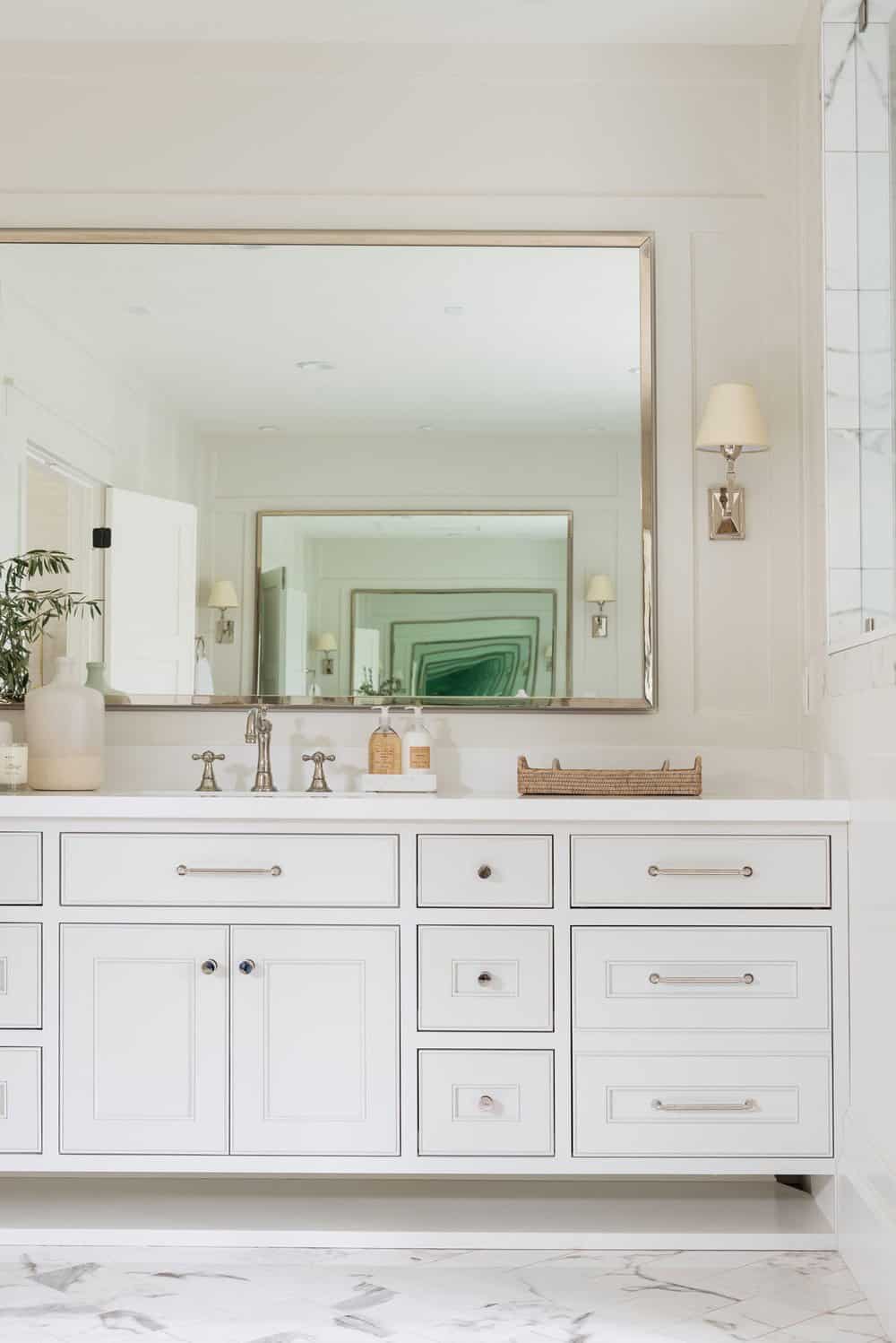
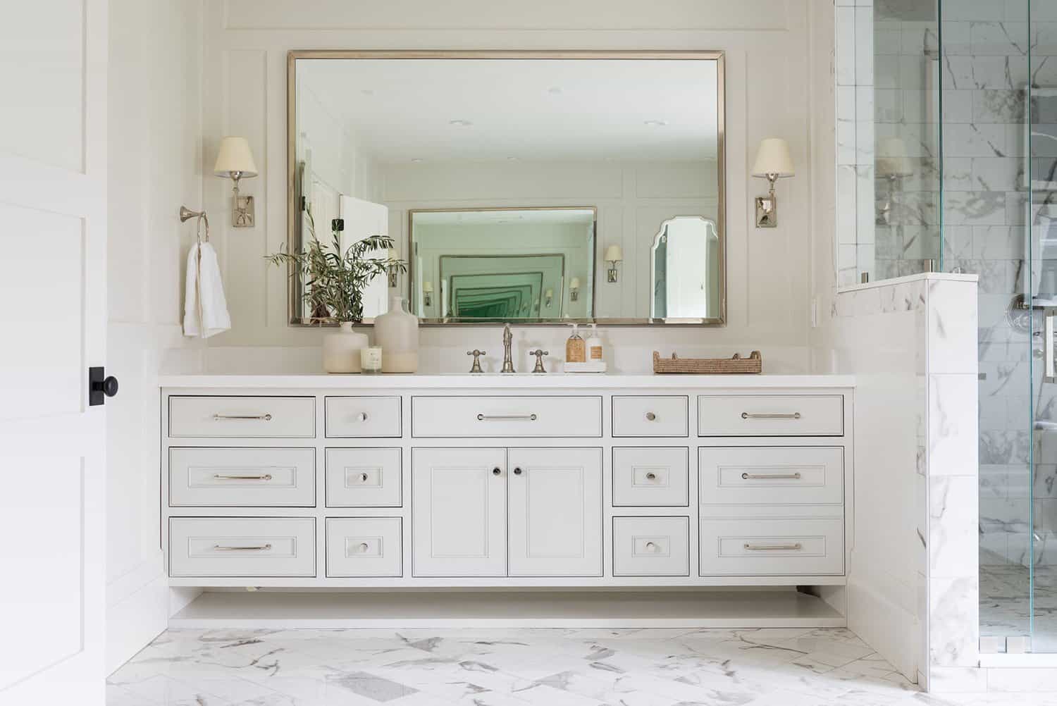
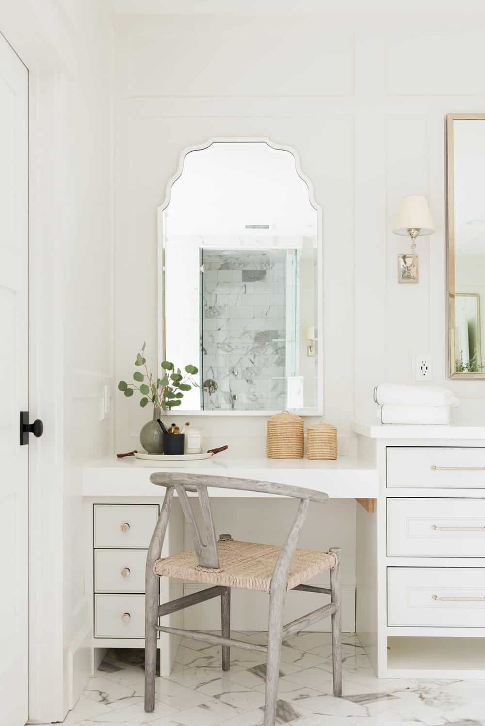
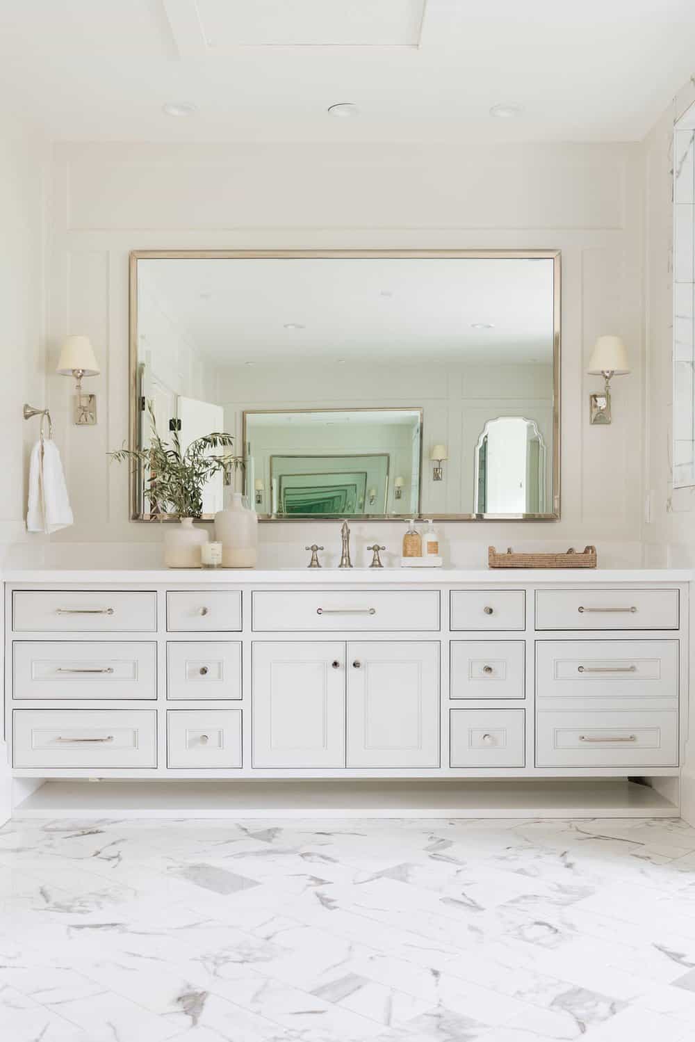
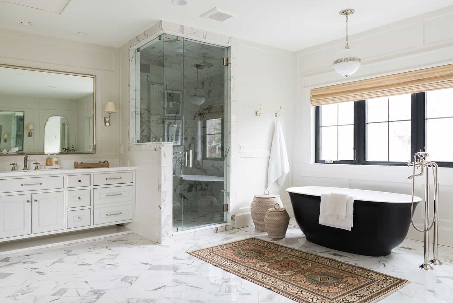
Above: The primary bathroom was completely remodeled with new vanities, custom cabinetry, marble flooring, and a statement black tub. Since the bathroom is expansive, the designer opted for some customized details that include a herringbone pattern tile floor and paneled walls painted in a soft, warm white. A vintage rug is layered in, along with artwork and hampers for storage.
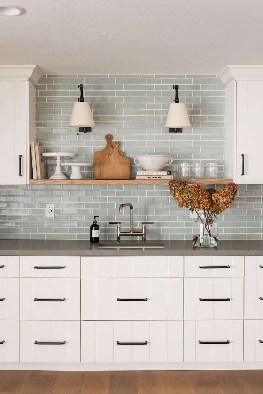
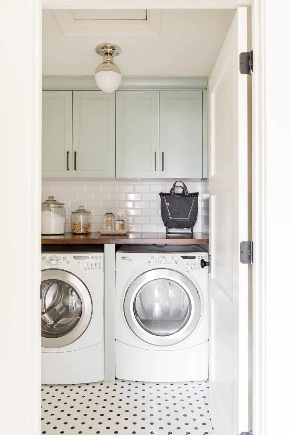
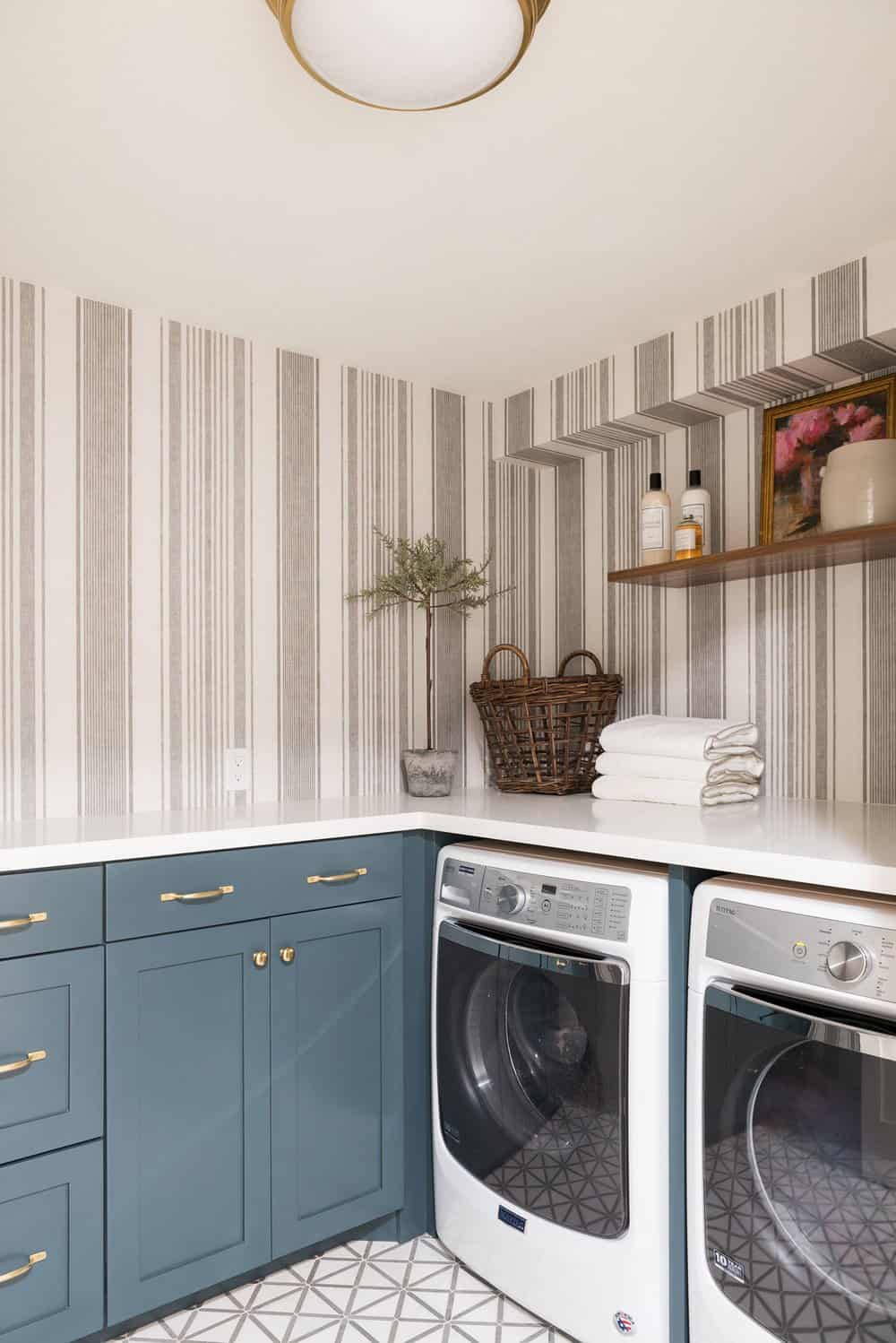
Above: The laundry room was freshened up applying a soft blue-green paint color on the cabinets. This helps to keep this windowless space feeling light and airy.
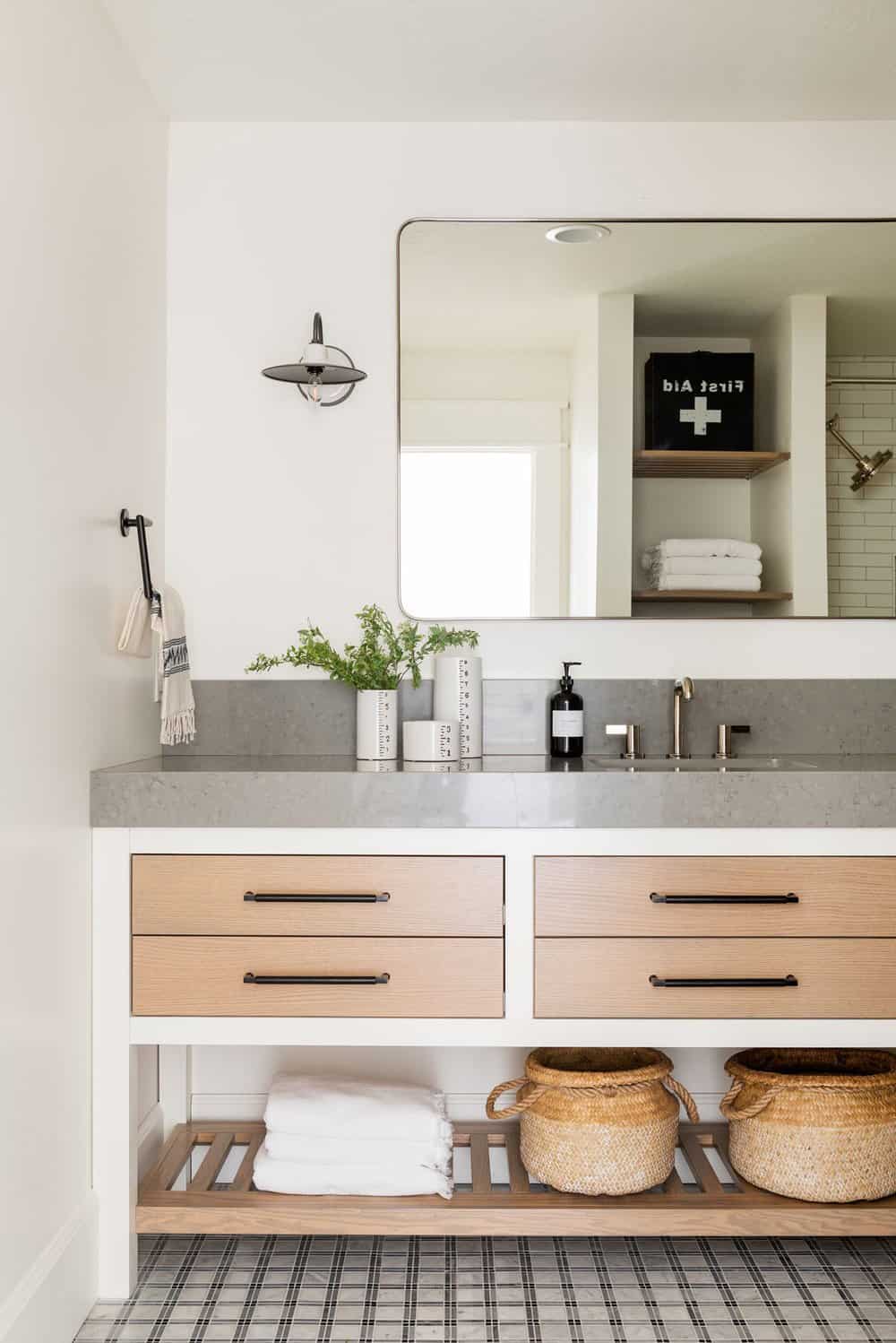
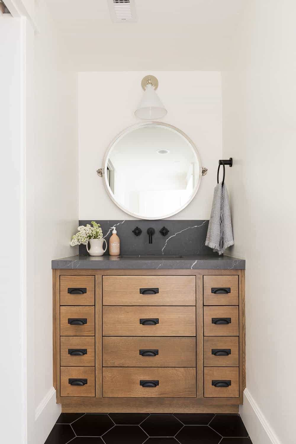
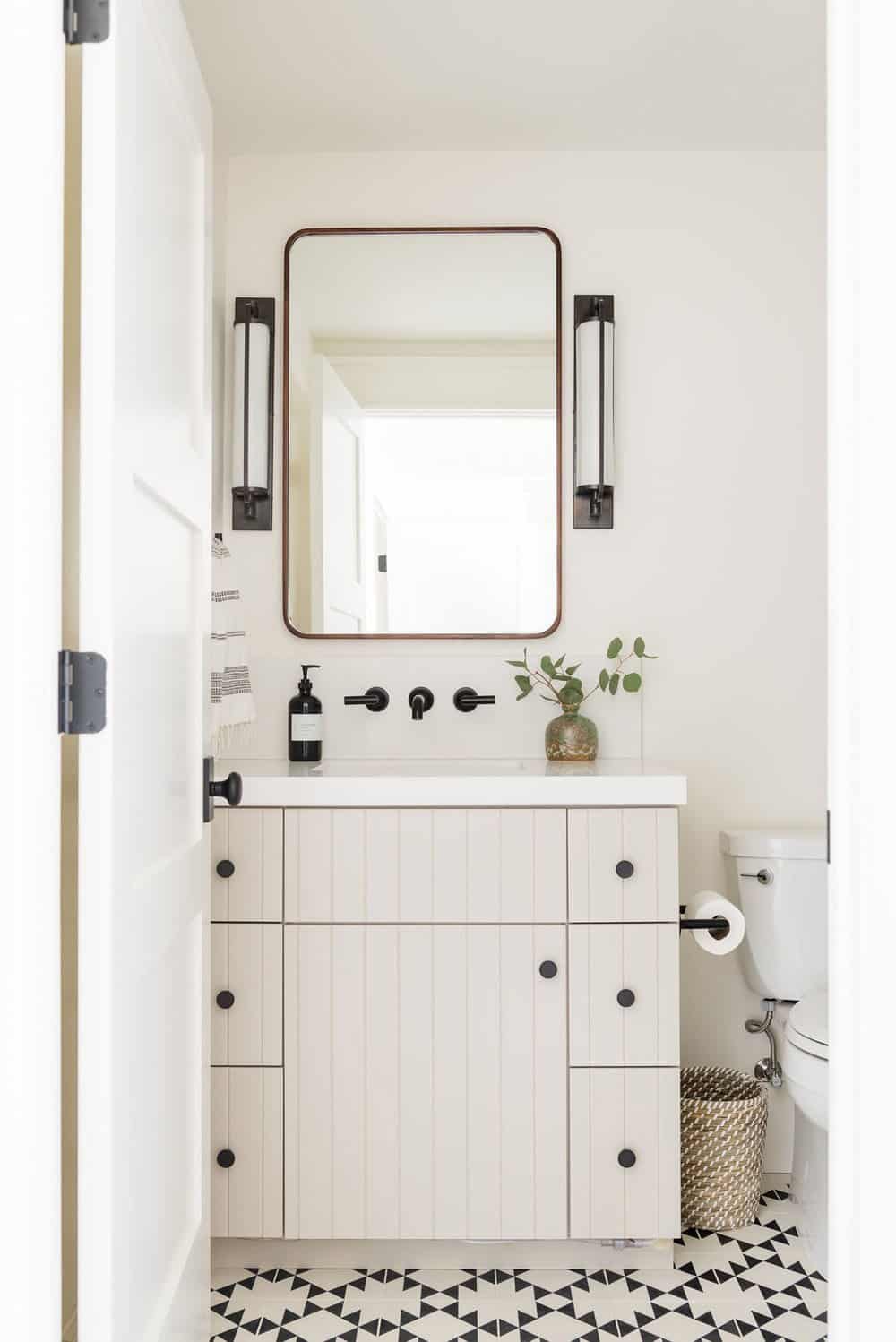
Above: This bathroom is located right next to the laundry. The space features two-toned cabinets — white on the frame and a wood slab front. The countertop is thick, gray quartz.
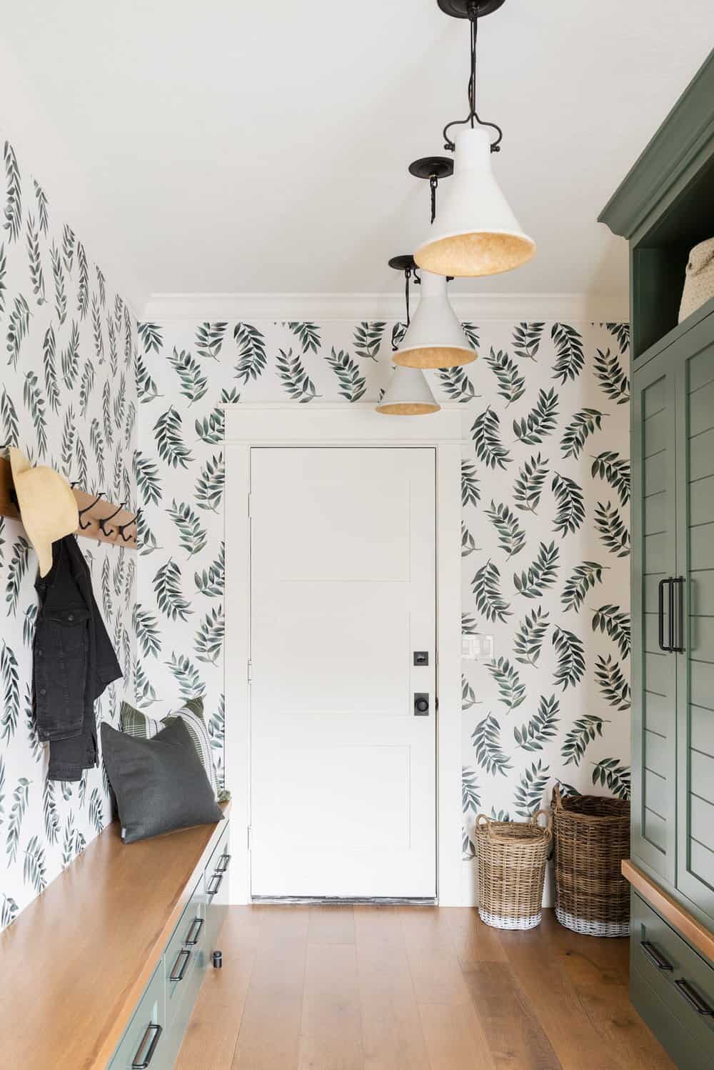
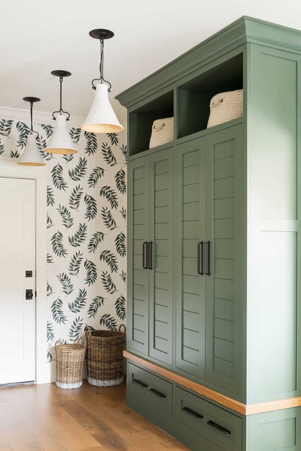
Above: The mudroom features a custom leaf wallpaper along with green cabinets with a louvered door that is used for storage. Warmth is infused into this space with the wood benchtops and the hooks.
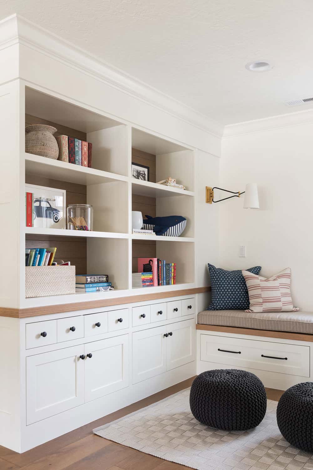
Above: What was originally an empty space at the top of the staircase was transformed into is this charming reading nook. The space features custom built-in cabinets, tiny drawers for storage, and a window seat with a cushion, eclectic pillows, and artwork.
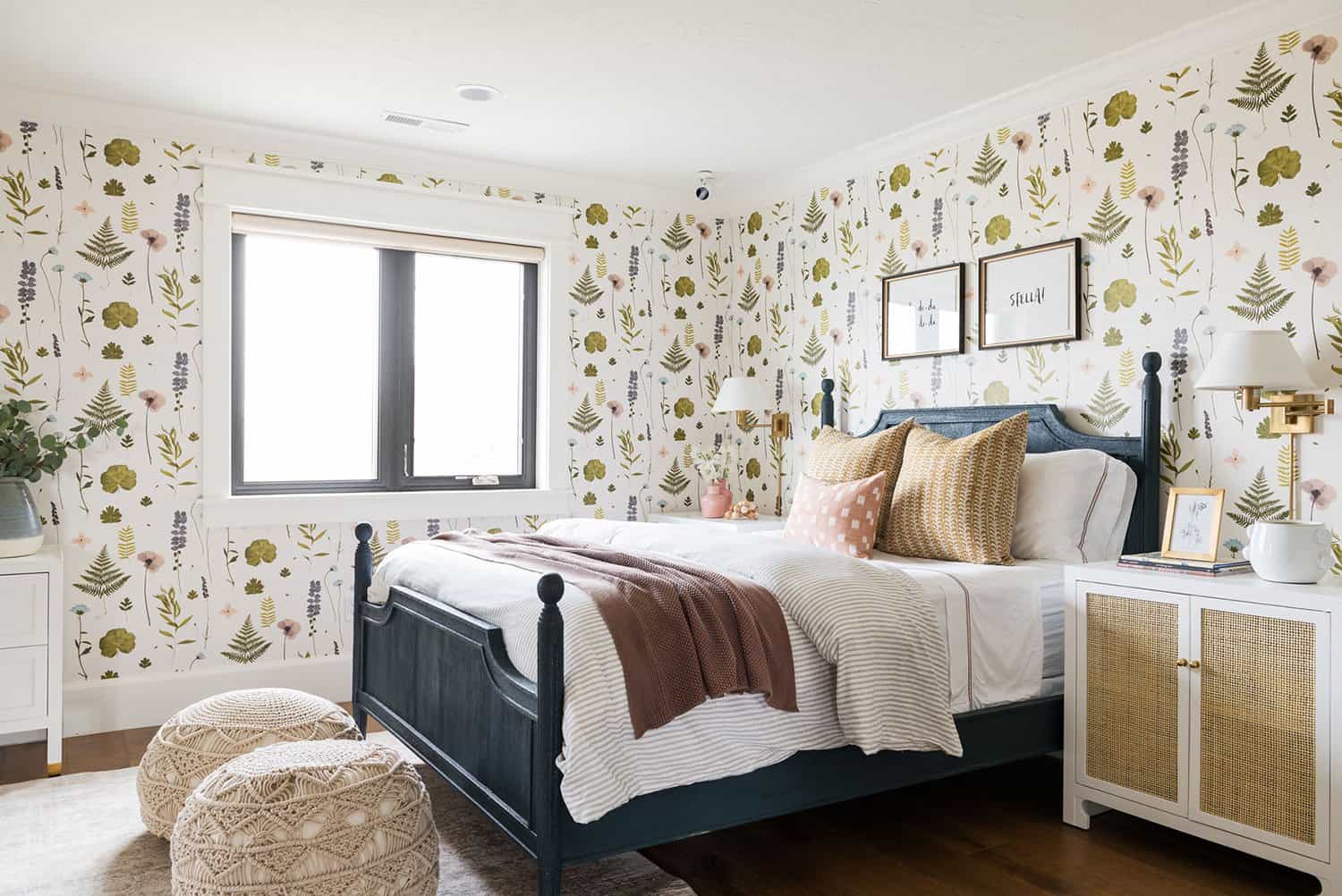
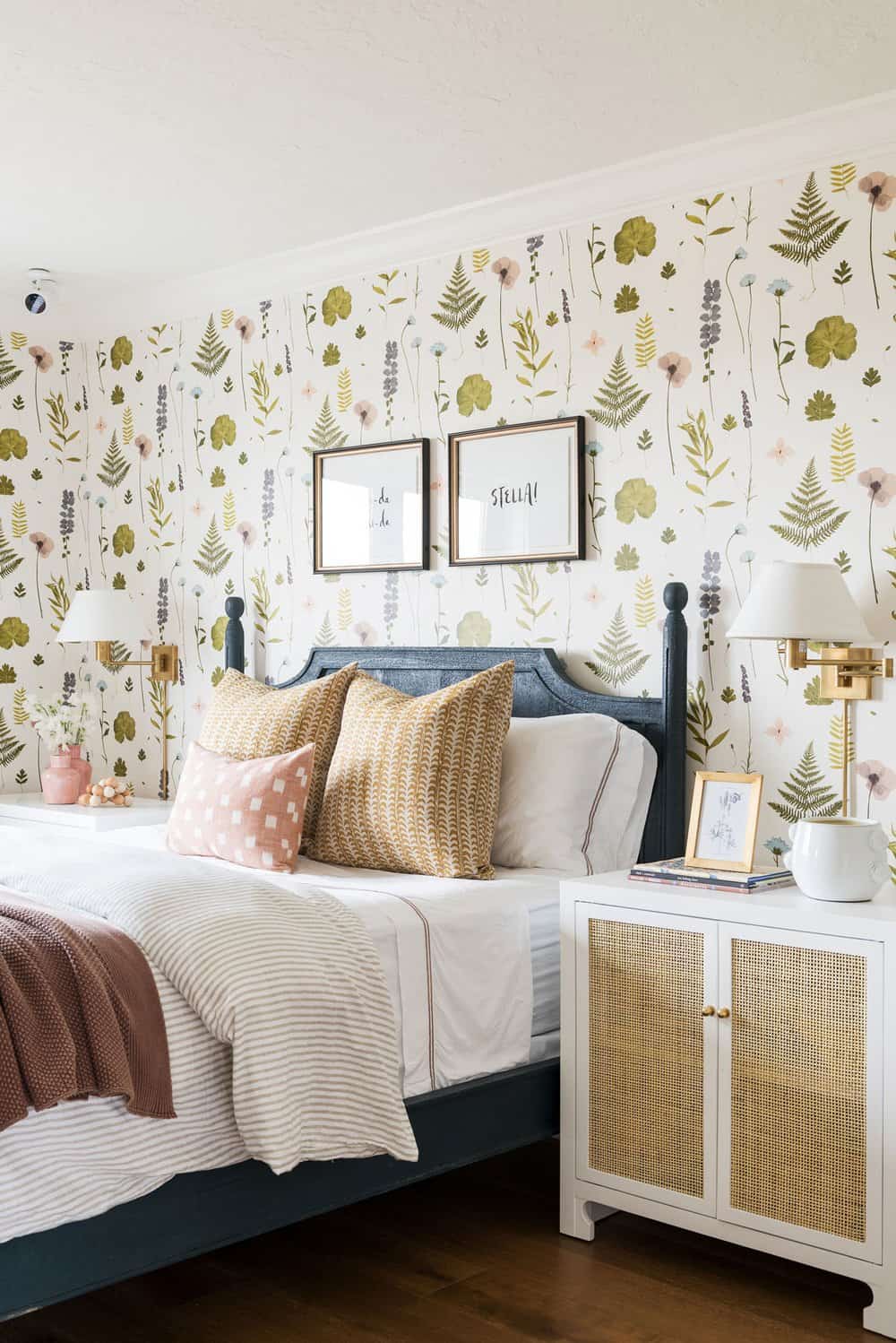
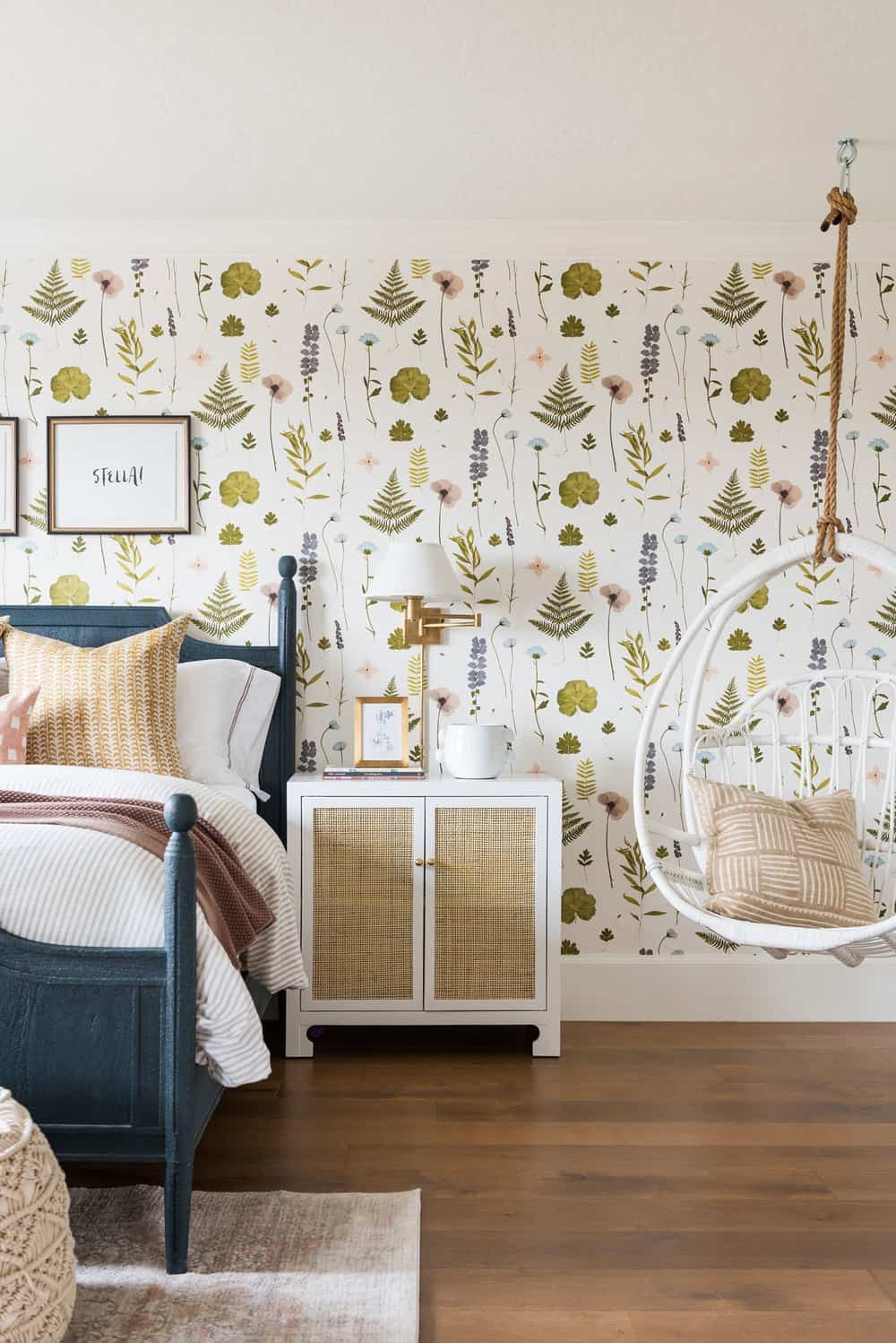
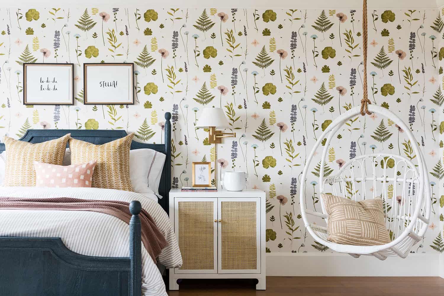
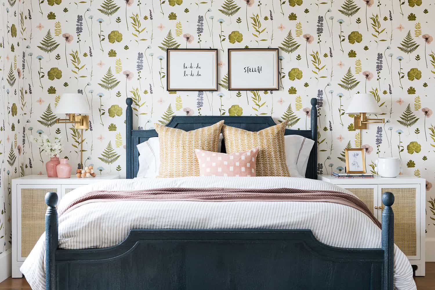
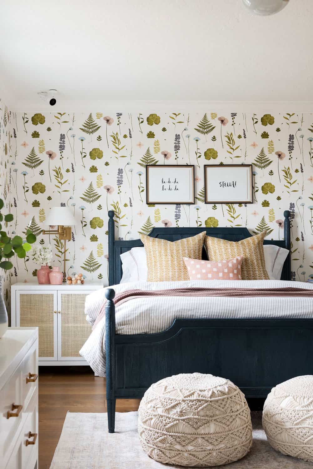
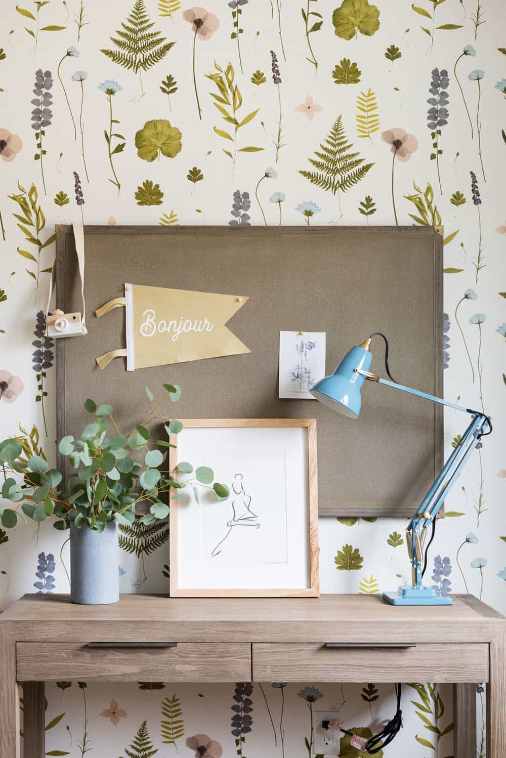
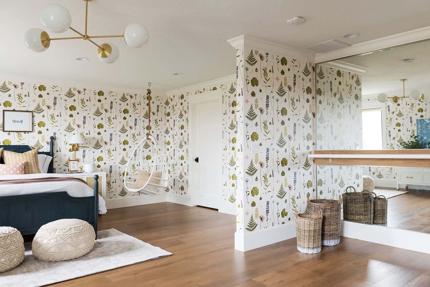
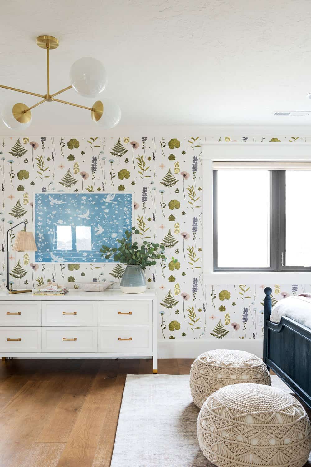
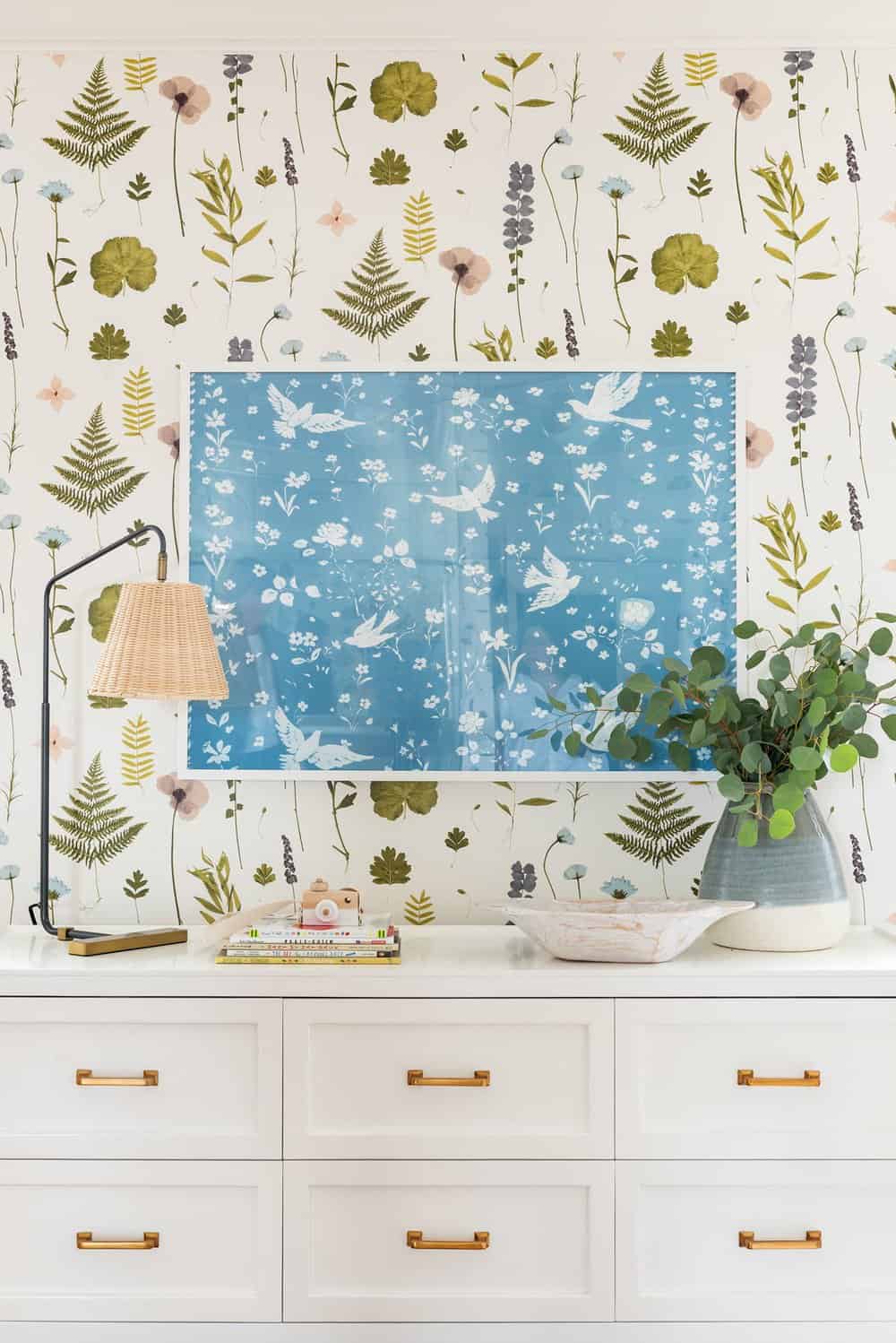
Above: This beautiful girl’s bedroom is fun and colorful, full of pattern and life. The space was inspired by the colorful wallpaper, where the rest of the bedroom’s color palette was drawn from — ochre, terracotta, pink, and blues. A ballet bar can be found on the opposite side of the room.
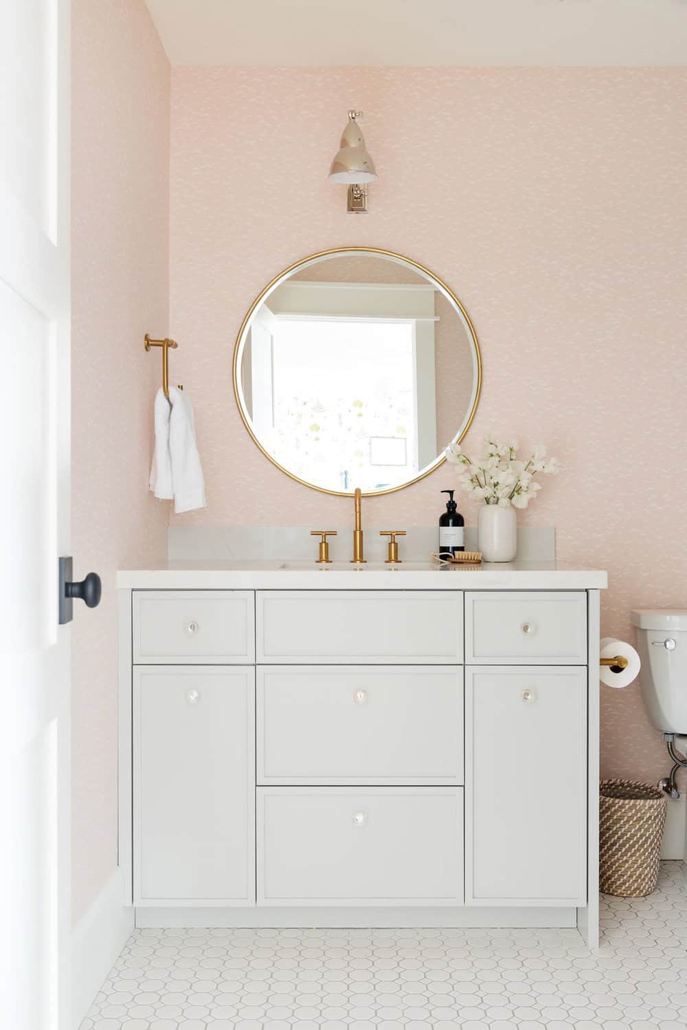
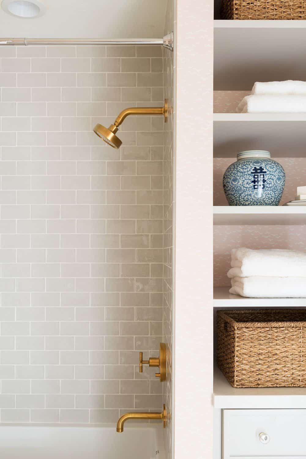
Above: The en-suite bathroom is a play-off of the color palette in the bedroom but in a more muted way. This includes soft pink wallpaper, subtle gray cabinets, and gold accents.
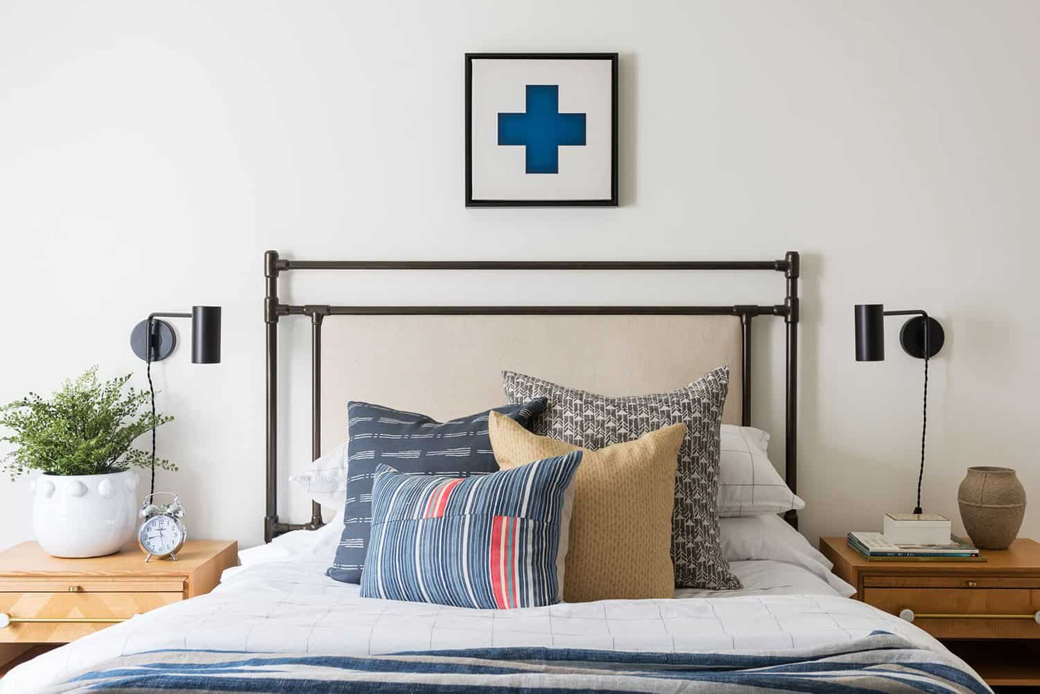
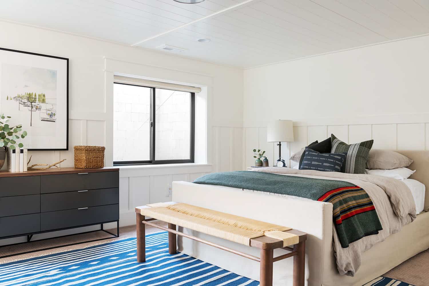
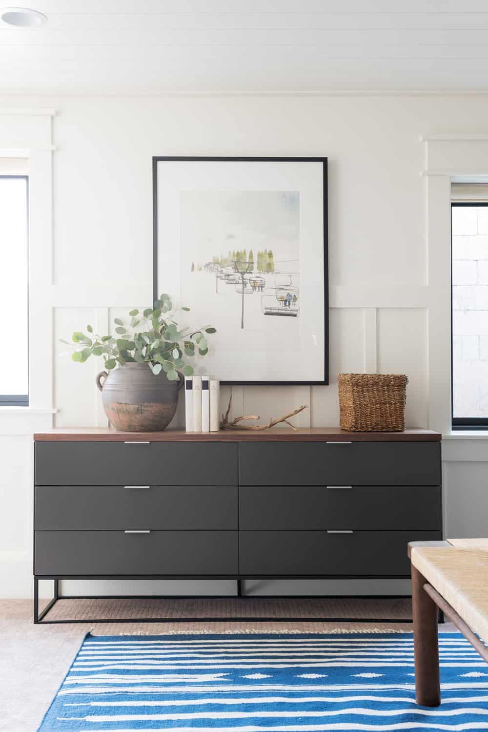
Above: The boy’s bedrooms feature similar elements throughout, which include wood, black accents, and some primary colors. The spaces are fun and colorful and grow up really well when designed in the right way!
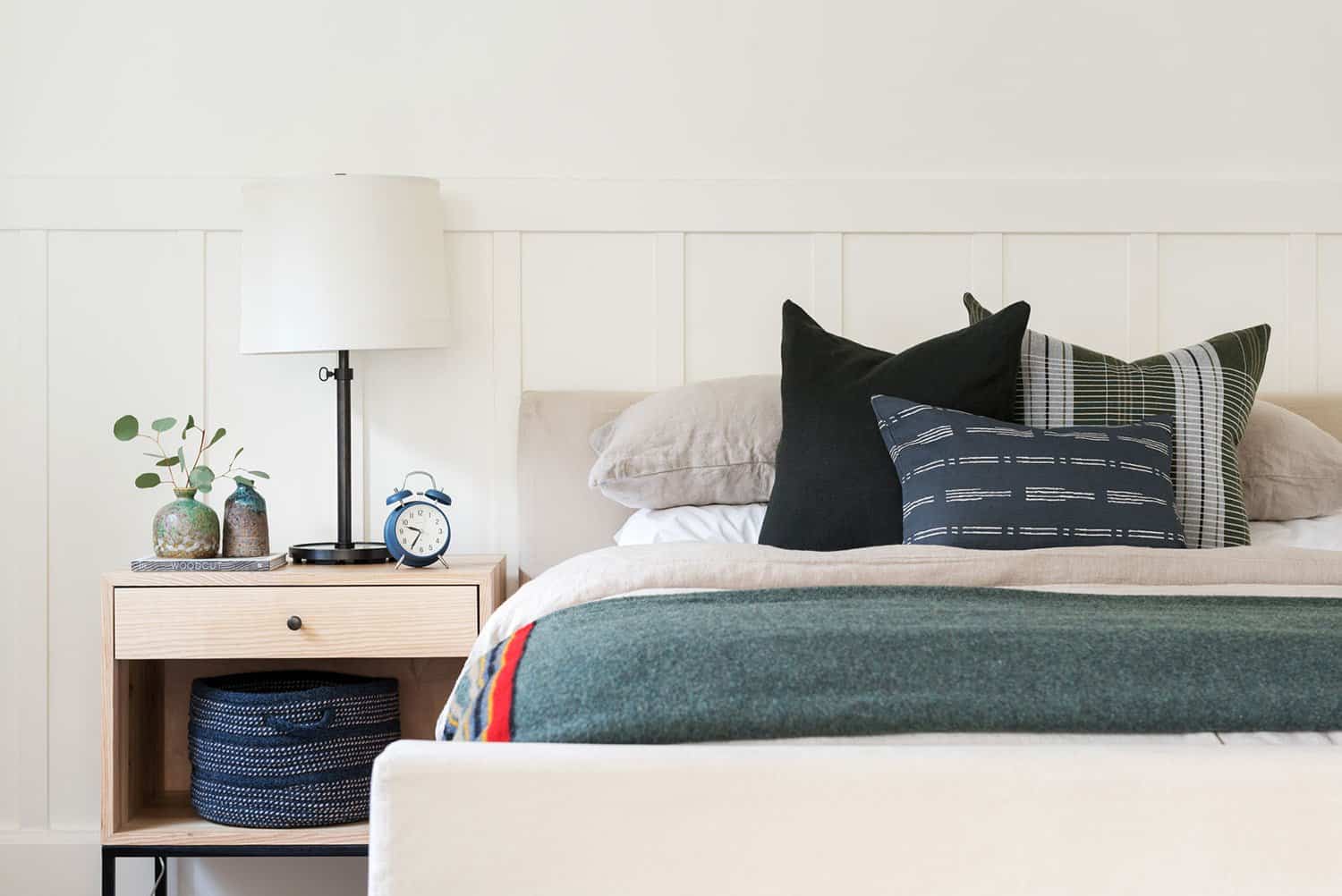
Above: The nightstands in this boy’s bedroom were sourced from the interior designer’s shop, McGee & Co.
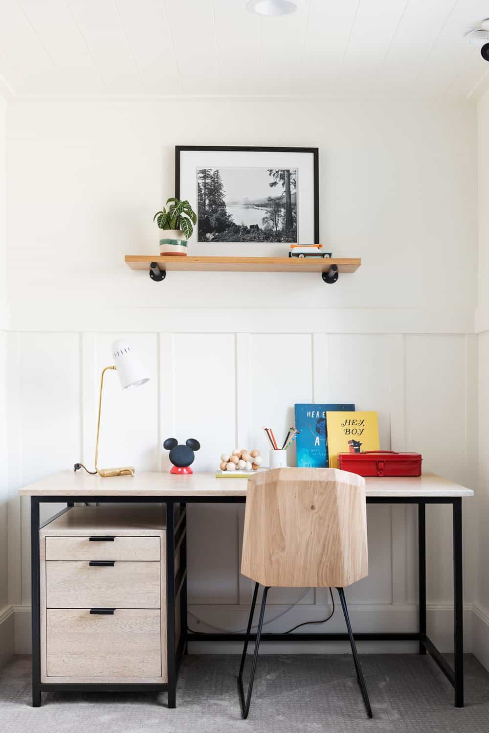
Above: The desk area in the boy’s bedroom features yellow, blue, and red accents.
PHOTOGRAPHER Lucy Call


2 comments