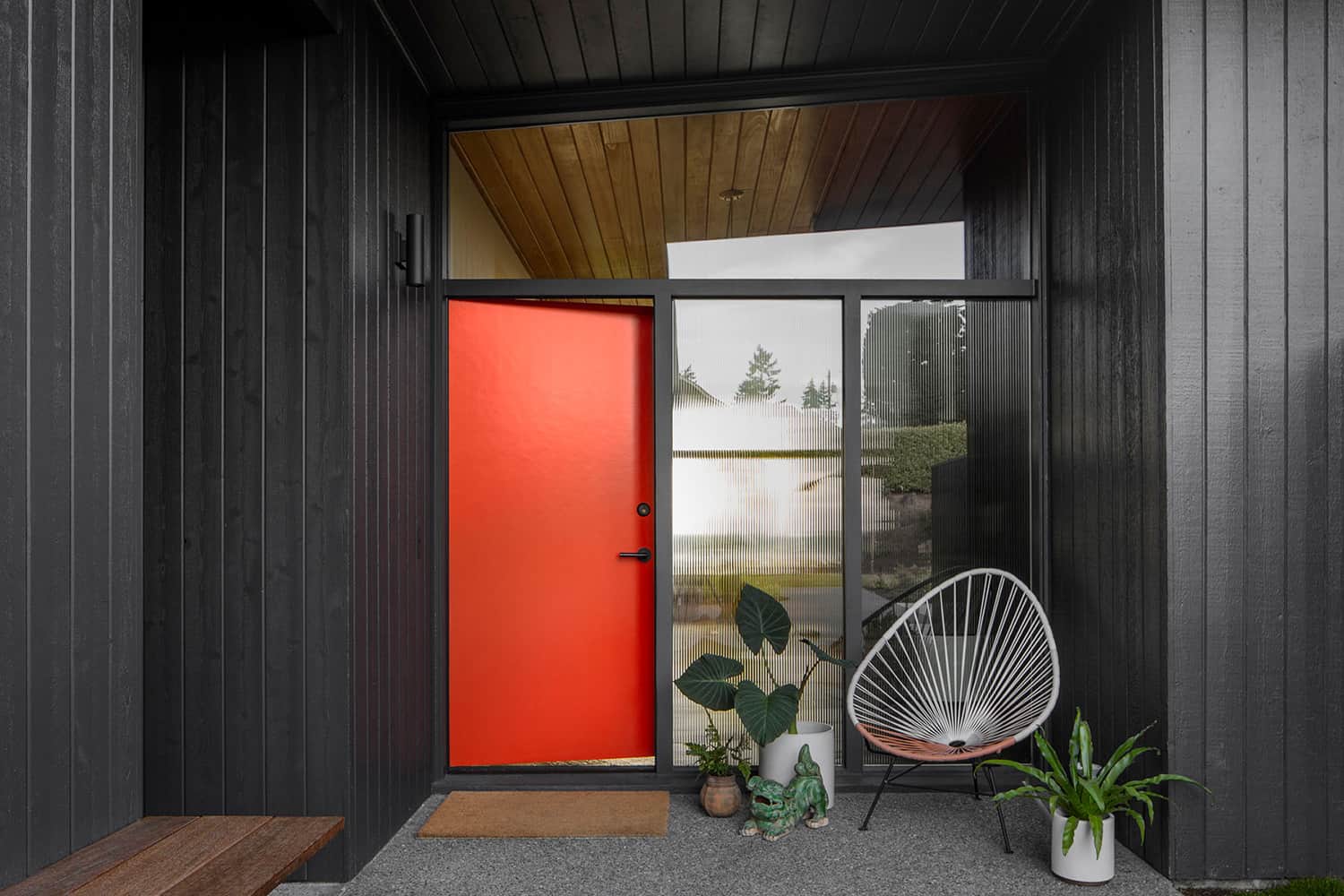
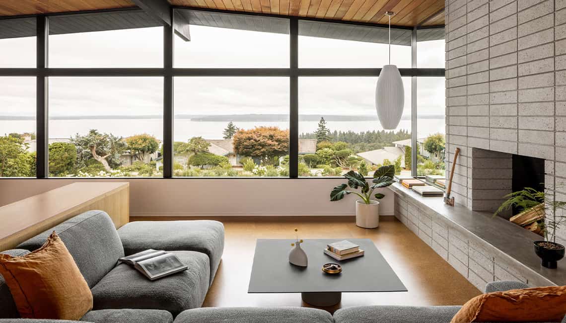
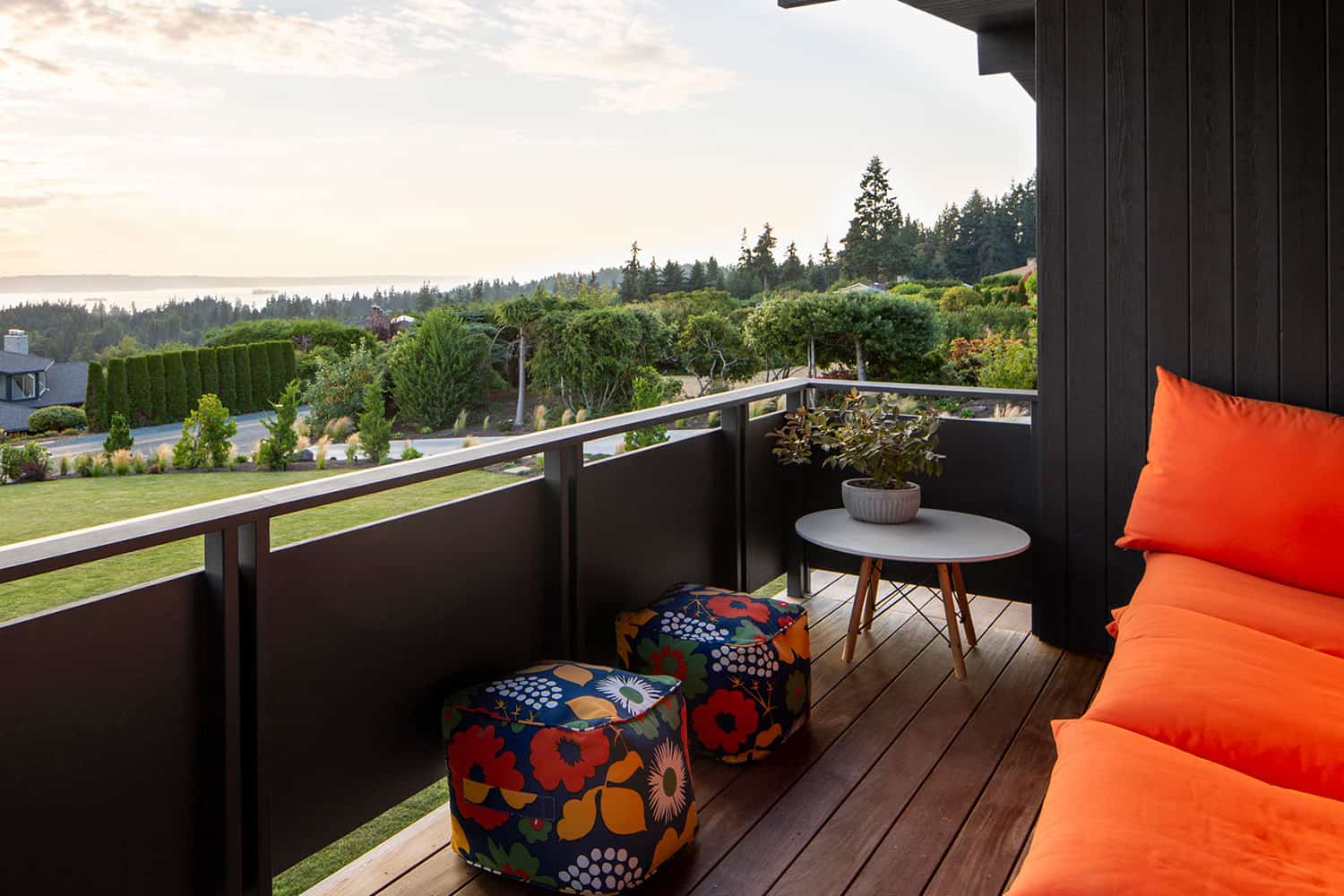
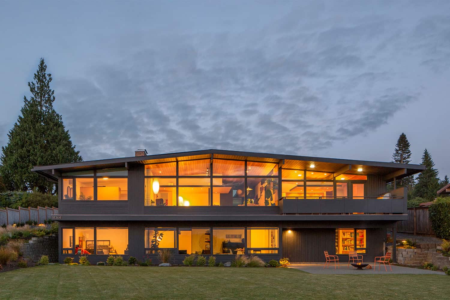
Shed Architects has restored this midcentury home that boasts views of the Puget Sound and the Olympic Peninsula, located in Shoreline, Washington. Despite this post and beam house’s good bones, modifications adapting the original layout for use as an adult living facility combined with deferred maintenance had tarnished the structure inside and out.
The architects were tasked with rejuvenating this home for a family of five while restoring its aura. The project entails an updated plan and section reconfiguration that gives the home an open, connected, and spatially intriguing floor layout. Custom casework and finishes showcase bespoke design solutions and artful execution.
DESIGN DETAILS: ARCHITECT Shed Architects CONTRACTOR Ambrose Construction STRUCTURAL ENGINEER Todd Perbix LANDSCAPE DESIGNER Susan Papanikolas LIGHTING DESIGNER Sparklab Lighting Design CASEWORK Beechtree Woodworks
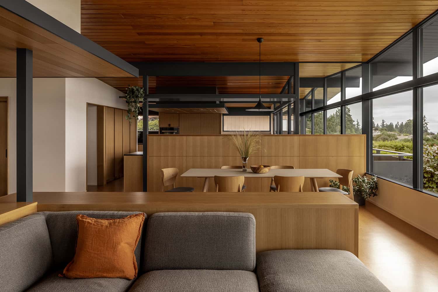
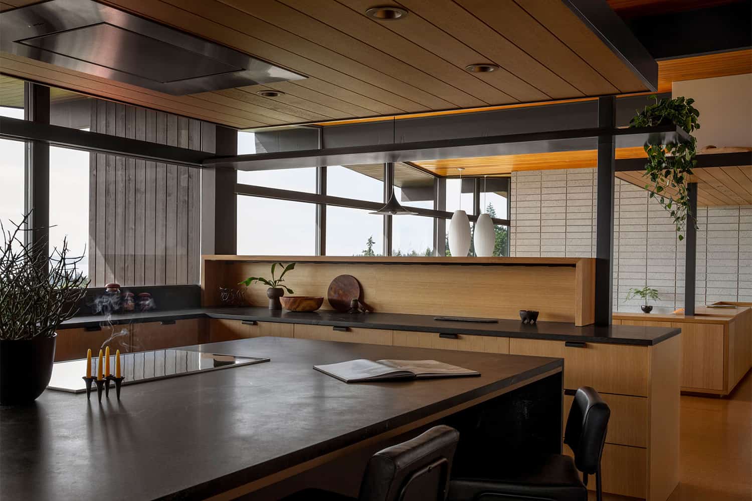
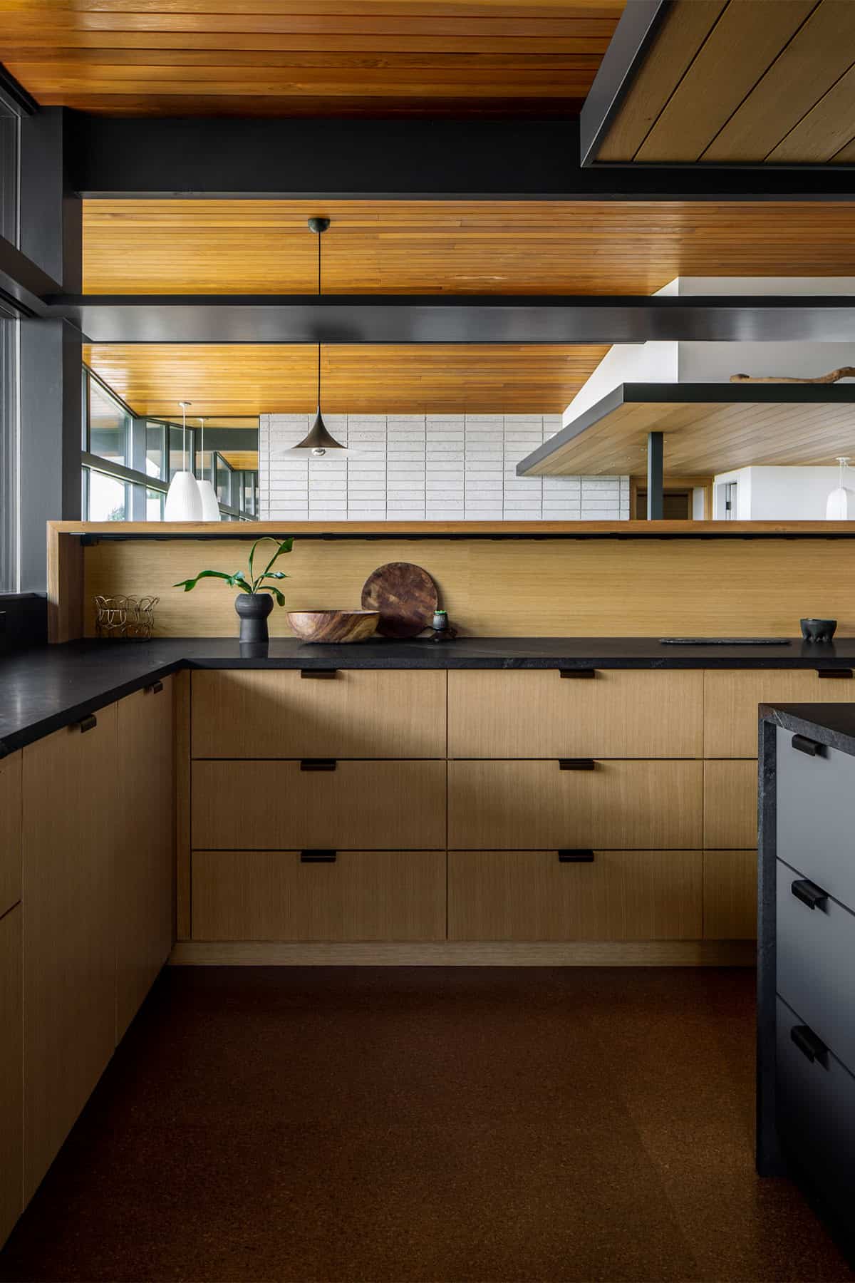
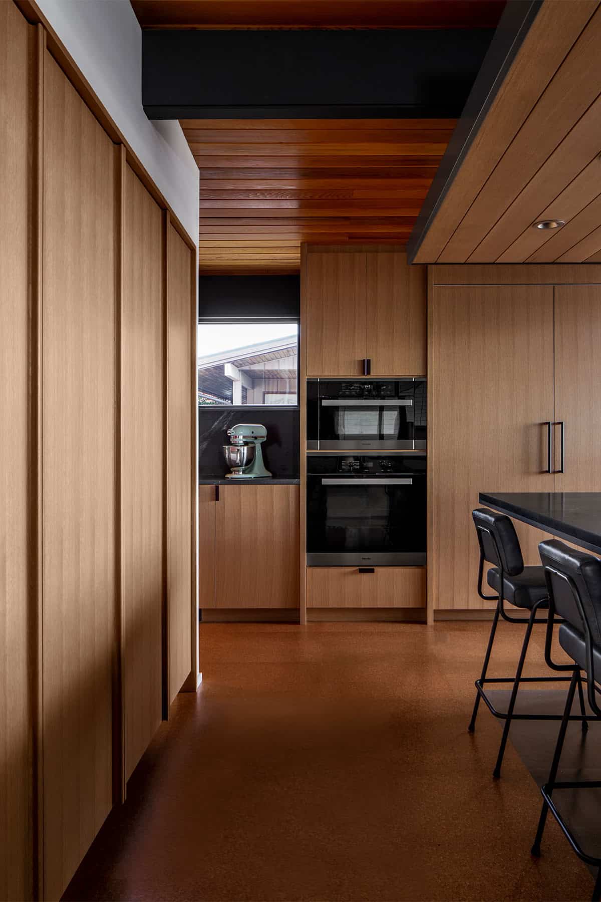
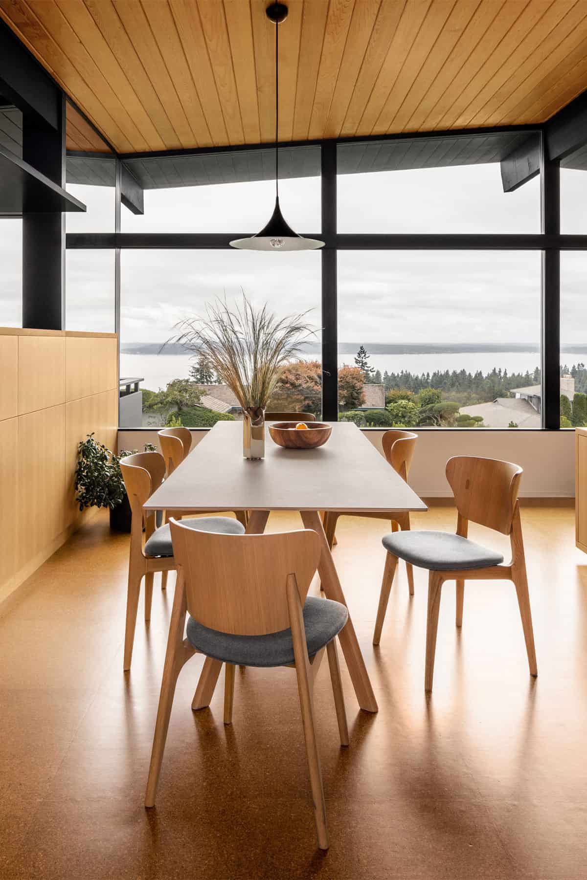
The goal of this project was to rehabilitate the structure from an adult care facility to a family home. To achieve this, the main level of the house needed to be transformed along with lower-level bedrooms and a bathroom. On the main level, walls and built-in casework were removed and program elements reshuffled. A buried galley kitchen was unearthed and re-formed around a central island overlooking dining and living spaces, allowing access to light, views, and the deck.
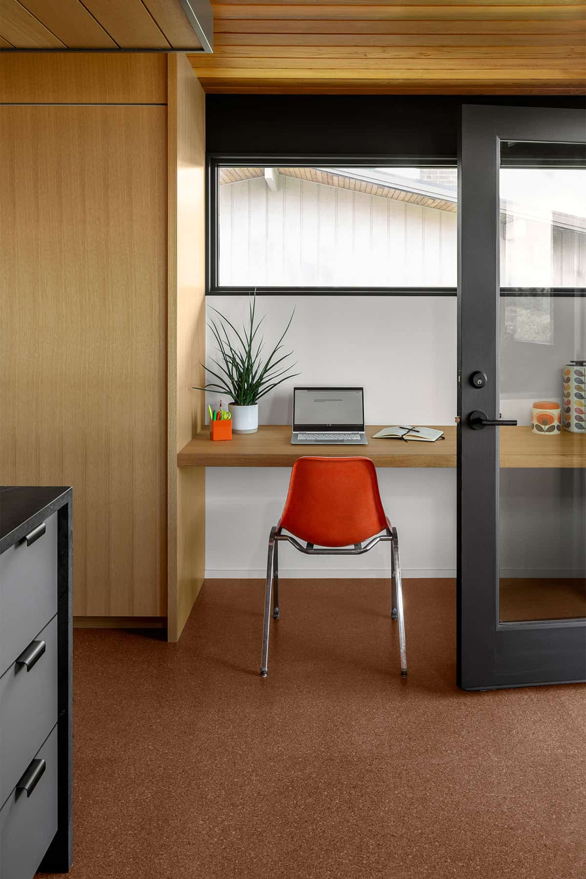
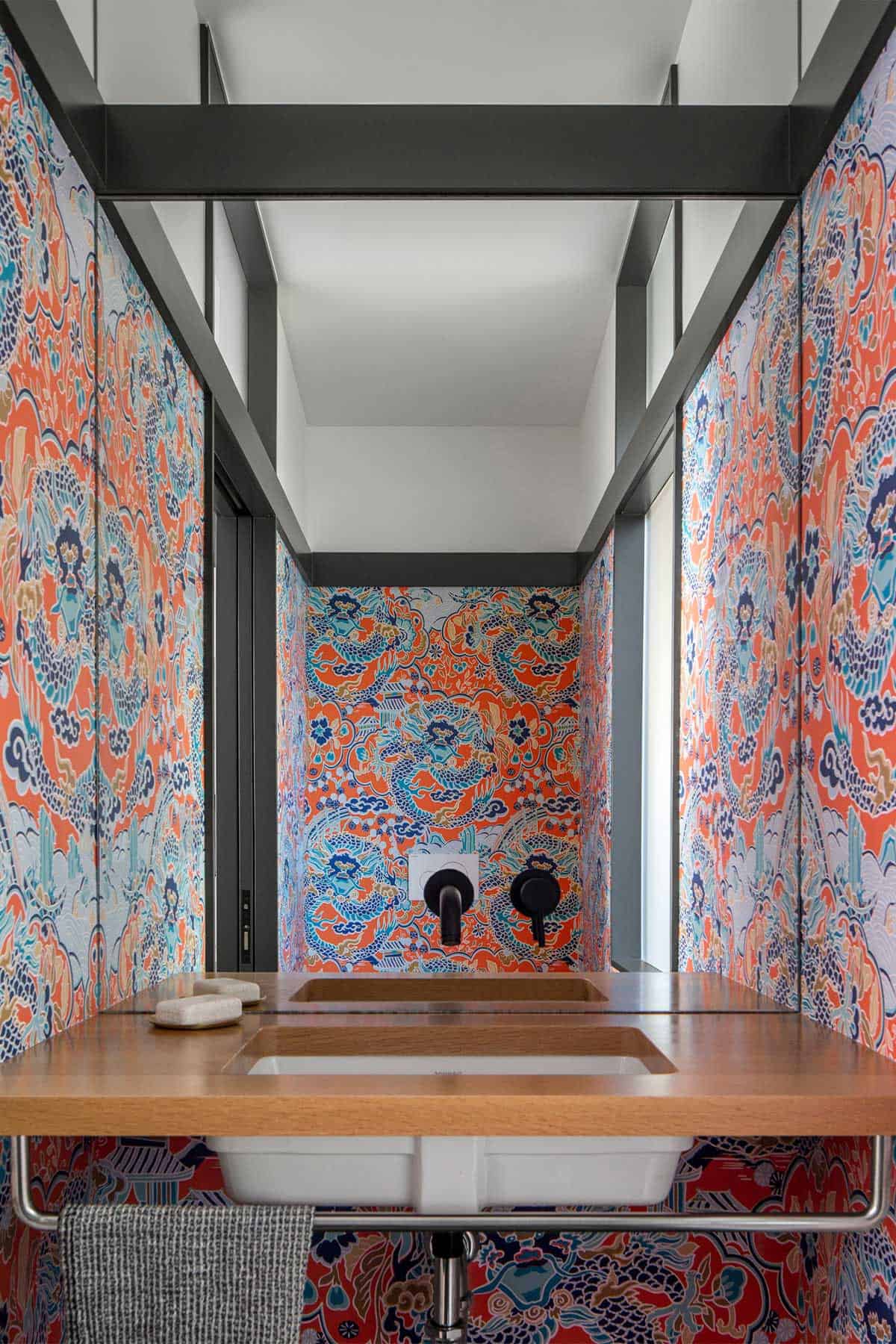
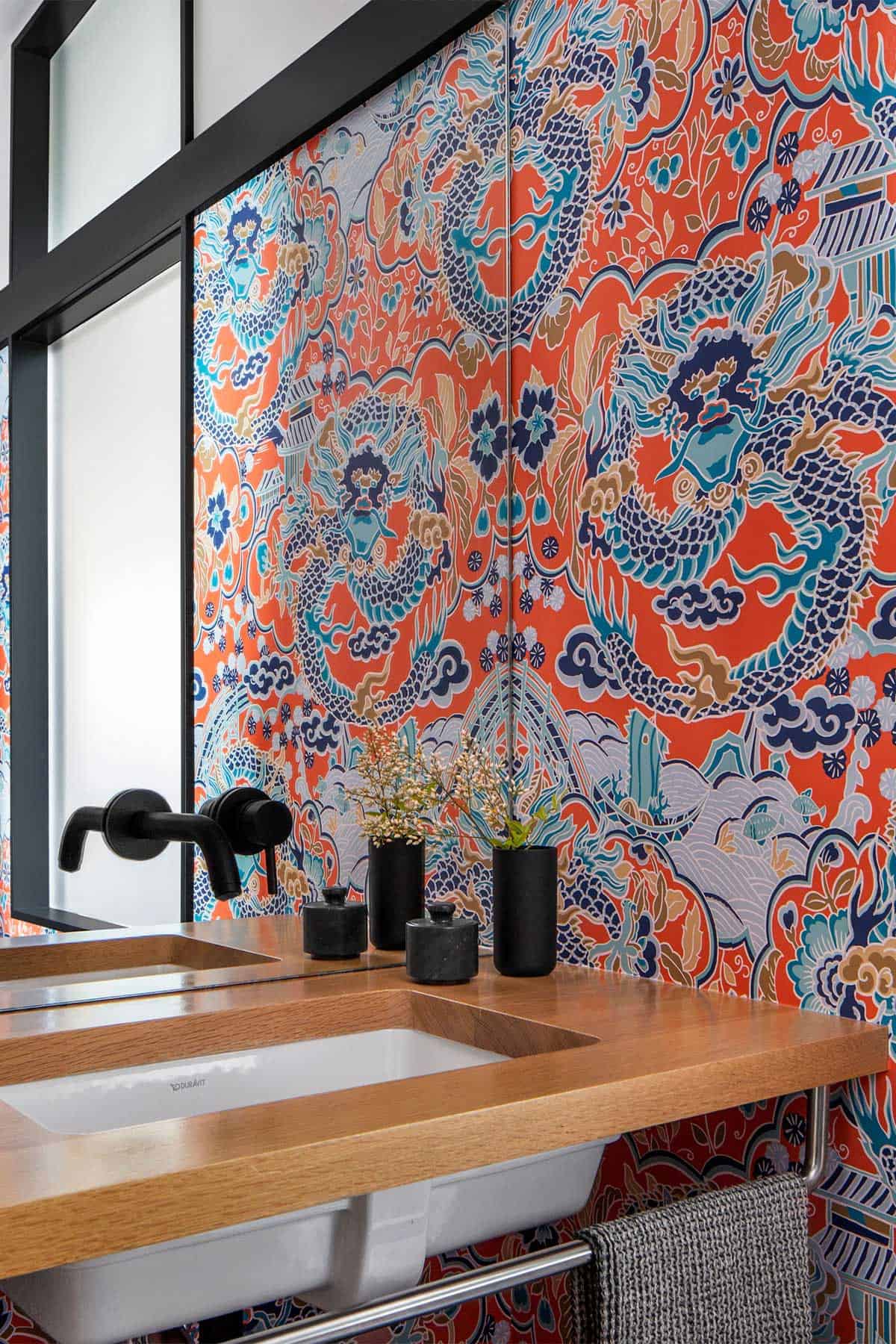
Moving the kitchen made possible a new functional core consisting of a home office, powder room, back pantry, and coat closets, all with direct access to both the kitchen and carport. Space was not added but instead creatively re-apportioned to transform the kitchen and support spaces. Two main floor bedrooms and bathrooms were combined to form a master suite, while a third bedroom was repurposed as a TV and flex room.
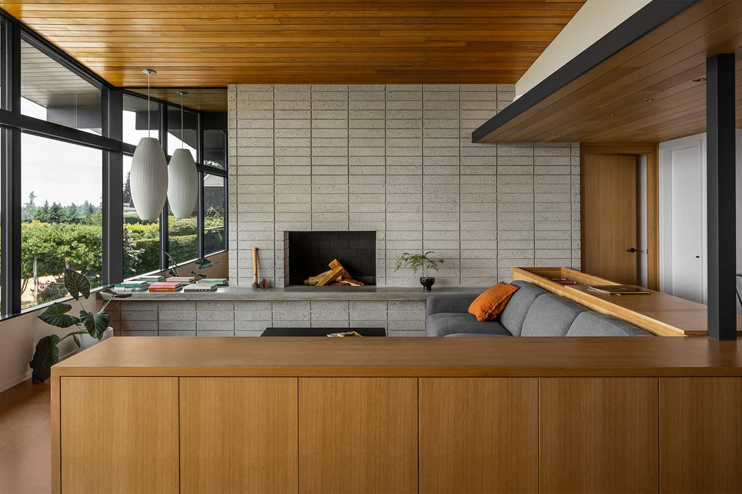
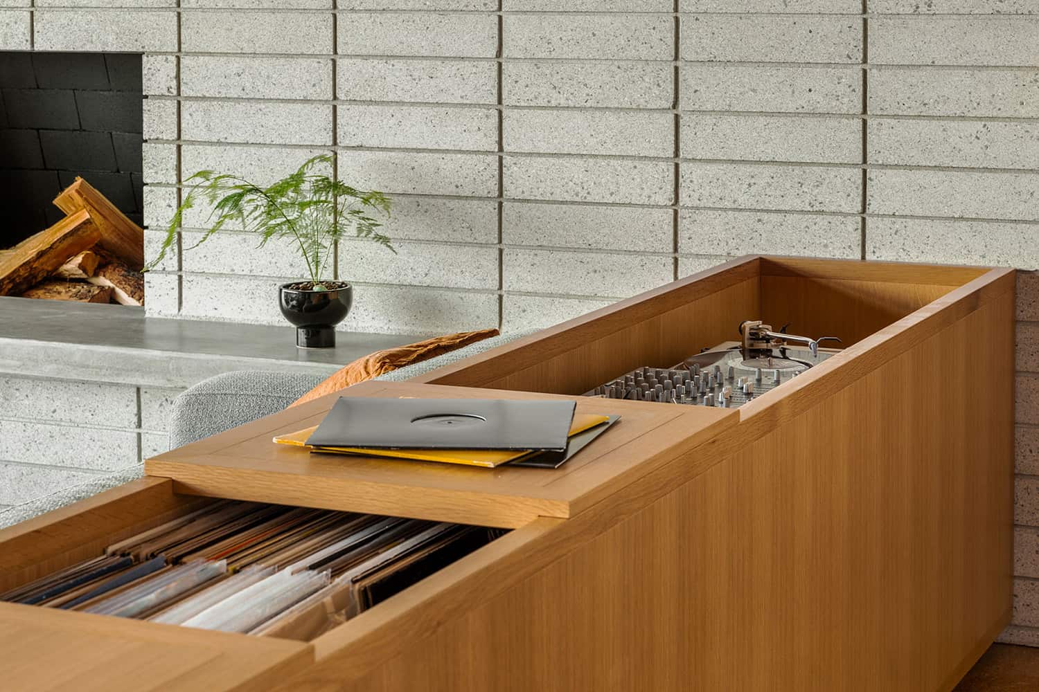
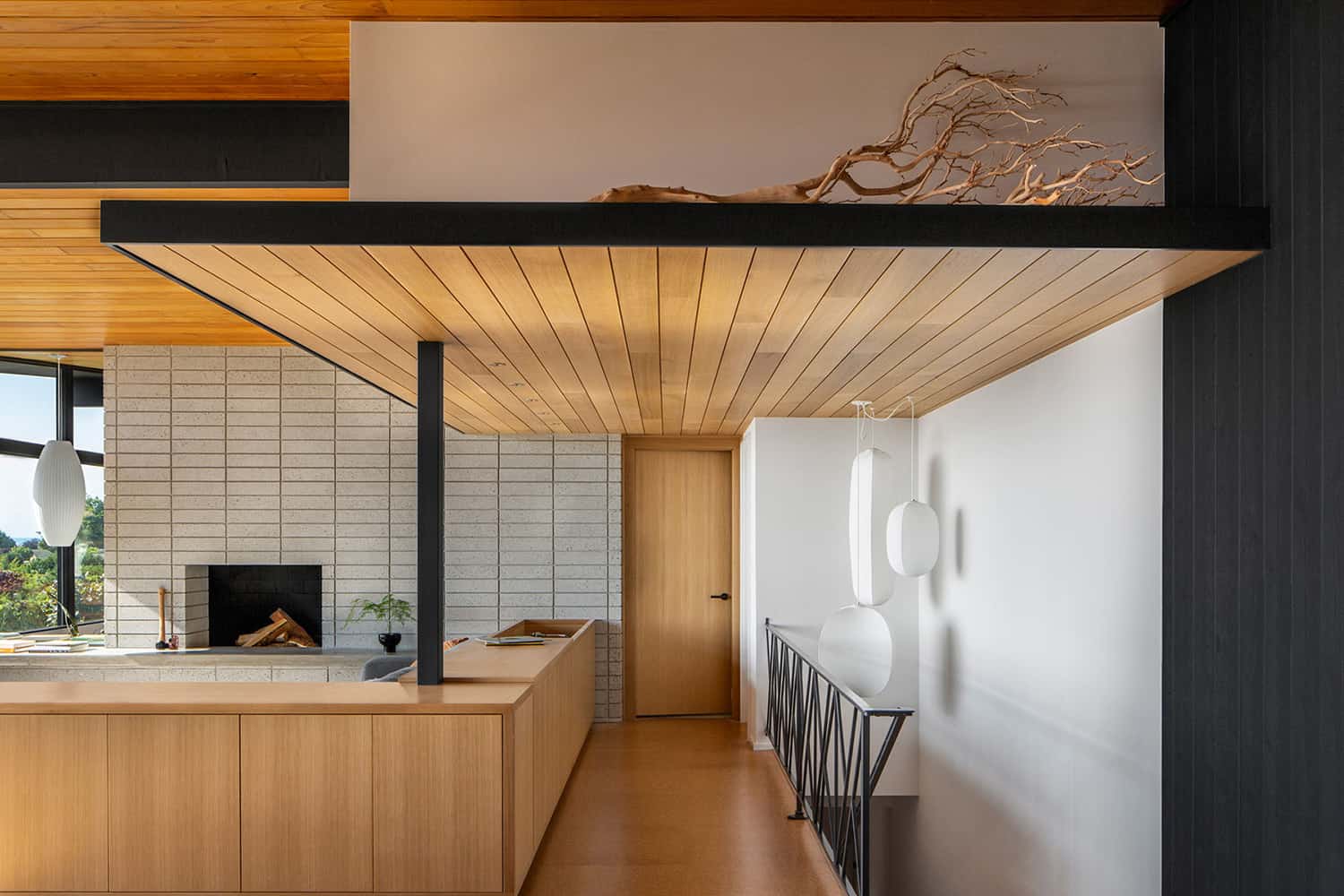
In the living room, special attention was paid to the redesign of the fireplace which was faced with ground face CMU blocks and a cast concrete bench. To complete the space, low built-ins and a DJ station frame a large section facing the fireplace and view west.
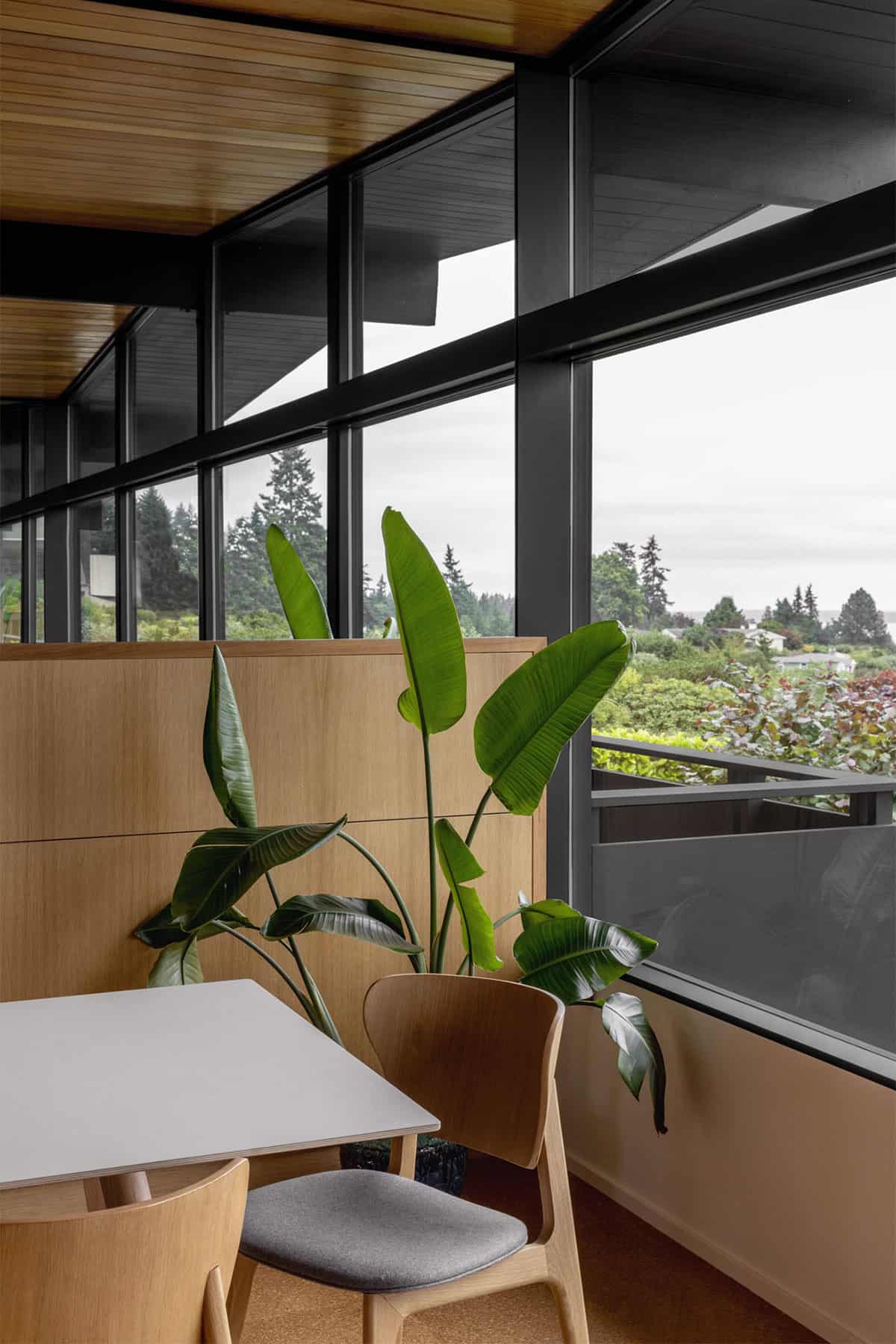
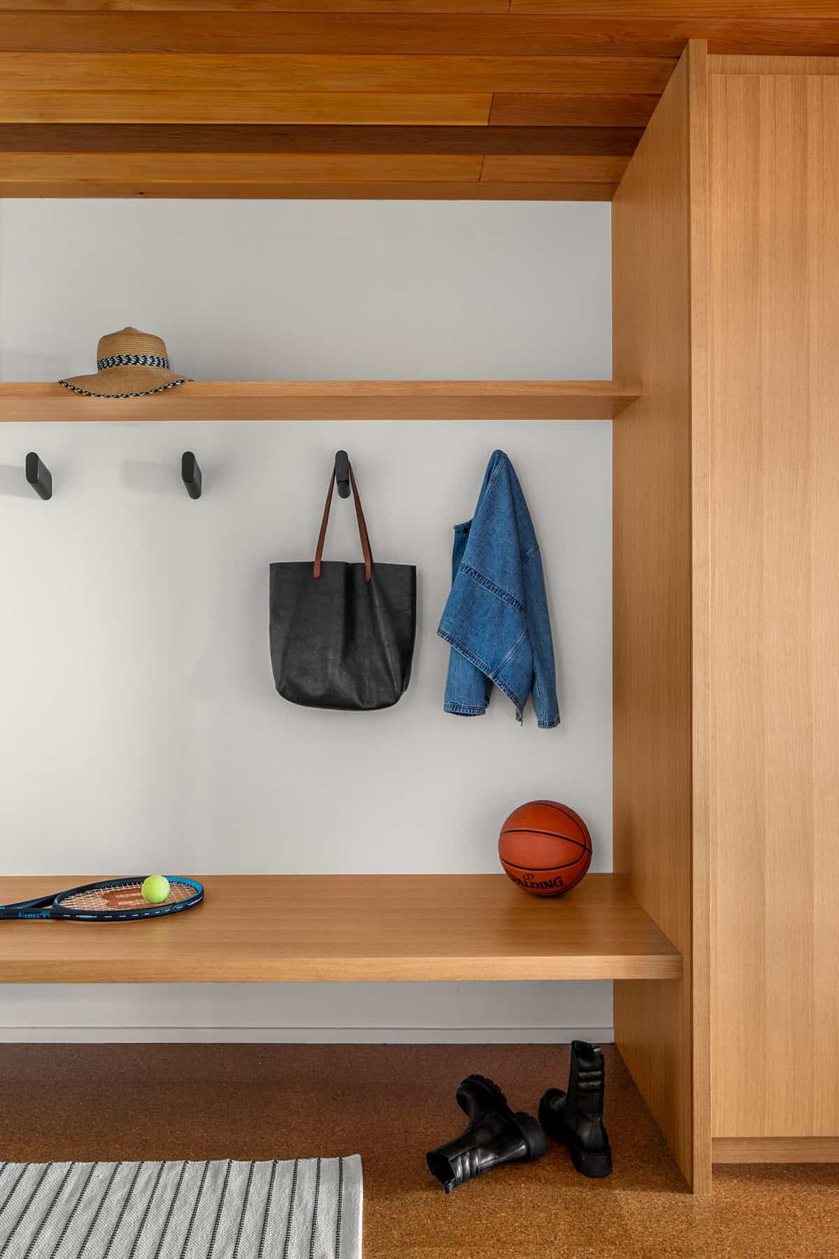
A limited palette of materials was used throughout the main level: cork flooring, rift sawn white oak paneling and casework, and white sheetrock walls are framed by wood structure and trim painted black to unify the space. As a nod to the past, the original natural slate tile and metal railing were preserved in the entryway.
What We Love: This midcentury home has been lovingly restored into a warm and spacious family home. Large windows help to not only flood the interiors with natural light but capture the gorgeous views. Materials of white oak and cork help to infuse warmth into this modern dwelling. Overall, the project team did an amazing job of harmonizing the new elements with the old, creating a beautiful design aesthetic for this family to enjoy for years to come.
Tell Us: What design elements in the revitalization of this home do you find most inspiring and why in the Comments below!
Note: Have a look at a couple of other incredible midcentury home tours that we have featured here on One Kindesign: Unbelievably beautiful mid-century family home in Newport Beach and Inside an inspiring midcentury modern in Texas boasting light-filled interiors.
Unique experiences were created in other areas of the main level, from built-in entry benches to workspaces in the kitchen for kids to do their homework.
Above: In the powder room of this restored midcentury home, a mirror and coral dragon wallpaper play with patterns and reflections.
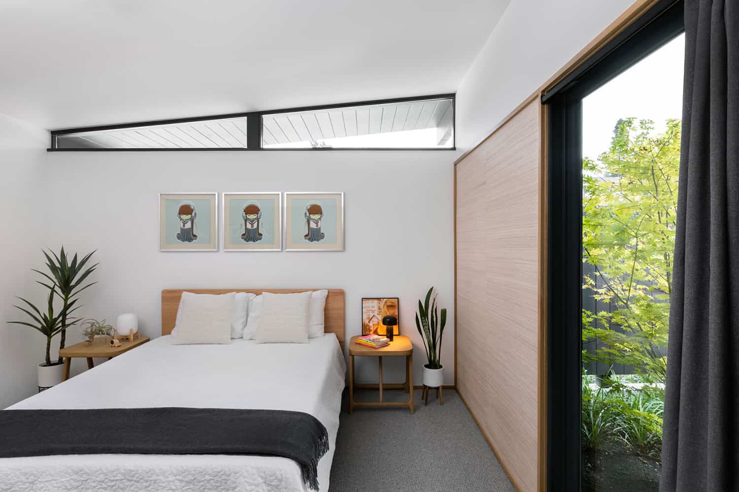
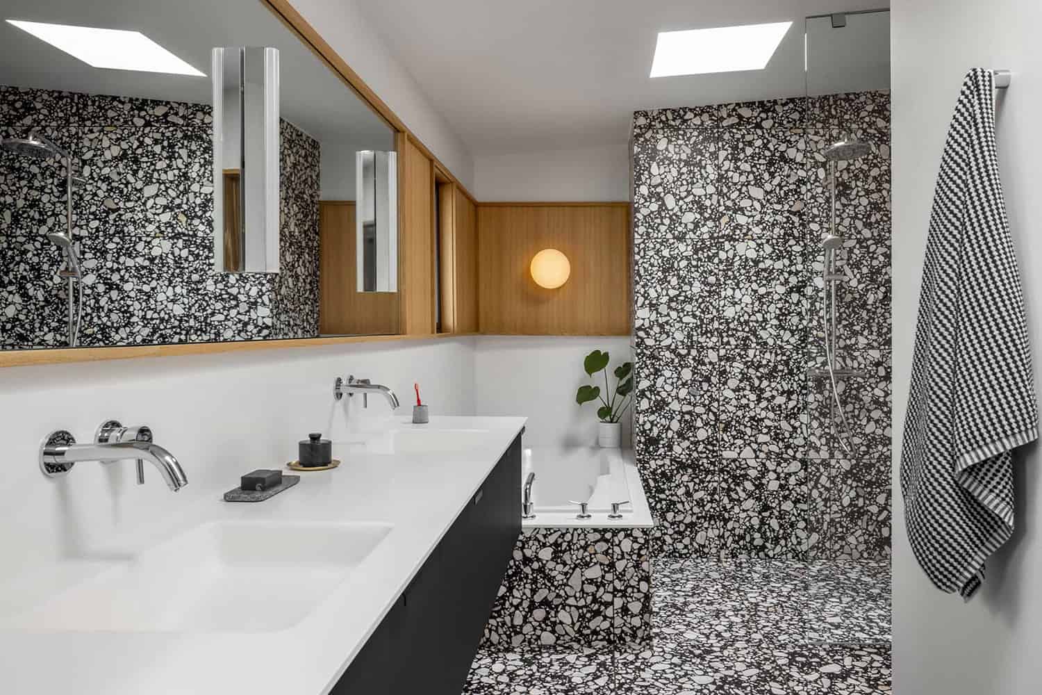
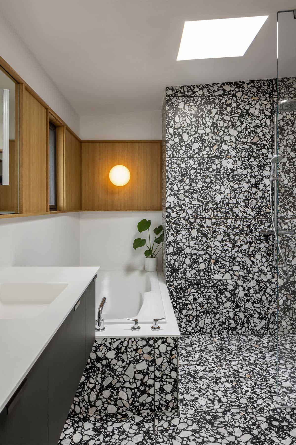
Above: In the primary suite, grasscloth and oak paneling unify the suite, the center of which is a bathroom covered in black and white terrazzo tile. There is an exterior hot tub garden adjacent to the bedroom.
Above: White Oak was used as a connecting datum behind the mirrors, wrapping around the tub to create a spot for an accent light and plant shelf.
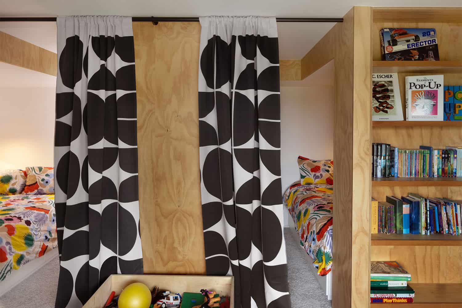
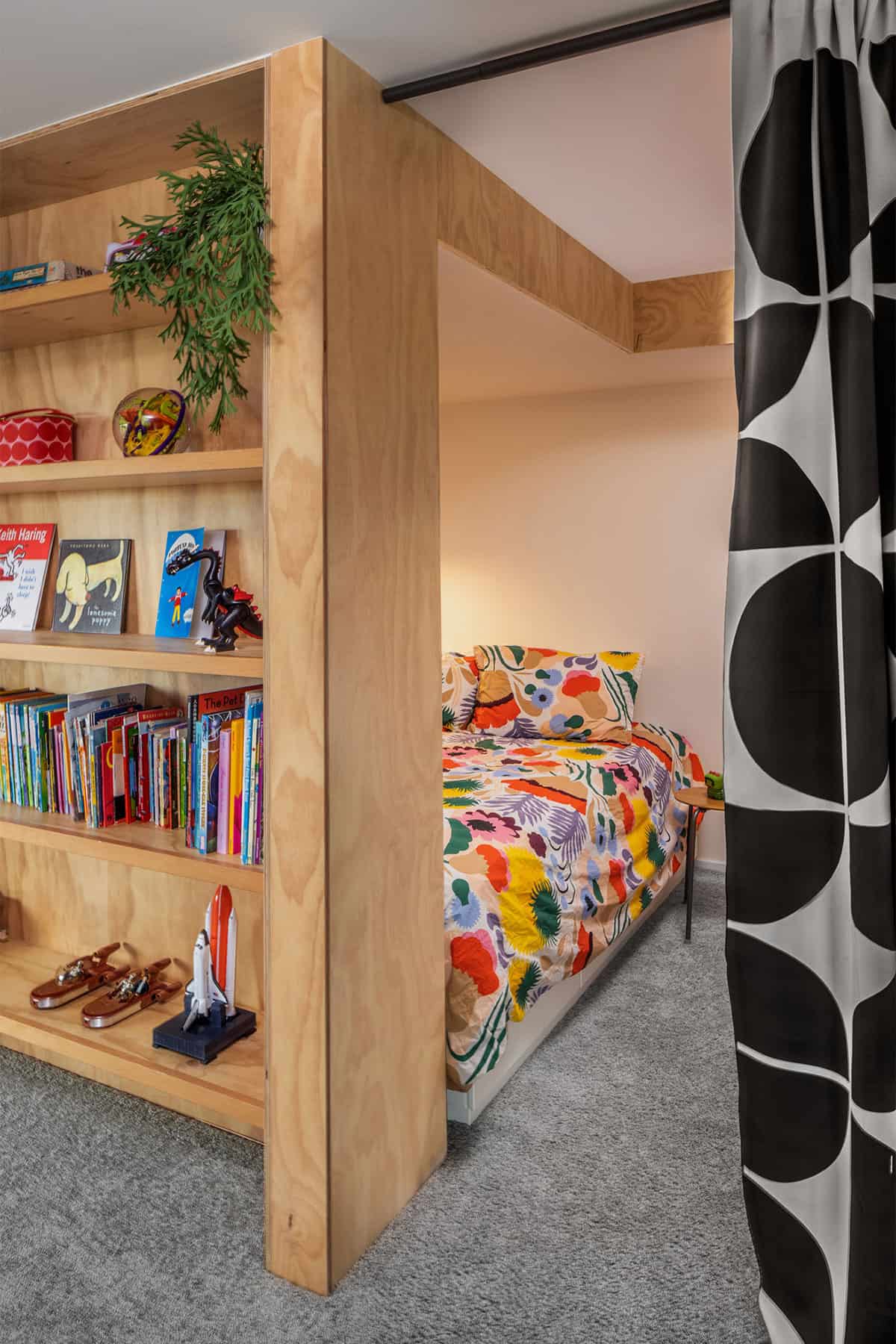
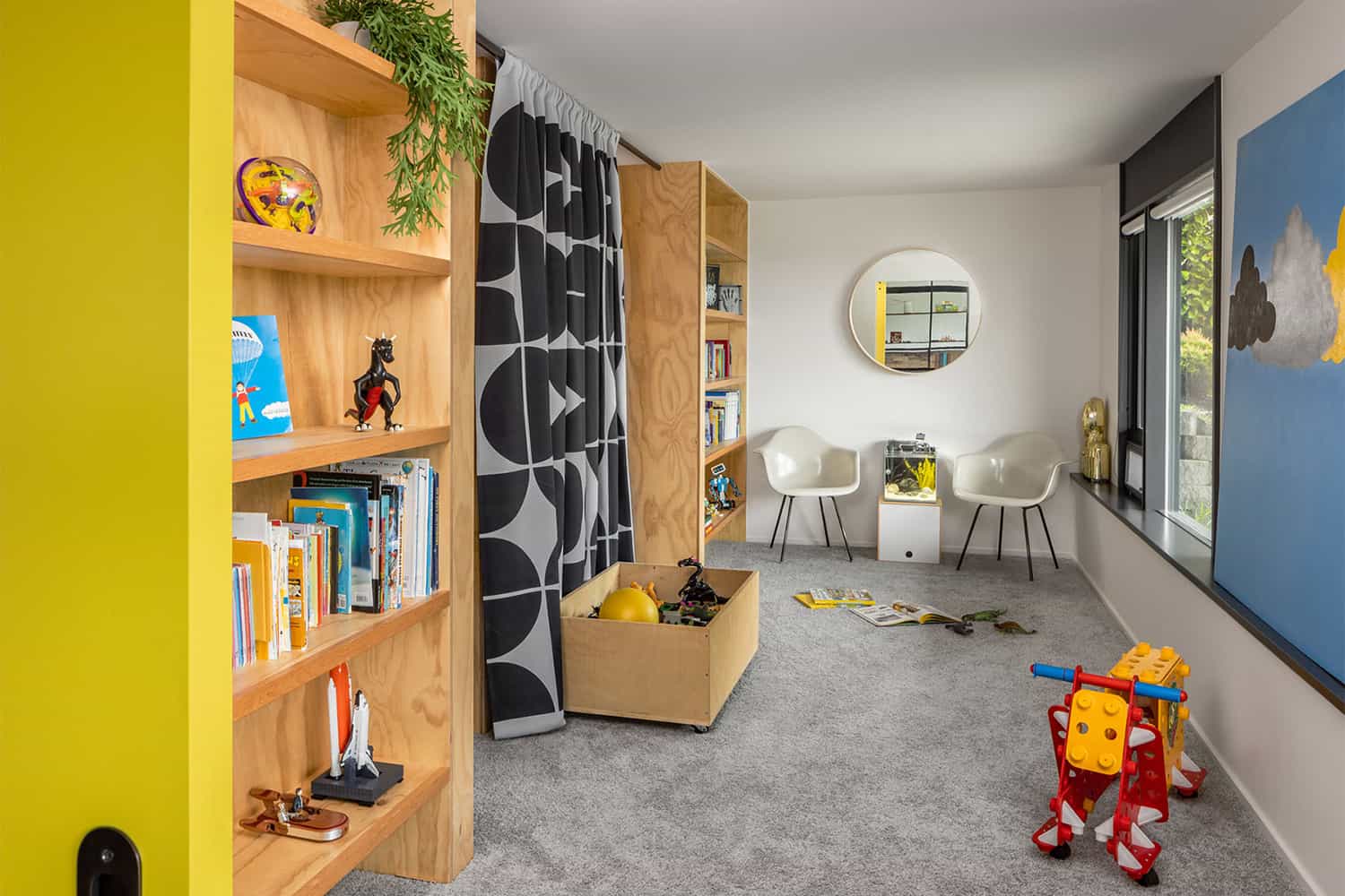
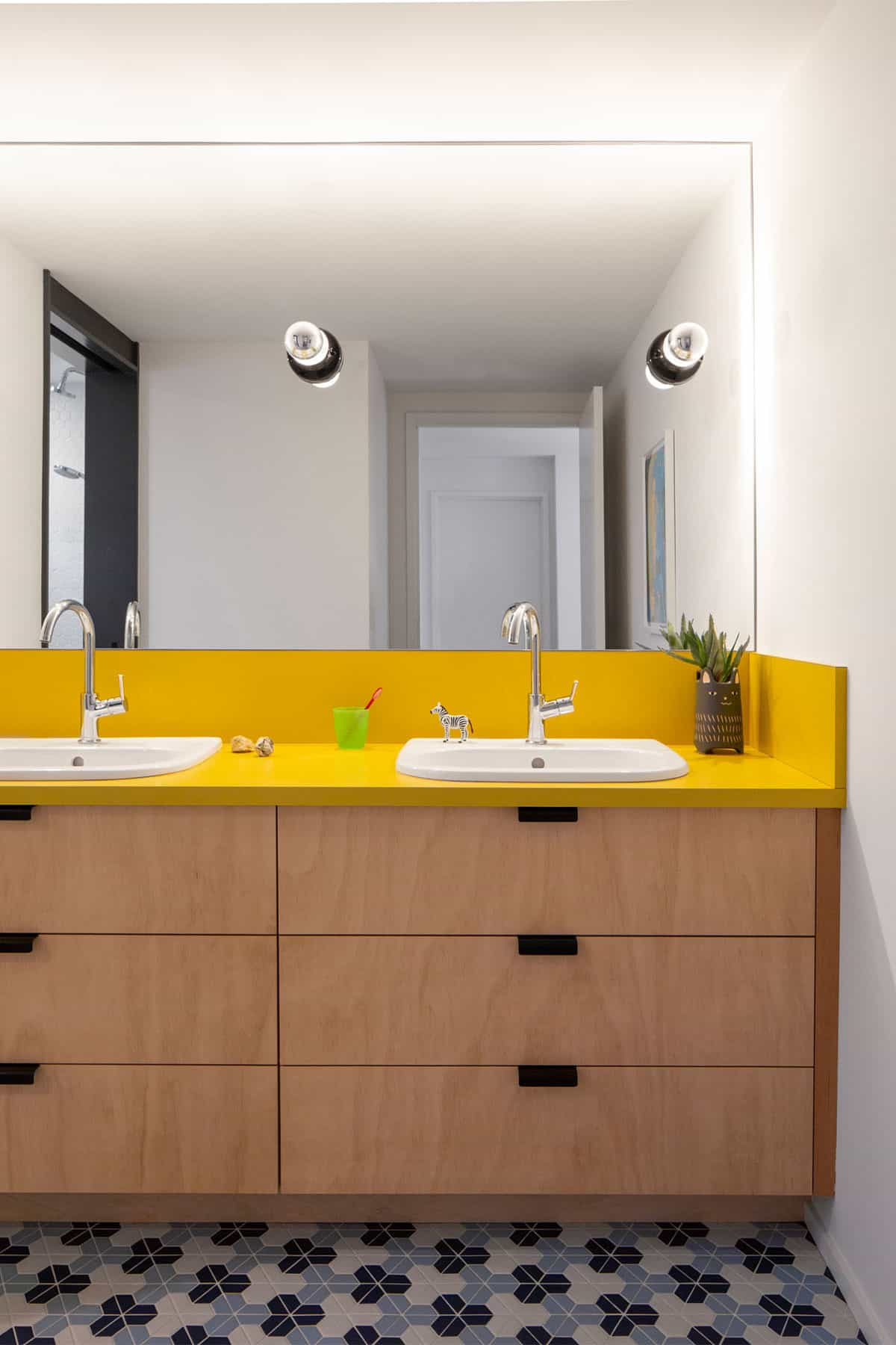
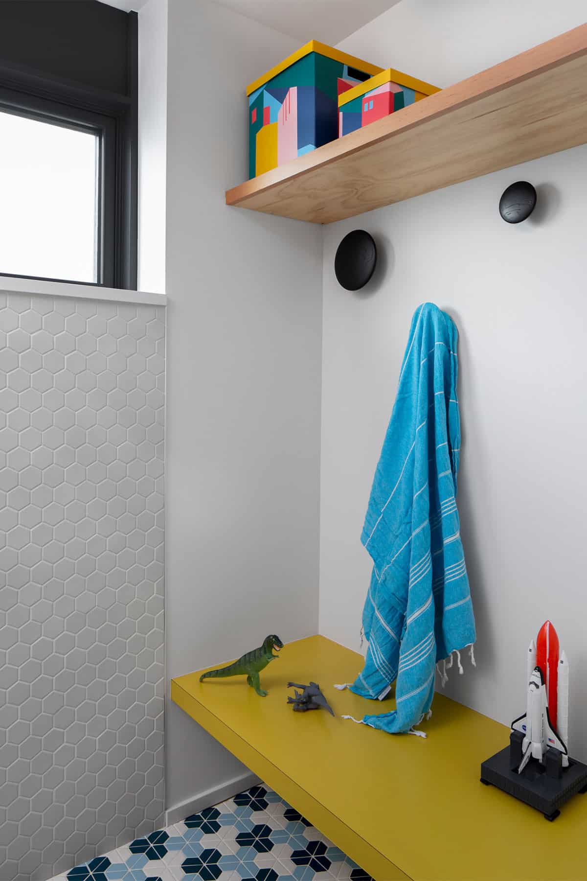
On the lower level, changes were required to accommodate three children and associated hobby and play spaces. A small lower-level bathroom was cleverly reconfigured into a multi-functional vanity, powder, and shower space to accommodate multiple users. A storage room was turned into a shared bedroom while the family room was turned into a kid’s craft and entertainment room.
Above: Plywood bed cubbies were designed for two kids, leaving a shared work and play space.
Above: Plywood casework and yellow plam countertops (plastic laminate) were used in the kid-friendly bathroom.
Above: On the exterior, the ADA ramp that cut through the front lawn was removed for a firepit area, landscaping, and a large lawn for family gatherings and neighborhood games.
Photos: Courtesy of Shed Architects


0 comments