
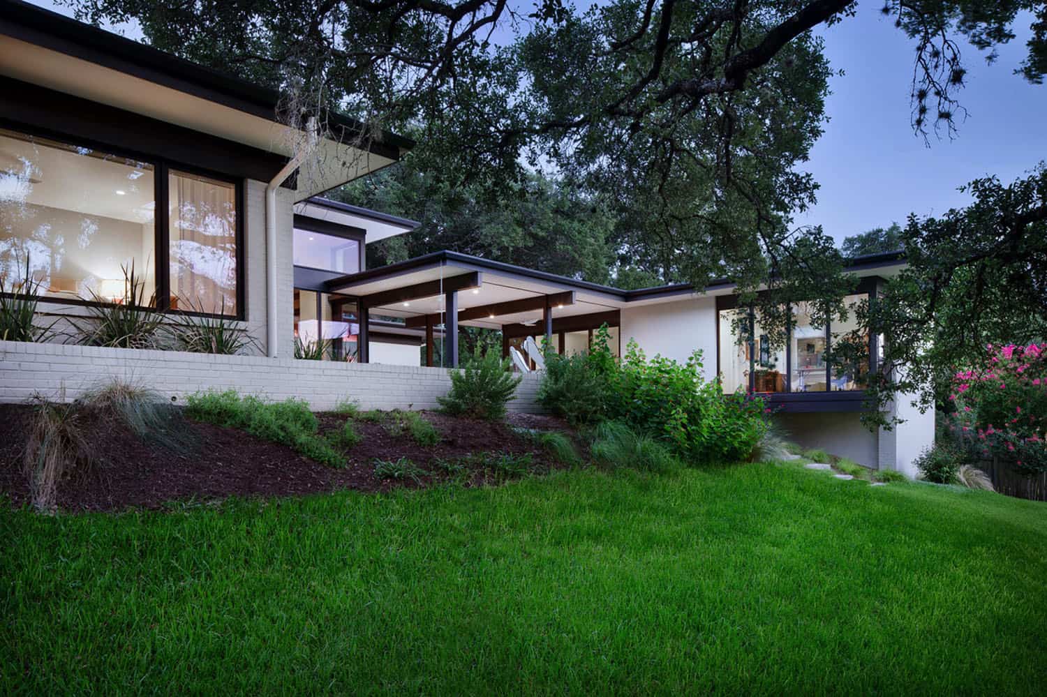
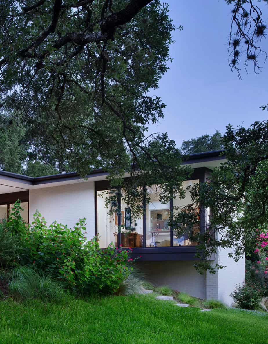
A Parallel Architecture in partnership with Allison Burke Interior Design has reimagined this mid-century home overlooking Lake Austin, Texas. Nestled on a sprawling hillside property, this 4,800 square foot dwelling is woven through a series of existing brick walls and foundations to create an entirely new experience of the site.
The original 70s layout was extremely dark and introverted, with 8-foot high ceilings throughout. After an extensive study of the schematic design, the project team collaborated on a more efficient and effective approach to maximize the flow of this dwelling. The structure was transformed into an open and airy home that capitalizes on the incredible site while meeting the lifestyle needs of a vibrant, growing family.
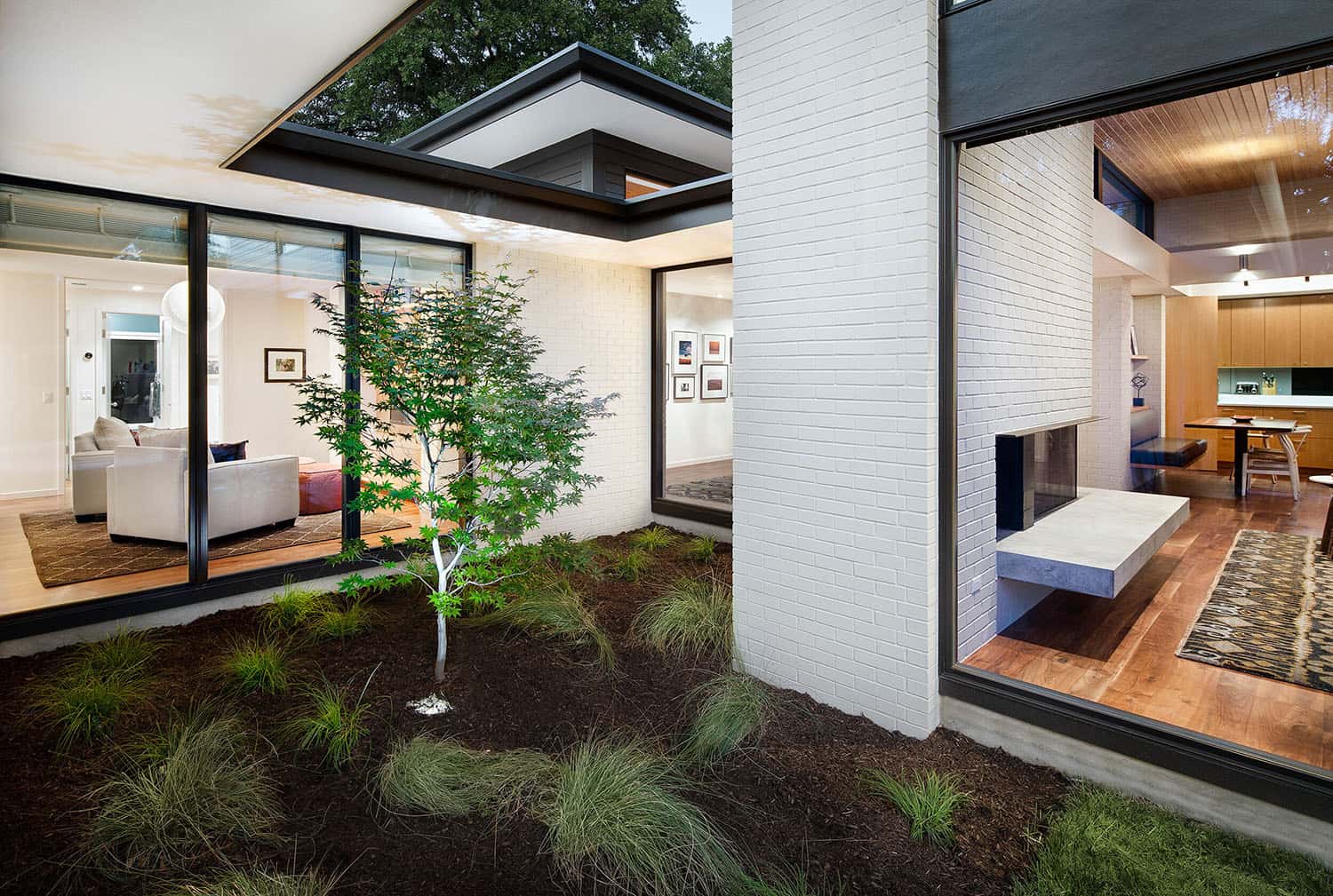
Arranged around a trio of overlapping courtyards, the structure’s main living spaces push and pull to create a wide variety of spatial experiences- solid and void, light and dark, release and compression. Designed in close proximity to the heritage oaks, the dwelling weaves around the sprawling tree canopies.
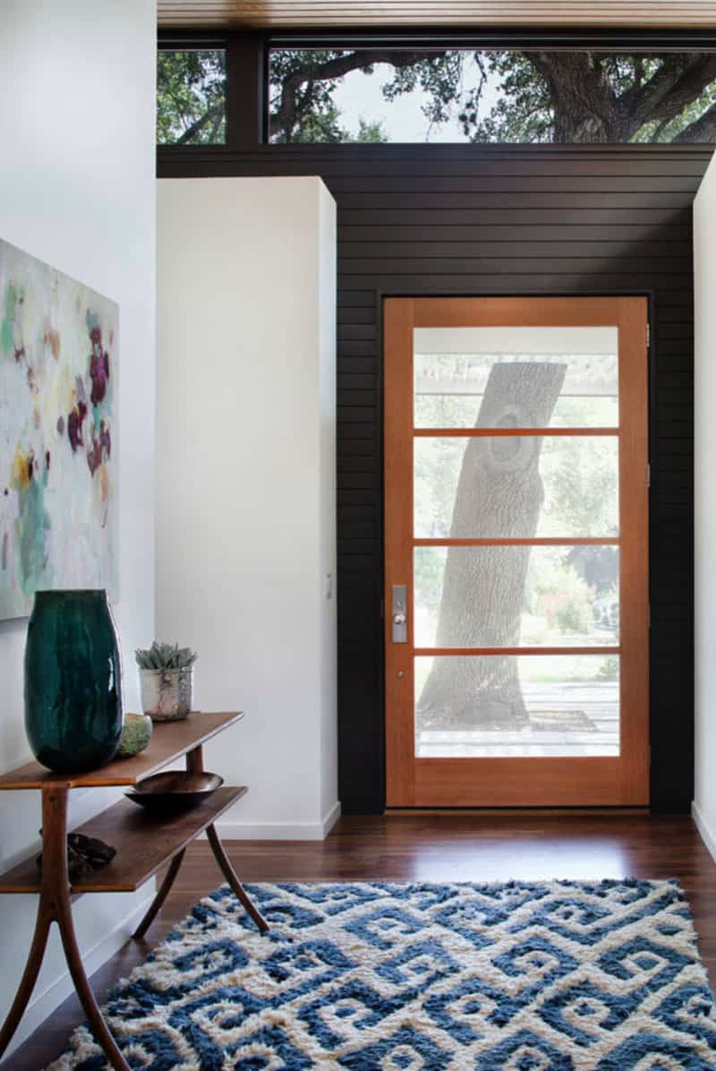
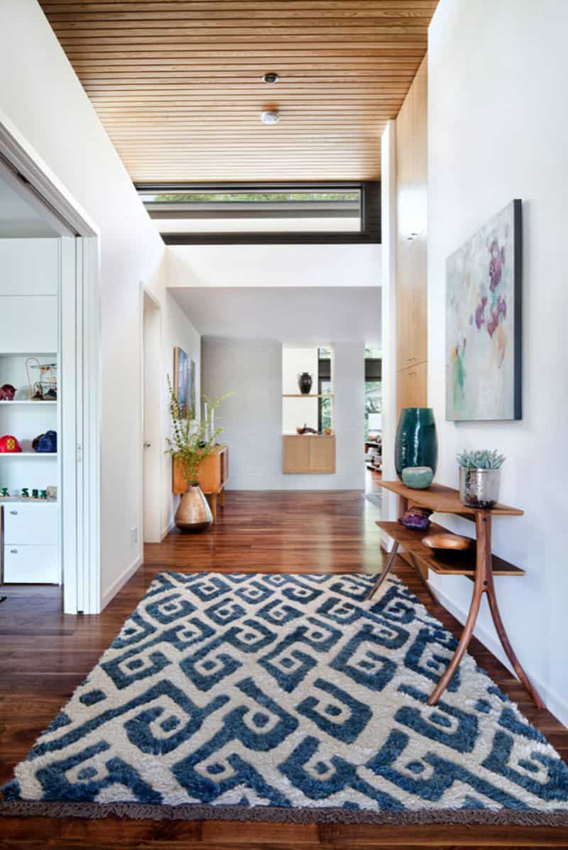
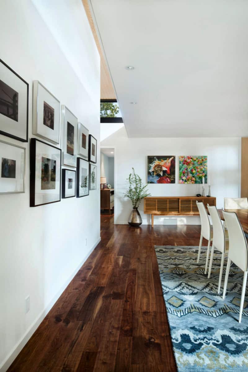
Above: The foyer is flooded with natural light courtesy of the transom window and a semi-translucent front door. The tribal rug is from Room & Board, while the Doppio B console table is from Organic Modernism.
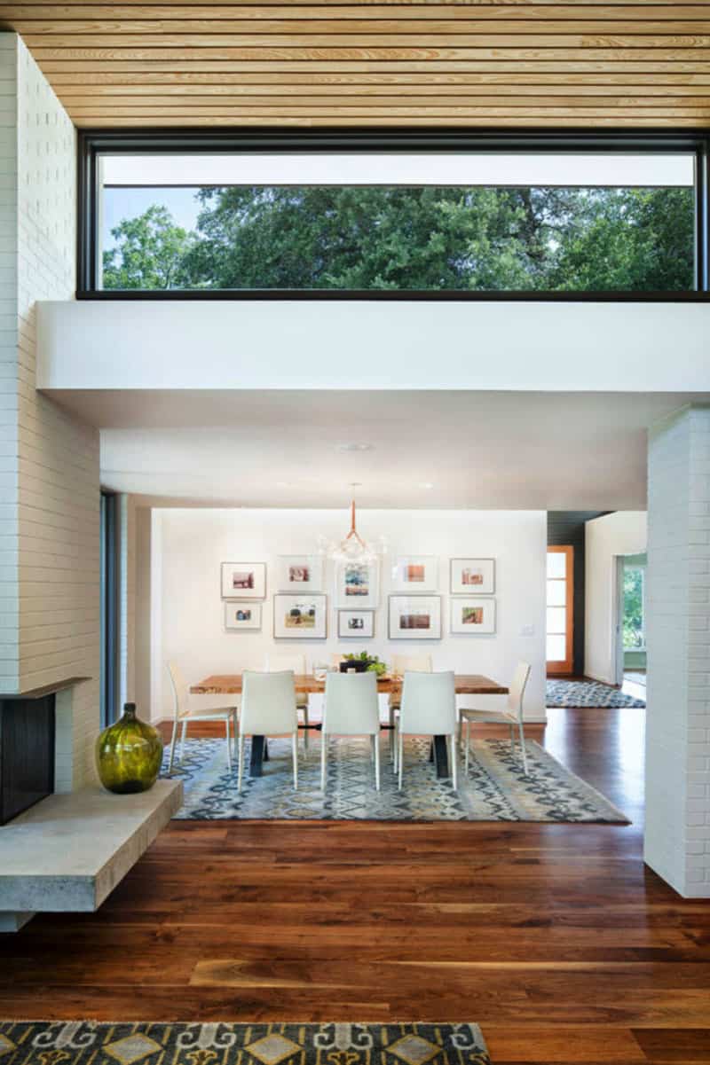
The material palette includes painted brick on both the interior and exterior, open grained cypress ceilings, rift white oak millwork, and old growth walnut floors.
The remodel includes four bedrooms and a backyard addition that functions as both a guest suite and home office.
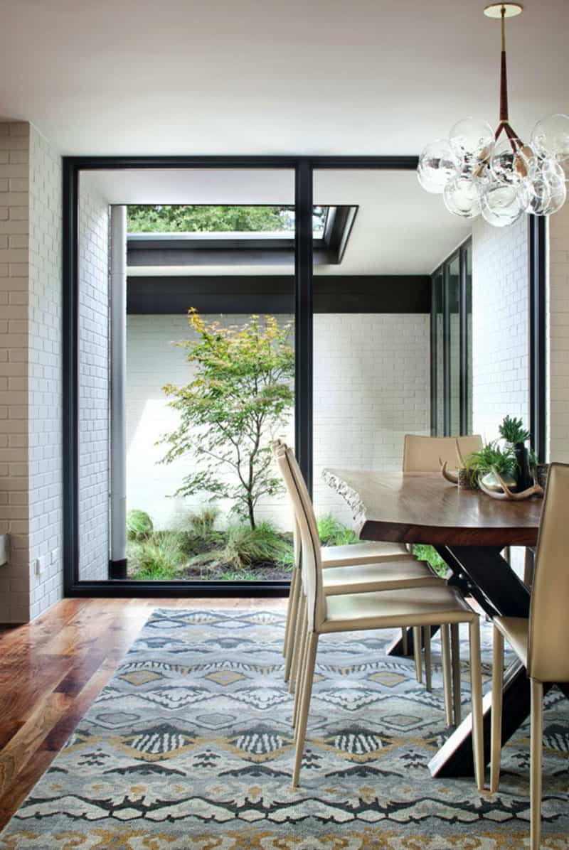
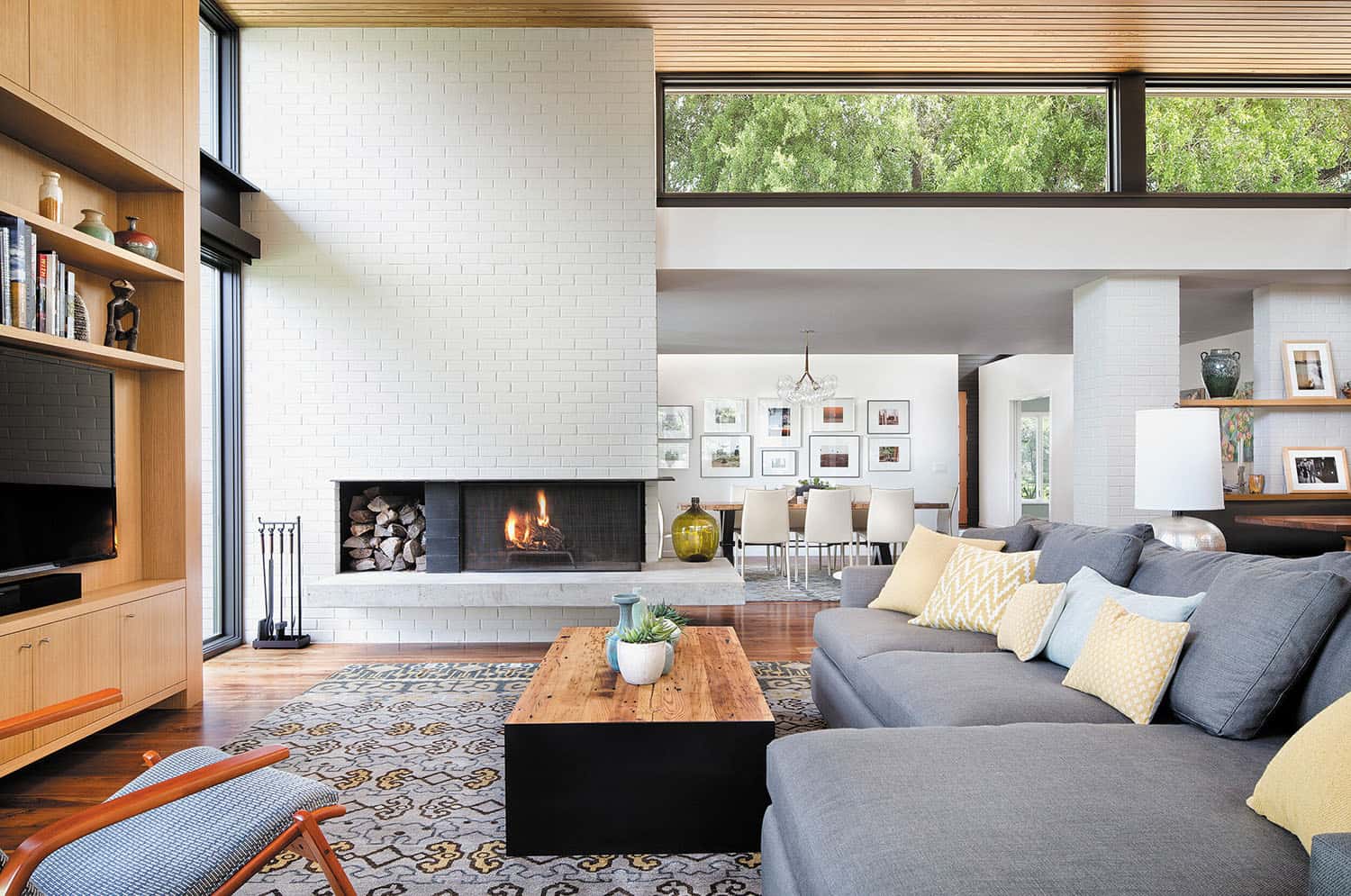
What We Love: This mid-century home has been beautifully reimagined to reflect light-filled living spaces that seamlessly connect with the outdoors. Stylish furnishings add to the overall aesthetics of this home, creating a welcoming atmosphere for family living. The newly configured floor plan caters to the lifestyle needs of this home’s inhabitants while also creating a more harmonious flow. Note: The light fixture above the dining table is the transparent glass and leather Bubble Chandelier by Pelle.
Tell Us: What do you find most appealing about the redesign of this home and why in the Comments below, we love reading your feedback!
Note: Have a look at a couple of our most popular mid-century home tours that we have featured here on One Kindesign: Mid-century modern house in Newport Beach gets stylish makeover and Renovation of a mid-century modern Eichler home in California.
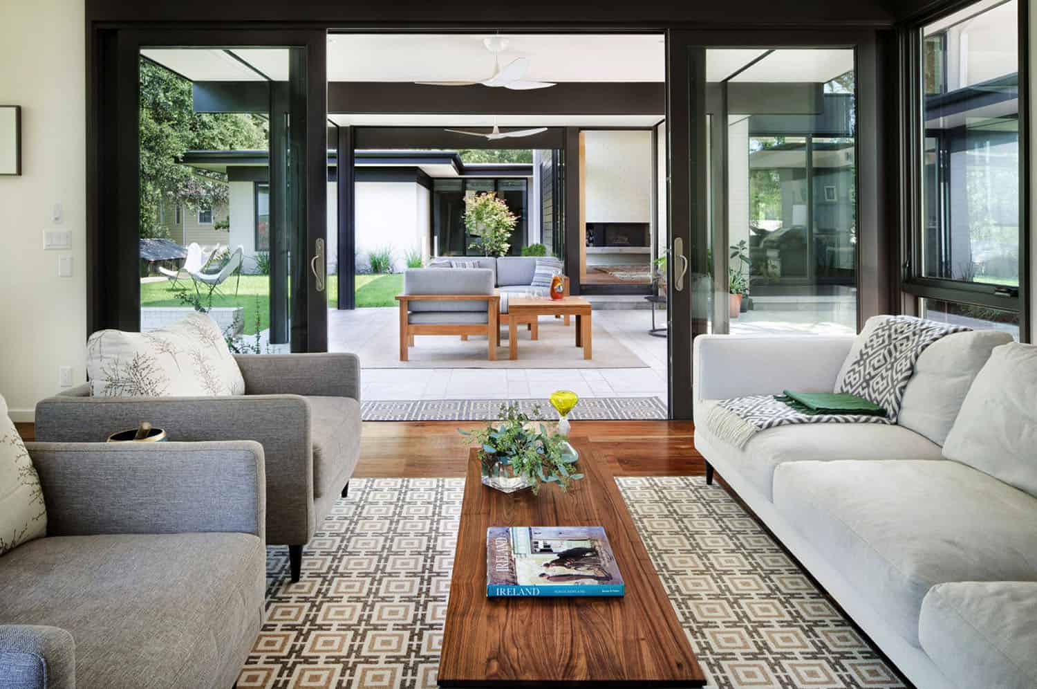
Above: In the living room of this reimagined mid-century home, the sofa is sourced from Crate & Barrel, while the Gage Cocktail Table is by Room & Board. The brick is painted in Shoji White SW 7042 – Sherwin Williams. Grounding the space is a contemporary tribal rug from Oriental Rug Gallery of Texas.
Above: The Hans Wegner Round Chairs can be seen in the foreground. Next to the sofa is a Marble-Top Side Table from Anthropologie.
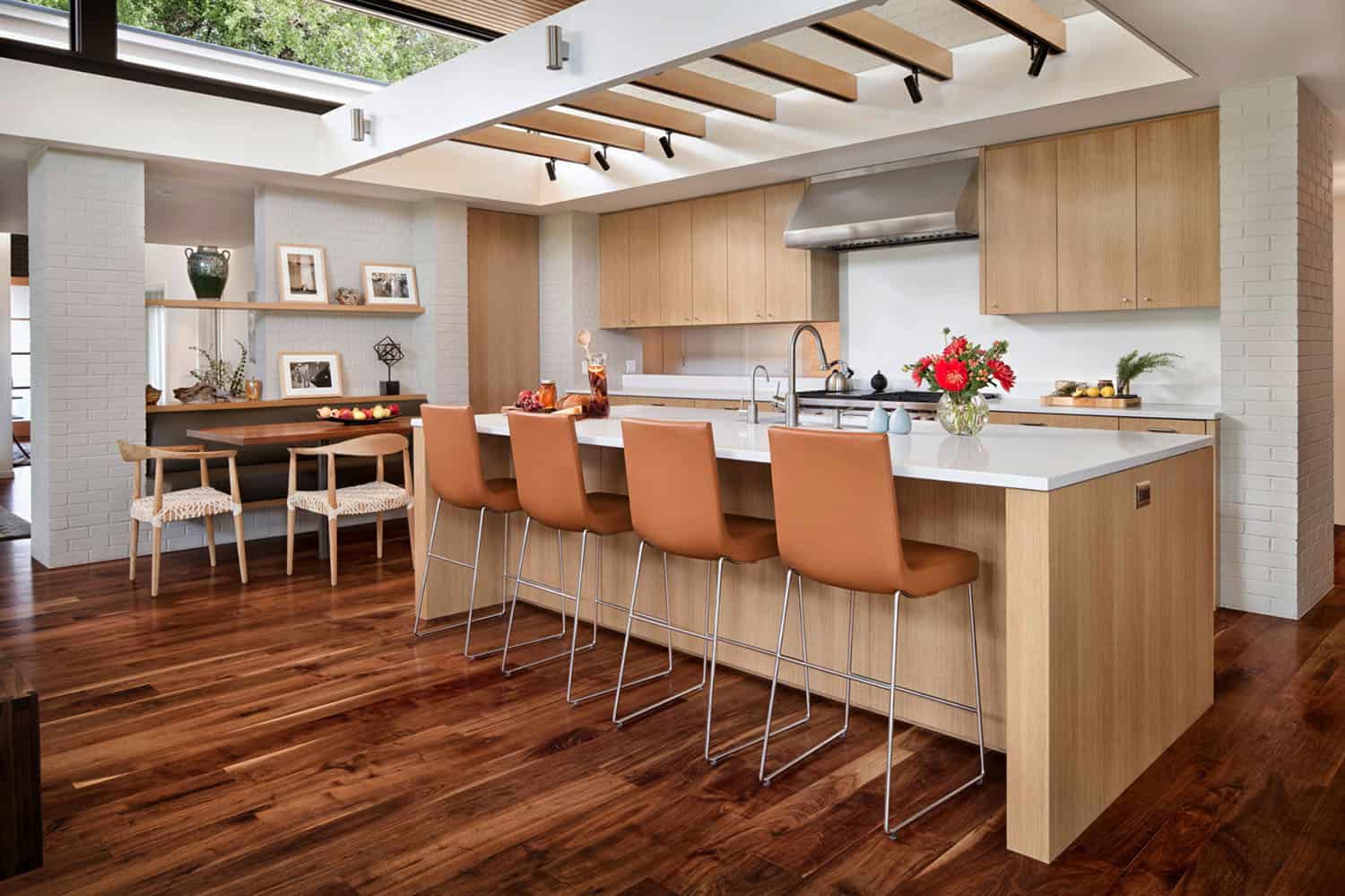
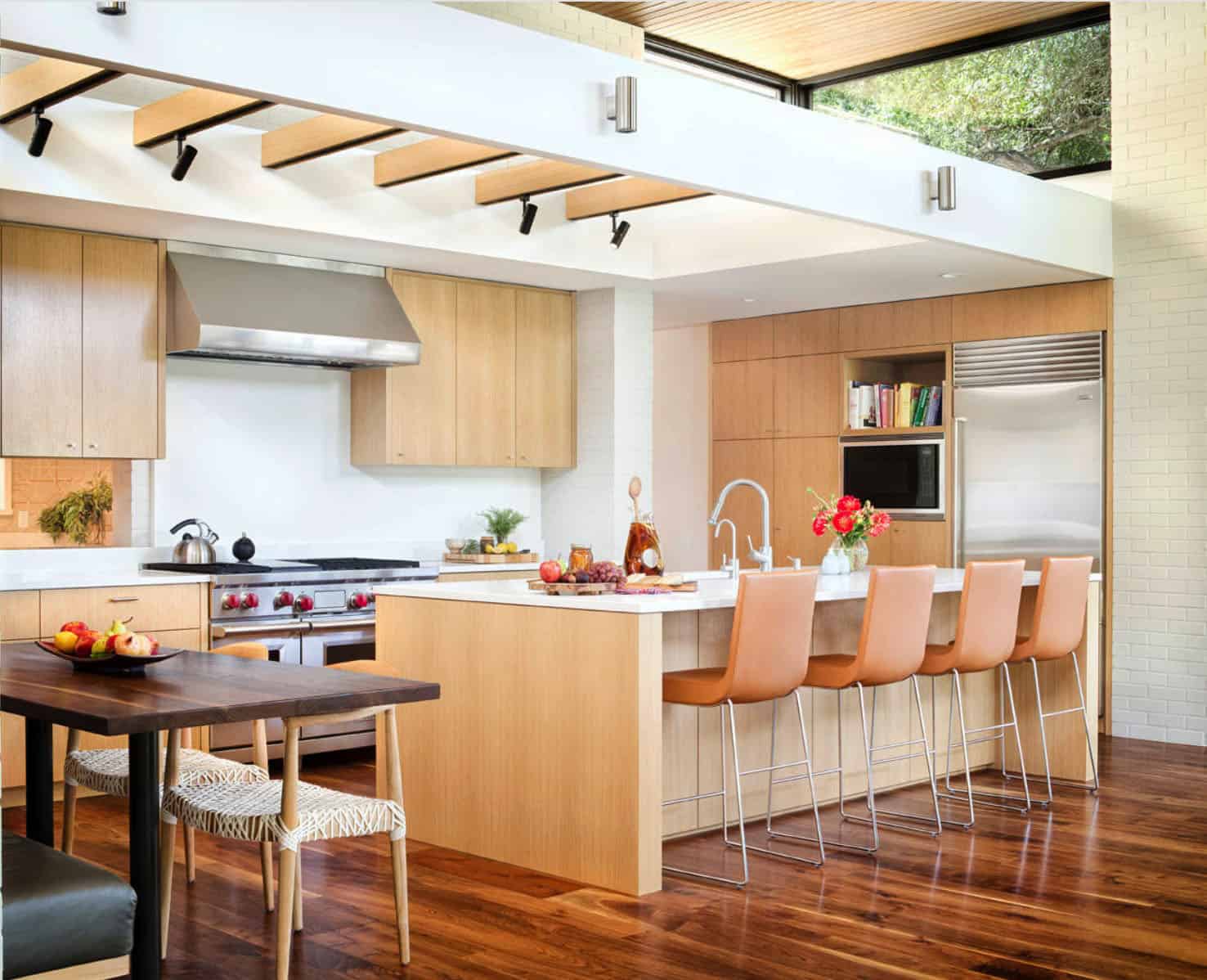
Above: In the kitchen, a custom designed, built-in banquette provides plenty of space for dining options. The island stools are the Jim Counterstools by Montis.
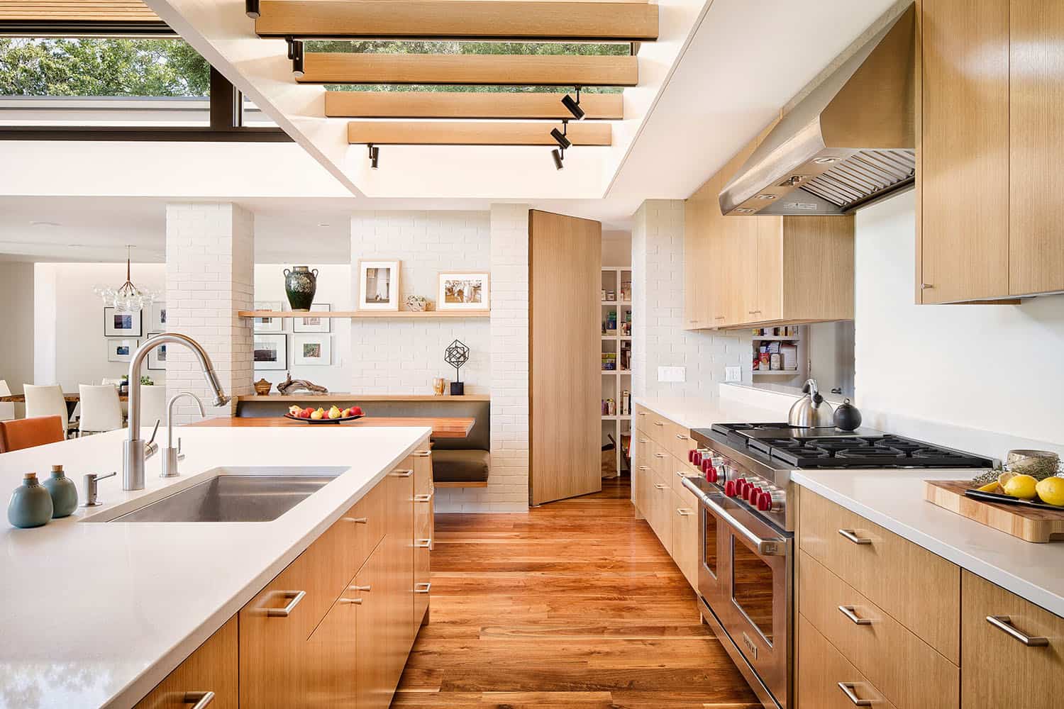
Above: Solid surface counters are from Caesarstone.
Above: The trellis structure was designed for artificial lighting while allowing for natural light to penetrate the kitchen from the transom windows.
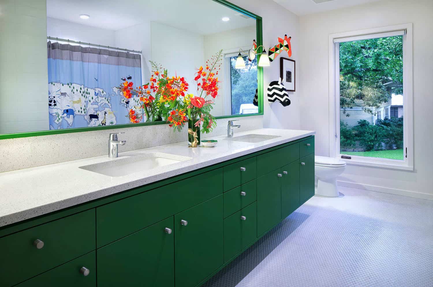
Above: In the kids bathroom, the countertops are Caesarstone with undermount Kohler Ladena sinks. On the floor, penny round tiles.
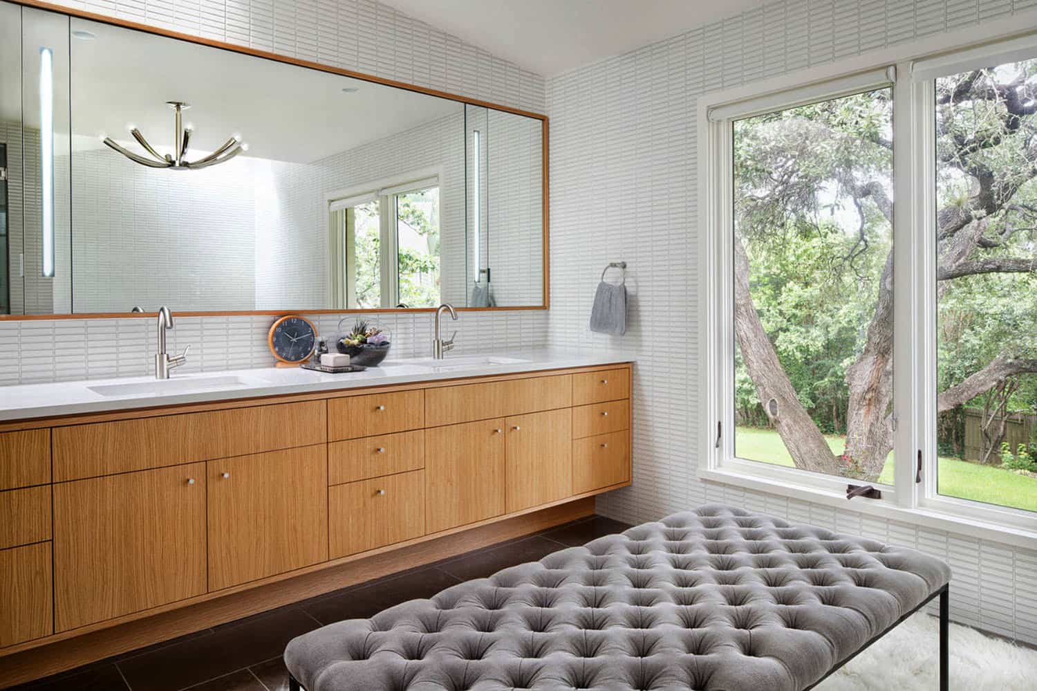
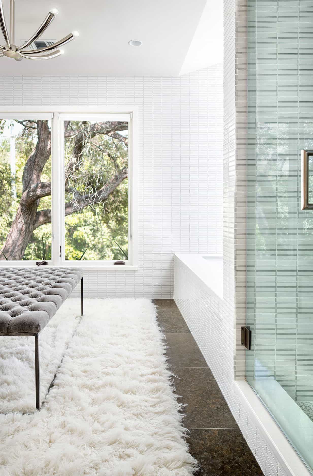
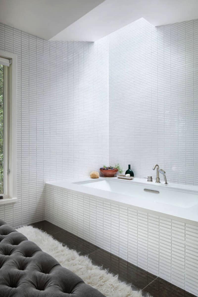
Above: In the master bathroom, the white linear tile is from the Savoy line, Ann Sacks. The countertops are Caesarstone with Kohler Ladena undermount sinks and the faucets are the Talis-S by Hansgrohe.
Above: In the powder bathroom, the wallpaper is the Woods & Pears by Cole & Son. The white and walnut sconces are sourced from One Forty Three.
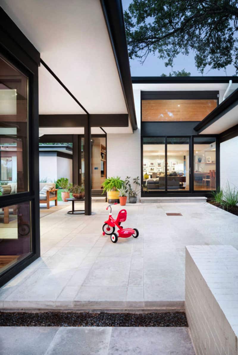
Above: The patio space between main home and guest quarters. New masonry walls, an extension of the original house, anchor the floating roofs which in turn strategically frame treetop views. A central court — once an enclosed sunroom — carves deep into the dwelling, offering each room a connection to the outdoors.
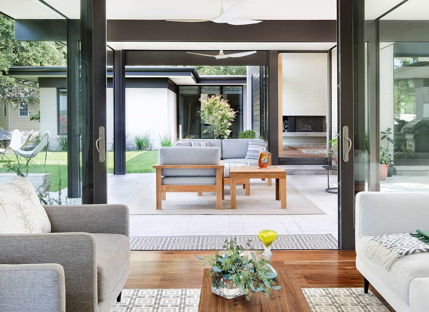
Above: View from the guest house onto the patio separating it from the main house.
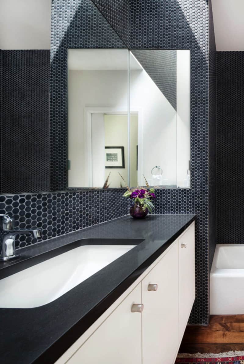
Above: The guest house bathroom features a skylight, drenching the space with natural light. On the floor, old-growth walnut, while the walls are a graphite colored penny round. The vanity countertops are a dark Caesarstone with a Kohler Ladena Undermount sink.
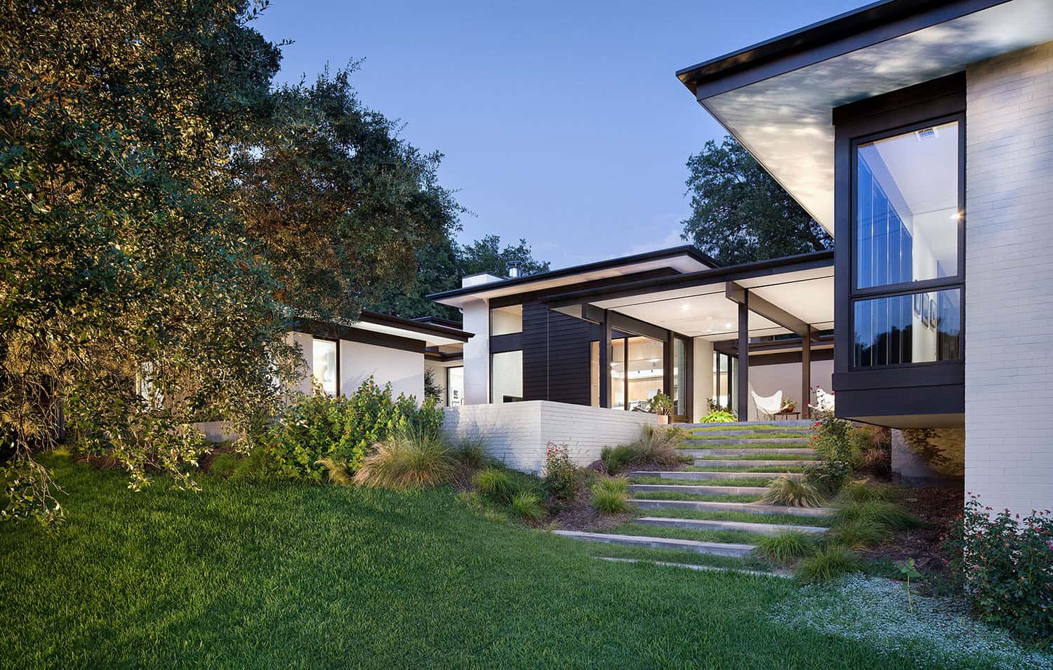
Above: Original brick walls on this mid-century home were updated with warm white paint (Shoji White SW 7042 – Sherwin Williams), large windows, and metal framing.
Photos: Paul Finkel Photography









0 comments