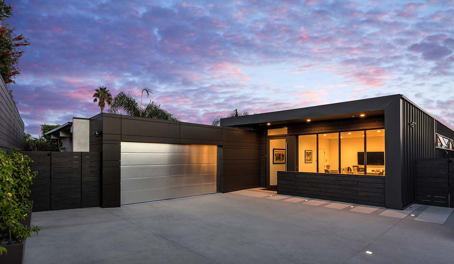
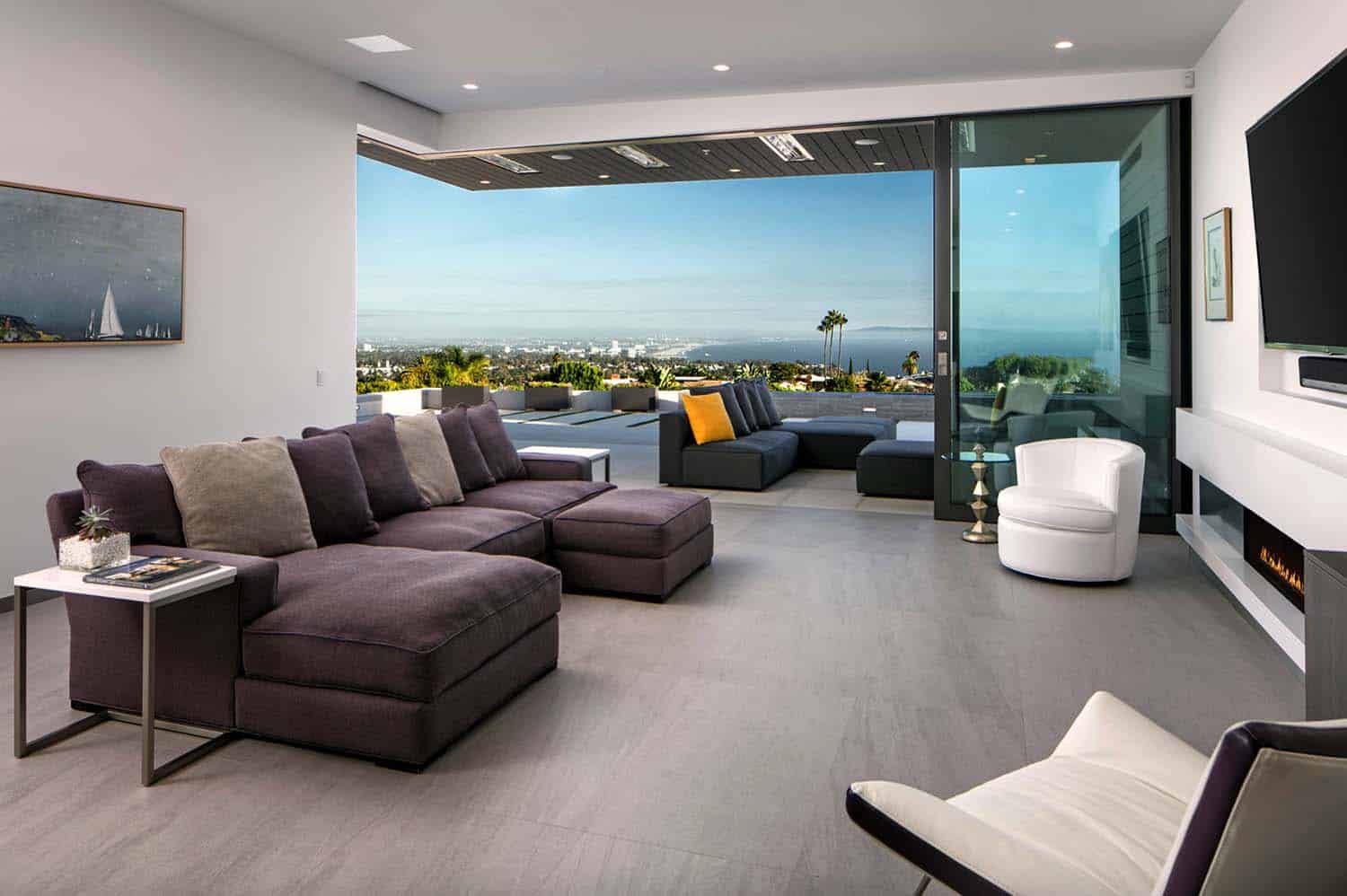
This single-family contemporary home was designed to showcase views of the outside world by Abramson Teiger Architects, located in the Pacific Palisades, California. Expansive windows capture the magnificent views of the Santa Monica Bay. The homeowners are a couple of empty-nesters who were looking to downsize from their previous home and meet with their current lifestyle needs. No longer in need of expansive living spaces and an abundance of rooms, the couple purchased this smaller ranch-style abode.
Boasting glamorous views of the Los Angeles skyline, this home had everything the couple needed… at least structurally. According to the architects, “the existing structure was stripped down to the studs so it could be rebuilt with crisp lines and modern figurations.” The interior living spaces are bright and airy, with crisp white walls punctuated with dark exterior materials to mimic a framed work of art.
Above: The architects selected a material palette for the exterior of the home based on their durability and low-maintenance. This includes: Trespa, Swiss Pearl, and metal siding wraps the facade. This materials helps to create a refined, simple and modern aesthetic.
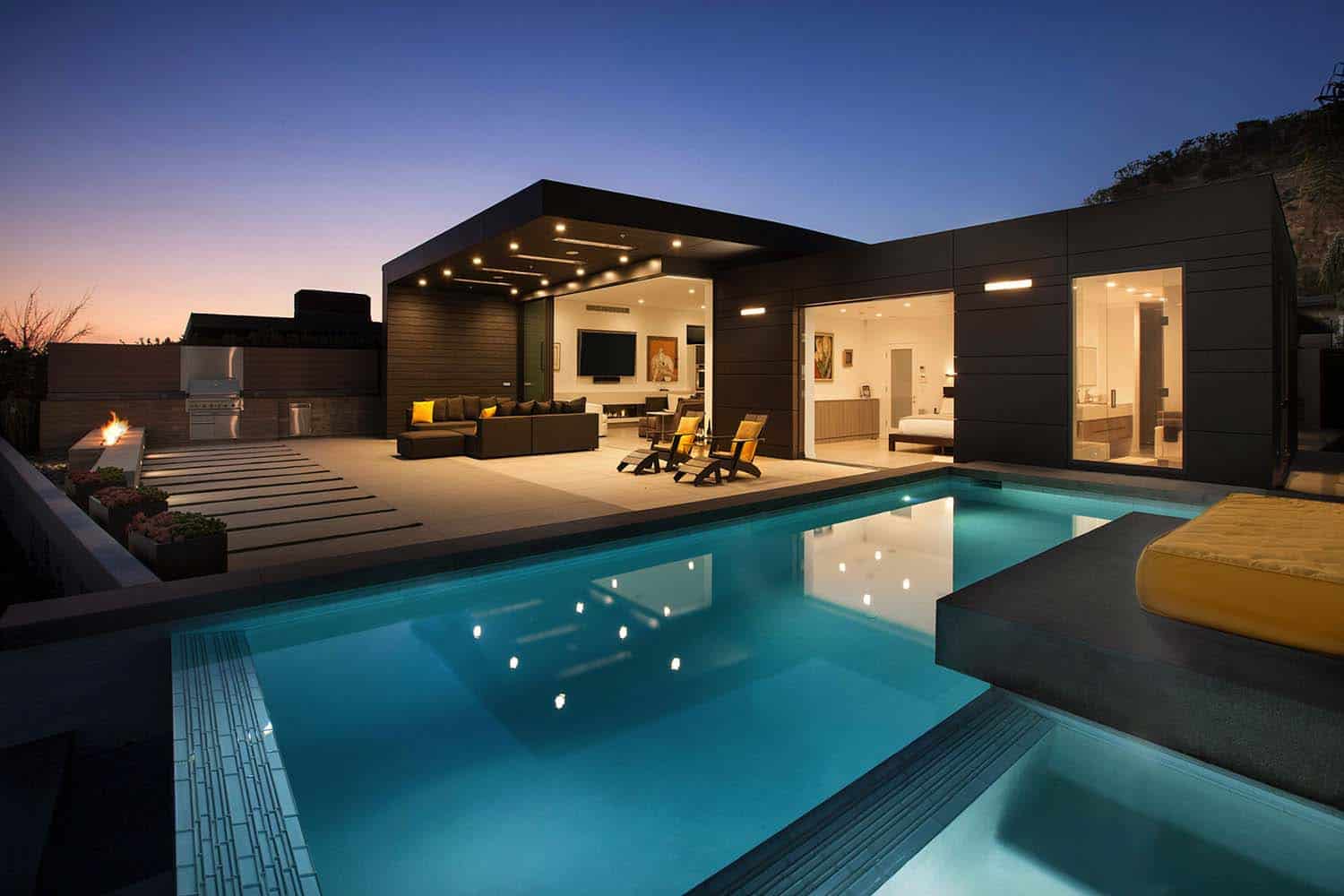
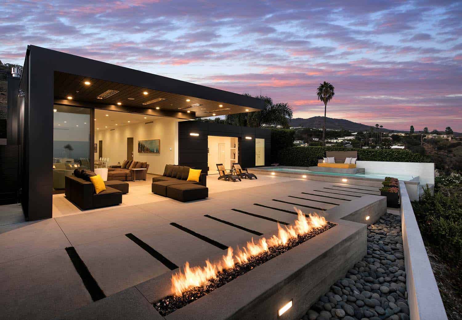
Above: At the rear of the property, a seamless indoor/outdoor connection creates a nice flow for entertaining.
What We Love: This interiors of this contemporary home offers an open and harmonious layout, making smaller spaces feel more substantial. The minimal styling and cool-toned neutral color palette, makes for a more simplistic lifestyle. Loving the seamless indoor-outdoor connection and how the spaces are maximized to take advantage of the views…. Readers, please share what you think of the design of this home. If you could change one thing, what would it be?
Note: Have a look at a couple more amazing home tours from the talented works of Abramson Teiger Architects: Modern mountain retreat melds into the Teton Mountain Range and Loft-like modern treehouse features luminous interiors in LA.
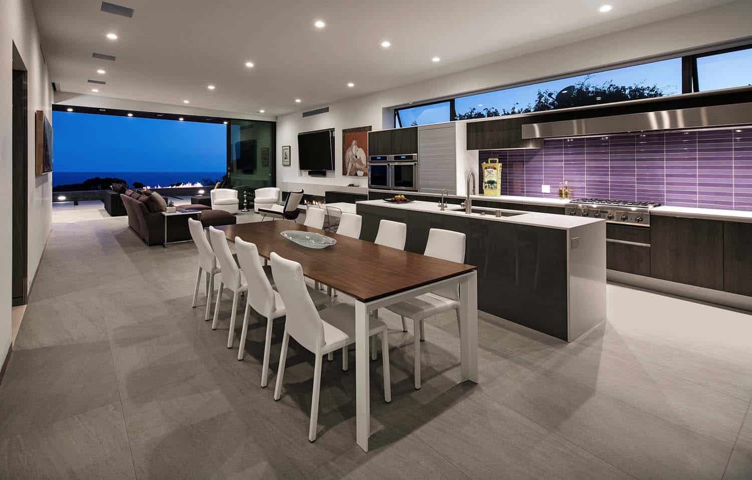
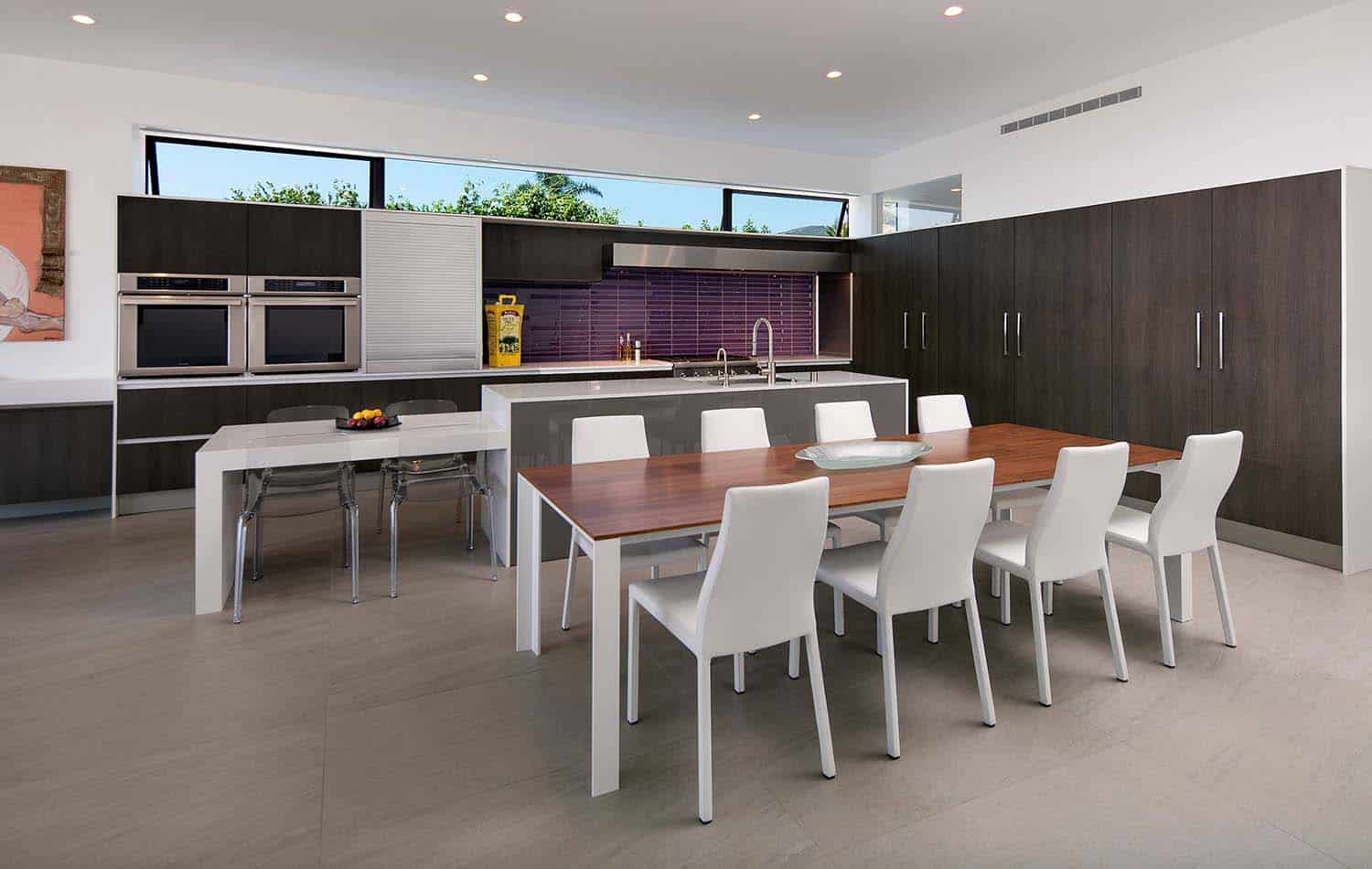
Above: The minimally designed kitchen showcases a bright burst of color with its purple mosaic tile backsplash.
Above: Even in the intimate spaces such as this master bathroom, you are able to enjoy the views of nature. An expansive window in front of the bathtub overlooks the patio outside. To give this space privacy, the glass becomes opaque when the lights are turned on.
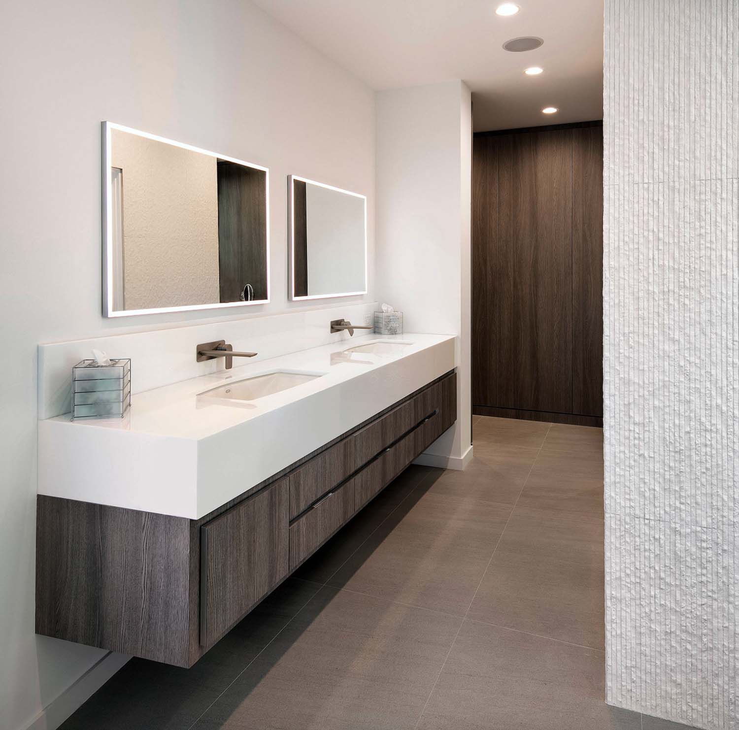
Above: The bathroom features sleek, clean lines, while texture is added through a marble mosaic tile accent wall.
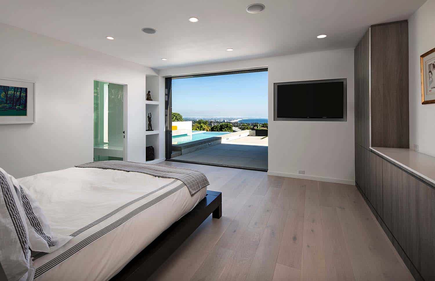
Above: In the master bedroom, an indoor-outdoor connection is made through pocketing sliding glass doors.
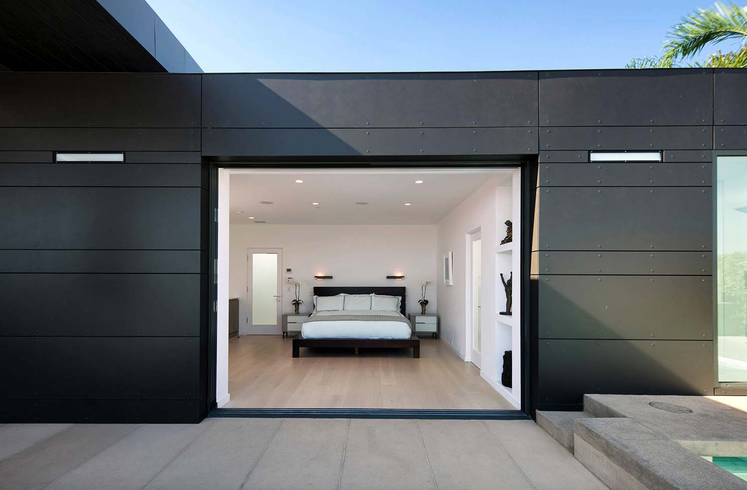
Above: The master bedroom offers access to the expansive outdoor patio. Dark metal siding on the exterior facade adds visual interest with its subtle stripes in varying widths.
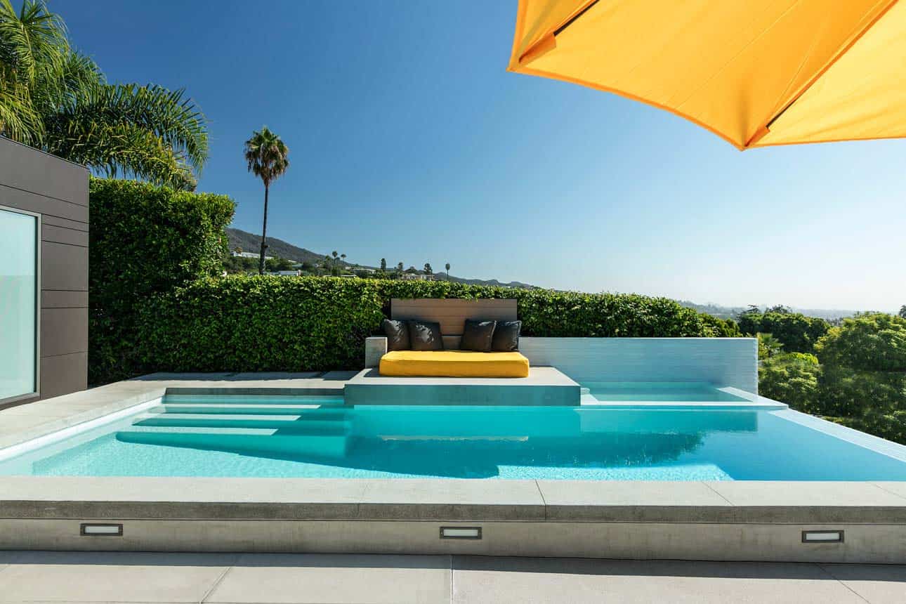
Above: An infinity edge swimming pool offers sweeping views of the Pacific Ocean below.
Above: A built-in, low profile fire pit is paired with shorter succulents to maintain in order to not obscure the views beyond.
Photos: Jim Bartsch






8 comments