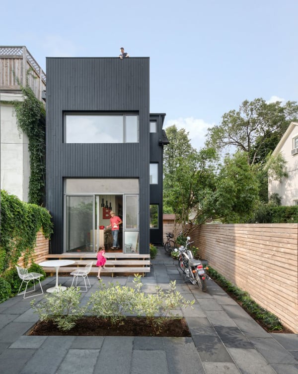
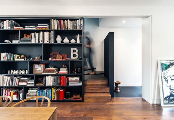
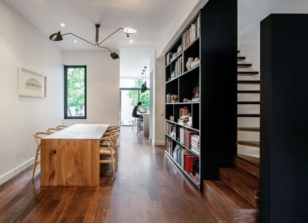
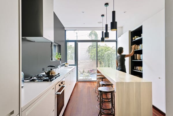
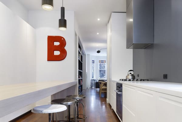
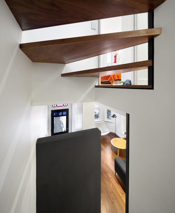
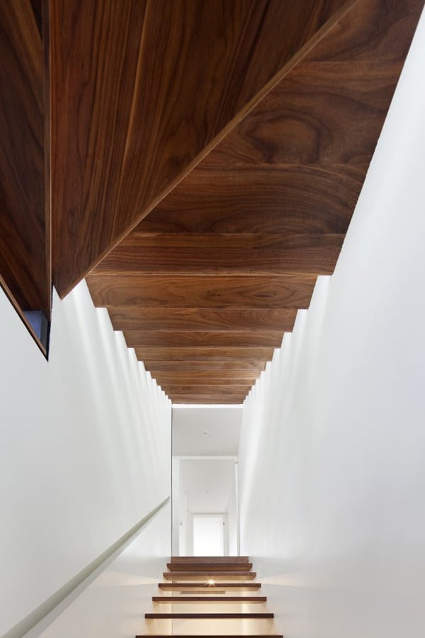
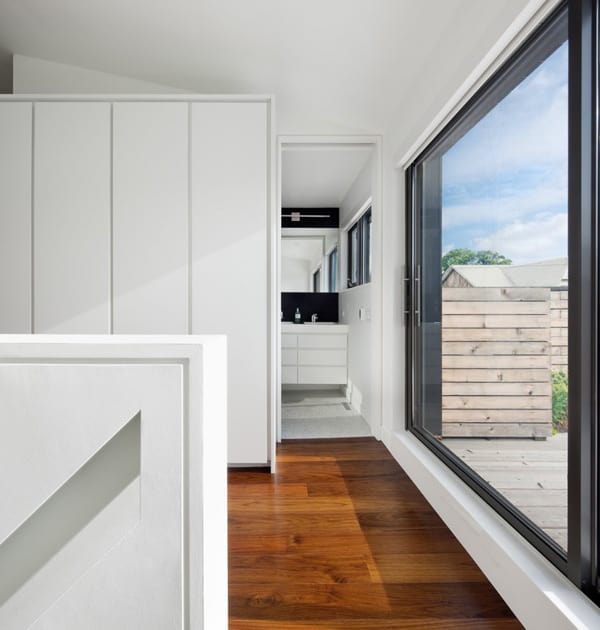
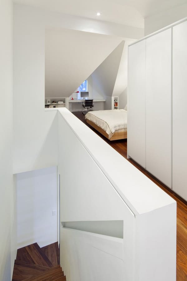
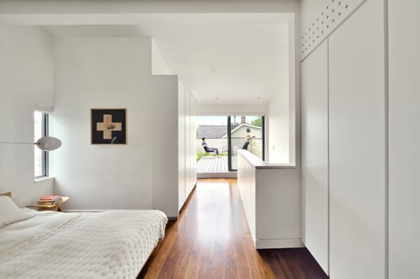
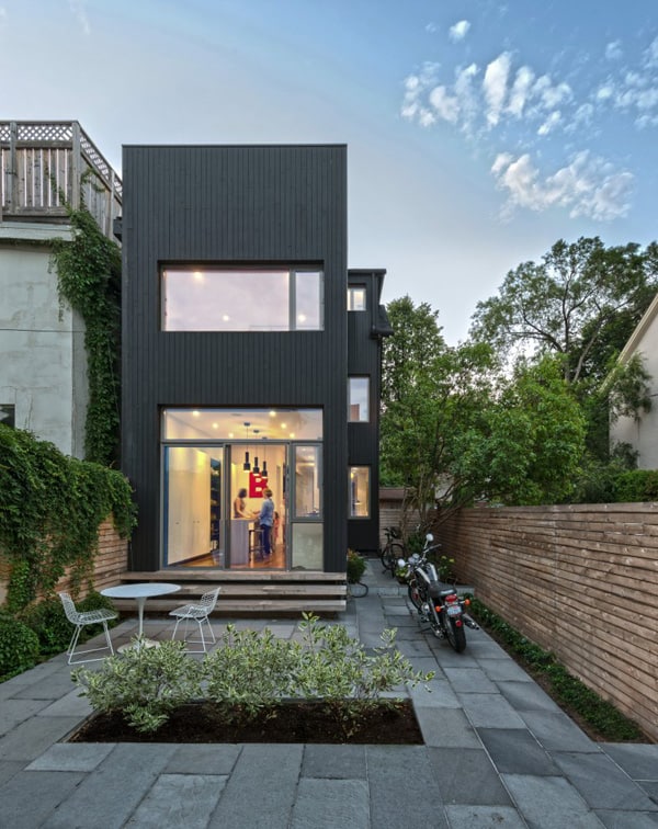
Contrast House is situated on a corner lot in a dense neighborhood of Toronto, Ontario, Canada, designed by Dubbeldam Architecture + Design. The intent of the remaking of this narrow 125-year-old residence was two-fold: to increase natural light in the interior using contrast, and to reduce the house’s ecological impact. An increase of natural light is accomplished through both physical and perceptual means. Physically, the long, narrow house – only 11 feet wide on the rear facade – was reconfigured to allow direct sight lines to new window openings. Perceptually, contrast was used as a means to “brighten” internal spaces without direct access to natural light. Contrasting elements are placed in proximity to produce an intensified effect. At each level, the stair is punctuated by a black element to define space — be it floating bookcases housing the owner’s collectibles, or a chalk board wall for play — and to create contrast to visually intensify the natural light spilling down from above.
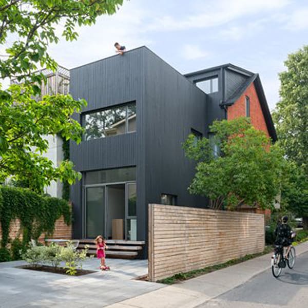
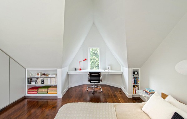
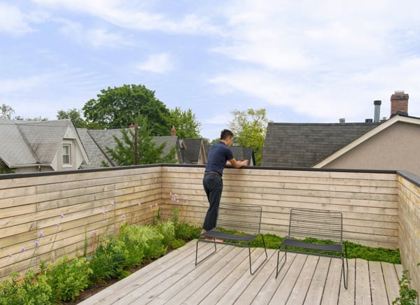
The monochromatic palette — walnut floors, white and dark gray walls — highlights the house’s architectural forms and lines, but is animated by the family’s collection of colorful furniture, art, books, and toys. The tonalities and concept flows from inside to out. Clad in black-stained cedar vertical boards soaring upward to conceal the modest roof deck behind, the exterior is a bold counterpoint to the red brick Victorian dwelling to which it is attached. Many passive sustainable systems are employed to minimize environmental impact. The reconfigured layout, location of the stair and new operable windows maximize natural ventilation, stack effect, and daylighting, reducing the need for both air conditioning and artificial lighting. Integrated with the roof deck, a green roof absorbs rainwater and provides a cooling effect for the upper floors, further reducing the dependency on utilities.


0 comments