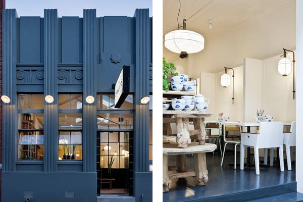
Hecker Guthrie’s design for the new ‘David’s’ restaurant draws on the heritage of Old Shanghai whilst breathing new life into the historic Melbourne, Australia warehouse building. Serving the cuisine of Shanghai, the restaurant is loved for its authentic yum cha, but until now its interiors – in traditional Chinese red – had been better suited to evening dining than to daytime use. The new design plays on honesty, simplicity and homeliness and references traditional Chinese elements in a contemporary manner.
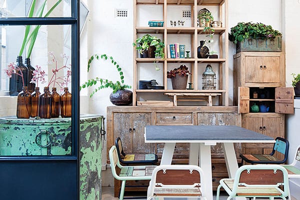
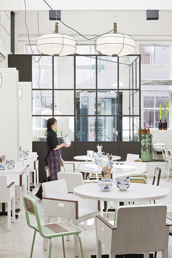
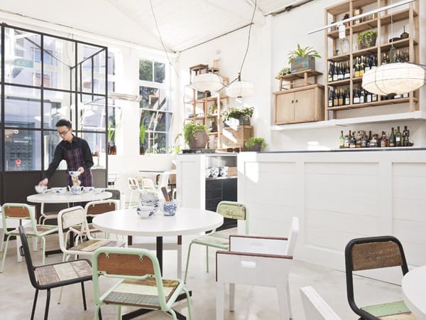
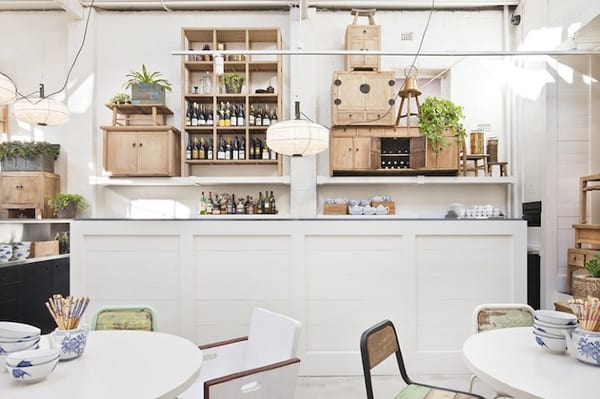
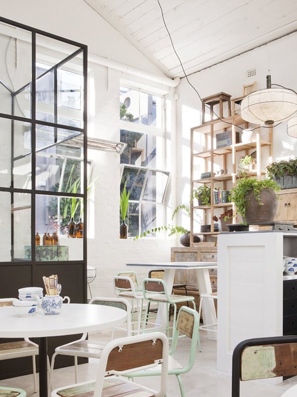
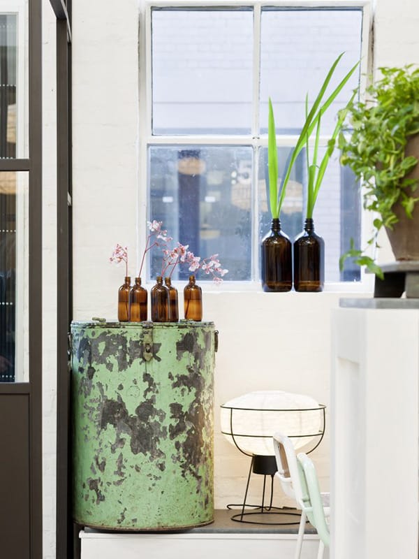
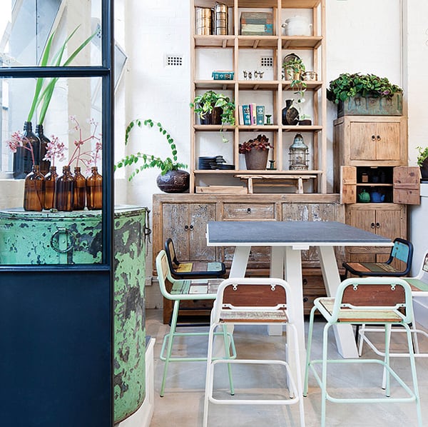
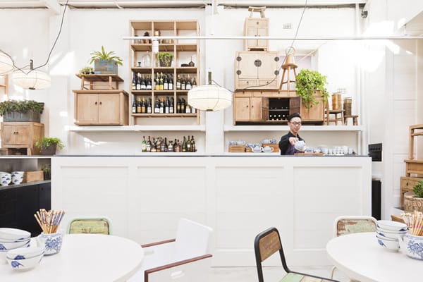
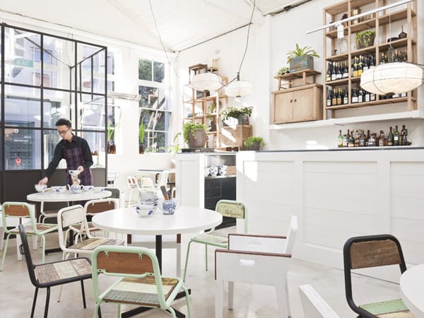
A pared-back space in white – combined with pastels, weathered timber and semi-industrial objects – the redesigned David’s is casual, chic and coolly contemporary. Hecker Guthrie stripped away the plaster walls and ceilings of the existing eatery to reveal the architecture beneath, including exposed beams and Georgian wired-glass windows. The rest was achieved through careful selection of off-the-shelf furniture, lighting and accessories, arranged against a pure white backdrop.
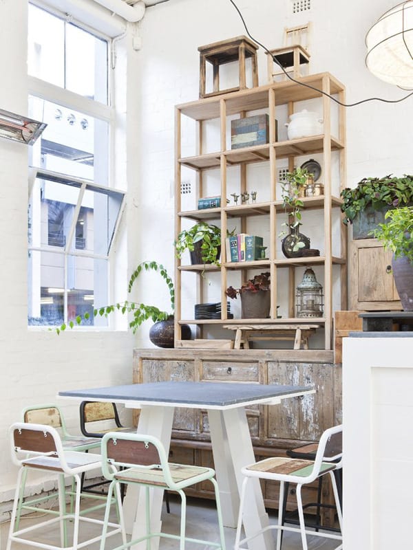
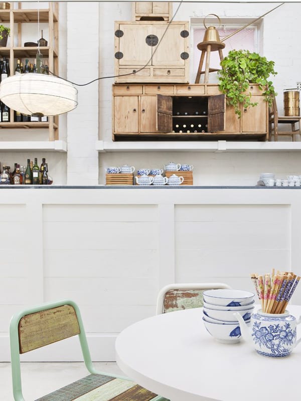
Elements like shelving, cabinets, waiter’s station and wine store were created out of loose elements rather than the use of joinery. According to the designers, they placed ‘precariously stacked furniture all the way along one elevation, bridging the gap between decorative and practical.’ Although traditional Chinese red was abandoned, a subtle nod to old Shanghai can be seen in the Arik Levy pendant lamps, which reference Chinese paper lanterns.
Photos: Shannon McGrath


0 comments