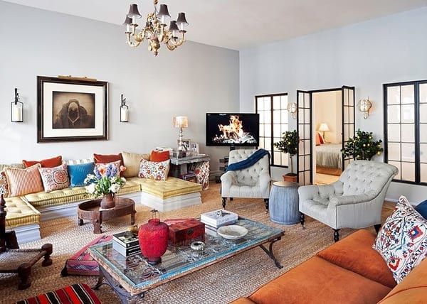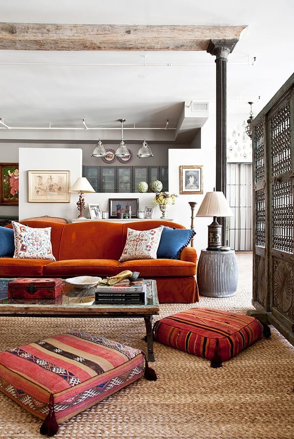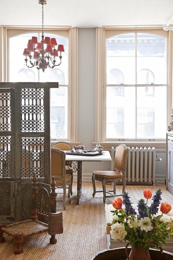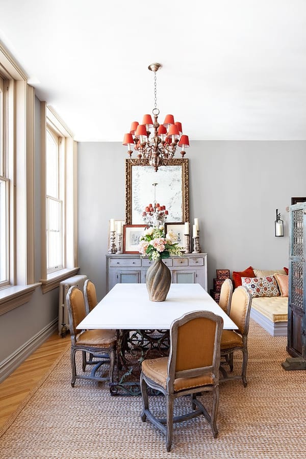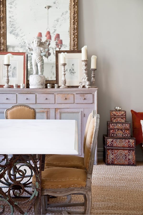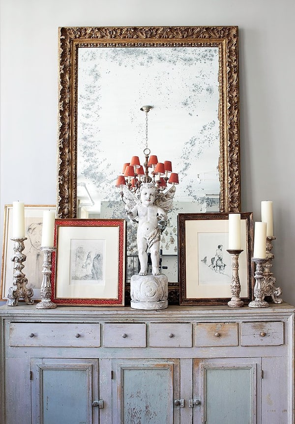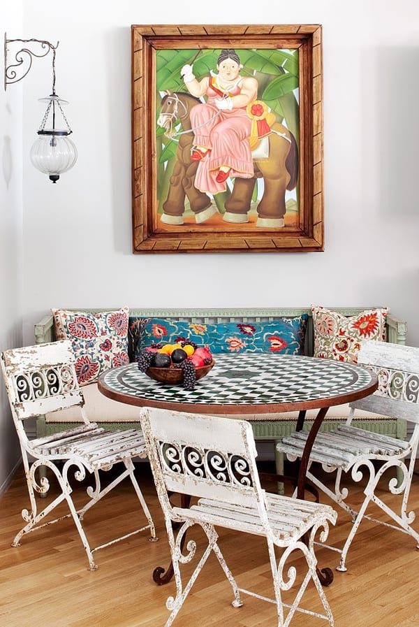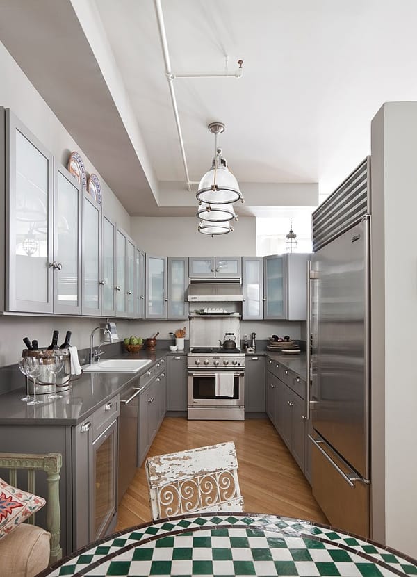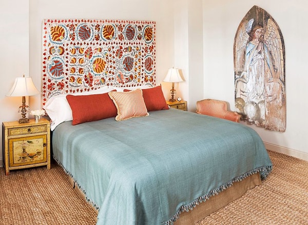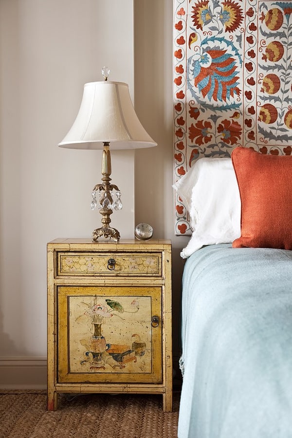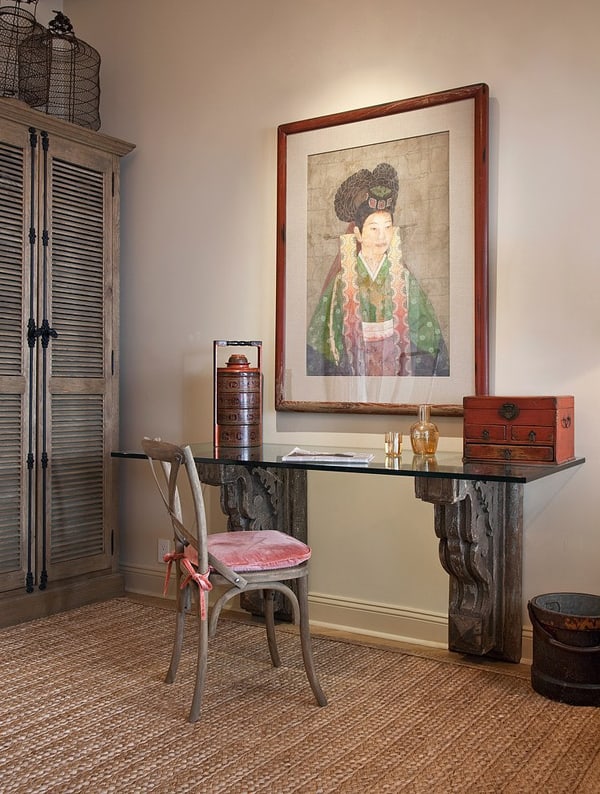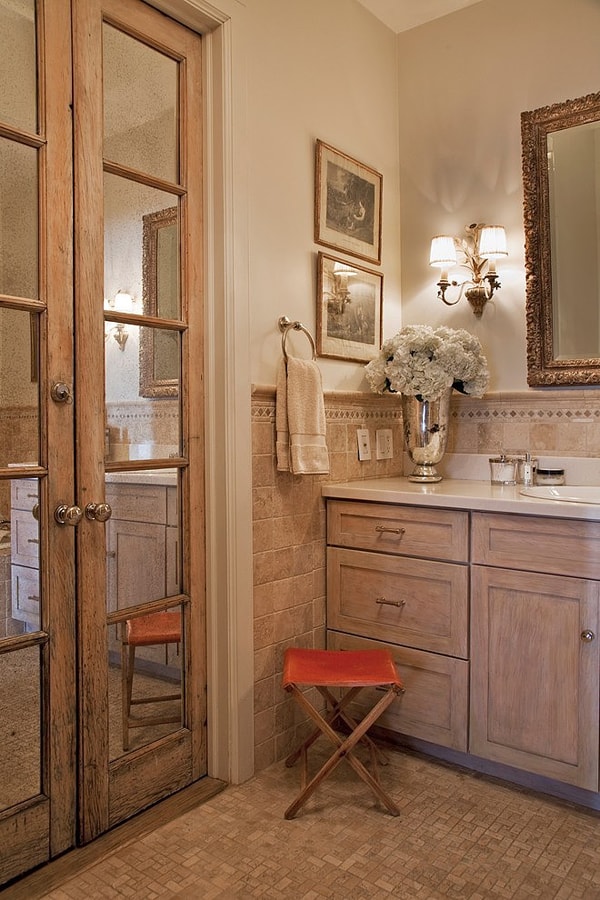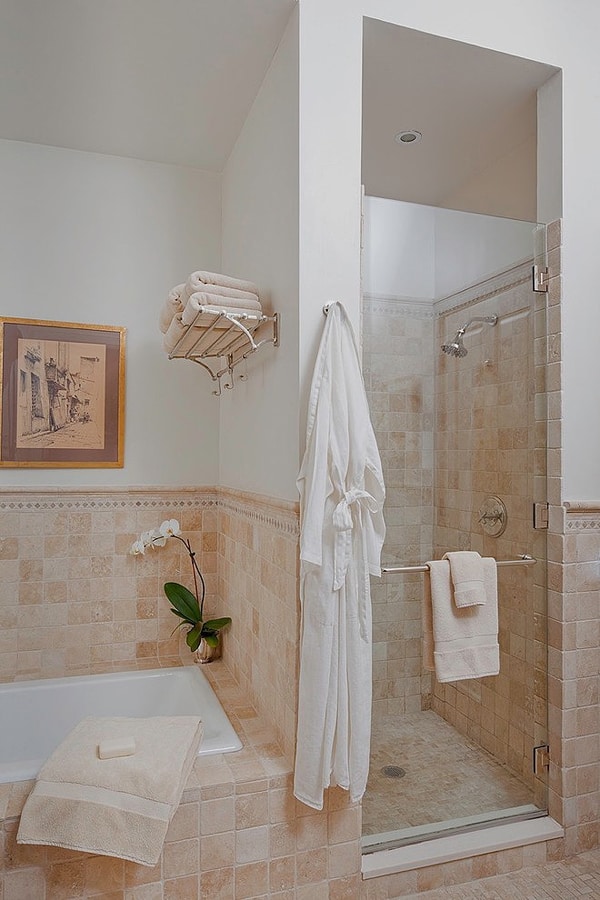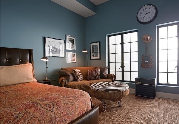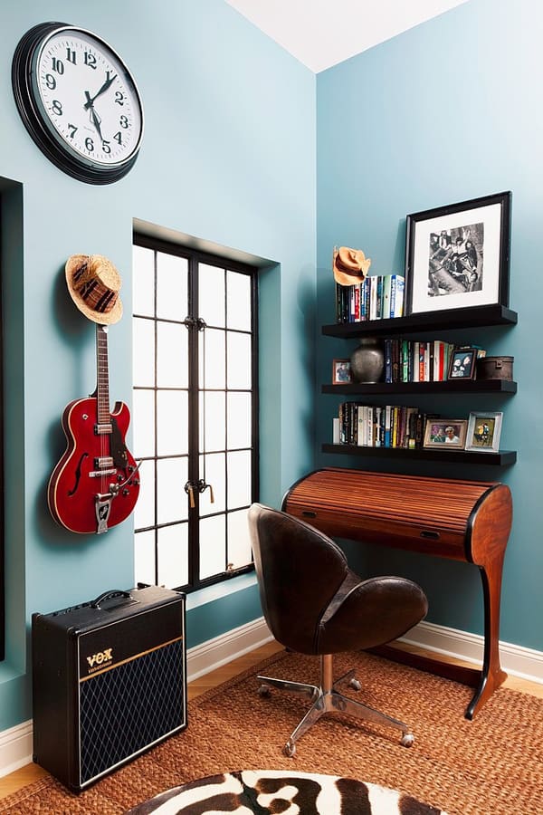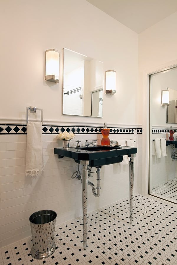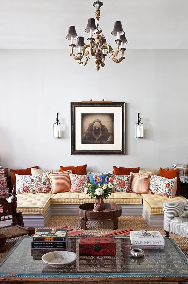
This stunning TriBeCa, New York loft has been designed by Deborah French Designs with a very eclectic, yet cohesive, mix of textures, colors, periods, and styles. Designed as her personal home, the designed has traveled extensively during her life, especially throughout Europe and Asia and therefore incorporated elements from both, as they are integral to who she is and how she has personally evolved both aesthetically and spiritually. Deborah has woven together styles from a diverse mix of history and cultures, including Italy, Morocco, India, France, China, America, Afghanistan, and Africa, creating an environment that is both warm and welcoming yet, at the same time, sophisticated and elegant. Her integration of both ‘high and low’ components within the various elements of the design is a critical factor in creating this perfect balance. No matter where one looks the eye is always pleased and the soul soothed. “Once inside, no one ever wants to leave,” she says.
Oh my…so ironic to criticize one’s “tastes”, then go on to use phrases like “barf in a blender”. I’ll say no more about that. I had seen some of these photos posted on houzz, and loved the way this abode was put together. Deborah was so generous and kind to answer questions from posters, and went so far as to divulge sources. I thanked her for that on the houzz forum. It’s so much easier to run to a furniture store (or two, or three), pick out a “style” then arrange it neatly into each room. However, to “collect”, rather… Read more »
No one cares.
you find this barf in a blender “beautiful, warm, comfortable (you love the “mattress” sofa) and interesting”, and some of us don’t. Get over it.
Gray walls and blood-orange accessories never looked so hideous together. Throw in some shabby-chic furniture. Throw in some Asian. Throw in a modern stainless steel kitchen. It’s kind of like barf in a blender. I don’t know what’s worse: no taste at all…or too many tastes, all of which clash terribly. Eclectic can work if there is a logic to it. But this was just random styles thrown around at the designer’s whim. It gives me a headache looking at it. Note to owner: thin out about half your furnishings.
Even with all the colors, patterns and accessories the rooms look very elegant, neat almost minimalist, allowing each piece to make a big statement. Absolutely stunning work.
4 comments