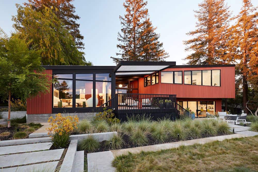
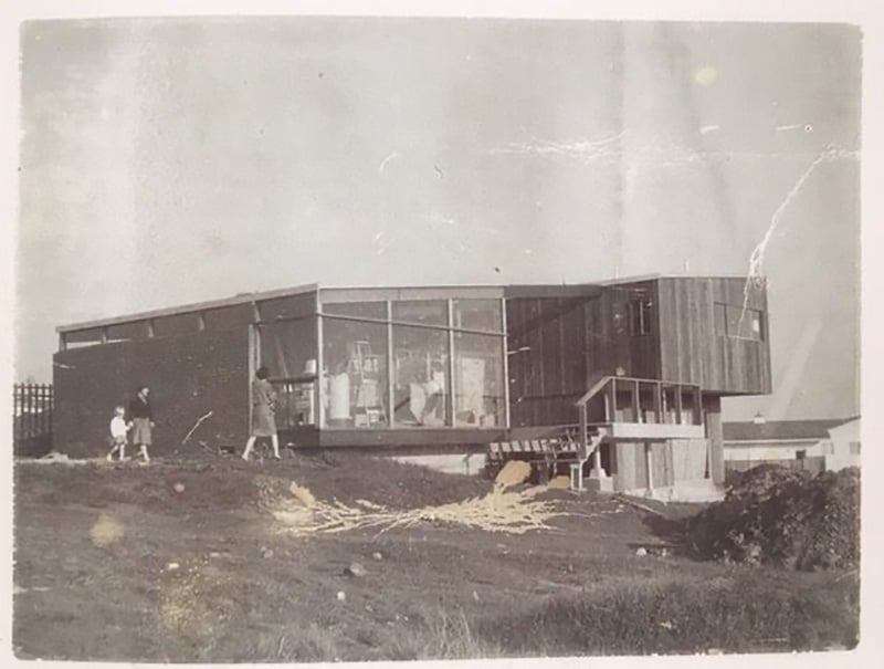
Klopf Architecture is responsible renovation and addition of this midcentury modern home located in Stanford, Santa Clara County, California. The Roger Lee designed house from 1962 was purchased by the current homeowners in almost original condition, as the previous owners elected to defer most maintenance projects over the years. Roger Lee was a notable Chinese-American architect known for his modernist style that reflects grace and clarity. He designed high style for the middle class, with extensive use of walls of glass and redwood panels.
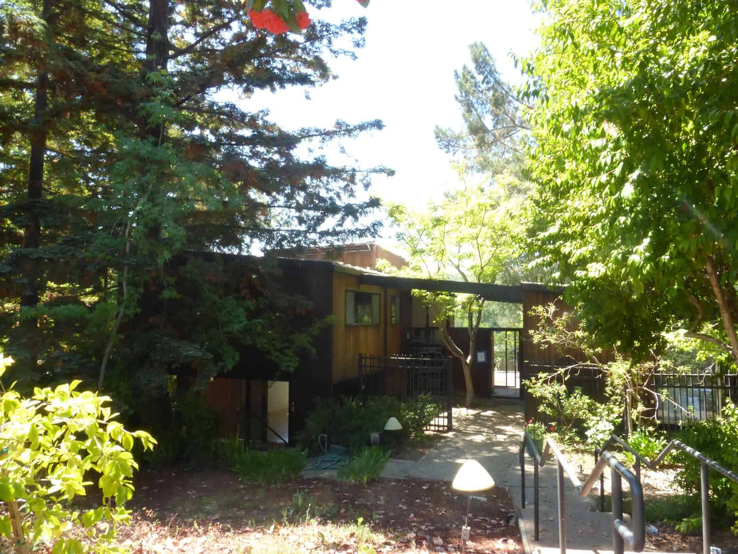
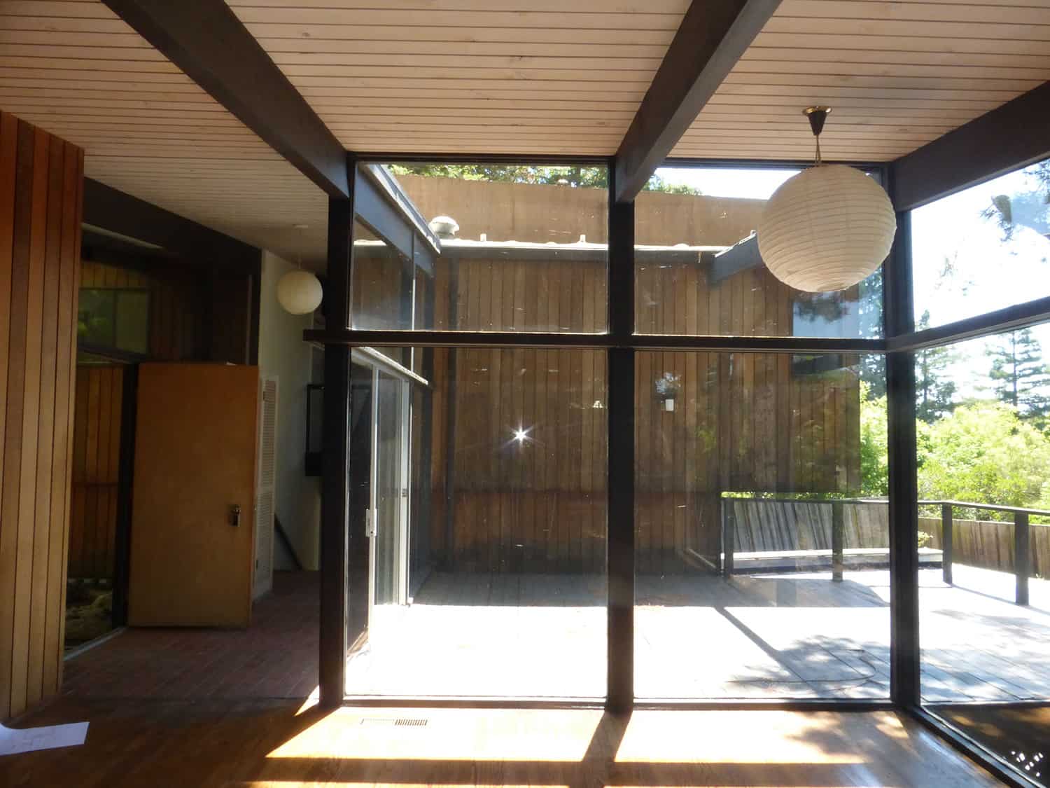
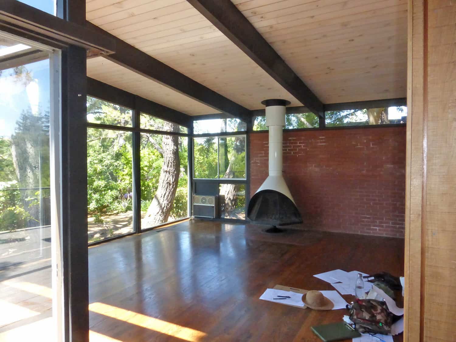
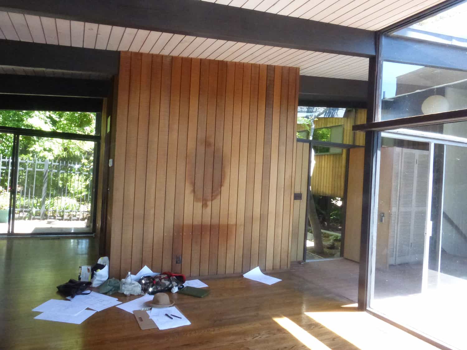
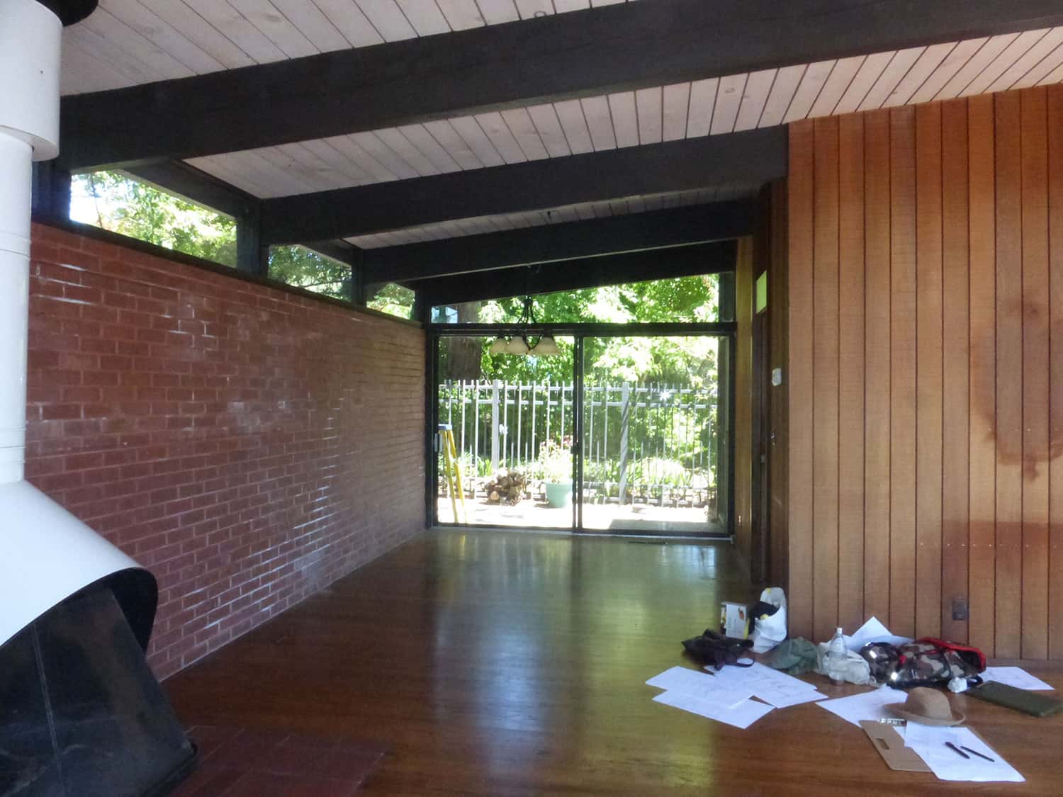
The owners were able to see beyond the dated materials and finishes, single-paned glass, and uninsulated walls and they approached Klopf Architecture to help them expand and update the entire home, one the family could settle into and enjoy for years to come. Continue below to see pictures of this home before the remodel!
DESIGN DETAILS: ARCHITECT Klopf Architecture CONTRACTOR ORB Construction STRUCTURAL ENGINEER Sezen and Moon LANDSCAPE ARCHITECT Outer Space FURNISHINGS AND DECORATION Urbanism Designs
It was important that the new designs were aligned with Lee’s original intent not only because of the client’s appreciation for mid-century modern architecture, but also because the house was deemed historical. The Stanford Real Estate Office requires a stringent design review that safeguards the integrity of the community, which Klopf Architecture was happy to oblige going into their updated designs.
As with many original mid-century modern homes, the house was scaled to the 1960s lifestyle where rooms were smaller and openings to views were limited and tightly framed. The original conditions defined the direction the family of four would take in updating the house and making it comfortable for their modern lifestyle.
Klopf designed a full gut remodel and a major addition to bring the house into the 21st century and provide the living area needed for the client’s family.
The newly expanded house added just about 1,100 square feet to create an airy, comfortable, and family-friendly house, taking full advantage of the beautiful southwestern views that extend out to the hills beyond. The enclosed garage created an additional 240 square feet of covered space for long-term storage.
A cracked swimming pool created an eyesore taking up a majority of the backyard landscape, so it was one of the first elements to go during the transformation.
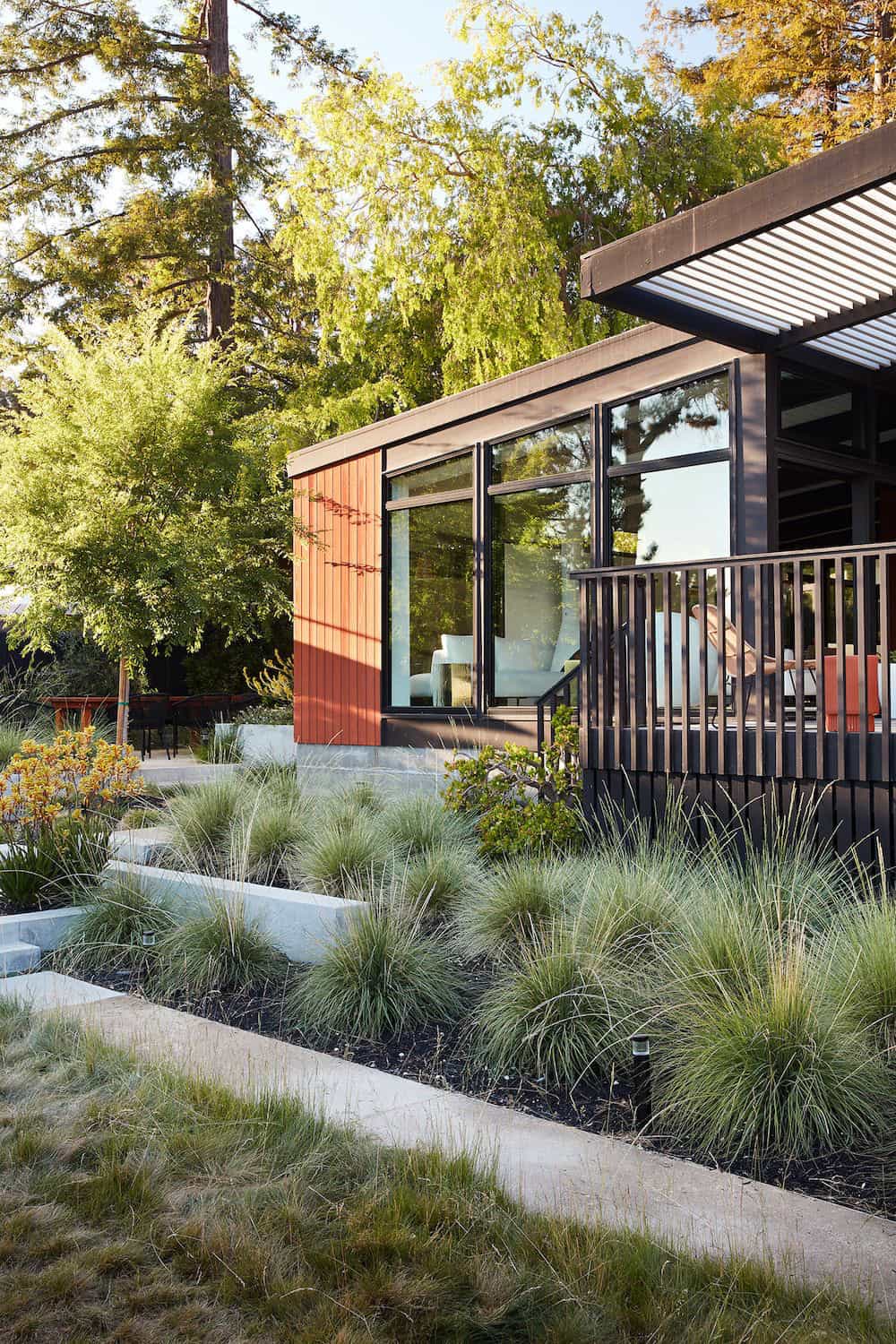
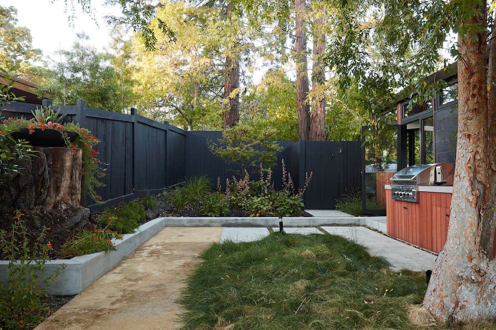
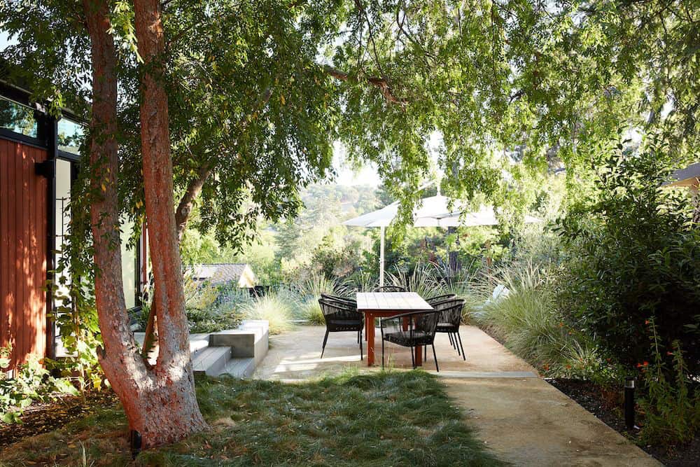
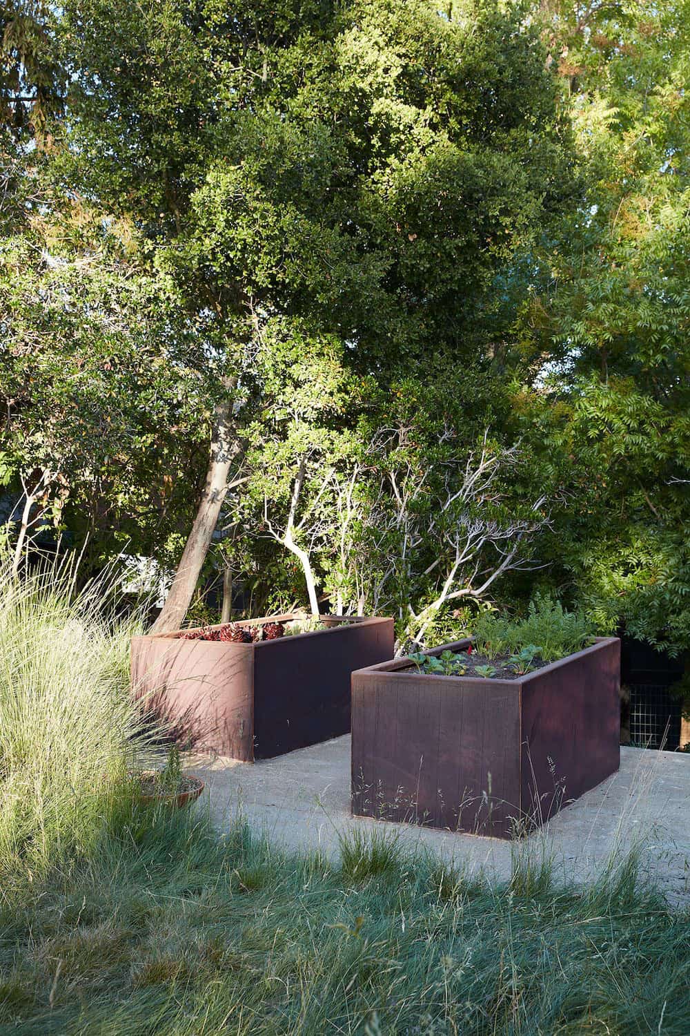
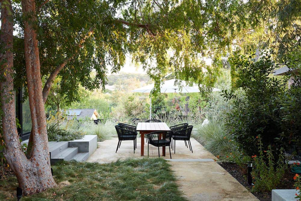
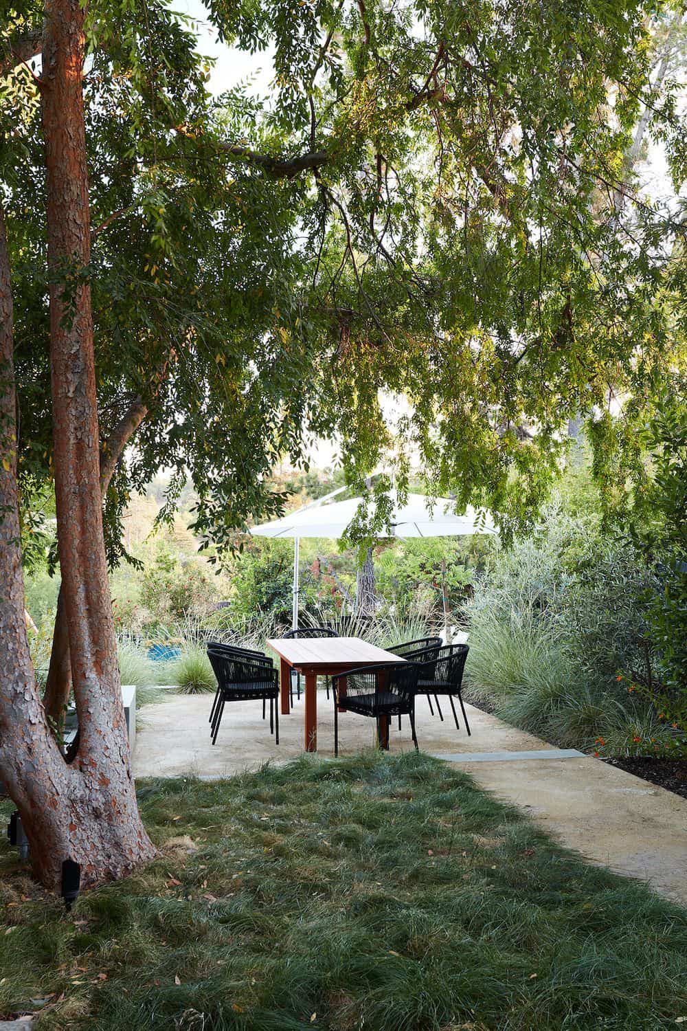
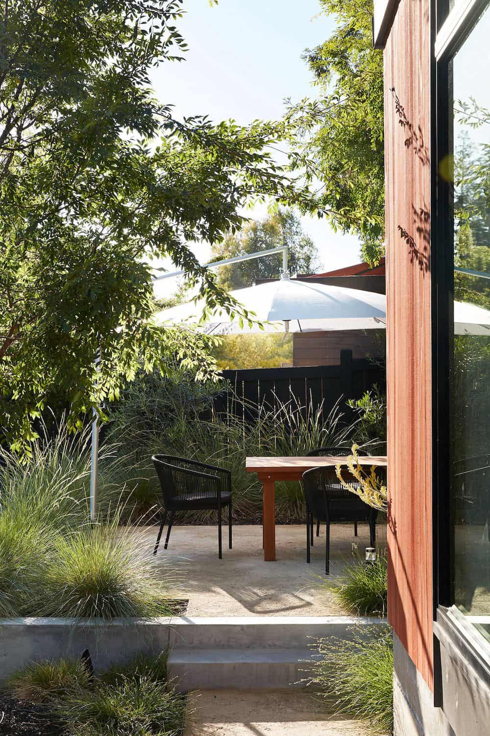
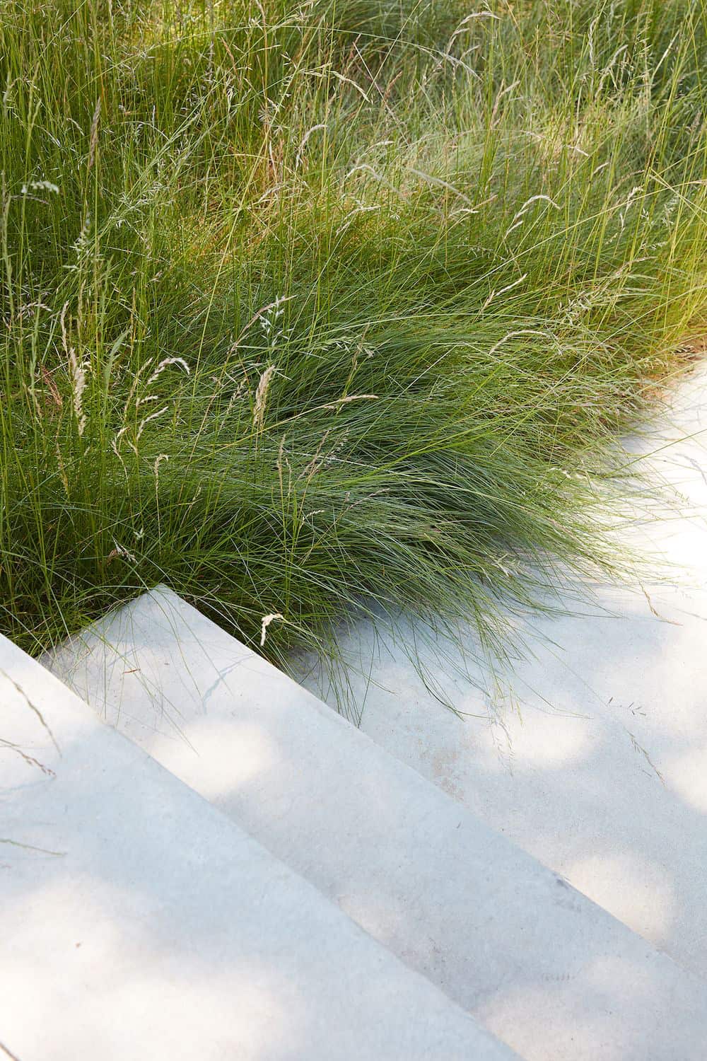
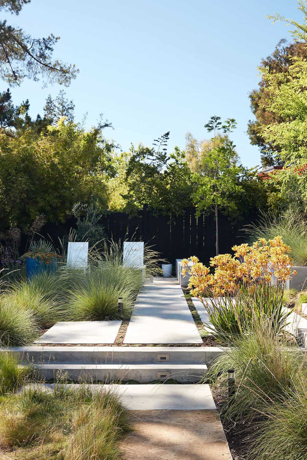
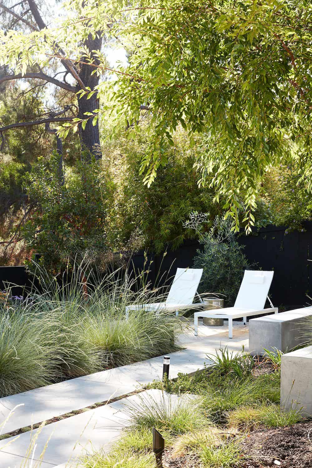
Working with Outer Space Landscape Architects, the family asked for a mix of relaxing outdoor patio spaces that eventually blend into the native landscaping, extending their views outward toward the natural greenery of the trees beyond their property.
Filling in the old pool was a smart way to expand the living spaces outward. The orientation of the house was designed to enjoy the views, but the original architecture provided the first homeowners with mere glimpses of the landscape outside.
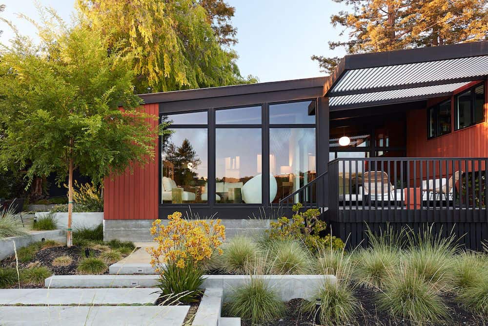
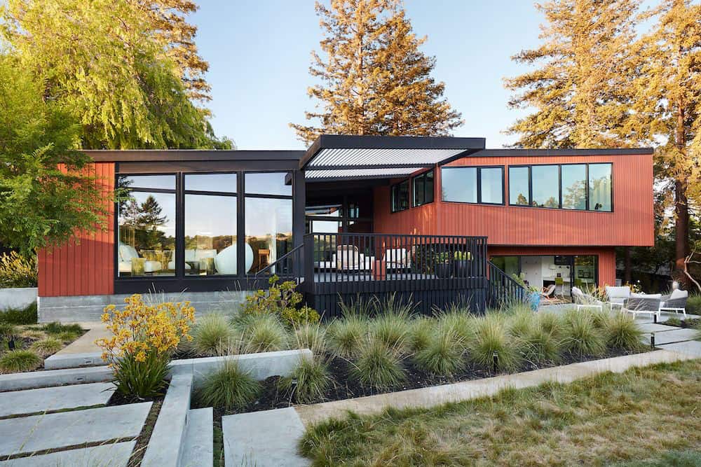
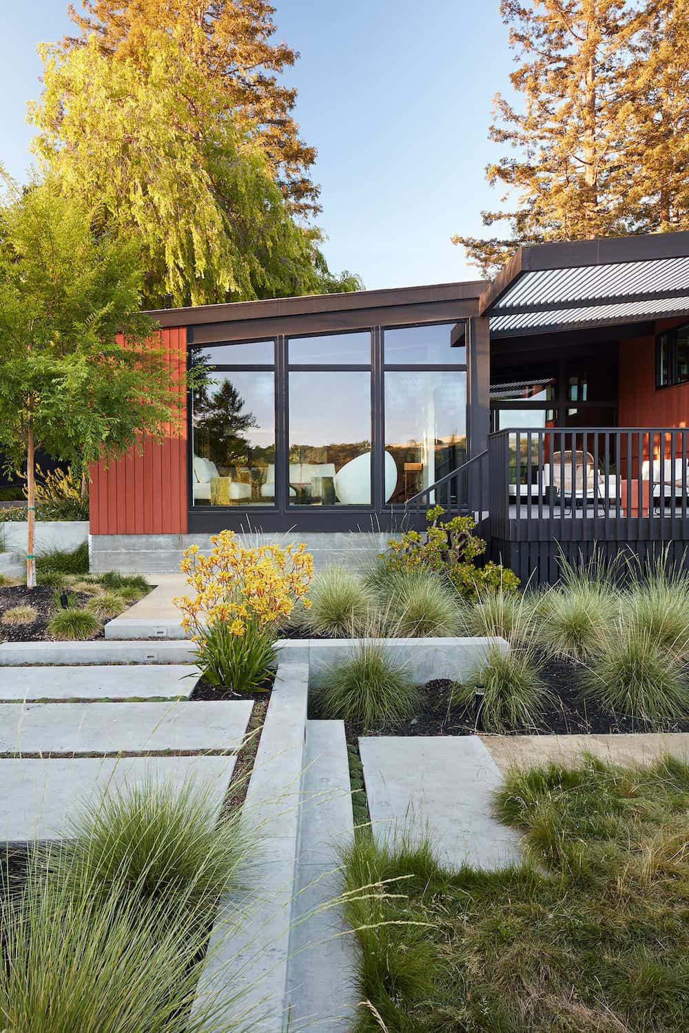
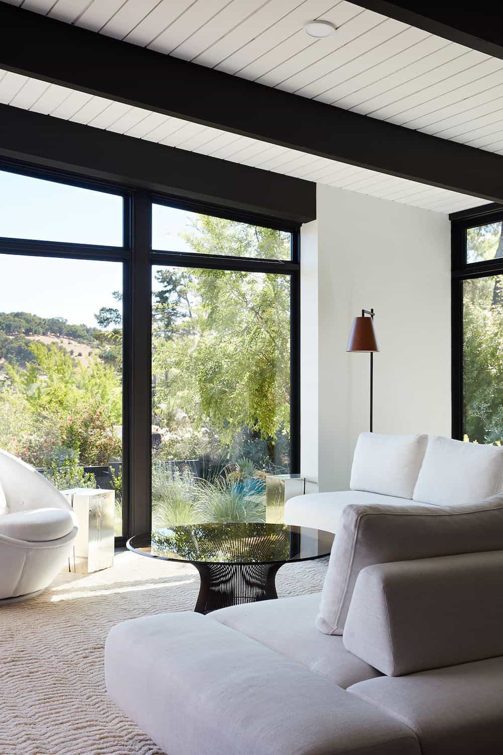
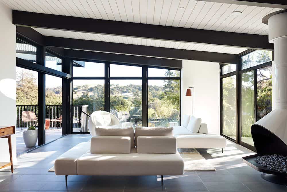
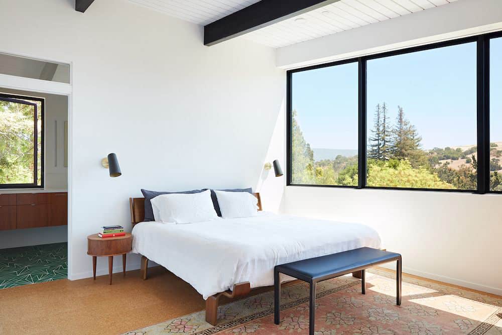
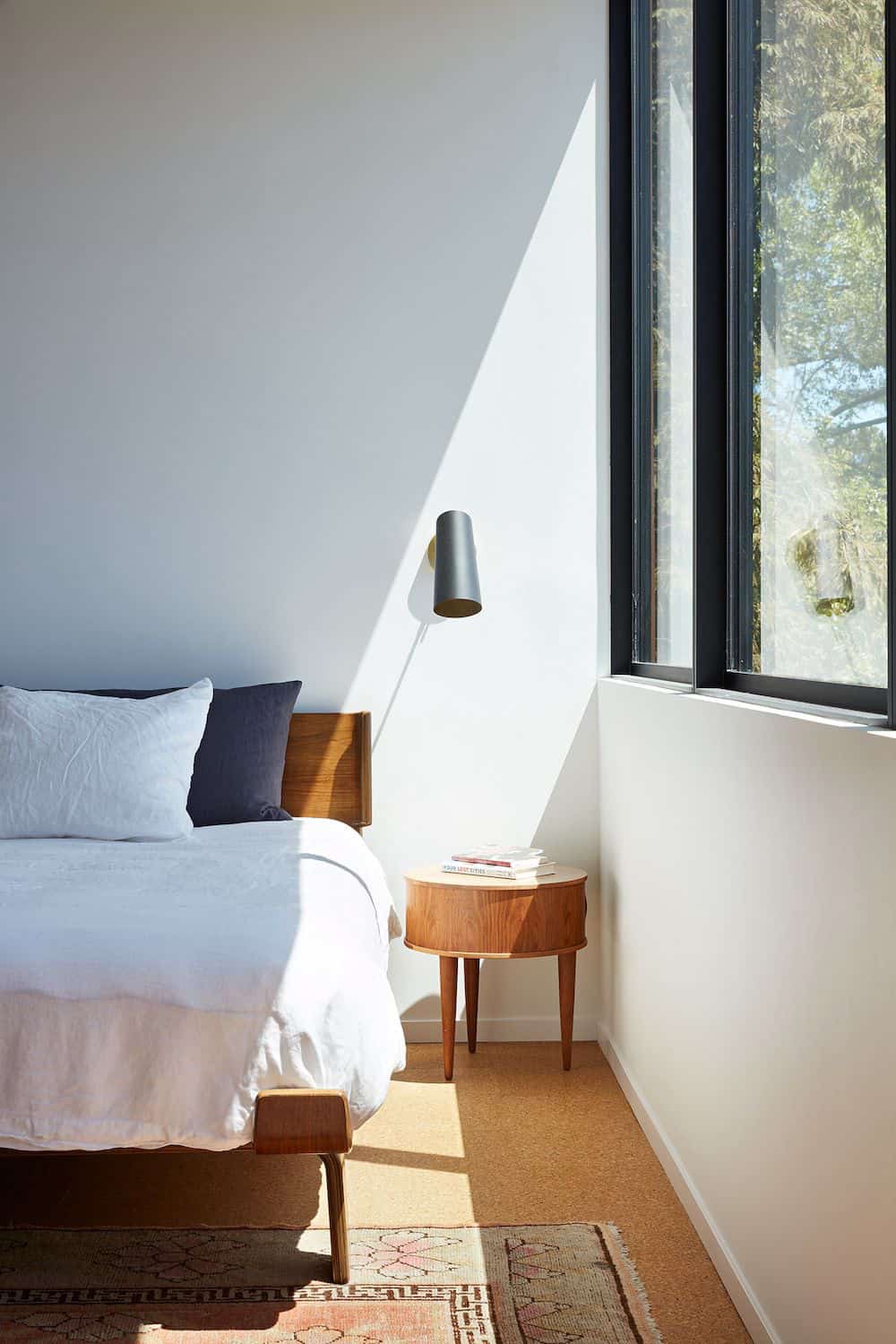
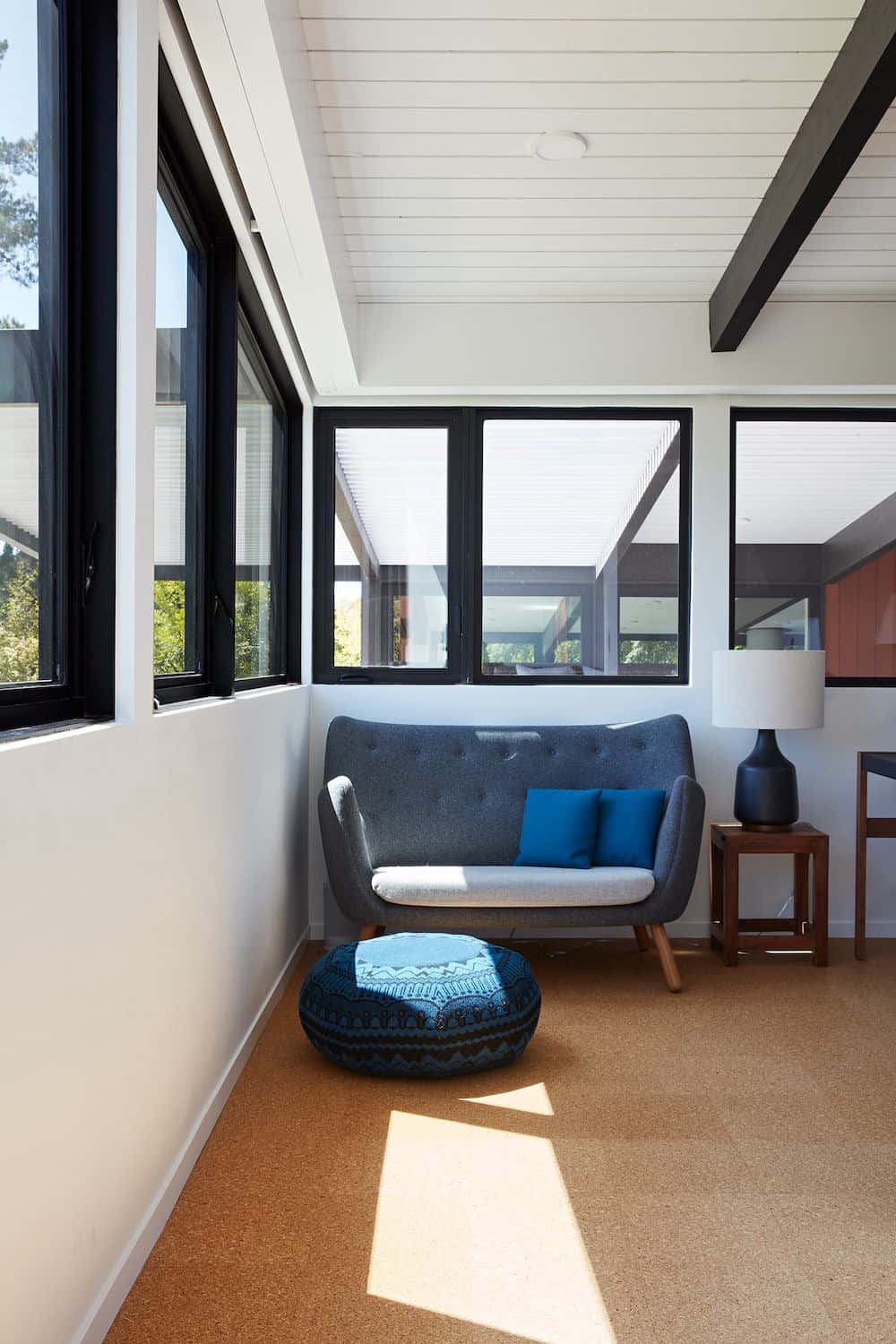
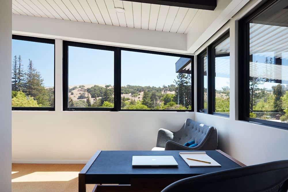
Klopf was able to broaden those views, continuing and extending on the original architecture to take full advantage of the unobstructed natural views across the rear facade of the house. Small horizontal openings in the primary bedroom and office were replaced with much taller windows that now follow the angled roofline upward, extending across almost all of the facade.
The architects worked with Western Windows, whose designs included an oblique-shaped, operable casement that allowed our design to rise with the slope. A new corner office added to the primary suite, offers a bright and functional work-from-home solution that looks out at the distant views and added natural light from the expanded window configuration that now wraps around the corner.
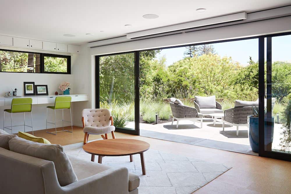
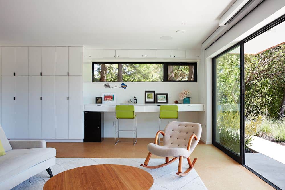
The existing lower level was designed by Lee as a utilitarian space, serving as a wet pool room with a drain in the center of the floor, bathroom, laundry, and storage areas. Without the need for a pool room, Klopf was able to convert the area into a much more comfortable and functional living space with a new family room and guest suite. The new spaces enjoy easy access to a new outdoor patio through floor to ceiling, full-width glass sliders.
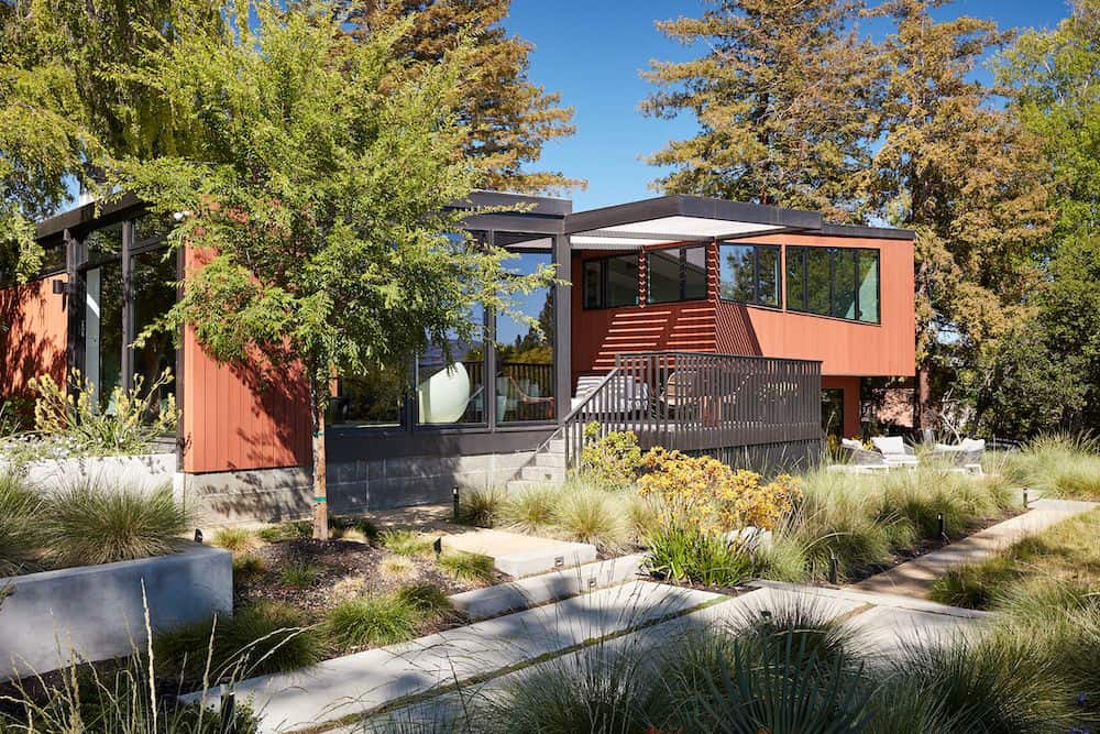
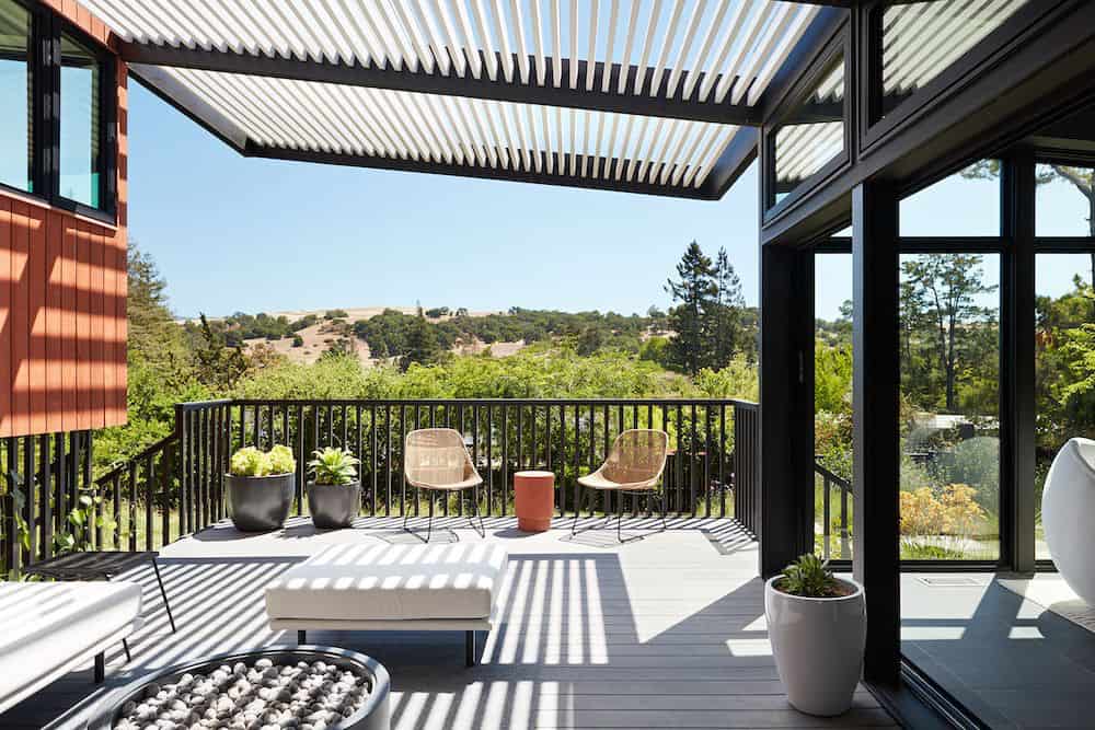
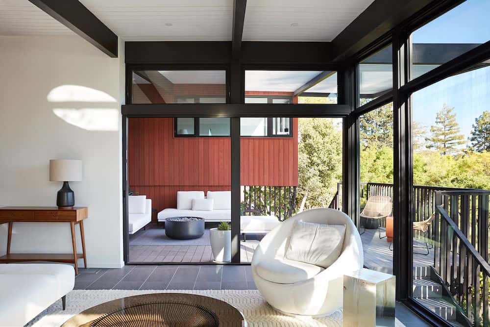
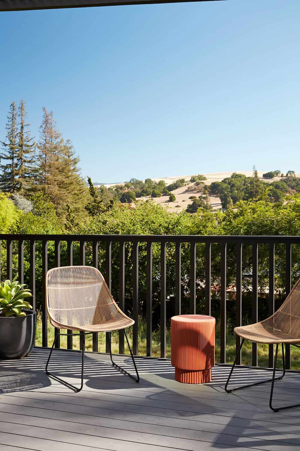
Continuing along the rear facade, a previously exposed deck extending from the living room and hallway provided access to the backyard through a single set of stairs leading toward the side of the house which made sense when the pool was in place. The new deck was re-envisioned as an extension of the main living room and now serves as a second outdoor living room.
A new slatted pergola above provides the homeowners welcome relief from the hot afternoon sun. A second set of stairs now creates a better connection to the redesigned lower level. Klopf was able to reconfigure the spaces, extending the living room outward toward the views, where the family now claims it as the heart of the home, spending a large majority of their time outdoors.
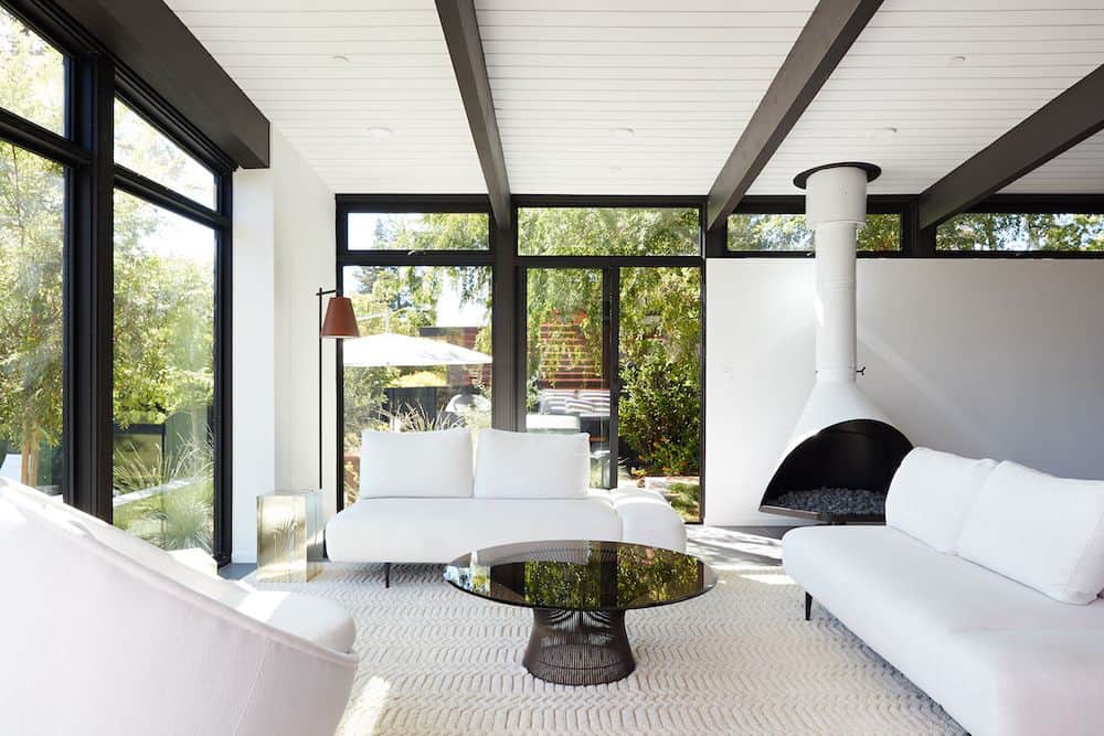
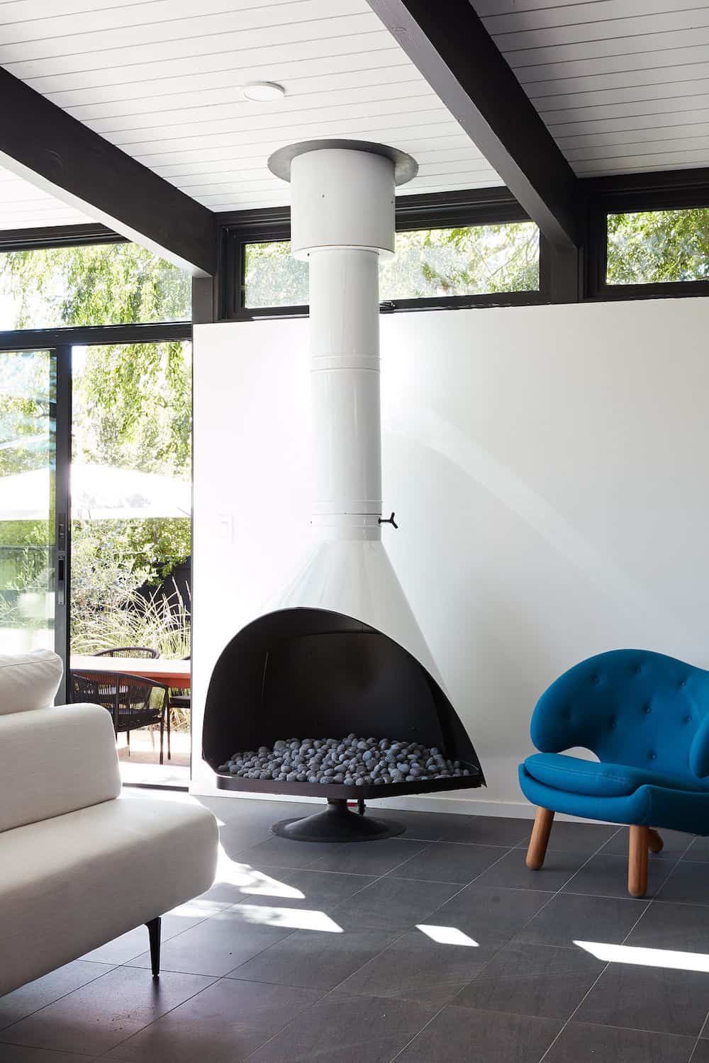
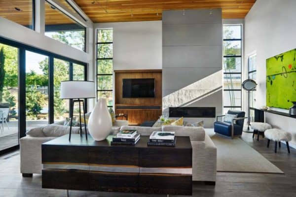
Back inside, the original wood-burning Malm fireplace was beautifully restored and a gas burner was installed to comply with California’s strict air standards. It now rests in front of a wall of Heath accent tiles where a dated red brick wall used to stand. A new taller window brings more light and views into the refreshed interior living room.
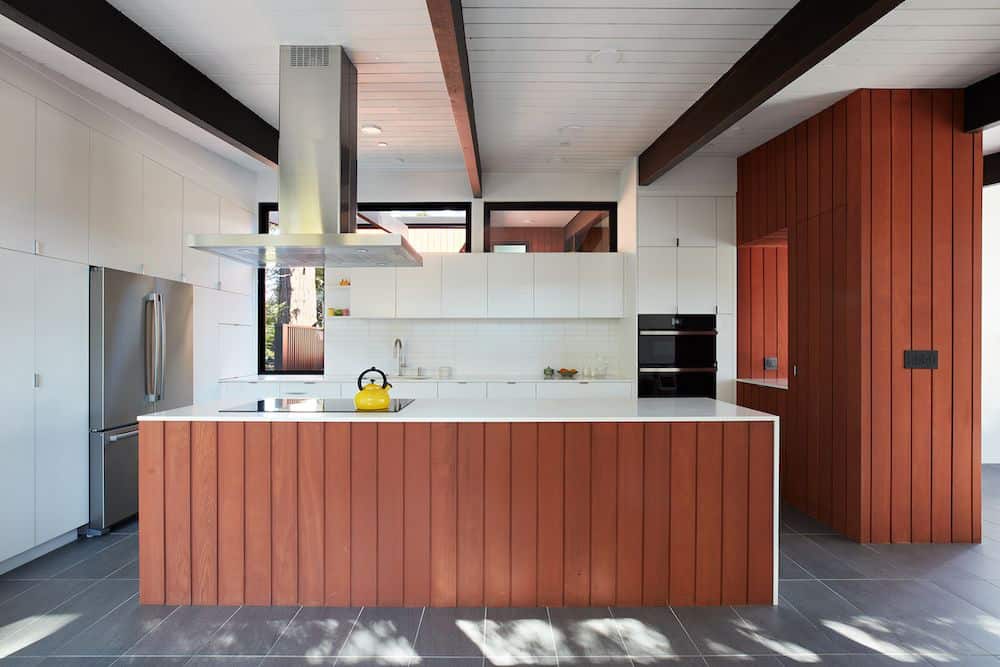
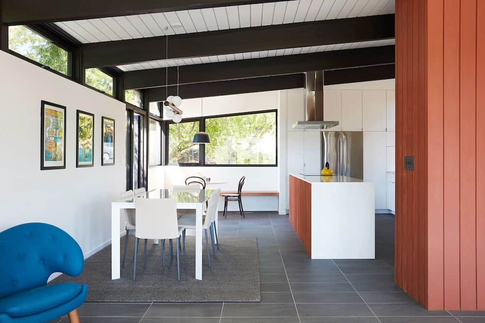
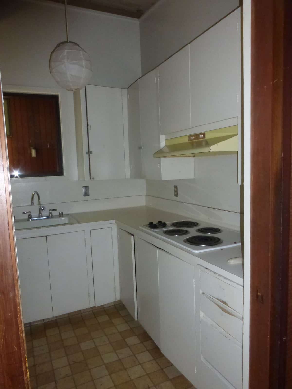
The original glass doors opposite the fireplace were replaced by larger sliders that when fully opened, create a seamless transition to the new outdoor living area so the two spaces feel like one connected space. The original utilitarian kitchen was needlessly tucked into the far back corner and closed-off, out of sight from the living room, so the owners asked Klopf to open it up and expand the kitchen forward so it felt more connected.
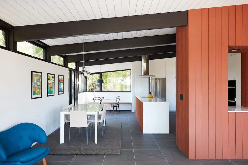
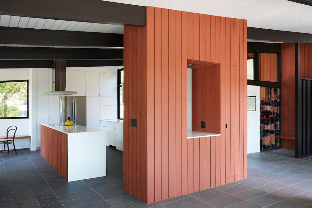
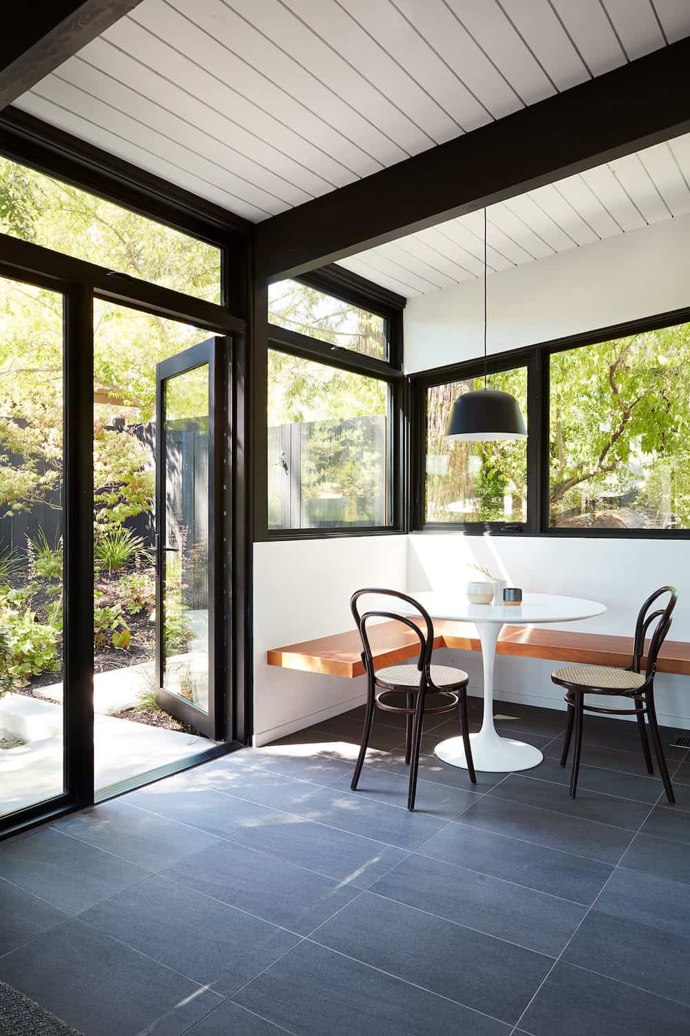
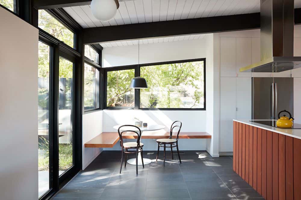
Today the much larger kitchen is connected to the living area where a short wall with a cutout offers a visual glimpse into the kitchen and a handy pass-through counter for serving guests. A new breakfast nook was also added to create another spot where the family can gather for casual meals.
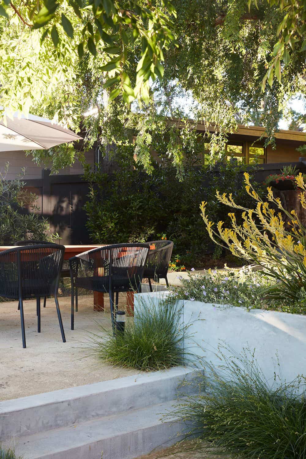
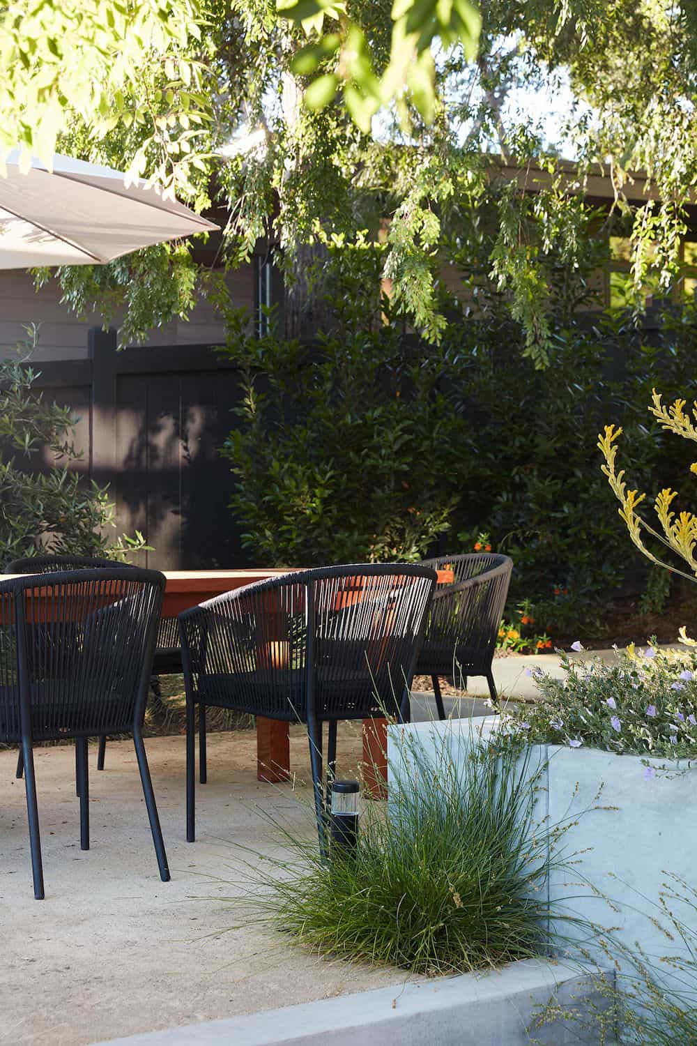
Just outside, a new built-in outdoor grill and prep area extends the kitchen outside and connects to a new outdoor dining spot nestled amongst the trees, taking advantage of the views of the backyard.
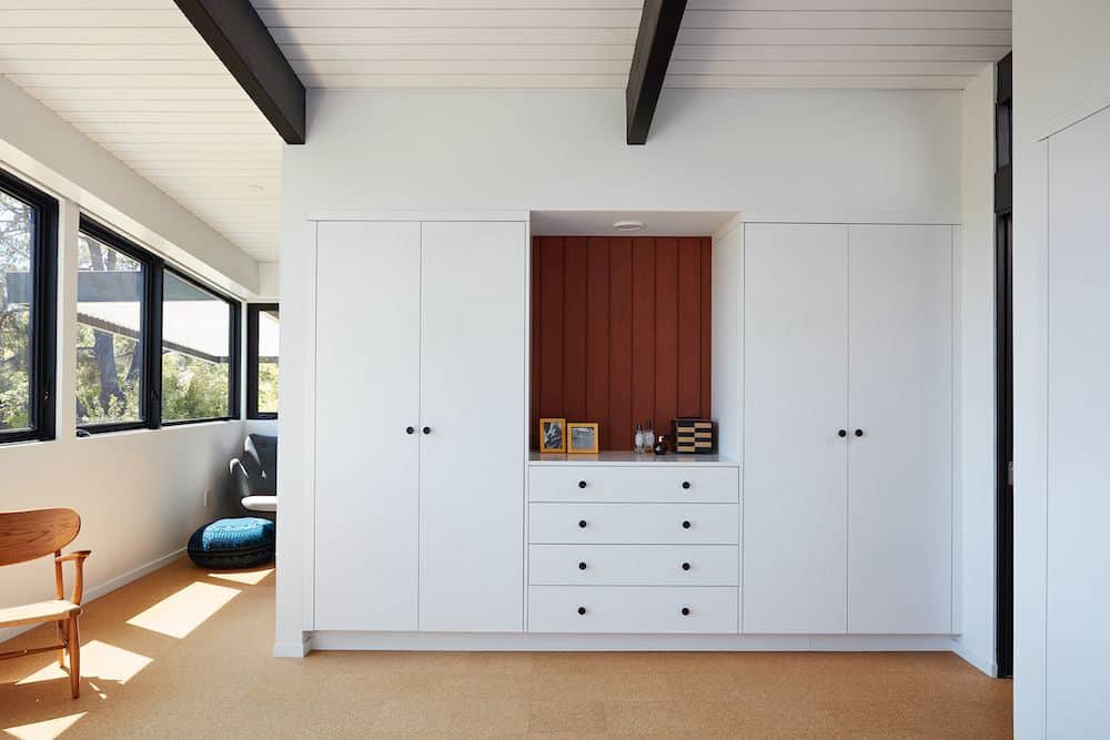
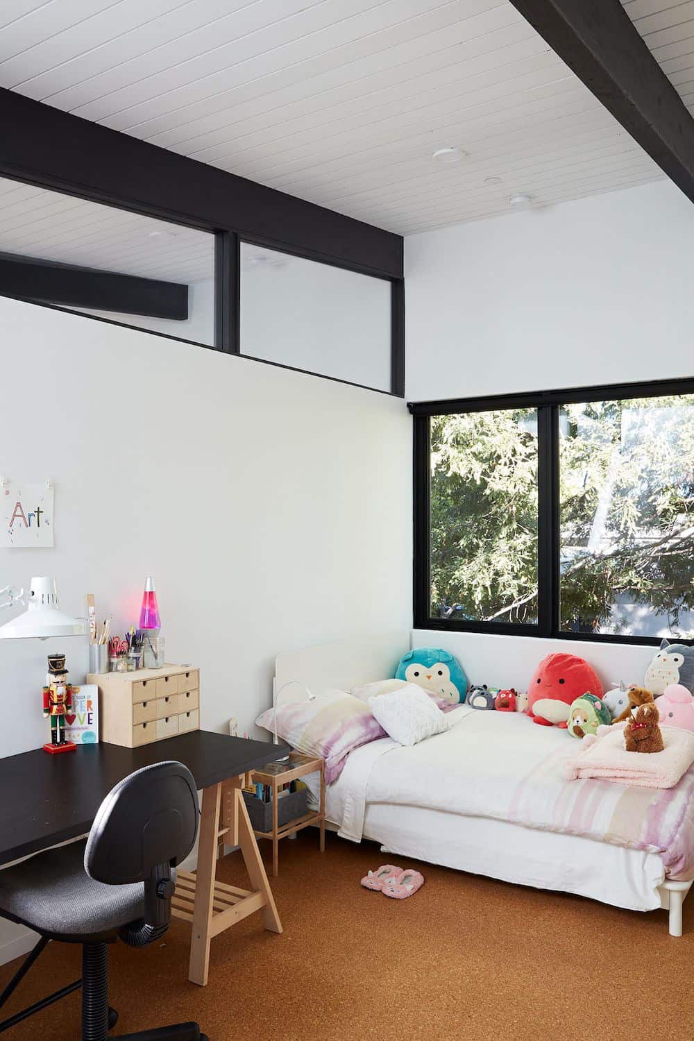
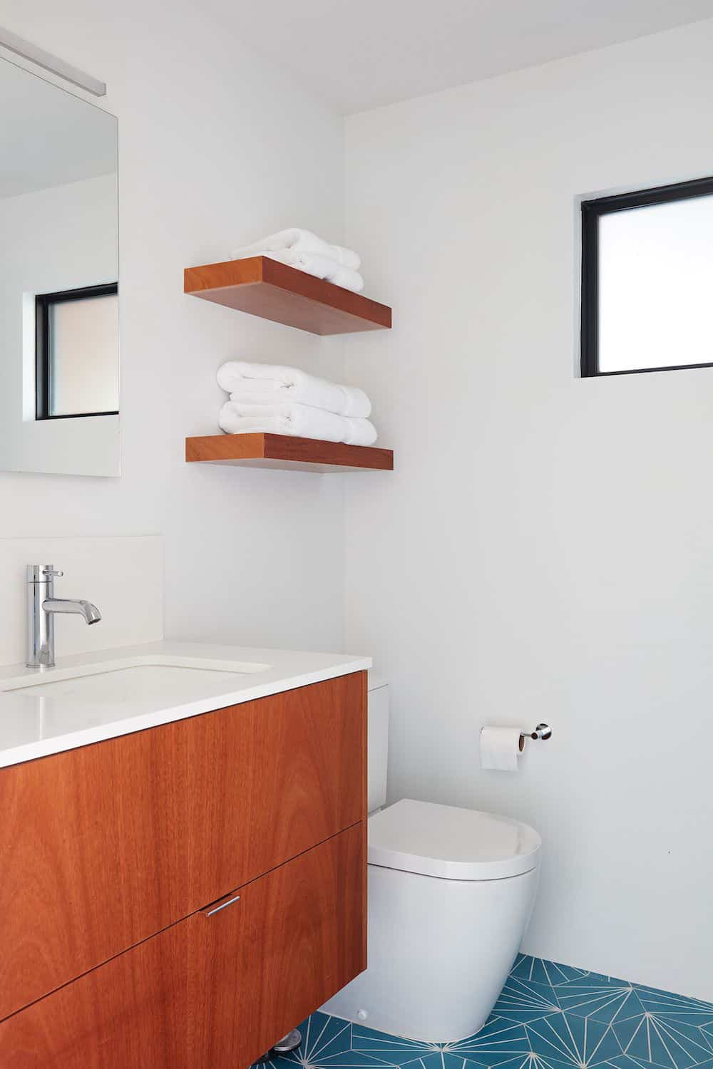
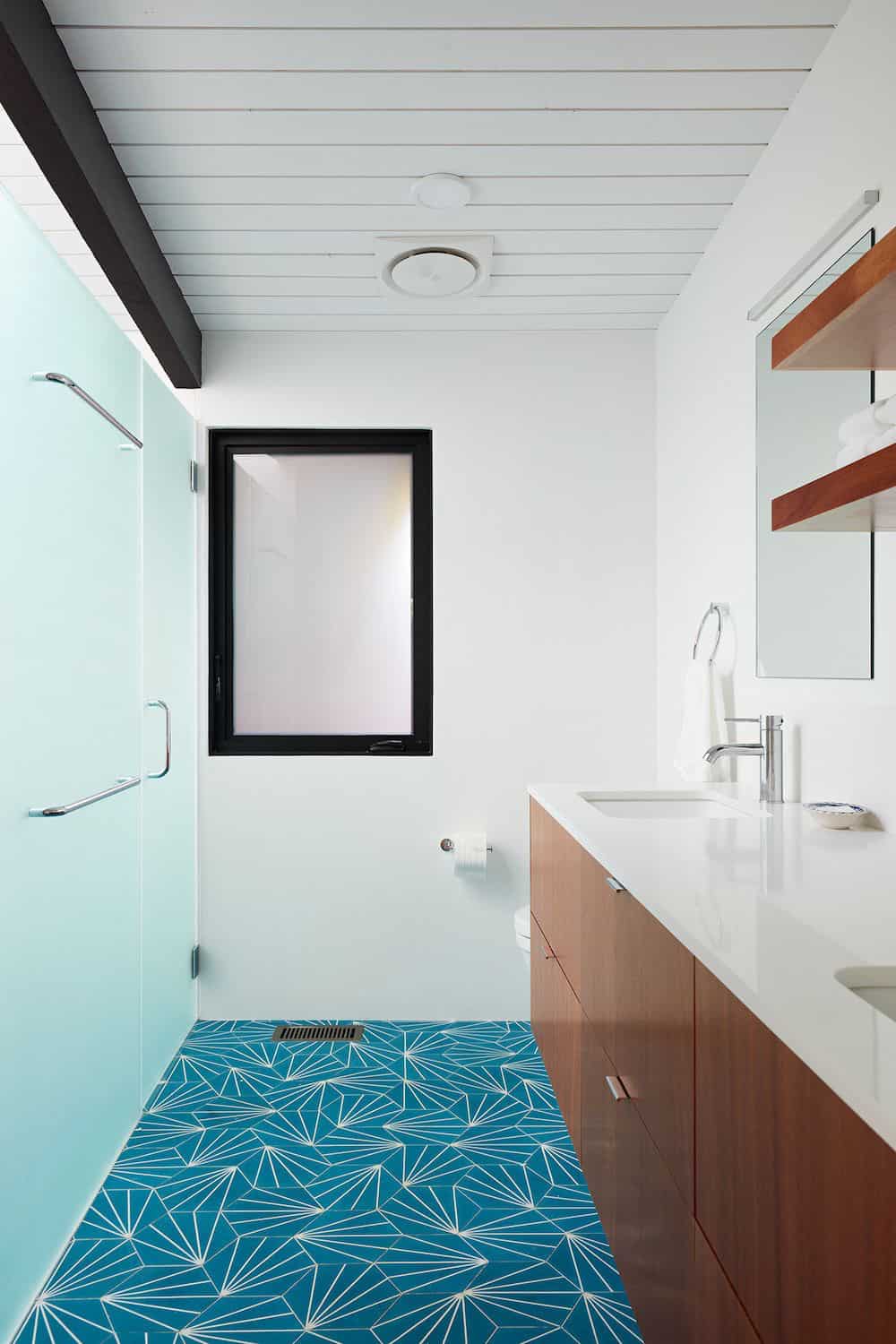
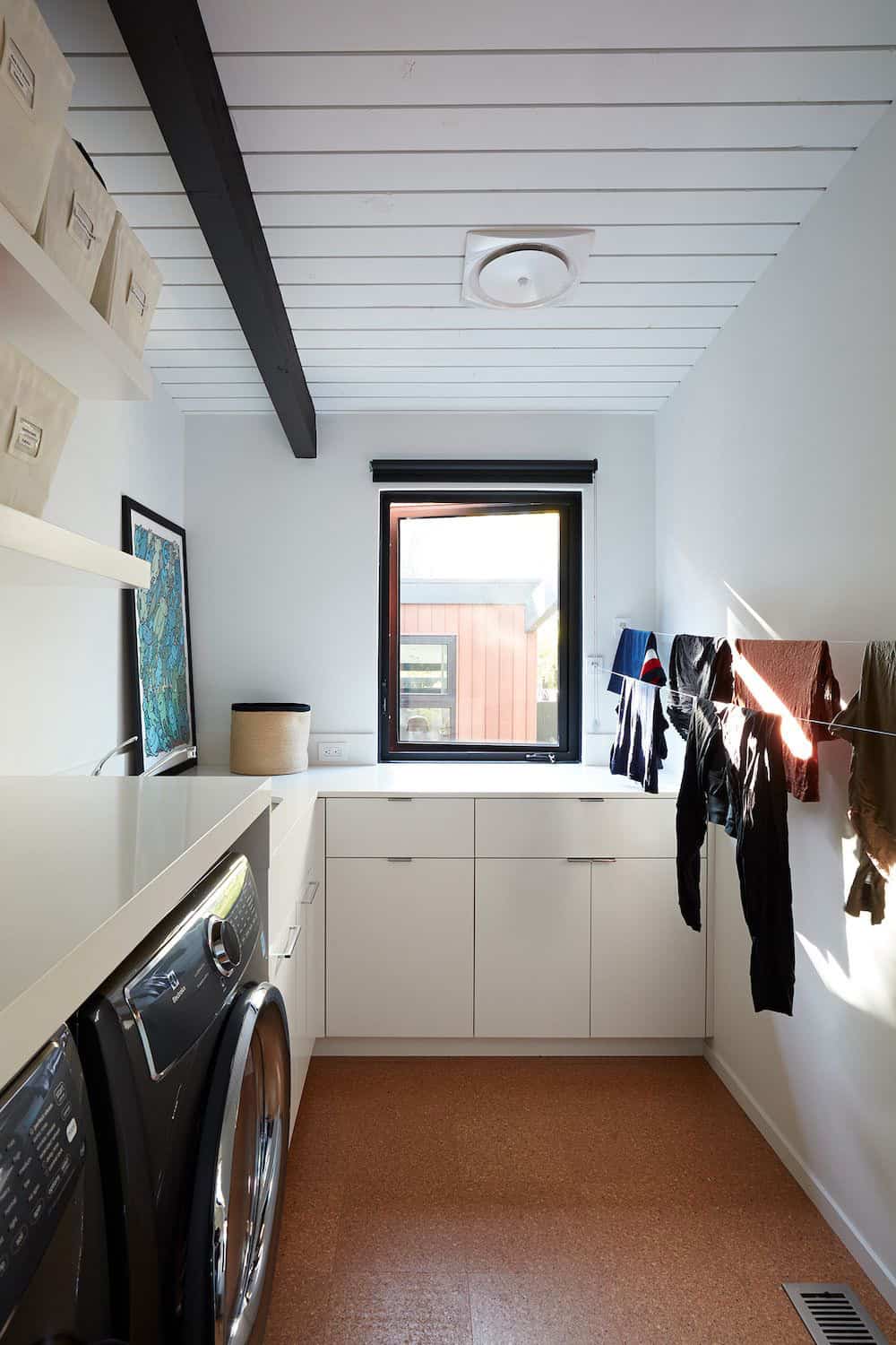
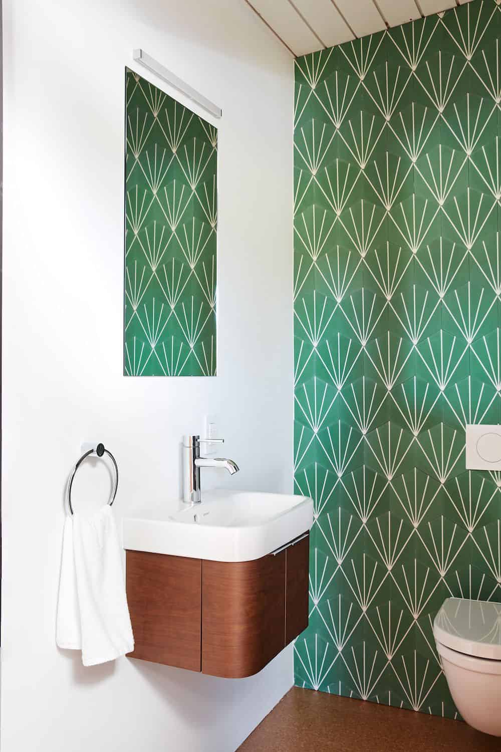
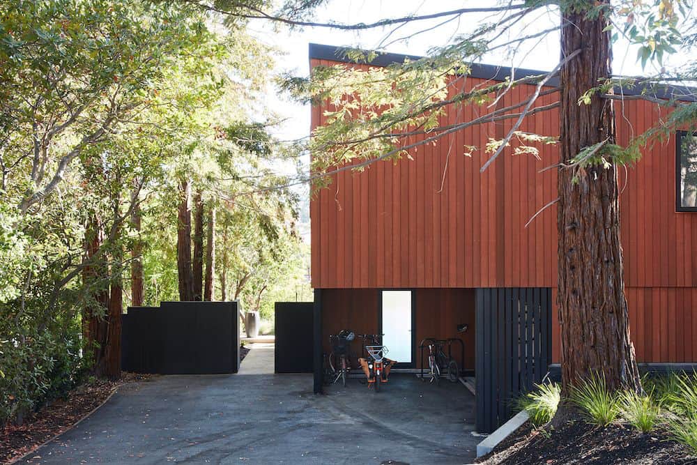
Klopf was able to expand the other two bedrooms, add a new laundry room and half-bath and convert the carport to an enclosed garage to add more storage areas which were lost when the pool house was converted to the family and guest room.
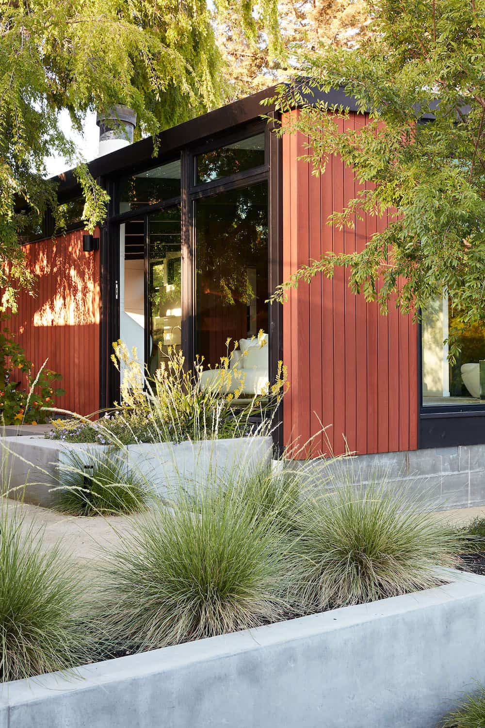
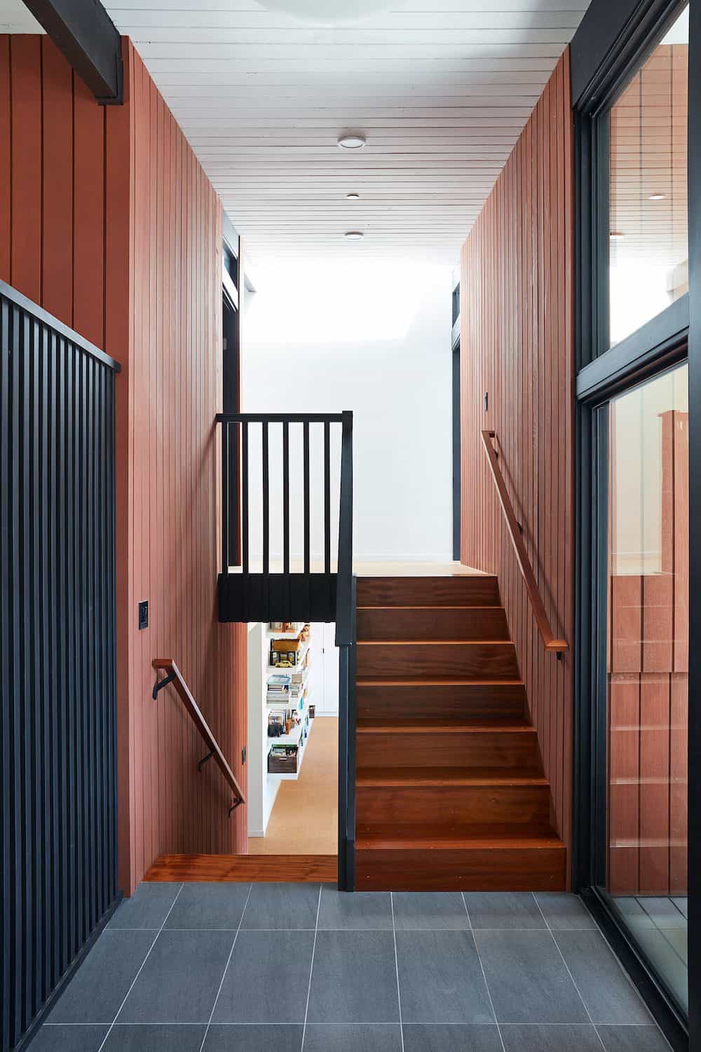
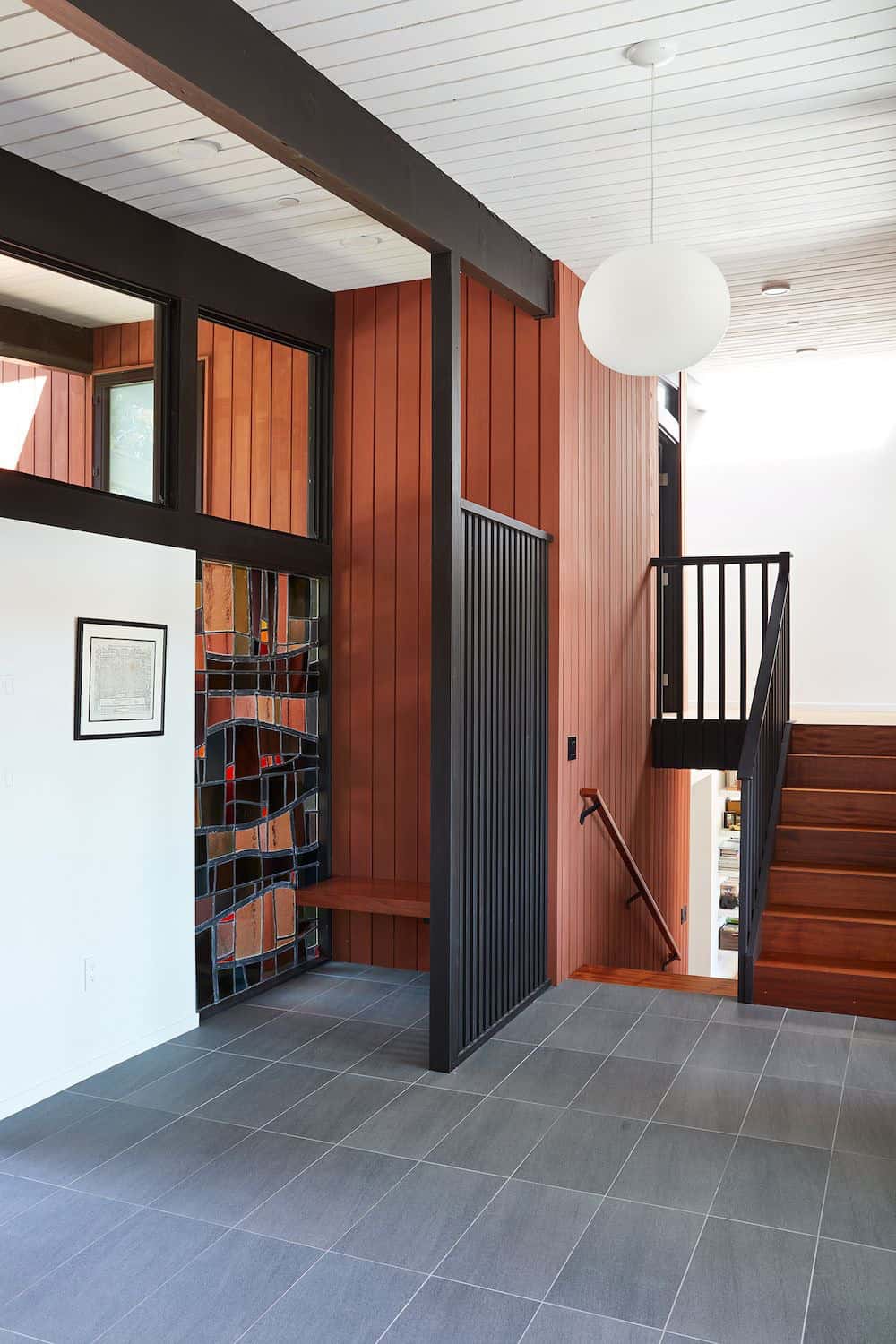
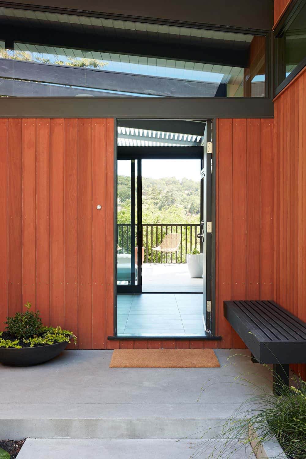
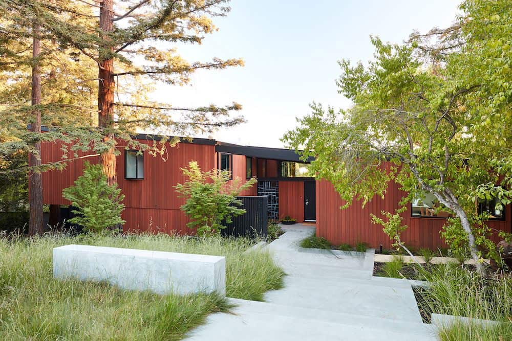
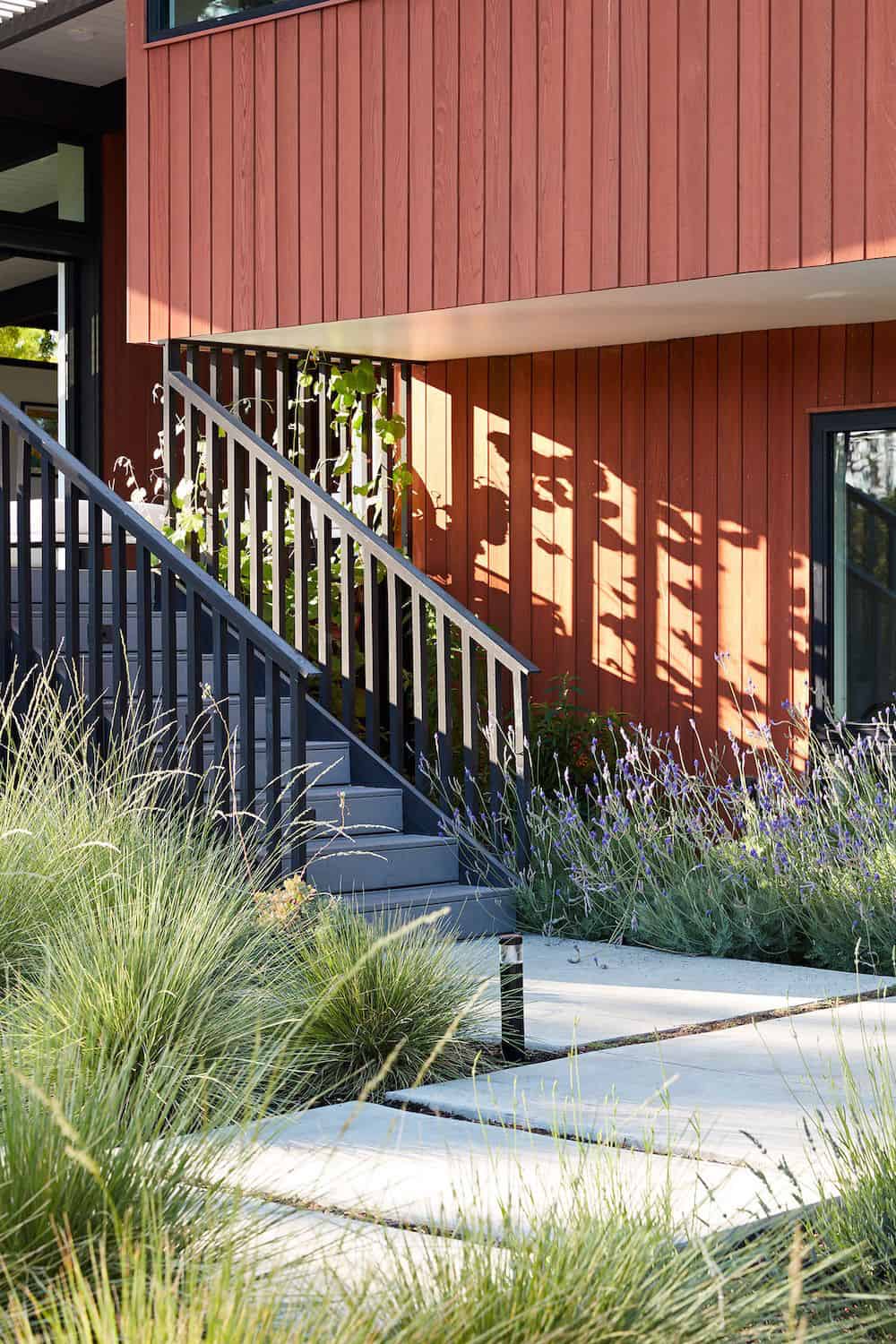
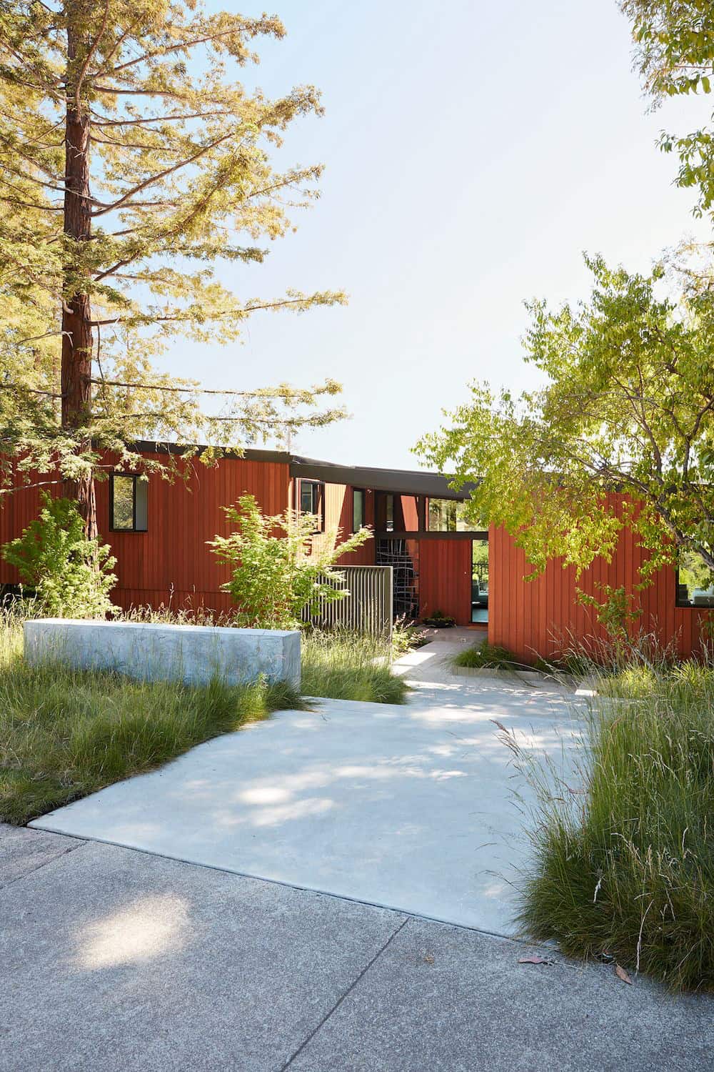
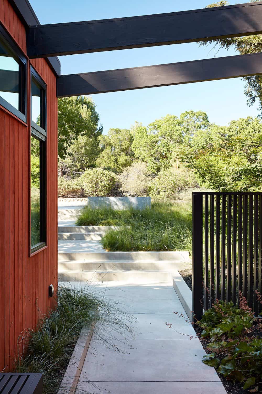
To maintain a historical connection to the original designs, the exterior siding was repeated on all exterior walls, a full-height stained glass window at the front entryway restored, and an interior slatted screen element repeated outside at the exterior entry courtyard and over the new outdoor living room to create a shade trellis.
The new house stands proudly and shines against its new landscaping features while respecting and expanding on the original intent of Roger Lee’s designs epitomizing the comforts of indoor-outdoor living in Northern California.
What We Love: This midcentury California home has been brilliantly remodeled to create an open and spacious layout with indoor-outdoor connectivity. The owners have a home that respects its historical past while being updated to today’s modern standards. We are loving that the original wood-burning Malm fireplace was restored to bring midcentury charm to this lovingly updated dwelling. Overall, the renovation of this home honors architect Roger Lee’s original design and will surely be enjoyed for many years to come!
Tell Us: What do you think of the overall aesthetics of this Roger Lee designed home? Let us know in the Comments below!
Note: Have a look at a couple of our favorite midcentury home tours that we have featured here on One Kindesign from the portfolio of the architects of this home, Klopf Architects: Eichler home remodel in California features radiant spaces and Indoor/outdoor connectivity defining mid-century modern Los Altos home.
PHOTOGRAPHER Mariko Reed
MIDCENTURY HOME BEFORE THE REMODEL
One Kindesign has received this project from our submissions page. If you have a project you would like to submit, please visit our submit your work page for consideration!


2 comments