❤️ Would you like to save this?
By saving, we'll email this post to you for later. Unsubscribe anytime.
This midcentury home underwent a complete interior and exterior remodel by Balodemas Architects, located in the Somerset neighborhood of Chevy Chase, Maryland. Originally constructed in 1968, the new owners of this home had a love of midcentury modern style. The property slopes up from the street, where the main living spaces on the upper level are connected to the backside of this property.
When the owner’s began the remodel, they wished to maintain the character of this home, keeping the main frame while adding color and a more modern layout. Included in their wishlist for this 3,500 square foot dwelling: increased natural light, an indoor-outdoor connection, a new kitchen, a harmonious flow between the living/dining/kitchen areas, and all new bathrooms. There are a total of five bedrooms and three bathrooms in this home. Continue below to see the before pictures and floor plans!
DESIGN DETAILS: ARCHITECT Balodemas Architects STRUCTURAL ENGINEER 1200 Architectural Engineers INTERIOR DESIGN Christie Leu GENERAL CONTRACTOR Highbury Construction

The original floor plan was not significantly altered. Instead, the project team focused on improving access to outdoor living spaces, creating a more spacious entry, and renovating the bathrooms and closets. The inviting entry features porcelain tile from Architectural Ceramics.

The owners loved the “Brady Bunch” style staircase, so they refreshed the look by adding a new top rail cap. The fieldstone planter is also an original detail that was preserved, but the painted wood screen was added to create a visual separation between the stairs and the lower-level family room and office.

What We Love: This midcentury home remodel showcases beautiful new design elements all while preserving the existing footprint. Living spaces have been updated to enhance the lifestyle needs of the owners while creating a fabulous indoor-outdoor connection. We are loving the addition of skylights and a Solatube to further increase the natural light into this home, creating a light and airy feel. Overall, an incredible transformation that is warm and inviting!
Tell Us: What do you think of the overall aesthetics of this home transformation? Are they any details you would have done differently? Let us know your thoughts in the Comments below!
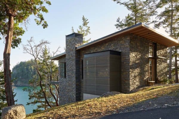
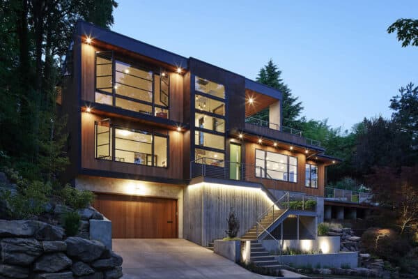
Note: Take a look at a couple of other amazing midcentury home tours that we have featured here on One Kindesign: Mid-century modern beach house retreat on Pender Island and Chic midcentury modern renovation surrounded by woods in Seattle.

Above: The landing at the top of the stairs leads to the four bedrooms, kitchen, dining, and living areas. The chandelier is from AF Lighting.

Above: Walls were torn down to create an open layout great room for this family of four. The white oak flooring is original to this midcentury home. There were four skylights added between the trusses of the vaulted ceiling, drenching this space with natural light.

Above: In the dining room, a teak farmhouse table is encircled by vintage metal and wood Revolt Chairs by Friso Kramer for Ahrend de Cirkel. The sideboard is from BoConcept.


Above: In the kitchen, a brand new island was added, bringing the family together while cooking. White lacquer and gray wood custom cabinetry provide a sleek, modern aesthetic. The new doors from Western Window Systems lead out to the backyard’s screened-in porch.

Above: All the appliances are Thermador. The countertops are Caesarstone quartz, while the faucet is from Brizo. Above the island, the globe pendant lights are by Progress Lighting.

Above: In the living room, the curved sectional is from Room & Board.

Above: The original main bath had a color scheme of pale peach! The transformation features a more expansive space — borrowing space from the kitchen to create a beautiful walk-in shower and dual vanity sink. Additionally, there was extra space for a walk-in closet in the bedroom.
An existing window in the middle of the vanity, along with a new skylight helps to bring in plenty of natural light. The shower and wall tile are by Porcelanosa, while the floor tile is from Architectural Ceramics. The vanity faucet is Moen, and the shower fixtures are Graff.

Above: The hall bathroom is for the couple’s two children to share. The original space was compact, so the project team reconfigured the layout. Colorful tile flooring is from Architectural Ceramics. A Solatube daylighting system was integrated into the ceiling, drenching the space with light. The tub is by Americh, the vanity faucet is Moen and the sconce is from Nuvo Lighting.

Above: In the daughter’s bedroom, the brightly colored wallpaper on the closet doors is from Serena & Lily. The desk was sourced from The Container Store.

Above: The wood framing of the original screened porch was 45 years old and was beginning to warp and rot. The door was also not shutting properly. The entire porch was reconstructed with new framing and screening, while the patio was extended.

Above: A garden wall was added to the screened porch area of the backyard, playing double-duty as a serving ledge. The outdoor table and benches were sourced from Crate & Barrel.

Above: The windows used throughout the home are from Windsor Windows & Doors. Siding is HardiePlank. Paint Colors: Hearthstone 1601 | Benjamin Moore (first-level brick); Westcott Navy 1624 | Benjamin Moore (siding); Poppy 1315 | Benjamin Moore (front door). Front door hardware, Emtek.

Above: The original two-car garage door was replaced. In its stead, a sapele wood-lined single-car garage door, Clingerman Doors.
MIDCENTURY HOME BEFORE REMODEL


Above: The original hallway bathroom is now the kid’s bathroom.

MIDCENTURY HOME REMODEL FLOOR PLANS


Above: The dotted lines on this floor plan indicated where the original walls were removed. The red lines demonstrate where walls were added.
PHOTOGRAPHER Hoachlander Davis Photography


1 comment