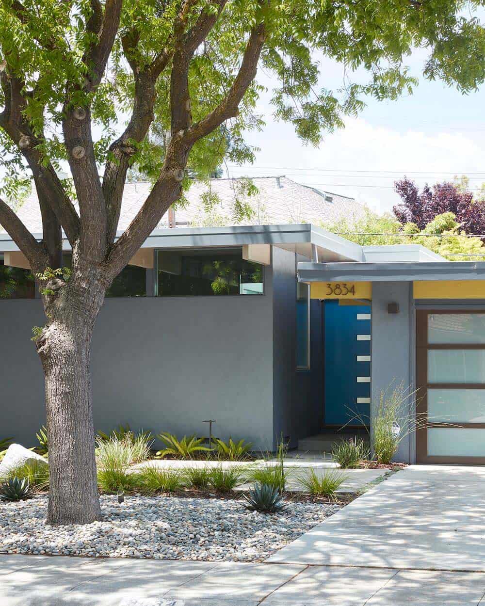
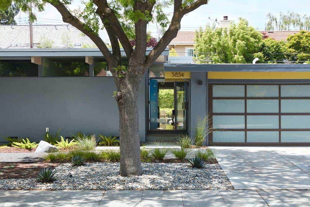
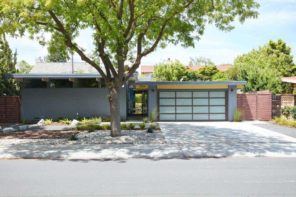
Klopf Architecture is responsible for the complete overhaul of this 1960’s Brown & Kaufman midcentury home, located in Palo Alto, California. Brown & Kaufman homes are similar to Eichlers, in that they mostly feature single story layouts, post-and-beam ceilings and openness to the outdoors. The major difference is their crawl space, which was major plus when it came to relocating the new furnace. An insulated foam roof covered the new wiring, therefore nothing unsightly extended above the roof.
The homeowners were transplants from New York, who discovered this home and were excited at the prospects or remodeling and brightening this dated home. This 1,450 square foot, three-bedroom, two-bath home had barely been updated since it’s construction. The goal of this project was to modernize and brighten this cramped and compartmentalized dwelling.
Project Team: Architects: Klopf Architecture | Contractors: Kevin Slagel Design & Build (phase 1), Coast to Coast Development (phase 2) / Year completed: 2013 (phase 1), 2017 (phase 2)
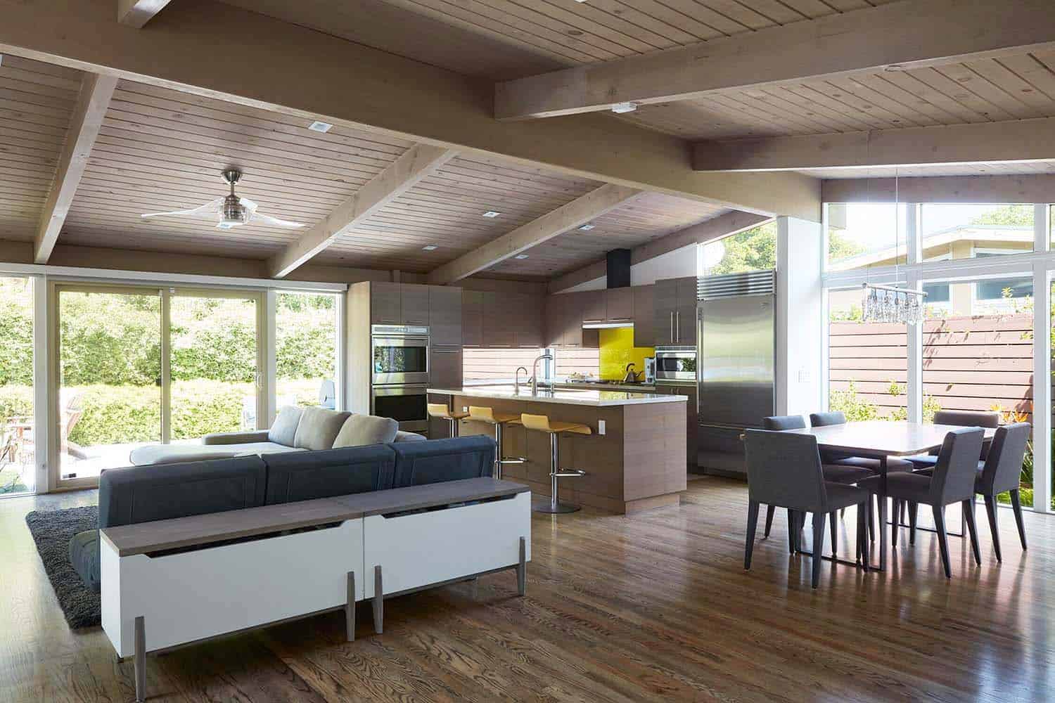
The remodel of this midcentury home was completed in two phases. The first phase involved the removal of several interior walls, opening the living space to draw in more light and improve the overall flow. A dark kitchen, closed off by a partition wall, is more radiant thanks to new windows. The kitchen was reconfigured to open directly into the great room, enabling family gathering in this expansive space.
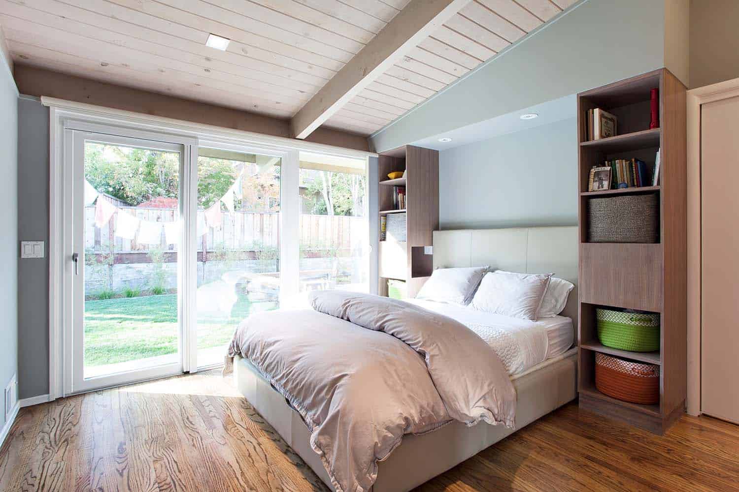
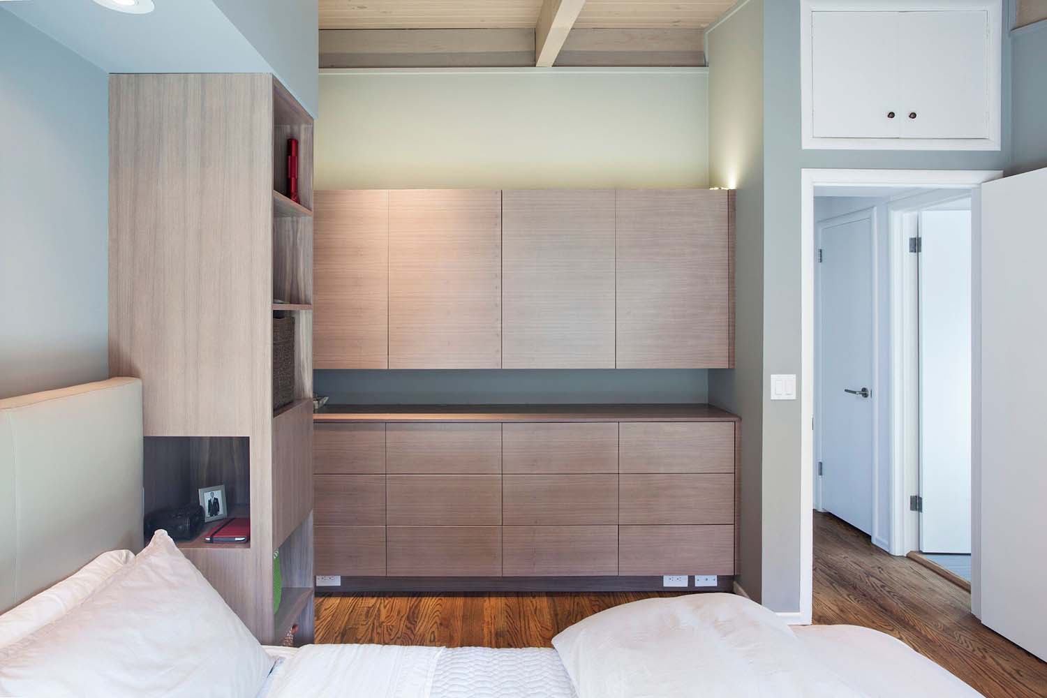
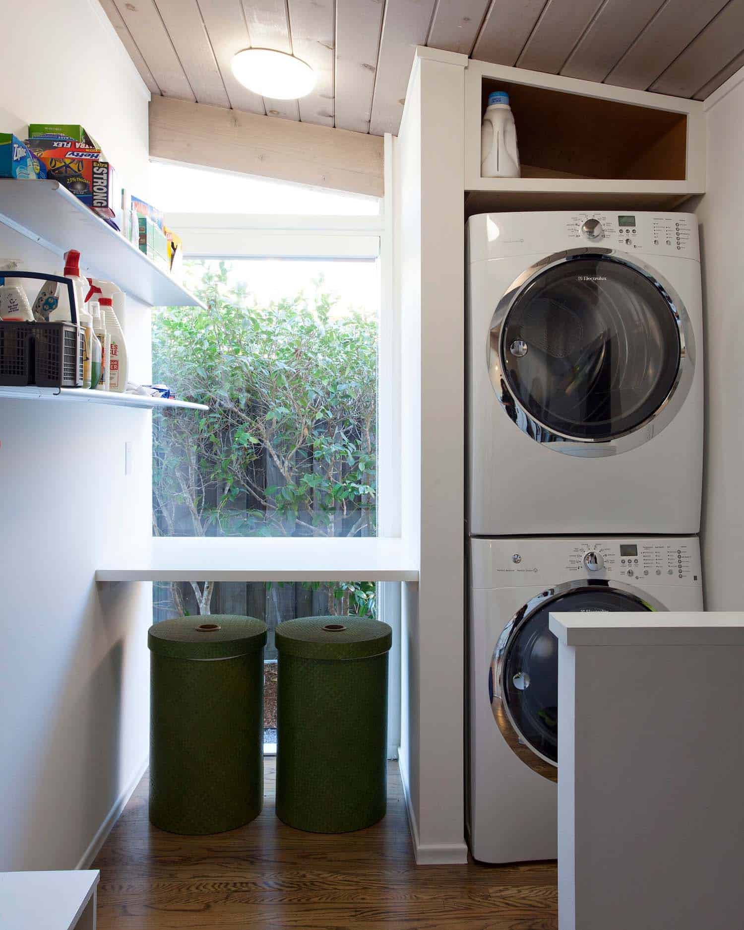
The homeowners requested a master walk-in closet, replacing their inadequate 1960s closet. To create more space, the architects re-worked the floor plan to slightly extend the master suite into the living room. The redesigned space created extra room for a desk/work area, in addition to a more functional laundry room. Even though the overall footprint of the living room was condensed, the space feels feels much larger and brighter thanks to the removal of interior walls and new larger expanses of glass that open up to the outdoors.
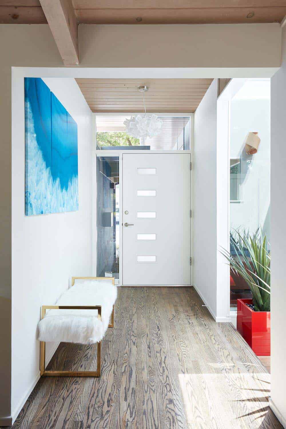
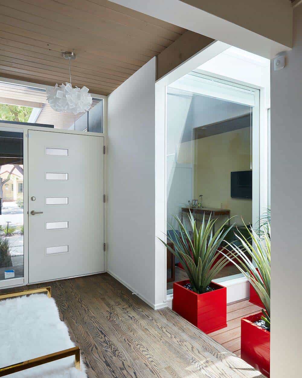
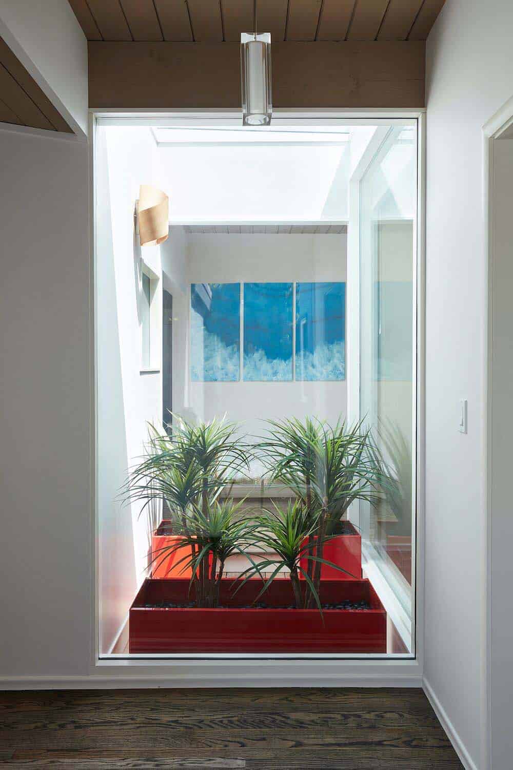
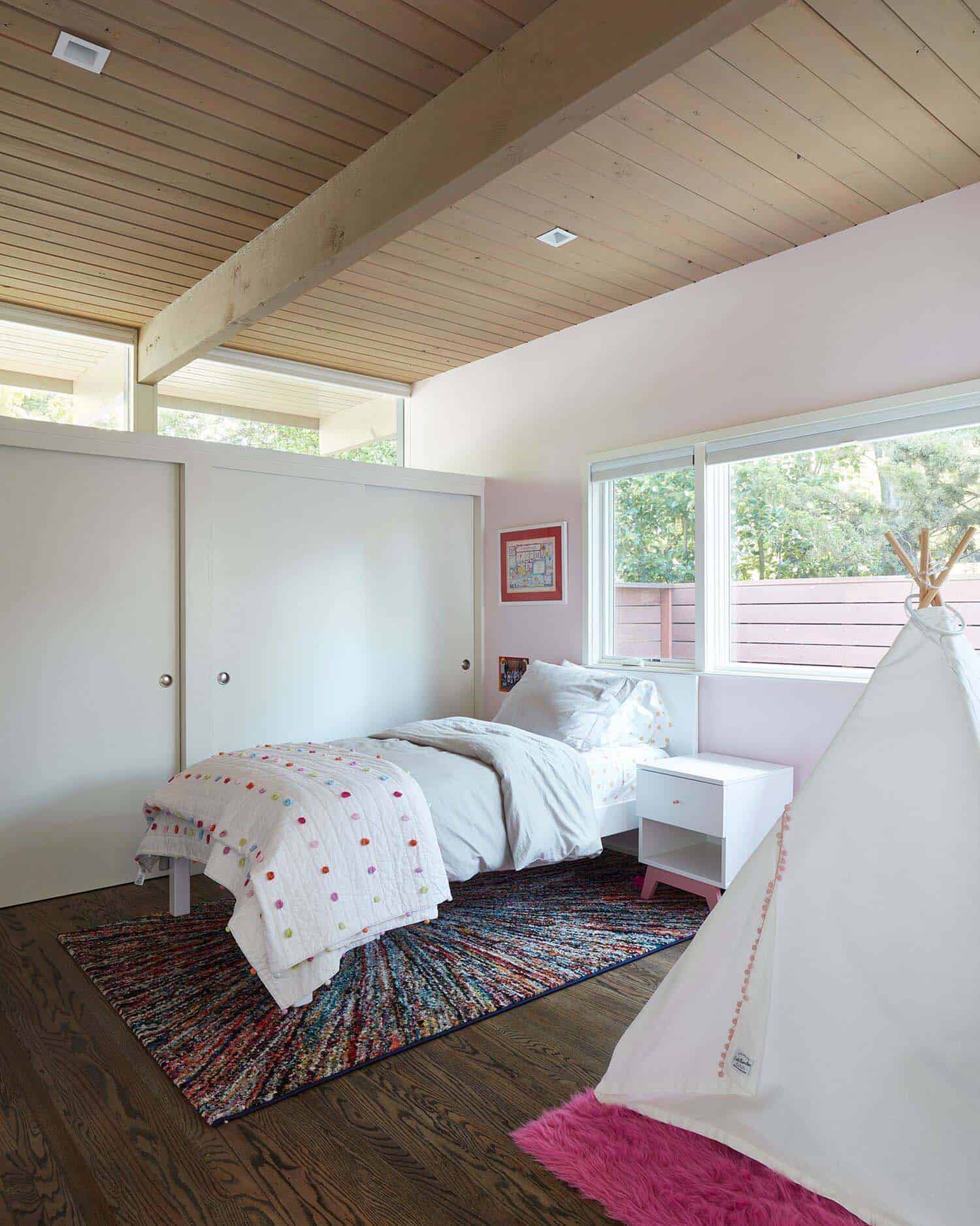
The second phase of construction was completed several years later, which focused on improving existing spaces to meet the growing family’s needs. The architects designed a new addition to the front of the home. This includes two kids’ bedrooms and a bathroom in an area separate from the main house. A central interior glass atrium unites this new bedroom wing to the rest of the renovated dwelling.
This creates an axis point, which frames views to the side and backyards as you walk through this new dramatic entryway. The atrium illuminates the interiors with natural light, creating a seamless connection to make it appear as though it had always been there. The original bulky central fireplace that was preserved in the first phase was finally removed, which left the great room free from barriers.
What We Love: This midcentury home renovation offers a fabulous new interior layout, spacious new addition and luminous living spaces. The homeowner’s finally have a home with a great flow, ideal for family gathering and their changing lifestyle needs. Overall the architects did a fantastic job of creating an idyllic floor plan that feels spacious, open and airy.
Tell Us: What do you think of the overall design of this renovation project? Any details you would like to have seen done differently? Please share your thoughts below!
Note: Have a look at two of our most popular home tours that we have featured here on One Kindesign from the portfolio of Klopf Architects: Renovation of a mid-century modern Eichler home in California and Eichler home remodel in California features radiant spaces.
Above: Suspended above the dining room table is a Broadway Linear Crystal Chandelier.
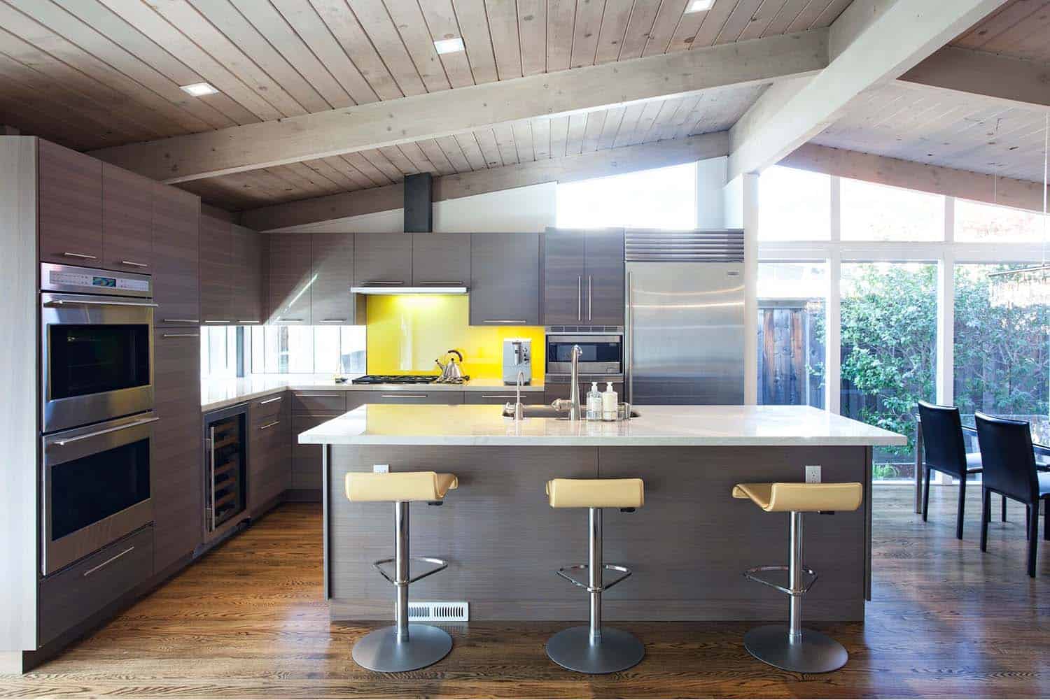
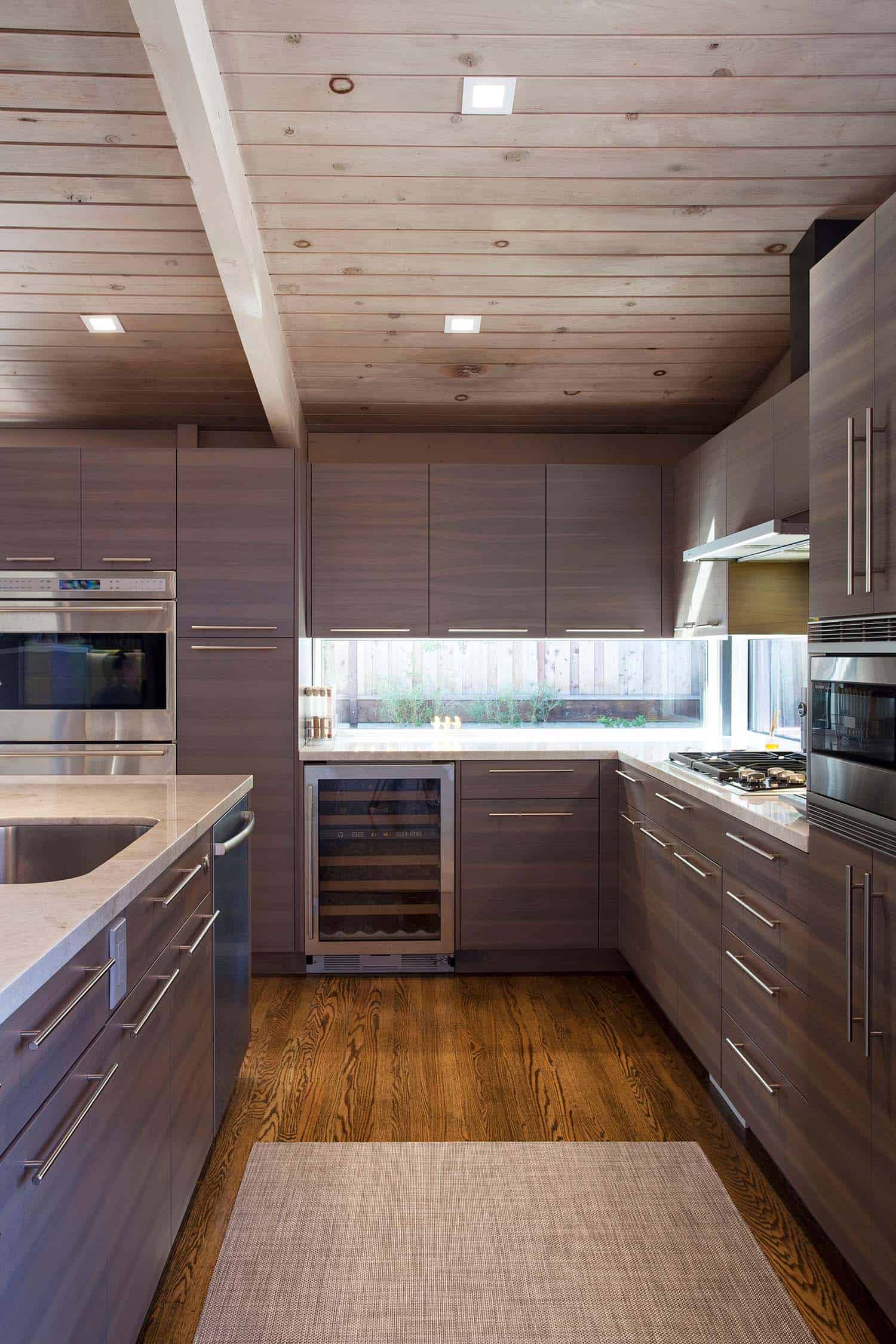
Above: In the kitchen, lightly mottled Quartzite tops compliment the continuous-grain walnut cabinetry, stained a medium brown-gray. Backsplash is a yellow Sodaglass. At the island, the yellow stools are by Ligne Roset. The homeowner’s selected the appliances, including a Sub-Zero fridge and wine chiller, Wolf oven and cooktop and a Bosch dishwasher.
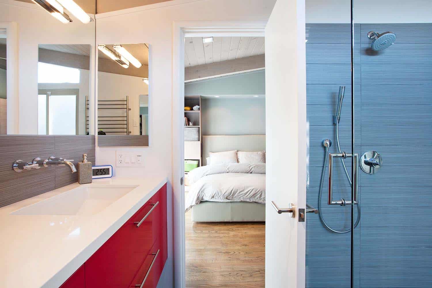
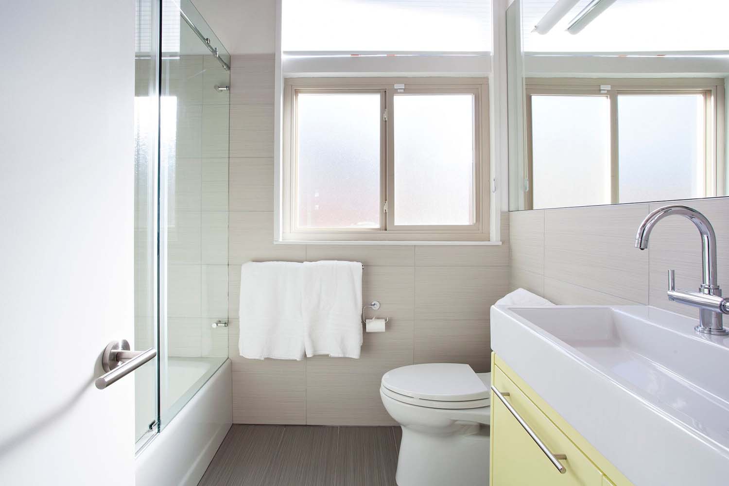
Above: Both bathrooms in this mid-century home feature Daltile tile, Linen Collection. Darker gray was used in the master, while the second bathroom features taupe. The countertops are CaesarStone “Blizzard”. Wall-mounted spigots in the master adds clean, modern lines.
Photos: ©2013, 2019 Mariko Reed
One Kindesign has received this project from our submissions page. If you have a project you would like to submit, please visit our submit your work page for consideration!


0 comments