❤️ Would you like to save this?
By saving, we'll email this post to you for later. Unsubscribe anytime.
This chic and stylish transitional style home has undergone a beautiful renovation by architecture studio Urrutia Design, located in Sausalito, California. The home was originally constructed in 1884 and added onto over the years in a not so graceful manor. When it was purchased back in 1998, it was a triplex consisting of three apartments, one on each level. The renovated consisted of combining the lower two levels into a family home. While the top unit, consisting of 700 square feet of living space, was transformed into the office headquarters for Urrutia Design. This is one of the oldest homes in Sausalito, constructed by an old sea captain.

What We Love: This beautiful family home in Sausalito offers a stylish renovation producing luminous interior living spaces. The kitchen is one of our favorite rooms in this home, with its earthy palette that is warm and inviting. The living room is also an inviting space, we are especially loving the artwork and the reclaimed table, adding a rustic touch. Overall a fabulous remodel project… Readers, what do you think, are their any notable details that stand out to you?
Note: Have a look at one of our favorite home tours from the amazing portfolio of Urrutia Design: Beautiful Mill Valley retreat with a treehouse feel.

Above: The fireplace and its location is original to the space, while the stone was left over from a lodge-like project the design team had worked on. Aesthetically, it’s timeworn appearance makes it seem like it has been in the home since 1884. FYI: The name of the stone is “Napa Chip” or “Wine Country Cobble.” It can be purchased at Shamrock Materials in San Rafael, CA. The artwork is by artist Tim Mooney Studio.

Above: The kitchen offers a unique design, its irregular shape does not have enough space for an island, yet is highly functional. It splits the lines between traditional and contemporary. The designer sought an earthy palette for this space, with the “Sable” brown subway tile, pot rack and vintage area rug from Turkey. While the exposed duct gave a “farm-like” aesthetic to the mix.

Above: The paint color on the walls of this kitchen are Calm 2111-70 | Benjamin Moore. The white shaker cabinet doors were painted in Super White OC-152 | Benjamin Moore.

Above: The countertop material is honed “Absolute Black Zimbabwe Granite.”

Above: The kitchen doubles as a hallway, a thoroughfare to get to the lower level of the home—a bit unusual, yet unique.

Above: The overall feel of this kitchen is simple, classic and elegant—with a very subtle twist. The subway tile backsplash is made by Sonoma Tile Makers, the color is Sable.


Above: The artwork on the wall in the living room is by artist Scott Segerblom. The coffee table is a reclaimed door from Mexico made of wood planks. The paint color on the wall is Lacey Pearl 2108-70 | Benjamin Moore, while the trim is Super White OC-152 | Benjamin Moore.


Above: In the bathroom, the washstand was sourced from Signature Hardware. It was ordered in polished chrome, while the countertop and backsplash were locally fabricated. The wallpaper is from Phillip Jeffries—Soho Hemp in Black & White.


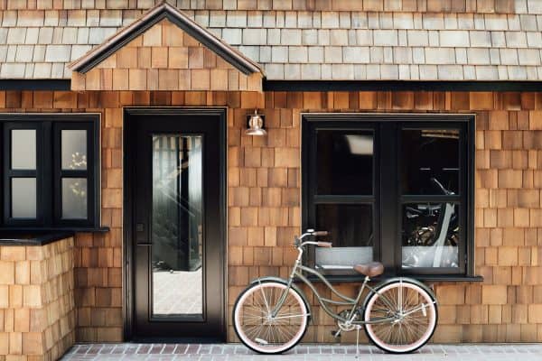
Above: The siding on the exterior facade is a classic “Shiplap” made from Redwood.

Photos: Matt Sartain


0 comments