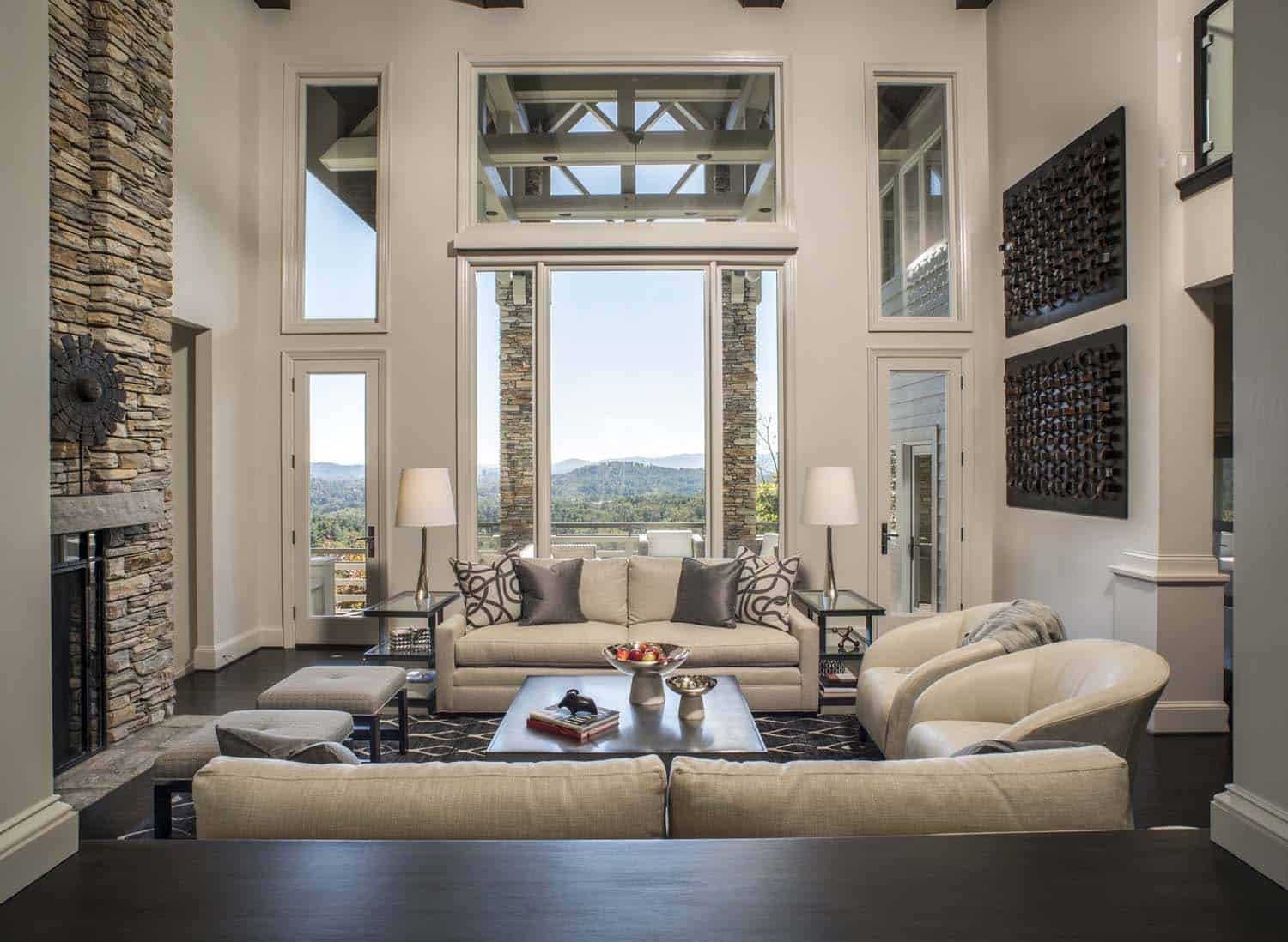
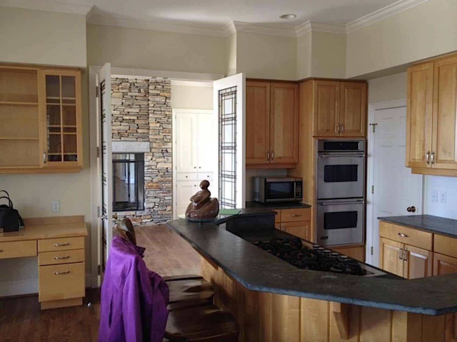
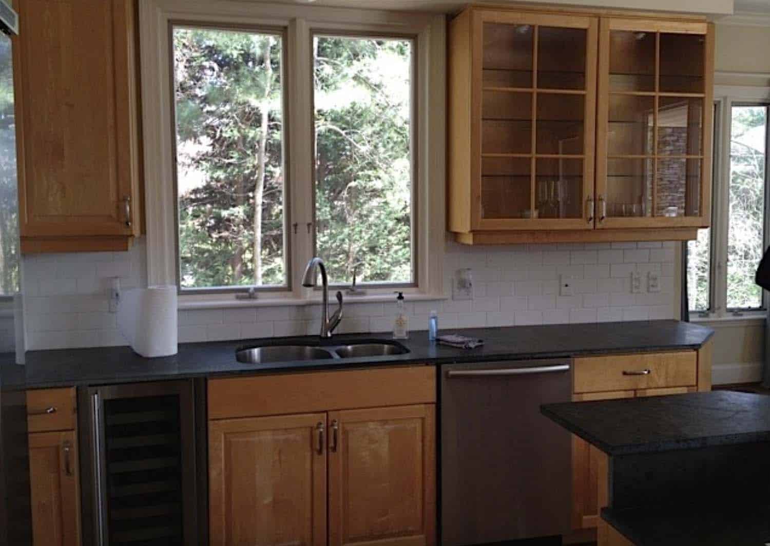
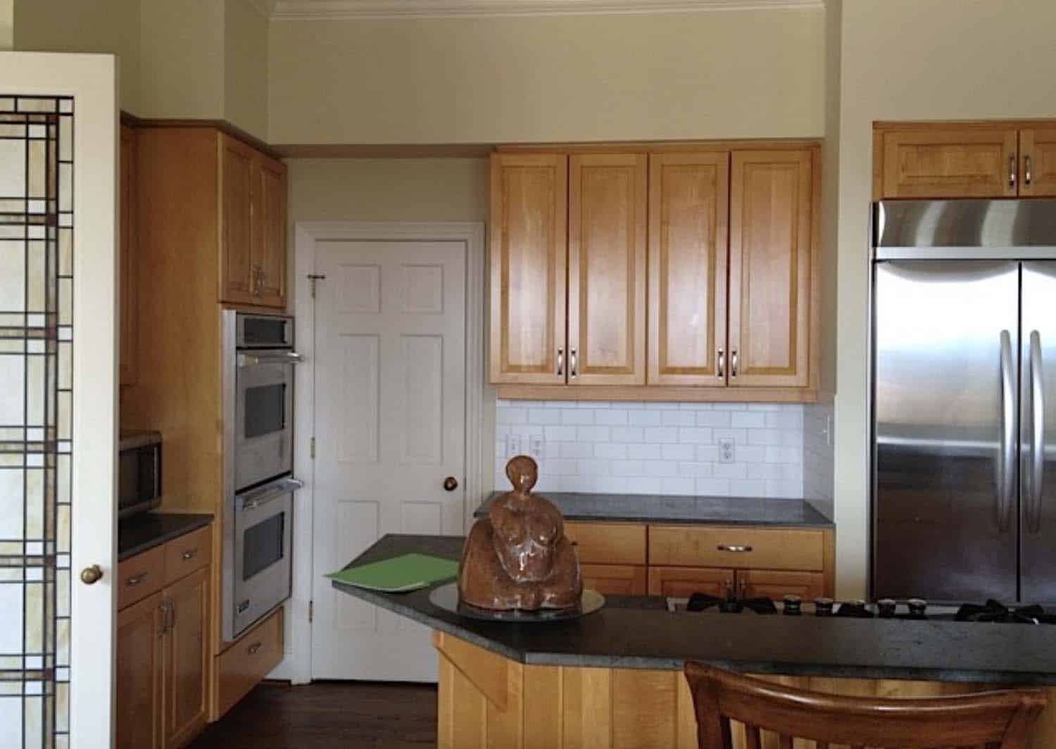
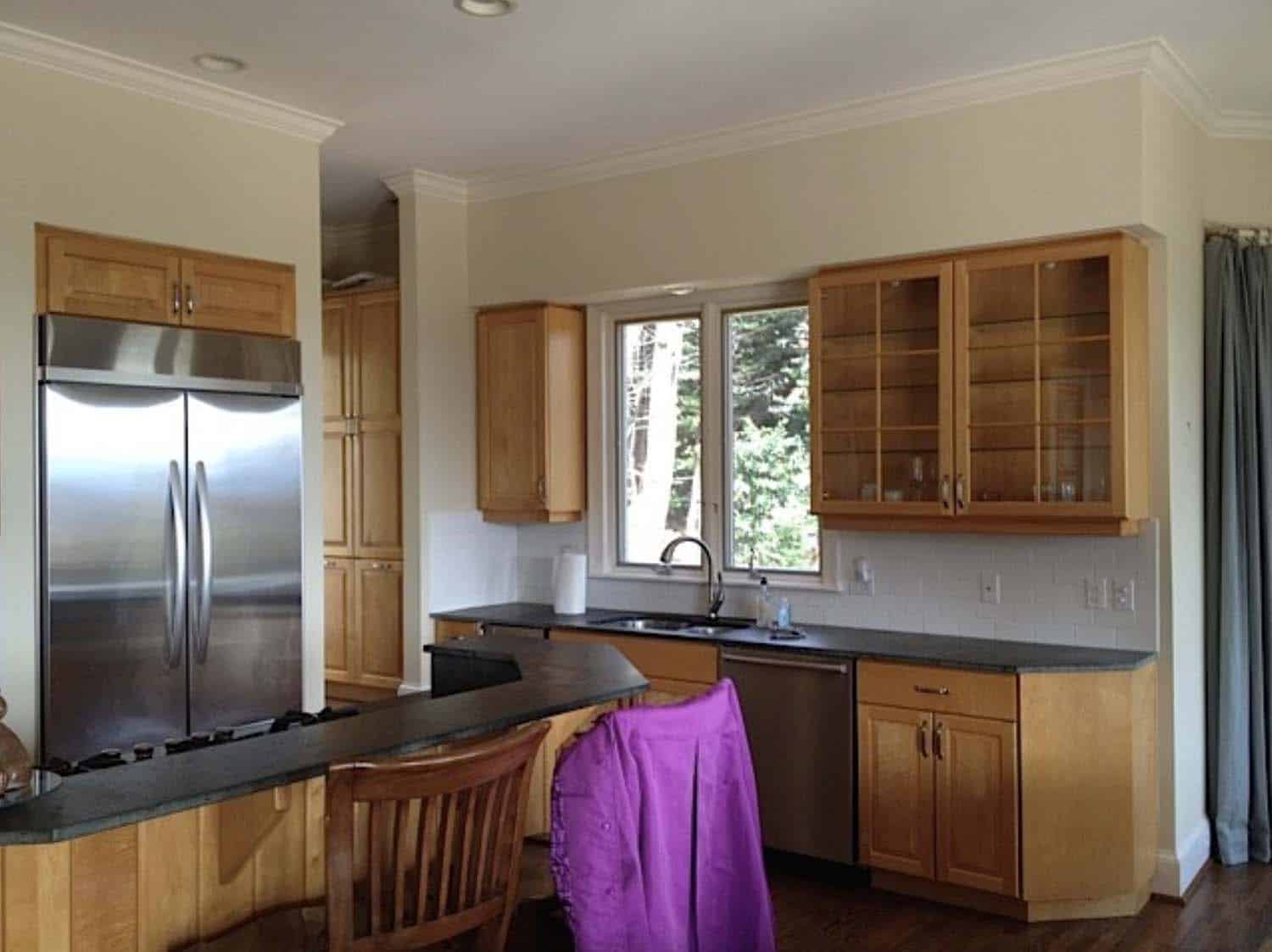
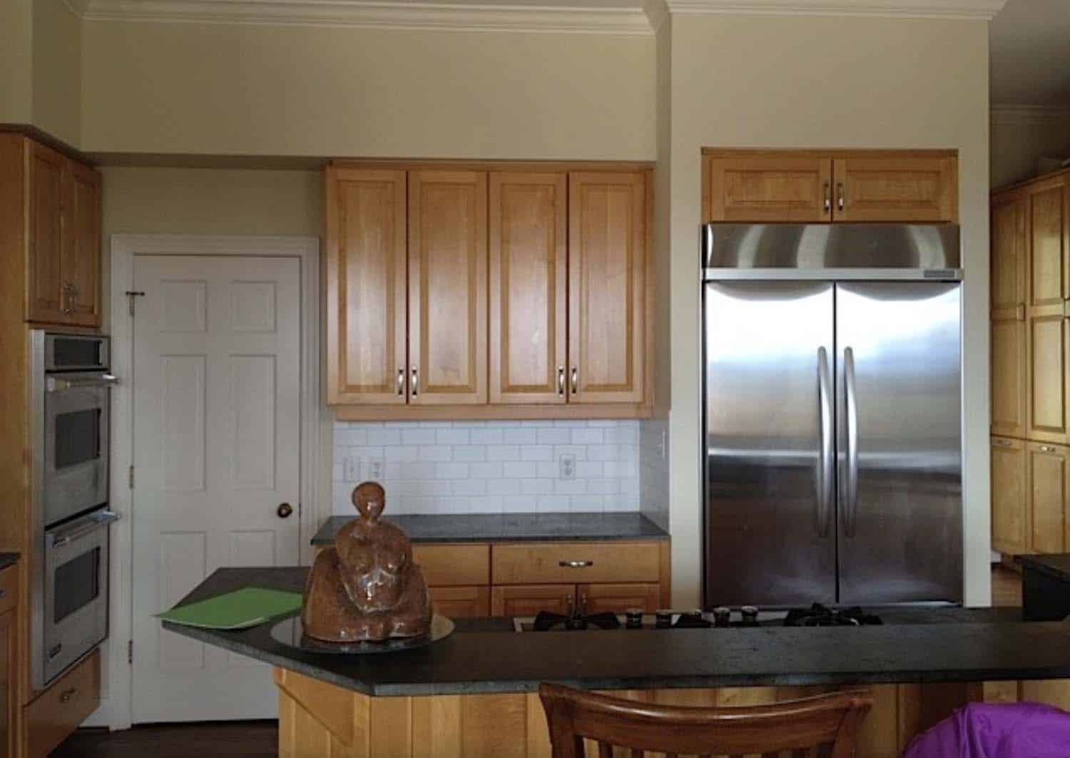
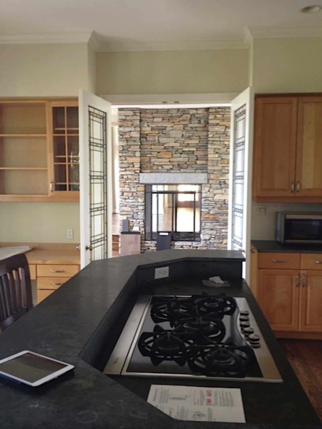
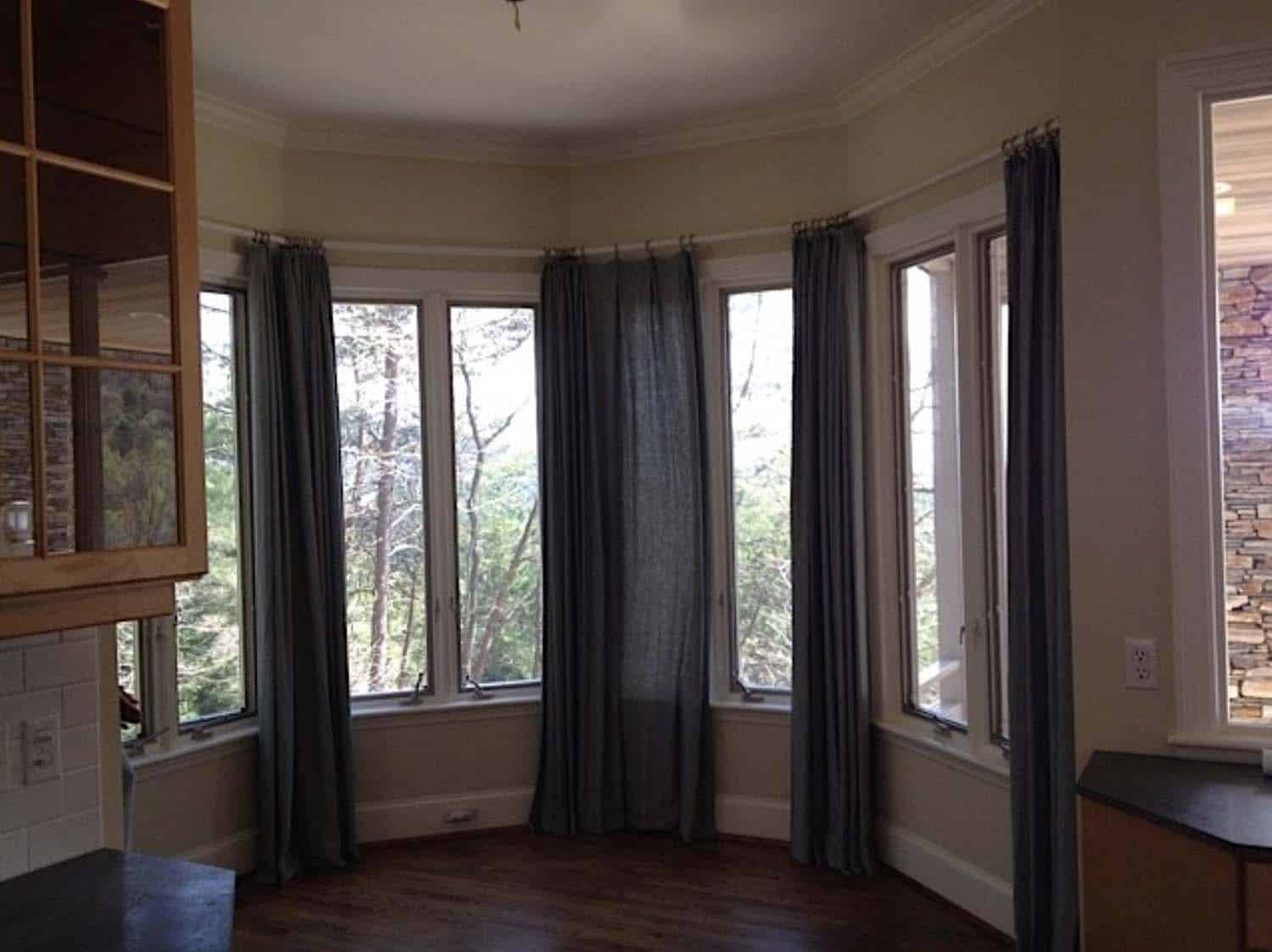
Allard + Roberts Interior Design is responsible for his contemporary home renovation project located in North Asheville, North Carolina. This project originally began with a kitchen renovation and ultimately expanded to the renovation of all three floors of this residence. The existing Kitchen was dark, drab, and dated.
The homeowner was inspired by another kitchen project that the designer had created and sought their help with the re-design. The traditional and craftsman style of the existing kitchen did not suit the new homeowner’s modern sensibilities or their lifestyle needs. Continue below to see the rest of this sensational home tour…
DESIGN DETAILS: INTERIOR DESIGN Allard + Roberts Interior Design CONSTRUCTION Cornerstone Construction CABINETRY Benbow & Associates COUNTERTOPS Solid Surface Specialists APPLIANCES & PLUMBING Ferguson LIGHTING DESIGN David Terry LIGHTING FIXTURES Lux Lighting
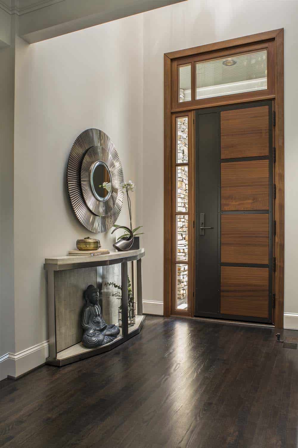
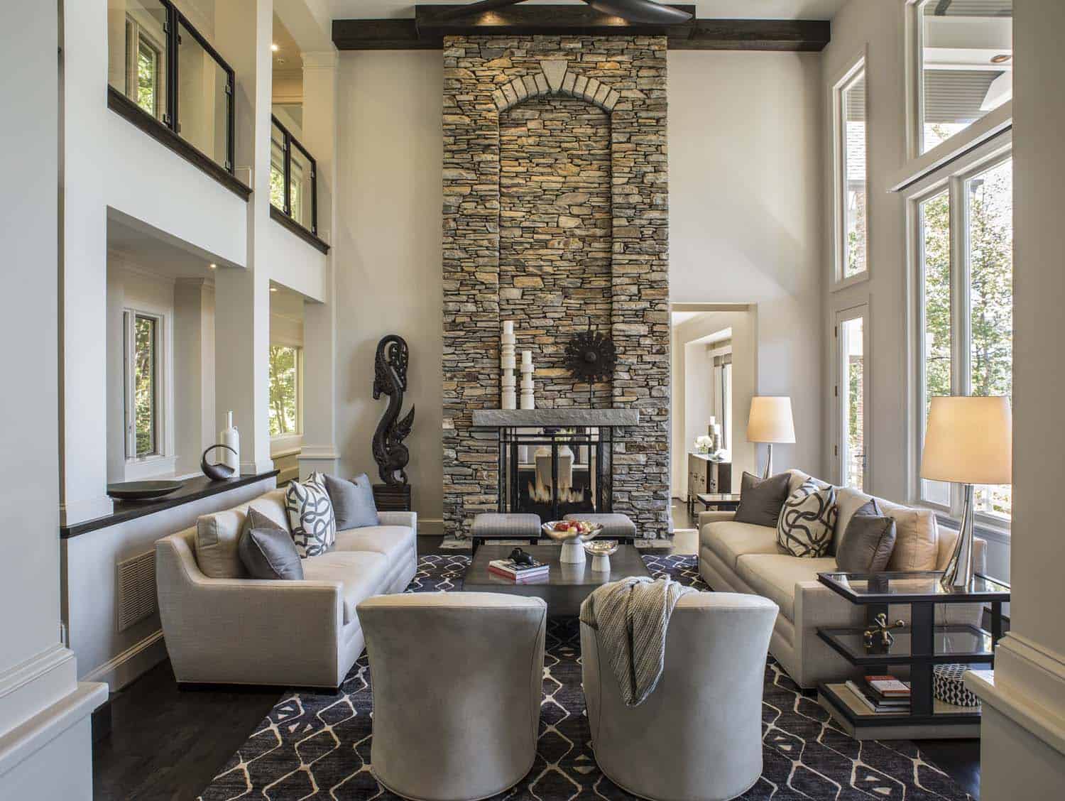
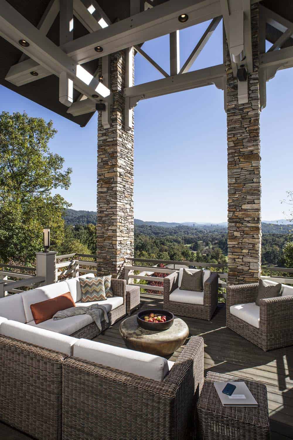
What We Love: This home renovation in North Carolina provides a beautifully updated home with soaring ceilings, light-filled living spaces, and relaxed yet stylish furnishings for entertaining. We are loving the sweeping views through the large windows and the completely refreshed kitchen that perfectly meets the lifestyle needs of the owners. Every detail has been selected for comfort and livability.
Tell Us: What details in this renovation project do you find most interesting? Let us know in the Comments below!
Note: Be sure to have a look at a couple of other sensational home tours that we have highlighted here on One Kindesign in the state of North Carolina: A warm and inviting European inspired house in the Blue Ridge Mountains and A North Carolina mountainside retreat overlooks a breathtaking waterfall.
Above: In the living room, most of the furnishings are from Vanguard, while the chairs were sourced from Swaim and the area rug is by Feizy. The wall paint color is Crushed Ice SW 7647 – Sherwin-Williams.
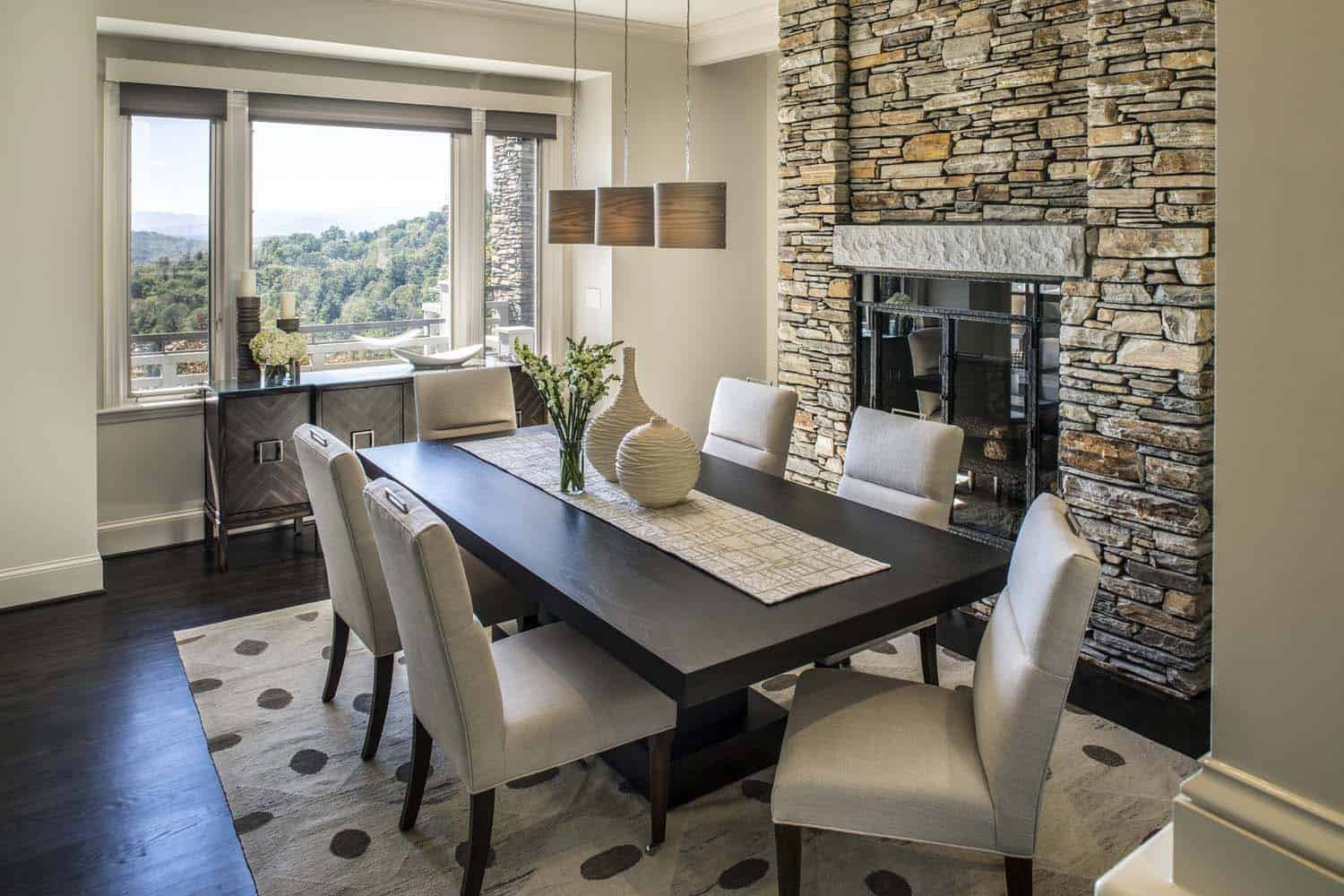
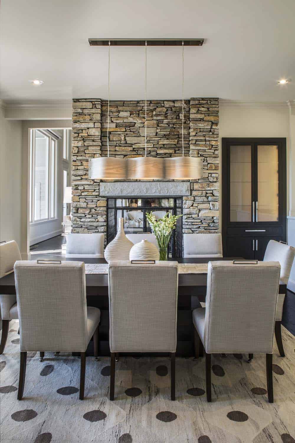
Above: The light fixture over the dining table is from LZF and is a wood veneer shade.
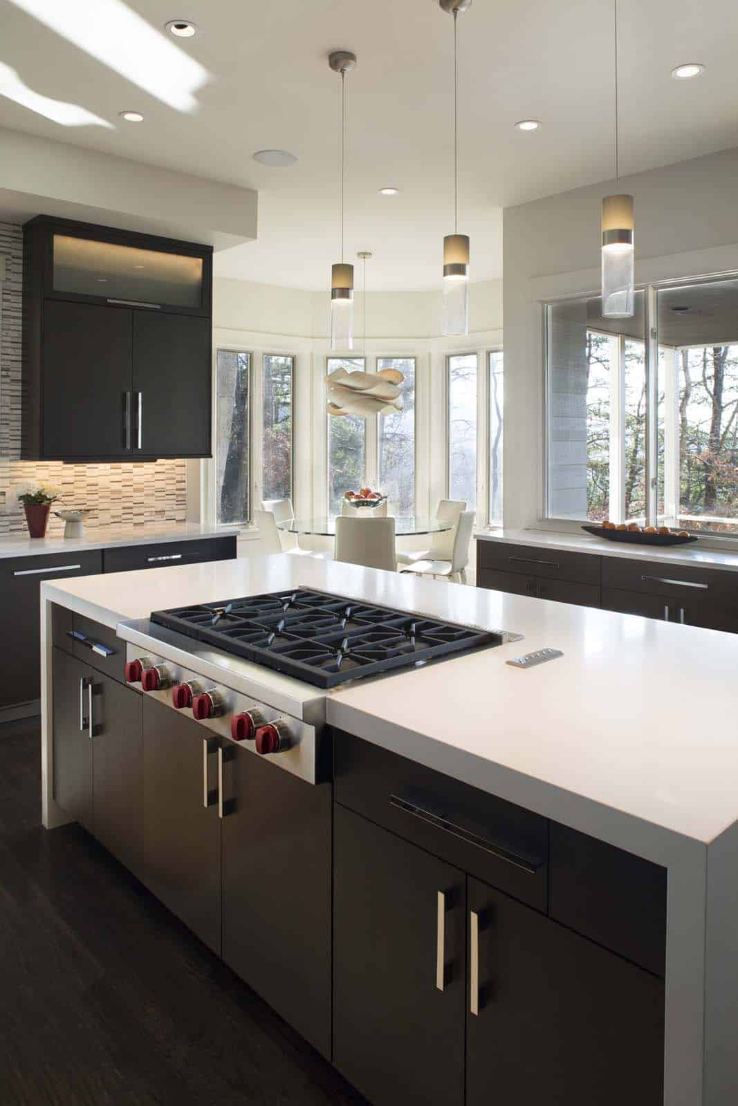
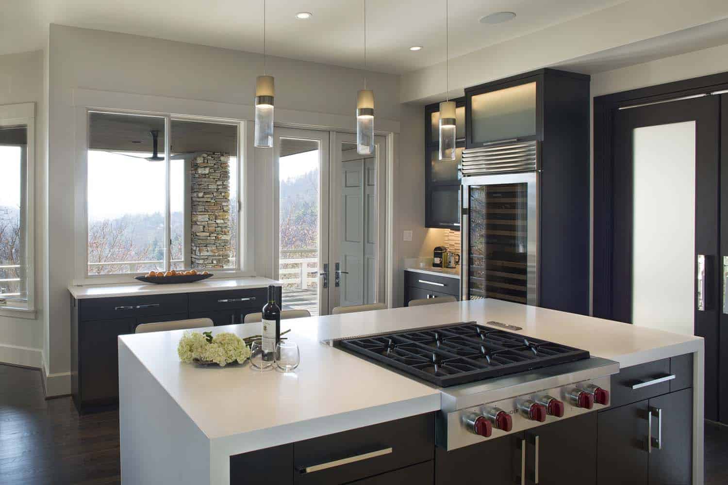
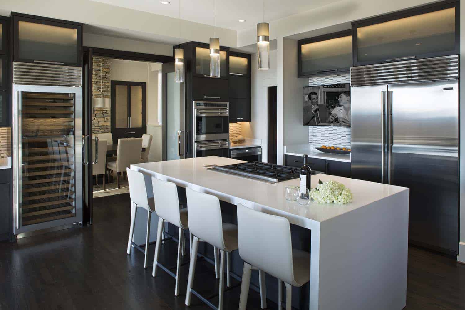
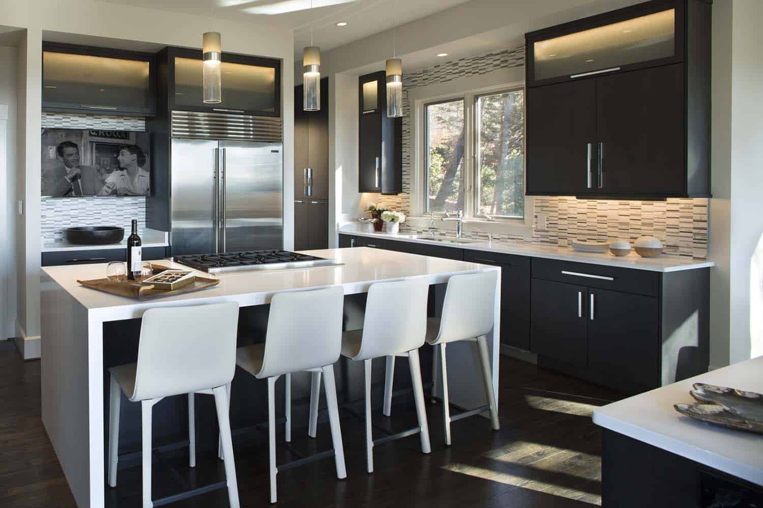
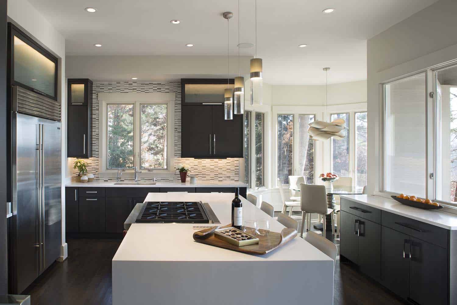
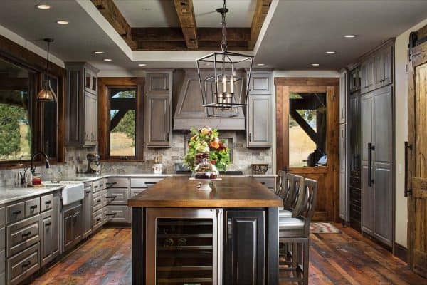
The designers were tasked with creating a high-contrast modern kitchen, perfect for entertaining guests, and watching the game with family and friends. The kitchen was gutted. New smaller soffits were added above custom cabinetry featuring horizontal uppers with glass fronts. All new Wolf and Sub-Zero appliances were added.
The flooring in the kitchen is an existing oak floor that was re-finished with a Minwax Ebony stain. The cabinetry was sourced from Benbow Cabinetry in Asheville, NC.
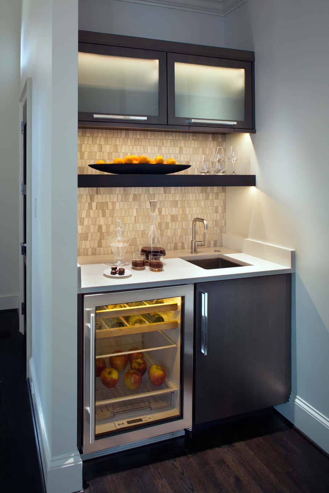
Above: The wet bar is located in a hallway just off the Living Room. The width is approximately 48-52″ wide. The Sub Zero unit was purchased through Ferguson Kitchen & Bath in Asheville, NC. The cabinetry was provided by Benbow Cabinetry in Asheville, NC.
A television beside the refrigerator can now be viewed from the island or the breakfast area, as the family enjoys watching football games together over a meal. A downdraft was used instead of a hood in order to keep the view clear to the television, and from the cooking area out the windows to the view.
Above: The stools are by Maria Yee and were sourced through Four Corners Home in Asheville, NC.
The new kitchen now functions for family gatherings and more formal entertaining, and it suits the owner’s taste perfectly.
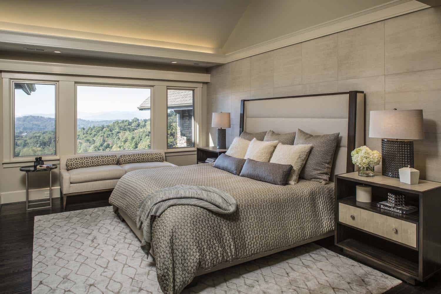
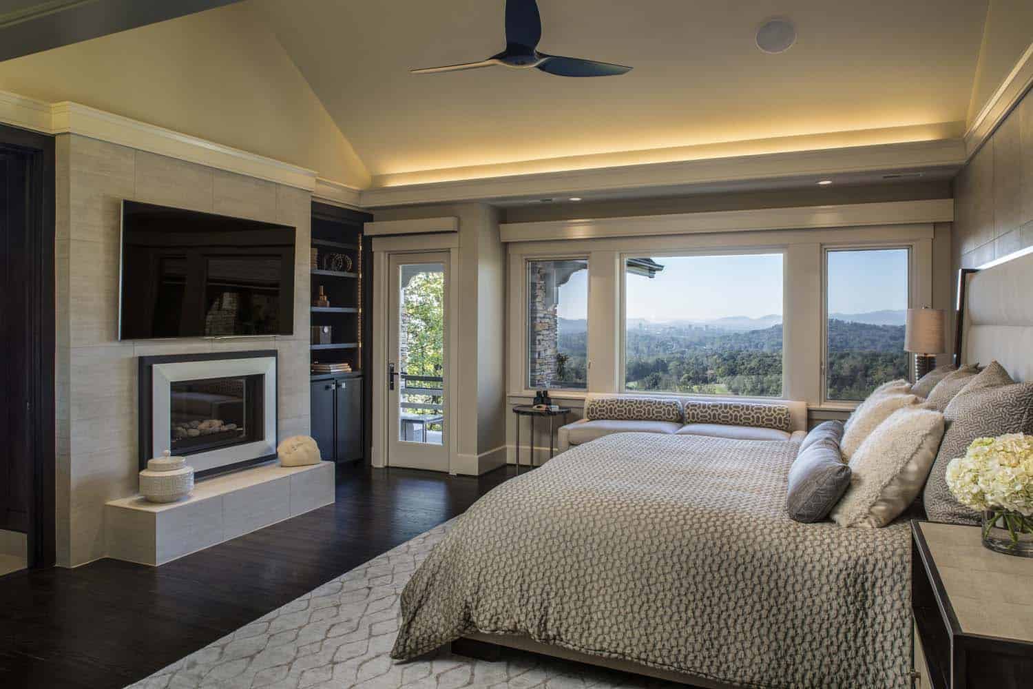
Above: The fan in the main bedroom was sourced from Haiku. The bed is from Vanguard Furniture.
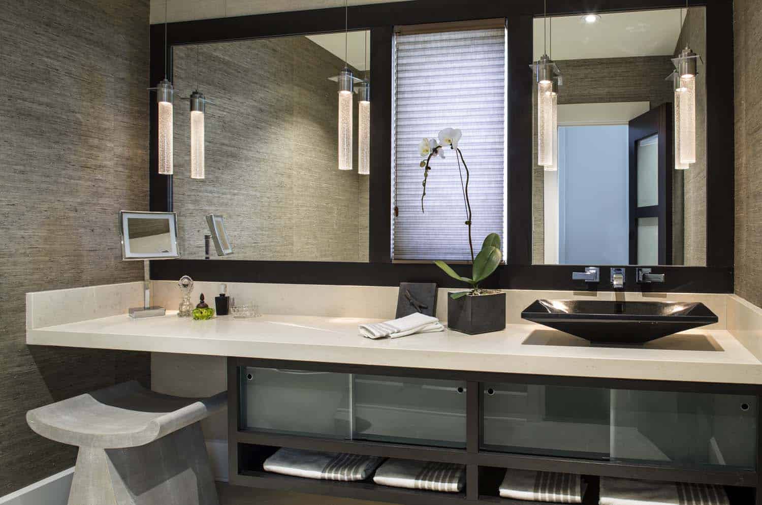
Above: The bathroom vanity stool is the Annika Stool from a company called Made Goods.
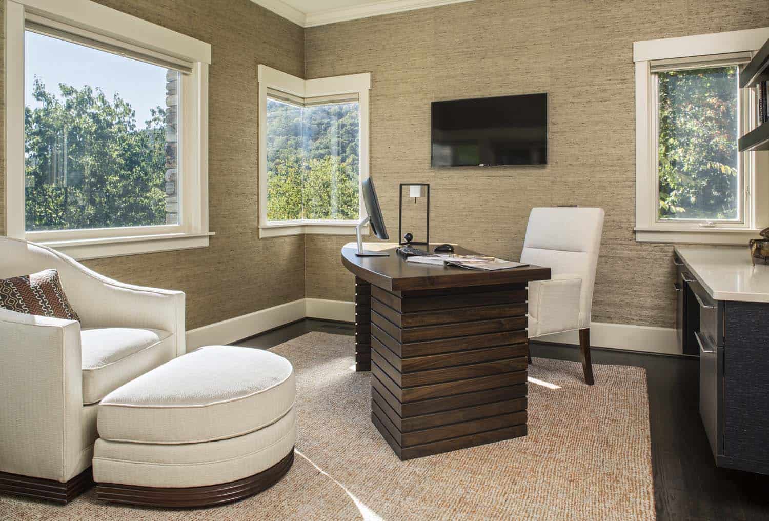
Above: The office desk was custom designed by Allard Roberts and was made by a local furniture maker. It’s stained Walnut.
PHOTOGRAPHER David Dietrich


5 comments