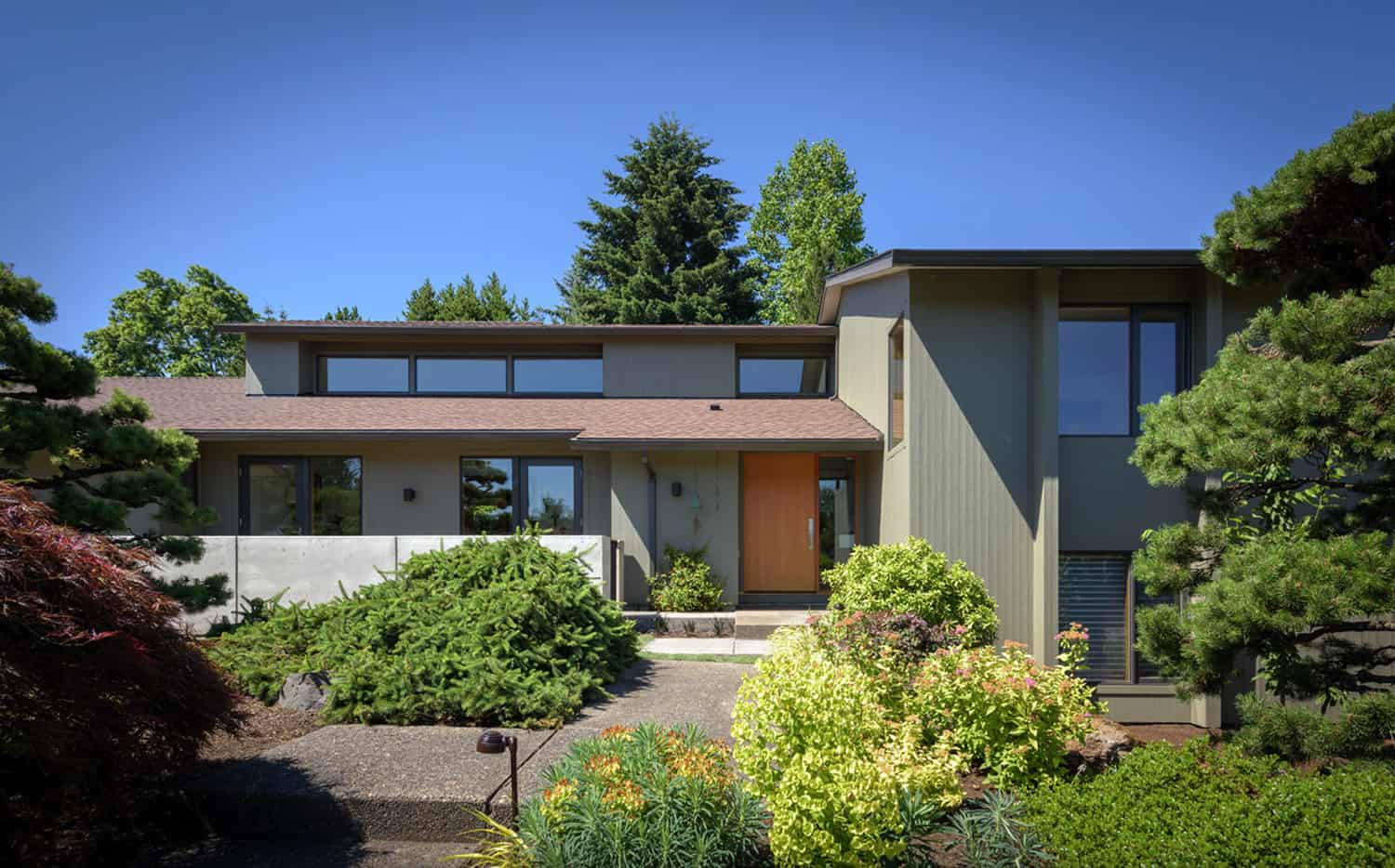
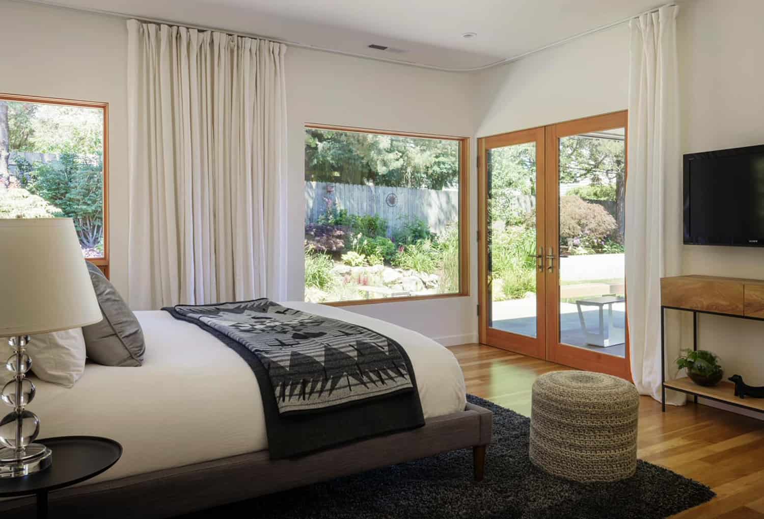
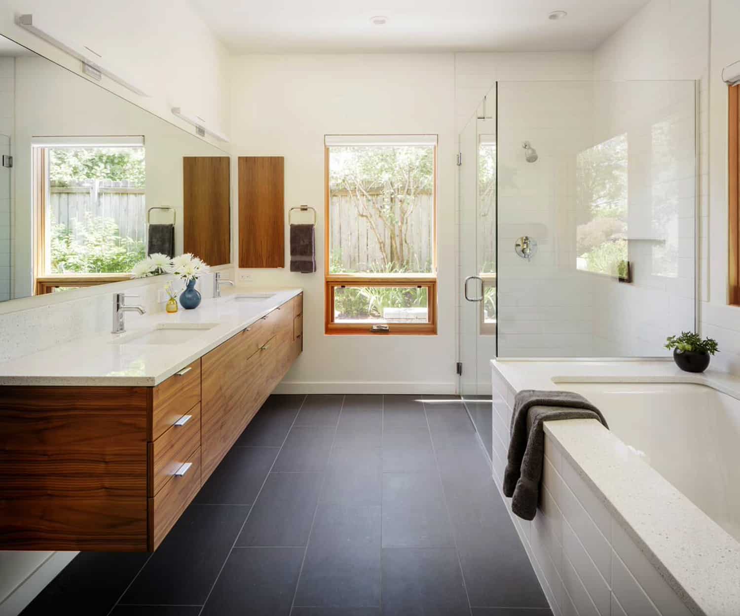
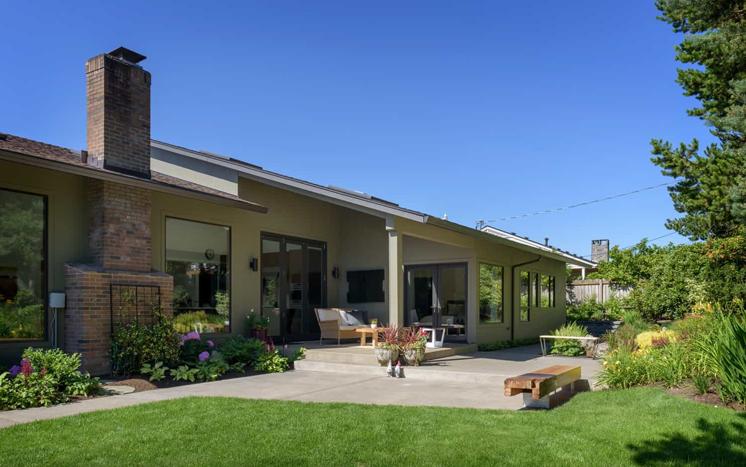
Risa Boyer Architecture is responsible for the complete transformation of a 1970s split-level modern home located in Raleigh Hills, a suburb of Portland, Oregon. The scope of this project entailed a renovation and addition to a ’70s split-level time capsule. When the owners purchased this home back in 2014, it had never been renovated from its original conception.
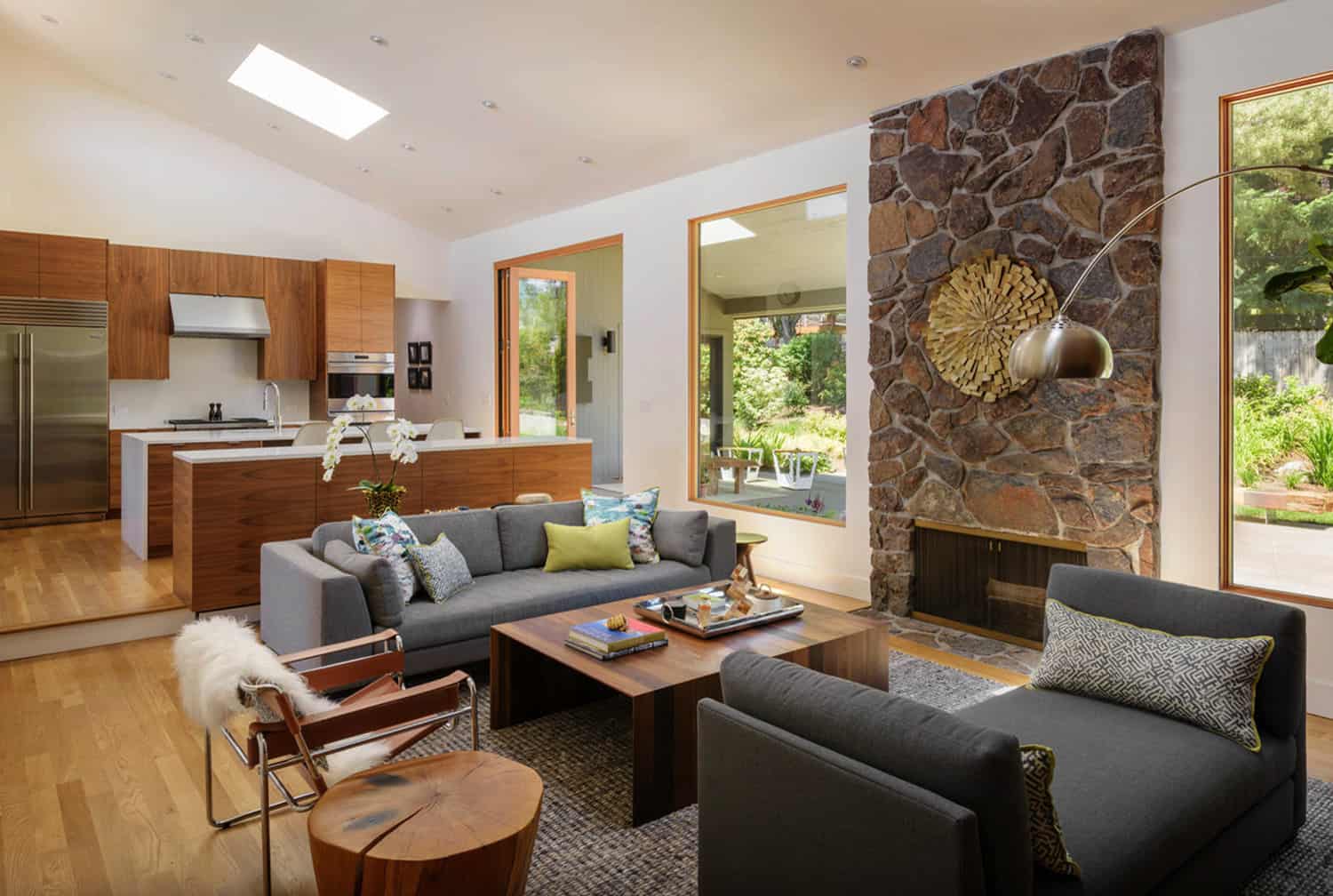
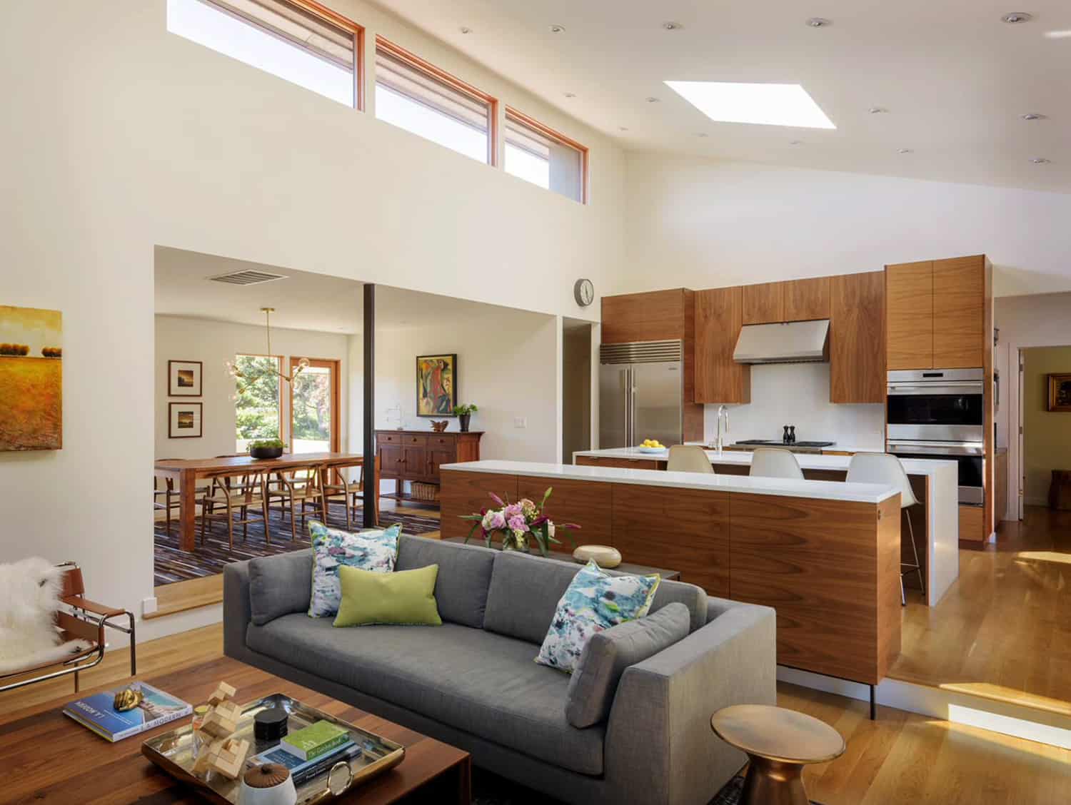
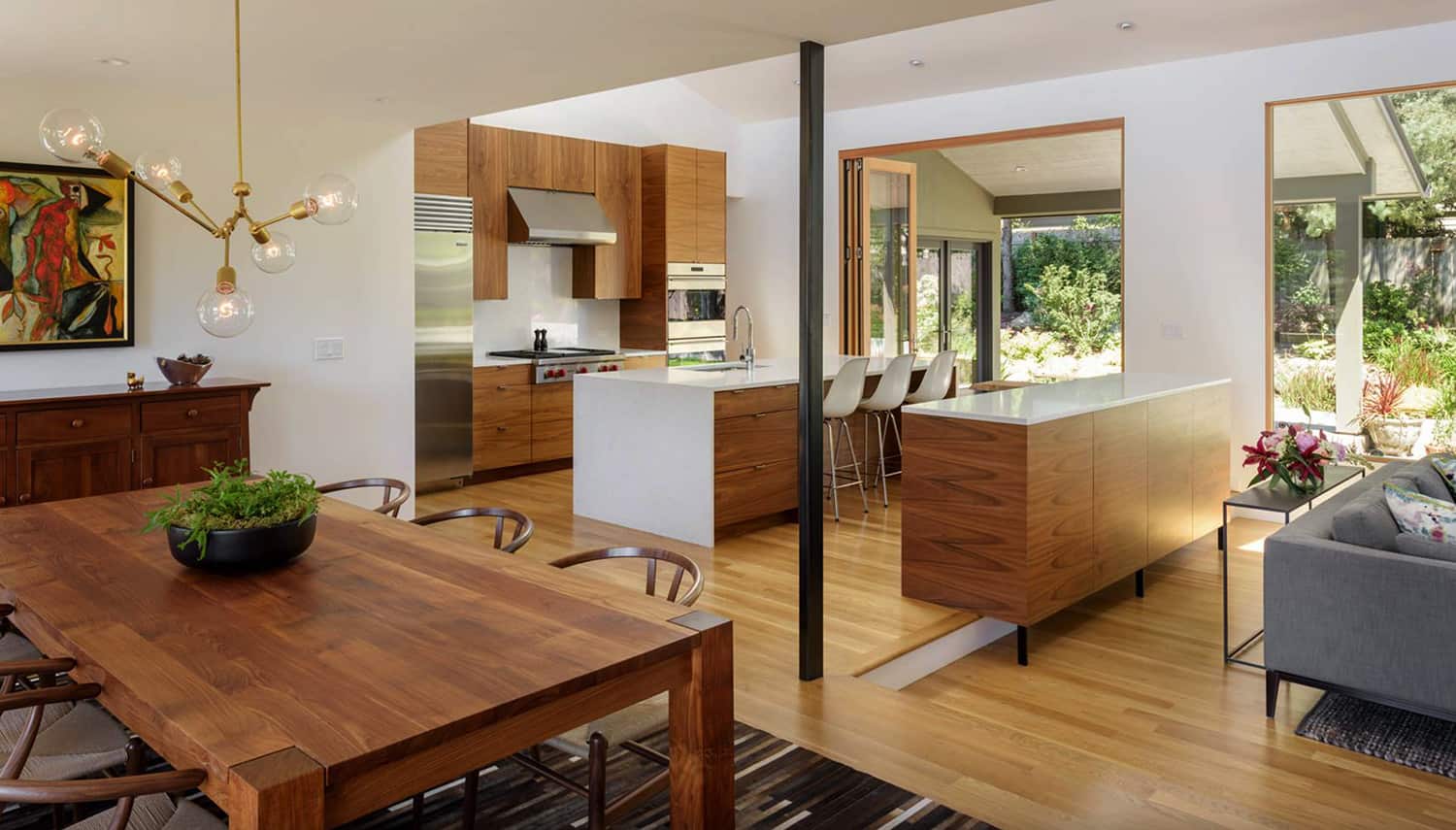
The architect went to work reimagining this home that had pink marble, low ceilings, and metallic wallpaper. Living spaces were completely opened up, while the ceilings were raised from seven feet tall to almost 17 feet high in the main living spaces. The walls were torn down between the kitchen, dining, and living areas, while large expanses of glass helped to flood the interiors with natural light.
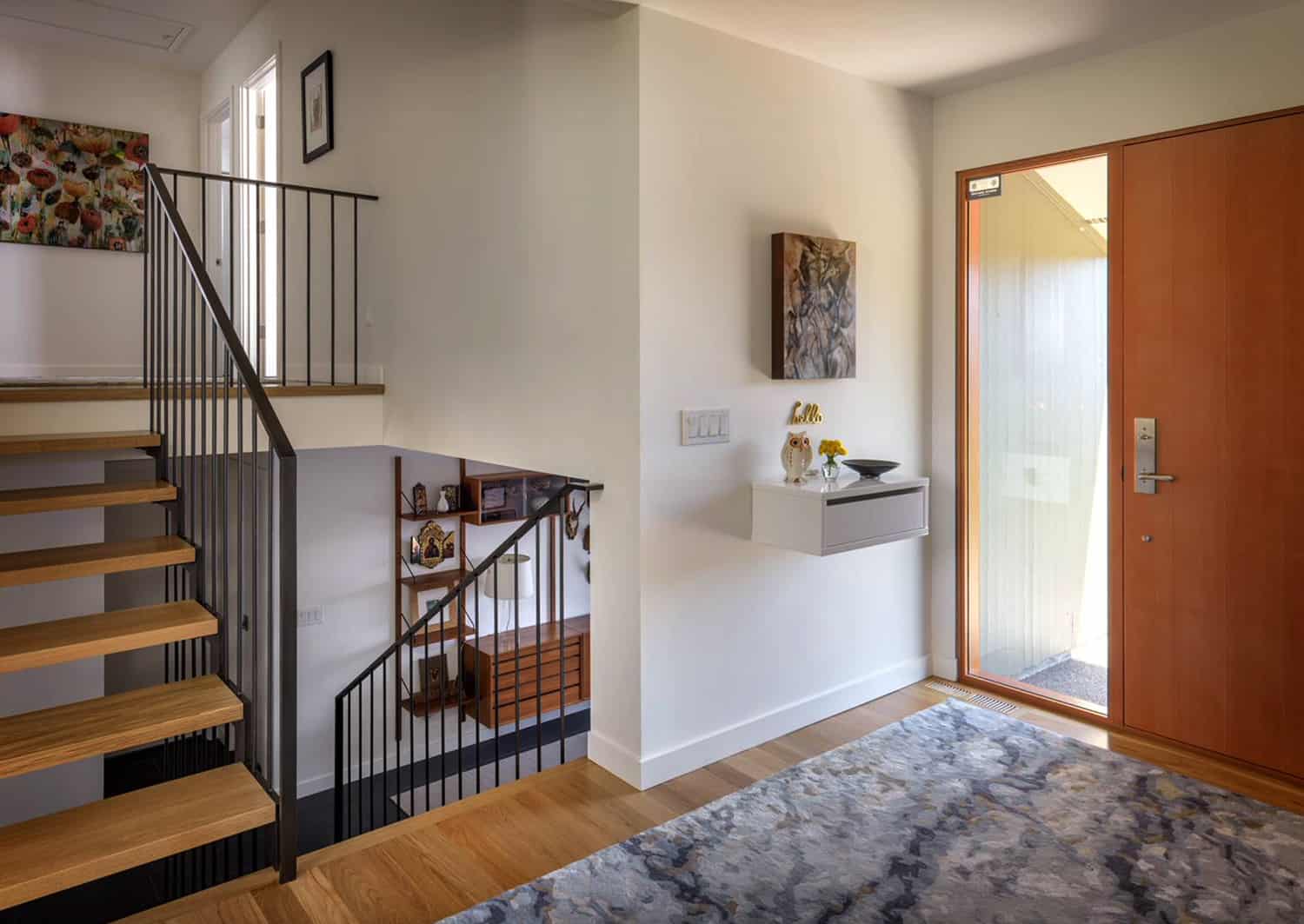
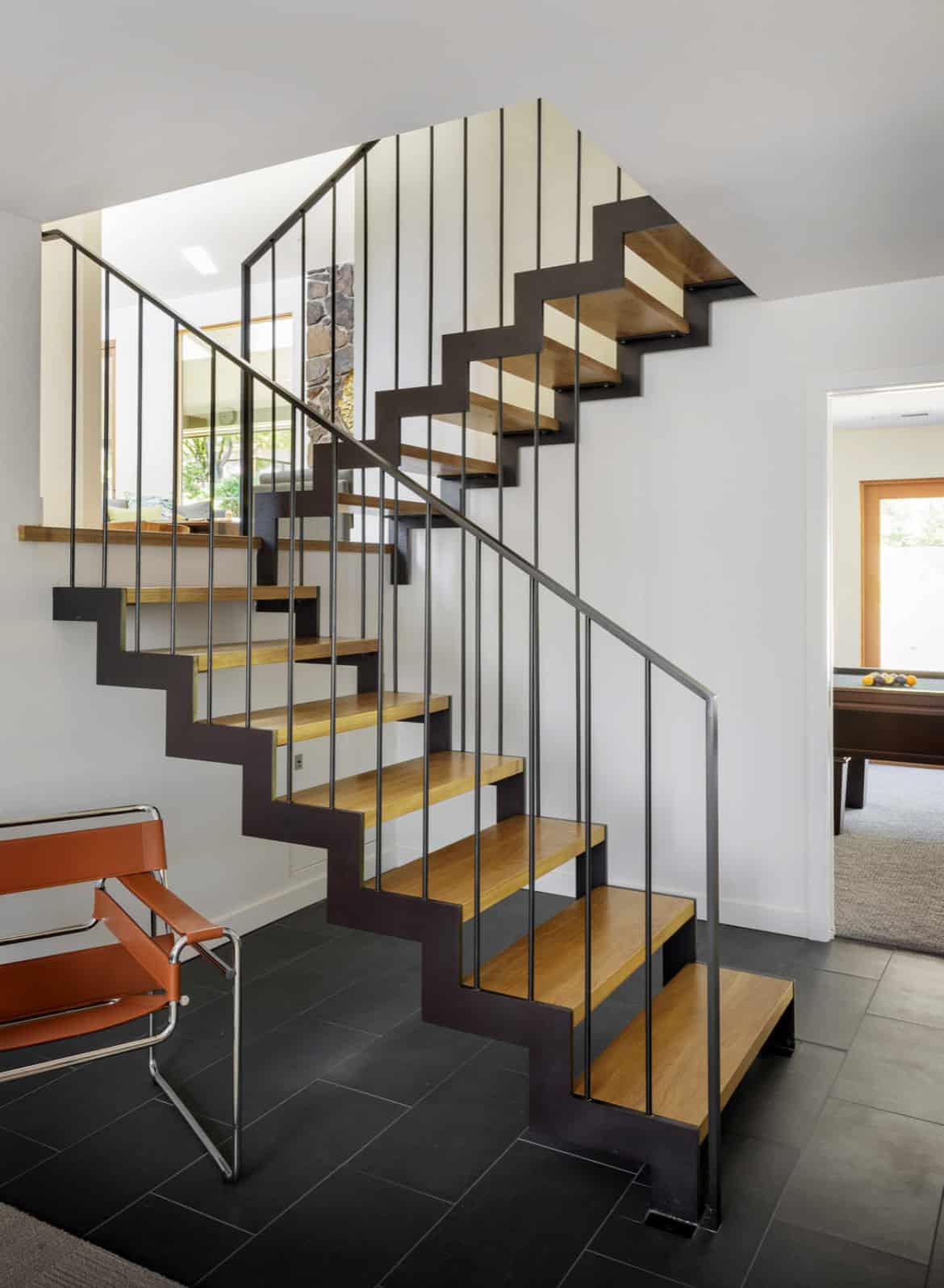
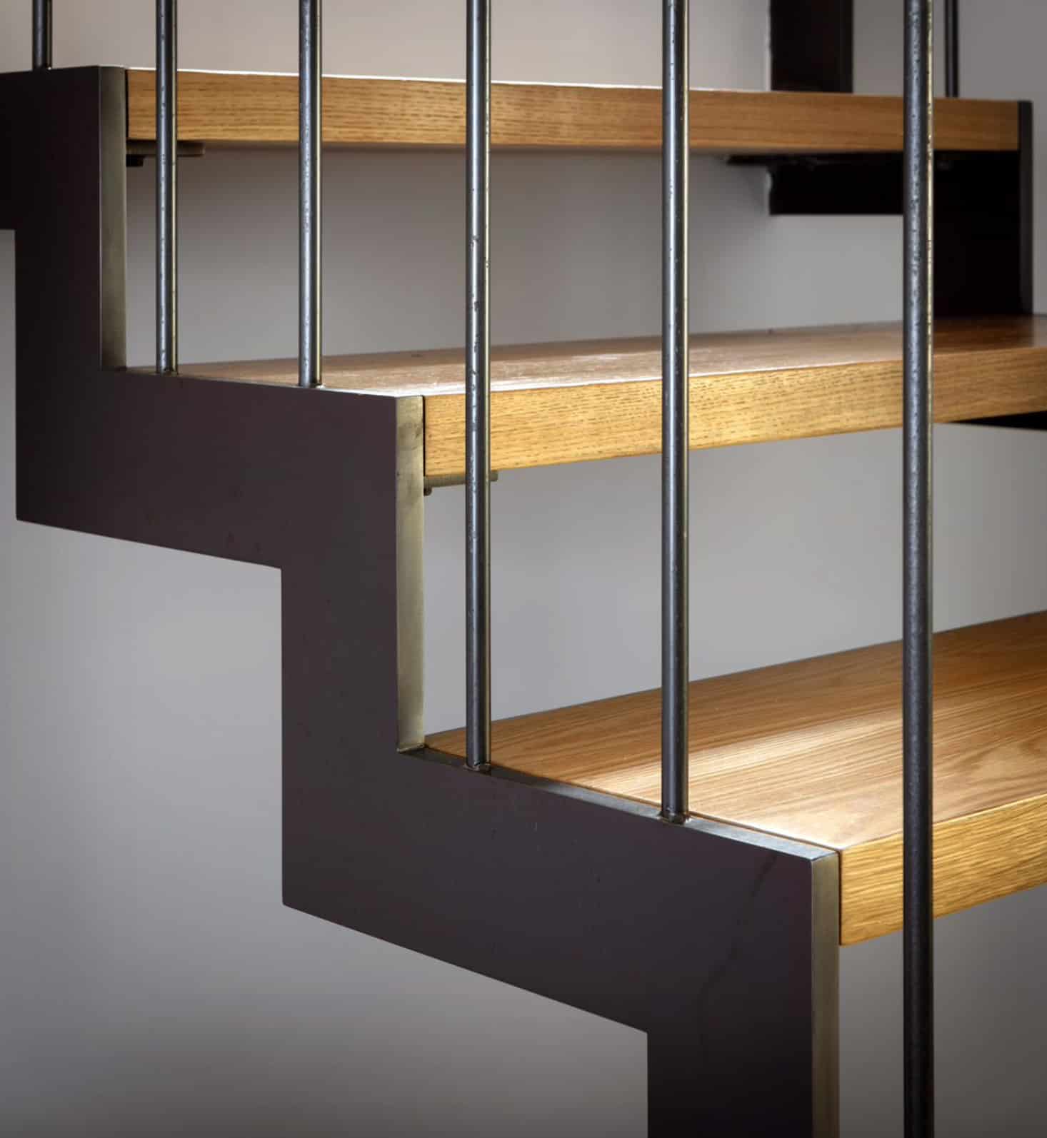
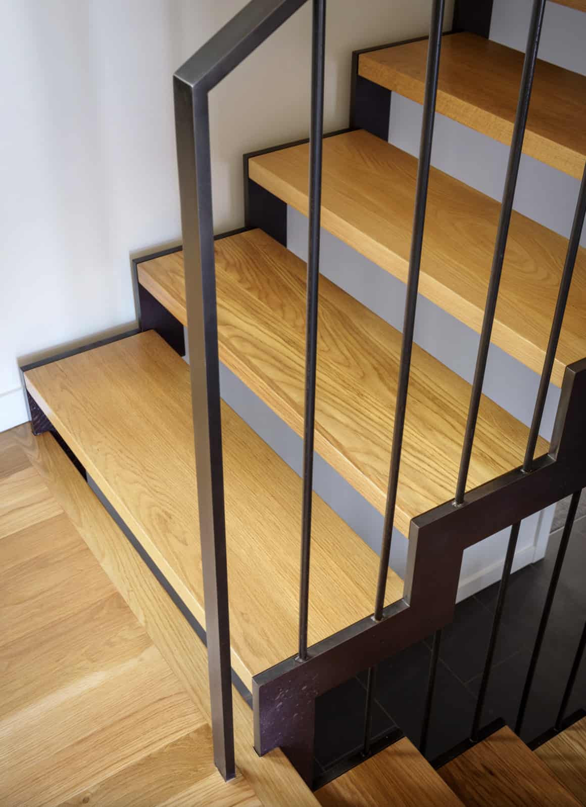
A carpeted cave of a stairwell became a floating steel-and-white-oak sculpture, and a sleek new primary suite added almost 500 square feet to this 2,700-square-foot residence.
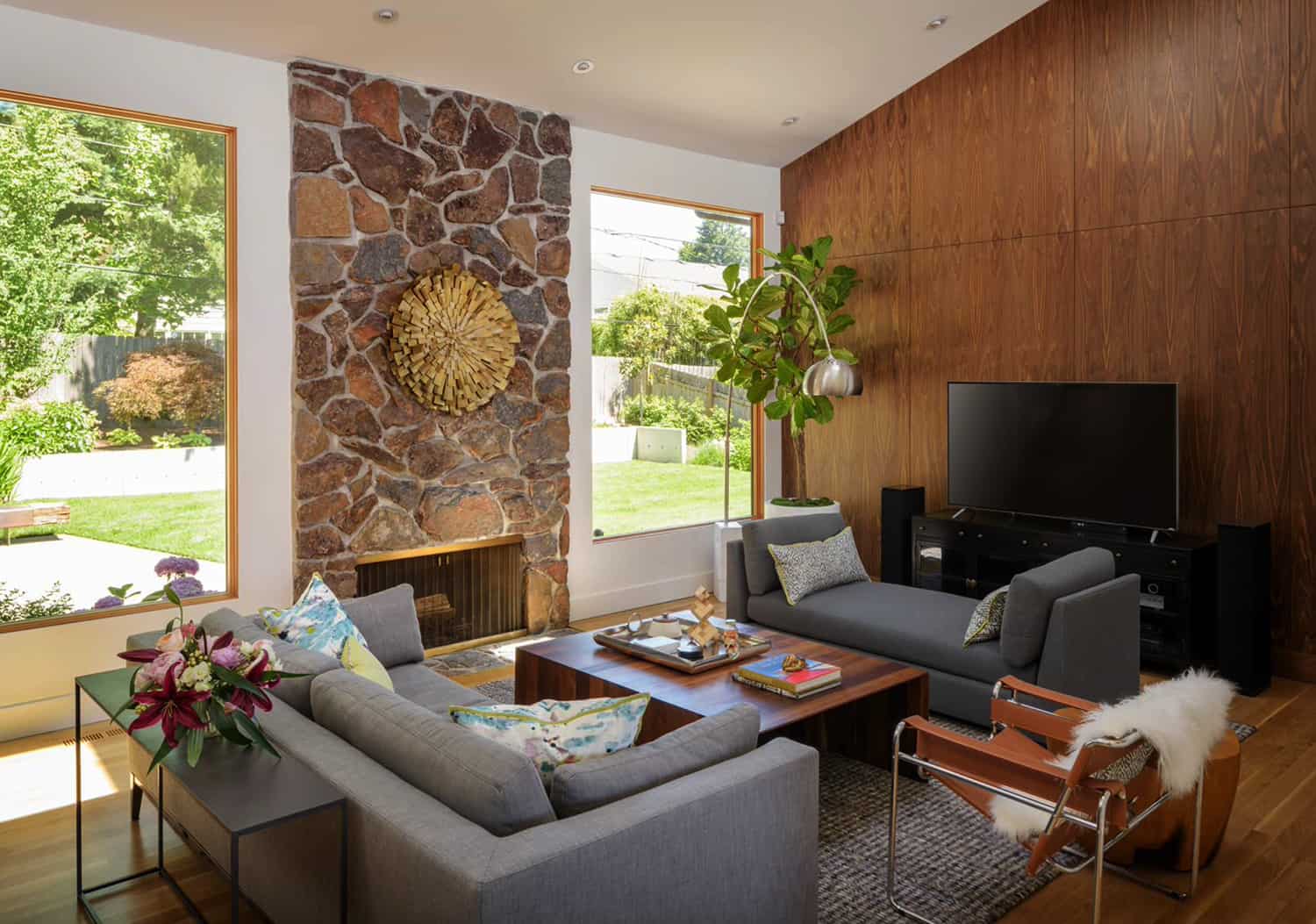
Some original details were preserved in this home to pay homage to its origins. In the living room, the stone fireplace is original and the space remains sunken. A wall of walnut mimics the ’70s fondness for wood paneling. The owners also kept a Cado wall unit that came with the home. It came complete with desks, shelves, and plenty of light — a nod to this home’s past.
What We Love: This split-level modern home was given a complete overhaul with crisp white walls serving as a backdrop to stylish mid-century furnishings. We are loving how the architect completely opened up the living spaces to provide a more harmonious flow. Details such as the original stone fireplace in the living room and the wall of wood paneling offer creative solutions to preserving the nostalgia of the 70s.
Tell Us: What is your favorite design detail in this home transformation? Let us know in the Comments below!
Note: Check out a couple of other amazing home tours that we have showcased here on One Kindesign in the state of Oregon: A black cladding house in Oregon blends in seamlessly with nature and Light-filled home designed to feel like a retreat in the Willamette Valley.
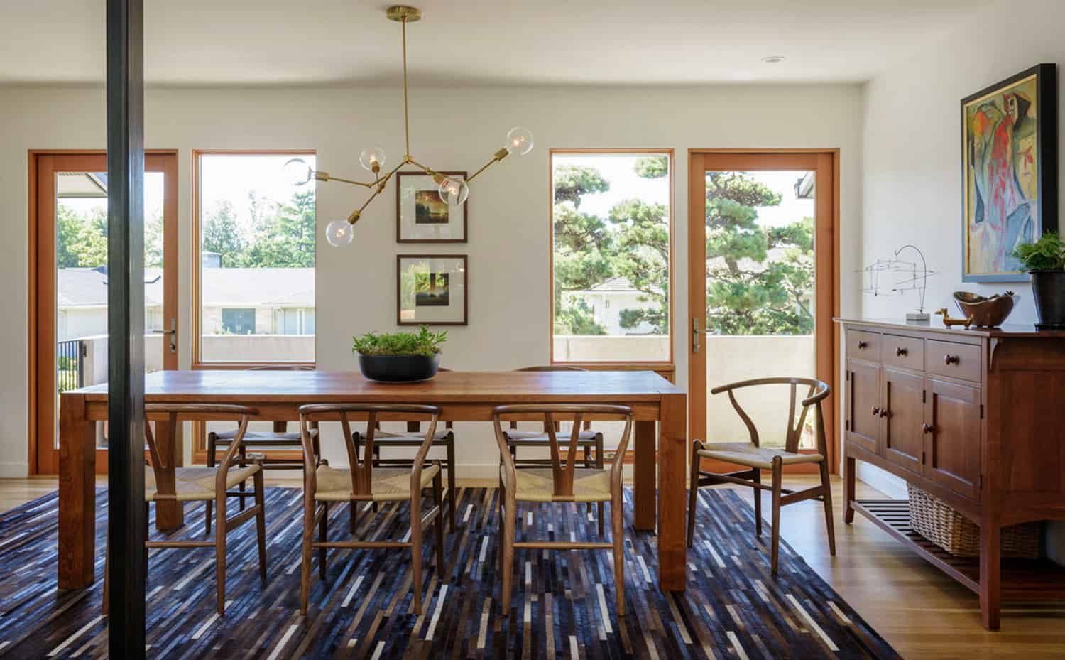
The interiors feature a muted palette with minimal details. Wood cabinetry and flooring help to infuse warmth throughout. Eclectic furnishings include the Wishbone Chairs by Hans Wegner in the dining room, a Stickly bookshelf, an abstract oil painting by Navajo artist Sheldon Harvey, and an au courant DIY chandelier.
PHOTOGRAPHER Aaron Leitz


3 comments