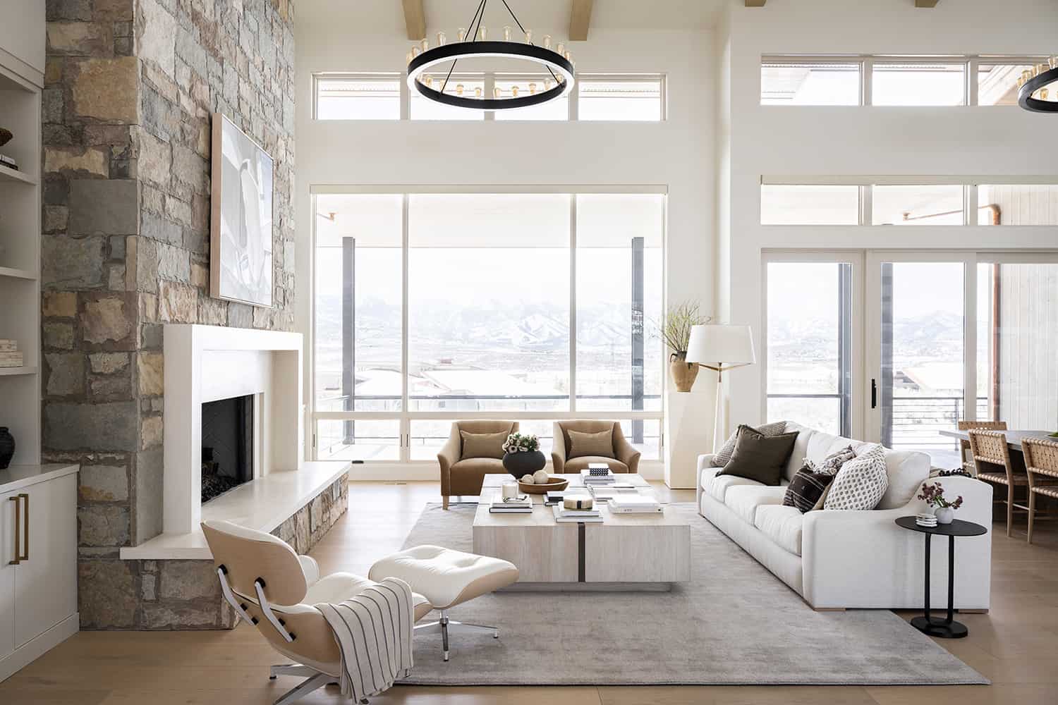
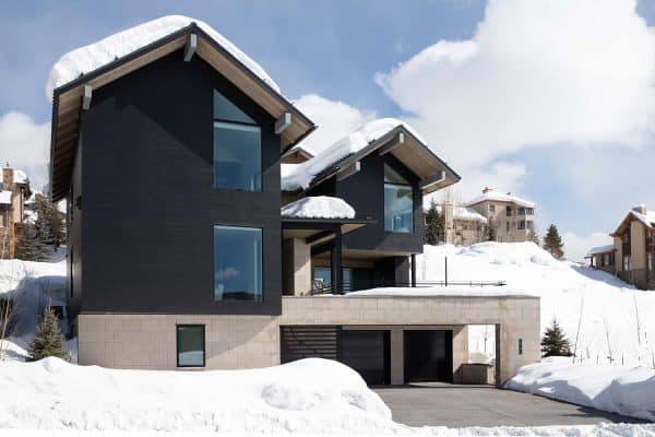
This beautiful contemporary home was designed by Otto Walker Architects with interiors by Studio McGee, located in the mountain community of Deer Valley, near Park City, Utah. The architecture of this dwelling speaks for itself through the selection of materials that enhance the natural elements of the space.
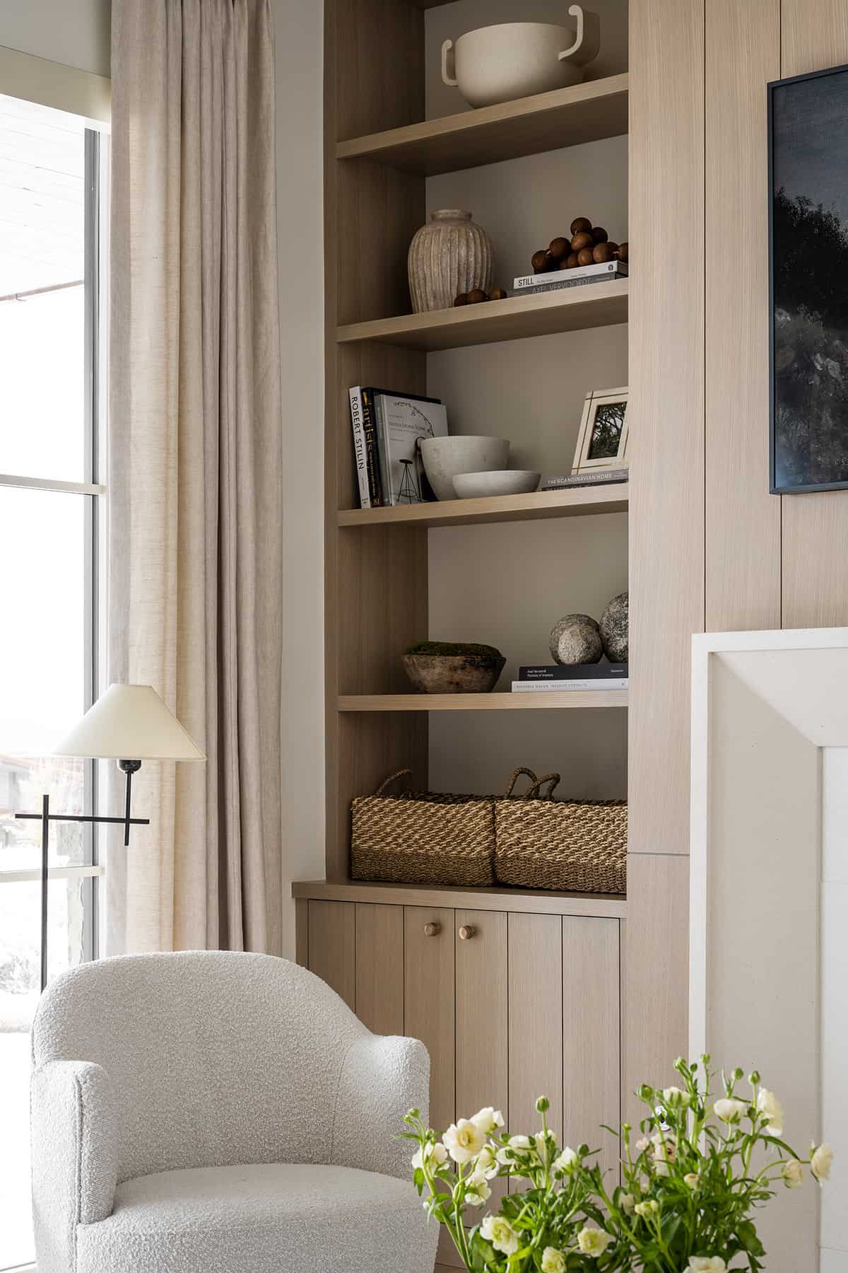
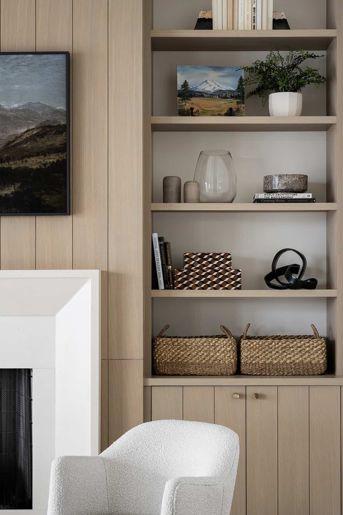
The owner’s wish for this home was to create a streamlined aesthetic with a very strict color palette. The goal was to create unified living spaces with a simplified palette yet keep it interesting. This is where the designer cleverly introduced layers and textures with interesting shapes.
DESIGN DETAILS: ARCHITECTURE Otto Walker Architects BUILDER Don Craig Construction INTERIOR DESIGN Studio McGee
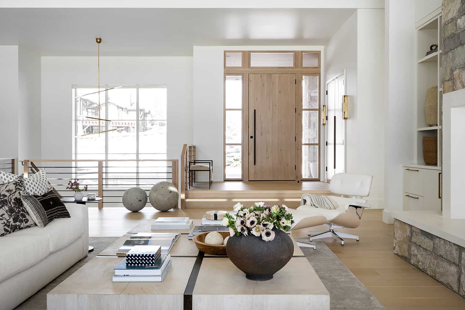
The entryway is an open balcony with views of an exquisite chandelier that suspends over the staircase that leads to the downstairs level. The designer did not have an entry moment to place a console table with a mirror, so instead, she focused attention on the closet doors with elongated hardware and a beautiful stain. She also placed a bench for taking shoes on and off.
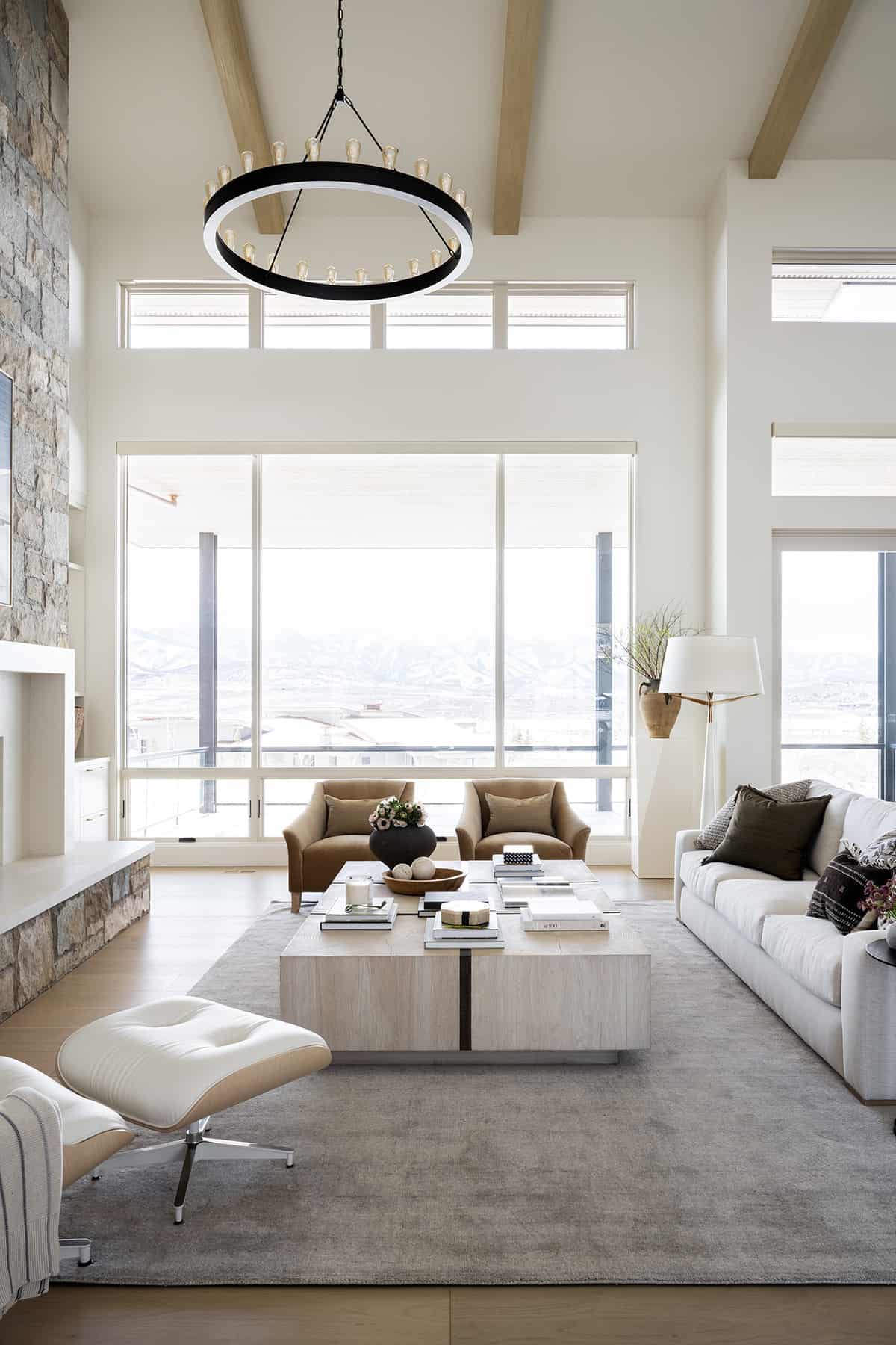
What We Love: This Utah mountain home offers clean, contemporary lines and a neutral color palette that was been softened with a layering of textures. With white walls as the backdrop, this helps to not detract from the expansive snow-capped mountain views framed through large windows. We are especially loving how the designer infused warmth throughout this Utah home through her selection of finishes and accessories to create an inviting aesthetic.
Tell Us: What details in the design of this home do you find most inspiring and why in the Comments below!
Note: Take a look at another fabulous home tour that we have featured here on One Kindesign in the state of Utah: Absolutely incredible modern farmhouse with a fabulous pool in Utah.
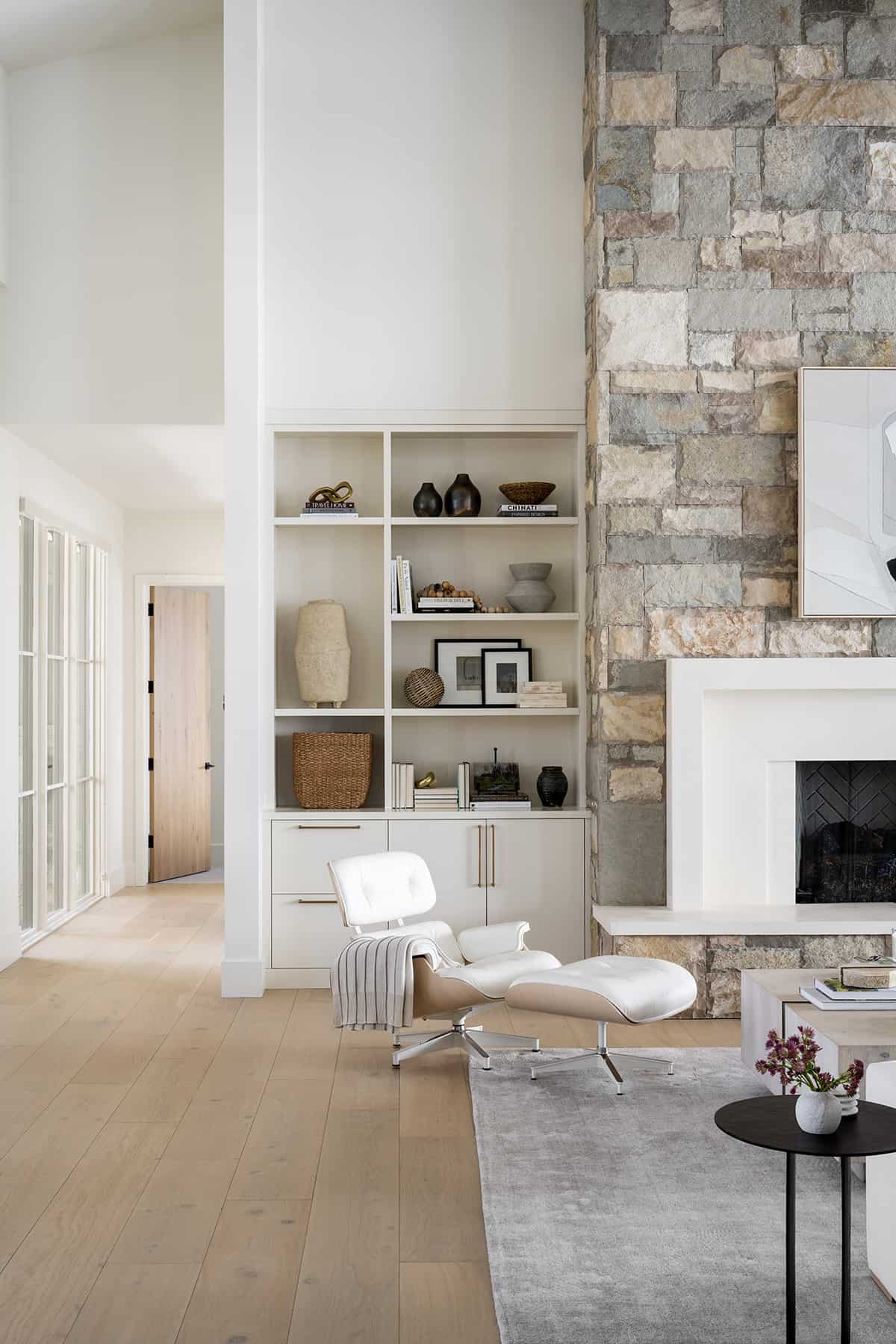
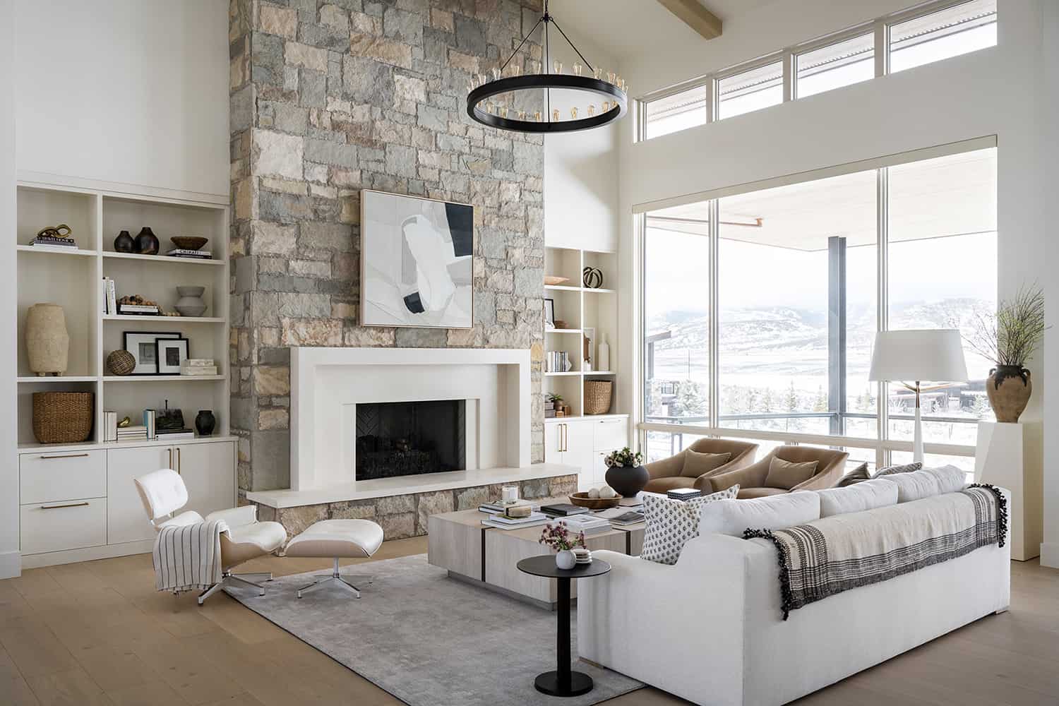
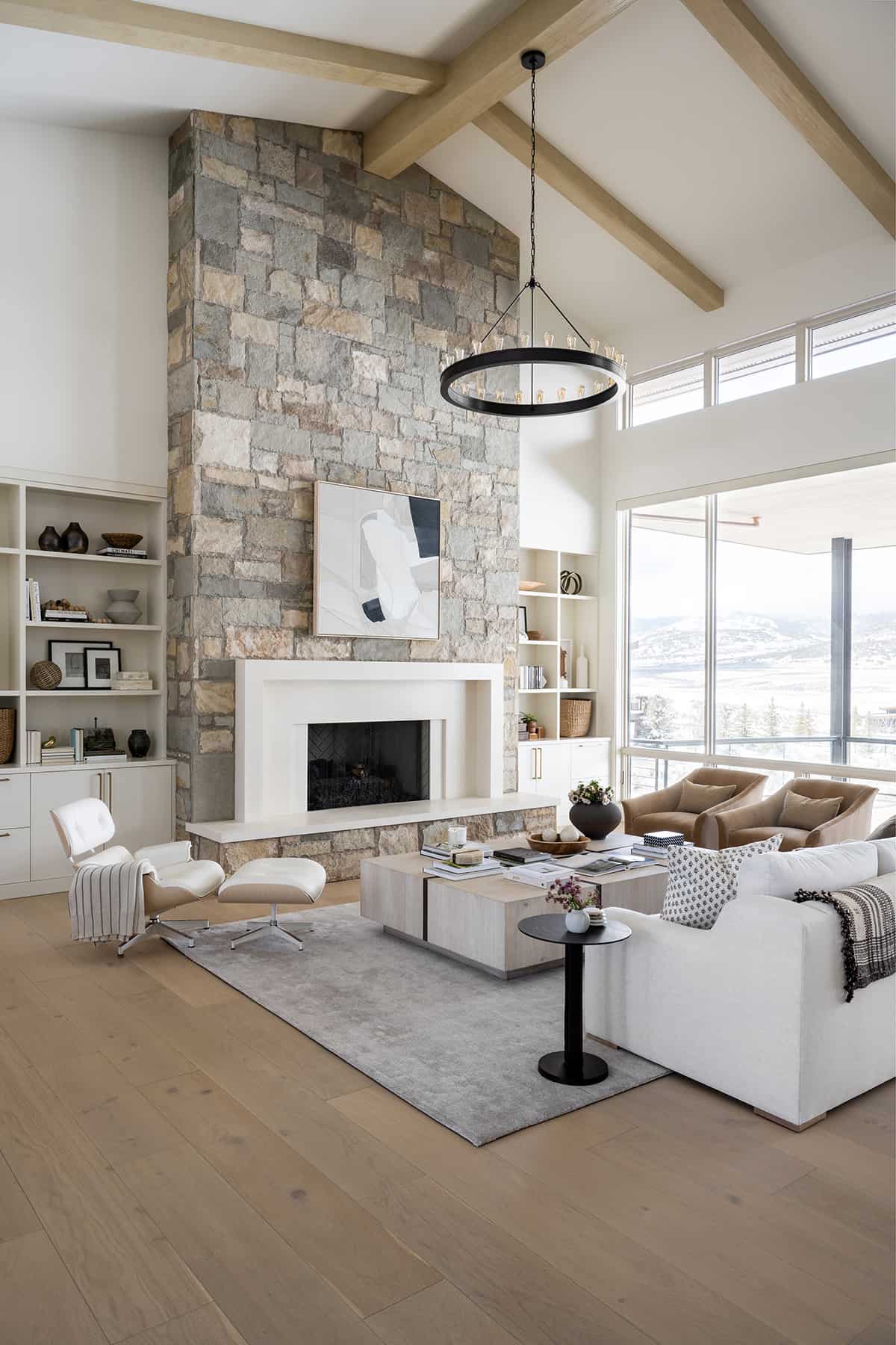
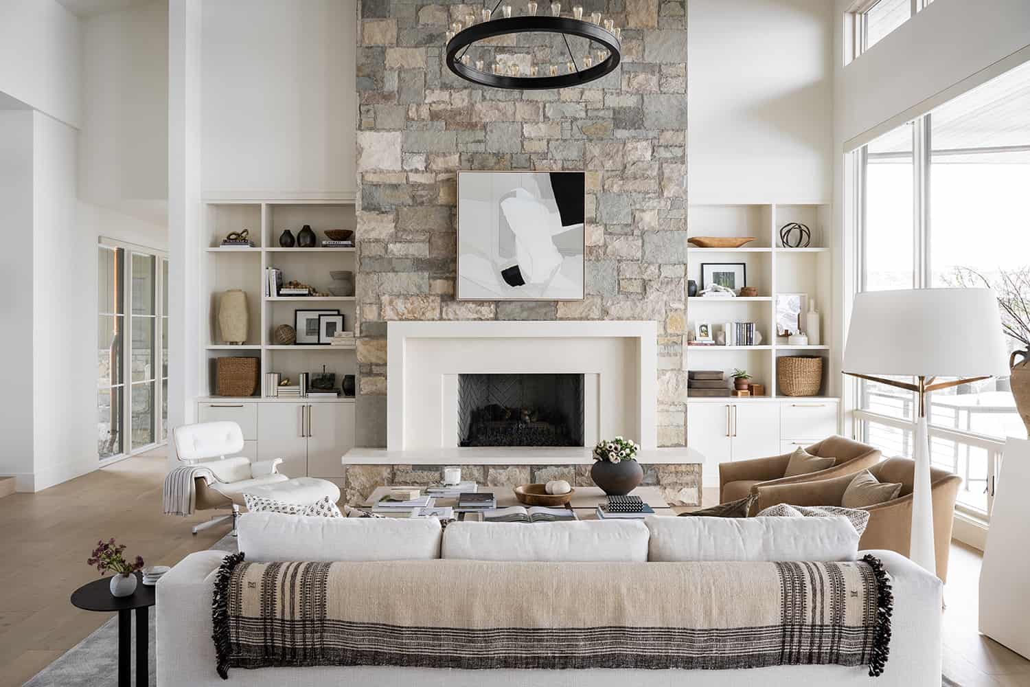
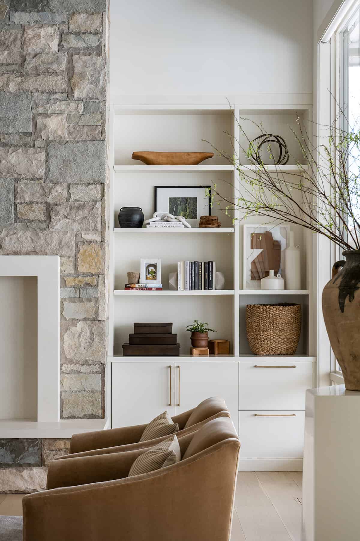
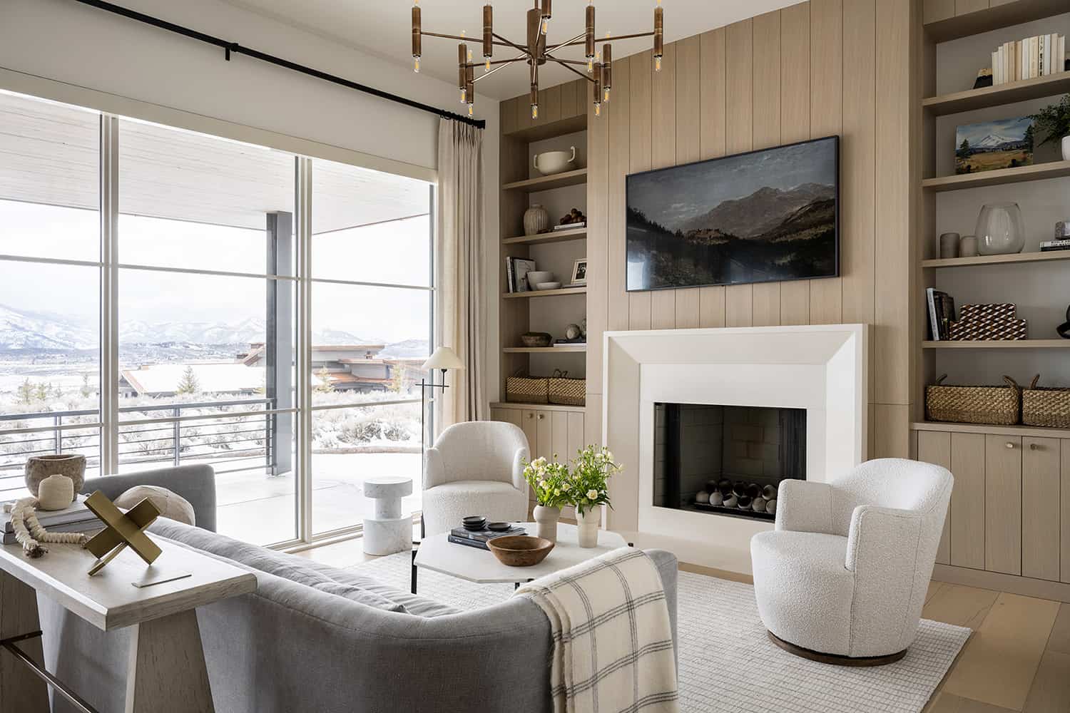
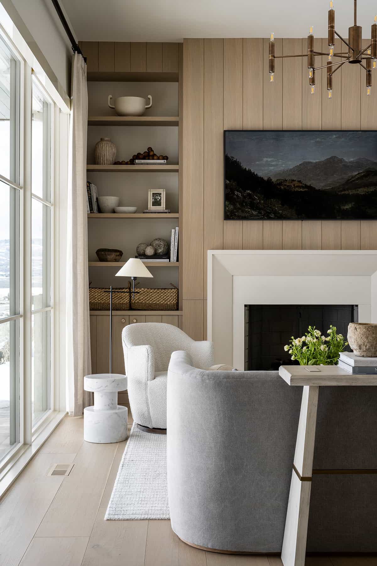
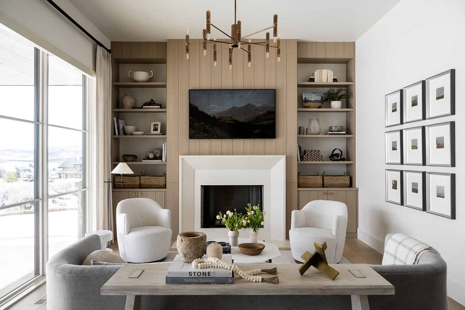
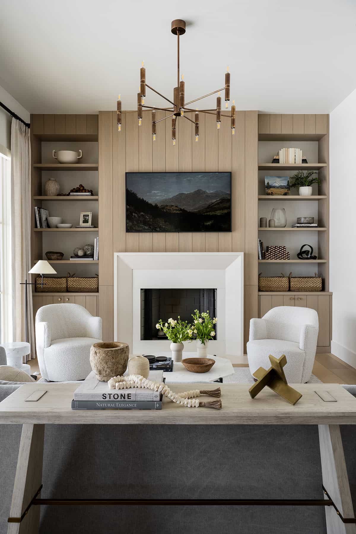
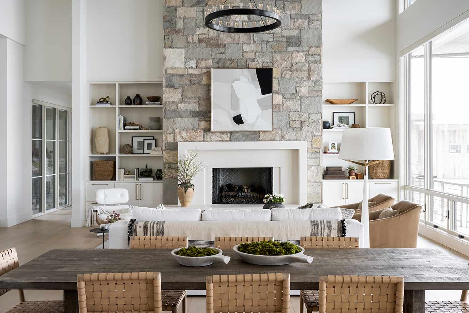
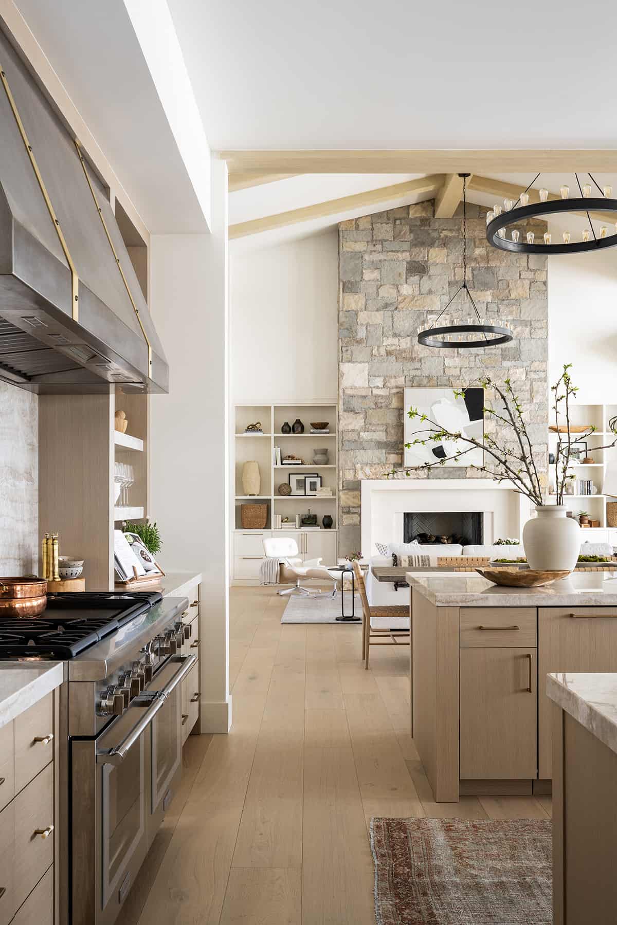
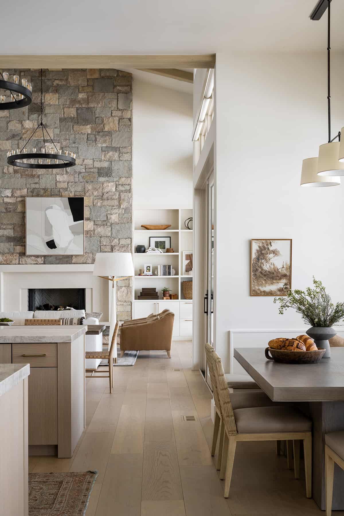
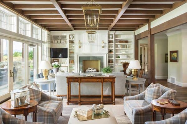
The designer was tasked with adding warmth and livability to this contemporary Utah home. The exterior stone was brought into the living room on the fireplace with a cast stone surround in a boxy trim detail. On either side of the fireplace are built-in bookshelves. Instead of doing even shelves, the designer opted to break up the look in an asymmetrical fashion to highlight a vase and keep that modern edge.
All of the views are orientated out of the back of the home and towards the Deer Valley ski slopes.
With a neutral color palette, layers of textures were added to the design scheme, along with a subtle pattern in the pillows.
If you are short on space to add a console to the back of a sofa, the designer suggests draping a throw along the back of the sofa. It acts as a visual barrier between two open rooms while adding great texture and pattern.
The hearth room features vertical paneling along the back wall. The fireplace has ceramic fire balls, adding a fun, modern element. They also bring a sense of height and proportion to the fireplace.
Throughout the interiors, the walls are painted in Swiss Coffee OC-45 | Benjamin Moore, while the window trim is Natural Cream OC-14 | Benjamin Moore — Studio McGee’s two favorite paint colors!
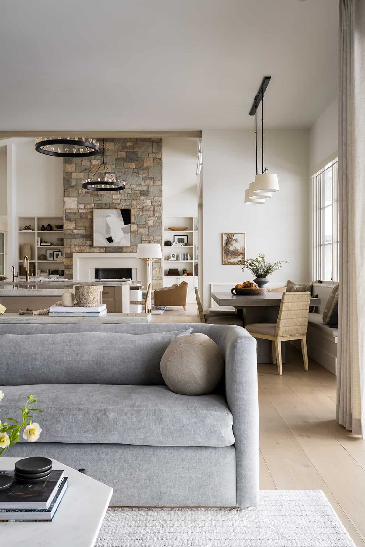
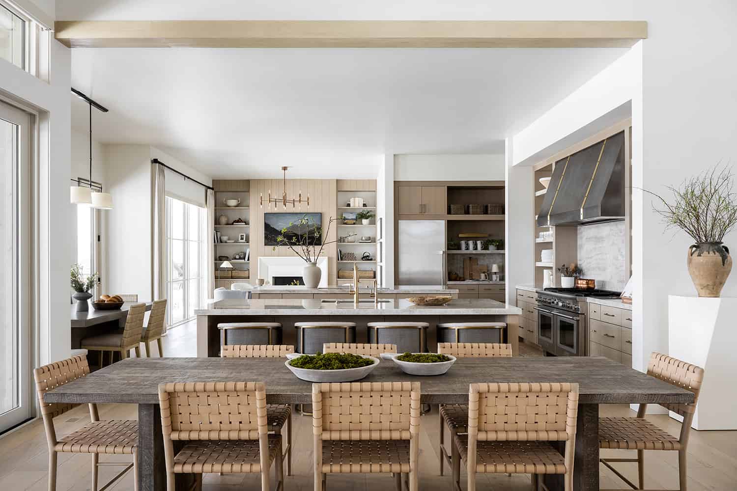
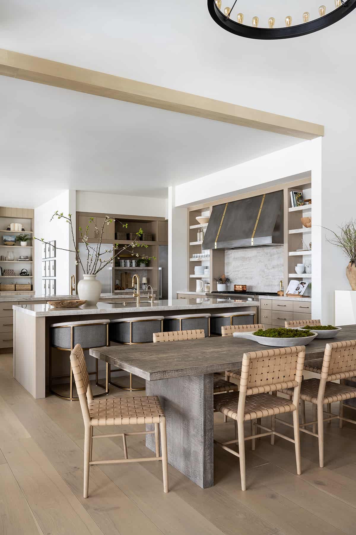
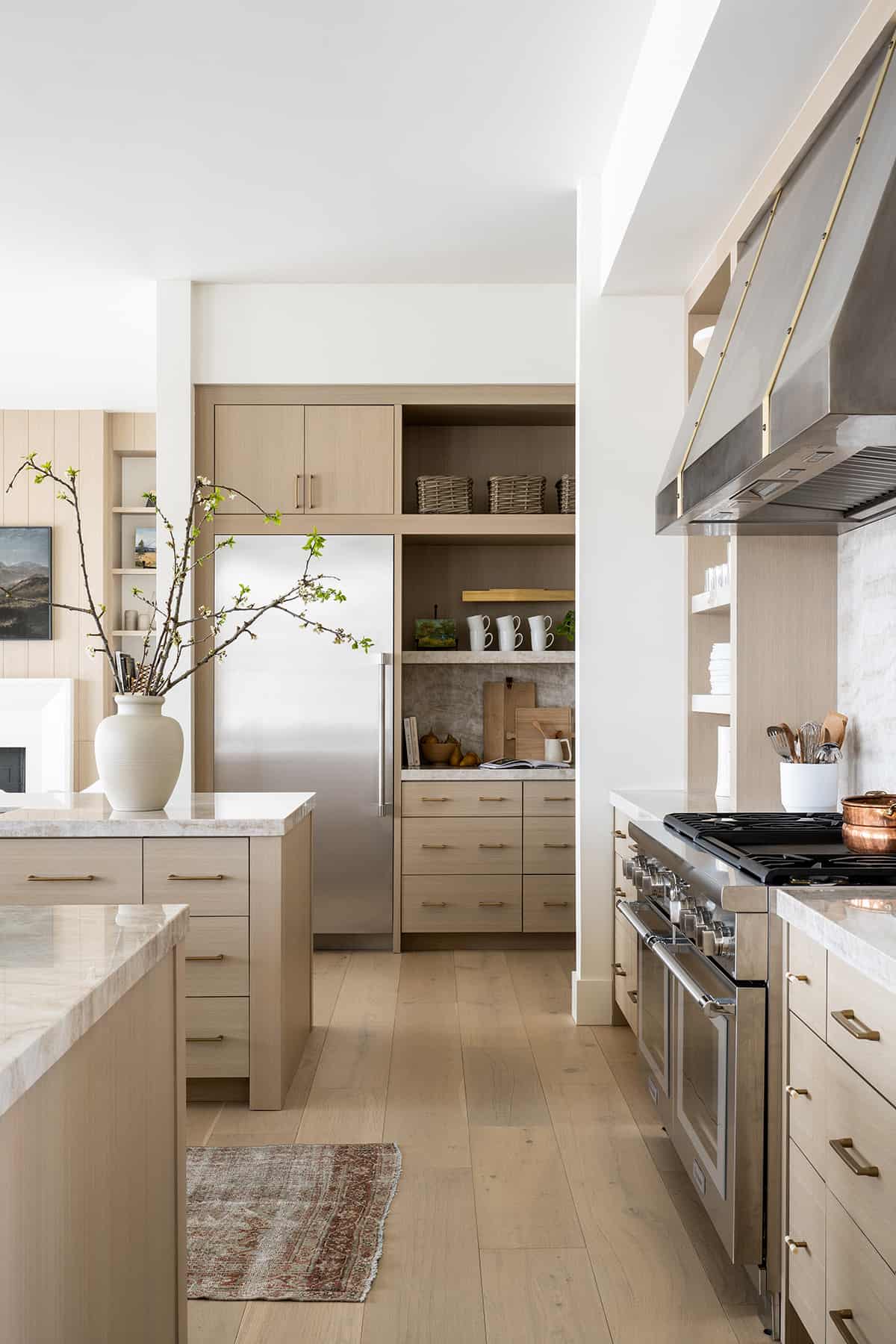
The dining room, kitchen, and living room are all stacked together in an open layout, so the designer selected materials and finishes that would be cohesive. The nude leather dining chairs are the Greely Chair from McGee & Co.
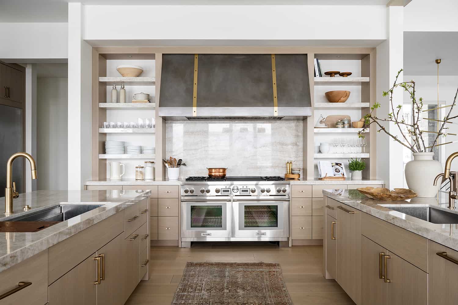
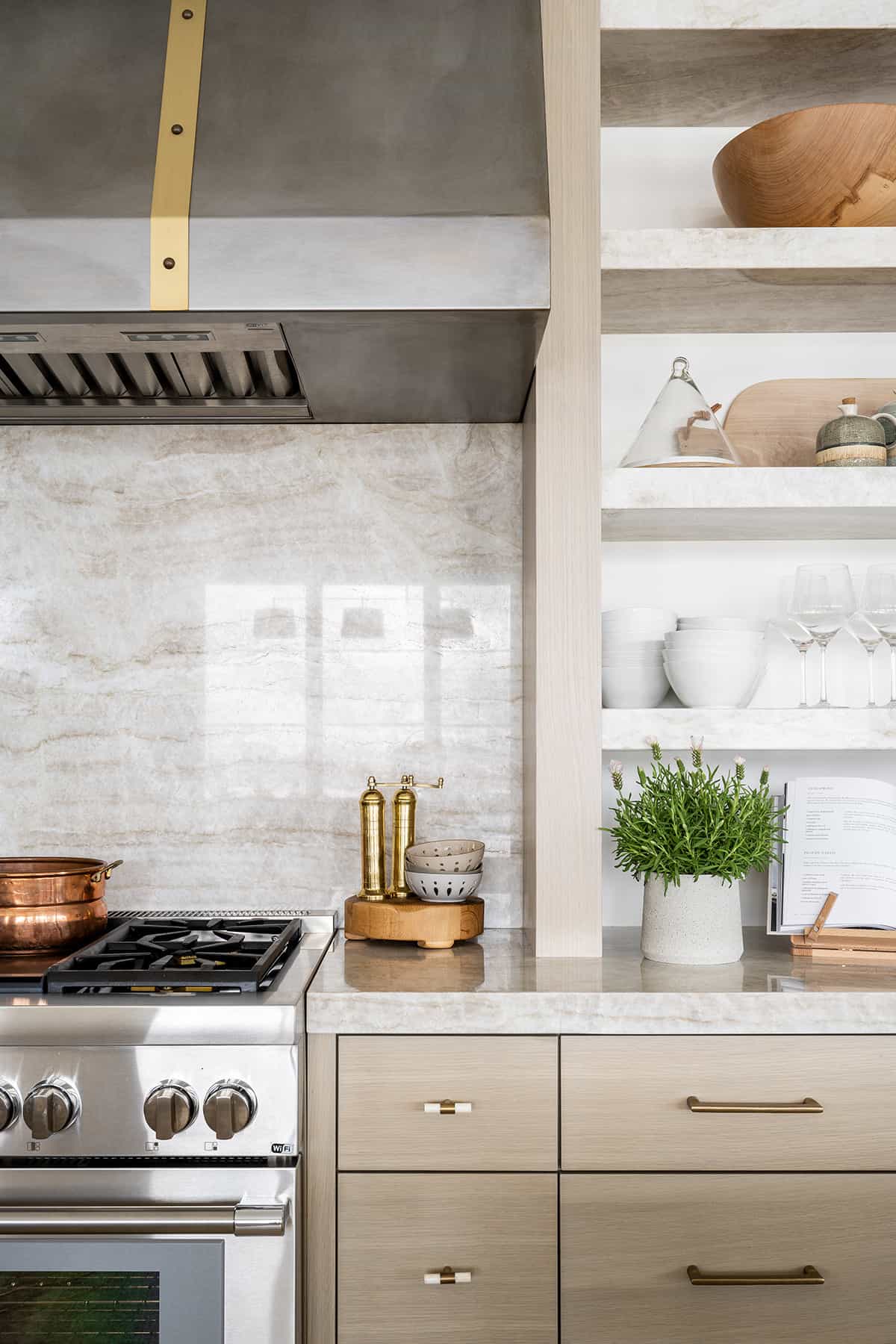
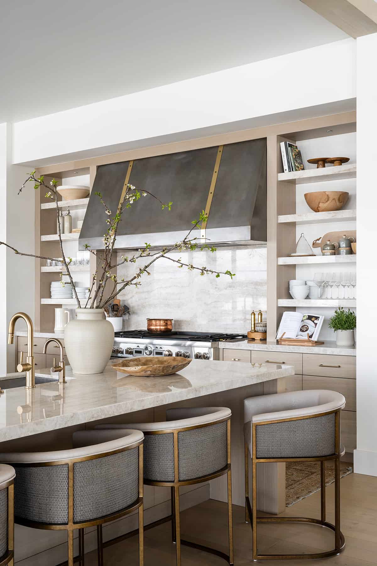
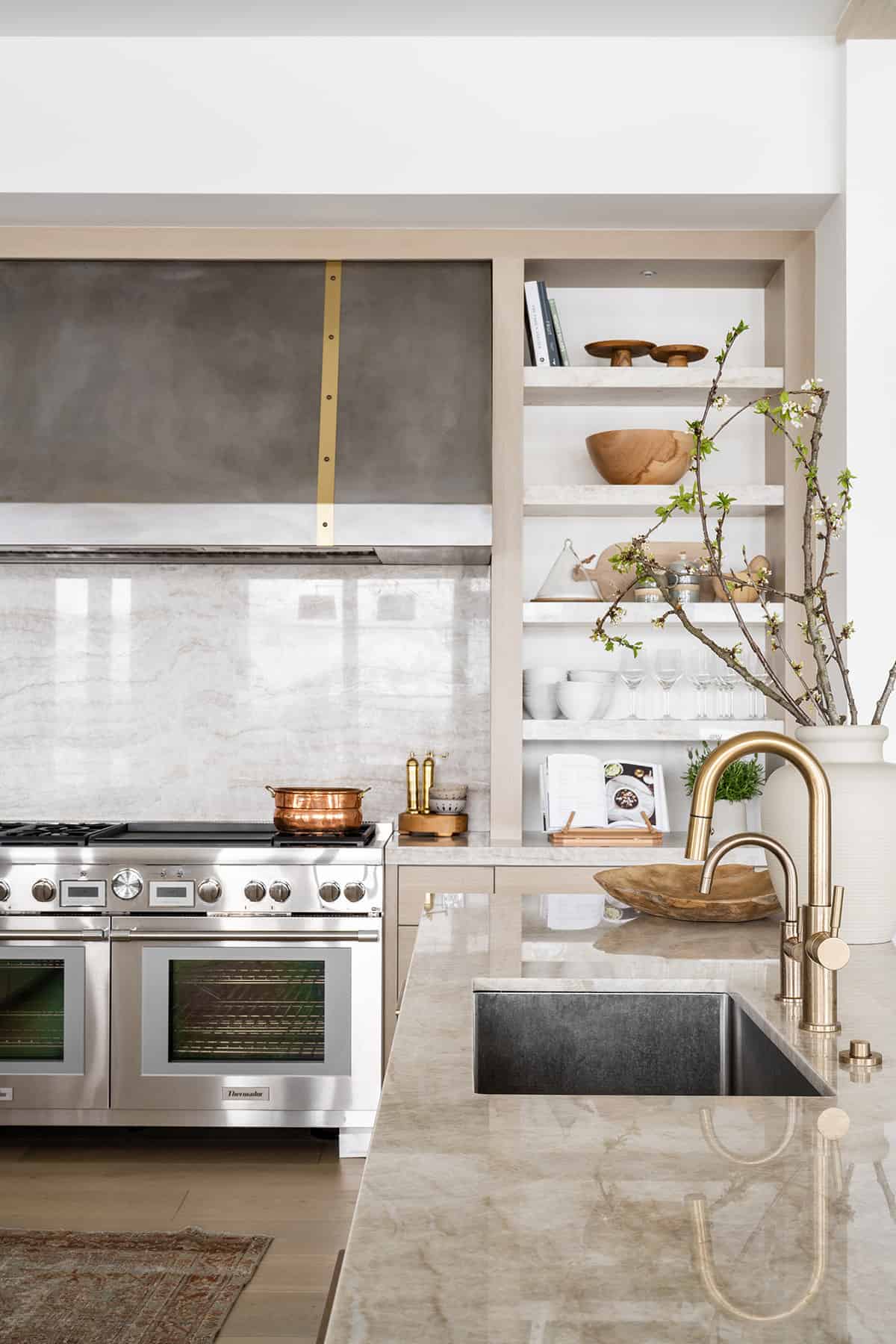
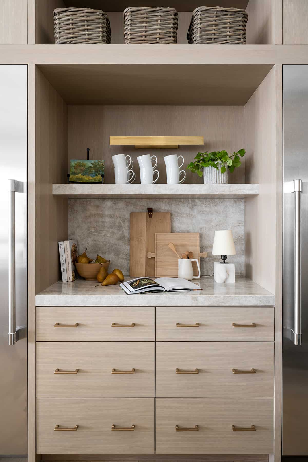
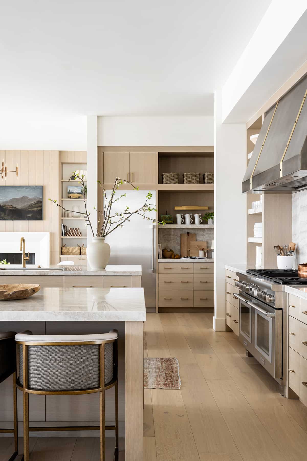
In the kitchen, two islands provide an abundance of space for the chef! Tajmahal Quartzite Countertops have a beige cream veining throughout. A custom hood is composed of stainless and antique brass, providing a show-stopping element to this space.
Flanking the range, the designer changed the hardware (from the rest of the kitchen) to horn knobs on either side. While still creating a cohesive look, the change in hardware adds interest.
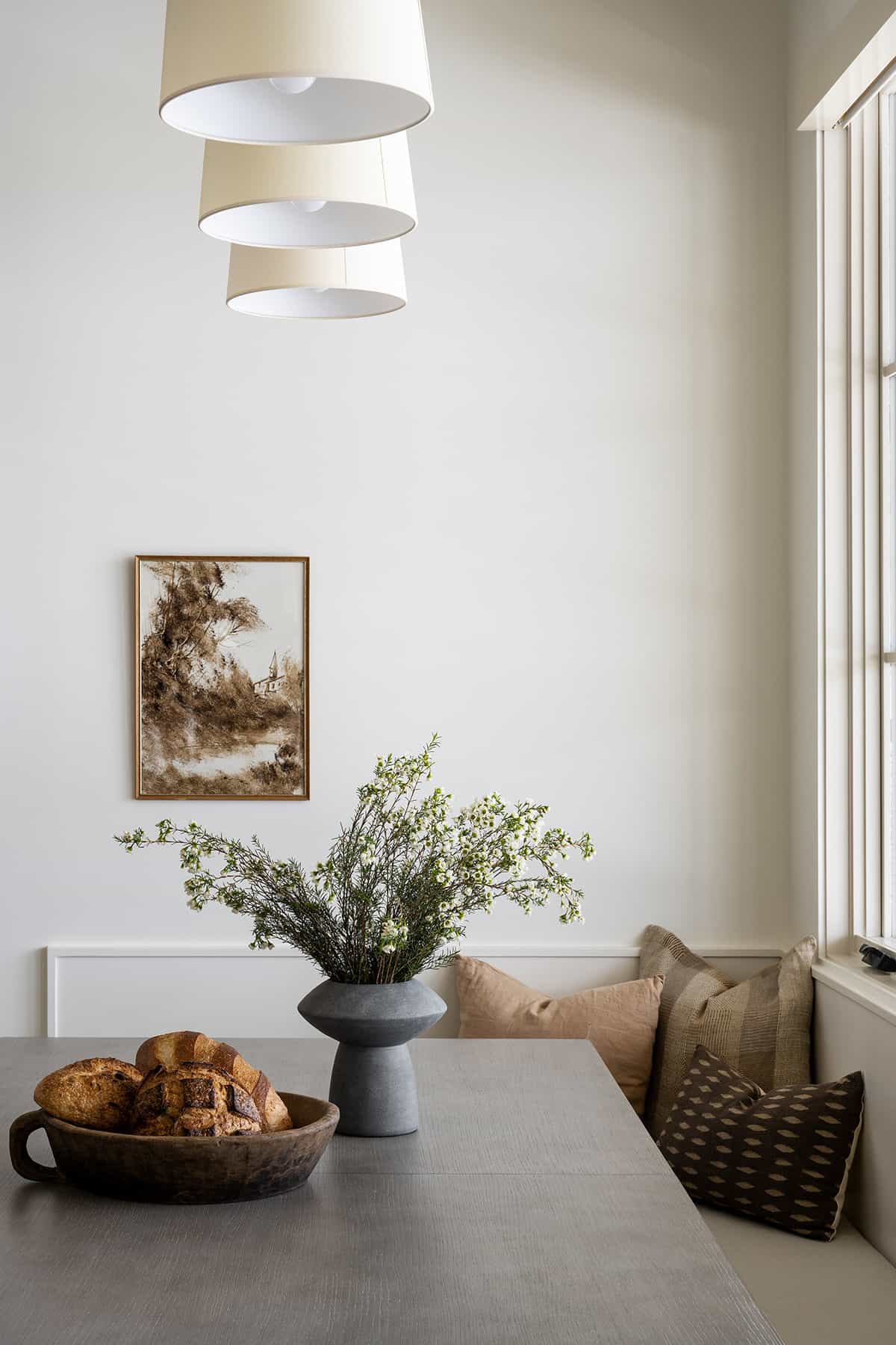
With dual chandeliers over the living and dining room areas, the designer opted not to place a light fixture over the kitchen island and instead selected a linear light fixture over the breakfast nook. Woven chairs bring texture, while accent pillows bring in some pattern. On the wall, the offset painting is vintage.
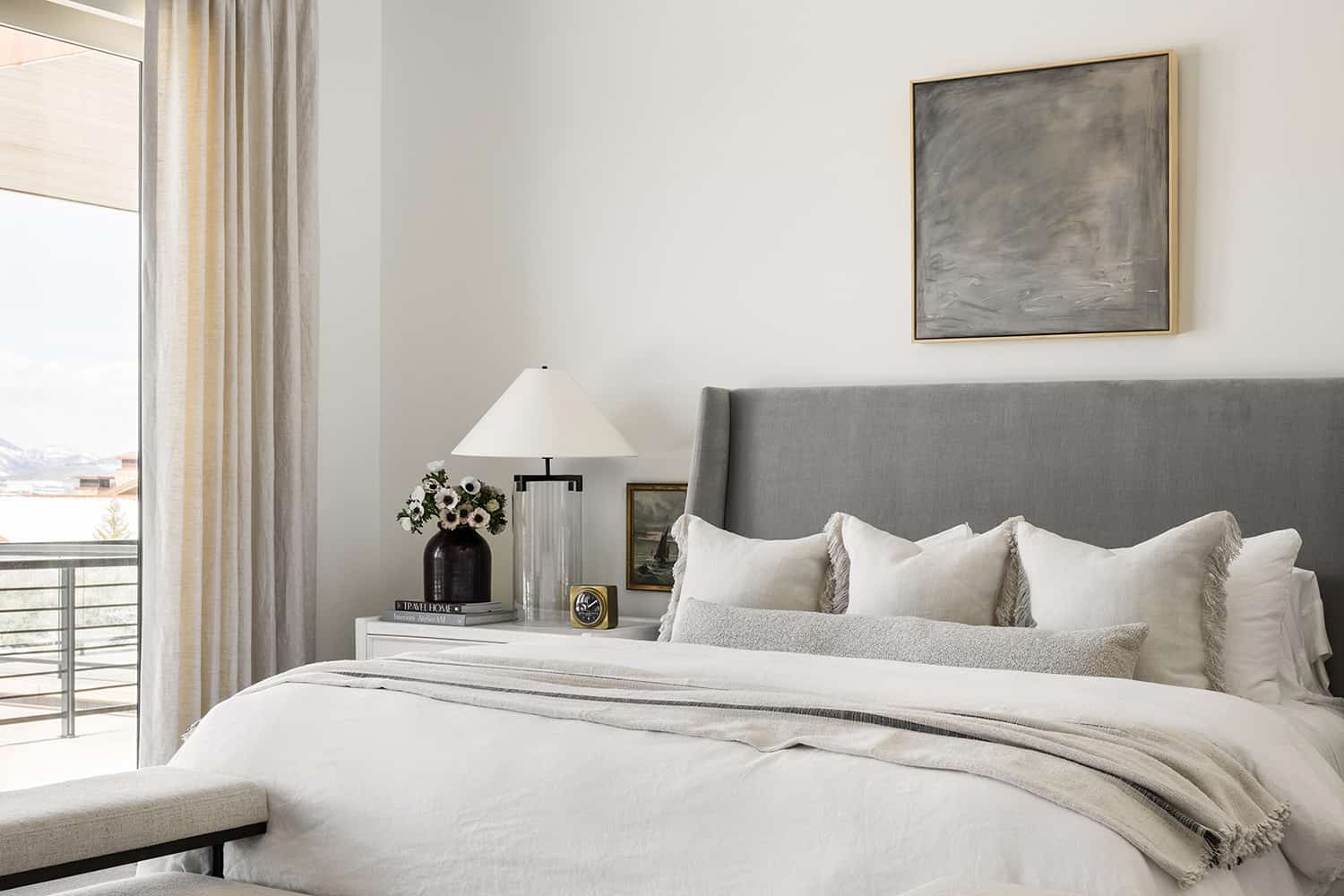
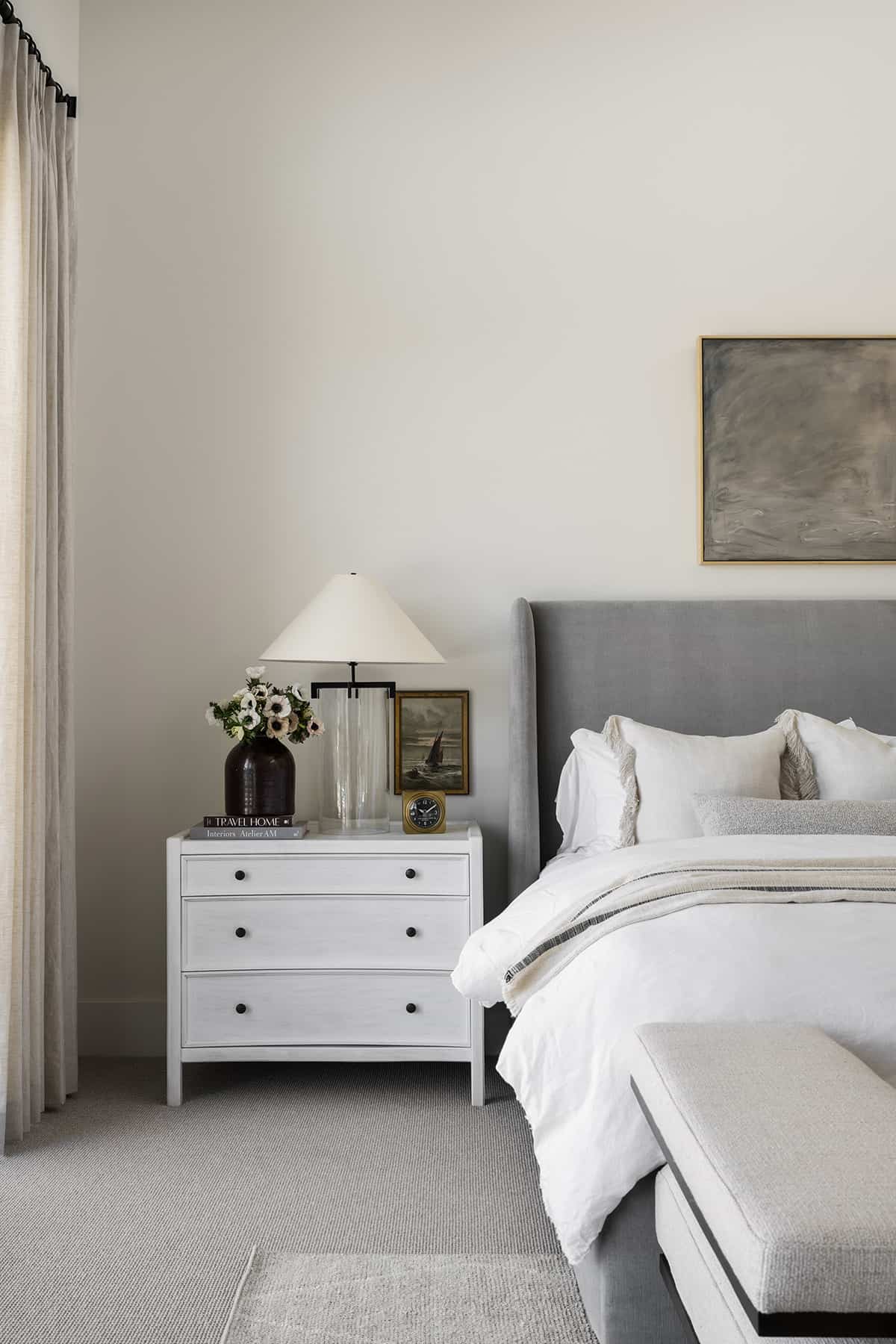
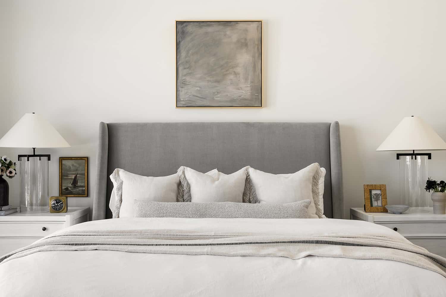
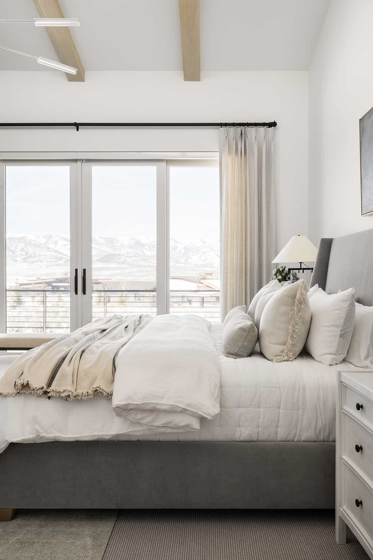
In the main bedroom, a gray velvet bed is complemented by layers of inviting textiles — perfect for keeping warm during the long, cold winter months in Park City, Utah.
One of the designer’s favorite tricks in the bedroom is hanging a piece of artwork next to the bed and over the nightstand. This is in lieu of a traditional picture frame.
To complement the soaring ceilings, the designer added a moody abstract painting above the bed.
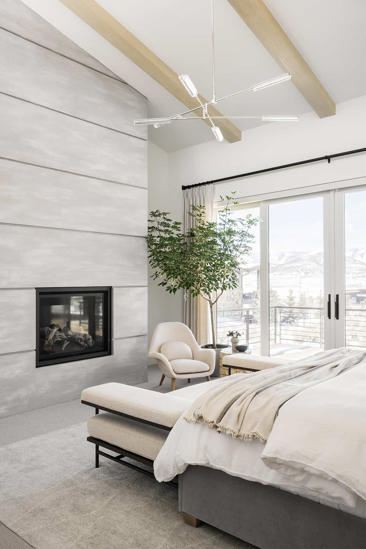
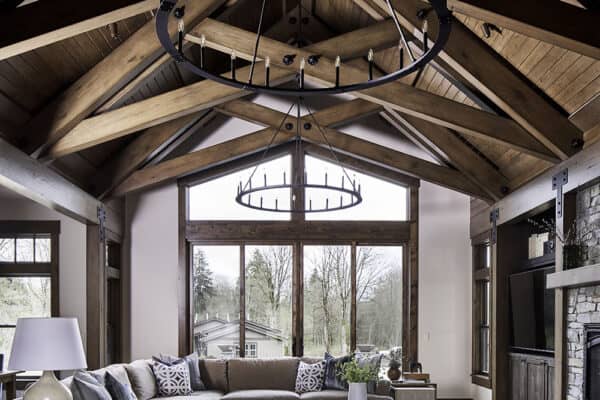
The main bedroom features soaring vaulted ceilings, wooden oak beams, and a concrete fireplace along with magnificent views of the snow-capped mountains. In keeping with the owner’s desire for a muted color palette and soft wood tones, the designer continued this theme into the bedroom to create a calm and cozy atmosphere.
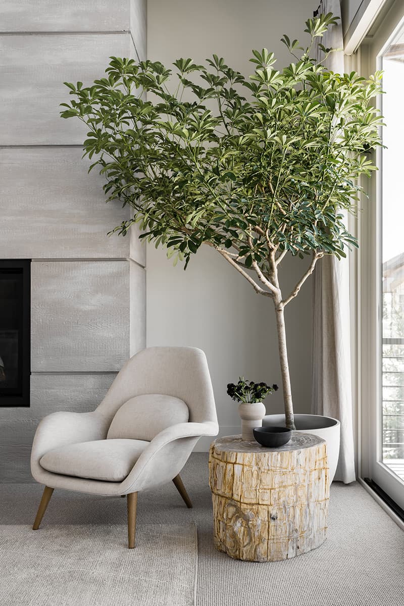
A comfortable and modern corner chair was added into the corner of this bedroom next to the fireplace, along with a large faux tree.
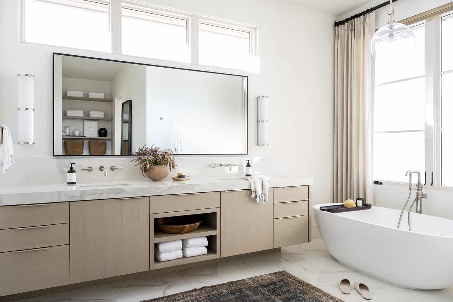
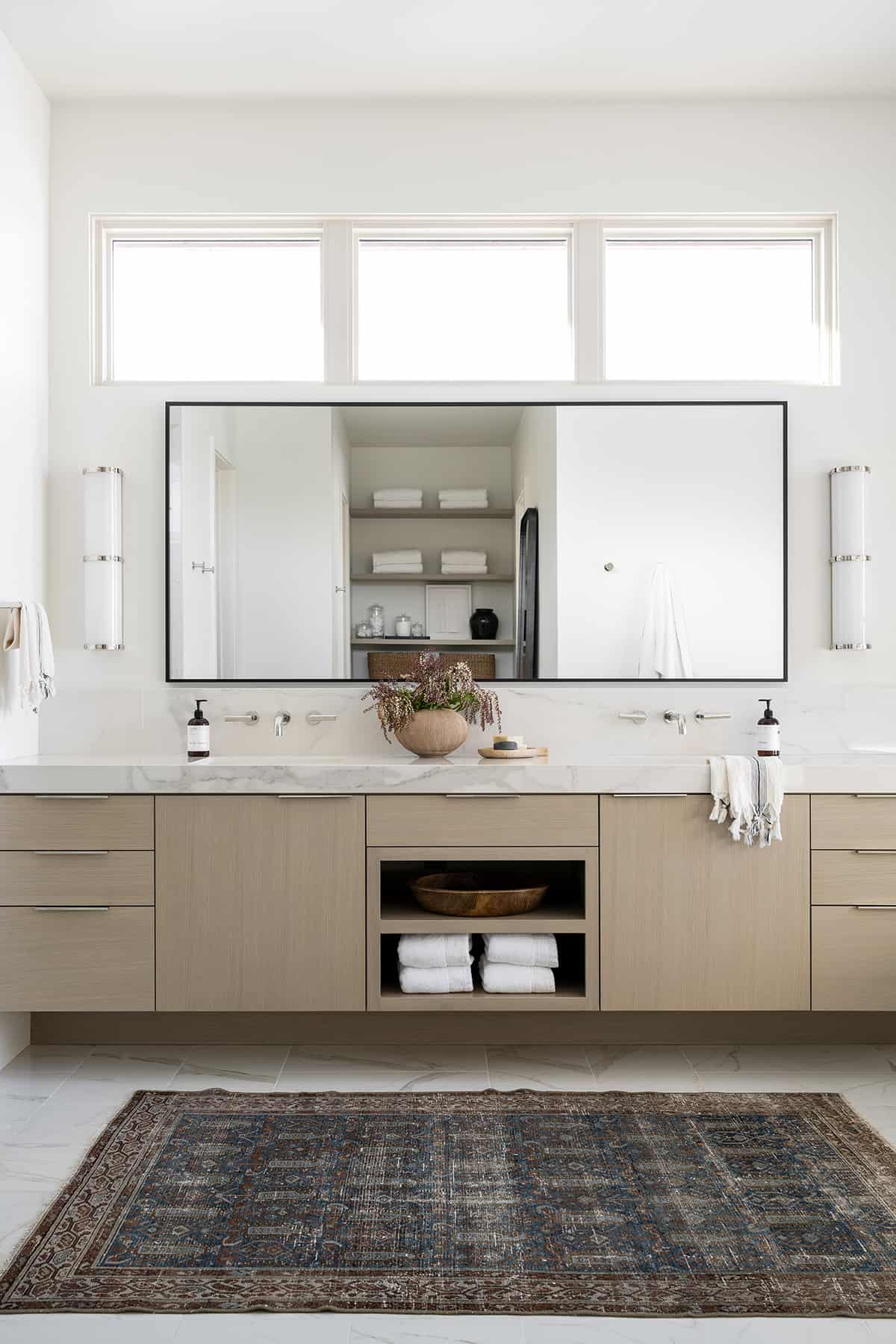
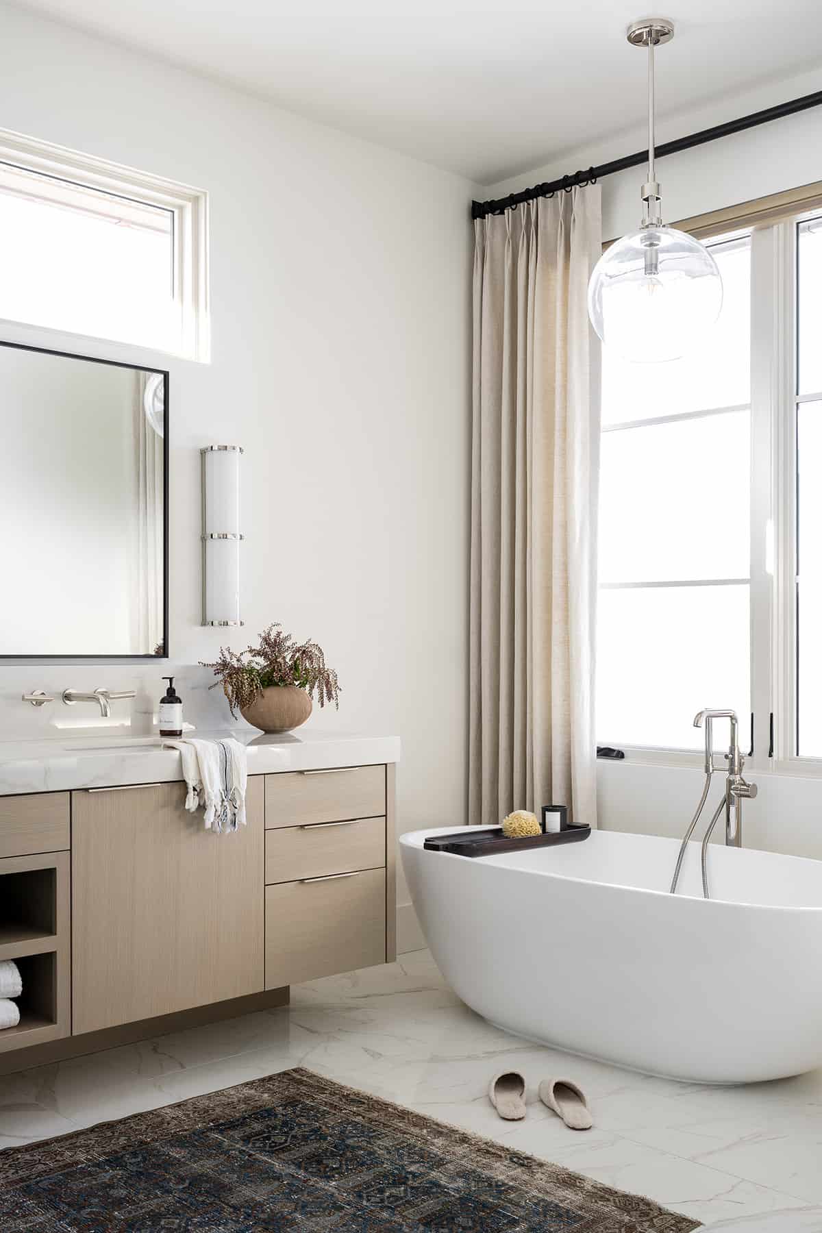
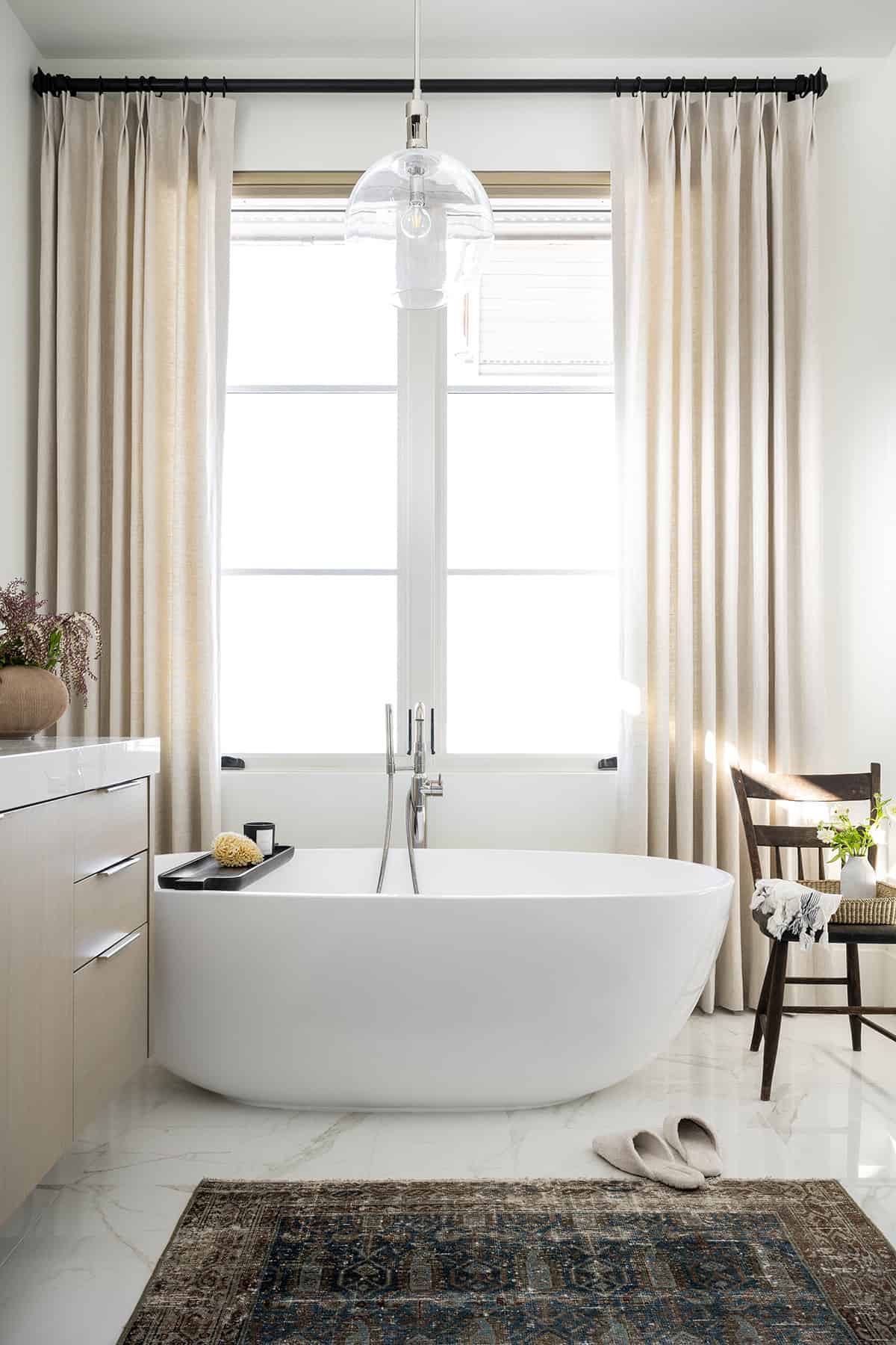
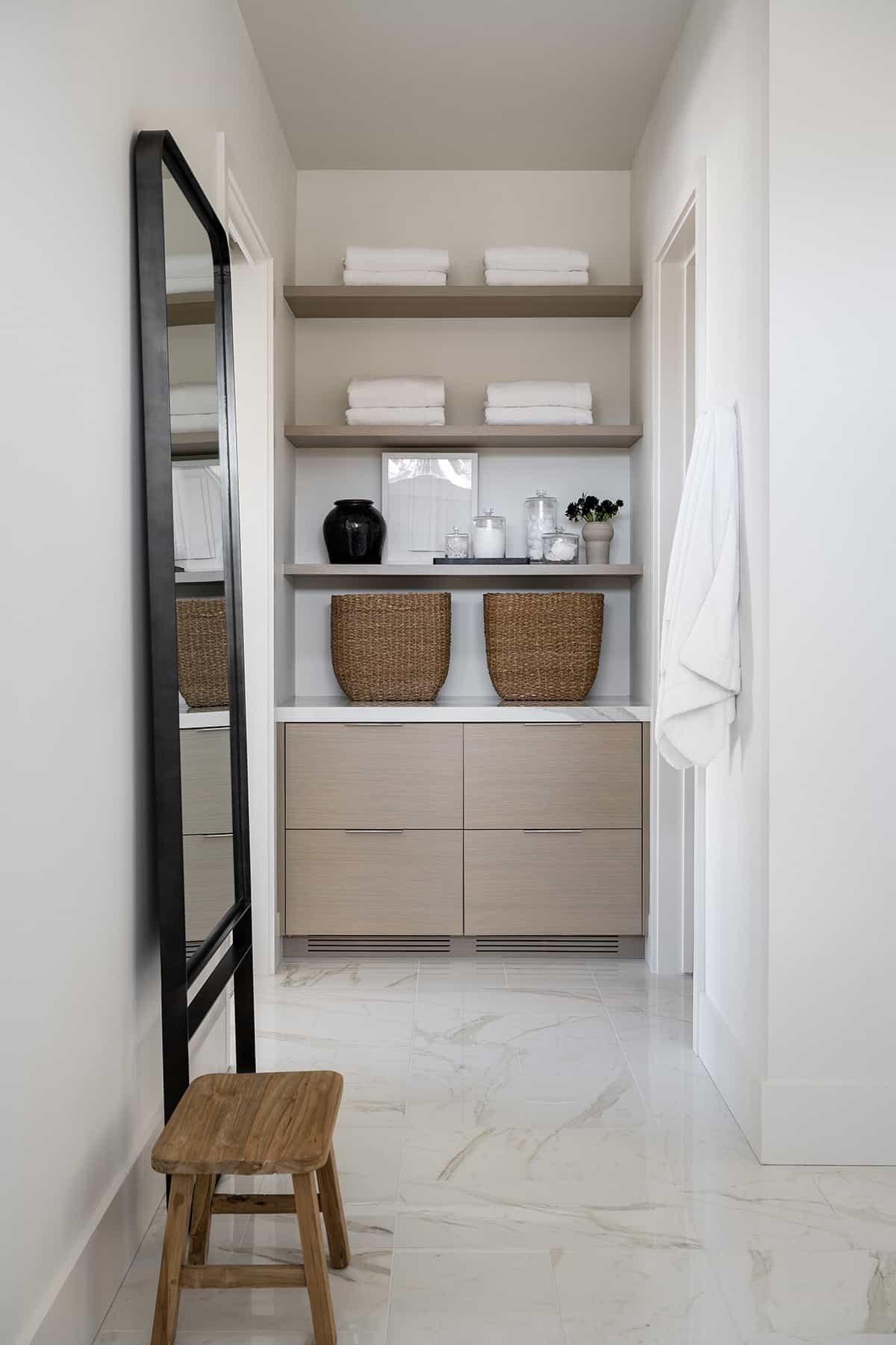
In the bathroom, marble was used on the floors, countertop, and shower walls. With the window above the floating vanity, the designer opted for an elongated mirror and linear sconces. Bringing this clean, contemporary space to life is a vintage rug and textural accessories.
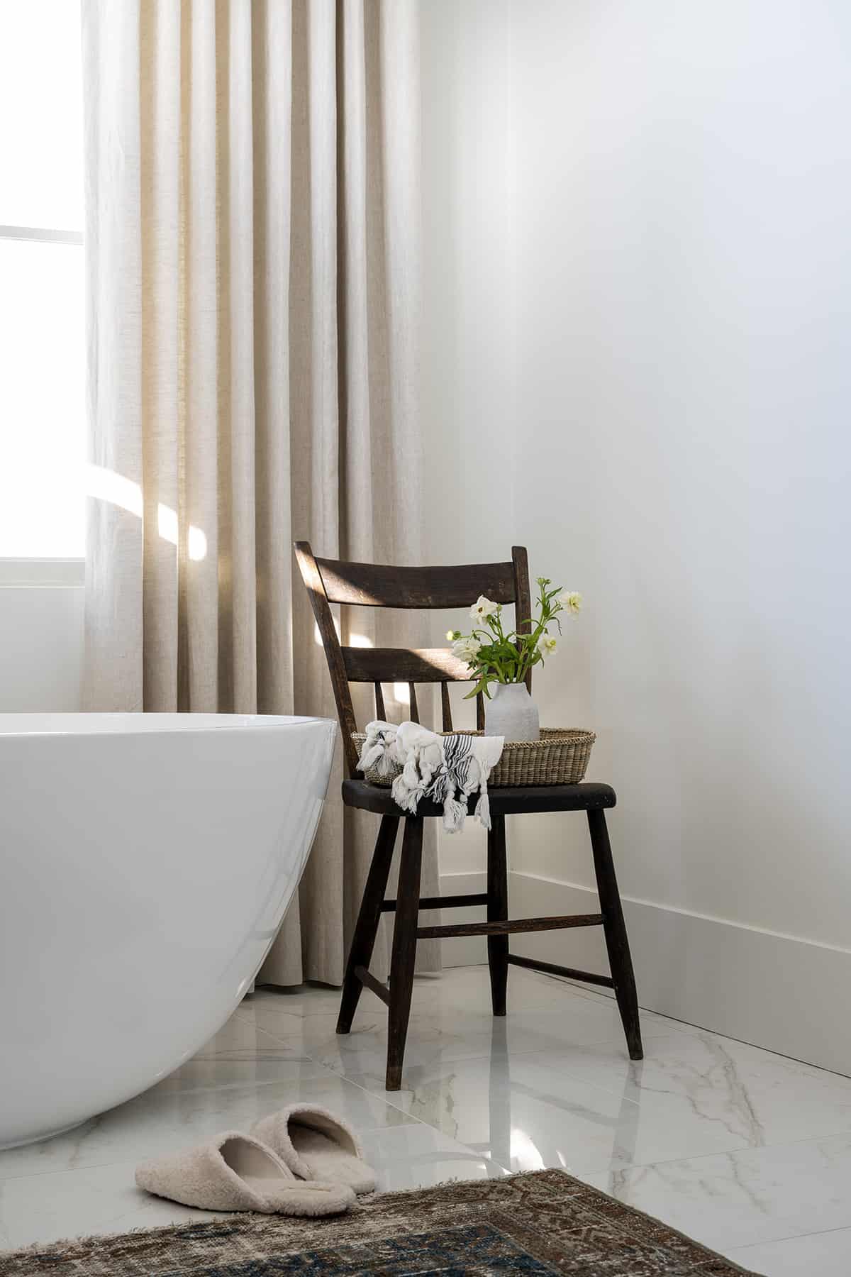
Next to the soaking tub, the designer added a vintage chair, bringing character into an otherwise clean space. This chair can hold a tray for your bath salts and a towel.
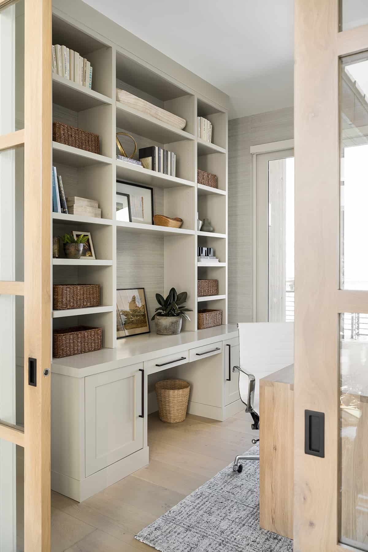
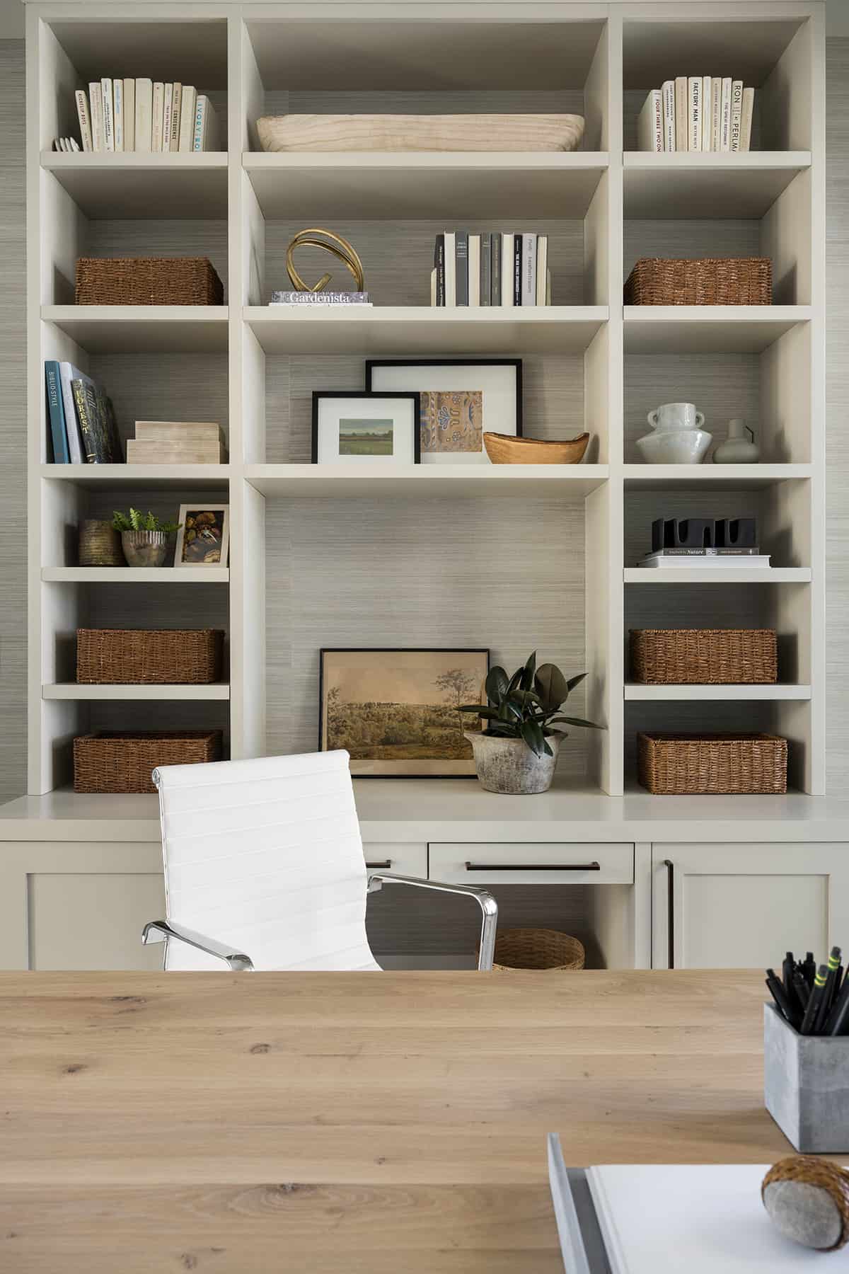
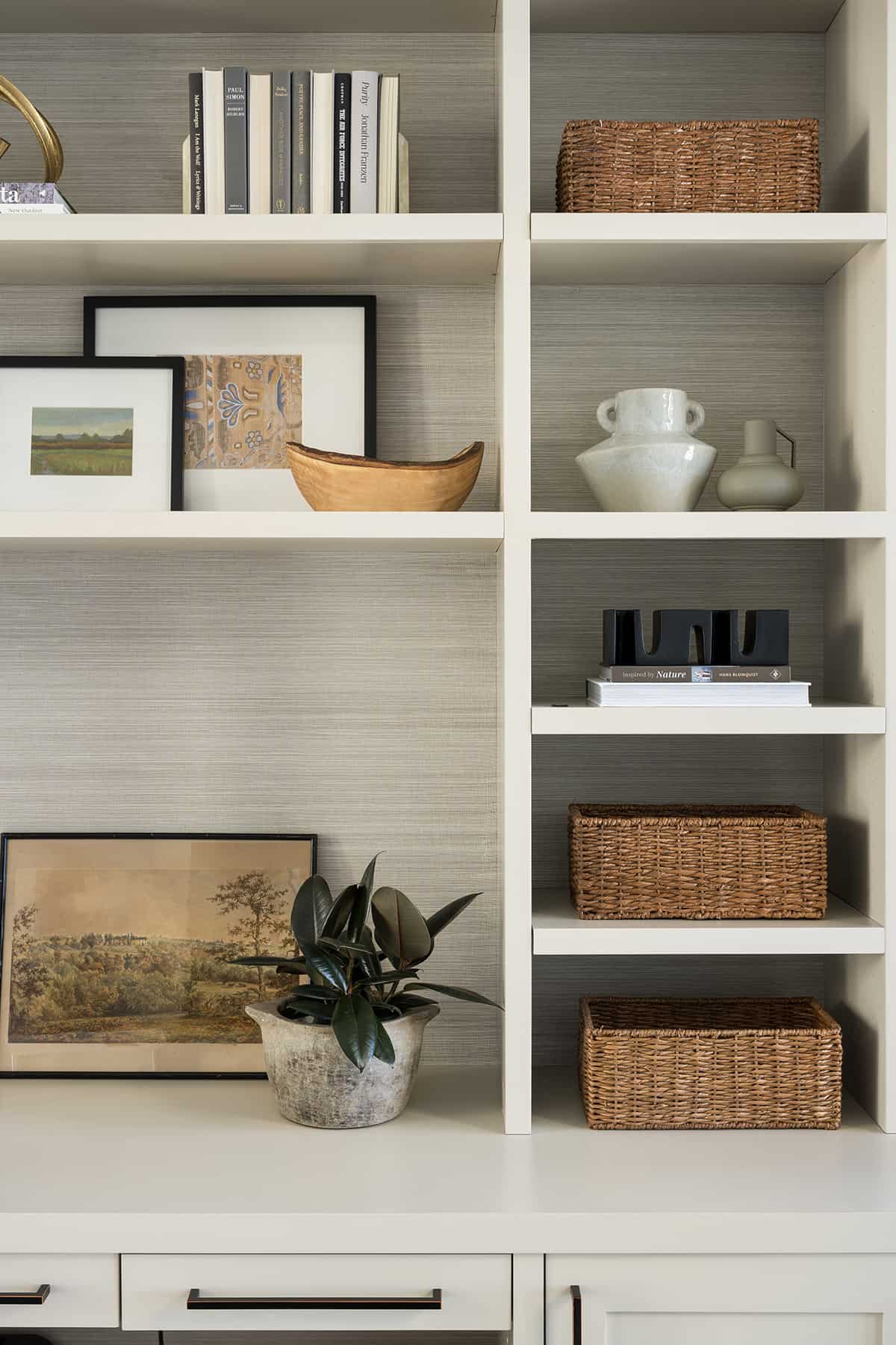
Outside of the primary bedroom, double pocket doors lead into the home office. The desk was placed in the center of the room. Grasscloth wallpaper brings texture.
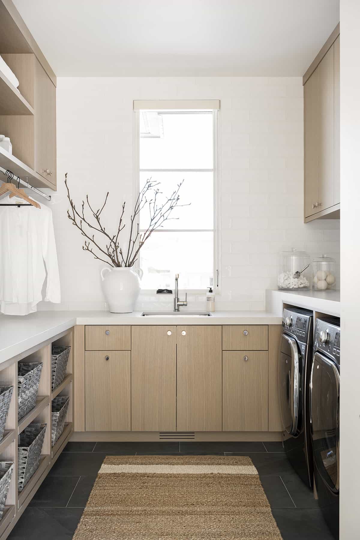
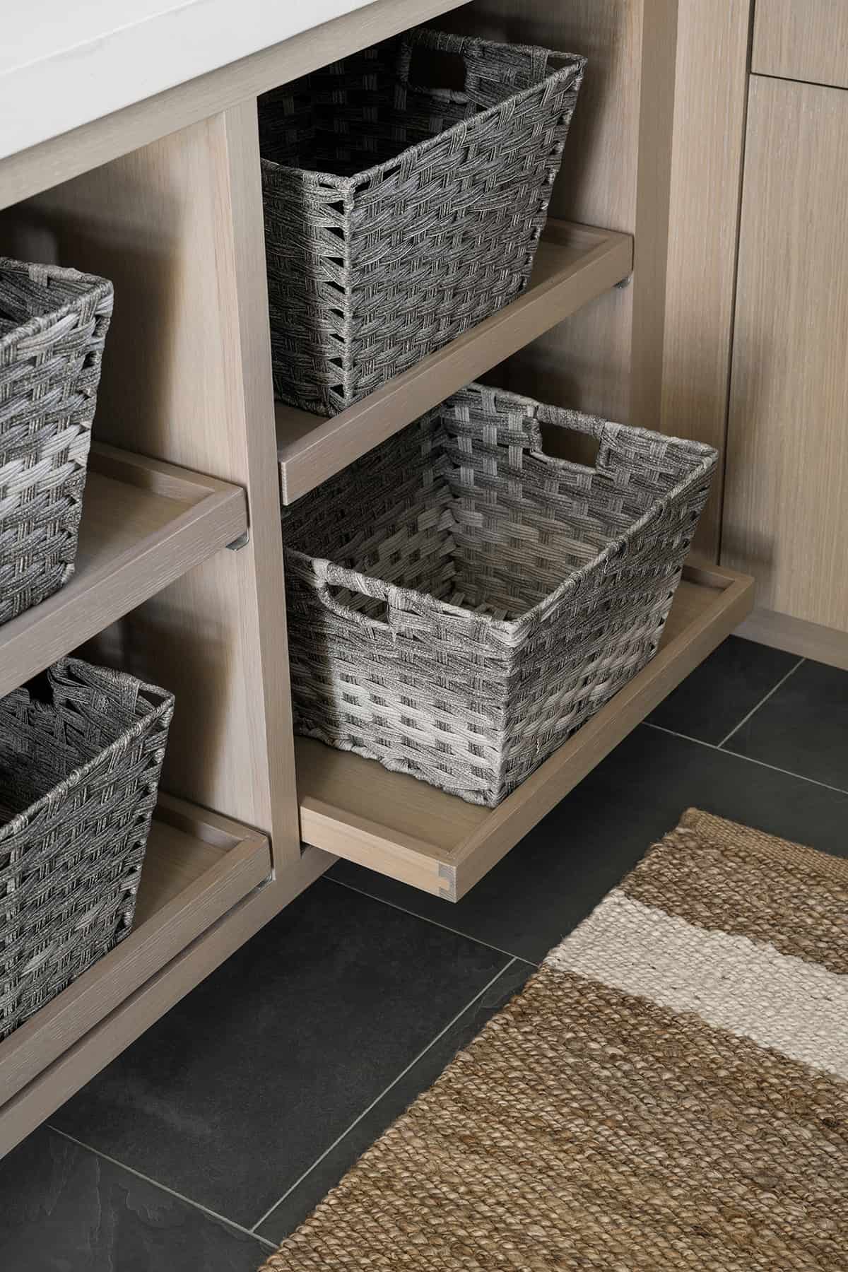
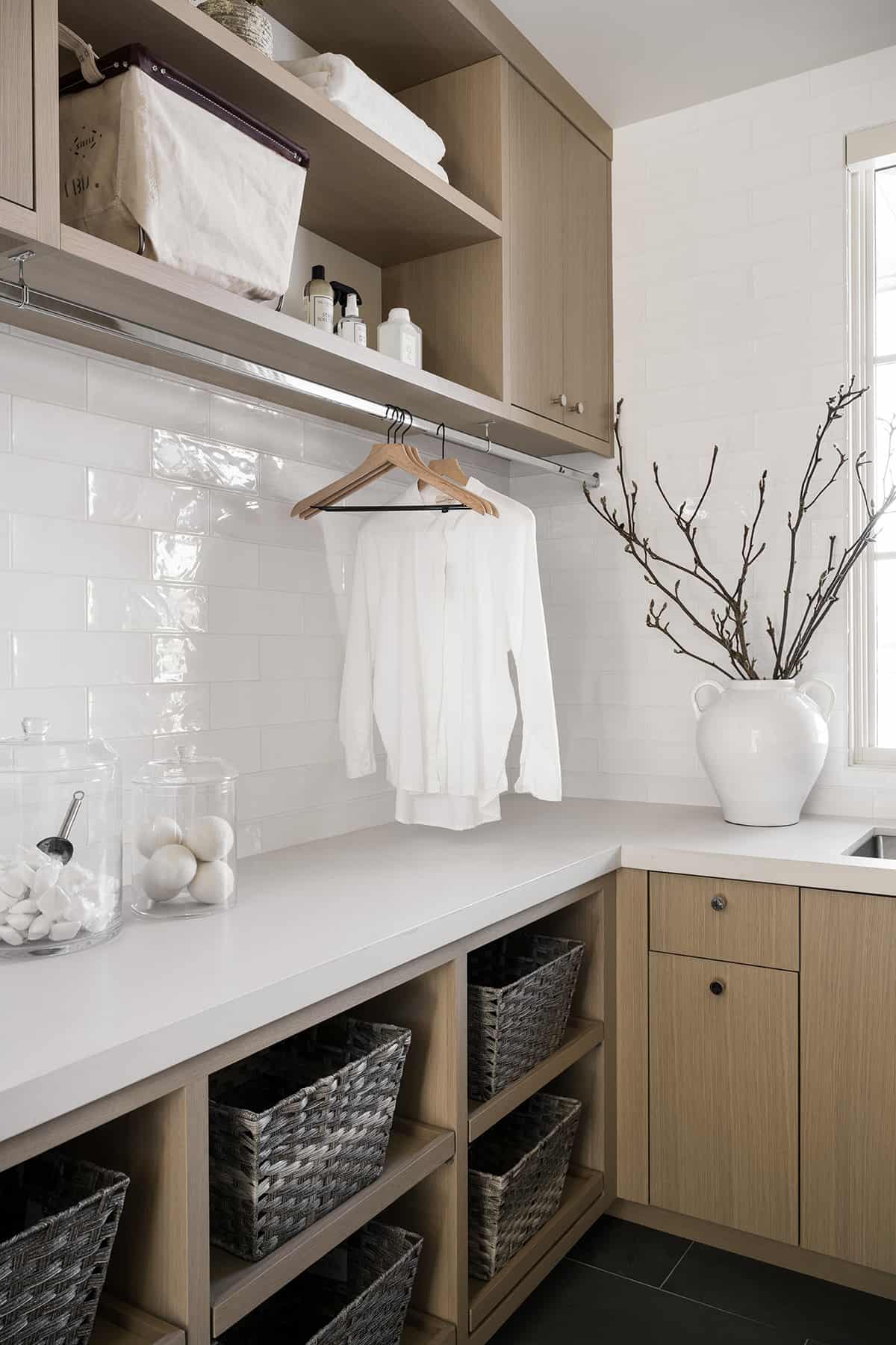
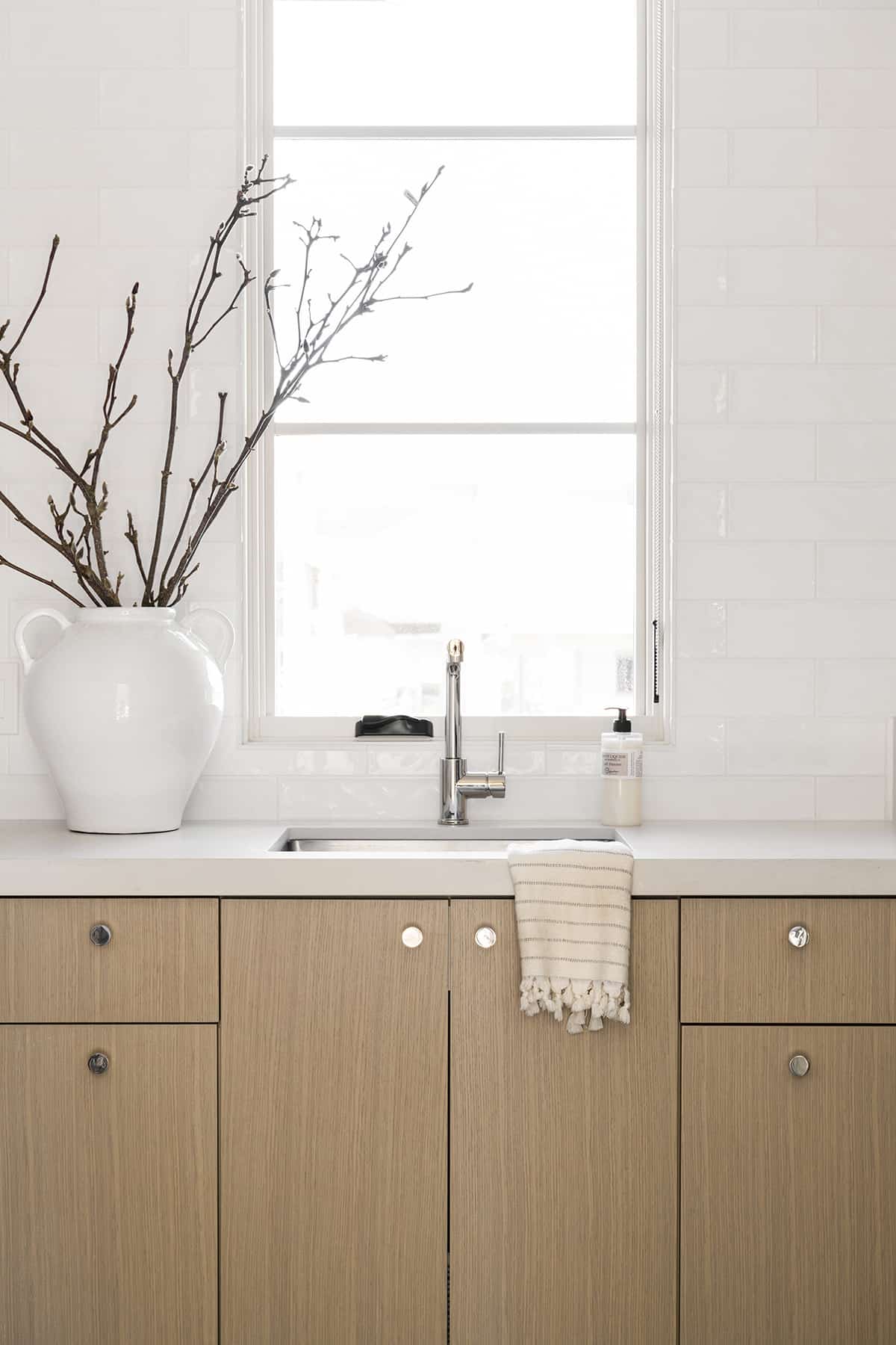
The laundry room features white oak cabinetry and a jute rug on the gray slate tile floor for texture. A white subway tile backsplash adds a cool and collected feel to this space.
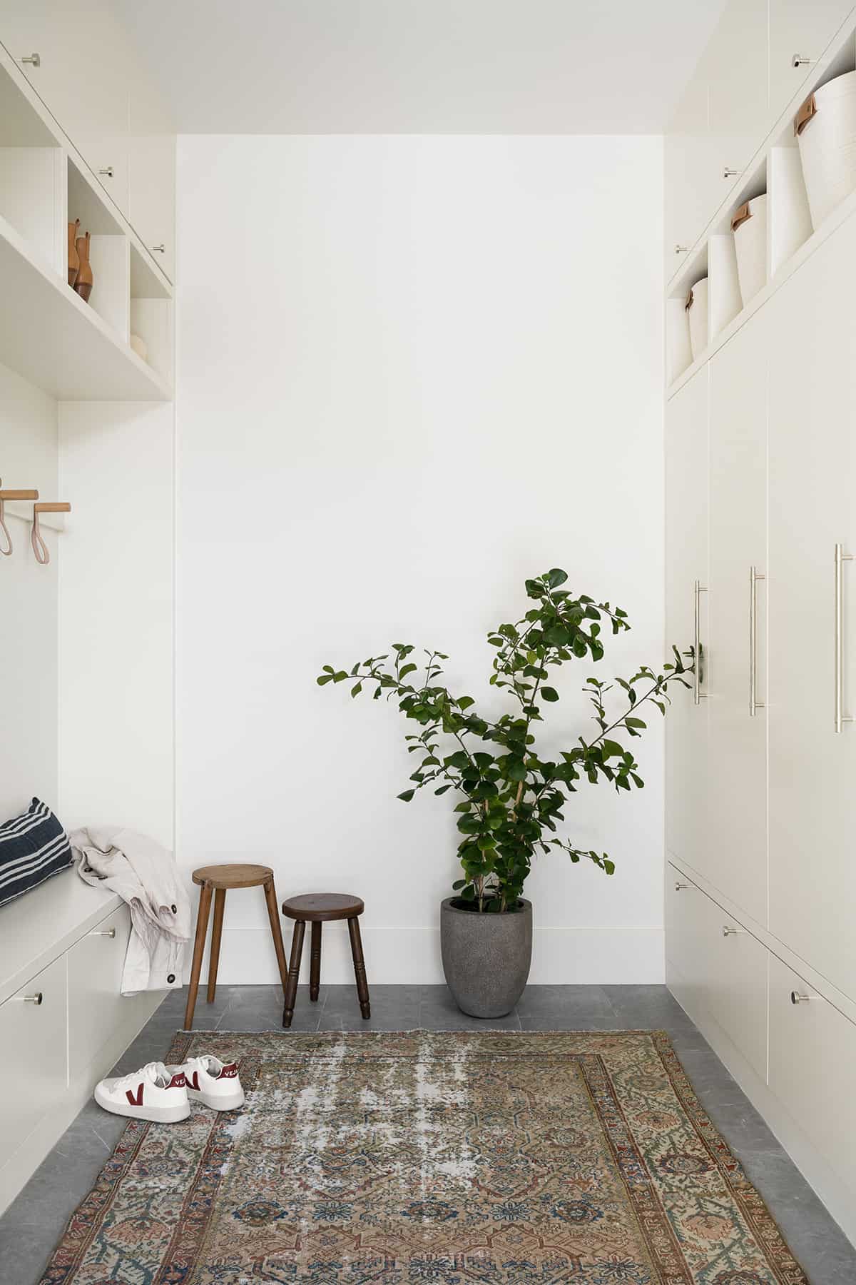
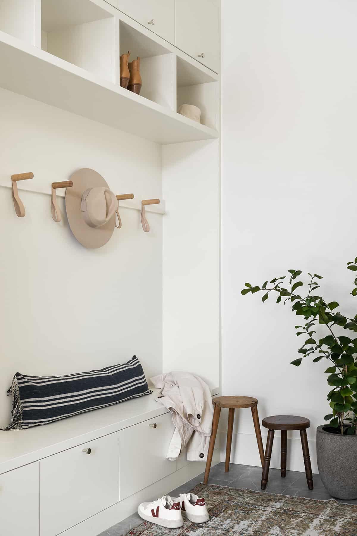
The mudroom features soft gray cabinetry and cool leather hooks, designed to be a highly functional space.
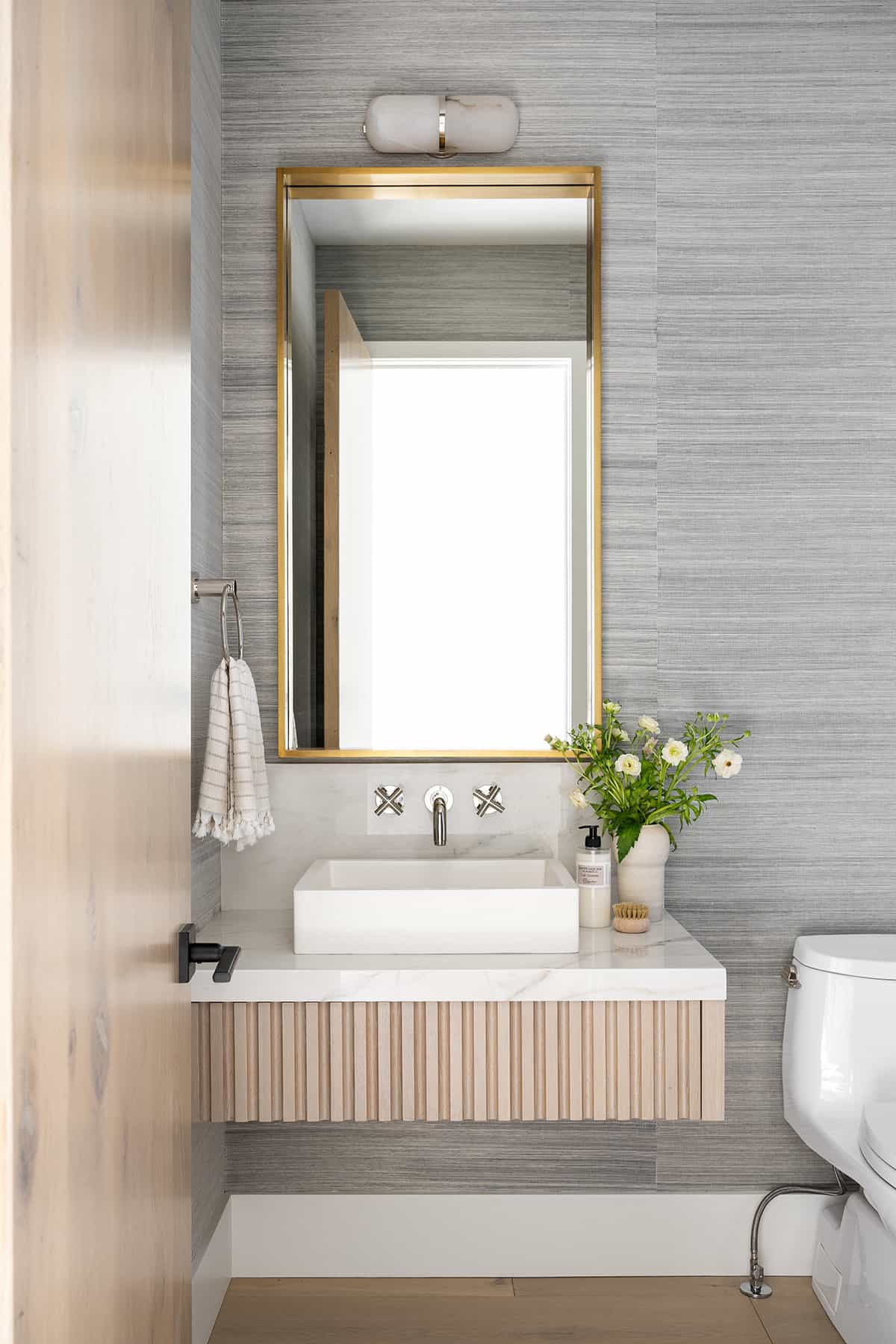
A carved curved detail across the floating vanity and grasscloth wallpaper elevates this powder bathroom.
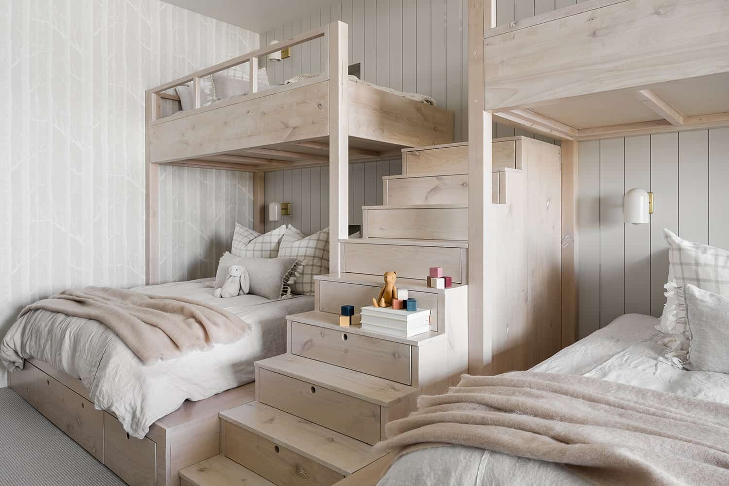
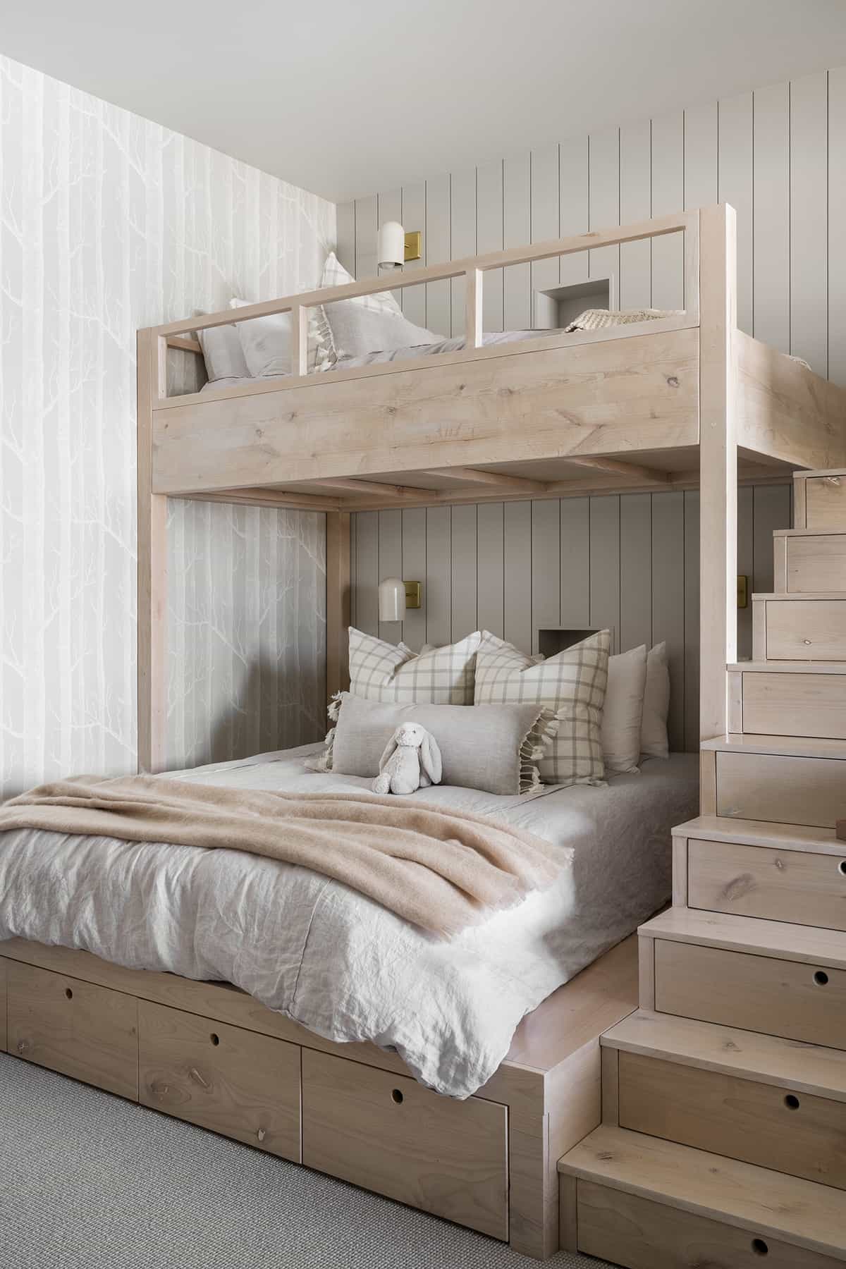
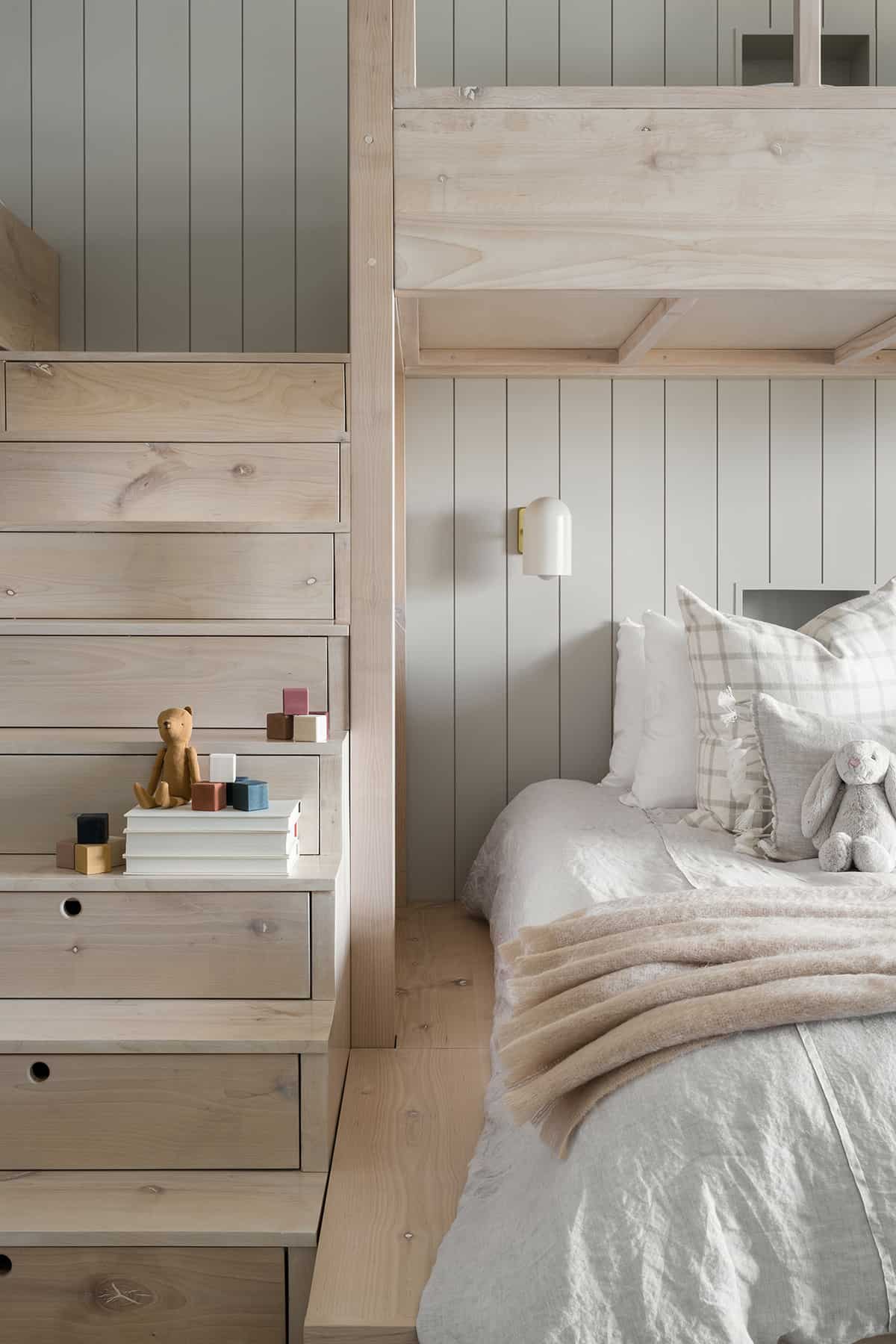
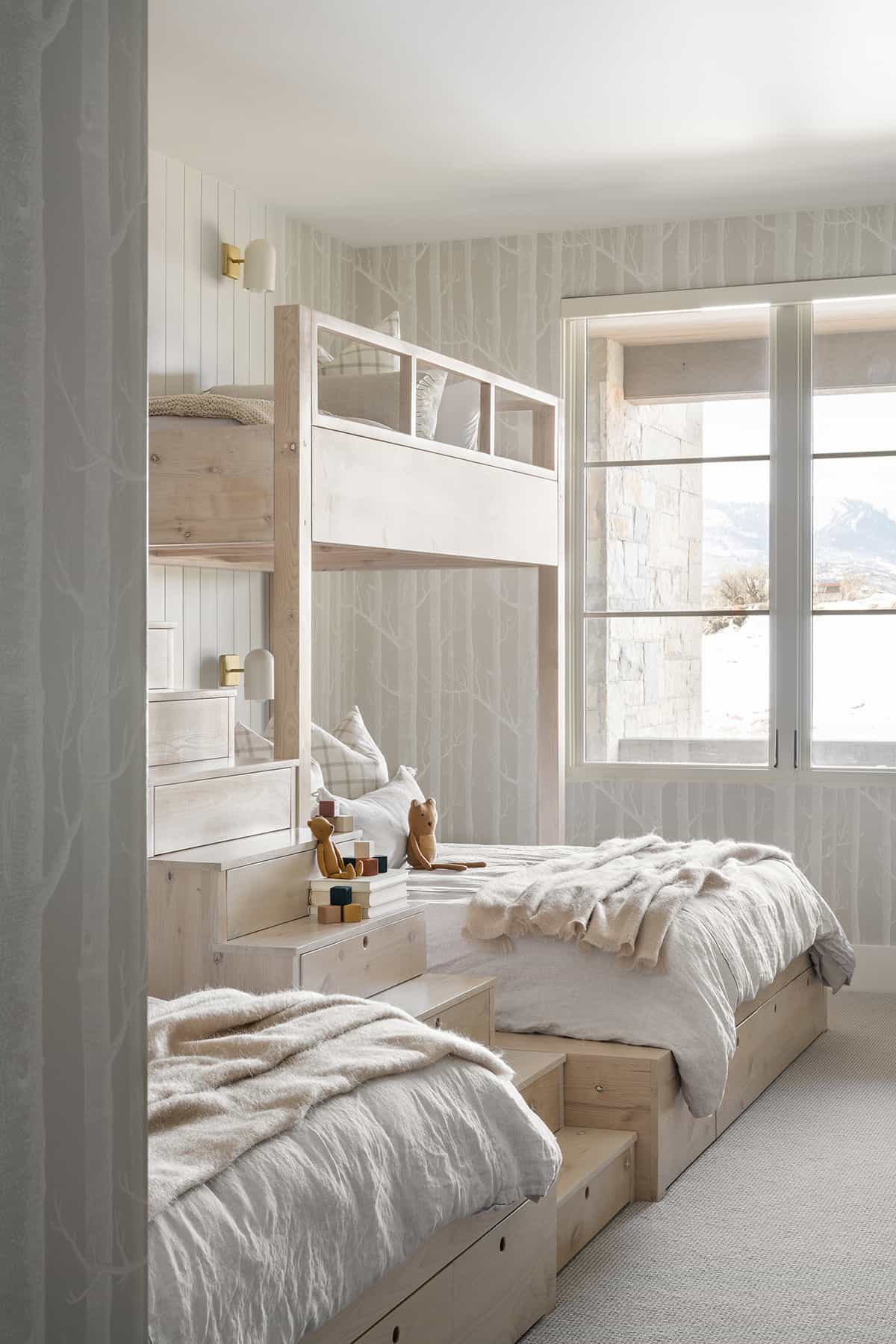
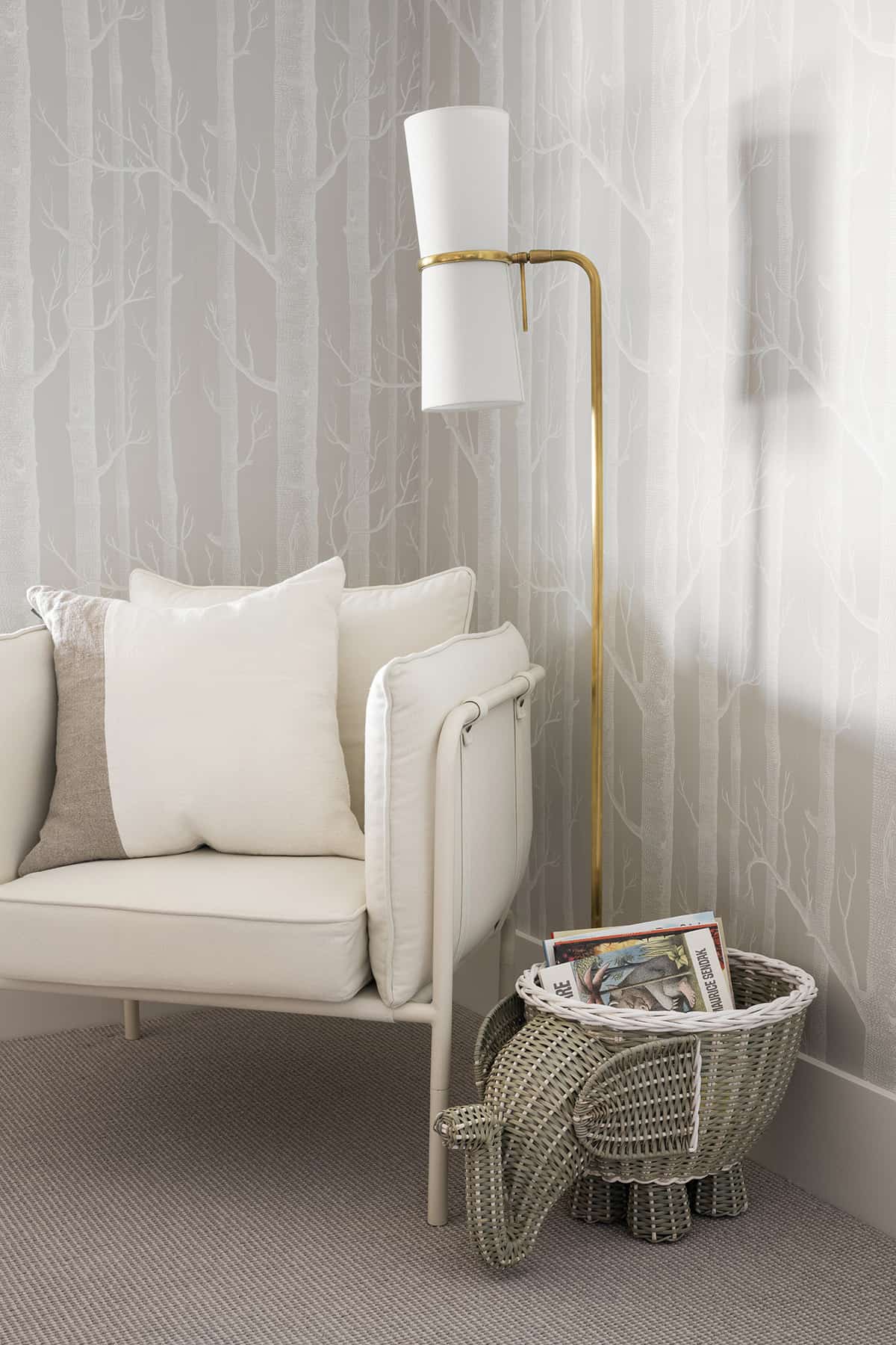
Located on the basement level of the home, this chic bunk room features Cole & Son Woods Wallpaper and a vertical shiplap. A whitewashed stain is incorporated into the bunks, while drawers for storage can be found on the stairs with a thumb keyhole detail.
By turning the bottom bunks the opposite way, you can fit a queen-sized bed on the bottom. This way, kids can sleep on the top, parents can sleep on the bottom, and there is room for the whole family when hosting guests!
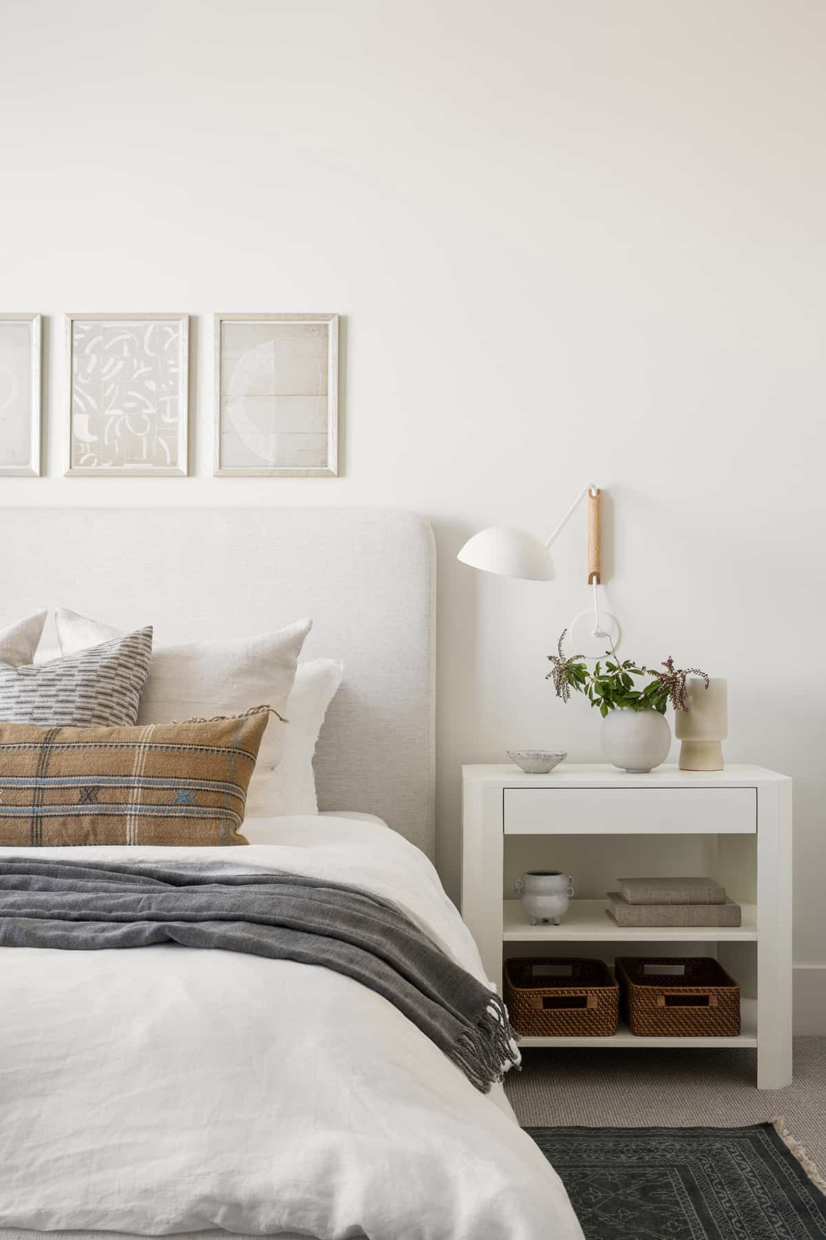
The owners love to entertain, so having an overnight guest suite was a must in this home. This light and airy space features layered textiles and wall sconces that articulate on either side of the bed, perfect for reading.
Photos: Courtesy of McGee & Co.





1 comment