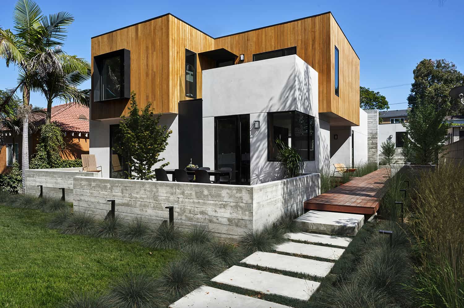
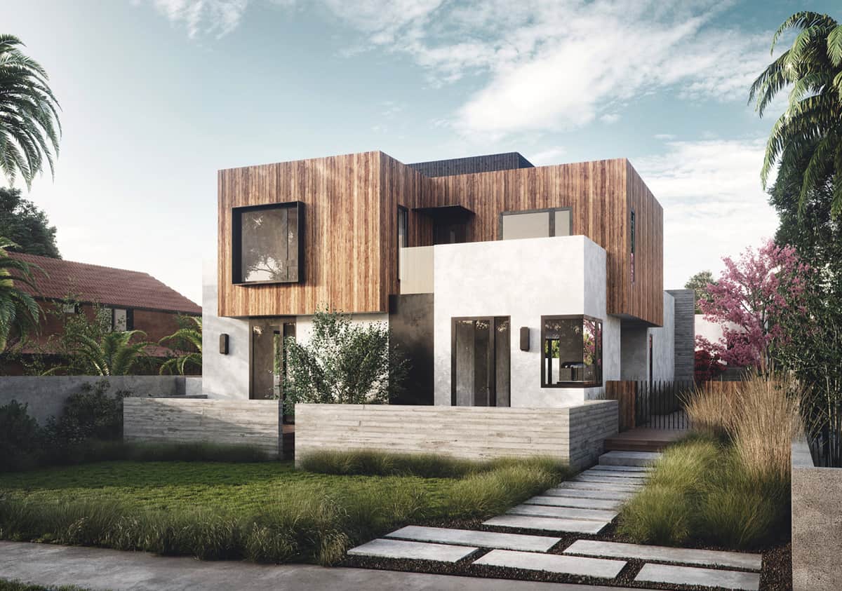
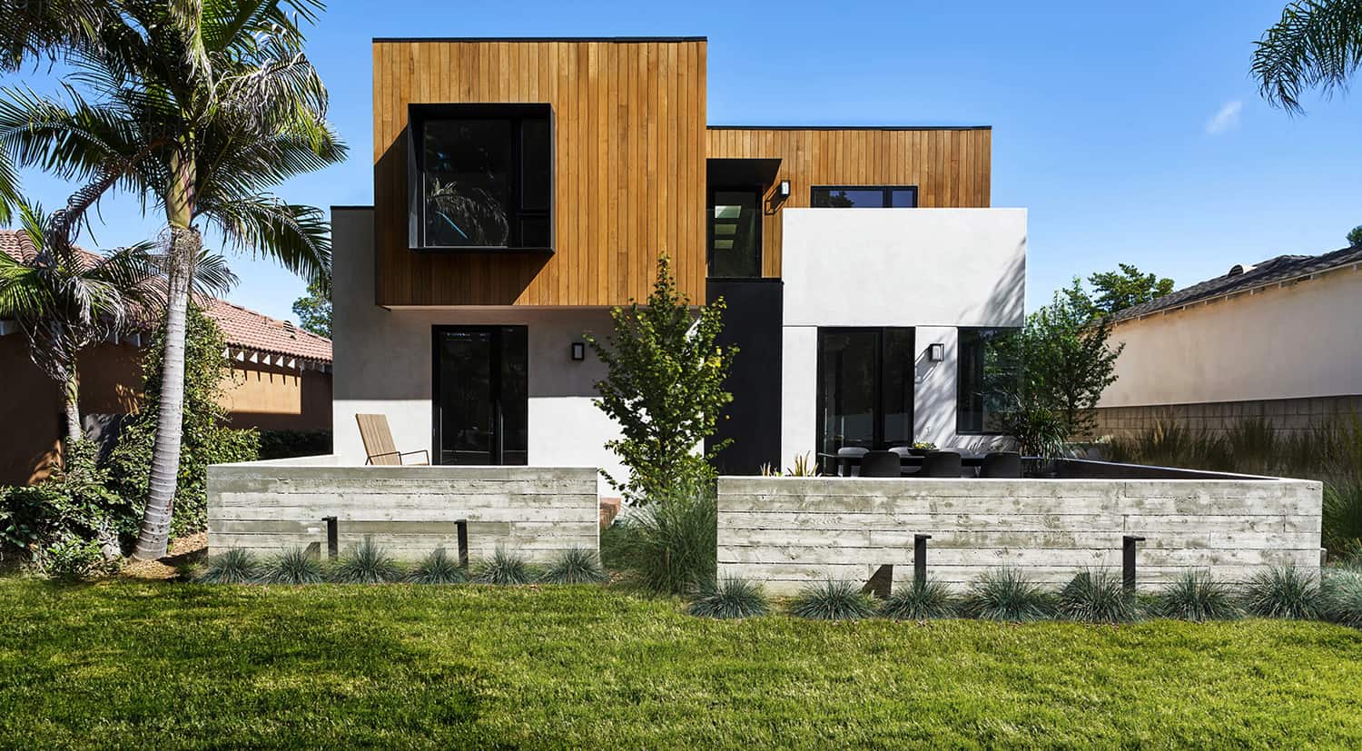
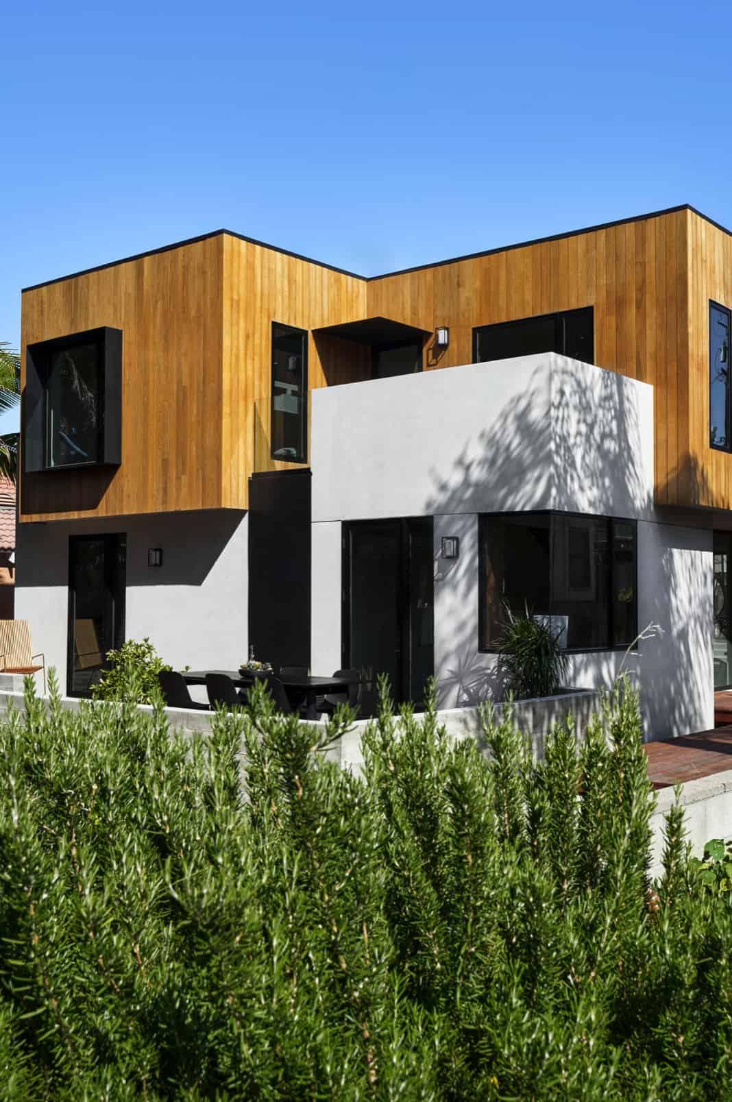
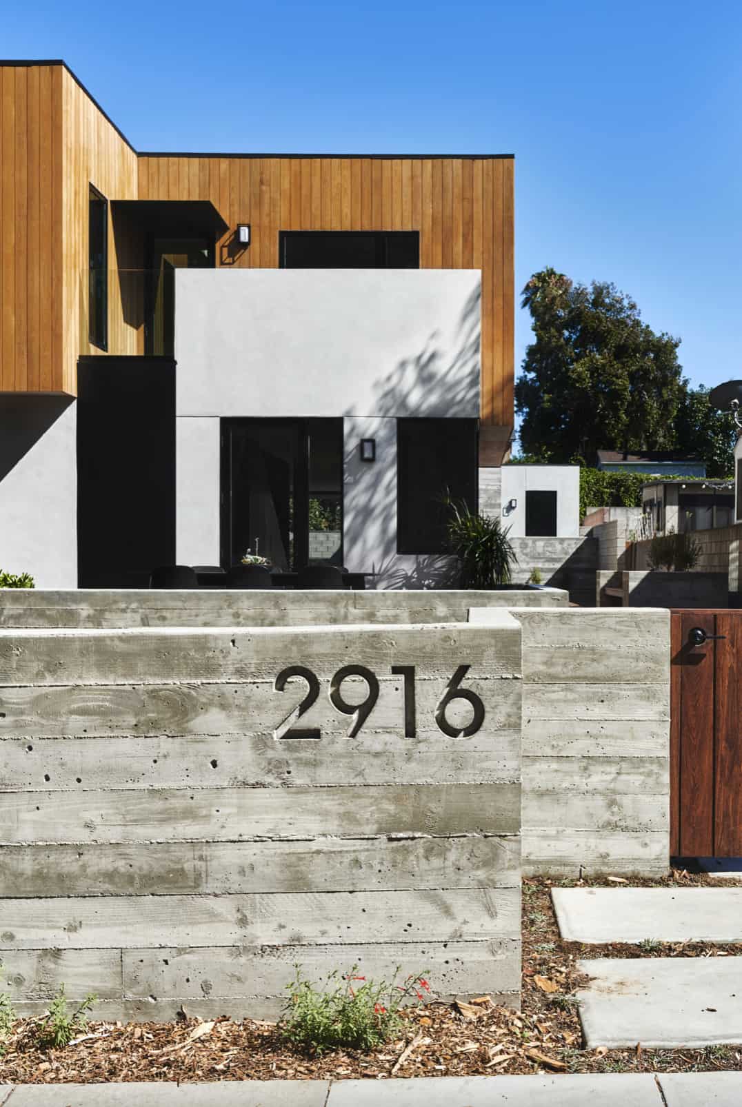
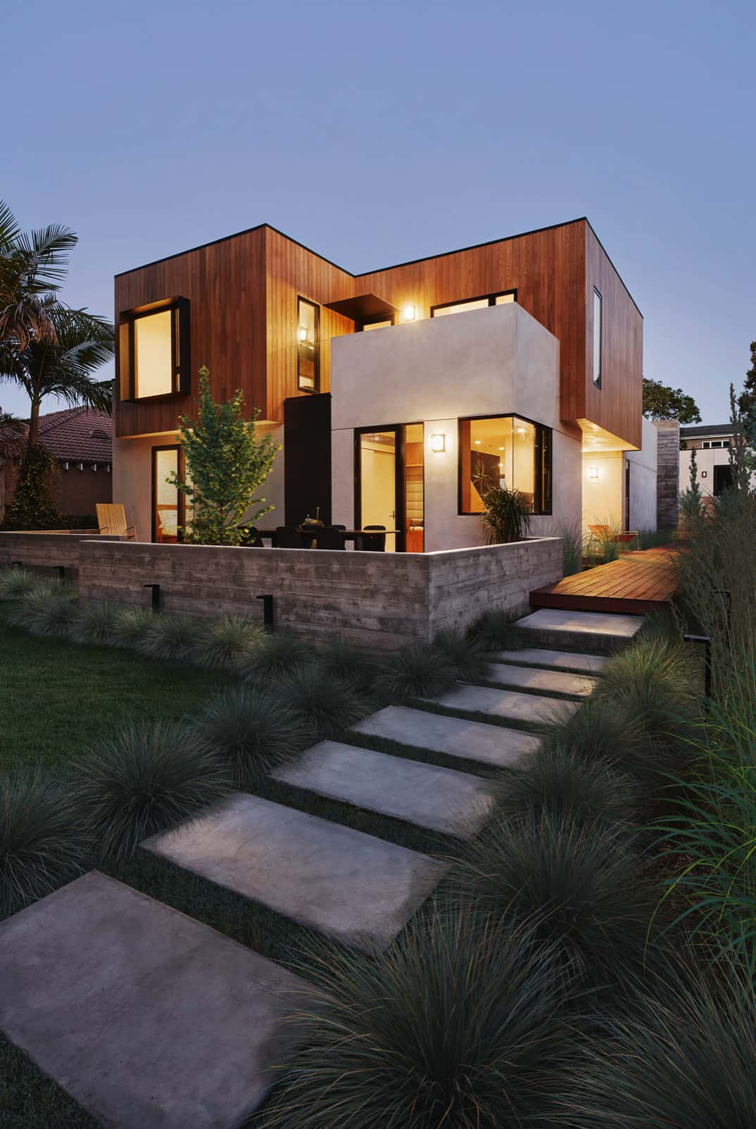
This dynamic family home was designed by AAHA Studio, situated on a quiet cul-de-sac at the edge of Santa Monica, a coastal city west of downtown Los Angeles, California. The owners commissioned the architects to create a home where they could put down roots with an abundance of space for the kids to run around.
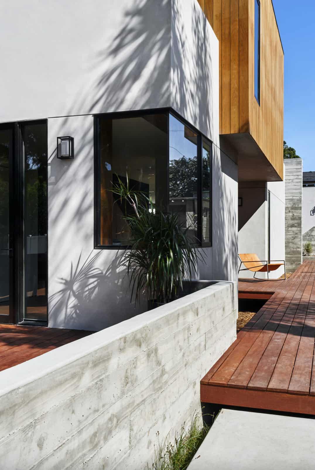
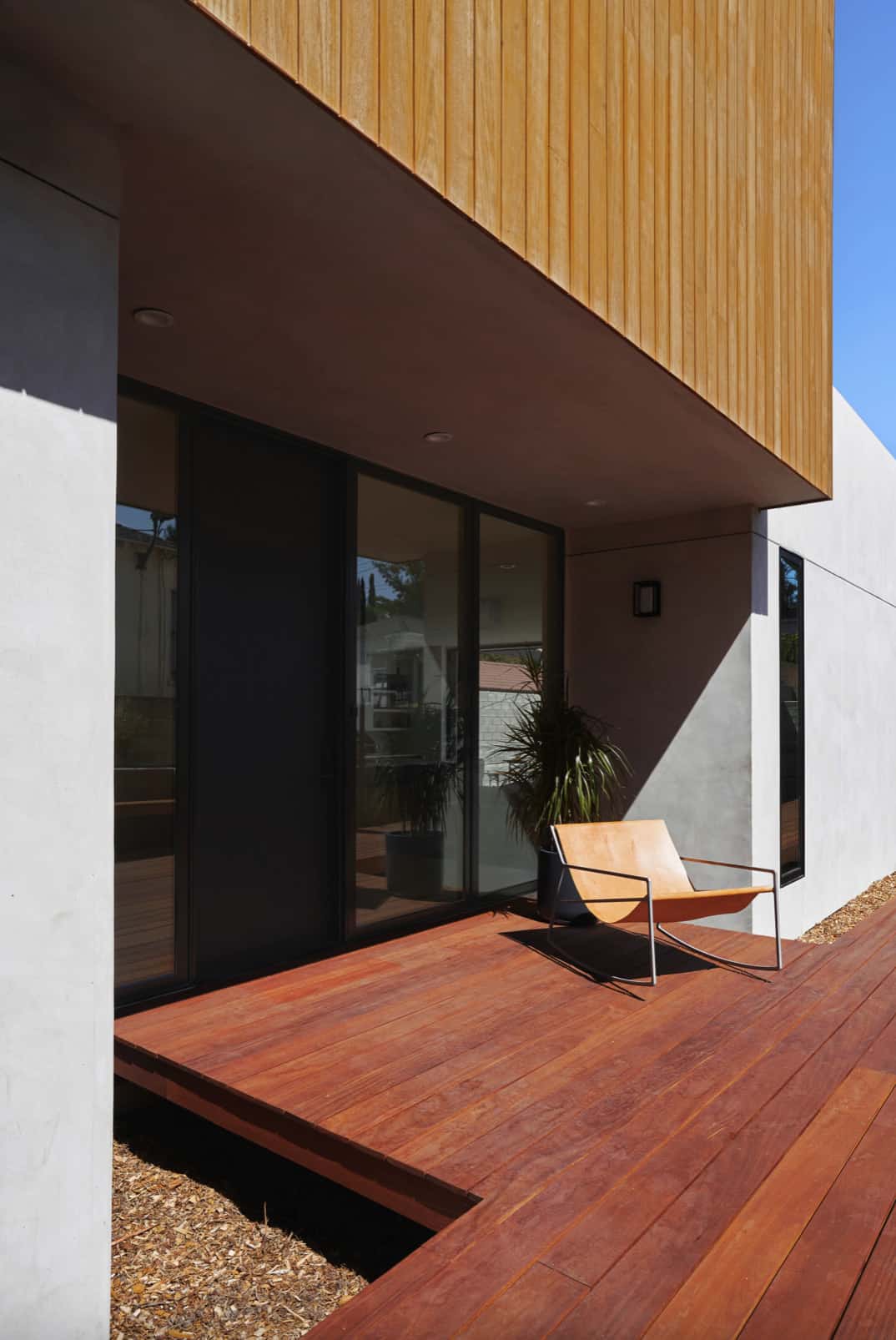
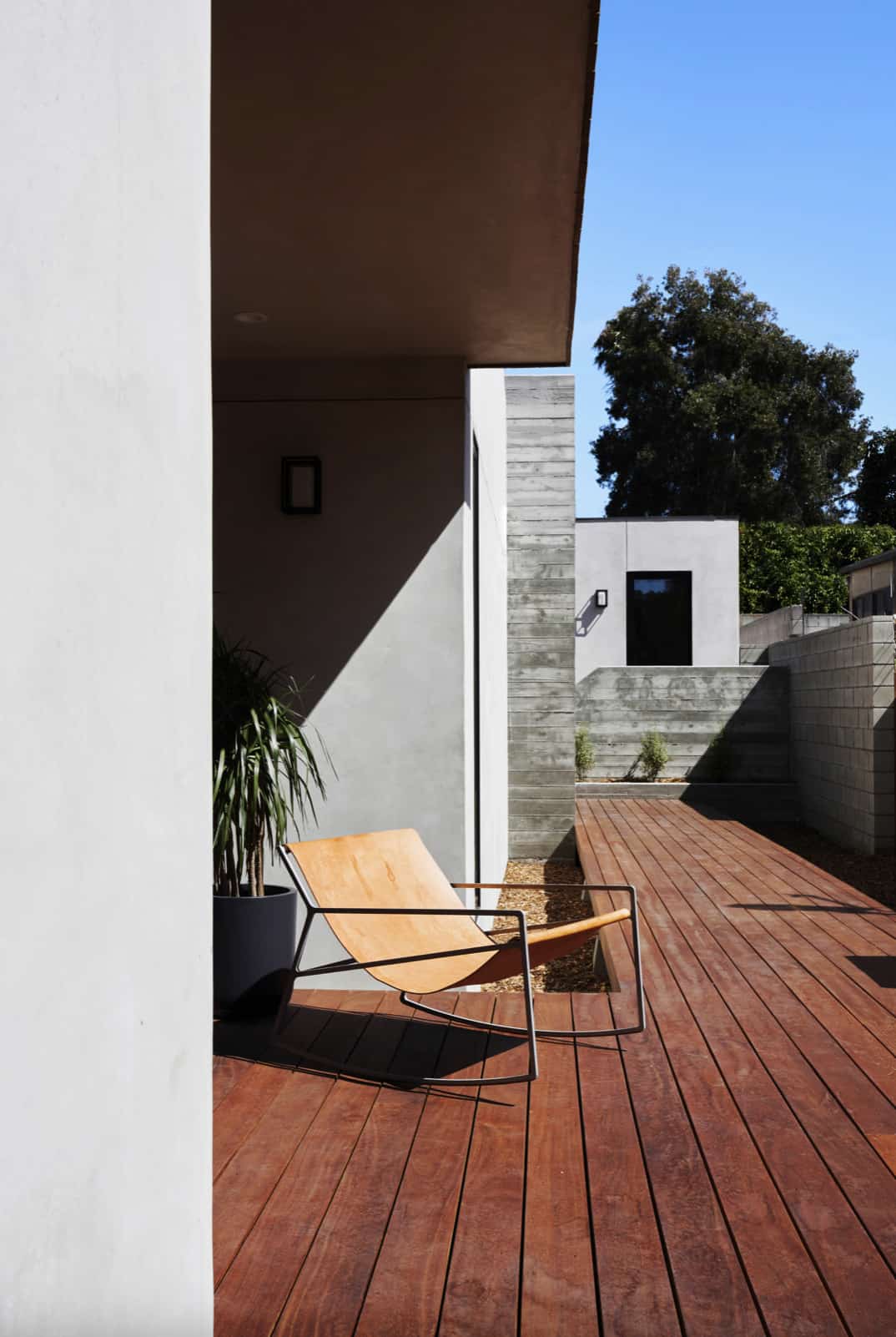
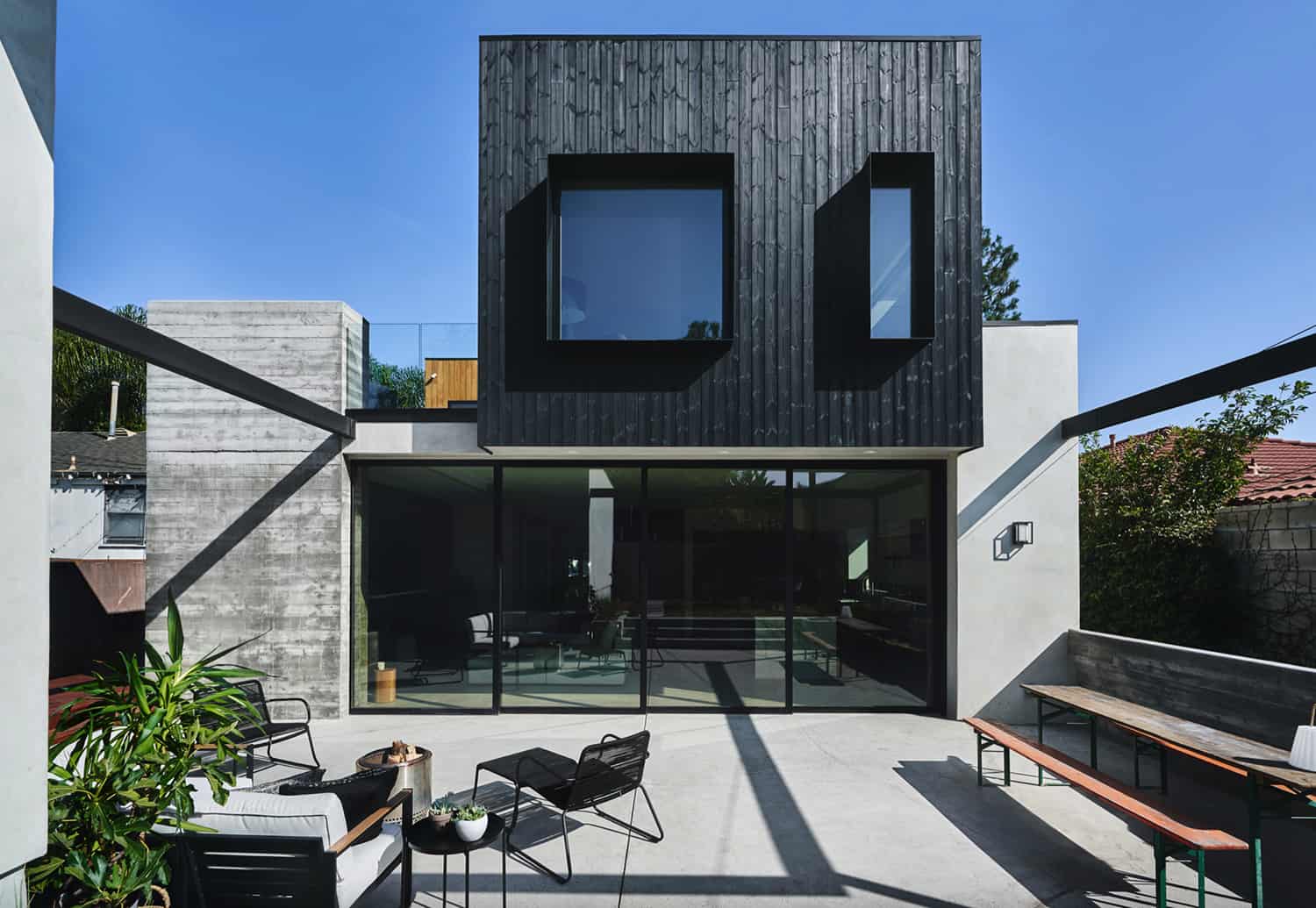
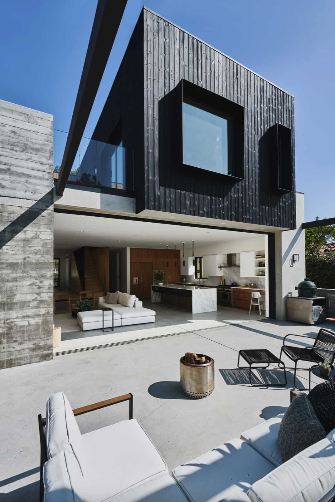
The 3,000 square foot dwelling boasts four bedrooms and four-and-a-half bathrooms, defined by large volumes strategically offset to create entry points, outdoor terraces, and shading throughout the day. A full-length boardwalk draws you through the length of the property flanked by planters of long grasses, silver sheen trees, and moody path lighting.
DESIGN DETAILS: ARCHITECT AAHA Studio CONTRACTOR Farnsworth Builders ENGINEERING Ashley & Vance
What We Love: This dynamic family home showcases thoughtfully considered living spaces and fluid indoor/outdoor transitions. The aesthetics of the exterior facade complements the interiors, hinting at what can be found inside — when attention and care are given to the exterior, there’s synergistic magic that kicks in to make for a home that feels truly special.
Tell Us: What do you find most appealing about the design of this home and why in the Comments below, we love reading your feedback!
Note: Take a look at a couple of other fantastic home tours that we have featured here on One Kindesign from the area of Santa Monica, California:
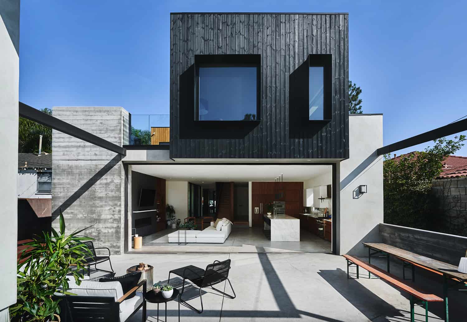
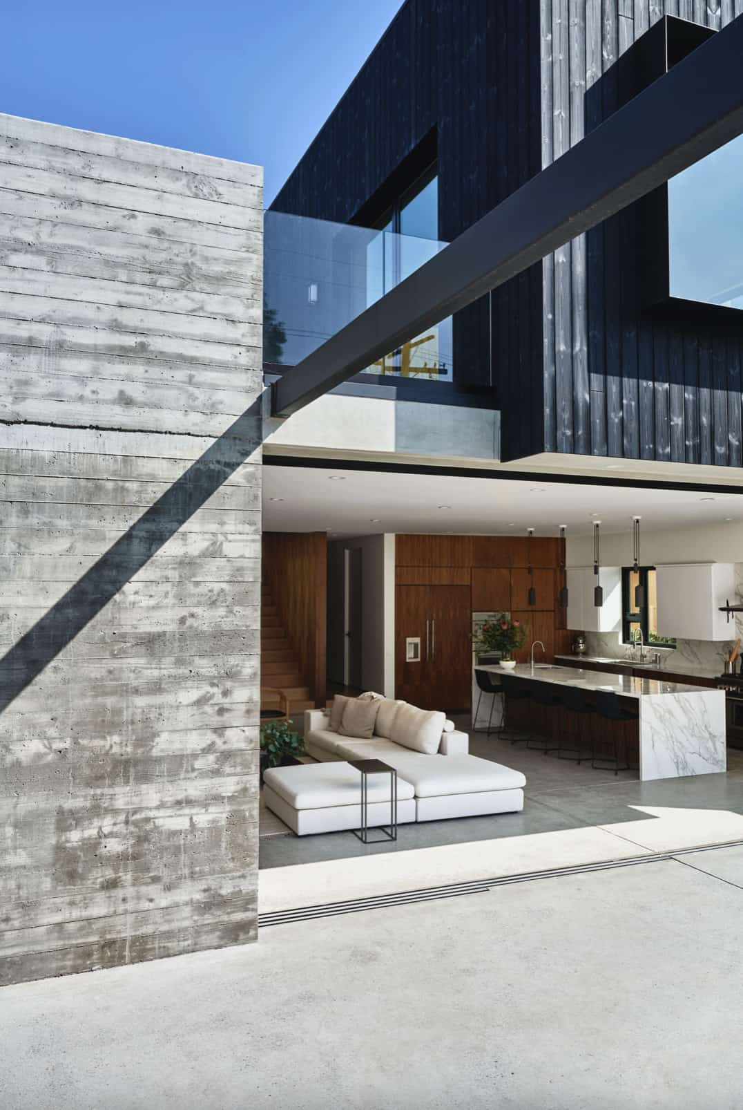
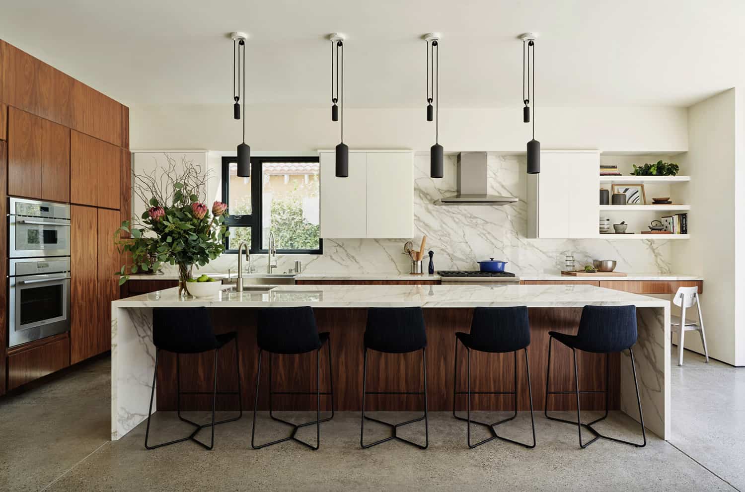
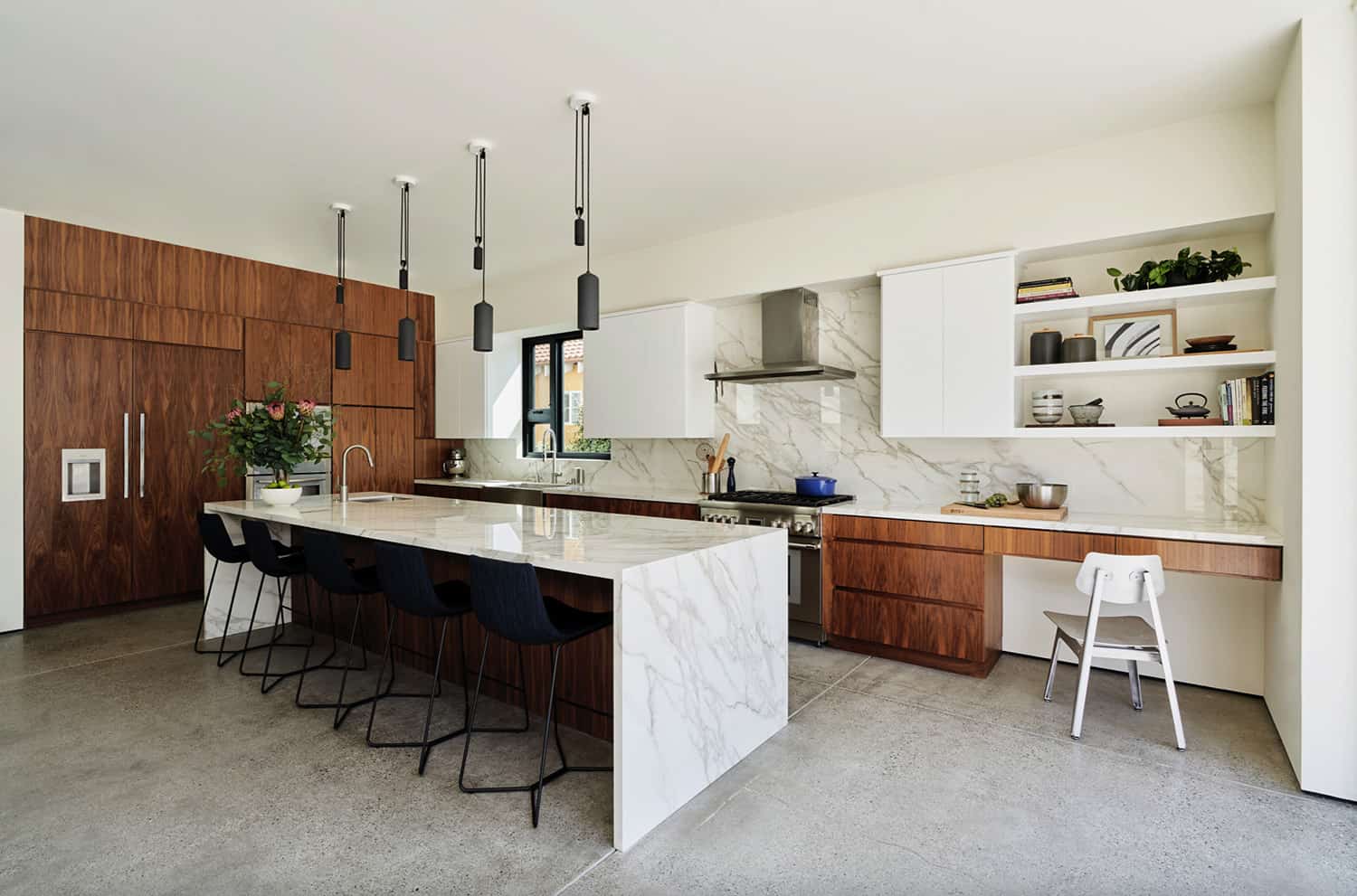
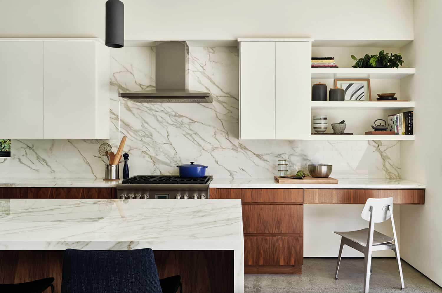
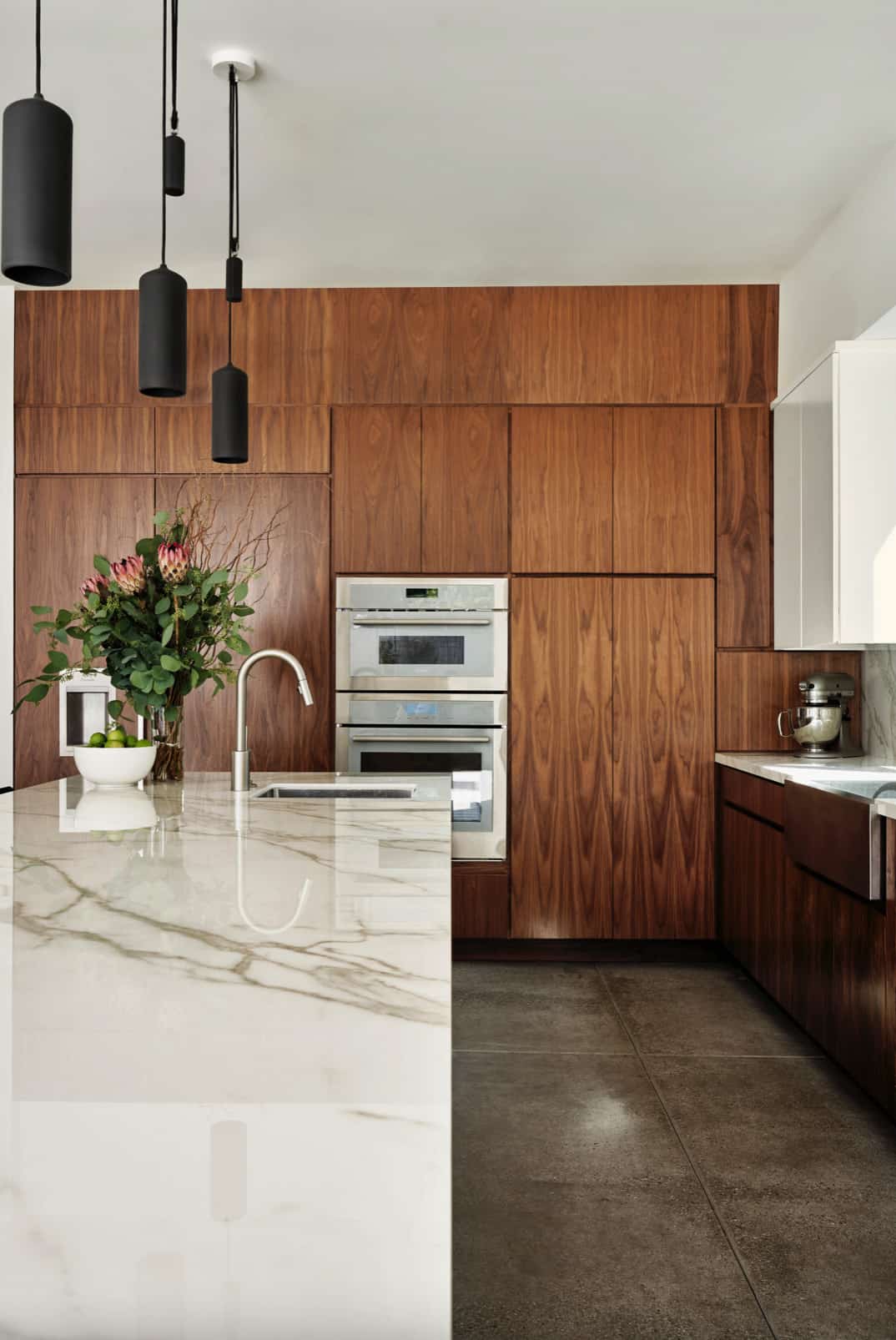
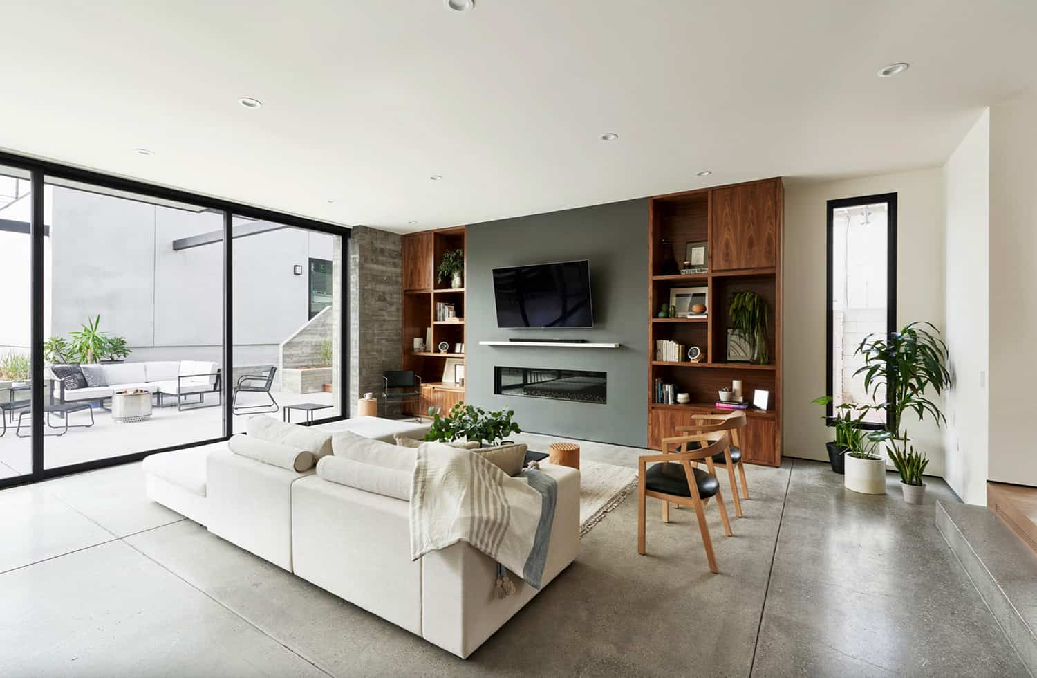
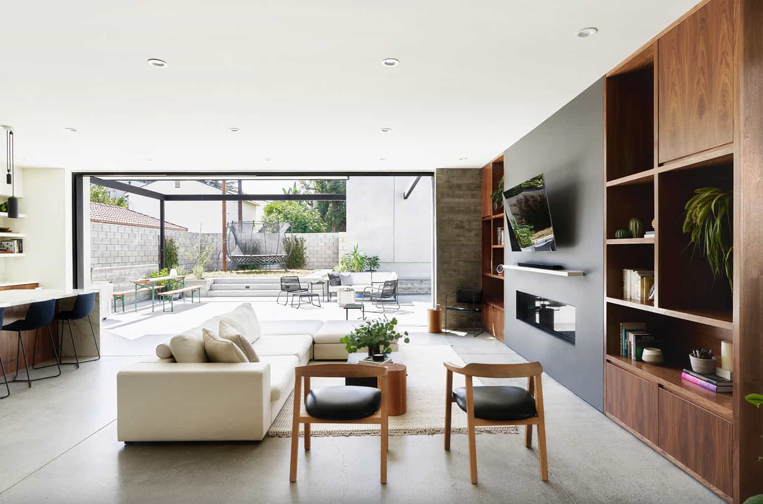
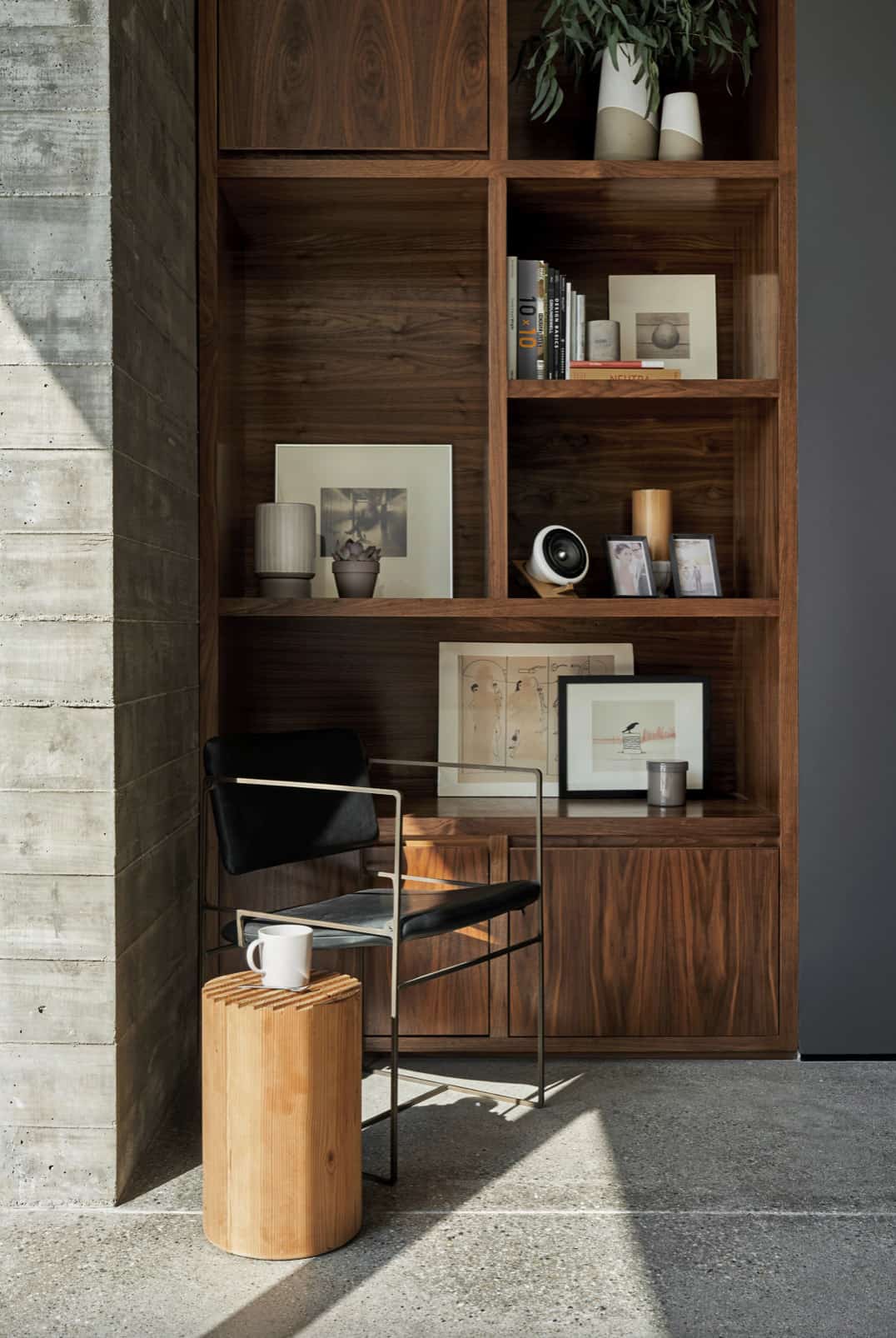
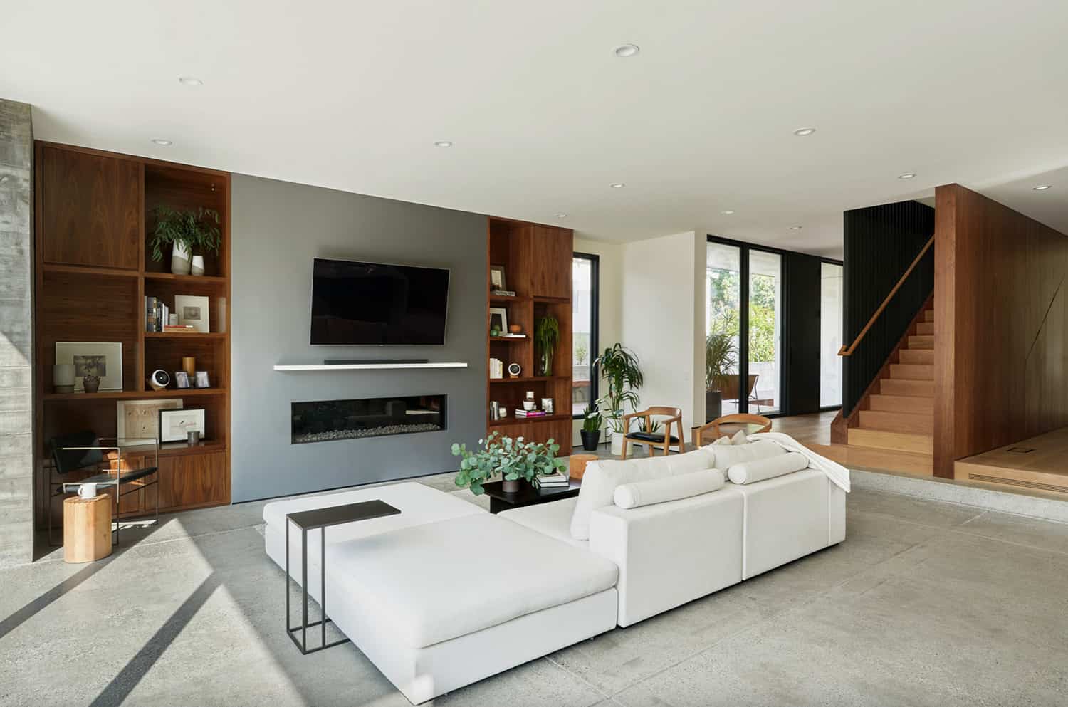
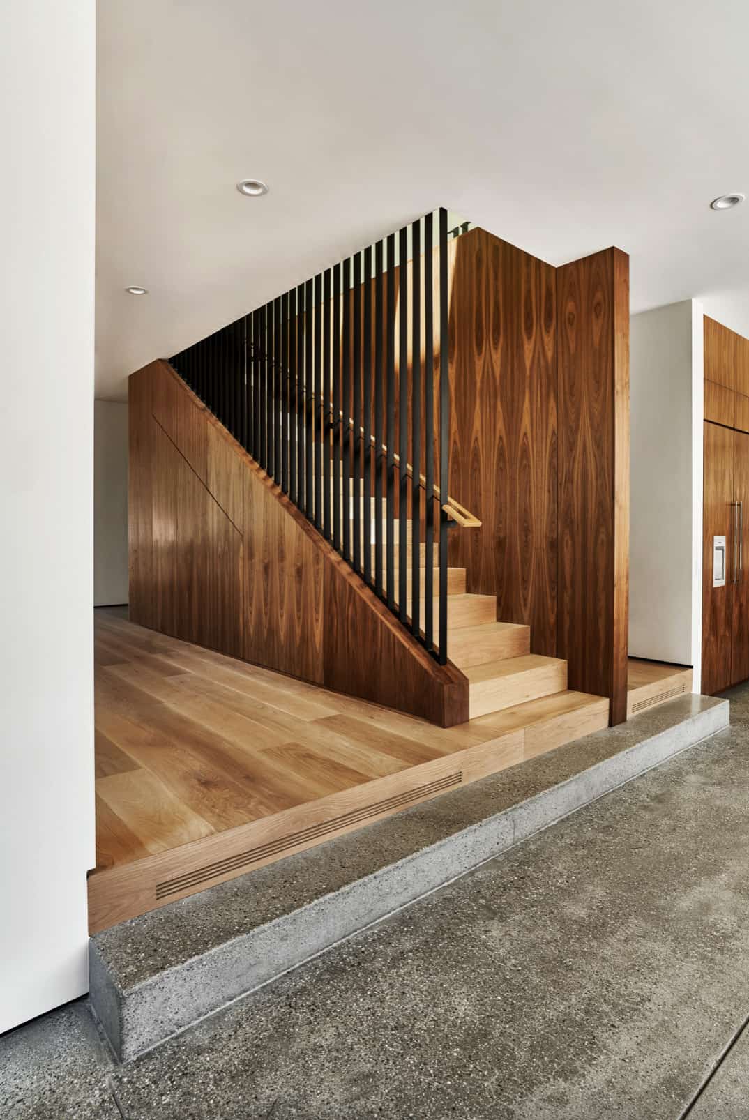
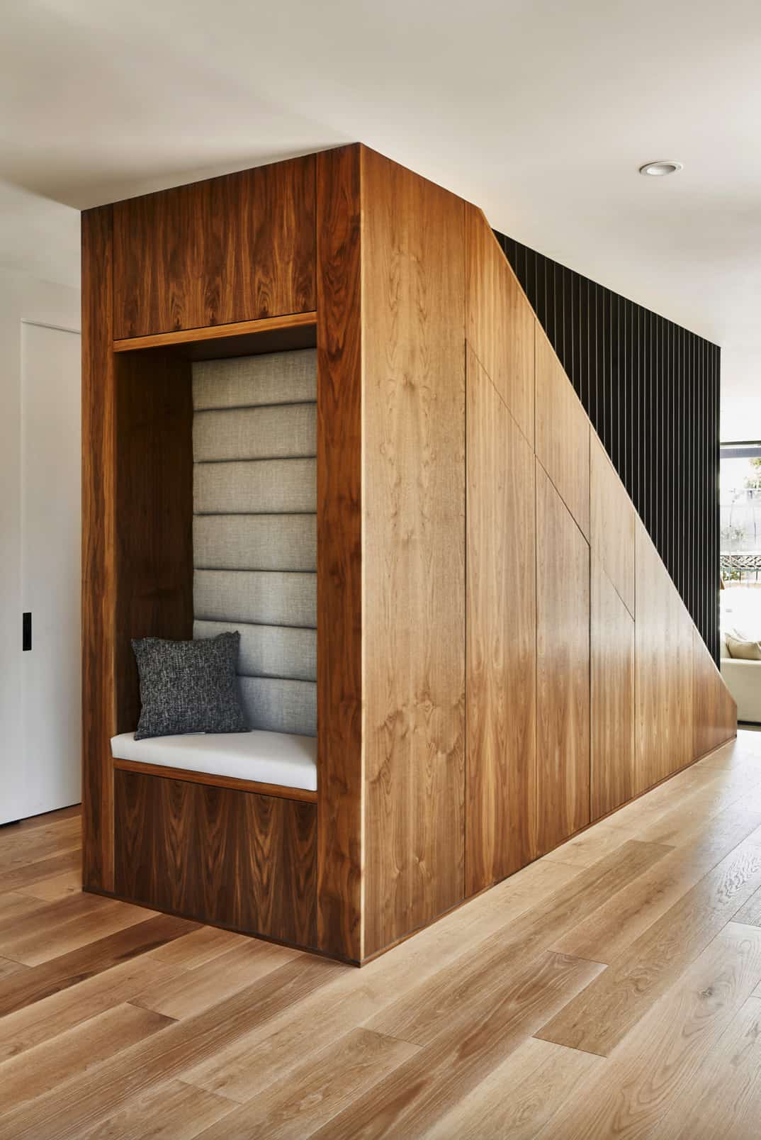
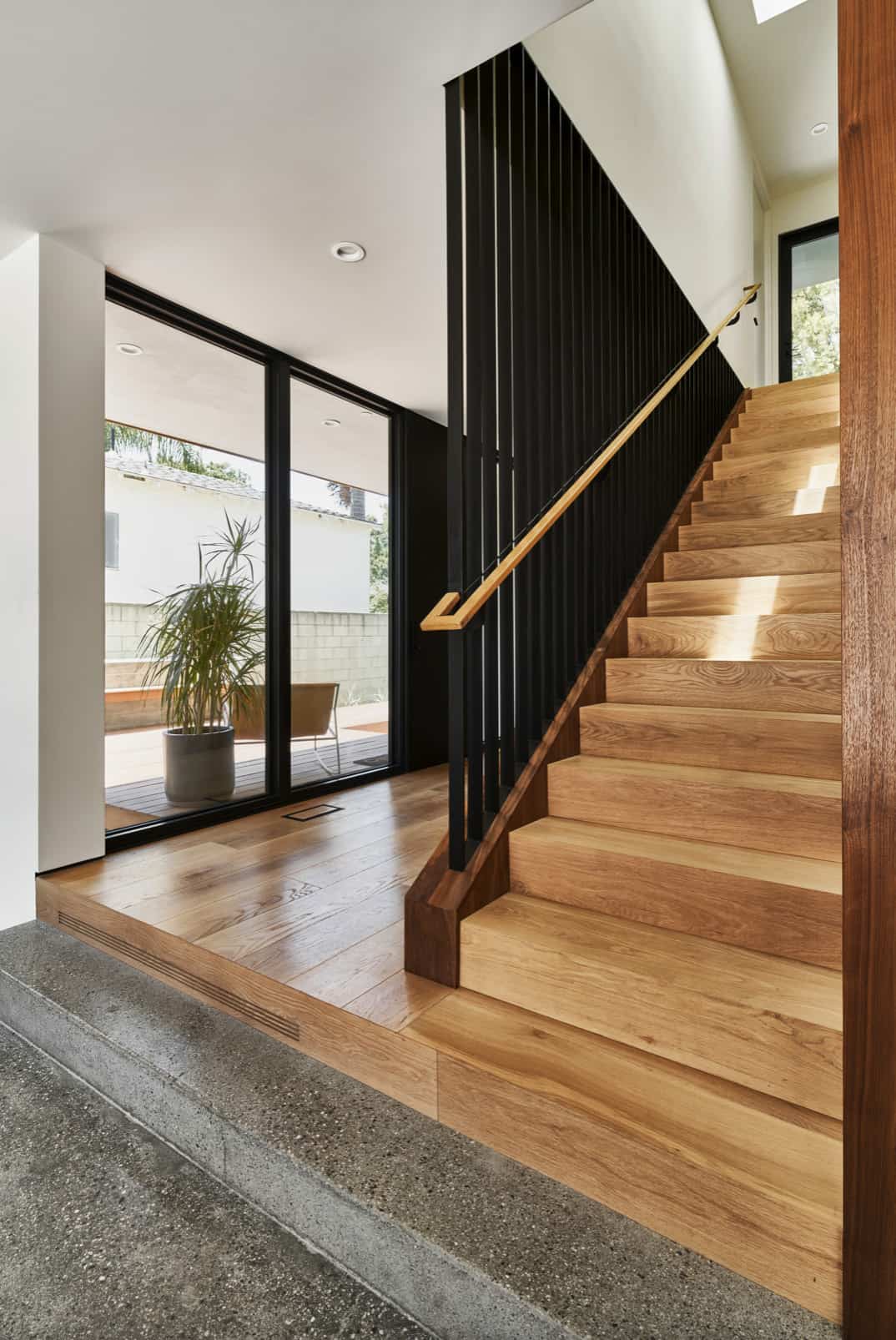
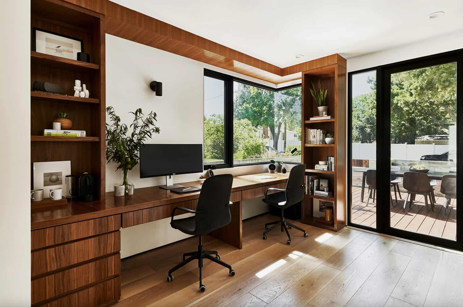
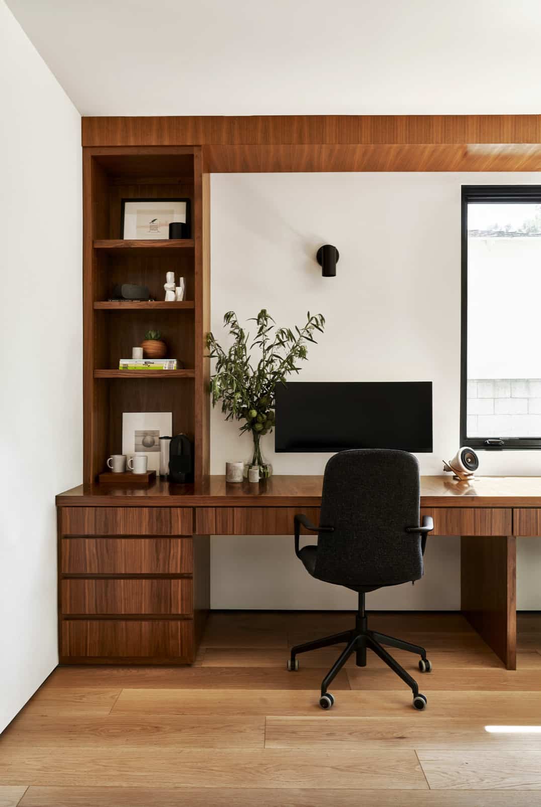
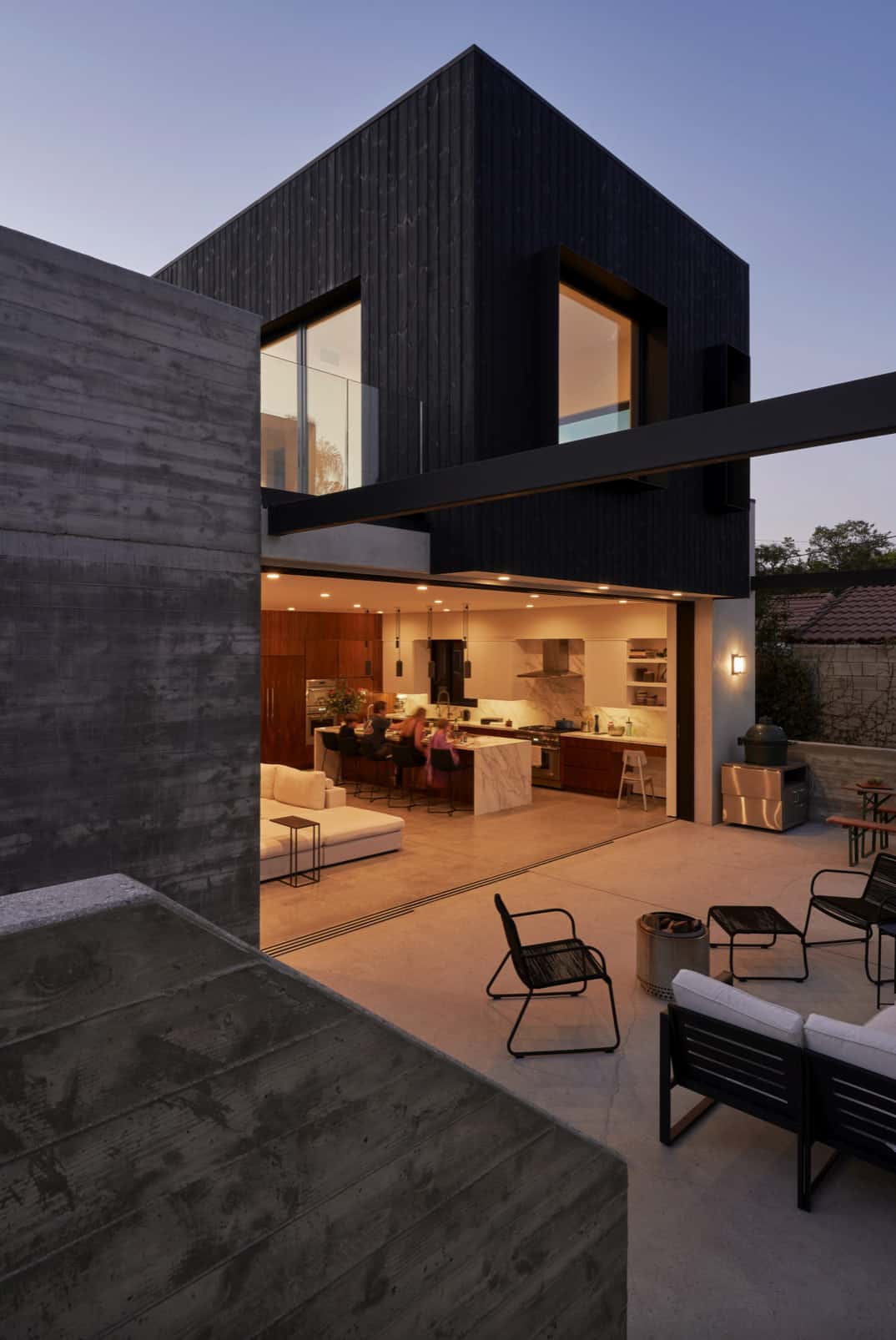
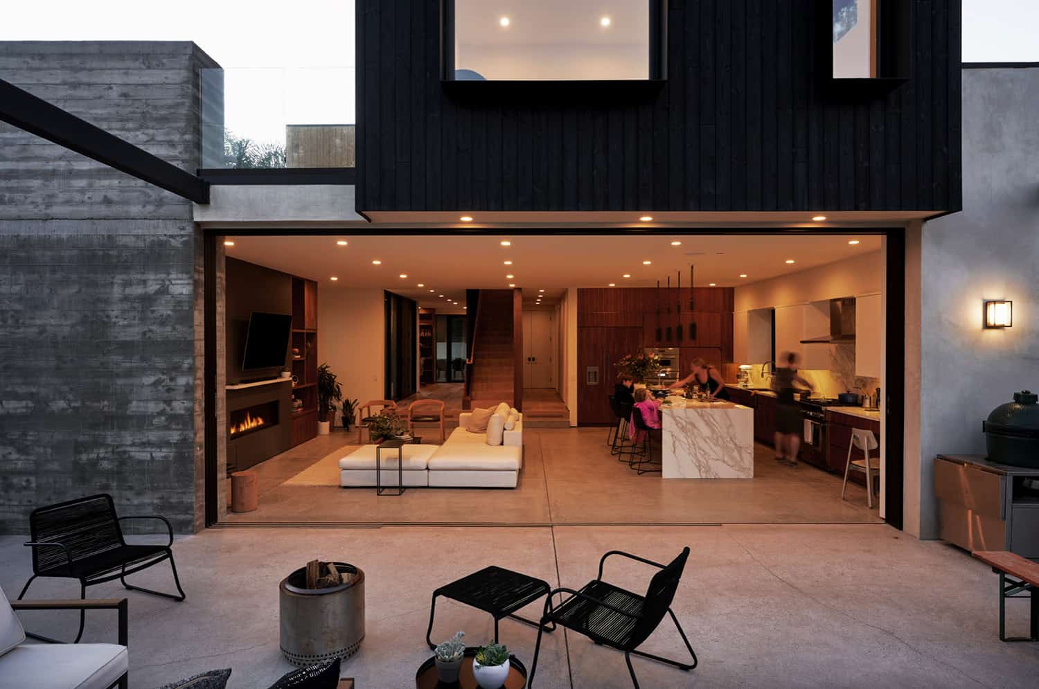
The house is layered with custom-designed, warm walnut millwork deliberately set against the cool of the poured concrete floors and board-formed concrete door pocket.
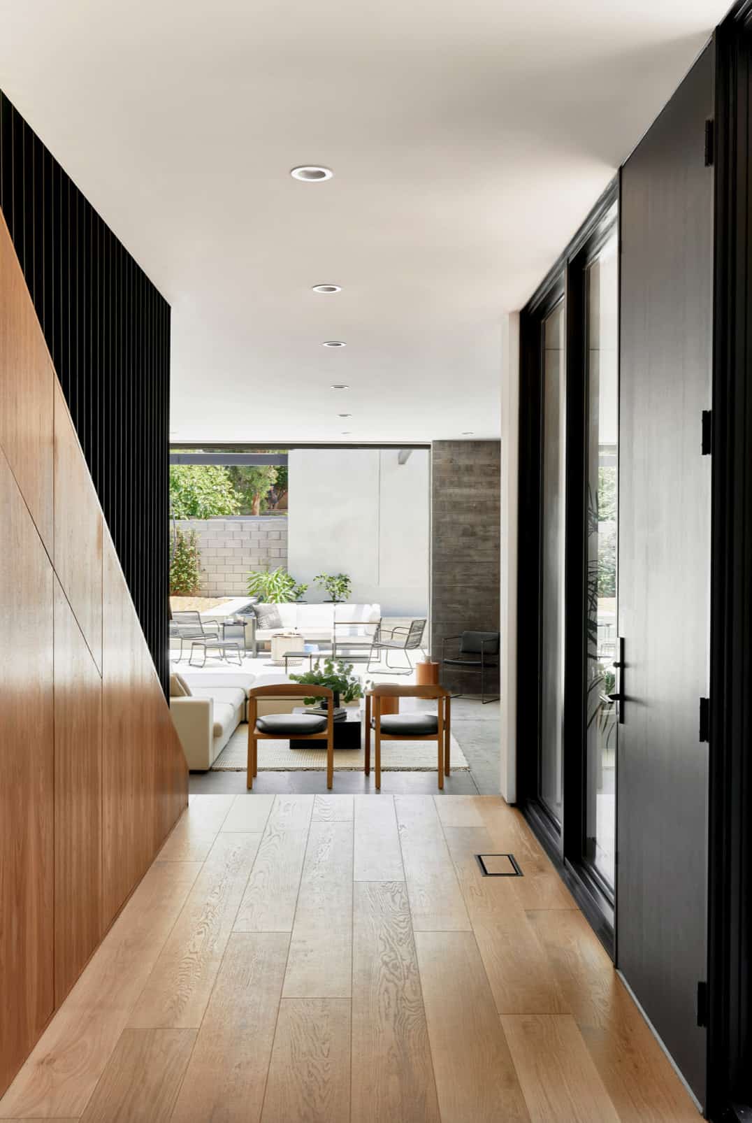
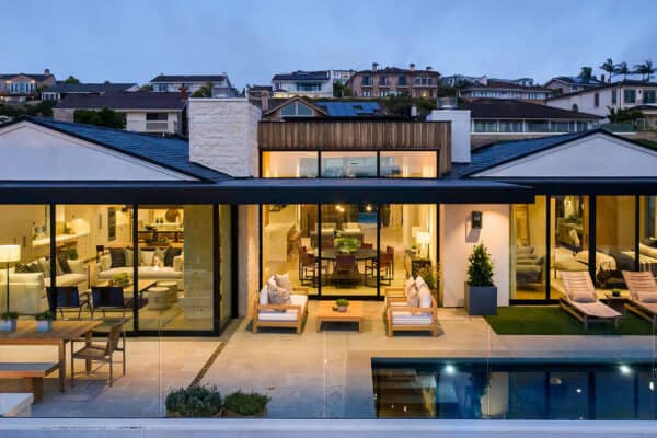
The main living space is anchored by a 22-foot wide sliding pocket glass door. When open, the interior is drenched with natural light, blurring the lines between indoors and outdoors. The polished concrete floor runs continuously from the great room through the backyard with the door track embedded into the slab.
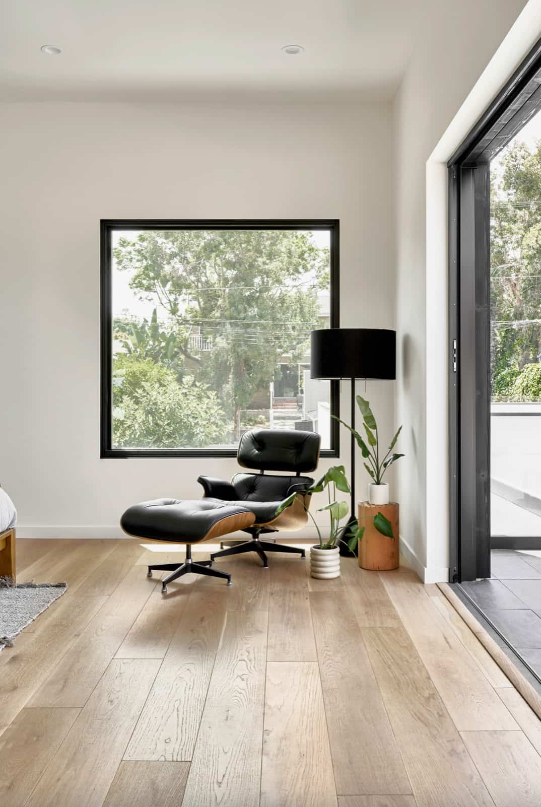
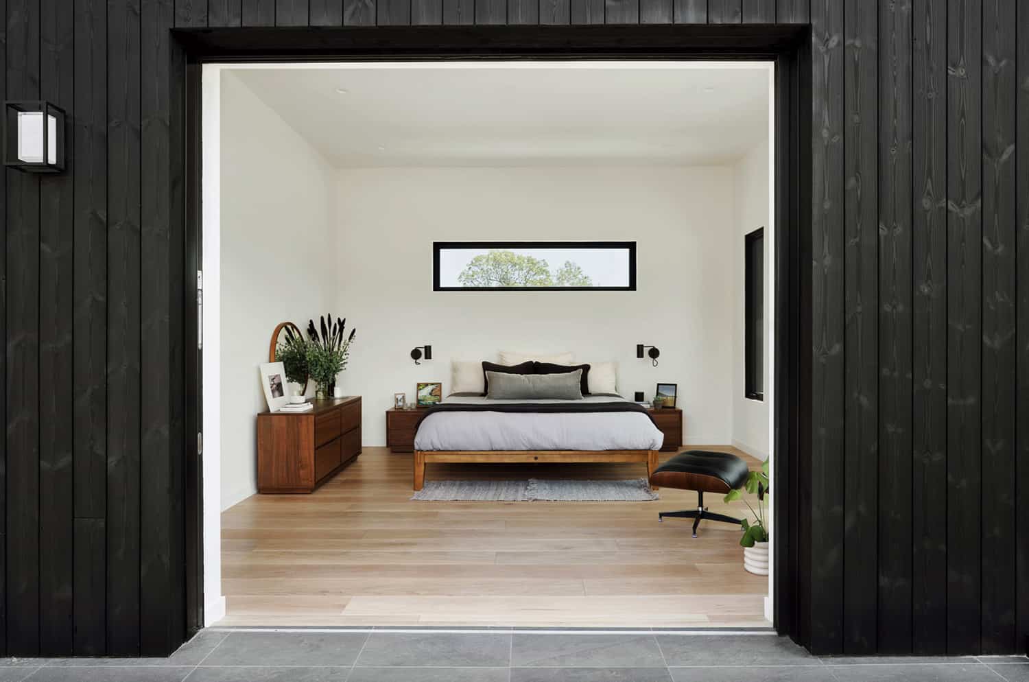
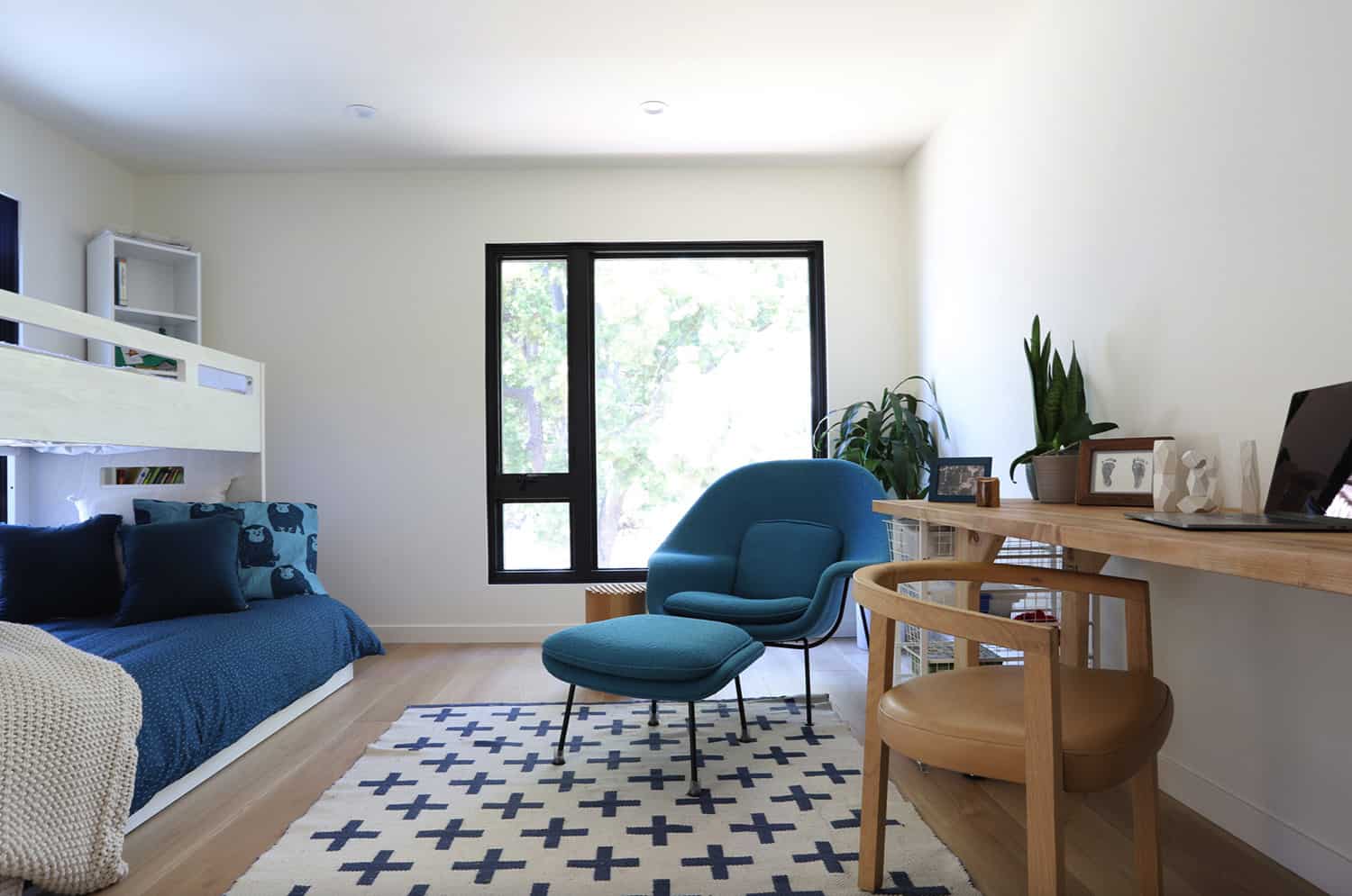
The wide-plank oak floors provide a tonal contrast at the entry, which are repeated in upper-level bedrooms.
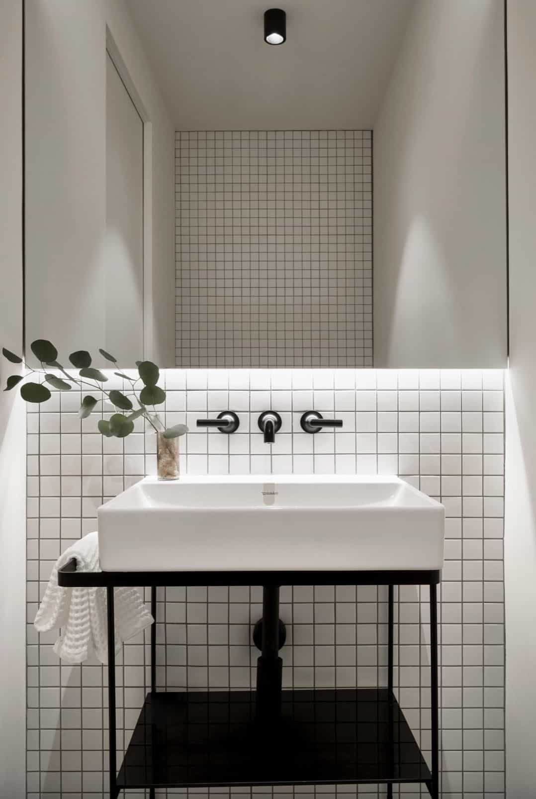
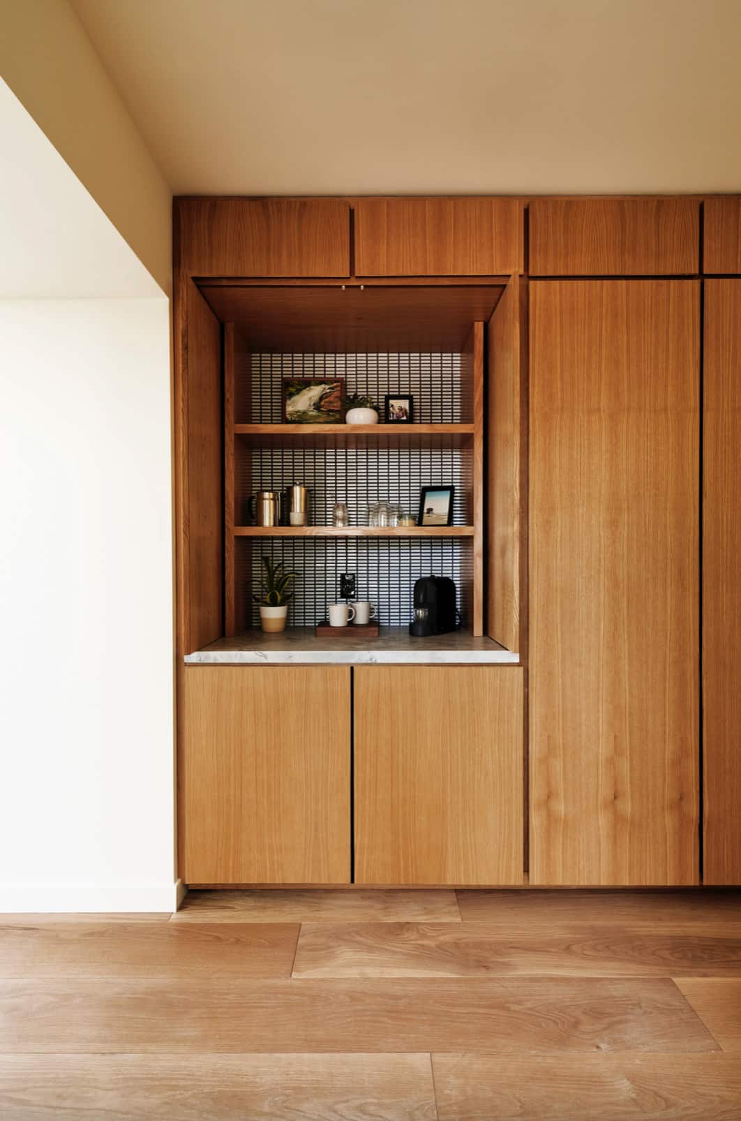
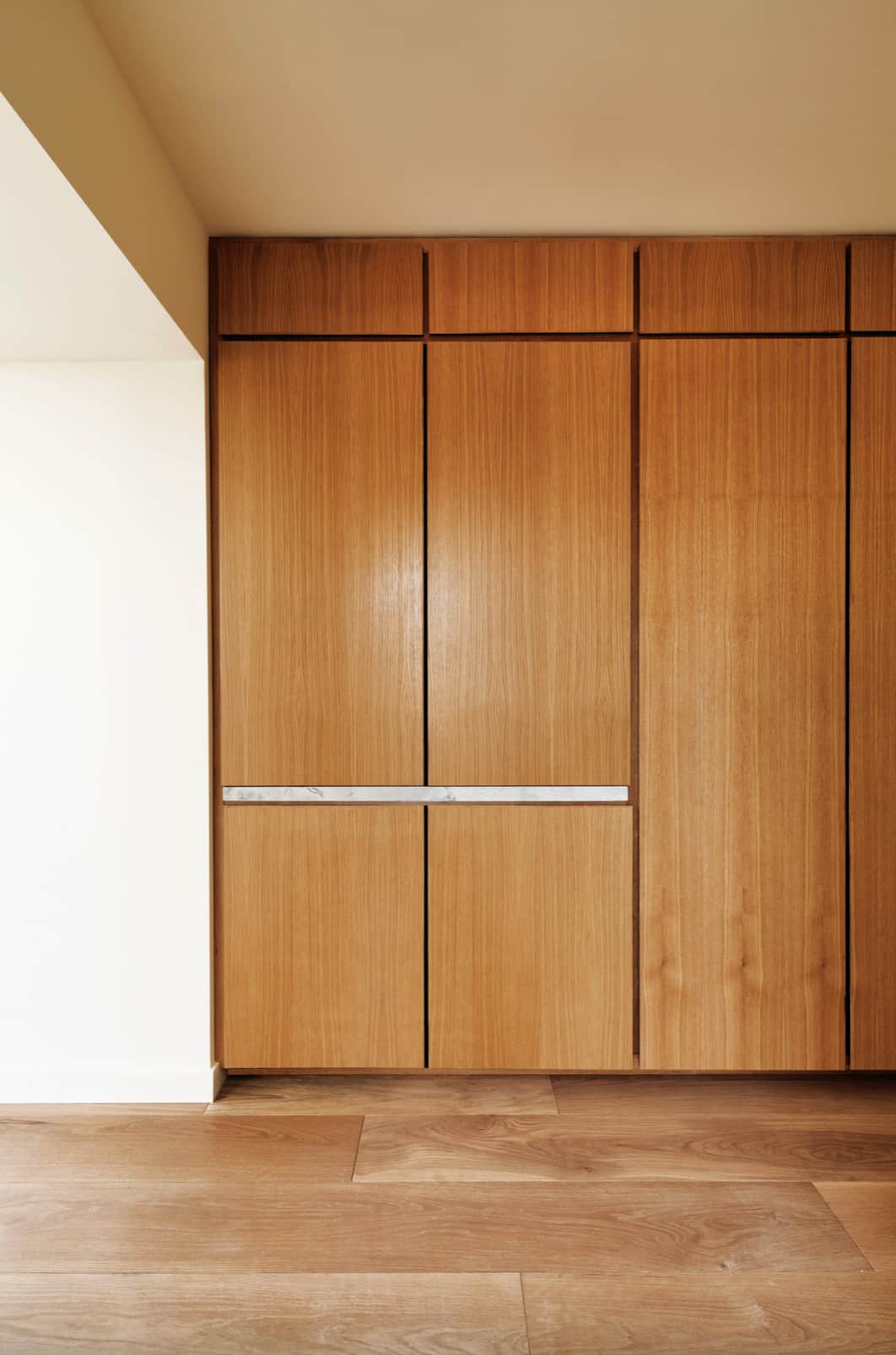
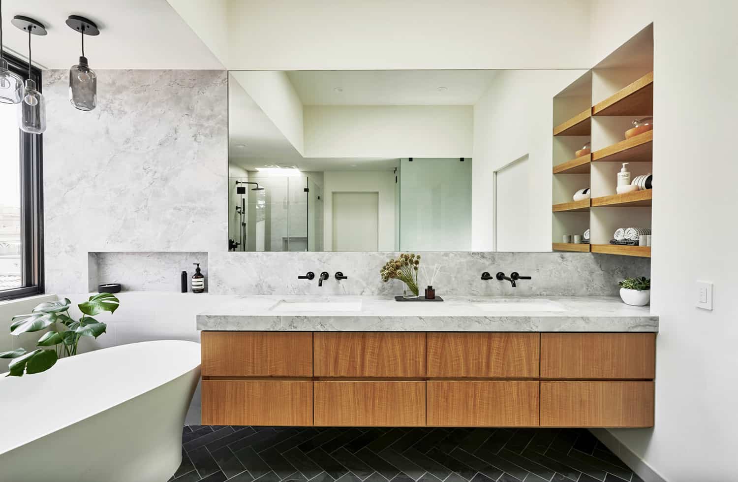
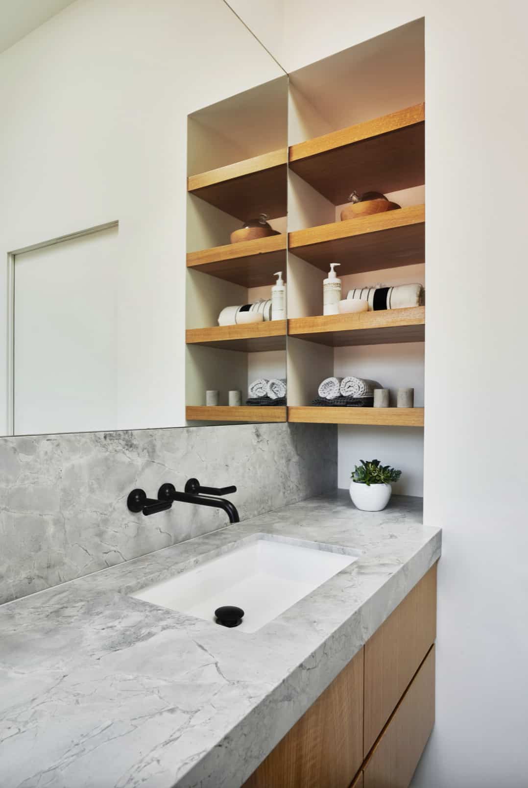
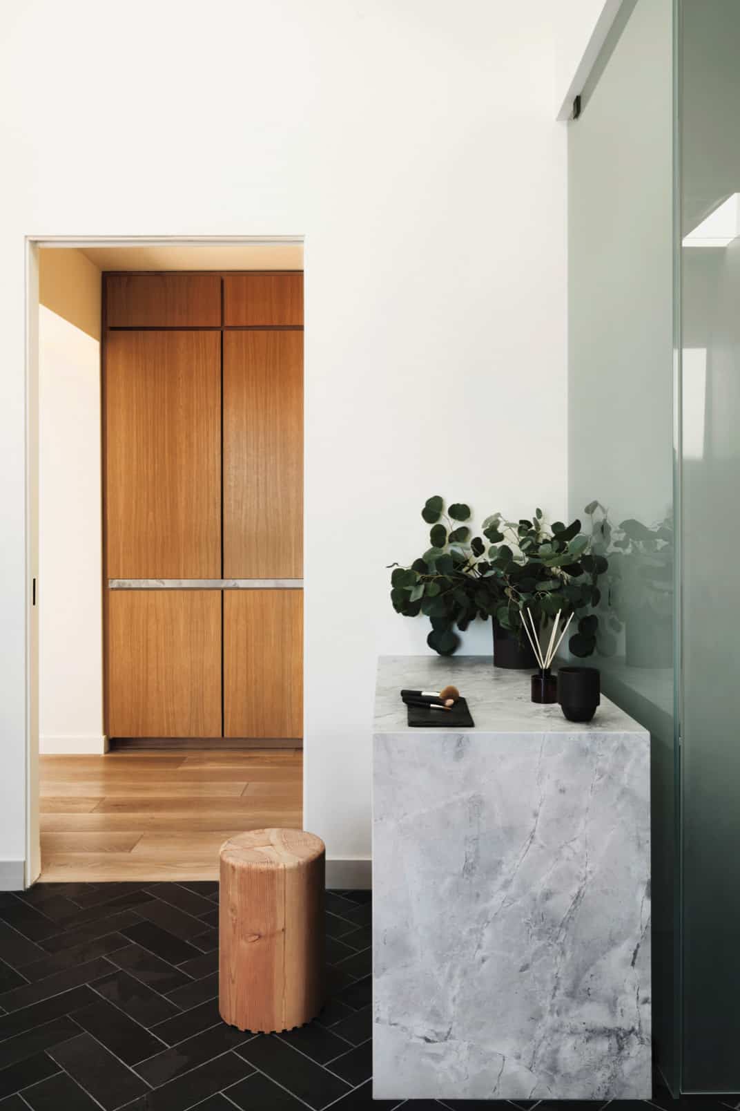
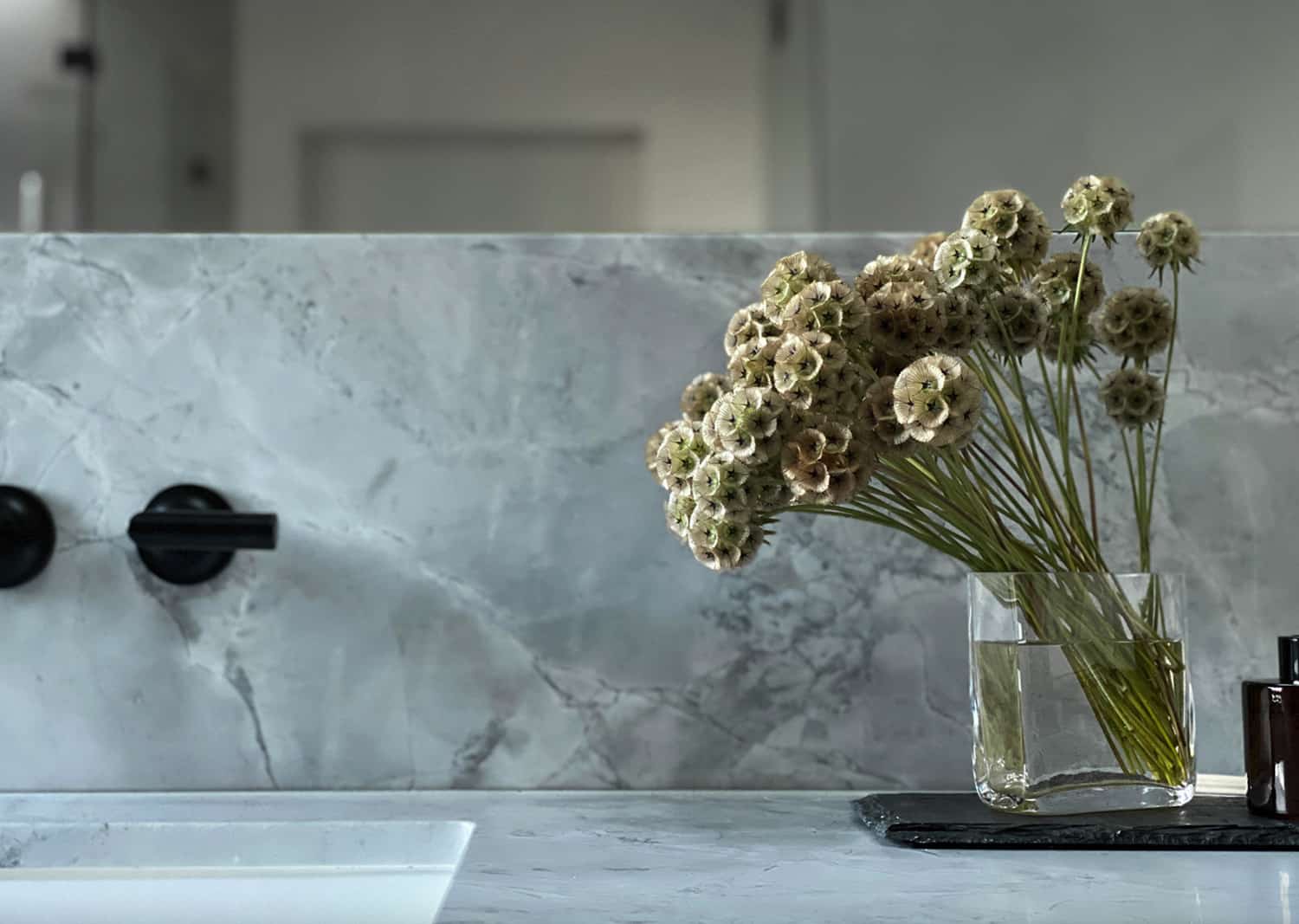
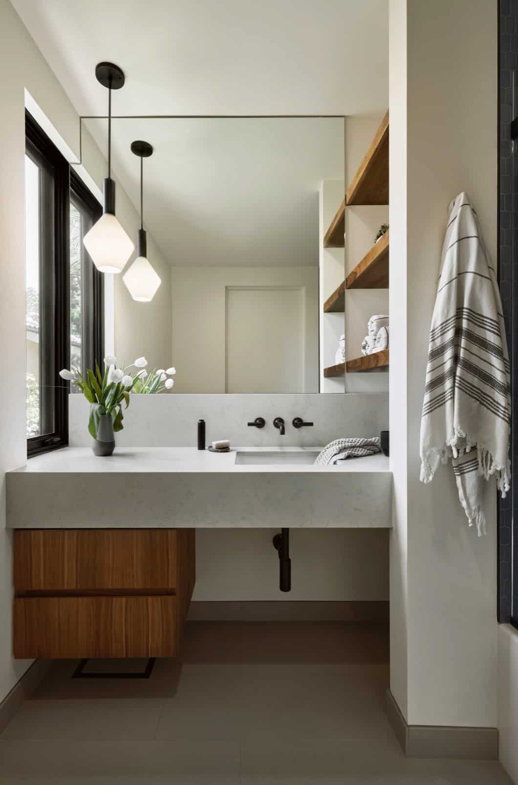
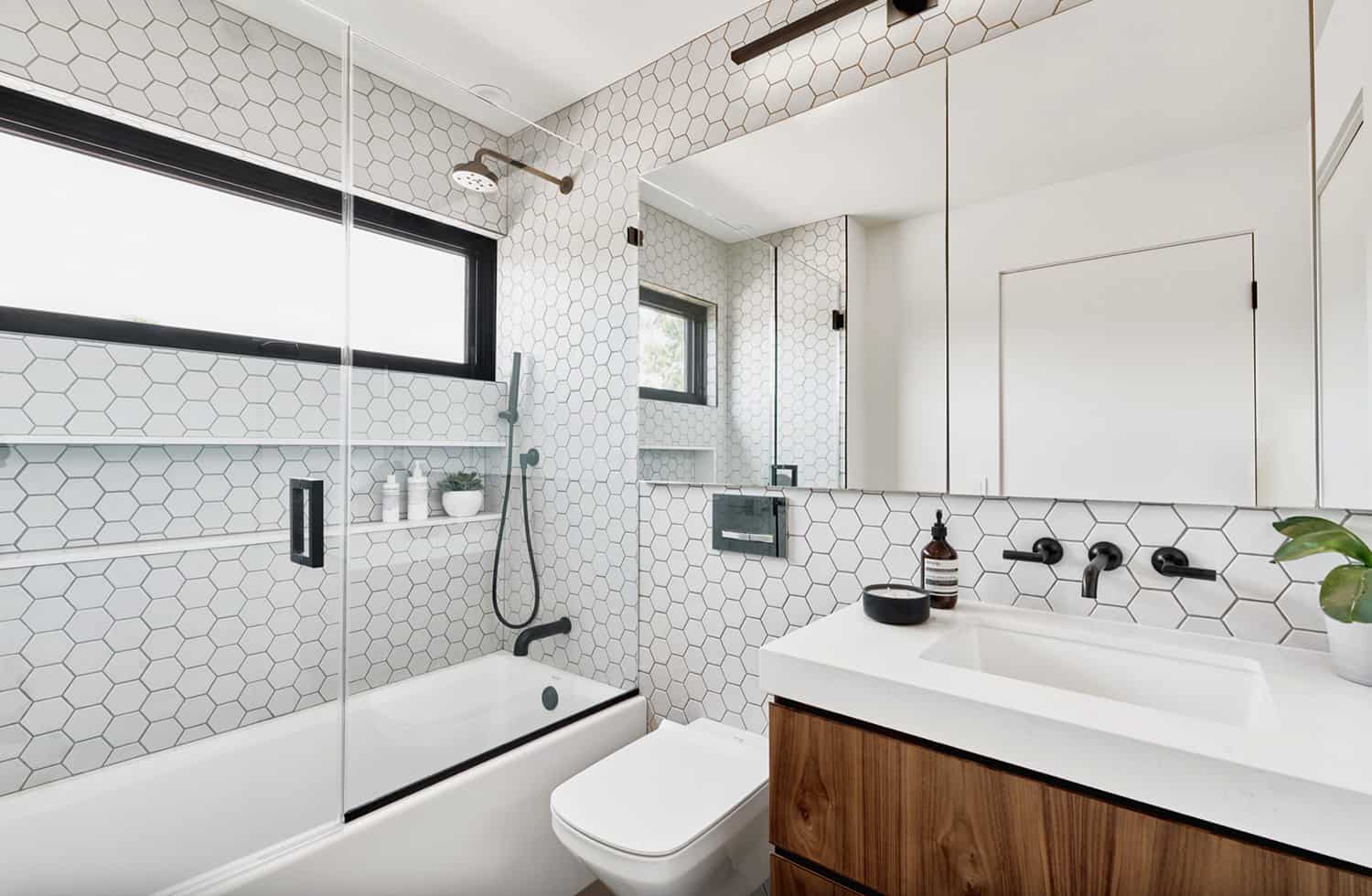
Each of the rooms in this home was thoughtfully considered to compliment the exterior architecture. Oak cabinetry accents can be found in each of the bathrooms, paired with full-length, gray marble slabs. An abundance of storage was provided wherever possible to ensure that the contents of family life can be tucked away when desired.
PHOTOGRAPHER Liz Carababas


1 comment