
This midcentury modern home was designed by New-Jersey based Mowery Marsh Architects, nestled on a sprawling 10,000 square foot wooded property in Washington. The home was originally constructed in 1957 by Seattle–based architect Hawley Adelbert Dudley, used as his personal residence. During the same year this home was built, Seattle Times awarded it “Home of the Month” in September.
Structurally the home was in great condition, yet the interior was very closed off and lacked visual connection with its beautiful surroundings. The homeowners requested a complete overhaul, beginning with the exterior facade, which now features updated siding and brand new windows—creating a unified aesthetic. Continue below to see the results of this stunning renovation.
Project Team: Architect: Mowery Marsh Architects / Builder: Mark Patterson Construction / Structural Engineer: Dibble Engineers / Interior Design: Kaylen Flugel Design
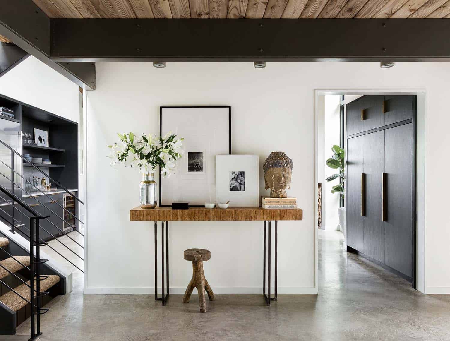
Above: In the front entry, the design team opened up an enclosed stairwell, while introducing a lighter color palette to keep things bright and airy. White walls, concrete flooring and minimal trim produces clean lines and a modern aesthetic.
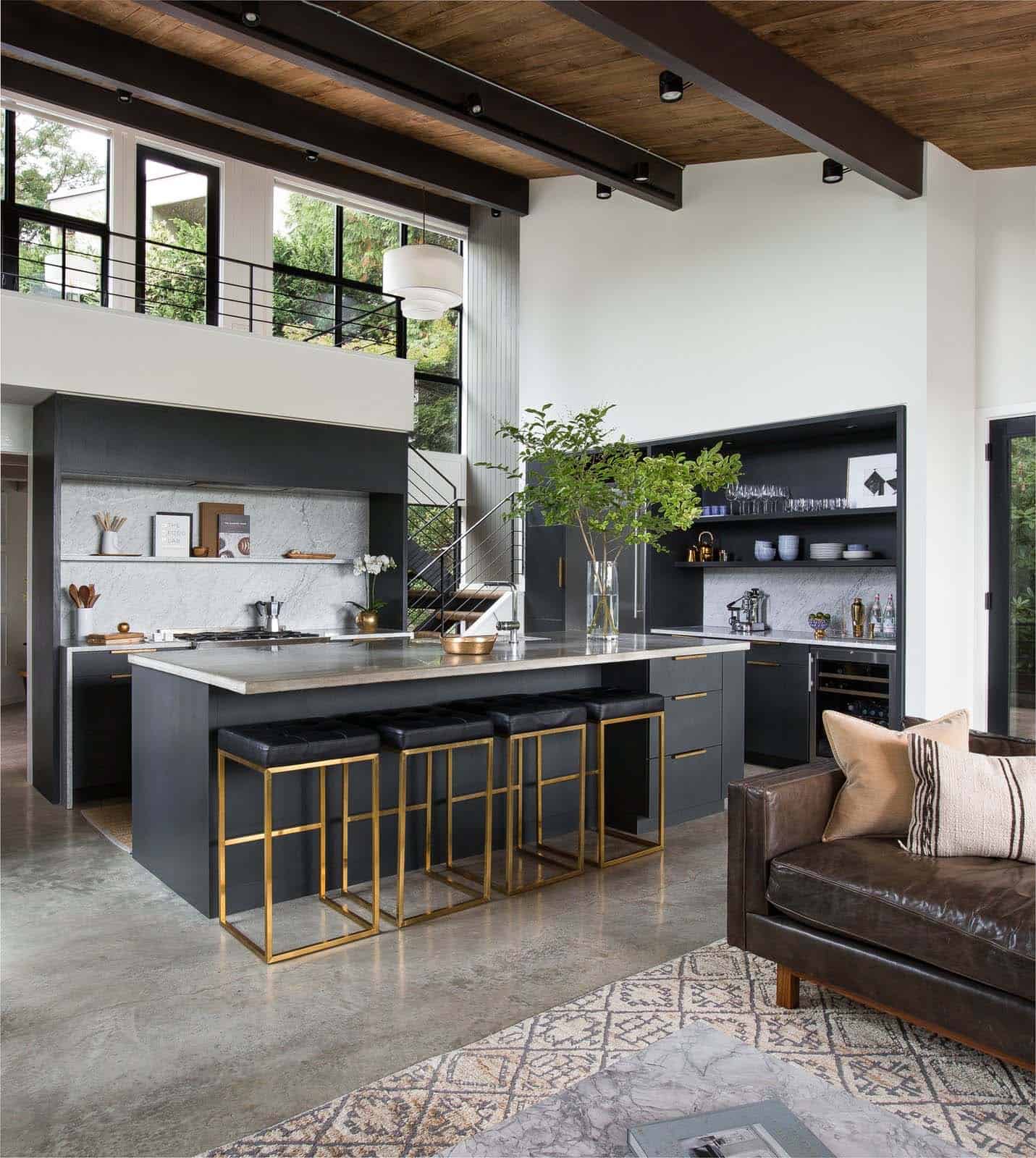
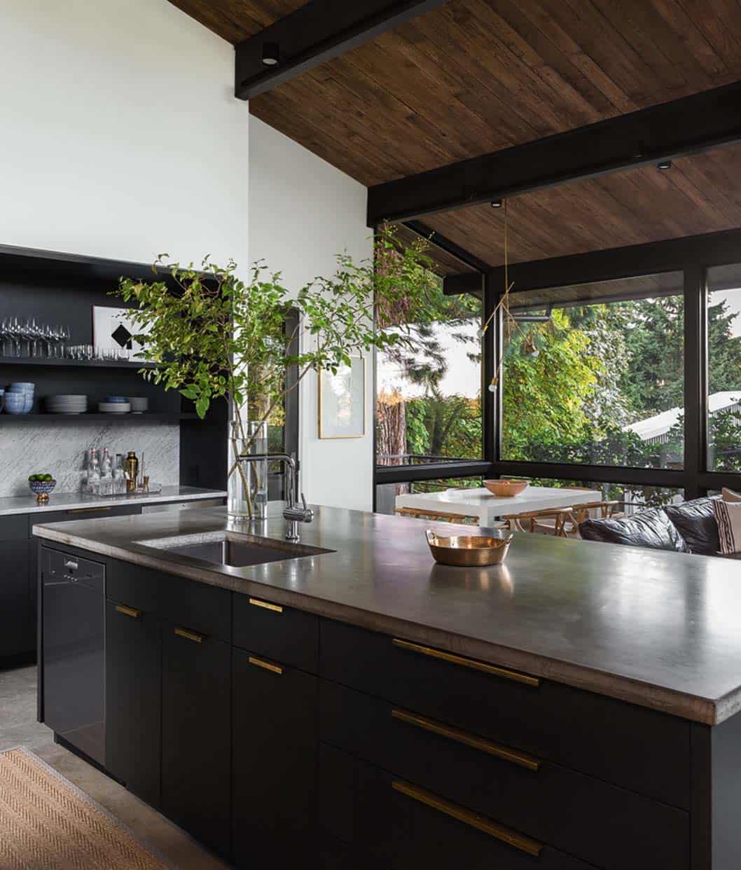
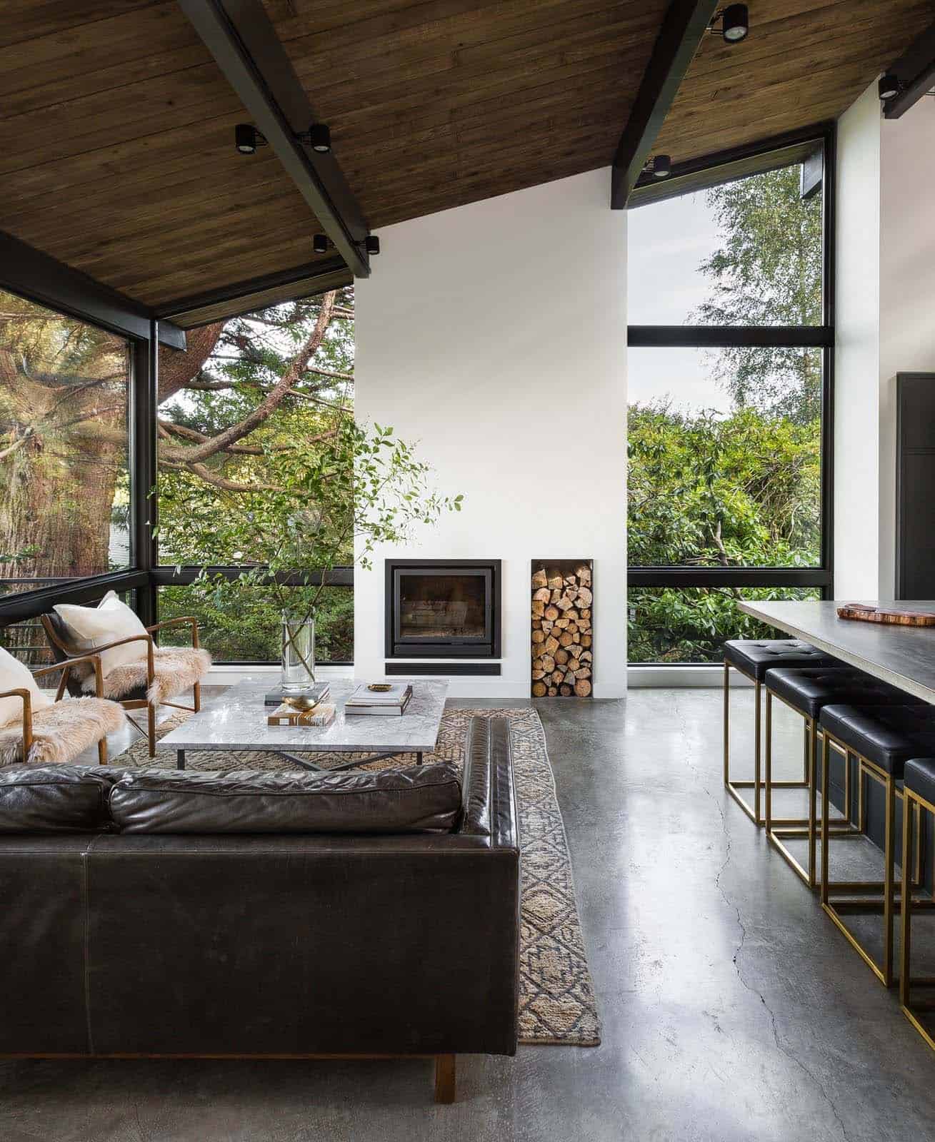
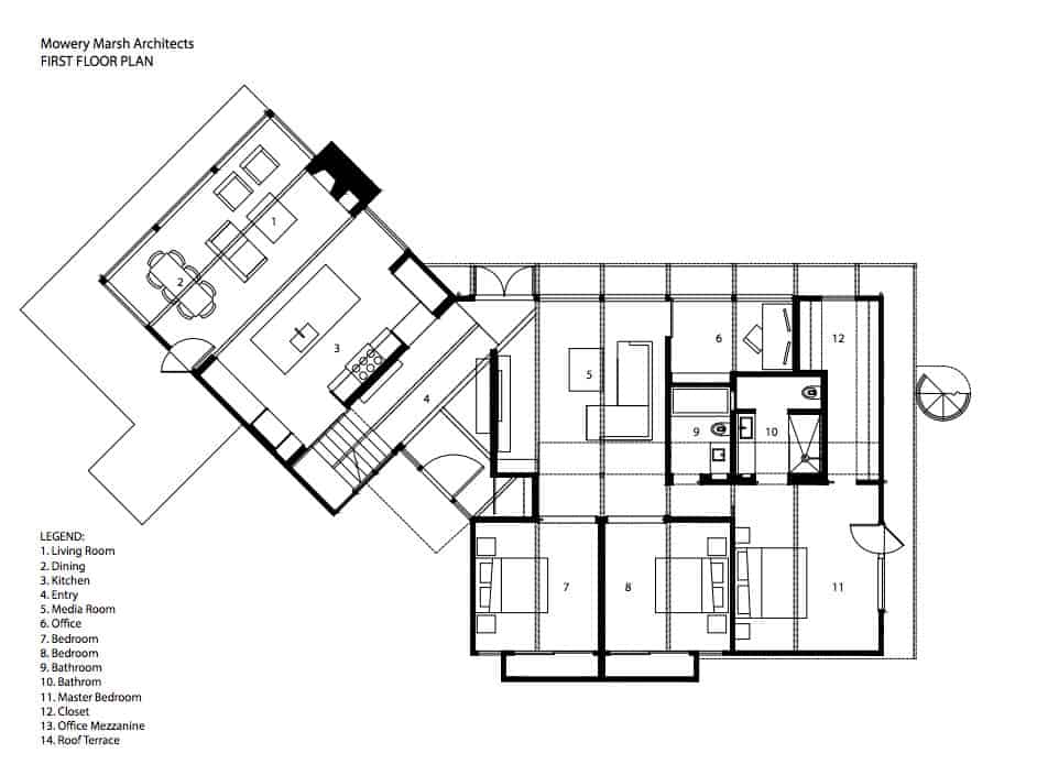
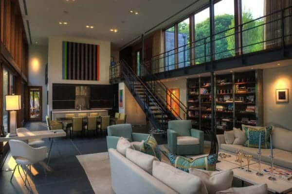
Above: The home’s entry connects to the open concept kitchen and living room. The upper level mezzanine was once closed off, but the renovation involved tearing down walls to illuminate the space with natural light and further connecting it to the outdoors. This space features soaring ceilings with warm wood ceiling boards and polished concrete floors—with radiant heat. In the kitchen, concrete countertops, a Carrara marble backsplash and deep black stained cabinetry.
What We Love: This midcentury modern renovation project features clean lines and a light and airy palette that is simply spectacular. The double volume, open concept great room is fabulous, we are loving the black and white palette in the kitchen. But our favorite space in this house has to be the rooftop deck! What a fantastic spot to relax while enjoying amazing views of this peaceful setting.
Readers, what do you think of the overall renovation of this home? Are there any details that you would have done differently? Please share your thoughts in the Comments below!
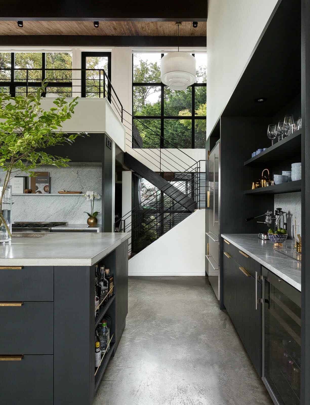
Above: From this vantage point, you can see through the stairwell to the front entry. The wood clad ceiling infuses warmth and character into the black and white color scheme.
Above: The long brass edge pulls were custom sized from E.R. Butler & Co., adding a touch of warmth to this striking kitchen.
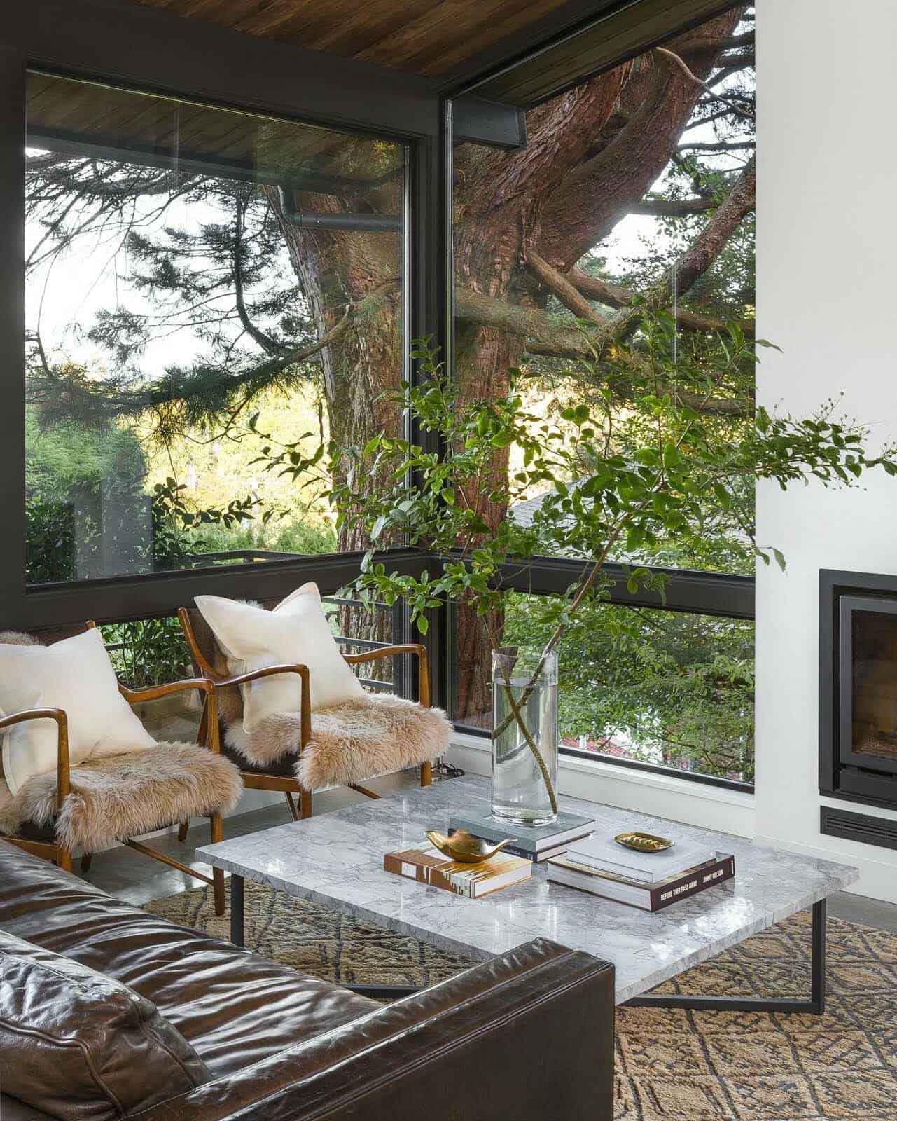
Above: The living room features a brand new, floor-to-ceiling fireplace, creating a welcoming focal point to the space. Expansive windows helps to visually connect this space with the outdoors.
Above: The windows are in the same places, yet the architects reworked them to improve sight lines. The original frames obstructed views with have a horizontal division while standing. Now the frames are at chair rail height, creating a clear, visual connection.
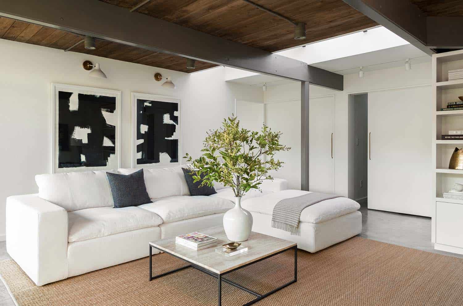
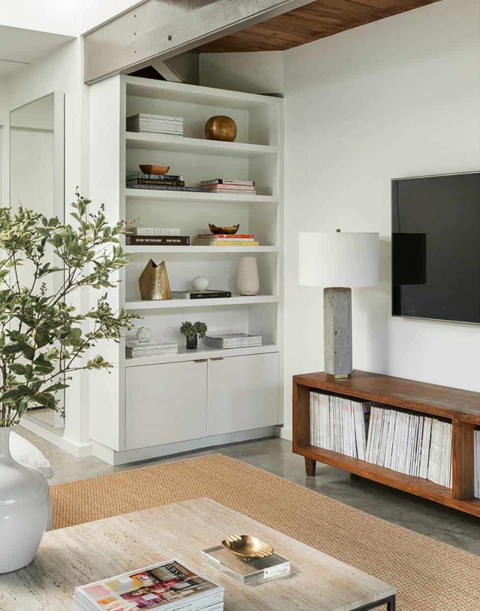
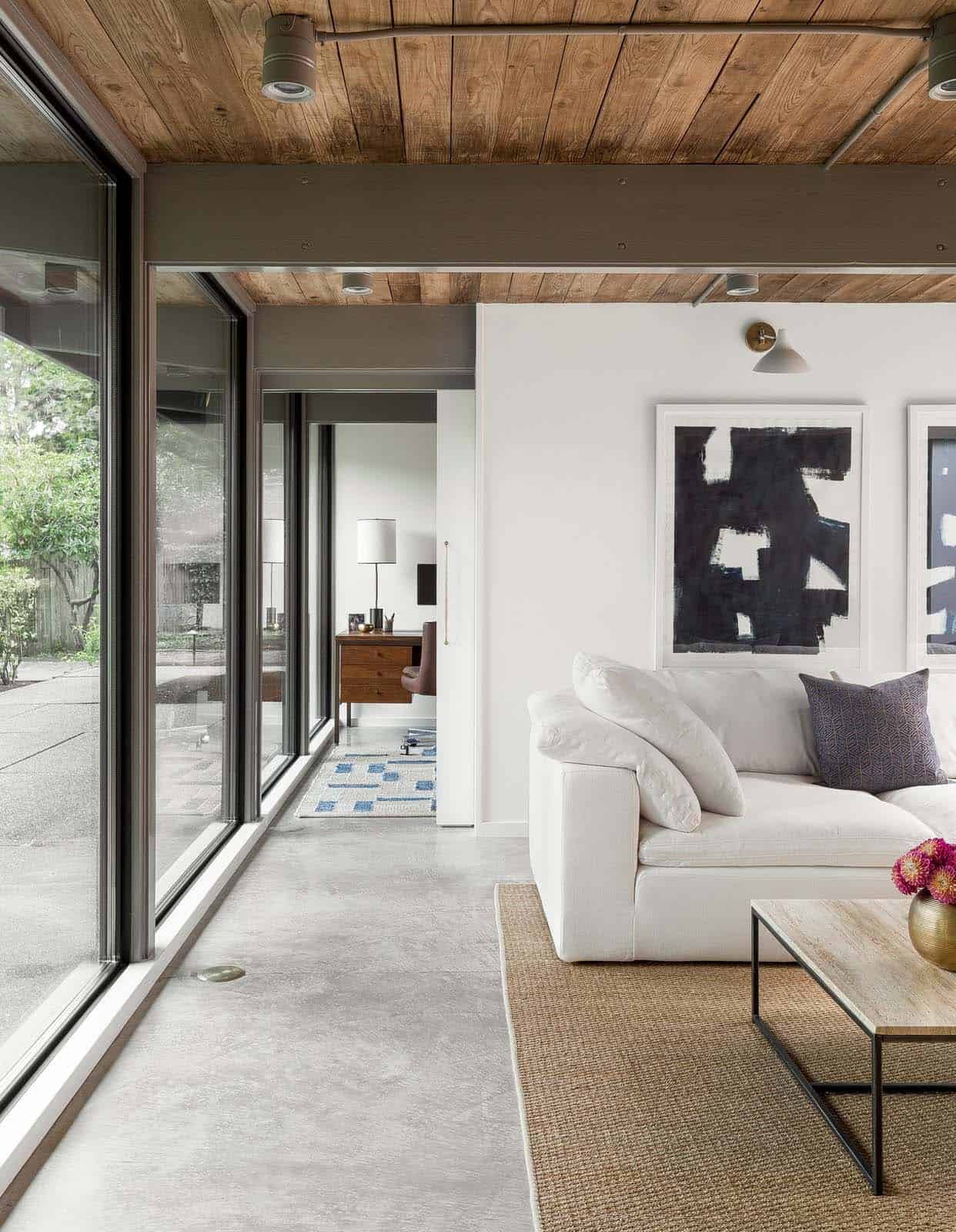
Above: The family room originally had short ribbons windows, which have been replaced with a wall of glass. This helps to blur the boundaries between indoors and out.
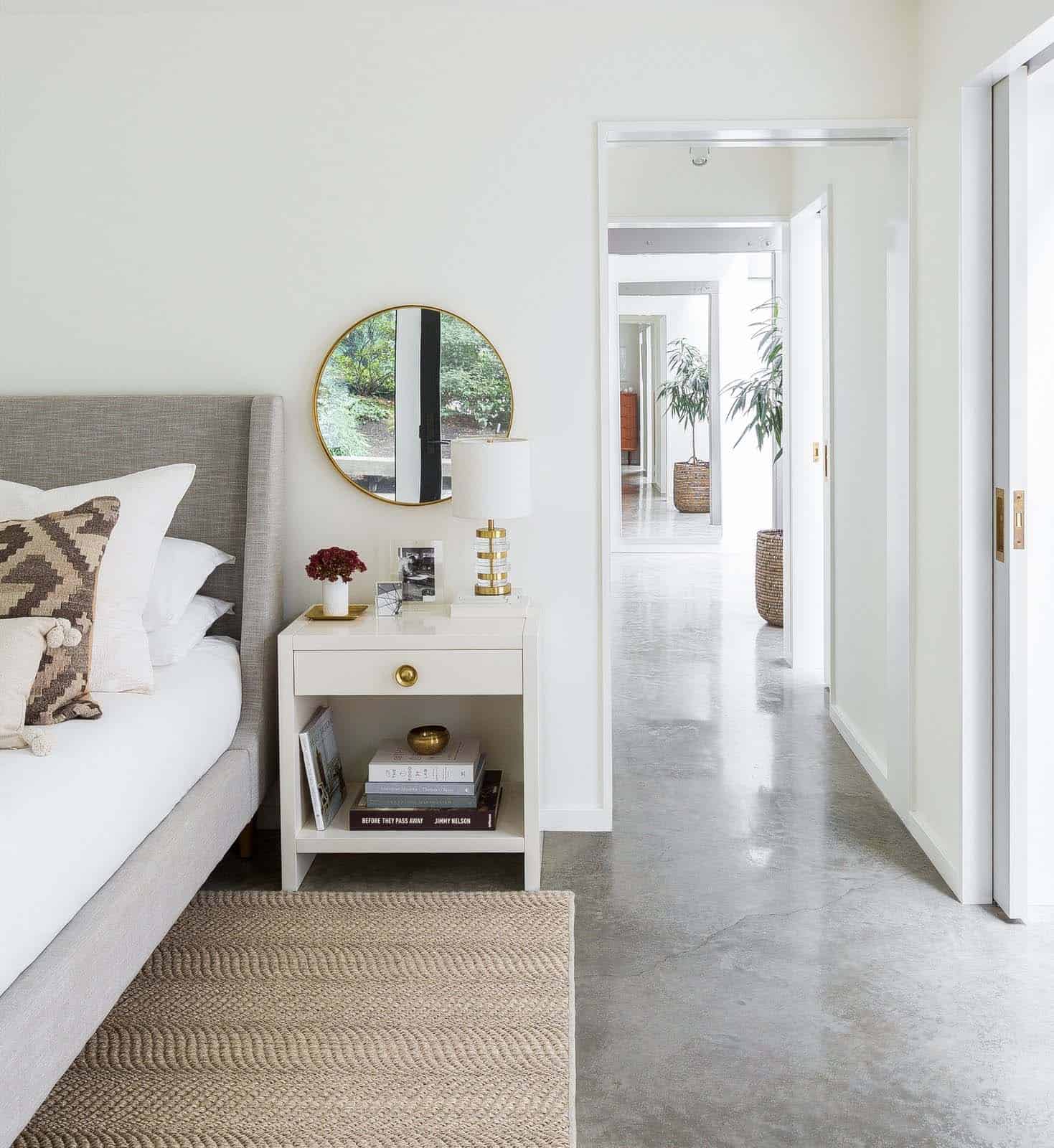
Above: An en-suite master bedroom retreat connects to the adjoining bathroom through pocket doors. The bathroom boasts an integrated skylight to help illuminate the space with natural light.
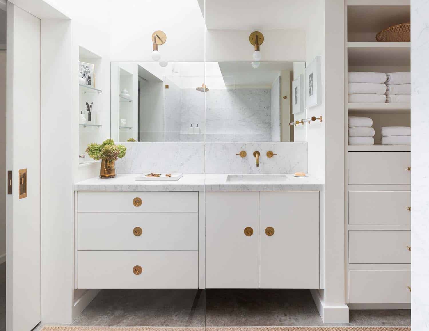
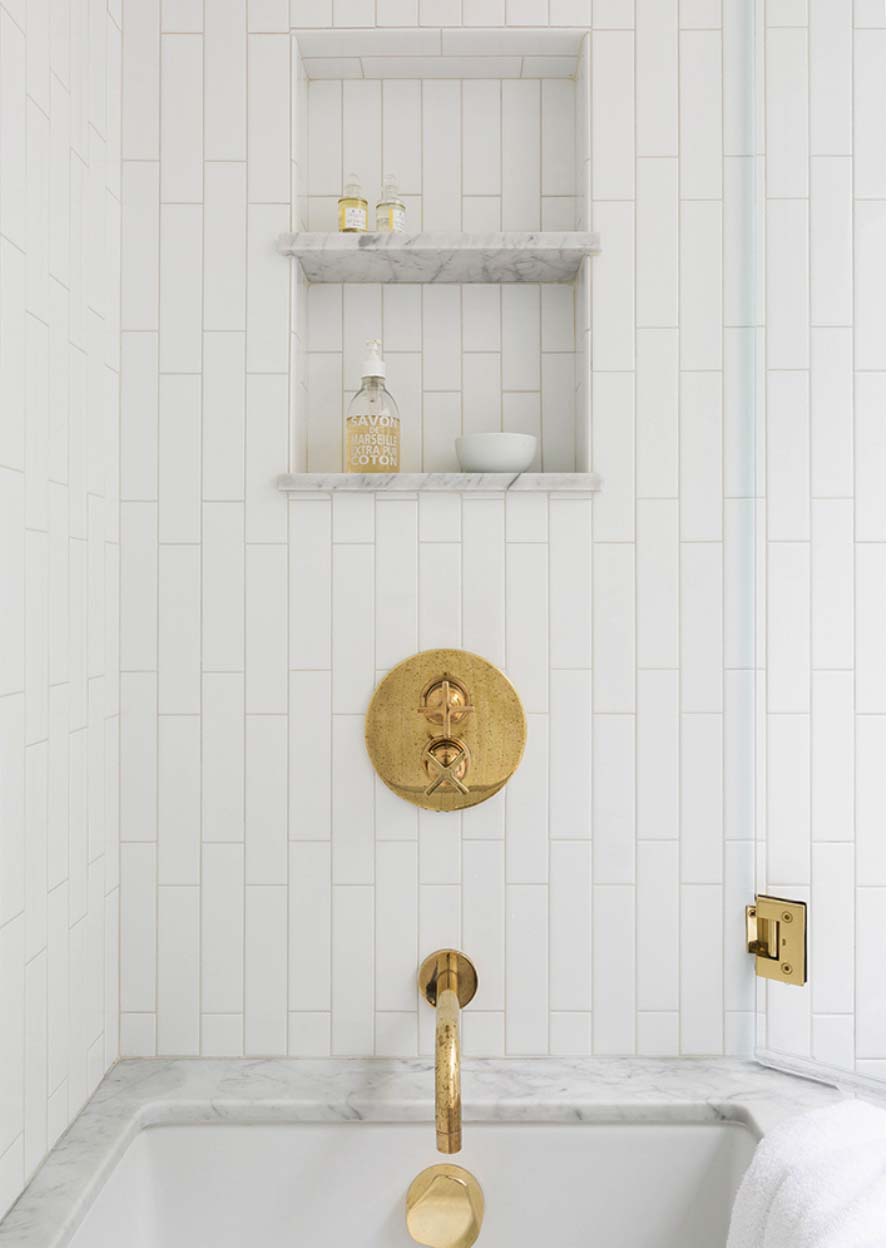
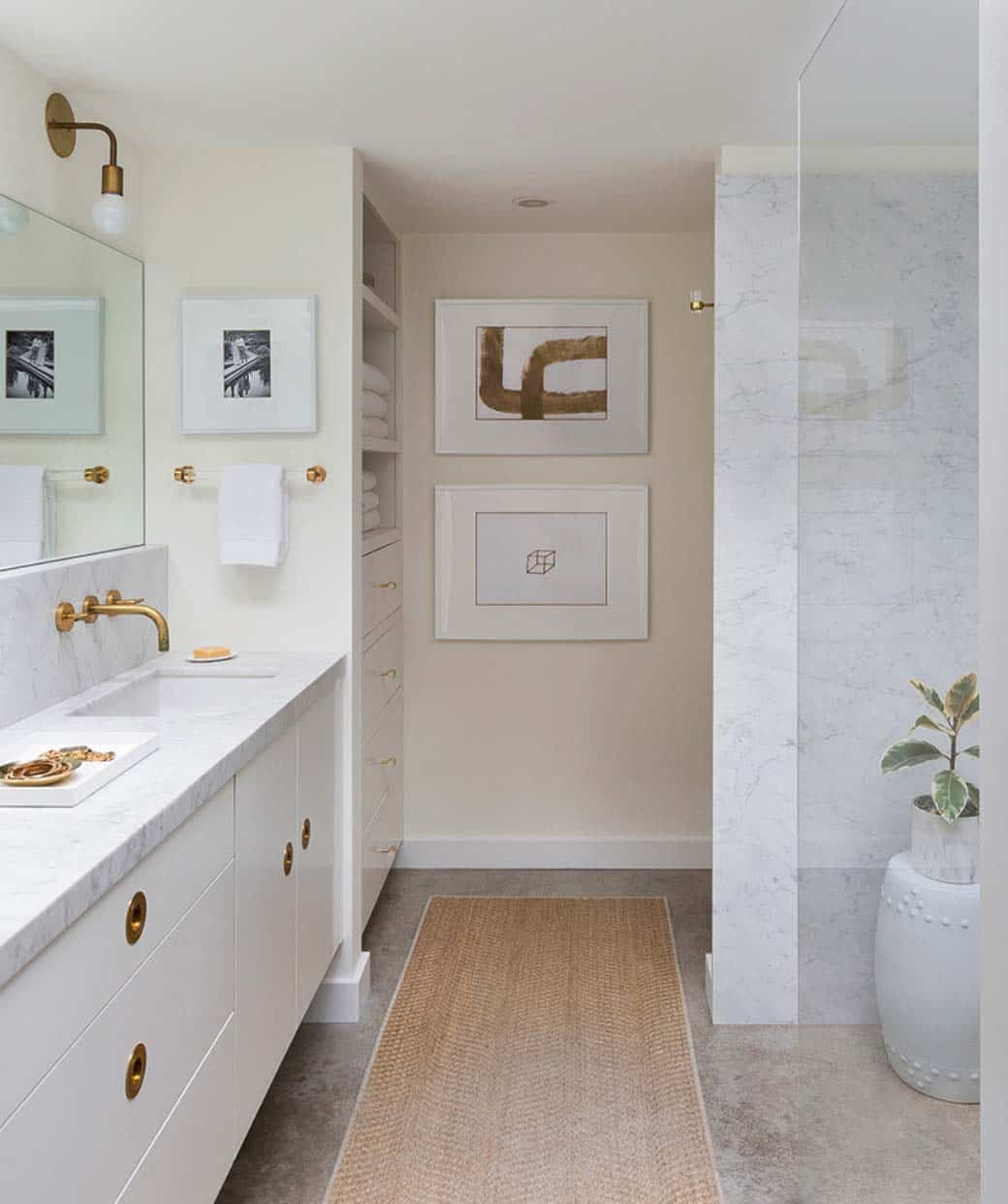
Above: In the bathroom, a Carrara marble countertop and backsplash, custom white cabinetry, frameless mirror and concrete flooring helps to create a fresh, clean aesthetic.
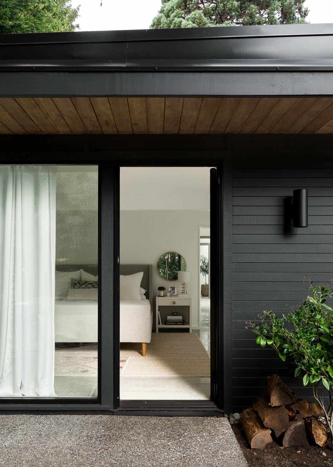
Above: A sliding glass door connects the en-suite bedroom to the outdoors. Generous overhands and period lighting is in keeping with the home’s roots.
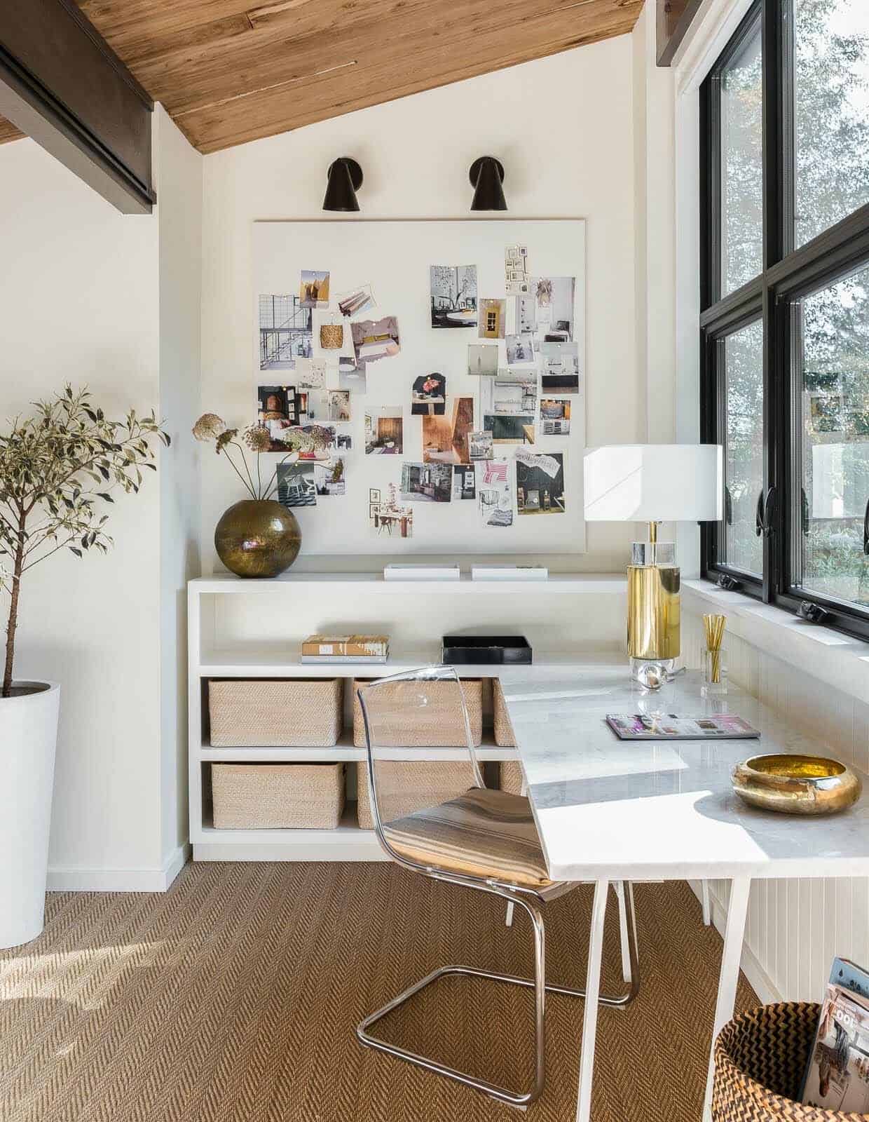
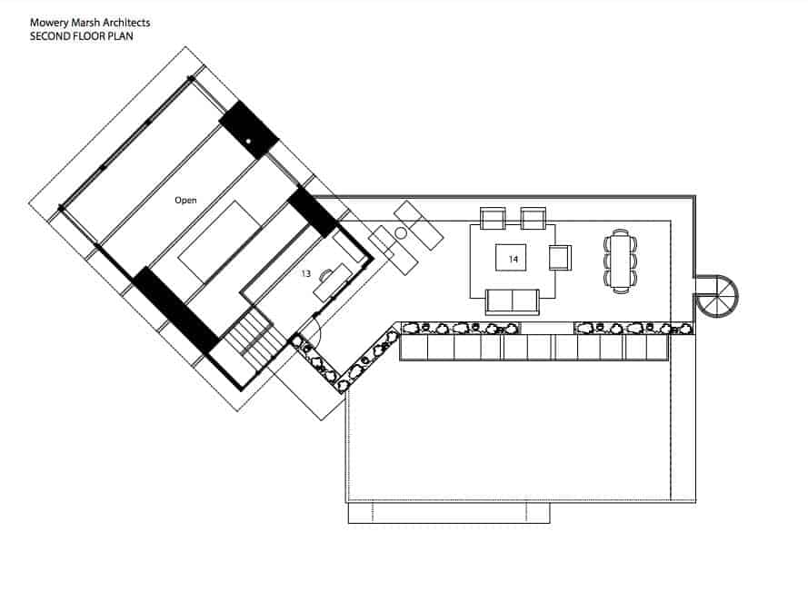
Above: A home office is located on the upper mezzanine level, looking out onto the rooftop terrace.
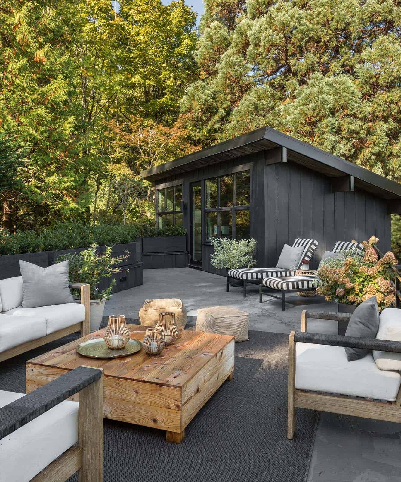
Above: The rooftop terrace features an outdoor lounge with inviting furnishings for entertaining. The space offers sweeping views over the verdant Seattle hills.
Photos: Haris Kenjar Photography for Dwell




2 comments