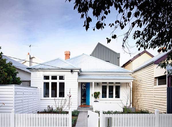
Sandringham Residence is a family cottage addition by Techne Architecture in collaboration with Doherty Design Studio, located in Sandringham, a bayside suburb of Auckland City, New Zealand. The home belongs to acclaimed Melbourne pub owner Doug Maskiell and his young family with two small children.
Description from the architects: Drawing on their commercial relationship, Doug Maskiell of Sand Hill Road, and wife Jenny, commissioned Techne for the building extension on their bayside home in Sandringham and Doherty Design Studio for the interior design. Sand Hill Road is renowned for owning some of Melbourne’s most celebrated pubs, including the internationally acclaimed Prahran Hotel, and soon to be complete, Terminus Hotel, all designed by Techne.
“Collaborating with Mardi Doherty was fantastic, she brought the interiors to life and really added some playfulness to the design that reflected Doug and Jenny’s aspirations for the renovation and more broadly, their outlook,” says Justin Northrop of Techne Architecture + Interior Design.
The brief from the client was to convert the double-fronted dwelling into a fun, energetic larger home with lots of colour that enabled the growing family to live in for the long term. In direct response to this, the renovation extended the existing home to include 4 bedrooms, a study and open-plan living area.
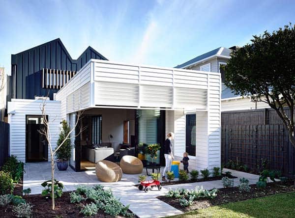
“Doug and Jenny desired an extension that was contemporary and congruous with the existing cottage that fronts the street. We were mindful of this when presenting a design with traditional material, weatherboard, that clads a contemporary form,” adds Northrop.
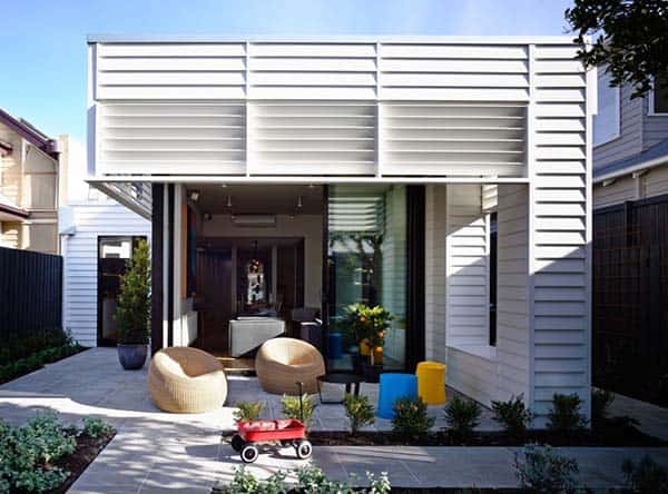
The front of the home was retained and a two-story extension added, that was based on the form of a contemporary shipping container. The rear living area, connected closely to the lush green garden – designed by Annabel Drew – creates a separate external living area with an abundance of natural light. High rear windows are shielded by fixed louvres that continue the rhythm of the weatherboards.
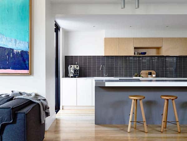
The inspiration for the interior design was to reflect a simple, utilitarian aesthetic, that plays with materiality, bold graphic shapes in robust finishes injected with strong blocks of colour.
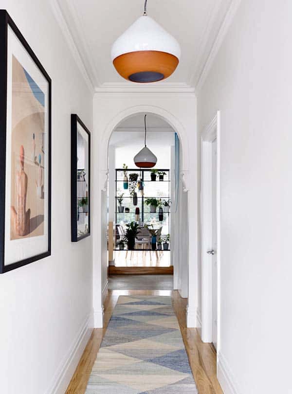
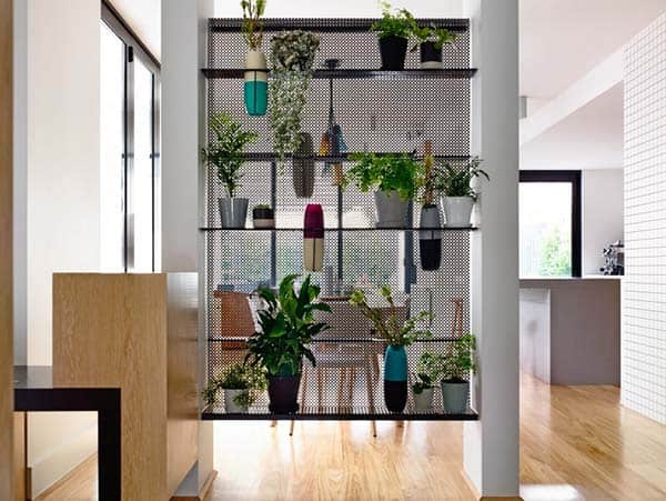
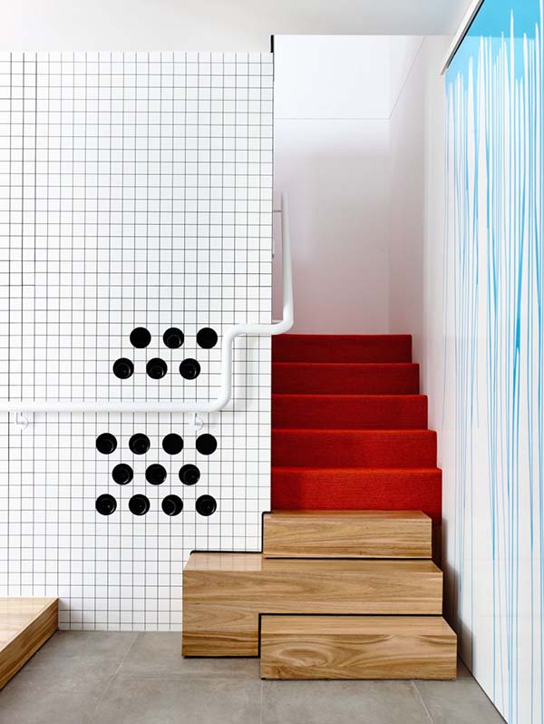
The two areas – original front and new extension – are separated by a perforated black folded screen that acts as not only a visual separation, but also an interesting feature. Cutouts in the screen are designed specifically for colourful Dinosaur Design vases. A mid-grey tile separates and defines the step up from old to new, while three irregular sized box-like timber steps lead to the upstairs, then solid messmate flooring flows through the new extension.
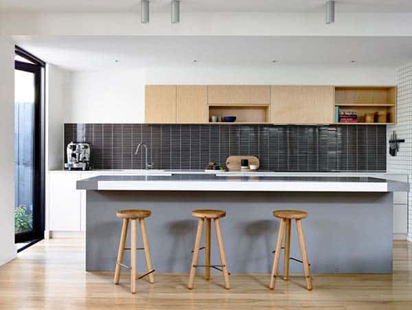
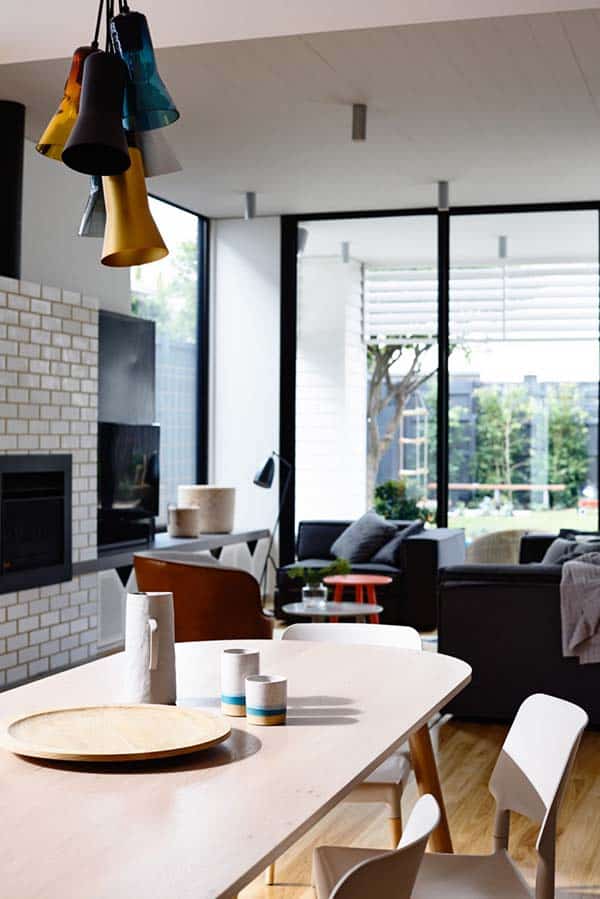
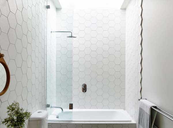
Painted timber lining boards extend from the living room ceiling into the undercover outdoor area to give a continuous feel from outside to in. Further enhancing the interior’s robust, graphic appeal, is the white brick finishes on the fireplace, the deep boxed timber framed window in the living area, terrazzo and graphic tile patterns in white/grey tones and exposed edge detailing.
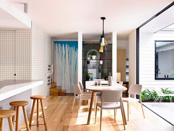
“Checkerboard black-and-white wall paneling is a strong graphic detail that not only adds the playful element the client wanted, but also a personal touch.
Being a pub owner, Doug wanted a display solution for his wine and beer. The checkerboard feature is a laminate box that surrounds the pantry and features 14 circular cutouts for wine, which can be accessed only from behind the pantry.” says Mardi Doherty of Doherty Design Studio.
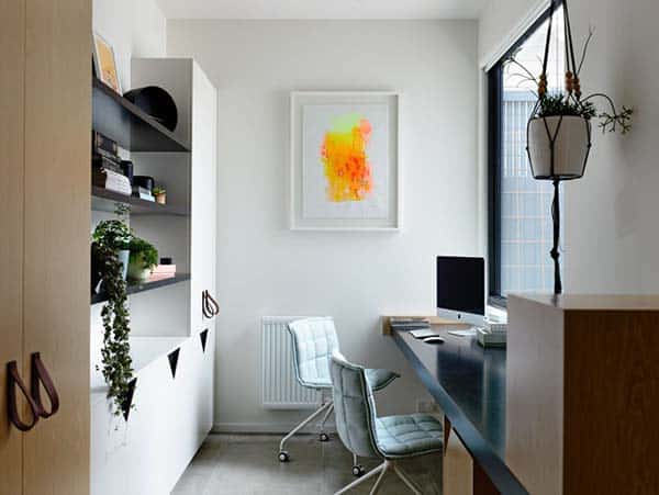
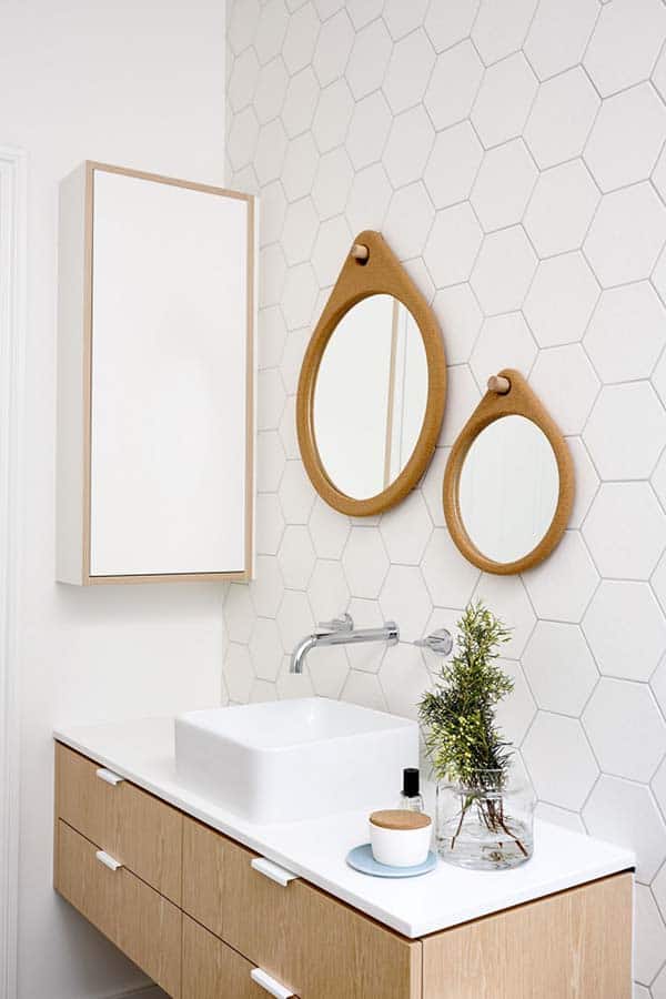
Other bold uses of colour can be found throughout the home, with feature pendant lights over the dining table, a staircase covered with bright orange carpet, a large sliding door with a bespoke paint-drip feature and electric blue powder-coated mirrors. Pale woodgrain used on the joinery throughout softens the look, while folded leather handles and custom cork mirrors in the bathroom add an element of interest and raw luxury.
A seamless collaboration between the two talented design teams, ensured the Maskiell Home was developed around the lifestyle of the client’s growing family, incorporating bright, energetic elements into the interior that create a sense of fun and playfulness. Paying respect to the original façade and surrounding street scape was crucial, with only a touch of metal cladding visible from the street, giving a subtle hint of the second level addition and the new life that lies within.
Photos: Derek Swalwell


0 comments