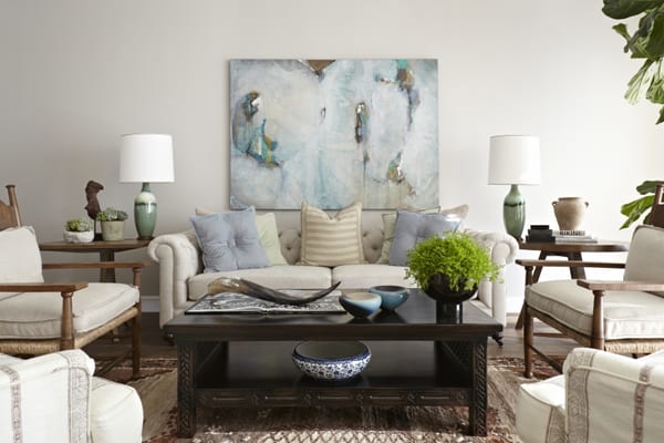
This Los Angeles, California ranch house was designed by Janette Mallory Interior Design, perched on a hill in Mount Olympus, a neighborhood in the Hollywood Hills. It has incredible views of the Hollywood sign, downtown Los Angeles and the ocean. The classic 1950s ranch was worn and outdated, but Mallory’s clients saw past that. It had a wonderful layout, which the clients decided they wanted updated, but left the floor plan the same.
The couple wanted the 4,000 square feet (371 square meters) four bedroom, four bathroom house to be contemporary and rustic. The vision fit with how the house already was — it had all the rustic elements of a classic ranch with a twist of midcentury style. Playing on that, the designer produced a transitional look that incorporated the owner’s love of collecting and art. The space itself is furnished with a mix of classic, colonial, rustic and midcentury pieces — a similar stylistic brew that might have been found in many ranchers in the early 1950s.
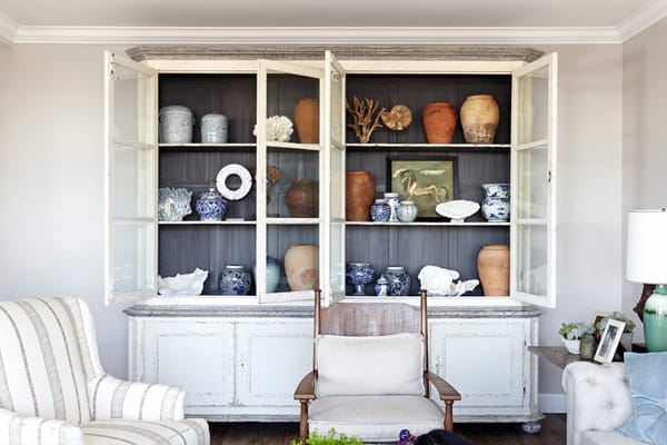
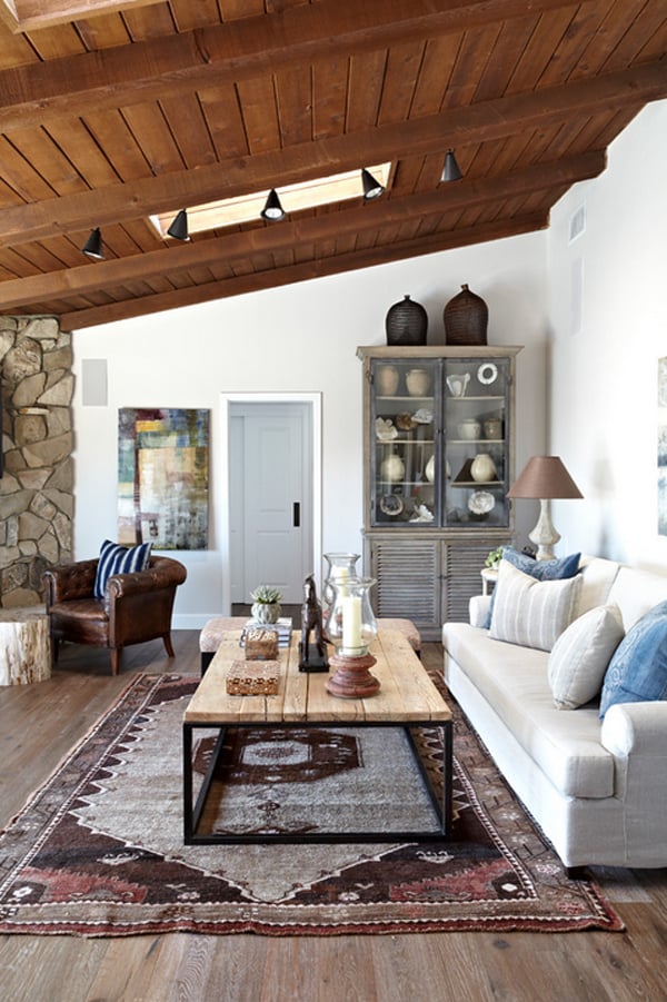
Although the layout and the indoor–outdoor nature of the home were carefully preserved, many of the tired finishes had to be replaced. The cabinet is a replica of an antique, and it houses the couple’s collection of vessels. Throughout the house, furniture and accessories are large and simple, making for a graphic decorative statement. In this cabinet, the designer included natural elements such as corals, shells and ammonites.
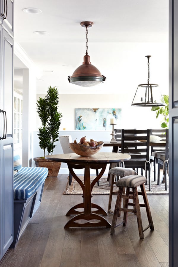
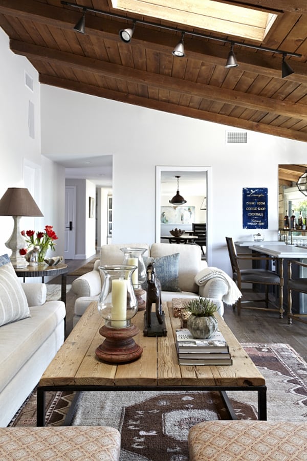
The living room is separated from the dining room and kitchen by a pony wall (you can just see the top of the abstract painting that hangs over the sofa peeking above it). Before the remodel, this shot would not have been possible, as the breakfast room was separated from the dining room by a floor-to-ceiling wall.
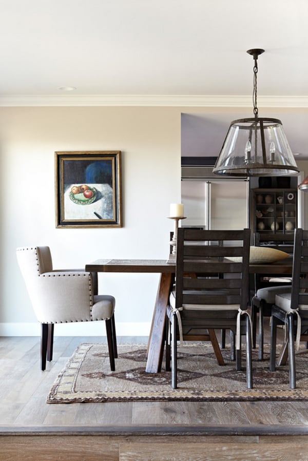
The dining room table has oversize ladder back chairs on the sides and upholstered chairs at each end. The designer thought too many wooden chairs would make it feel heavy. The upholstered chairs help to soften things up a bit.
The family room is topped by another classic ranch house feature: A wood-paneled ceiling and exposed rafters. They were dirty and in bad shape yet the designer and the owners didn’t want to paint them, choosing to sandblast and refinish them instead. The statement ceiling is balanced by a floor crafted from reclaimed walnut.
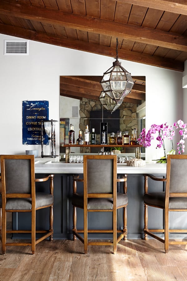
In another classic midcentury move, the family room contained a wet bar. The owners chose to preserve it, and the designer gave it a new limestone top and accessories to freshen it up. The clients like to entertain a lot, so it made sense to keep it. The designer chose to front it with incredibly comfortable chairs, making bellying up to the bar a relaxing experience. A giant antique hourglass and a vintage hotel sign advertising “dining, coffee and cocktails” decorate one end of the bar; while a new metal-and-wood shelf displays select bottles behind it.
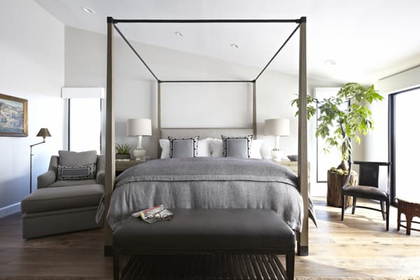
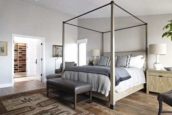
In the master bedroom, the designer started with the bed. She wanted to keep it simple and clean-lined. The designer put a chair on either side of the bed for her current event-loving clients. Each one has a place to sit and enjoy their coffee and newspaper.
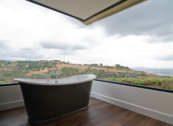
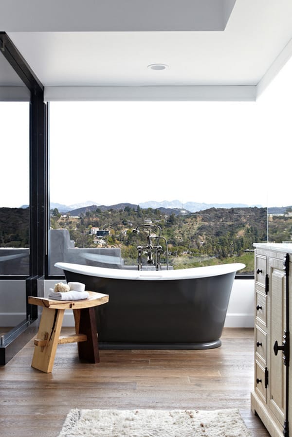
The master bedroom already had a corner glass window, designed to embrace a swoon-inducing view. The designer selected this tub because you can select your own color for the exterior. She did not want a stark white tub there.
The elegant tub is positioned perfectly to enjoy the landscape — giving new meaning to the phrase “soak in the view.”
Photos: Courtesy of Janette Mallory Interior Design



0 comments