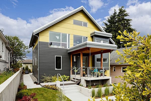
Phinney Ridge house is a renovation and addition by Portal Design Inc of an existing early 80’s craftsman style home in the Ballard neighborhood of Seattle, Washington. The inspiration for the three bedroom, two-and-a-half bathroom home was the owner’s experience with the lifestyle of Palm Springs, California, where they have a vacation home. One of the things they love most about Palm Springs is the ability to live indoors and out, which is not something you can typically do in Seattle, but it was one of the main drivers in renovating this house.
The house is comprised of 2,100 square feet of living space spread out over two levels, plus a 180 square foot loft. The exterior and interior scheme was to use basic industrial, natural colors and materials set off with glam elements that provide a little whimsy and ‘pop’ during dark times. The overall building footprint and shape changed very little, however the house changed tremendously, updated from its early 80’s style and sectioned layout.
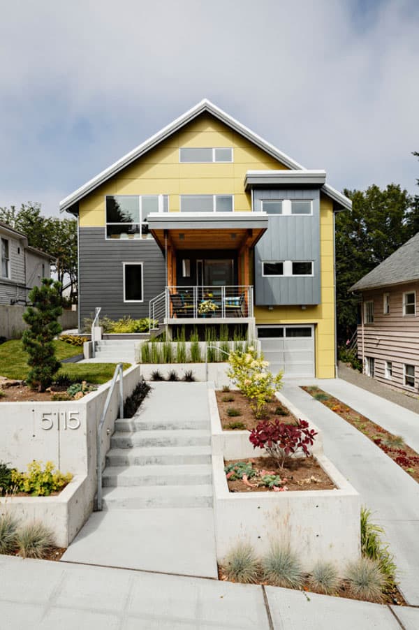
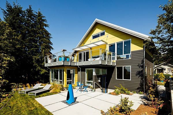
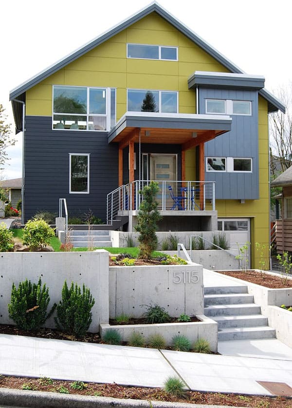
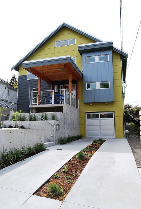
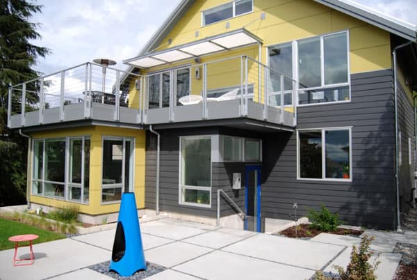
The look of the front elevation was influenced by the site’s sloping nature. A pop-out over the garage clad in metal balances the front facade. A number of new windows were also added to allow in as much light as possible.
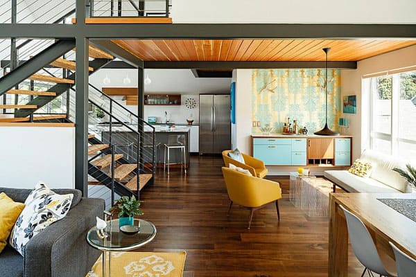
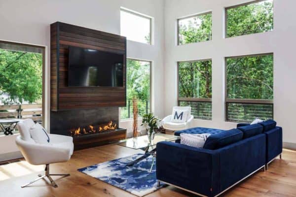
The house has a reverse floor plan, with the bedrooms and bathrooms on the first floor and an open kitchen, living area and dining space, plus a half bath, on the second level. For the second floor, timeless finishes were used such as walnut floors, white kitchen cabinets and a marble kitchen island. A touch of whimsy was also introduced into the design with wallpaper applied above the credenza in the lounge.
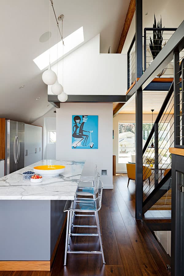
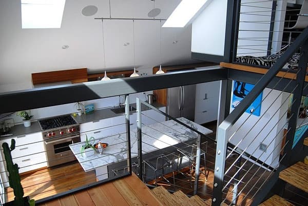
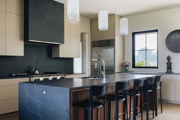
The kitchen island is topped with marble and clad in gray lacquer over medium-density fiberboard (MDF). The wood toe kick is walnut, to match the floor
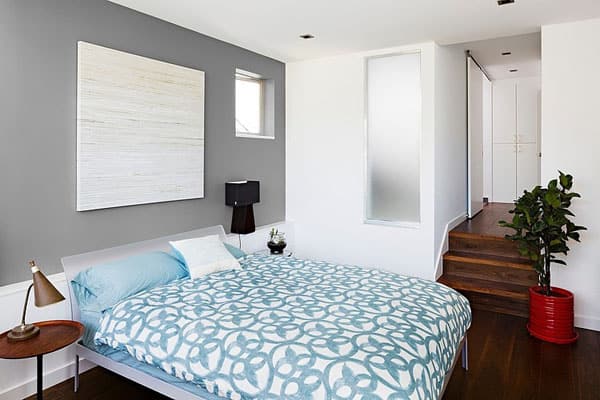
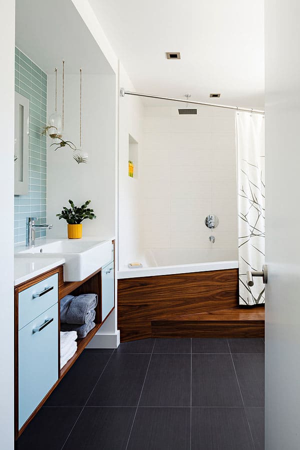
The design of the master bedroom again reflects the designer’s effort to keep things that were going to be more permanent as neutral as possible. “We chose that warm gray partially because it’s an easy color to decorate with as a background. You can throw anything against it, and it’s going to look fabulous.” Because the master bathroom is buried a bit in the middle of the house, a frosted glass panel was used in the shower to allow more daylight to traverse into the bathroom. The bed is from Design Within Reach, artwork above the bed is from Crate & Barrel and wall paint is: Chelsea Gray HC-168, Benjamin Moore
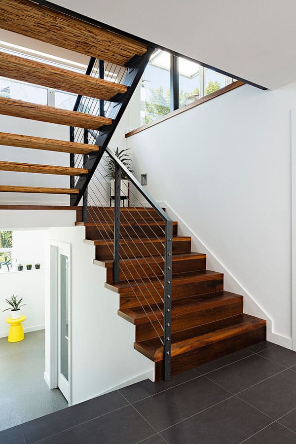
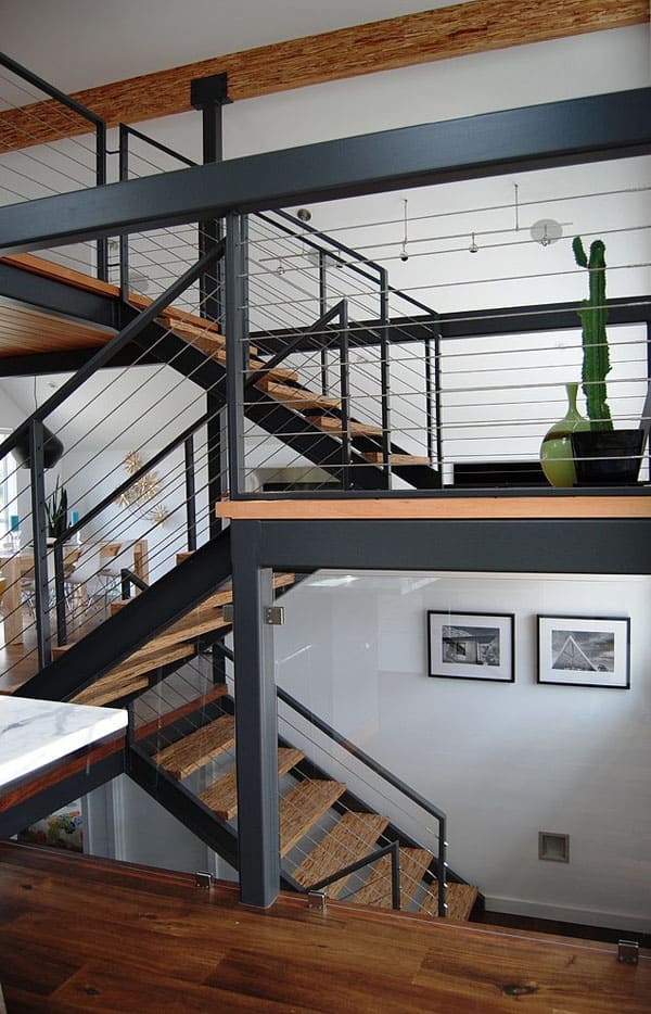
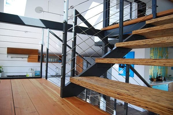
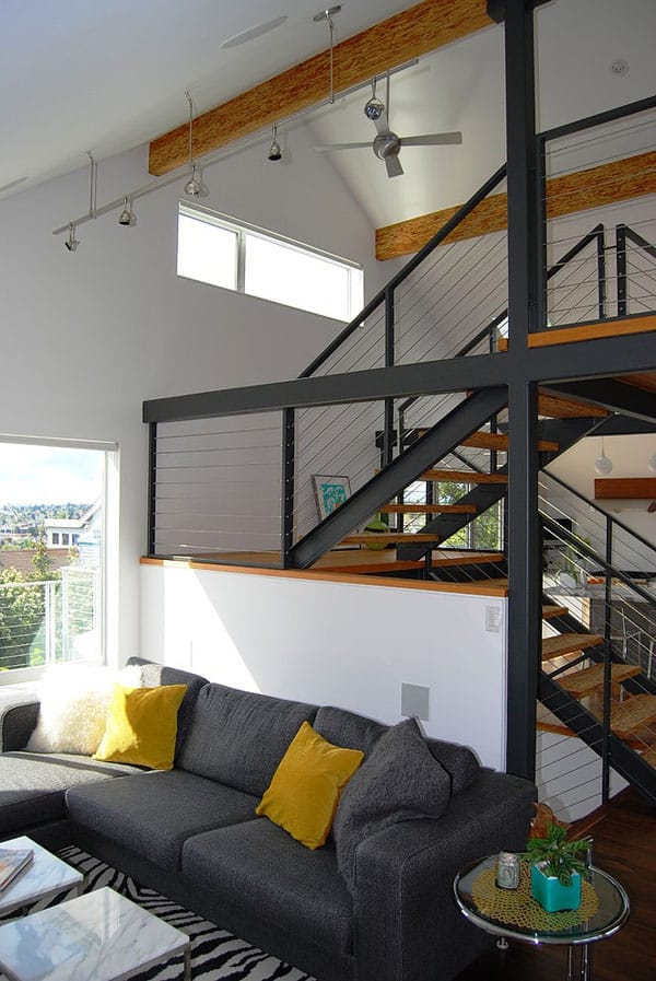
The stairs are in the same place as they were in the original house, but were completely walled in. The stair treads are parallel strand lumber, and the railing, with stainless steel cables, was custom designed by Portal Design and fabricated by its contractor.
Because of the steep lot, the design team had to make several transitions to get from the driveway up, from the sidewalk up, and still have that connection to be able to go around the side of the house to the backyard.
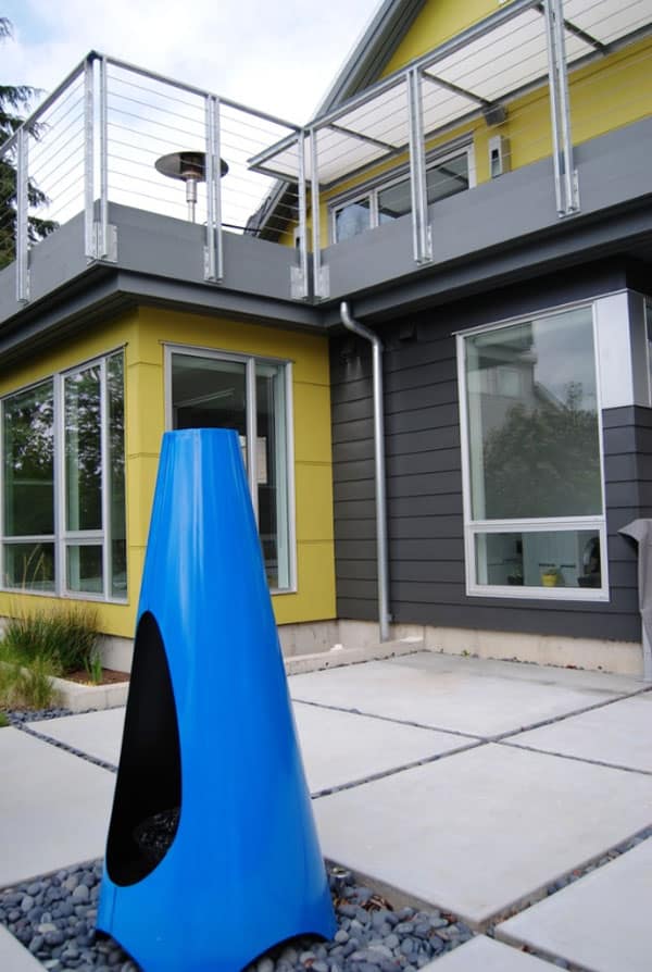
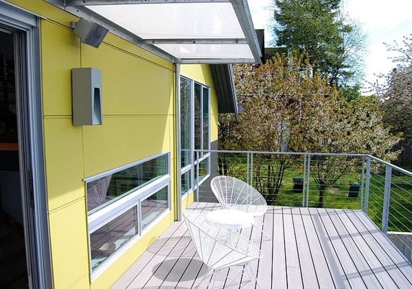
A deck opens off the main living area and cantilevers over a small addition that was added to expand the master bedroom. The awning is frosted acrylic and was custom designed.
This outdoor fireplace is by Modfire.
The walnut wrap on the left side of the refrigerator frames in the white cabinets. “The idea was to create a furniture type of look, where there’s an edge of walnut showing, and offsetting that with the white lacquer”. The stairs to the right lead up to the loft office.


1 comment