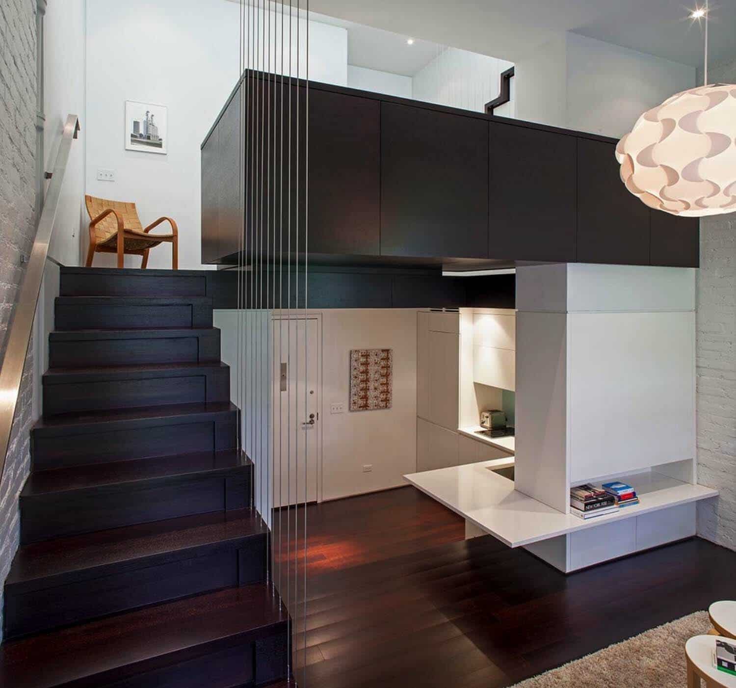
A compact and awkward brownstone apartment on the Upper West Side of Manhattan, New York has been completely transformed by Specht Architects. Located at the top of a six-story building, this 425 square foot space offered a kitchen and dining area, a small living area up a few steps and a bedroom and bathroom on the top floor. The space was very oddly shaped to fit a proper bed, yet it offered an amazing ceiling height of over 24 feet!
The apartment also offered a rooftop terrace, just up a flight of stairs off the bedroom. The new design boasts an open concept layout that flows from one space to another, taking advantage of the ceiling height and allowing natural light to penetrate from above. It is now a bright, open and comfortable home.
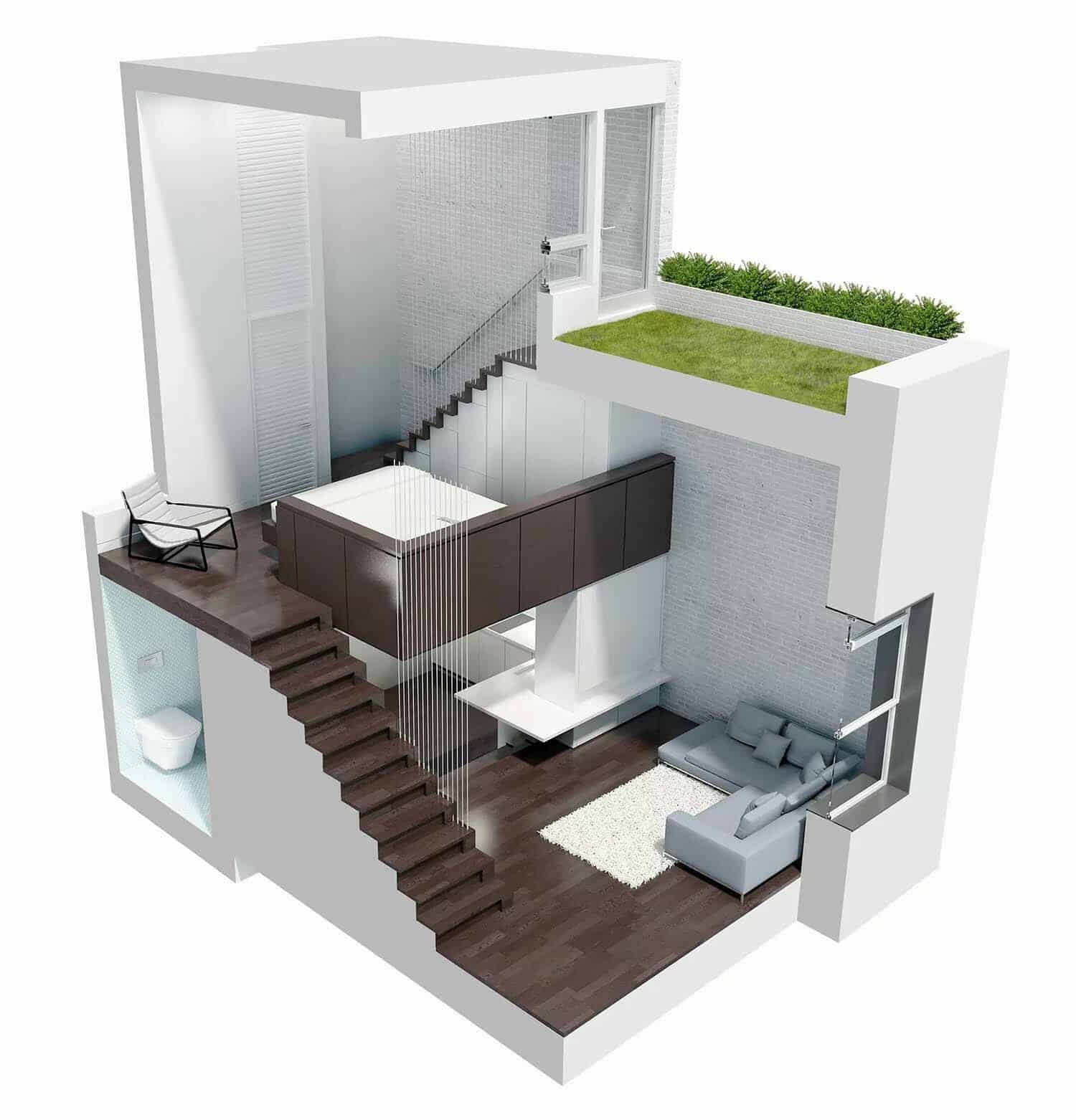
The homeowner commissioned the architects to renovate the home to use as a pied-à-terre. The solution was to create four separate living platforms that would provide enough room for all the essentials and allow the apartment to feel open and light-filled, with no barriers.
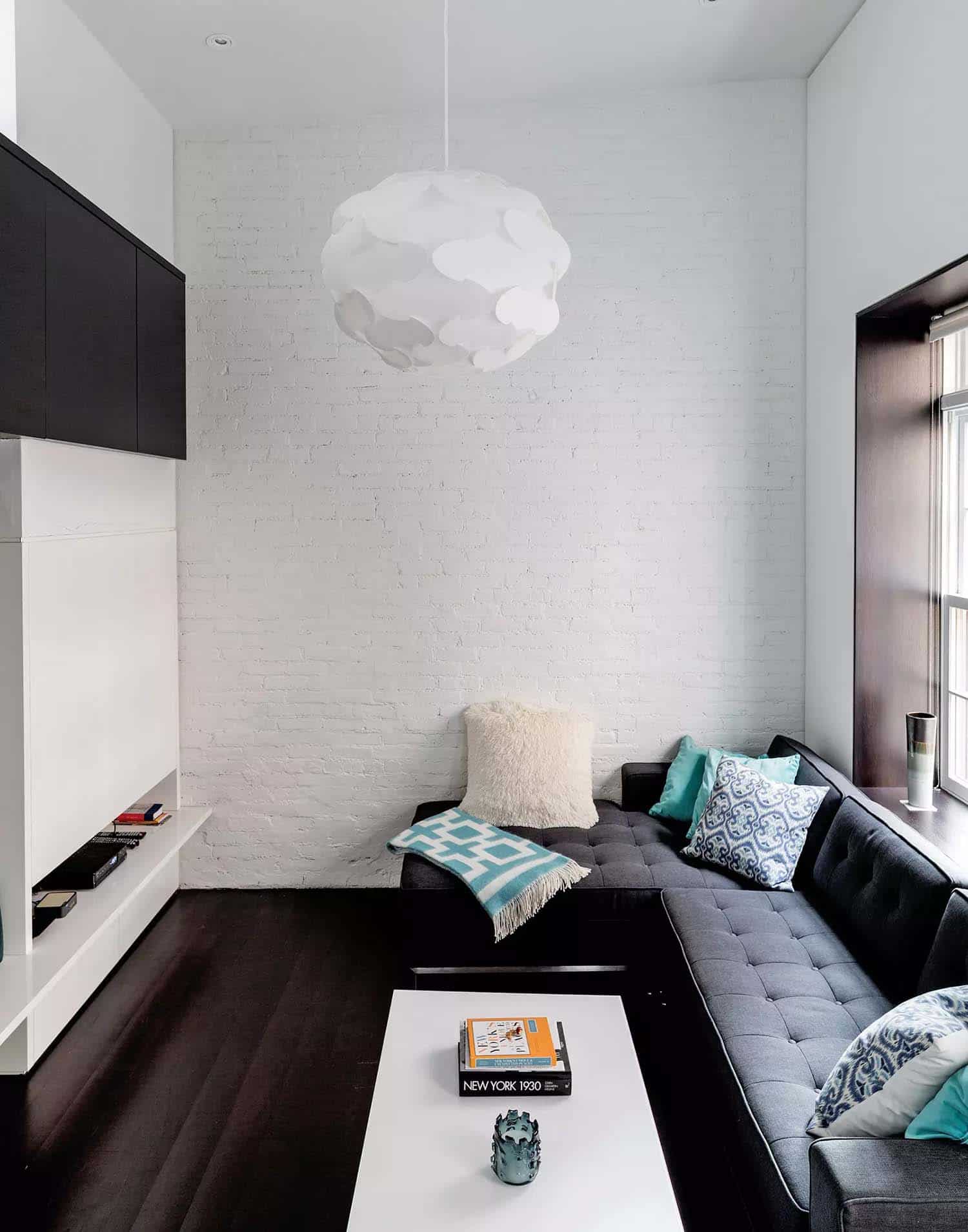
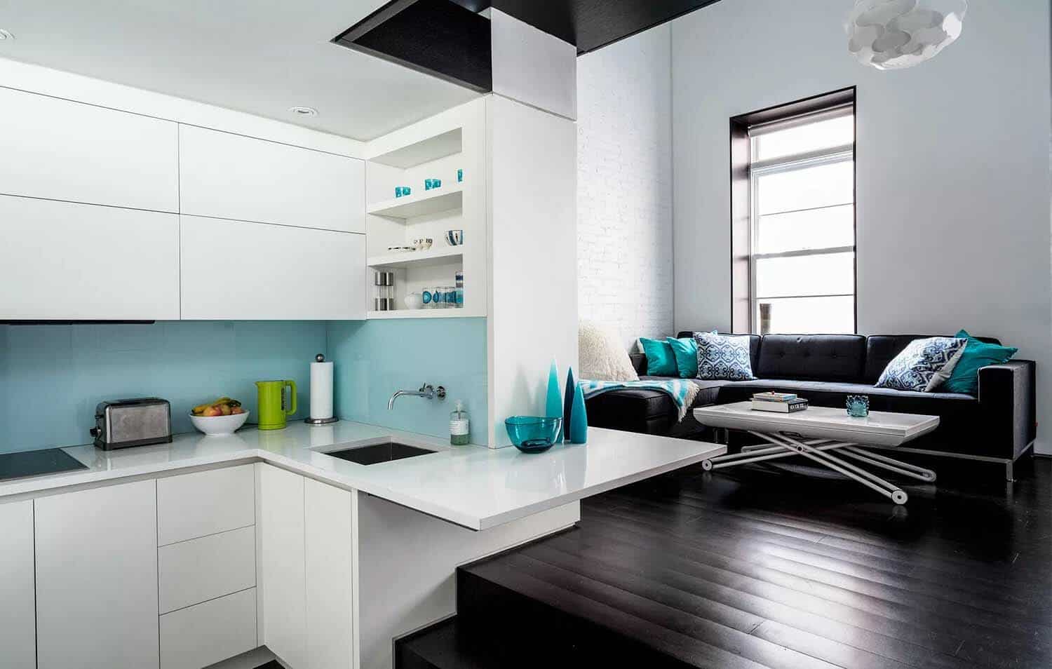
Above: The living room is furnished with a Gus* Modern Jane Bi-Sectional sofa (about $3,200 at Bobby Berk Home) and a Ligne Roset Pagnon & Pelhaître Crescendo table ($2,270). The baby alpaca throw is from Jonathan Adler ($295), and the Fillsta pendant lamp is from Ikea (about $30).
What We Love: This compact brownstone apartment offers a fantastic layout, with soaring ceilings, an open flow and plenty of natural light. The original cramped space now offers a functional design that feels spacious for its small footprint. We are especially loving the rooftop terrace, a relaxing space to enjoy the outdoors in the midst of an urban jungle. Overall, a fabulous and fresh design… What do you think? Please share your thoughts in the Comments below!
Note: Have a look at a couple of popular home tours that we have featured here on One Kindesign from the portfolio of Specht Architects: Mid-century modern New Canaan Residence and Ecoluxe villa in Mexico with amazing indoor-outdoor connection.
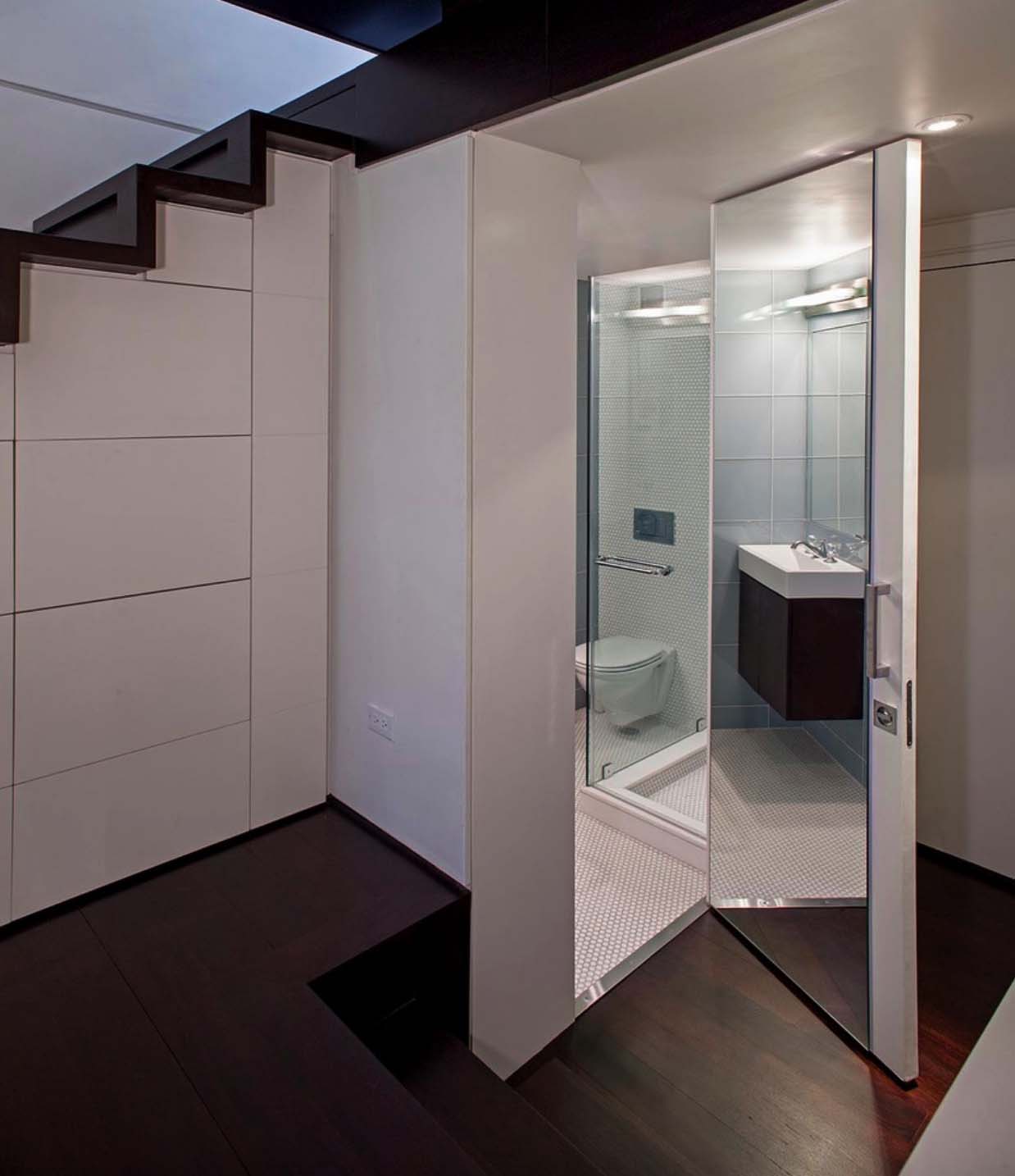
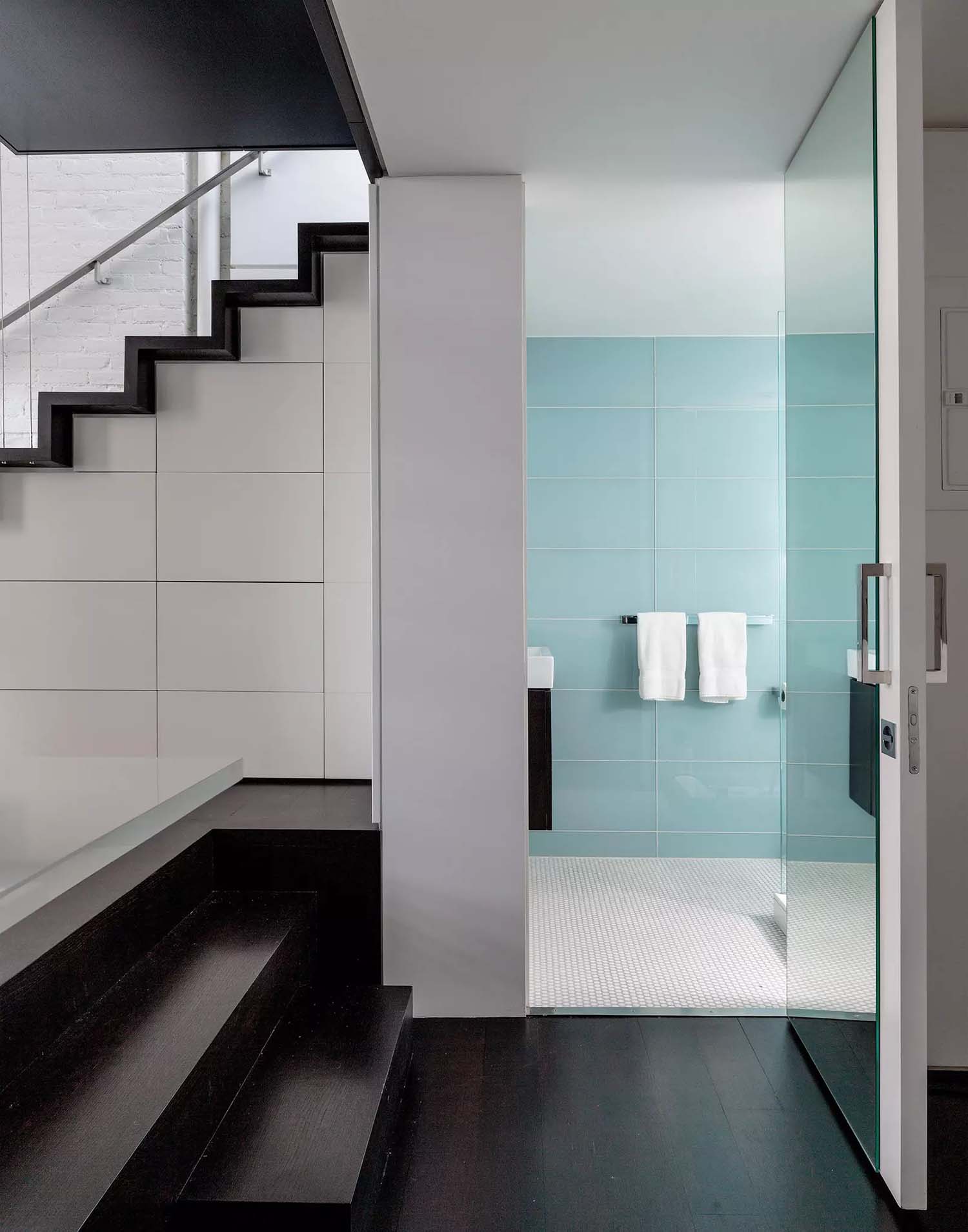
Above: The bathroom is in the space formerly occupied by the kitchen. The walls are covered in Savoy Ricepaper and Crystal Glass Dew tiles from Ann Sacks.
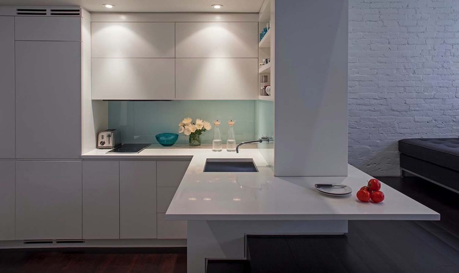
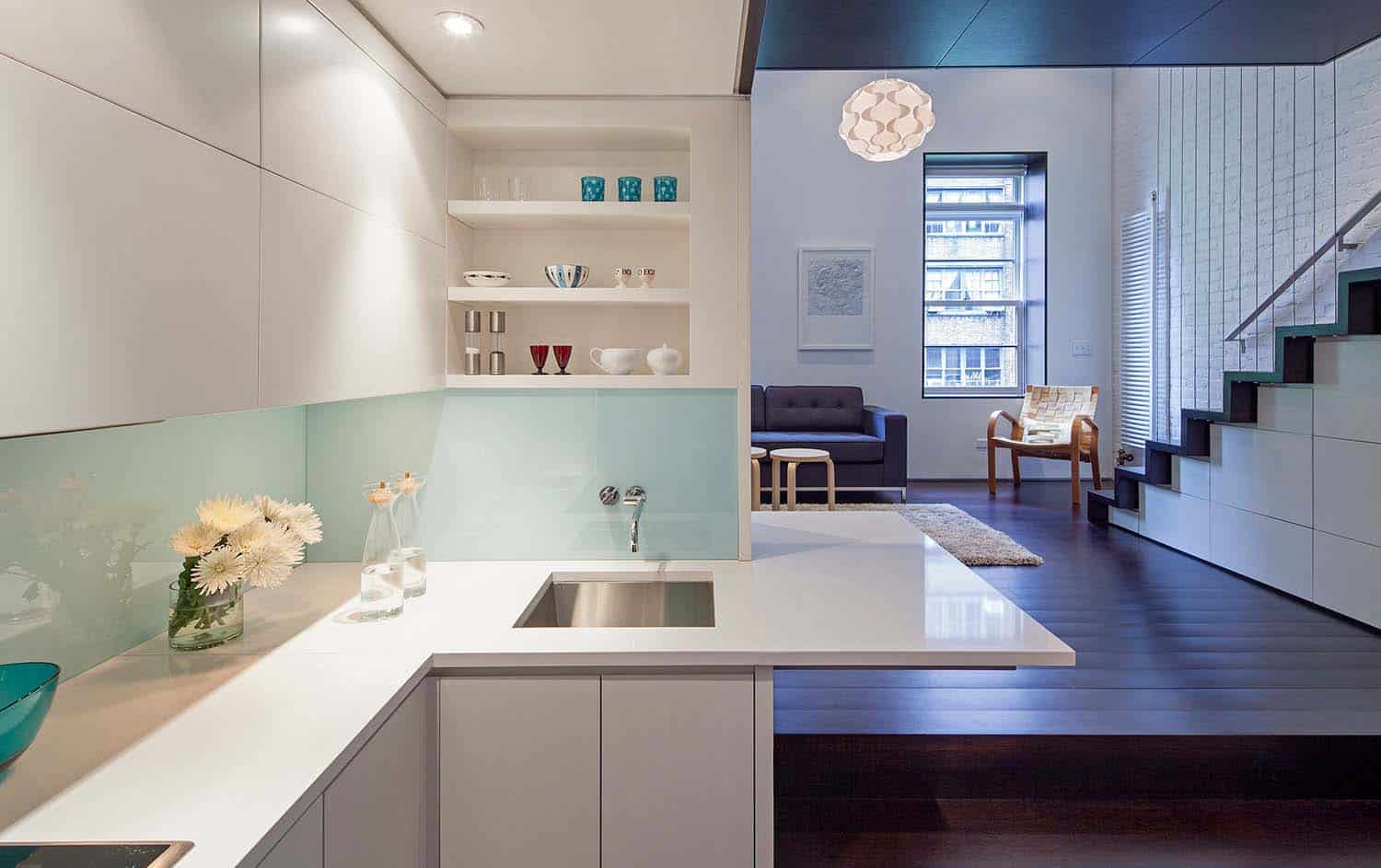
Above: The sunken kitchen is in what was once the dining area. The backsplash is painted with Benjamin Moore’s Harbor Fog and covered in glass. The Julien UrbanEdge 3647 undermounted stainless steel sink is from AF Supply (about $700). The blue glass candleholders are from C. Wonder.
Above: The new kitchen, as elegantly compact as a ship’s cabin, has two burners and a convection oven, crisp glass backsplashes and a combination countertop-and-breakfast bar (for formal meals, the coffee table can be elevated to dining height).
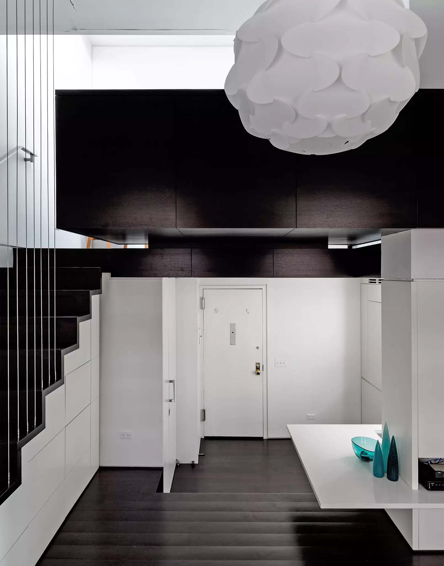
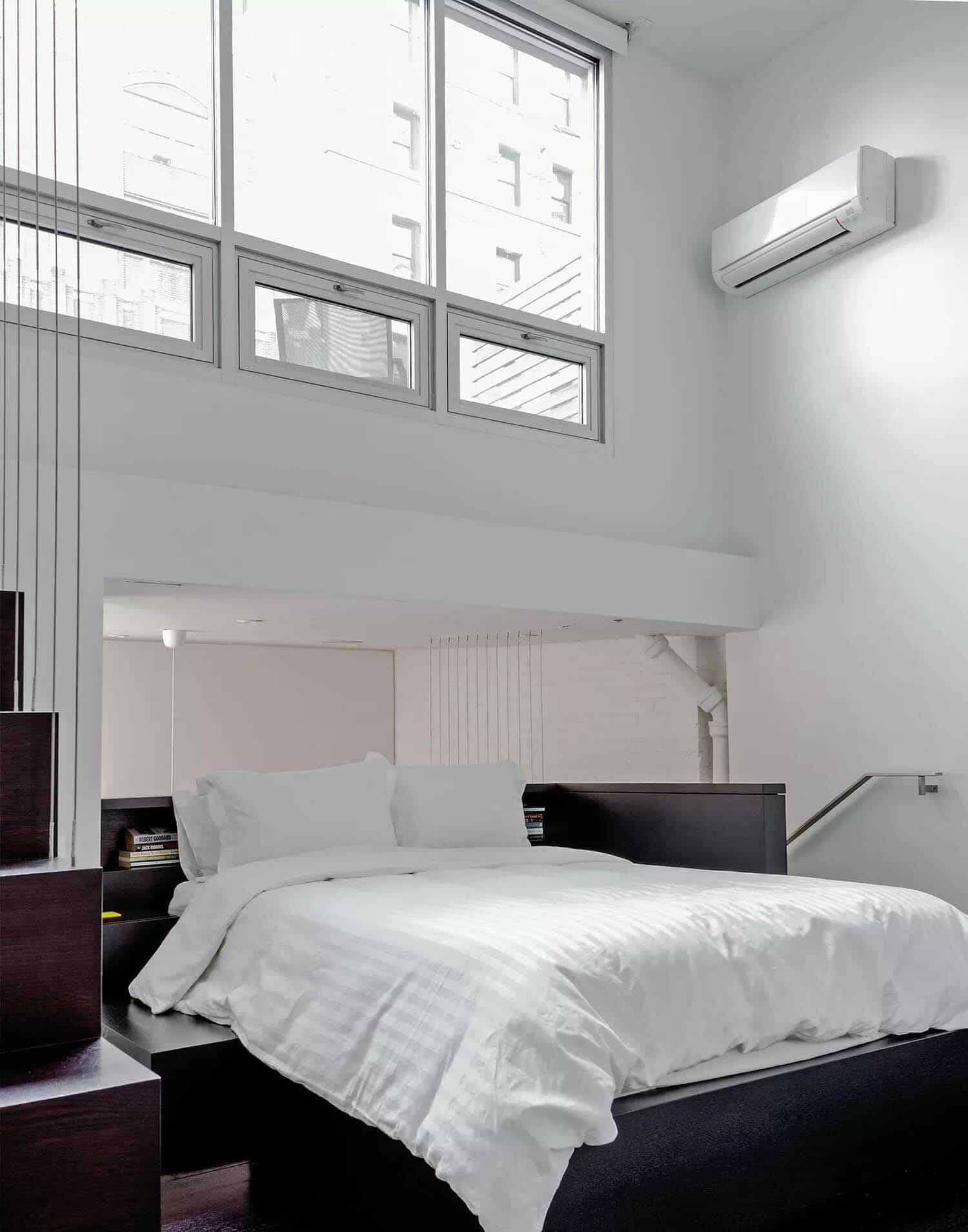
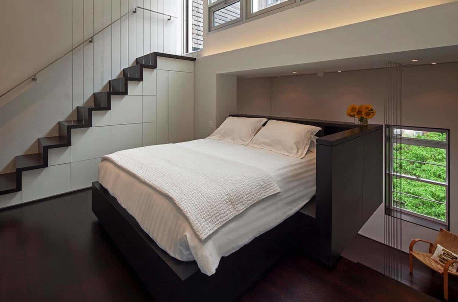
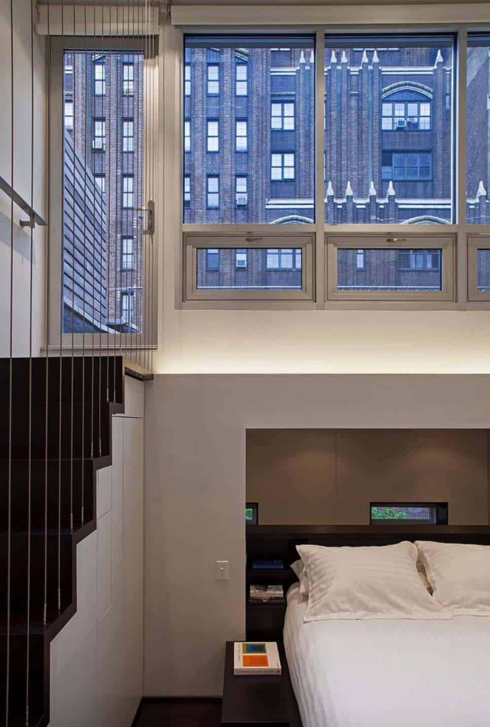
Above: The architect Scott Specht describes the apartment’s principal design element, the queen-size bed platform that cantilevers out over the living room, as the “object around which everything revolves.”
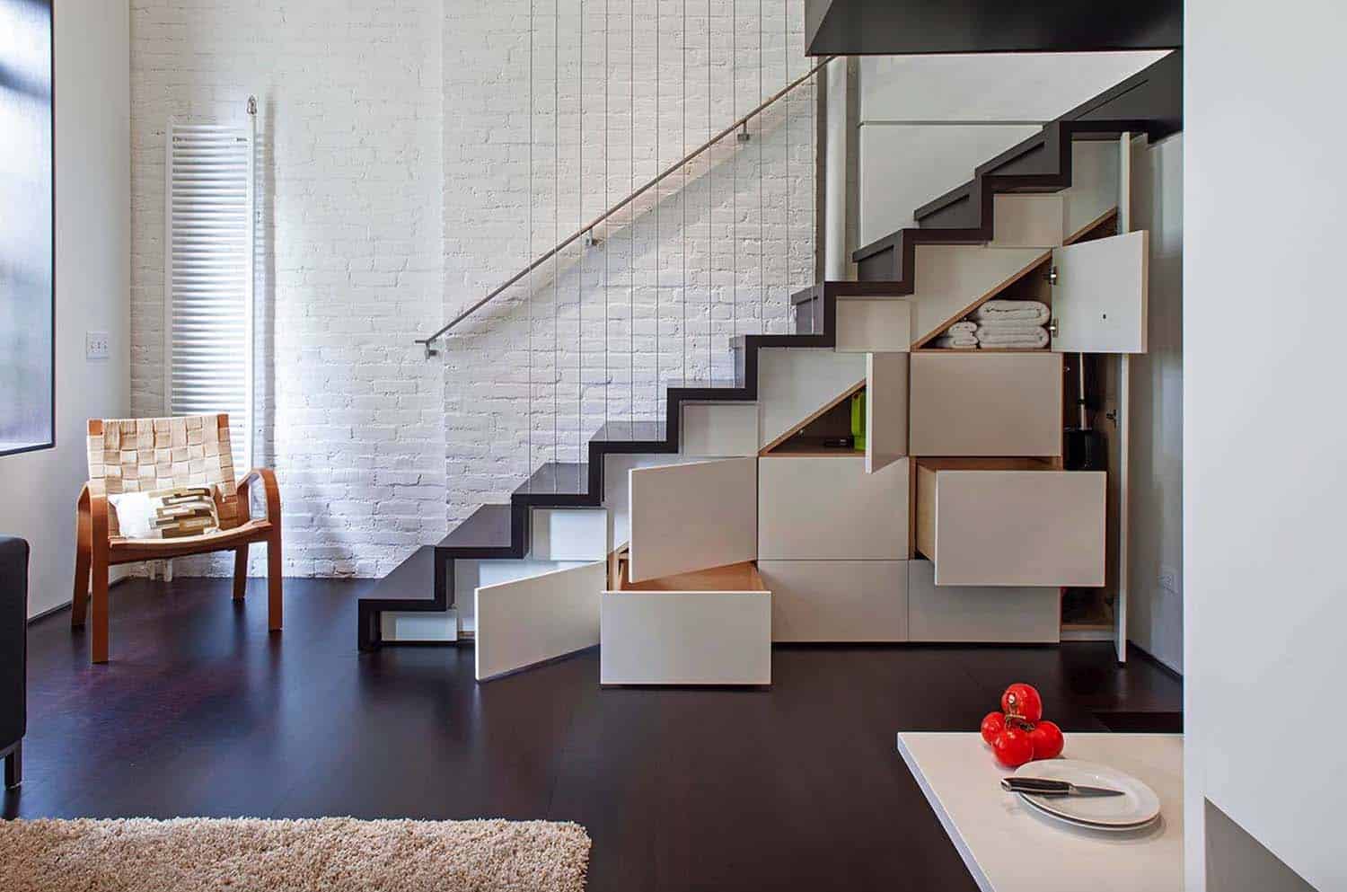
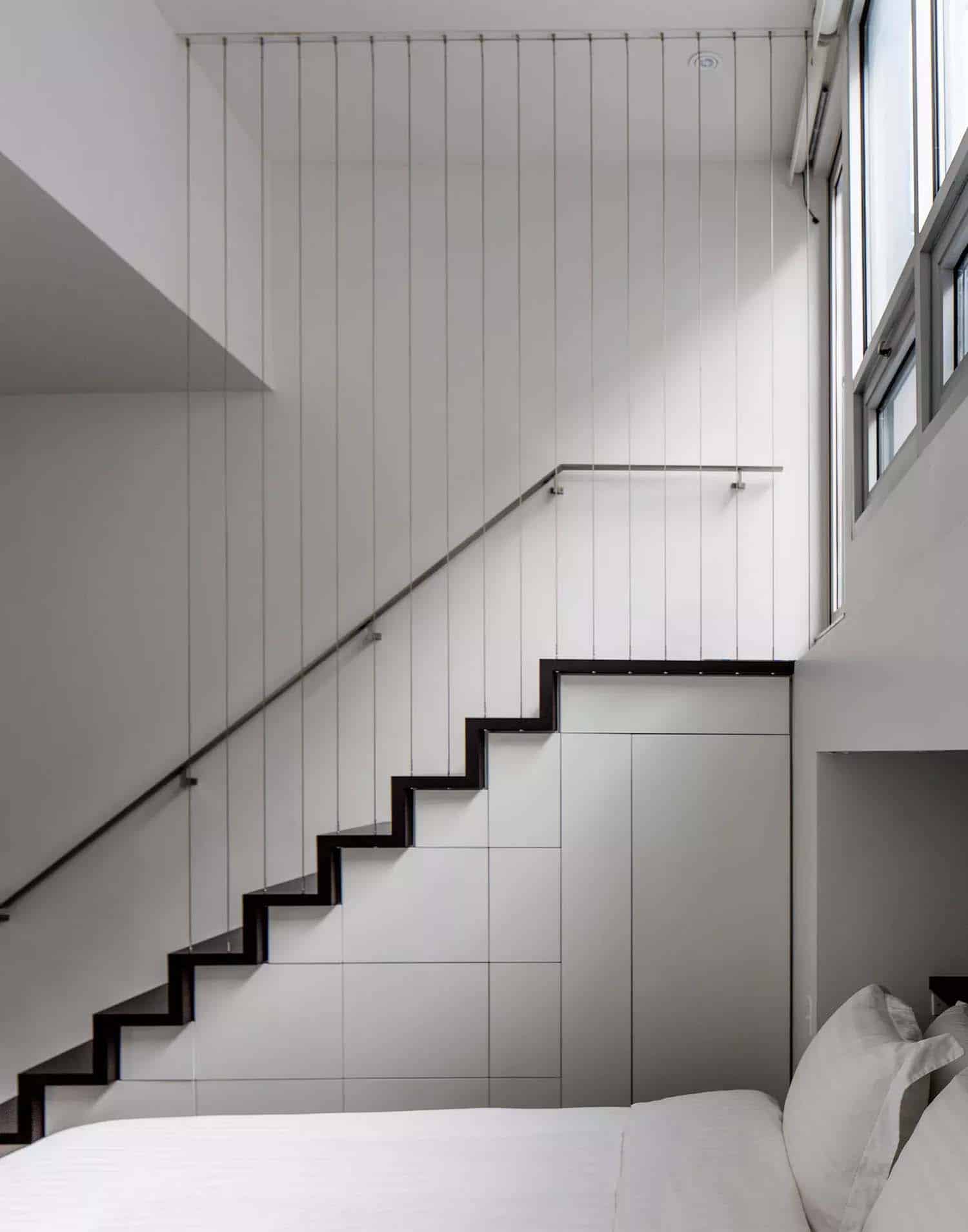
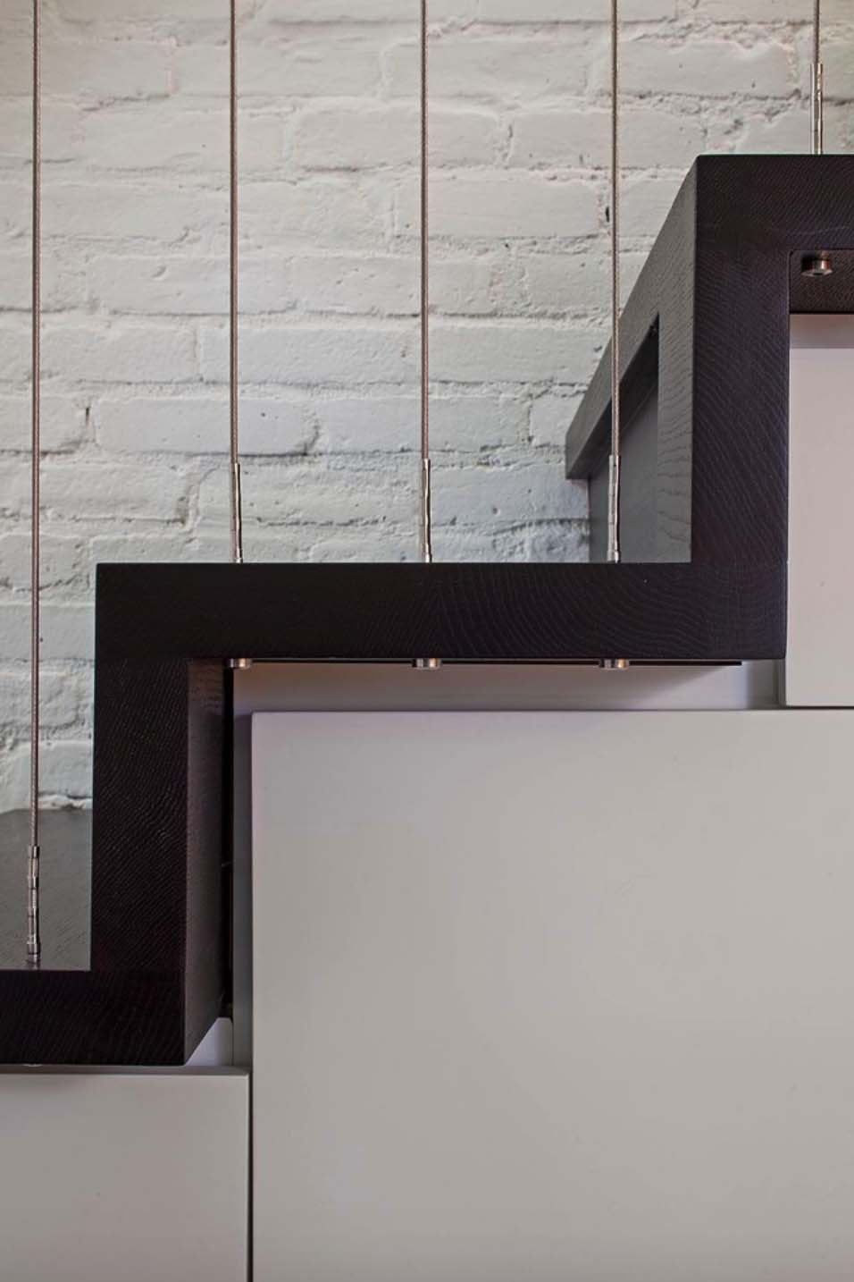
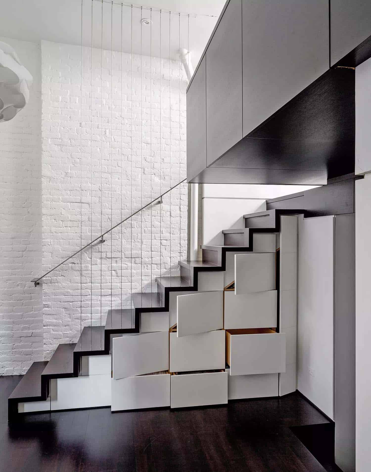
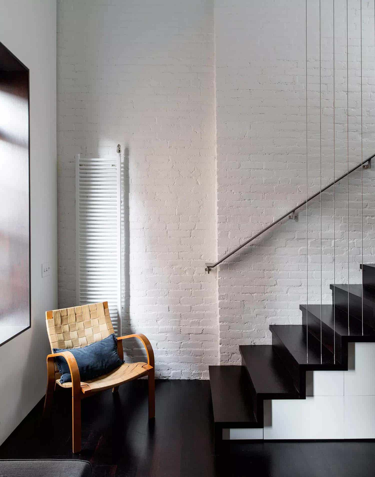
Above: In the living room, the architects demolished the imposing, drywall-enclosed stairway on the eastern wall; the stair they substituted on the west side is lightly screened by vertical cables and resembles a Japanese tansu cabinet with multiple drawers and closets. The exposed brick throughout the apartment was painted a light-reflecting white.
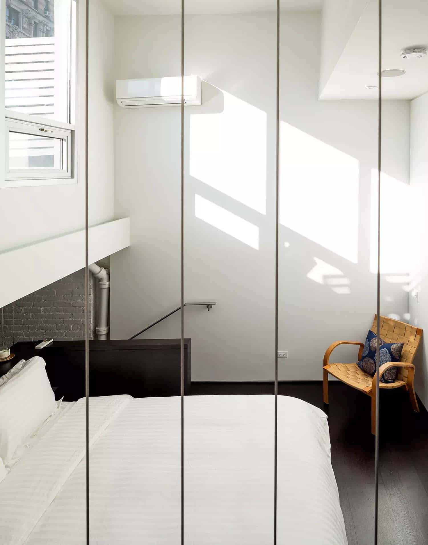
Above: On the third level, the enlarged bedroom contains a queen-size cantilevered bed platform that projects out over the living room. By leaving the space above the bed open to the living area, the architects were able to preserve views and bring in daylight from the windows facing the rooftop terrace.
Above: The bedroom space once felt toxic and is now very soothing and comforting for the owners.
Above: A second tansu-style stair leads to the terrace, on the apartment’s fourth level.
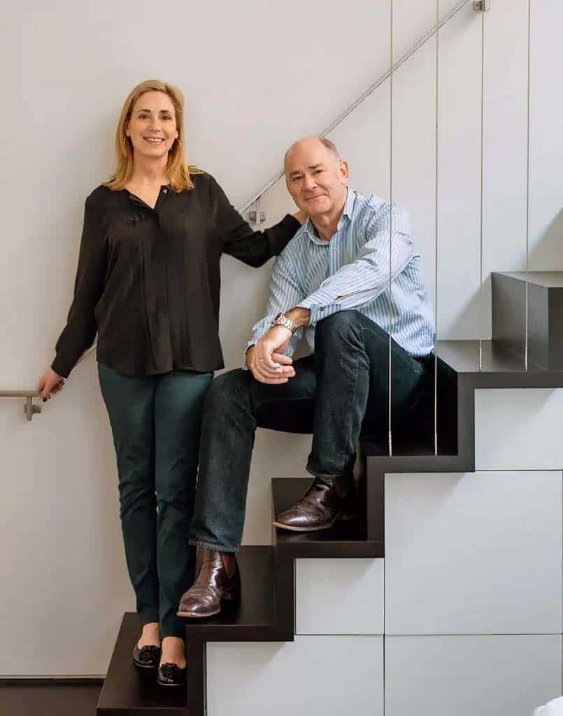
The owner’s of this Manhattan apartment, Rosanne and Huxley Sommerville, stated, “two people could live here full time quite comfortably — almost.”
The total renovation cost was around $400,000, yet a good portion of that cost was from being on the top floor and hauling things up and taking things down.
Above: The 3-D model depicts alternating solids and voids, and artfully layered horizontal and vertical planes.
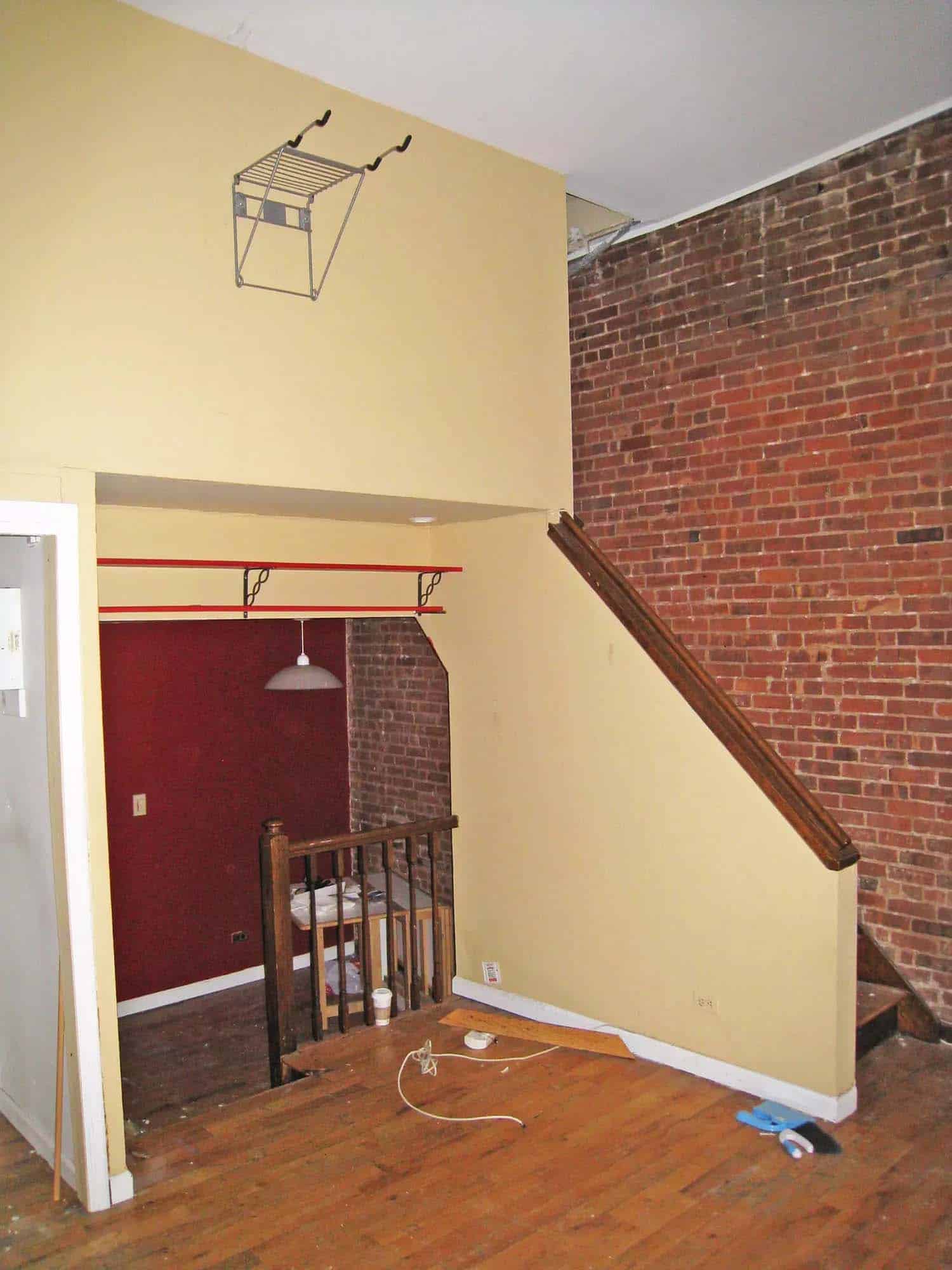
Above: The living room, before renovation.
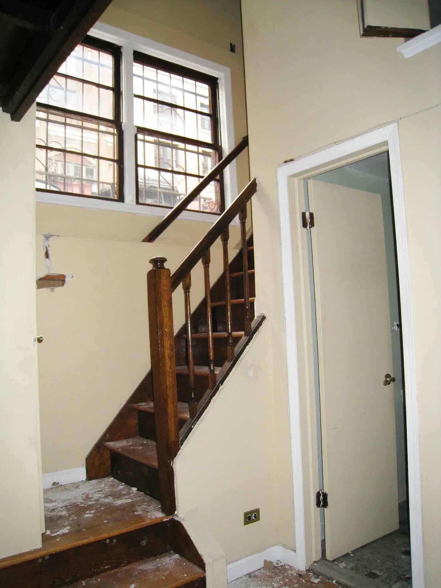
Above: The entry hall, before renovation.
Above: The second flight of stairs, leading up to the apartment’s terrace.
Above: The living room, before renovation.
Above: Another view of the living area, before renovation.
Photos: Trevor Tondro & Taggart Sorensen










1 comment