The narrow site is sandwiched between very old neighboring buildings in Landskrona, Sweden. Since mid-20th century it has been empty, waiting behind a wooden fence. It is only 5 meters wide with a tiny area of 75 square meters. Immediately adjacent buildings are low, but the street is lined with buildings of various height, size, facade material, age, and approach. Behind the row of buildings is a colorful world of back yards, brick walls, sheds, and vegetation.
Designed by architect Elding Oscarson, his goal was to create a razor sharp contrast to the other neighboring homes, to express inherent clarity, but most importantly to highlight the beauty of the surroundings. The architect’s clients, a male couple who has a great love for art and runs a cafe in a bigger city close by; plan to settle here permanently. They see the potential in this small town, beyond its current economic and social problems.
The architect’s intention was to use small means to create an array of different spatial experiences in this very small project, 1,345 square feet (125 square meters). The division of the single space aims at a non-minimalistic and lively sequence of confined and airy spaces, niches, interiors and exteriors, horizontal and vertical views as well as carefully framed views of the site. The continuous interior space is opening up to the street, to the middle of the block, and to the sky above.

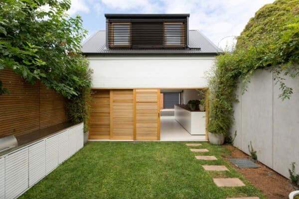
Compressed slab construction, unconventional ceiling heights, and the ground floor flush to the street level, permitted fitting three floors into a volume aligned with the neighboring rooftops. The interior consists of a single space, softly partitioned by three exposed steel slabs. These span the entire width of the house and divide its program – kitchen, dining, living, library, bed, bath, and a roof terrace. A home office for a growing side business of art dealing is located in a separate building across a small garden in the back. Mechanical and service spaces are housed next to a glazed entrance from the street.


The openness to all directions generates a building both monolithic and transparent. All facades are treated equally, exposing the interior and offering views through the building with similar apertures whether on the front, back or sides. The neighboring facades are closed, yet there is something deeply humane about their tactility, detailing, and ornaments. The architect wanted the home to contribute to the street with a faded border to the private sphere, with artifacts, furniture, plants, and patios; traces of human presence, consideration, and care.


Photos: Ake E:son Lindman


0 comments