
❤️ Would you like to save this?
By saving, we'll email this post to you for later. Unsubscribe anytime.
Haven Design and Construction has completely reimagined this striking midcentury modern home located in Terrell Hills, a peaceful neighborhood in San Antonio, Texas. The 1960s Terrell Hills home was originally designed by Robert Harris and built as a dream home for San Antonio icon, Bernard Lifshutz, a prominent San Antonio real estate developer, civil rights advocate, and historic preservationist.
The unique steel-framed structure took three years to build. It is both an architectural and an engineering marvel, with its cantilevered living room, large expanses of open spaces, numerous skylights, and oversized windows. When remodeling this home, the designer wanted to preserve the beautiful natural light and the open expanses of this home, while still making it livable for today’s lifestyle.
One of the biggest challenges of the project was the home’s original layout, which did not work for the new owners. They wanted to re-configure the primary suite floor plan, the main hallway, and the adjoining kitchen layout. The project team also added a small addition to attach the former guest house to the main house.
The owners have small children, so their bedroom and bathroom needed to be connected to the main house for practical and safety reasons. The additional space between the two formerly separated buildings provided room to add a new walk-in closet to the kids’ bedroom.
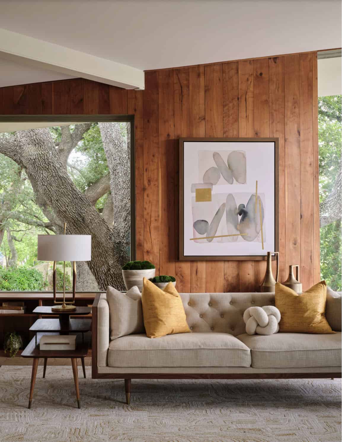
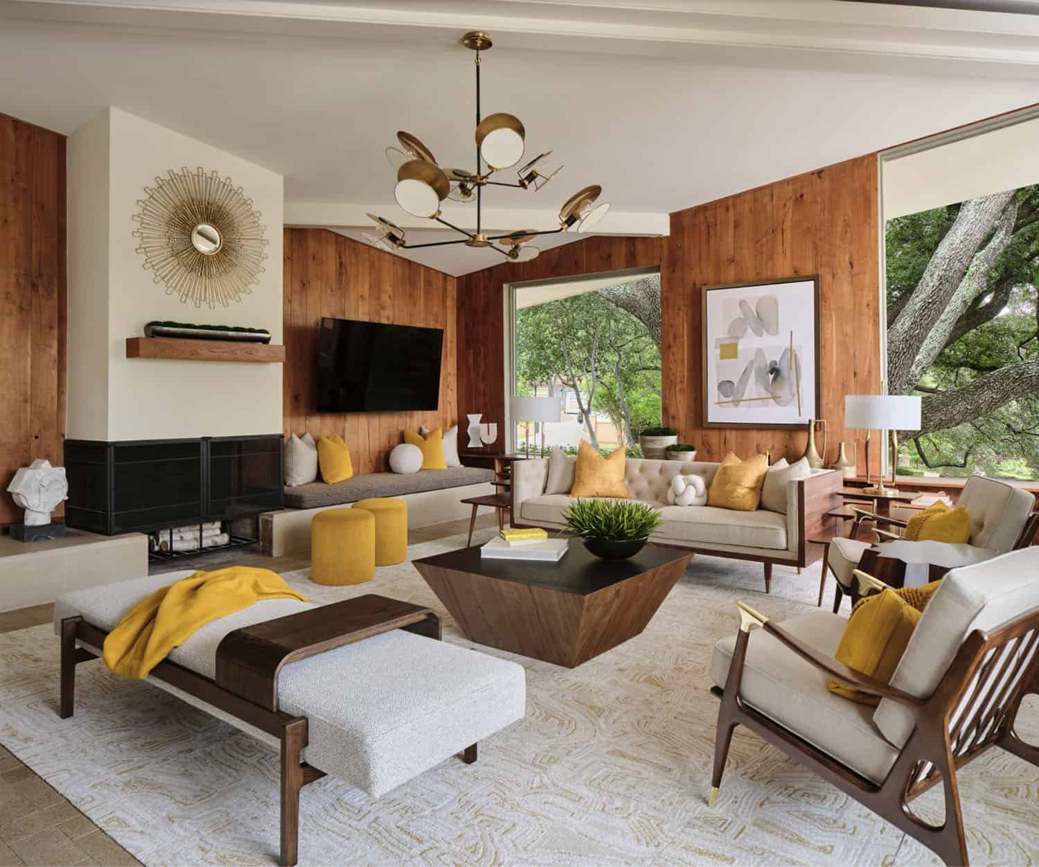
Above: The cantilevered living room of this incredible midcentury modern home still features the original wood wall paneling and brick floors. This space includes a new modern light fixture, midcentury modern furnishings, lamps, and accessories. The homeowner’s existing rug was used in this space and the room’s inspiration colors were pulled from it. Bright citron-yellow accents add a punch of color to the room.
This home boasts radiant heat flooring throughout the main floor. This was quite a luxury in 1960 and was innovative for that time period. The original radiant heat copper piping system still works perfectly and has a temperature sensor that will automatically turn on the radiant flooring when the temperature drops below 50 degrees.
What We Love: This midcentury modern home in San Antonio provides a family with a completely transformed home to cater to their lifestyle needs. The design team did a wonderful job of preserving the original architecture while infusing midcentury details into this home to help restore it to its former glory. Refreshed living spaces are light and airy with stylish furnishings, finishes, and fixtures throughout.
Tell Us: What details do you find most intriguing in this midcentury modern remodel project? Let us know in the Comments below, we love reading your feedback!
Note: Have a look at a couple of other incredible home tours that we have showcased here on One Kindesign in the state of Texas: This beautiful San Antonio home is built around a majestic oak tree and Contemporary home with a rustic twist in a historic Texas neighborhood.
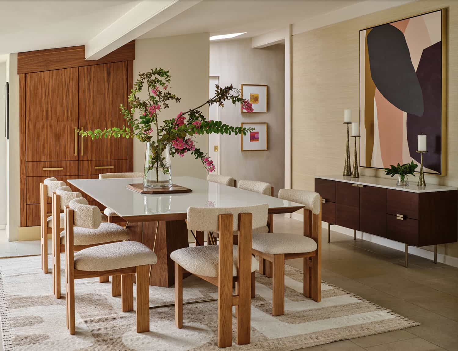
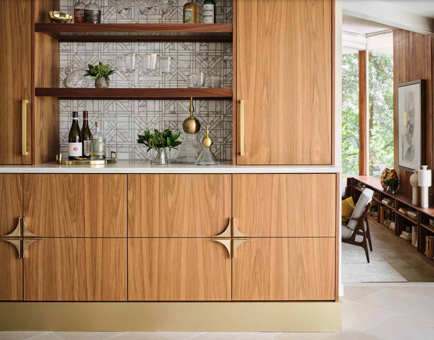
Above: The dining room features a walnut bar with an antique gold toe-kick and antique gold hardware, along with an enclosed tall walnut cabinet for storage. The tall dining room cabinet also conceals a vertical steel structural beam, while providing valuable storage space.

Above: The original dining room cabinets had been whitewashed and they also featured many tiny drawers and damaged drawer glides that were no longer practical for storage. So, they were removed and new cabinets were built that look as if they have always been there. The new walnut bar features geometric wall tile that matches the kitchen backsplash. The walnut bar and dining cabinets breathe new life into the space and echo the tones of the wood walls and cabinets in the adjoining kitchen and living room.
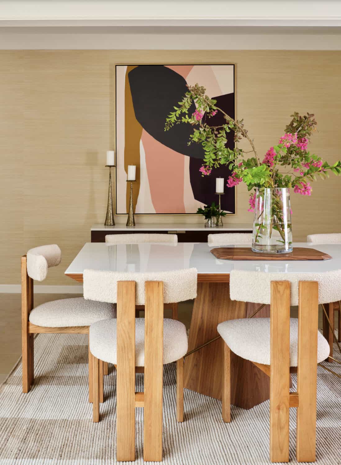

Above: The owners’ reproduction Frank Lloyd Wright Floor Lamp and midcentury modern furnishings complete this seating area in the dining room nook. This area used to be an exterior porch but was enclosed to make the current dining room larger.
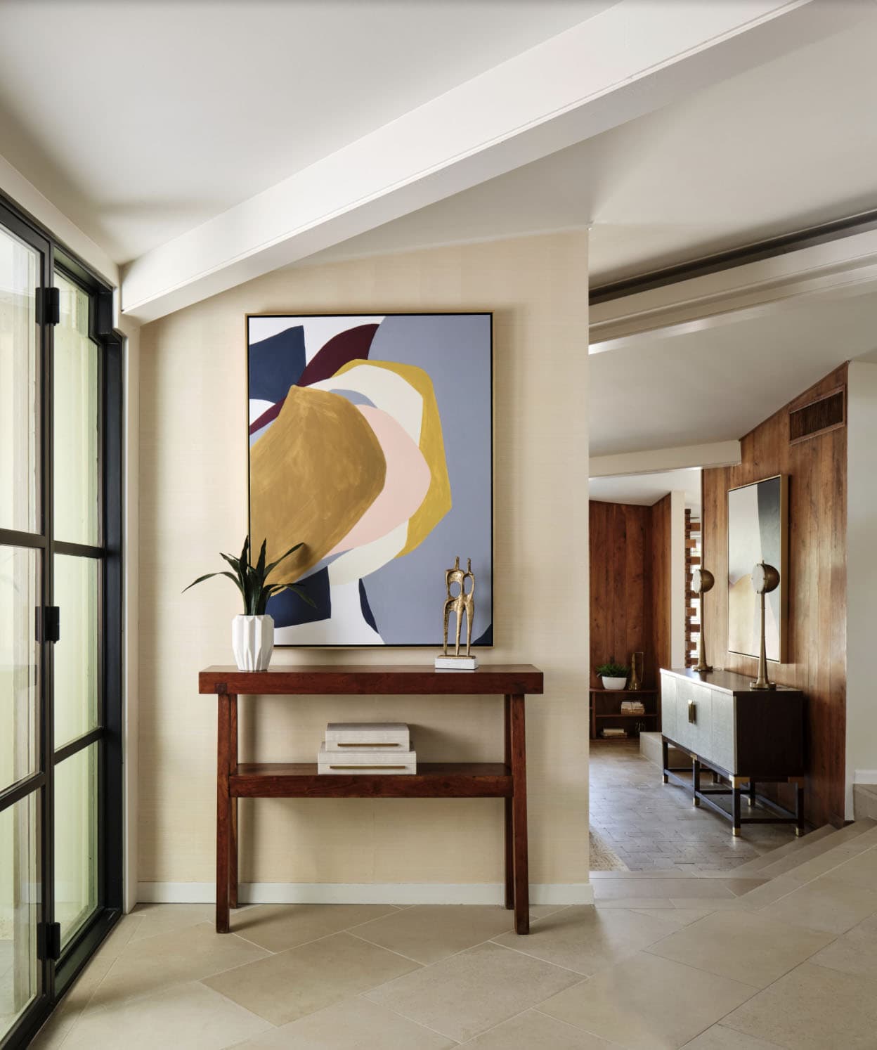
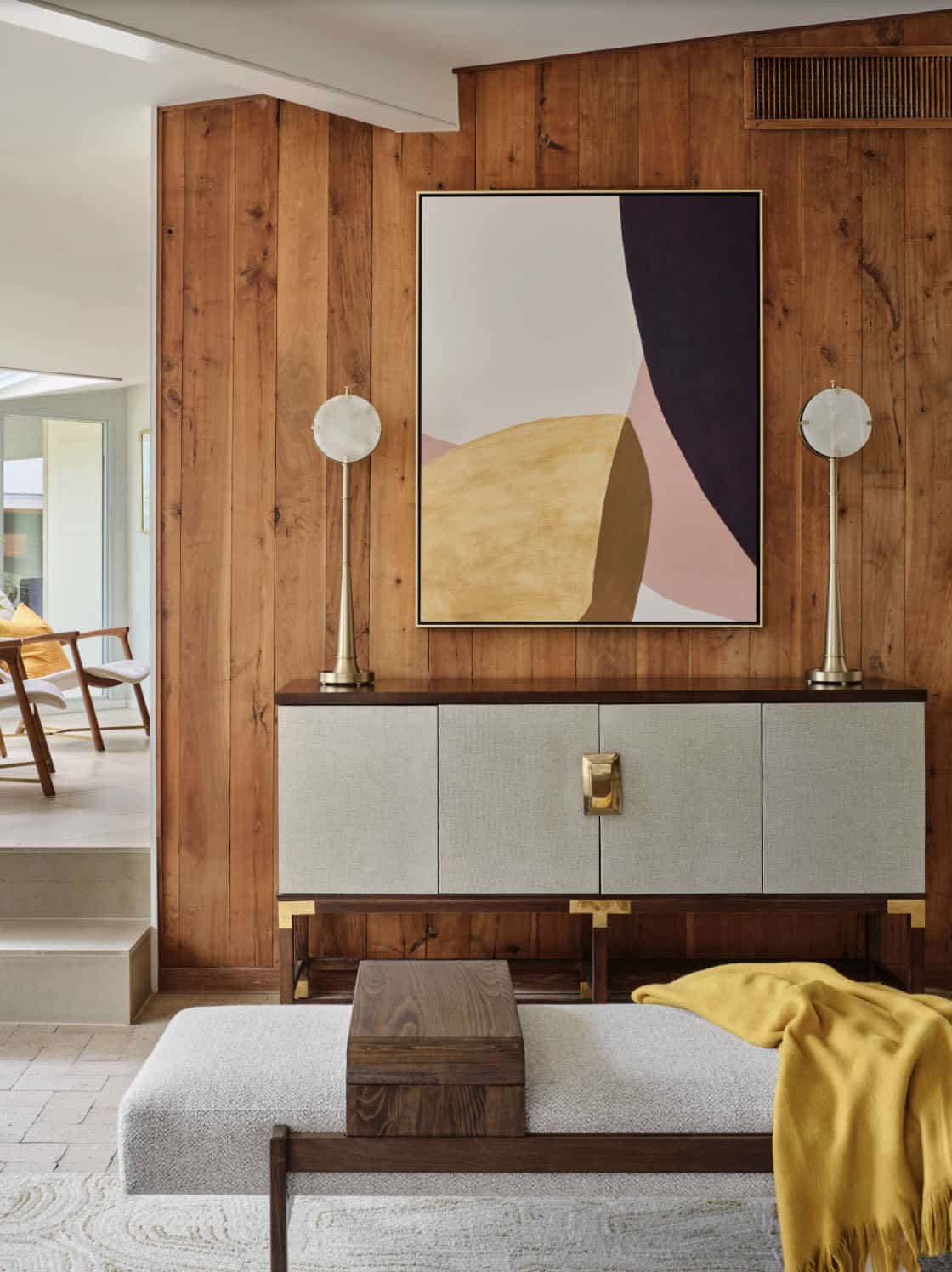
Above: The light-filled foyer features metal and glass front doors. The design team selected midcentury modern furniture and finished the space with colorful art, throw pillows, lamps, barware, books, bedding, and home accessories. The homeowners already owned a few wonderful original midcentury modern furniture pieces that were incorporated into the design.
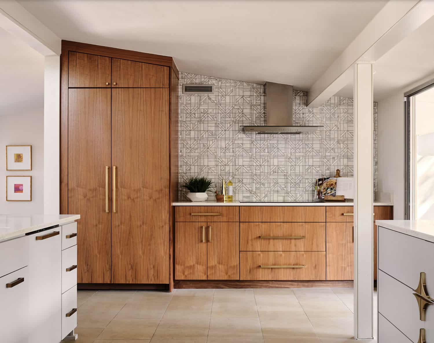
Above: In the kitchen, which was recently remodeled by the previous owners, the design team wanted to keep as many of the newer elements (that were just purchased) as possible. However, they also wanted to incorporate some new midcentury modern wood accents back into the space to tie it to the living room, dining room, and breakfast areas.
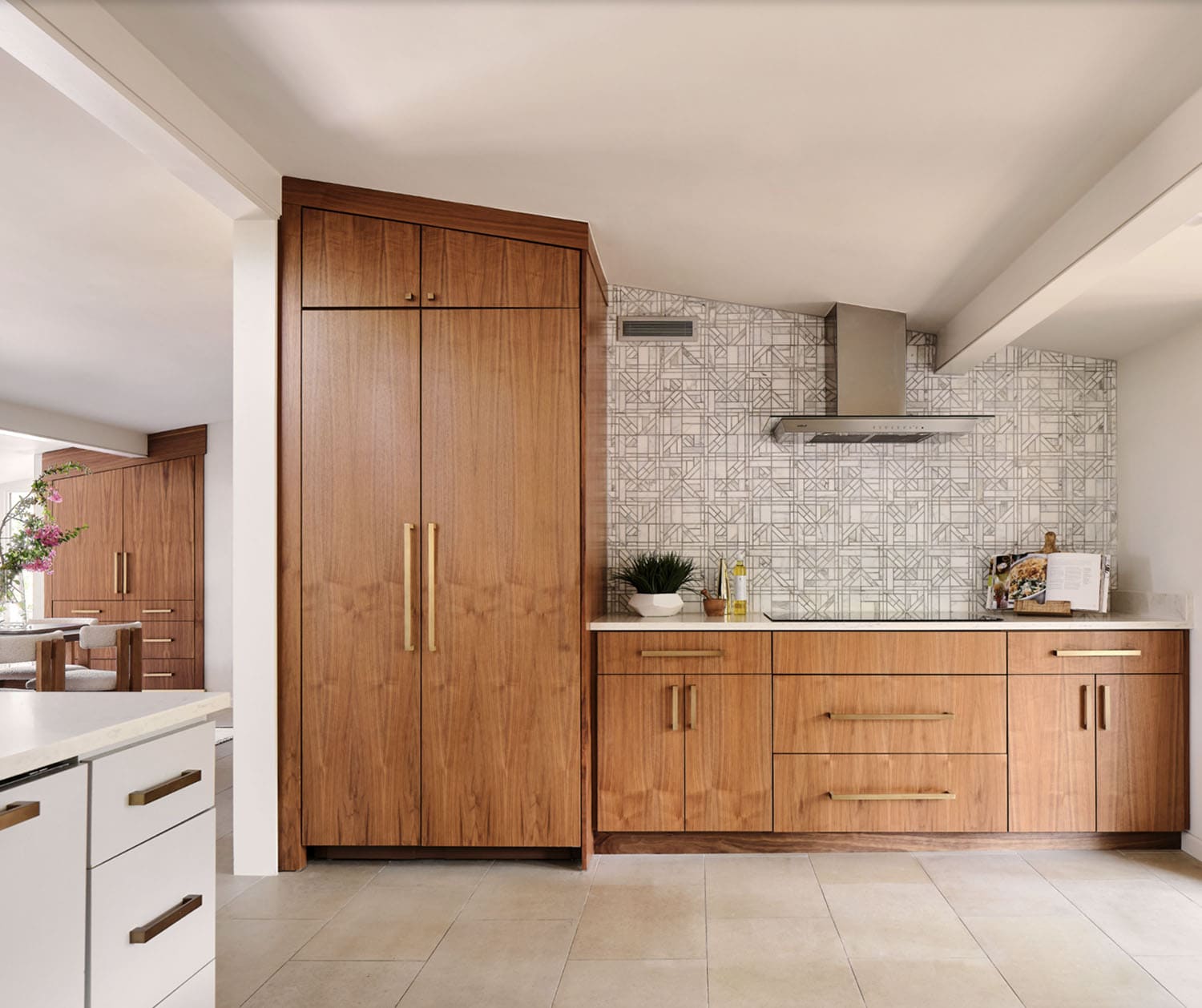
Above: They added new walnut cabinets on the refrigerator wall, which balances the new geometric wood accent wall in the breakfast area. They also incorporated new quartz countertops, new streamlined plumbing fixtures, and new lighting fixtures to add modern midcentury appeal. A geometric marble backsplash and diamond-shaped cabinet hardware at the bar and on some of the kitchen drawers were also added.
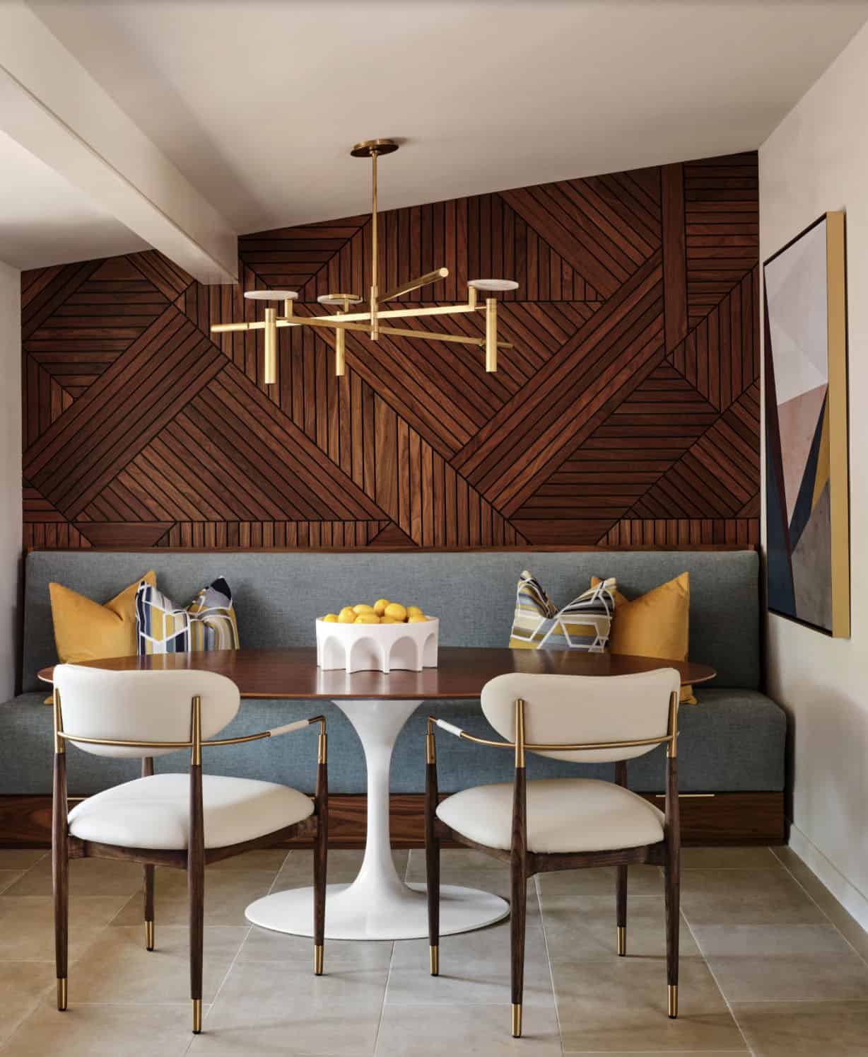
Above: One functional challenge was that the home did not have a pantry. Midcentury modern closets were historically smaller than the walk-in closets and pantries of today. The breakfast area was quite large, and it backed up to the primary bath on one side and it also adjoined the main hallway. The designers decided to reconfigure the large breakfast area by making part of it into a new walk-in pantry.
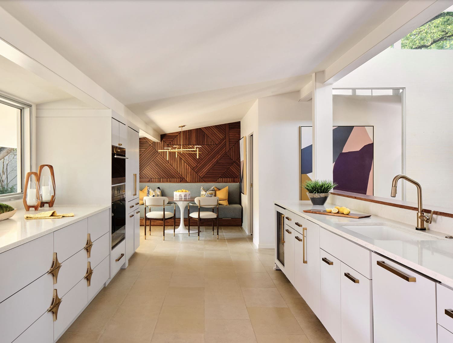
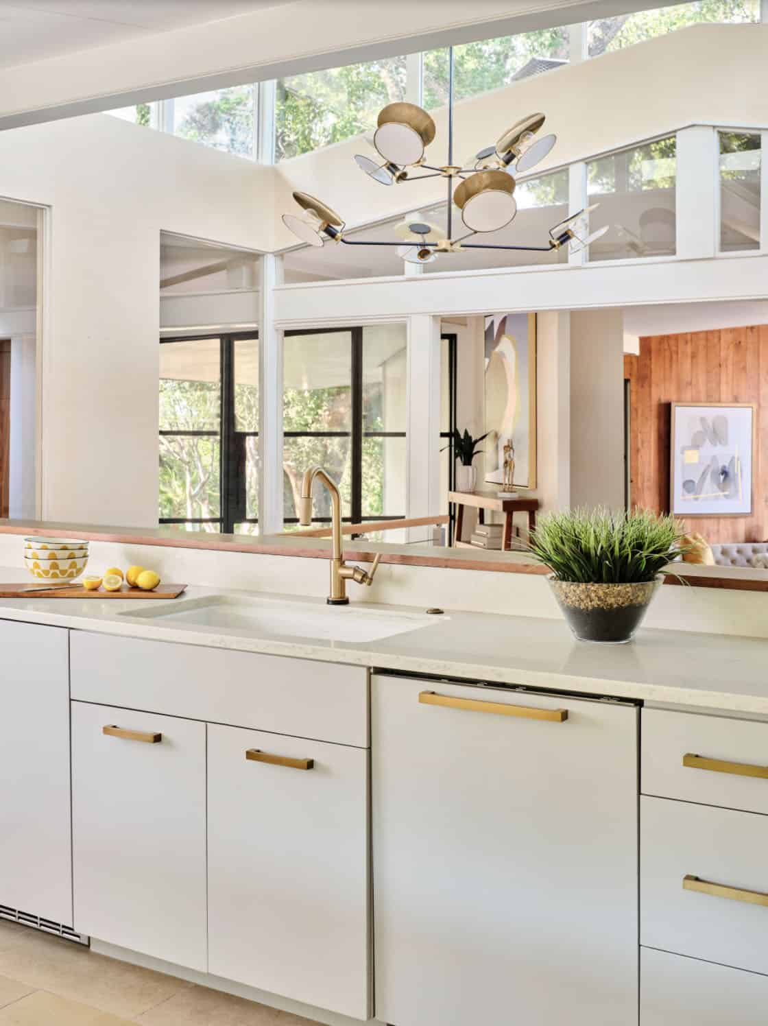
Above: The kitchen sink is uniquely positioned to overlook the home’s former atrium and is bathed in natural light from a modern cupola above. The original floor plan featured an enclosed glass atrium that was filled with plants where the current stairwell is located. The former atrium featured a large tree growing through it and reaching to the sky above. At some point in the home’s history, the atrium was opened up and the glass and tree were removed to make way for the stairs to the floor below. The basement floor below is adjacent to the cave under the home. You can climb into the cave through a door in the home’s mechanical room.


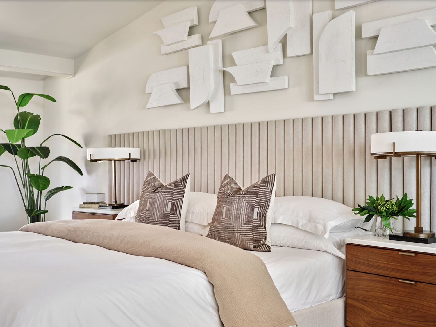
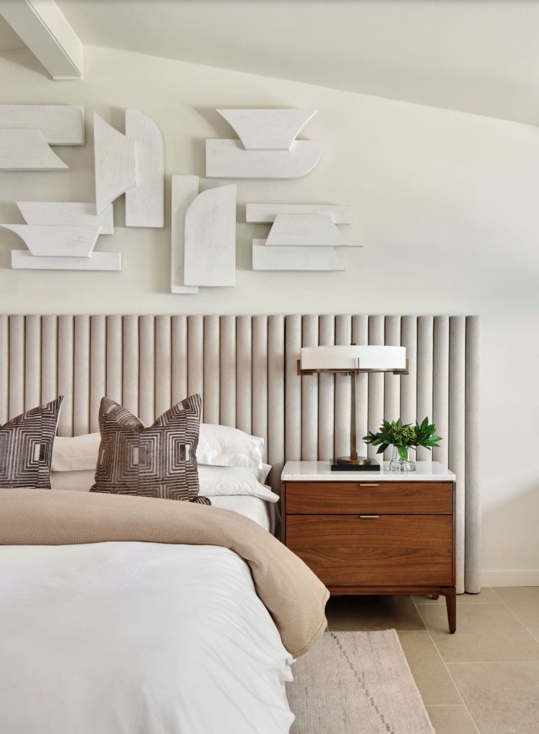
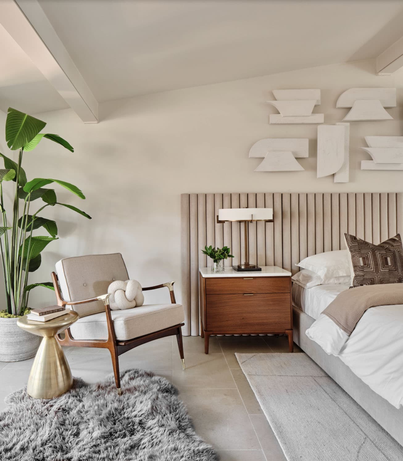
Above: The bedroom features limestone flooring and steel ceiling beams. The original built-in walnut dresser is still intact. The design team added the long upholstered wall bed to accentuate the linear bedroom. The walnut nightstands balance the wood on the original built-in dresser and layers of bedding and a geometric rug add warmth. Geometric wall art adds a modern touch.
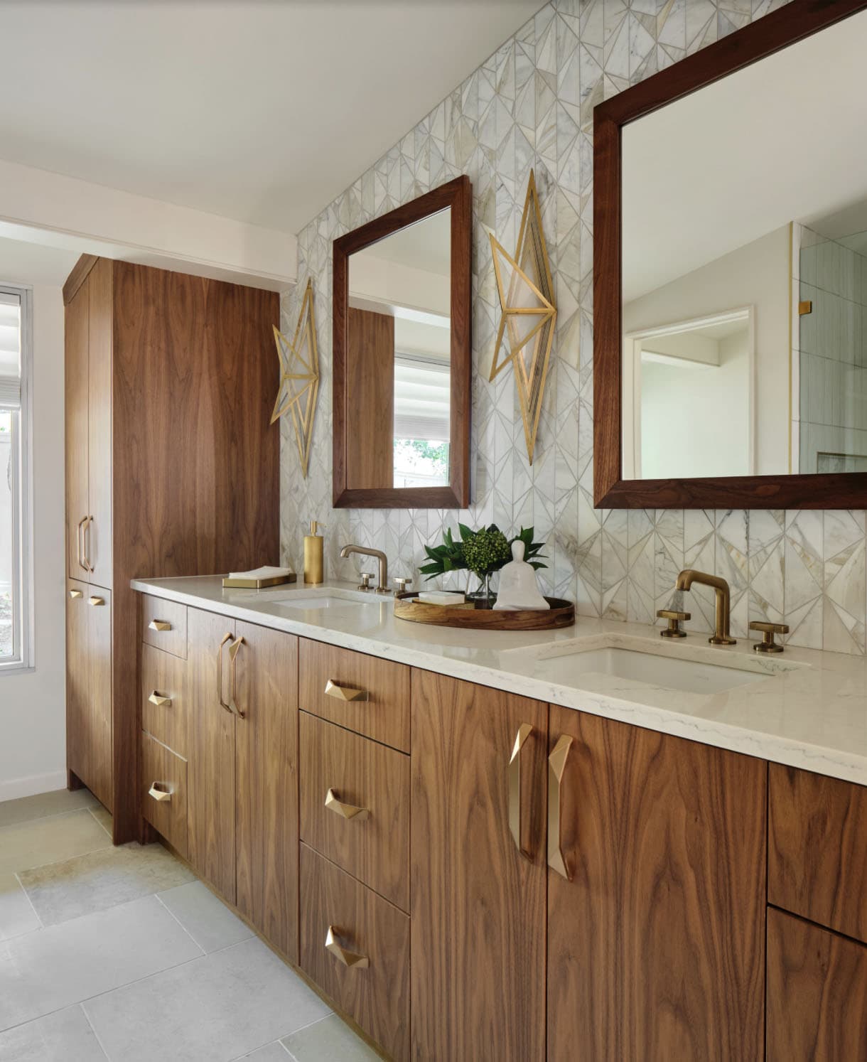
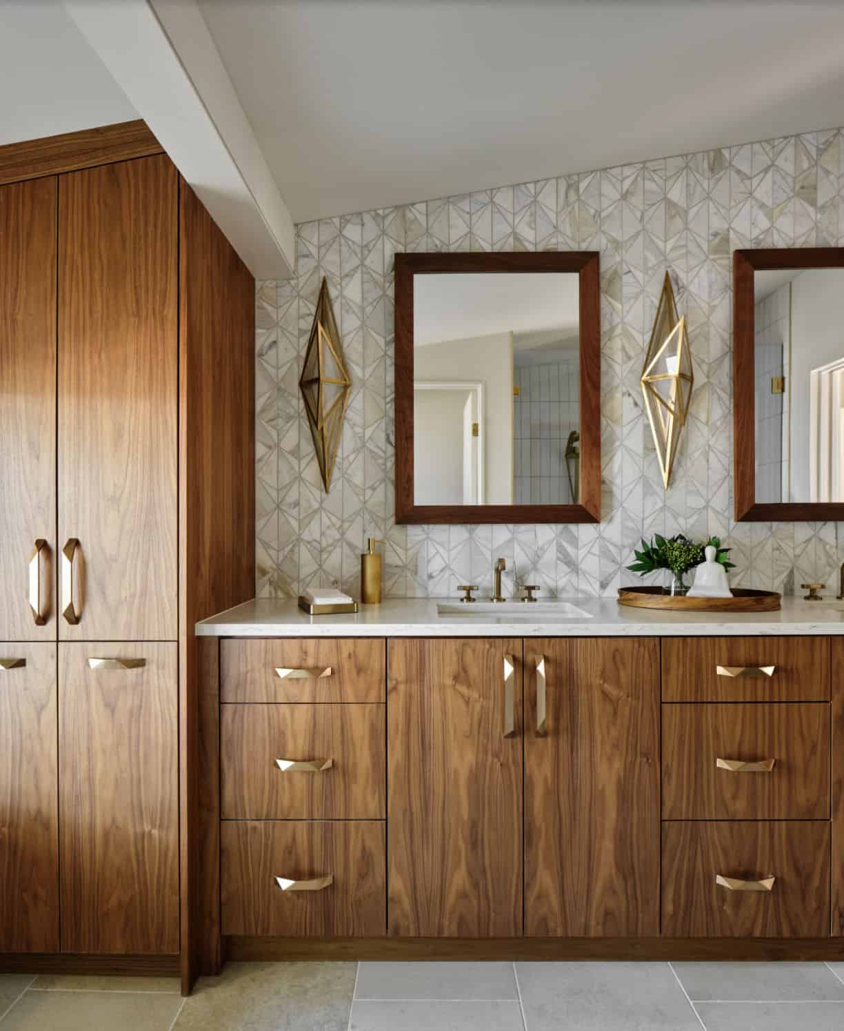
Above: In the primary bath, all of the original features had been removed, except for the low-sloped midcentury modern ceiling that was prominently interrupted by a rectangular AC soffit that was added on later. The AC ducting was relocated to vent through the floor instead, and once again revealed the bath’s iconic low-sloped triangular ceiling. This space was widened by 2’ to accommodate an enclosed toilet room.
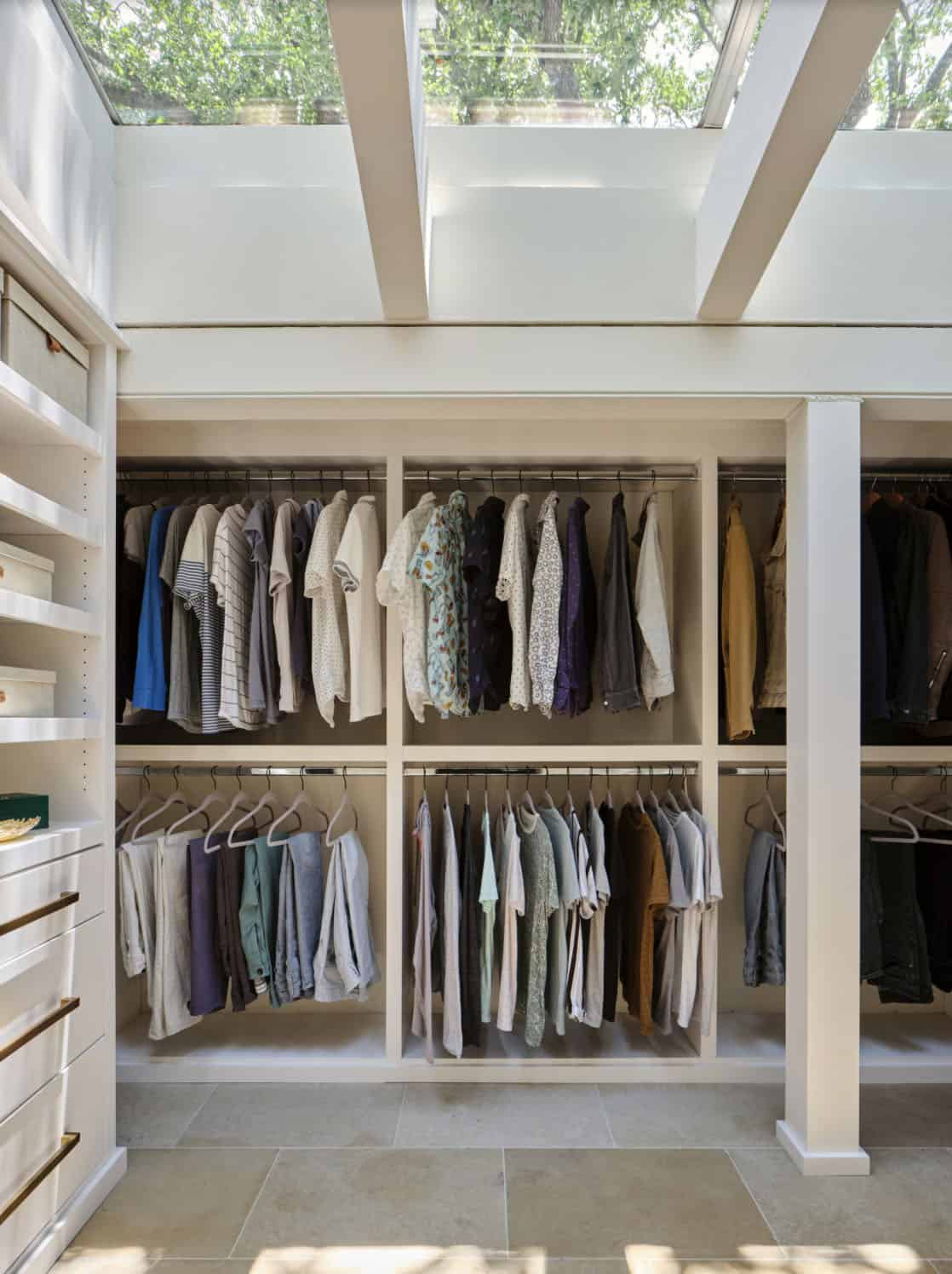
Above: After relocating the main hallway of the home, the project team reconfigured the home’s original hallway with amazing architectural skylights and transformed it into the new primary walk-in closet. This ethereal light drenched space is a dream to get dressed in. The custom closet built-in’s were designed around the skylights and the home’s unique architecture and it produced a significant amount of storage space for hanging, shelving and also drawer storage.
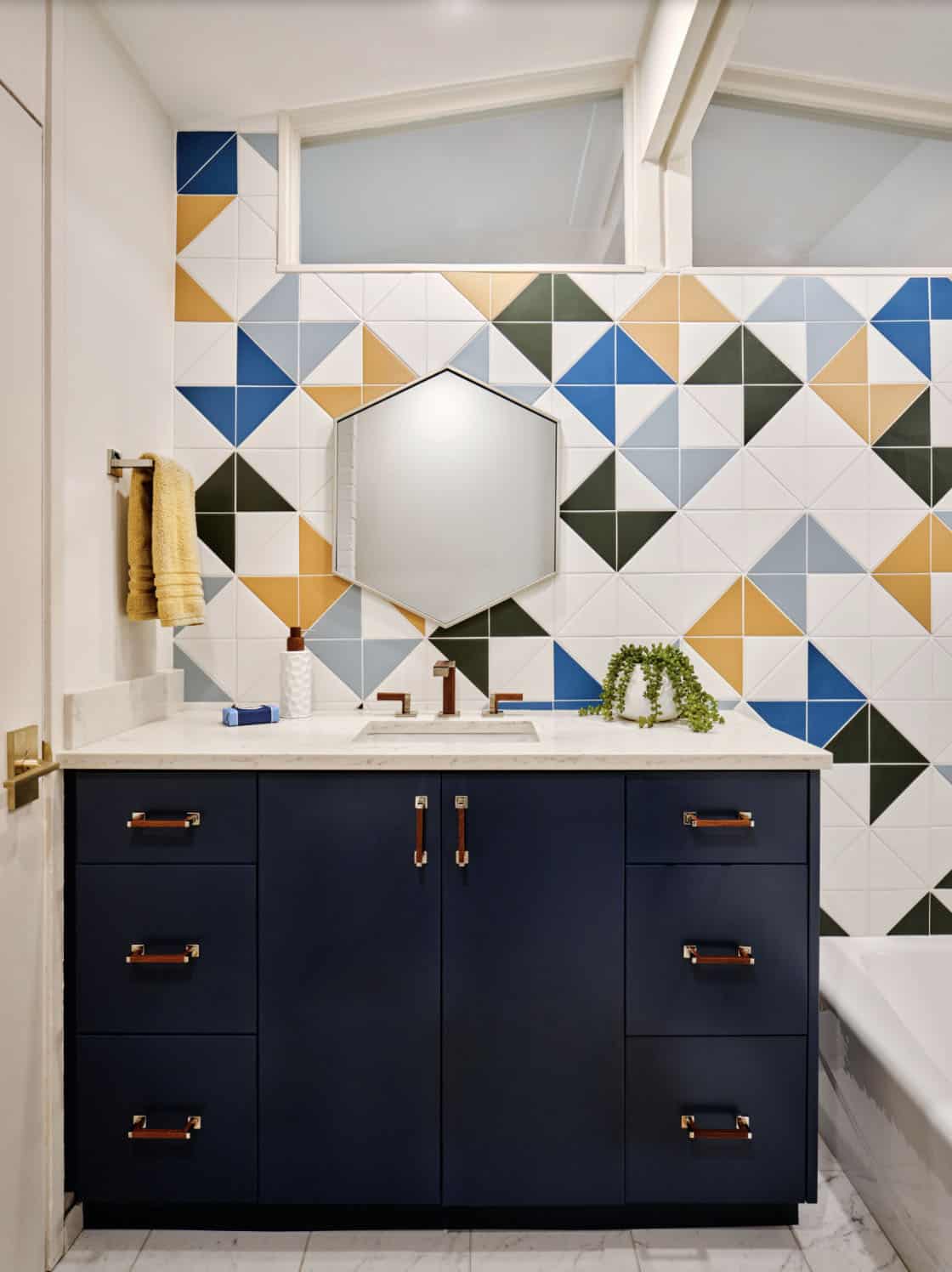
Above: The kids’ bathroom previously featured a 4’ long bathtub that was cramped and impractical. The knee space in front of the existing toilet was also quite tight. So, the designer turned the bathtub 90 degrees to incorporate a standard 5’ long bathtub and also gave the space in front of the toilet more room for knee space.
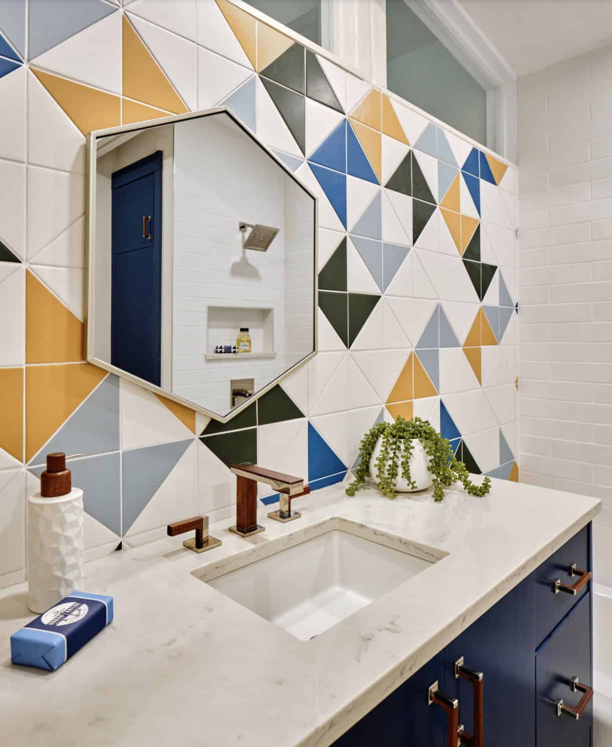
Above: The designers gave this kid’s bathroom a fun midcentury modern punch that they would not outgrow, so they designed a colorful accent wall of geometric tile, added a wood and chrome faucet, and a blue vanity with chrome and walnut cabinet hardware.
PHOTOGRAPHER Matthew Niemann Photography


4 comments