
❤️ Would you like to save this?
By saving, we'll email this post to you for later. Unsubscribe anytime.
This two-story home has recently undergone a complete transformation by Ashby Collective, located in the Westlake neighborhood of Austin, Texas. Each room was turned into an artful space with loads of character. The project team gave this 5,800-square-foot residence the maximalist wow factor the homeowners desired. Maximalism is a design style that focuses on a more-is-more philosophy.
One of the main spaces for entertaining, the music room, entailed a myriad of must haves from the couple. They were certain they wanted black and white checkered flooring and a dynamic and colorful wallpaper. The wallpaper (House of Hackney) was one of the first selections for the room.
DESIGN DETAILS: ARCHITECT Clayton Korte INTERIOR DESIGN Ashby Collective BUILDER Burnish & Plumb LANDSCAPE ARCHITECT Word + Carr

The team used a dark and stormy paint color on the ceiling (Tulsa Twilight Benjamin Moore) to tie in with the wallpaper and marble checkered flooring. “We up lit the ceiling with bronze sconces and painted it in high gloss so that it would reflect some light back down. The lilac chandelier was an added pop of color that brightens the space and gives off a sparkle at night but is also cheerful in the daylight. We knew there would be a plentitude of light coming in during the day after we added an entire wall of steel doors and windows,” says Christina.

The music room’s checkered tile floor extends out through a wall of steel and glass to the outdoor patio with stunning views of the mountain-side and the skyline of the city of Austin in the distance. The design team used Galapagos Turquoise (Benjamin Moore) on the chair rail and mantel. The artwork on the wall is by artist Amie Dicke.

Bistra is Eastern European and loved the idea of building in old world references — so the design team considered the steel accents to act less in a modern way but more of a nod to a worldly solarium. Pattern and texture are carried through in the kitchen’s stone hood vent. This was an especially strong statement and really came into play after the clients fell in love with the Silver Wave Marble slab. “We wanted to make the marble a strong visual in the space, in order to really allow the incredible ‘wave’ in the stone be the focus we had to show as much of it as possible — so that you can relate to the movement of it,” notes Christina. On the wall, the artwork is by artist Marilyn Minter

“The clients wanted luxurious and maximal design elements — an abundance of color was a must. They wanted spaces to show off their collections of not just fantastic art but also vintage finds and historical artifacts. They love pattern and requested that every room be magical and ready for entertaining and hosting lots of guests, says Christina Simon, Principal, Ashby Collective. “We took this directive and elevated each space to be unexpected. We transformed the home’s traditional millwork and moldings to be more contemporary by adding saturated, punchy colors in high gloss sheens. Anywhere we could add pattern, color and texture we did it! Most of the furniture was custom designed in dramatic color combos and metallic fabrics.”

The bespoke dining set is topped with dramatic lighting– Pair of Pearl Necklaces Pendant by Ludovic Clément d’Armont. The flooring is white oak.

Above: The artwork on the wall of the lounge is by artist Walton Ford.
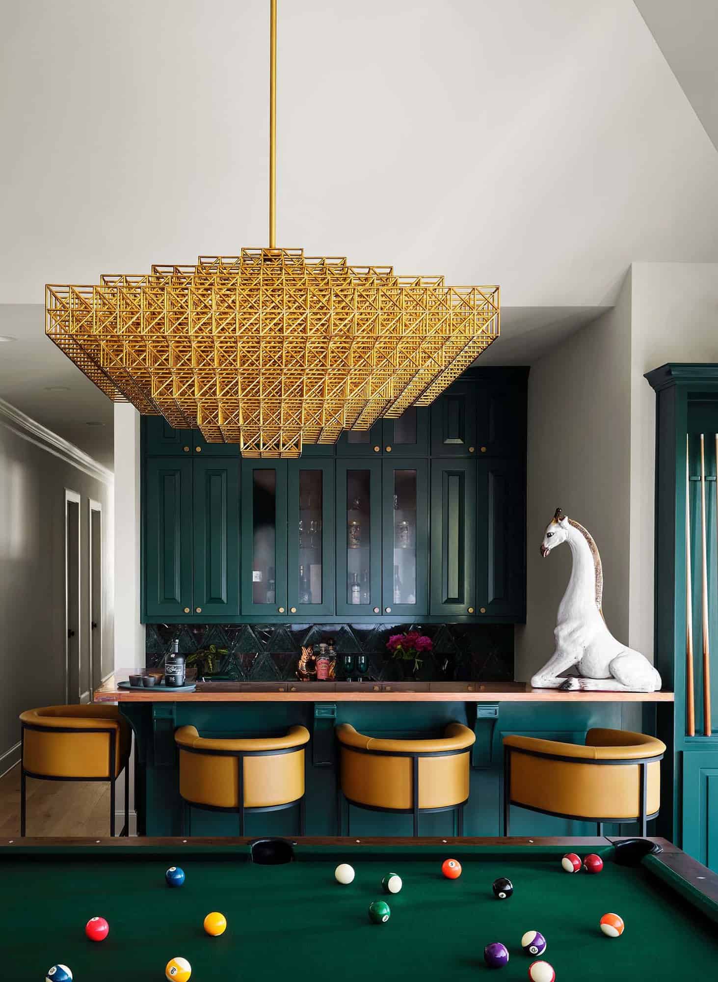
The primary theme of color and pattern was followed closely by the secondary theme in the design plan — metallics. Bronze and copper as well as unusual specialty hardware and lighting is a common thread throughout. The copper built-in banquet seating in the game room visually connects to the copper-wrapped bar and contrasts with the striking geometric brass light fixture by Roll & Hill.

What We Love: This spectacular maximalist home remodel project features bold wallpaper, deep saturated tones, eclectic curated art, and vintage furnishings to create a one-of-a-kind design. We are especially loving the the exquisite kitchen with the waterfall countertops, floating oak wood shelves, and the decadent stone wrapped hood. Overall, the project team did a fabulous job of reimagining this home with an abundance of color and personality.
Tell Us: What elements in the design of this home do you find most appealing? Please share your thoughts in the Comments below, we enjoy reading your feedback!
Note: Have a look at a couple of our favorite home tours that we have showcased here on One Kindesign from the portfolio of Ashby Collective: Fresh twist on the classic ranch style home in Texas Hill Country and Mid-century modern house gets inspiring transformation in Austin, Texas.

Above: In the stairwell of this maximalist home, the artwork is by artist Lorraine Tady.

Above: The primary suite gets a rosy treatment, the homeowner’s Karl Haendel artwork takes center stage (Drawing of Lion with Wristwatch)..

Above: The bathroom includes new custom white oak cabinets with Calacatta stone.


The study wall features the homeowner’s collection of books and found objects. The team choose a rich teal hue for the built-ins.

Above: The hallway of this maximalist home features an 800+ piece glass art installation by Rob Wynne.

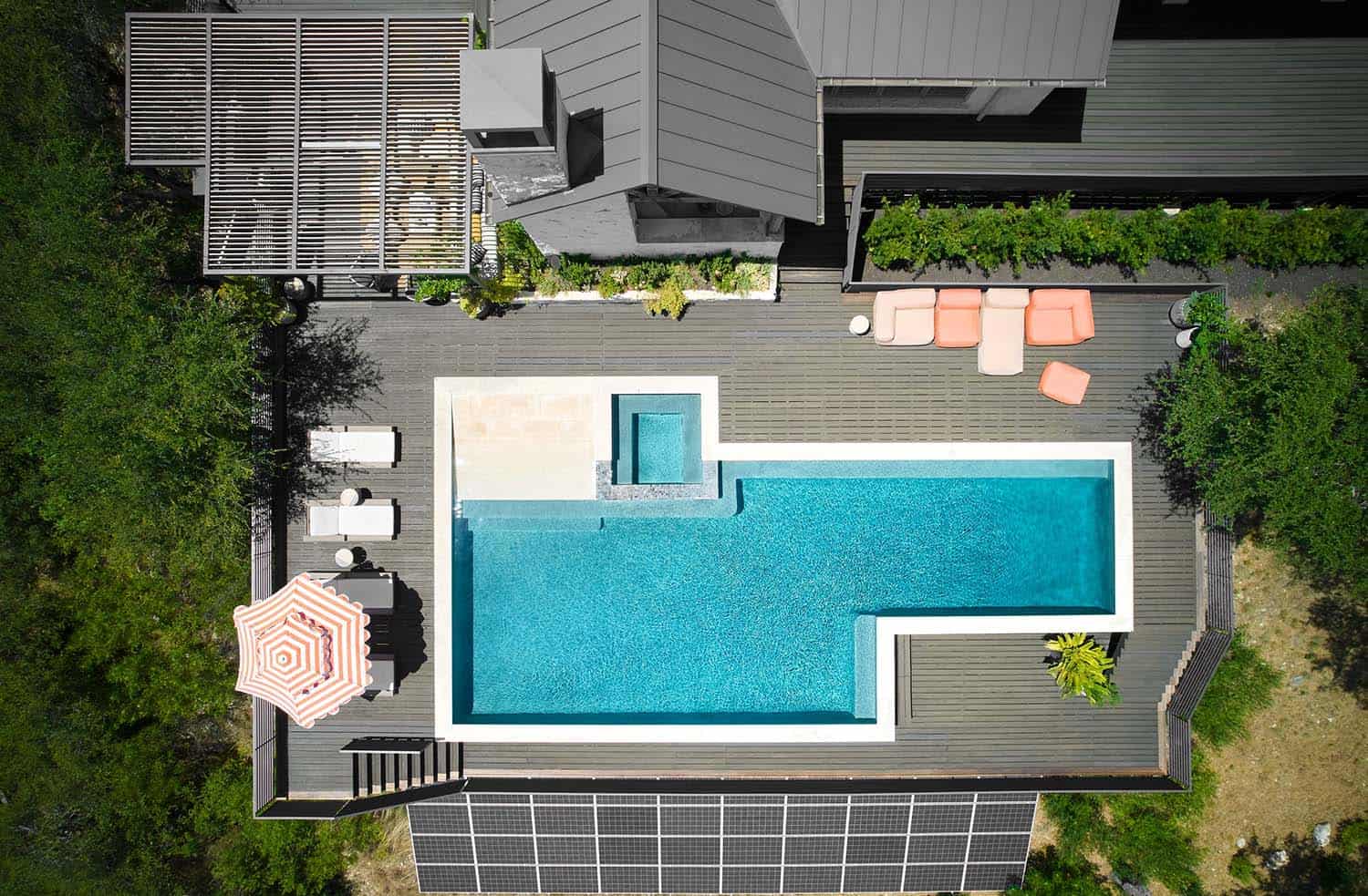
On the outside of this maximalist home, a pergola was installed for outdoor entertaining. This fabulous living space features a new outdoor kitchen that includes a grill and cabinetry with stainless steel fronts. An outdoor television for watching sporting events and movies along with string lights for ambiance.
PHOTOGRAPHER Clay Grier
One Kindesign has received this project from our submissions page. If you have a project you would like to submit, please visit our submit your work page for consideration!




3 comments