
❤️ Would you like to save this?
By saving, we'll email this post to you for later. Unsubscribe anytime.
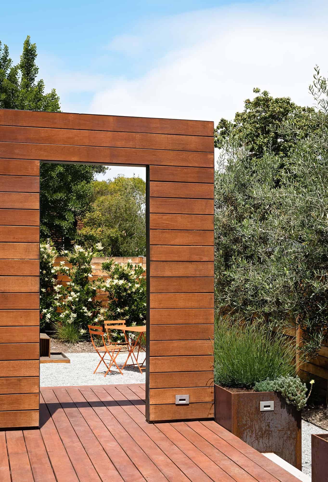
Designed by Buttrick Projects A+D, the Art House entails the addition of three small structures on two adjacent parcels, retaining the original 1920s home and enhancing their living space in Palo Alto, California. The scope of this project involved the construction of three distinct structures, creating additional interior space, and forming a private courtyard for an existing house that remains in place.
The largest new structure, the Art House, is designed to house a burgeoning art collection, and accommodate occasional guests. When the lot adjacent to their house came on the market a few years ago, the owners saw an opportunity to expand beyond the small house where they had lived for twenty years, raising their four children.
DESIGN DETAILS ARCHITECTURE Buttrick Projects A+D INTERIOR DESIGN Buttrick Projects A+D STRUCTURAL ENGINEERING Structus Inc. GEOTECHNICAL Murray Engineers Inc. LANDSCAPE Stroudwater Design LIGHTING DESIGN Pritchard Peck Lighting CONTRACTOR Sherrill Construction

The planning challenge was how to resolve the geometry of the trapezoidal site while complying with the scale of the neighborhood and providing enough open space to satisfy the requirements of the program.

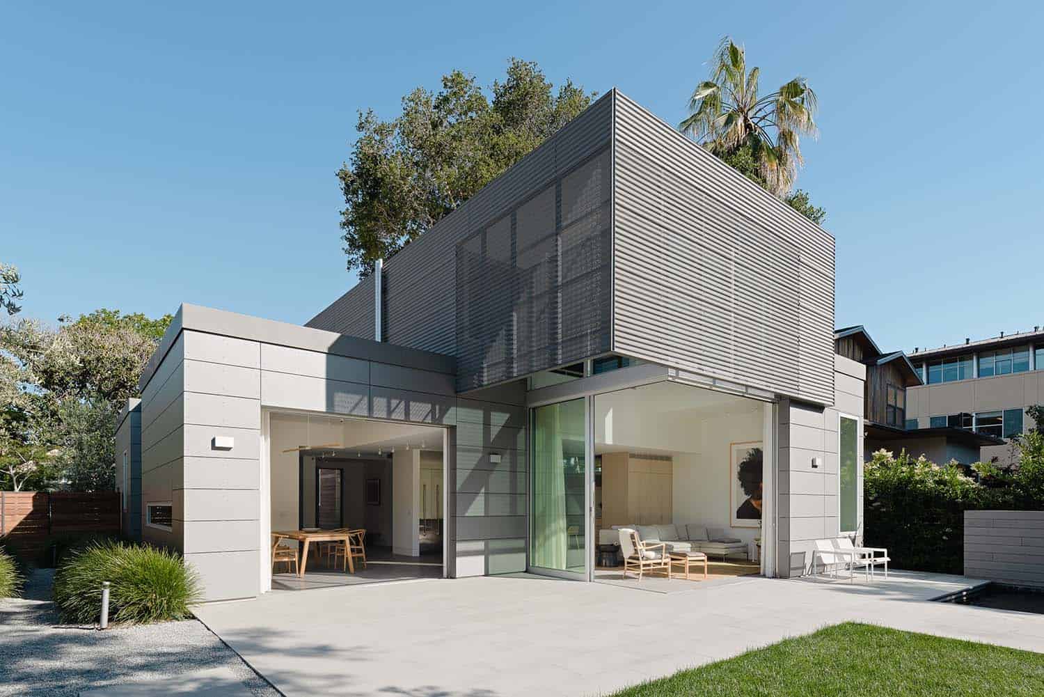
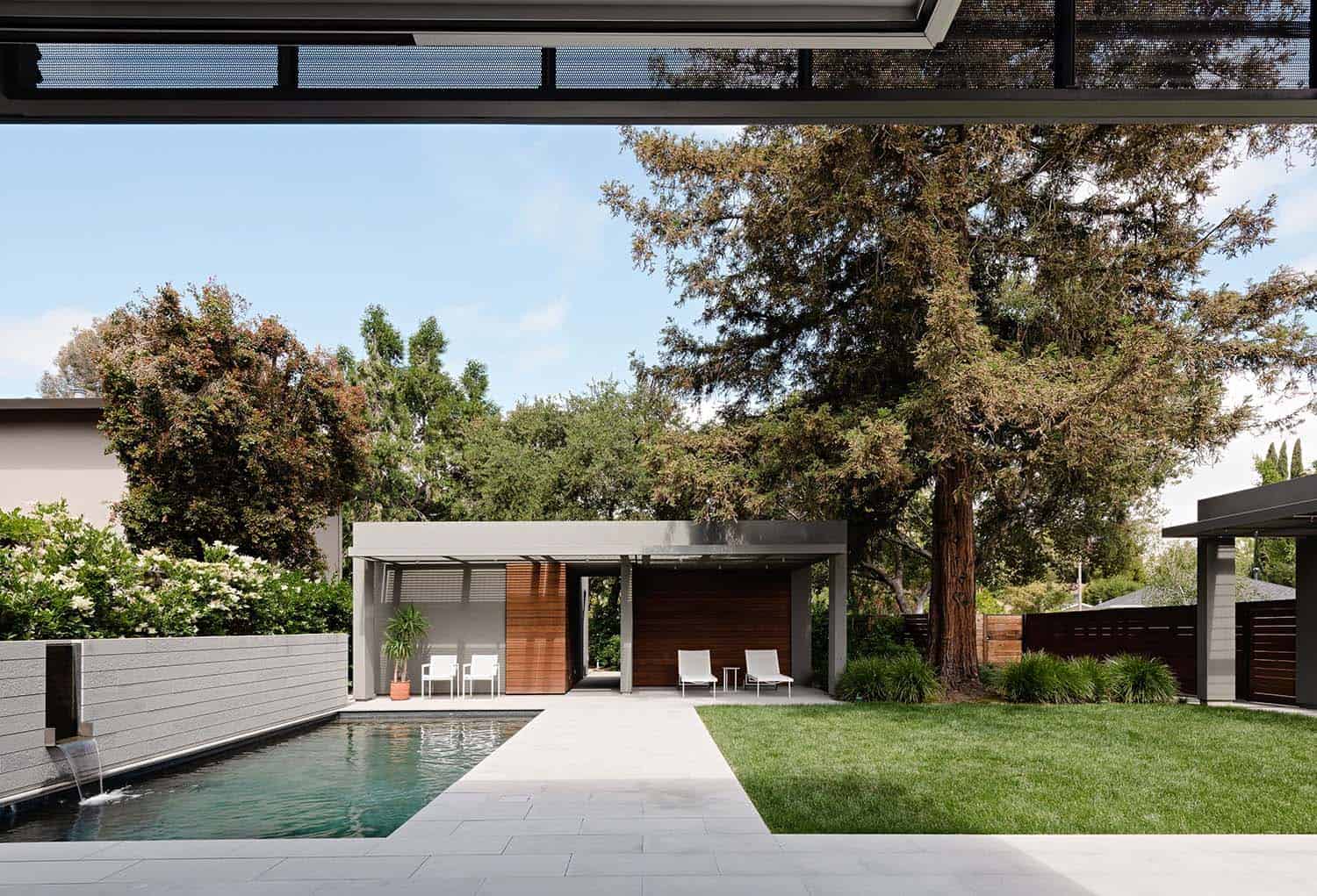
Locating the art storage and studio structures against the rear setback, while keeping them low and discreet relative to the forward position of the taller new and original houses creates a false perspective, increasing the perceived depth of the property. In the Art House’s living room, 11’ tall glass doors disappear into pockets and are set flush, blurring the distinction between inside and outside while adding a grand scale.
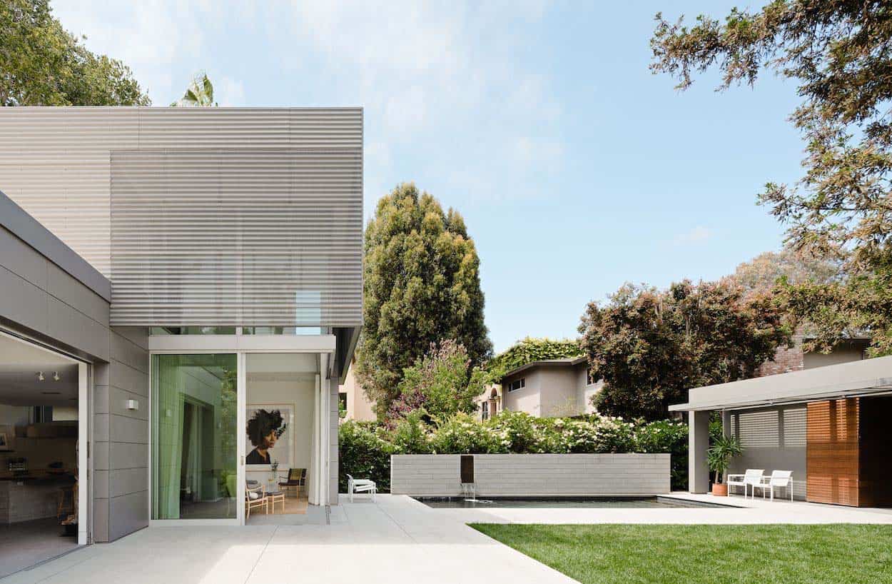
A small pool and lawn provide a focal point to the open space creating a ‘village green’ where the family gathers on weekends. The house plan is inverted in the sense that bedrooms face the street, while the living room and kitchen are in the back, connecting entertaining spaces to the courtyard.

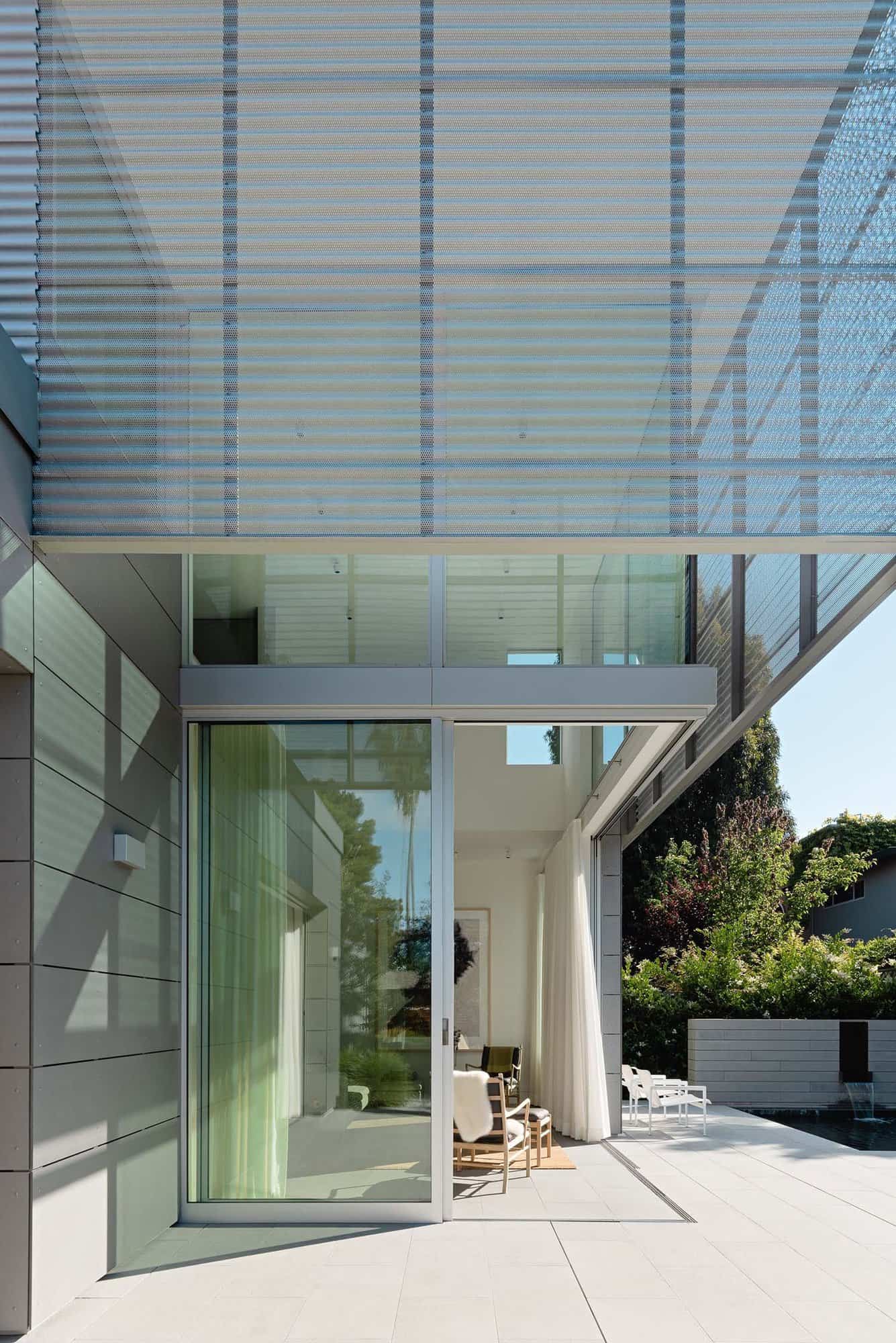
Art is present in every room and on every wall, while daylight is filtered through perforated zinc that wraps the second level, reducing heat gain. The other primary material of the exterior is cementitious panels attached over metal ‘hat channels,’ reducing direct thermal transfer.

Green-grey limestone flooring throughout the main floor connects the interior spaces with the exterior patio, creating a feeling of continuity.

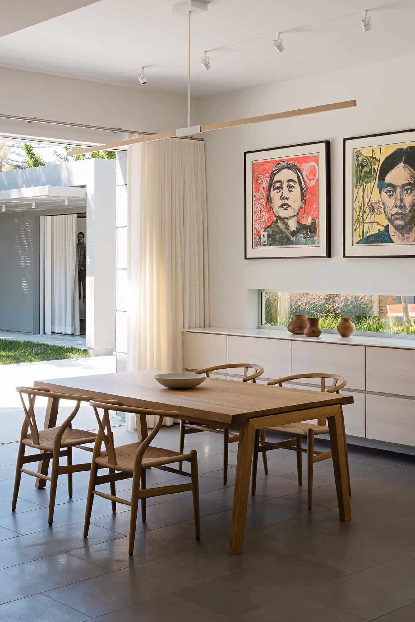
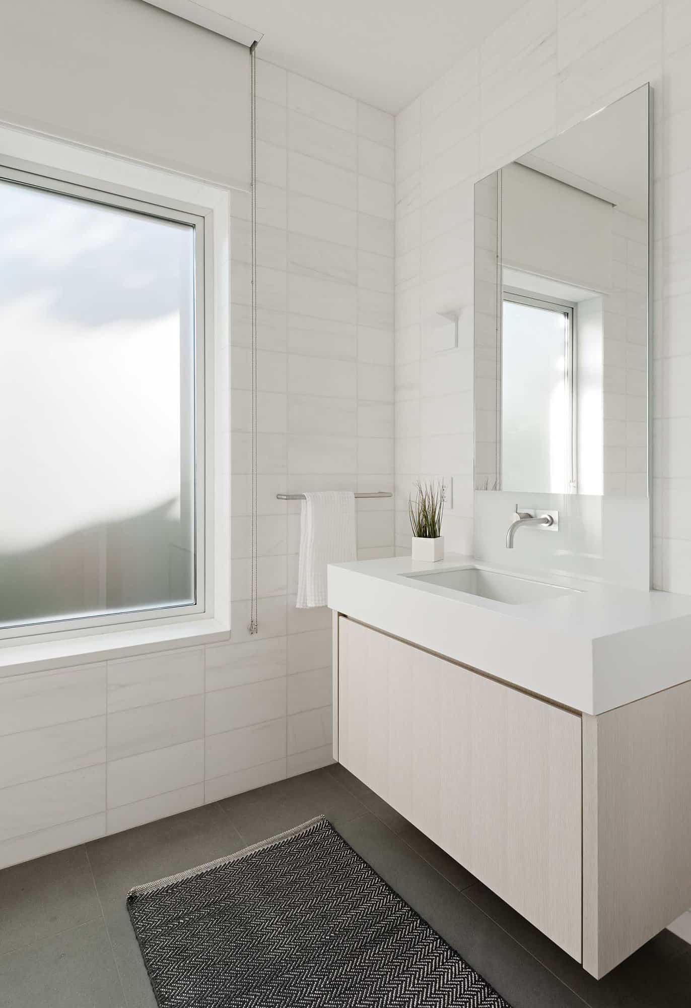
The white ‘gallery’ quality of the interior spaces, selected as the background most versatile for art, is offset with a muted palette of soft green colored stone, stained white oak, and warm neutral furnishings. Details throughout are restrained and minimal, receding in service of the art.

The internal plan organization of the new house inverts the existing adjacent plan by placing the bedrooms at the front and the ‘public’ living spaces at the rear. Whereas the existing house has window shades in the living/dining room that are usually drawn for privacy from the street, the new living/dining room has 10’ tall, unencumbered doors and windows, allowing you to experience the space of the courtyard all day long.

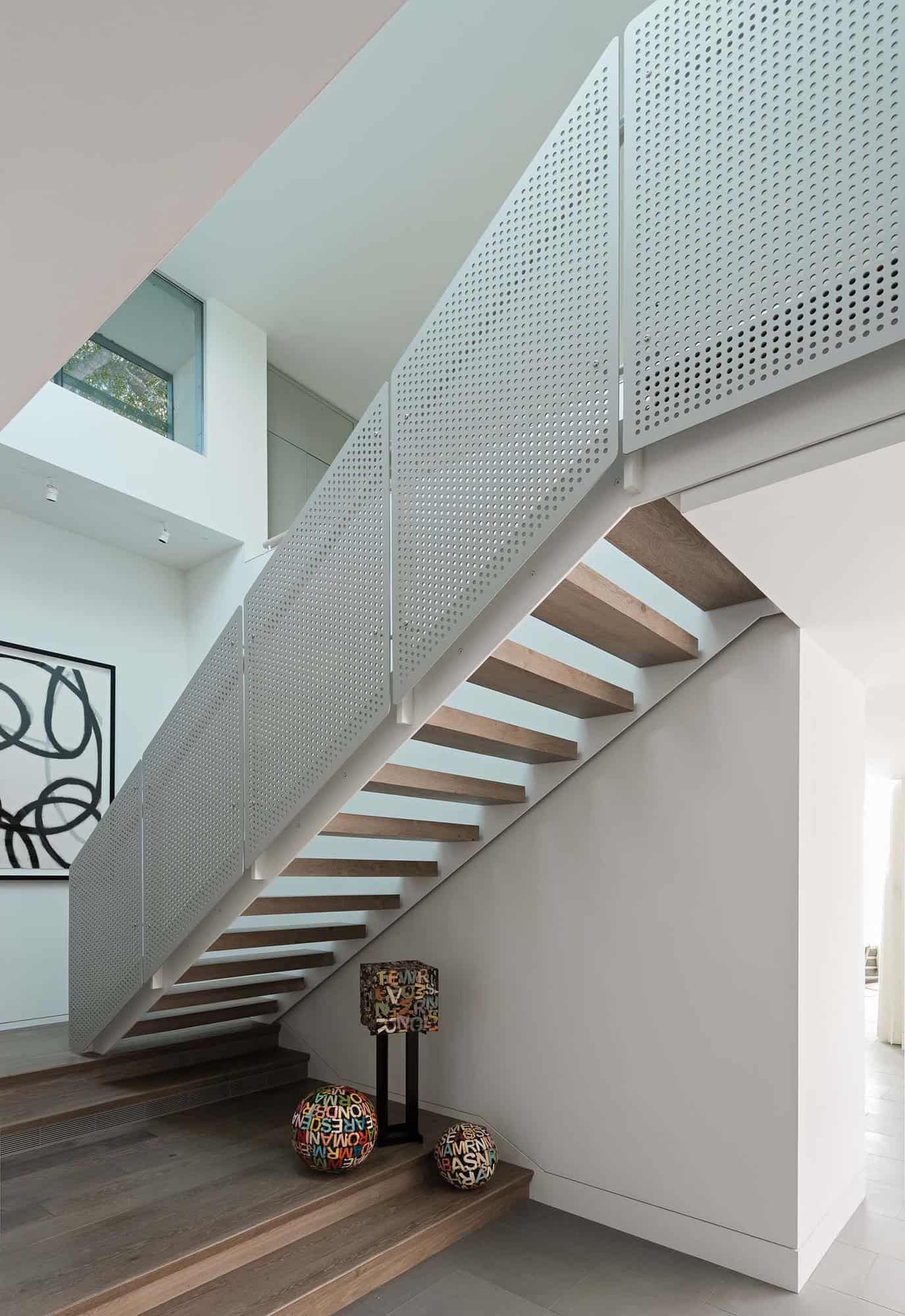
Flush stone floors running from inside to out reinforce this connection. Vertical interior space is created by a central upstairs loft pulled back from the walls so that the upper room hovers. Looking out through the veiled scrim that wraps the upstairs, the exterior light is softened and the viewer is offered a chance to see the outside landscape abstractly.

From the street, the volumetric arrangement of the new house builds on the blocky vocabulary of the existing residence –a generic assemblage of unadorned builder boxes, with a few random arches, now removed.
In order for the two buildings to feel connected, though not physically touching, the new house begins with the same massing language, however, the two bedrooms are now on the street side, split by the entry, forming separate volumes with differing floor levels. A third box at the second level, set back on the sides and front, completes the composition.

In addition to providing ample wall space and interior daylighting, consideration was given to how the building feels at night: curtains are used to protect from the heat sink of the nighttime sky and artificial lighting is ample, flexible, and balanced. Curtains dampen acoustic reverberation in interior space, making the space feel quieter.

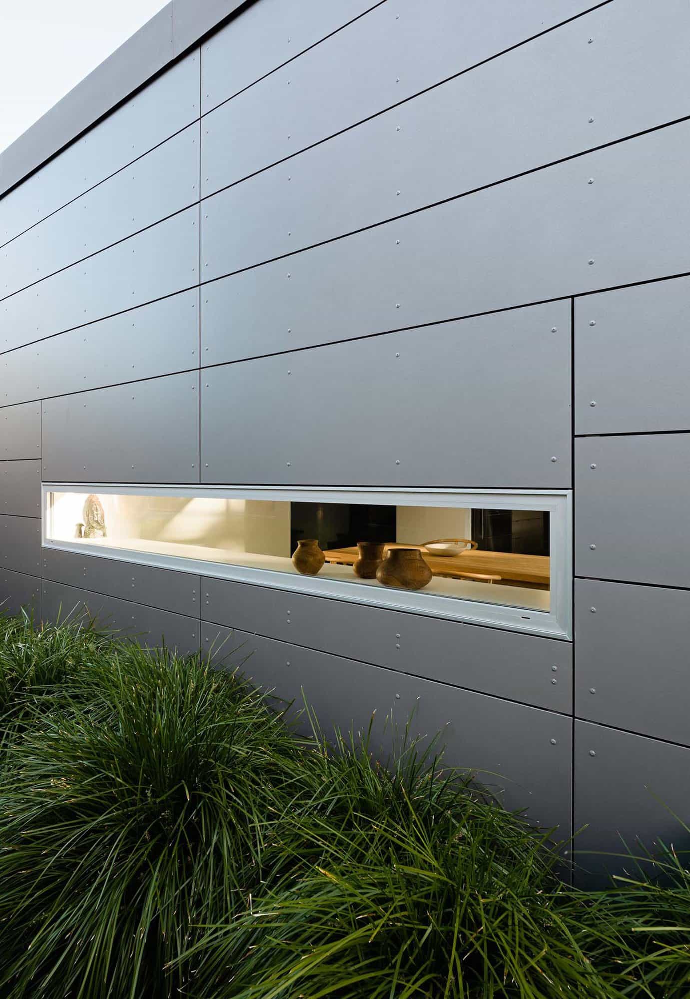
Besides the upper-level corrugated zinc scrim, sometimes perforated sometimes not, the balance of the building envelope is clad in low-maintenance cementitious panels detached from the exterior plywood sheathing by an air barrier. This ‘rain screen’ construction, provides both thermal and waterproofing benefits.

MATERIAL SELECTIONS
Anodized Aluminum Windows and Doors by Fleetwood
Corrugated Zinc Panels by VM Zinc
Cementitious Siding Panels by Swiss Pearl
Limestone Floors and Walls by ASN
Wood Floors by First Last and Always
Cabinets by Eby Cabinets
Board Formed Concrete Walls by Bill Brown Concrete
Wood Island Top by Arborica
Kitchen Tile by Heath
Sustainable Measures
Cool screen envelope
Rainscreen wall with low-maintenance exterior cladding
Cool roof
Heat recovery ventilation
Dense pack cellulose insulation
LED lighting

What We Love: This project provides the owners with new structures to enhance their lifestyle, including a place to showcase their growing art collection, a playroom, a casual workspace, and an intimate courtyard to gather with family. Natural light was cleverly enhanced through UV-filtering glass openings to protect the artwork. Overall, the team did a fabulous job of integrating new construction techniques while preserving the character of the neighborhood.
Tell Us: What elements in the design of this residence do you find most appealing? Please share your thoughts in the Comments!
Note: Have a look at a couple of other fascinating home tours that we have highlighted here on One Kindesign in the state of California: Tour this gorgeous rustic contemporary home in Palo Alto, California and Fresh modern update to an Eichler house in the San Francisco Bay Area.











PHOTOGRAPHER Joe Fletcher


One Kindesign has received this project from our submissions page. If you have a project you would like to submit, please visit our submit your work page for consideration!




0 comments