❤️ Would you like to save this?
By saving, we'll email this post to you for later. Unsubscribe anytime.
This stylish mid-century modern house was completely renovated by interiors studio Lindye Galloway Design, located in Newport Beach, California. With the clients wishes in mind, the design team transformed this dated home into a chic living space with pops of graphics. The original kitchen felt small and cramped. The designer improved this by creating an open and spacious layout, adding open shelves and increasing the ceiling height. Designer appliances and fittings were added, including a beautiful Wolf range. Additional changes to the home included updating a bathroom into a more stylish aesthetic. The designers added a graphic cement tile wall and floor, along with white subway tile walls and black and bronze touches. Keep reading on below for other details of this fantastic home renovation project.

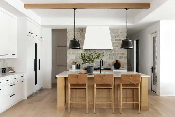
A close up detail of the kitchen showcases a white 3×6 Carrara Marble tile backsplash, beautiful Wolf range, open shelving and white engineered stone countertops.

What We Love: This mid-century modern house is chalk full of chic and stylish features; from the kitchen to the tranquil bedroom. The designers have re-created a dated home into a bright and airy living space. There is now a seamless flow from one space to the next… fabulous! Would you agree?
Have a look at some more inspiring house tours by the same designer of this home, Lindye Galloway Design: Luxe coastal home renovation in Corona Del Mar, California and 1950s Home gets fresh modern farmhouse style update in California.


Above: The flooring is an engineered Euro/French White Oak with a whitewash finish.

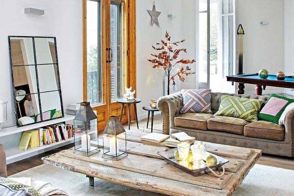
Above: The living room was one of the greatest and most impressive transformations of the entire residence. This space is characterized by bright white walls and furnishings that are full of texture and style. Natural light reflects off the plank oak flooring through expansive windows. Plants add some naturalness to the space… and a breath of fresh air.
FYI: The walls are painted in Decorator’s White CC-20 | Benjamin Moore.


Above: The master bedroom was re-imagined with a serene aesthetic. The look was created by adding layers of soft textures and light fabrics and hues. The walls were painted in Gray Cloud 2126-60 | Benjamin Moore, one of the designer’s favorite go-to colors. A luxurious area rug adds plushness underfoot. While pops in graphic pillow and art adds some visual interest. Vaulted ceilings helps make the space feel airy and bright. The chandelier was sourced from West Elm, as were the brass night stands.


Above: The brass and glass nightstands were sourced from West Elm!


Above: The wallcovering was sourced from CB2.


Above: The bathroom features a wall mount faucet is from Brizo, while the graphic floor tiles were sourced from Cement Tile Shop.


Above: The guest bedroom features a contemporary bed sourced from CB2, while the nightstands are from West Elm.

Above: The artwork is from Minted. According to the designer, “they have a great selection of modern/abstract pieces!”


Photos: Jasmine Star


16 comments