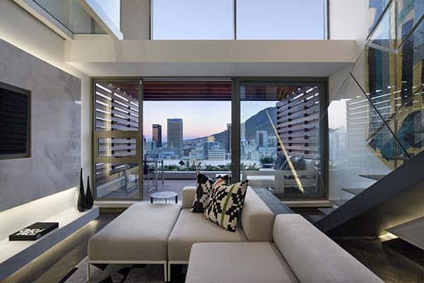
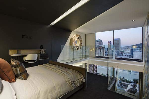
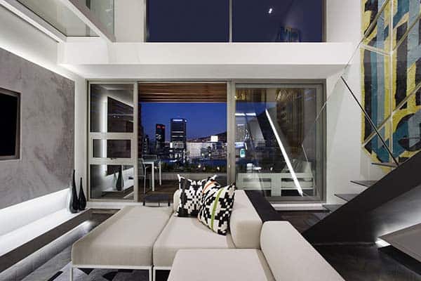
De Waterkant project is the re-design of a duplex apartment by SAOTA architects, located in the trendy area of De Waterkant, in the heart of Cape Town, South Africa. During the day, the neighborhood of De Waterkant hosts cool-hunting hipsters frequenting impossibly quaint eateries and in the evening it becomes the urbanites playground as fashion and art champion the nights. This was the decidedly perfect place to create a space like no other. A true Stefan Antoni space where luxury reigns and style is of the utmost importance.
View more projects by SOATA
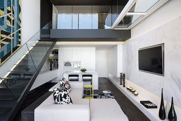
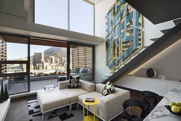
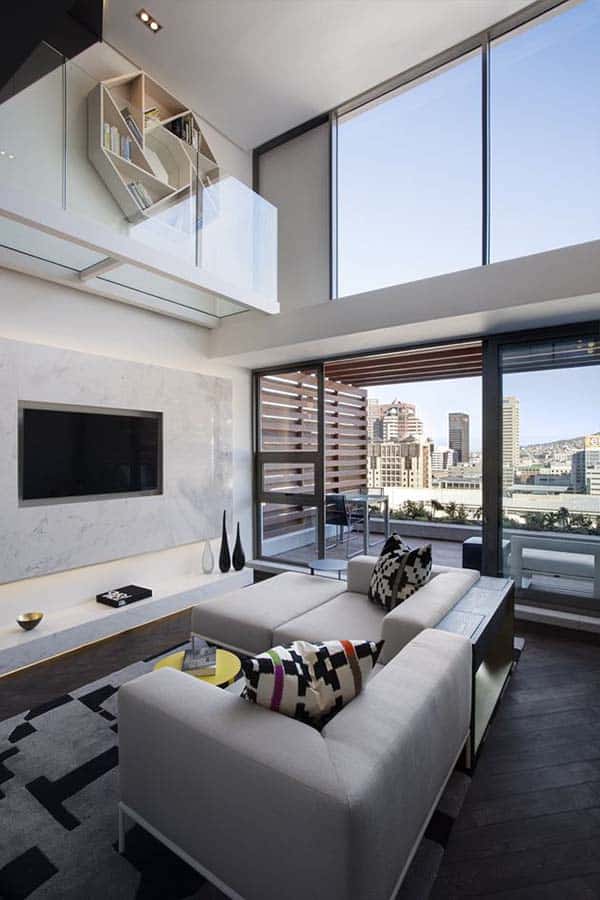
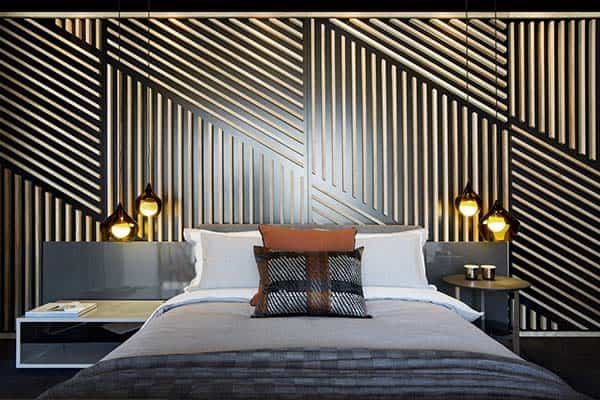
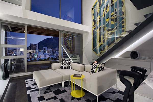
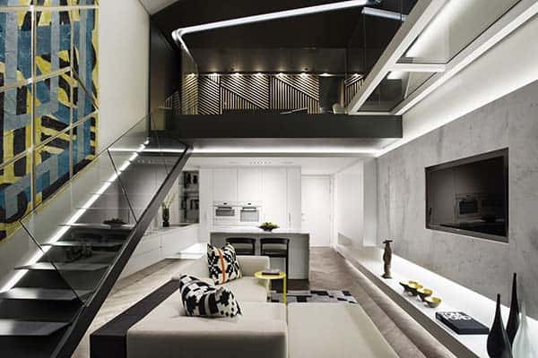
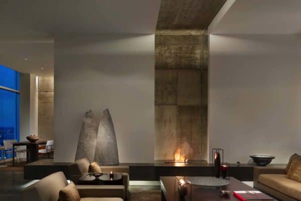
Antoni Associates (AA) Interiors and OKHA Interiors ensured this tall order materialized. Renowned for its contemporary take on African luxury, AA Interior’s distinctive style paired with the unique pieces designed by OKHA, set this apartment in a category of its own. Mark Rielly, partner at Antoni Associates said that the apartment “combines contemporary living with high design”. The interior spaces represent modern, urban Africa and Rielly noted that there is a strong emphasis on rhythm, geometric forms and graphic elements. They wanted artwork and interiors that explored the avant gardist graphic of the interior architecture and introduced color.
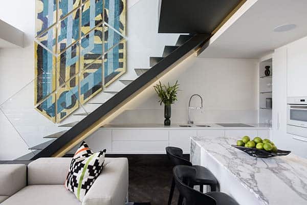
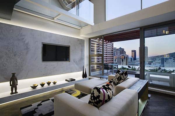
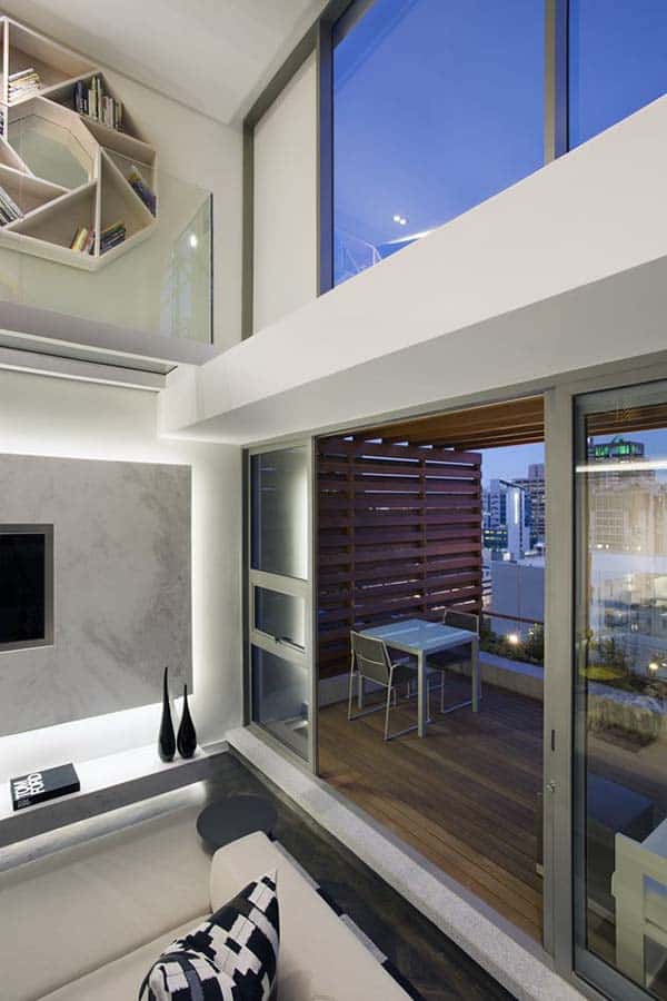
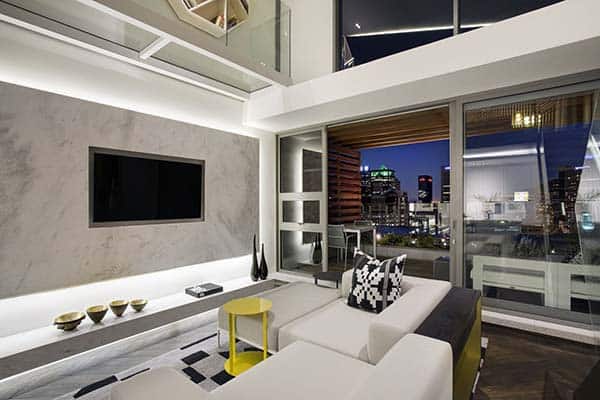
Adam Court, partner at OKHA, played with a fusion of modern African graphic and color to juxtapose the lean, monochromatic interior. “We wanted very limited accessories and one major artwork, not wanting to overload the space or the senses,” Court noted. Urban living comes with few but finite obstacles such as space, challenging any aesthetic idealism as function needs to meet form. Here, innovation meets true purpose as Court designed multi-use and bespoke furniture which can hide all the clutter accumulated in any home. “We have also used every opportunity to maximize clever storage space without compromising the design” commented Michele Rhoda, partner at Antoni Associates.
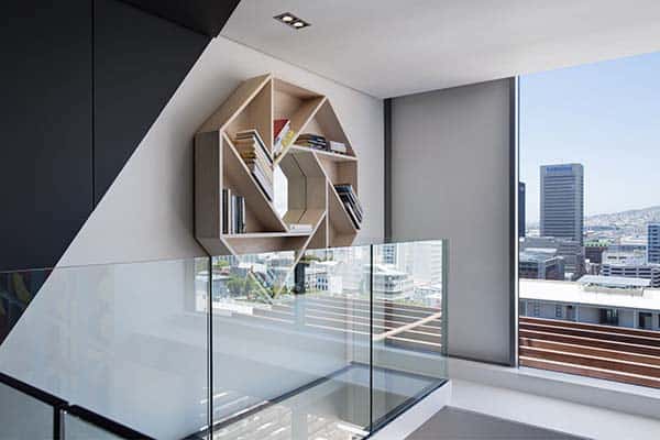
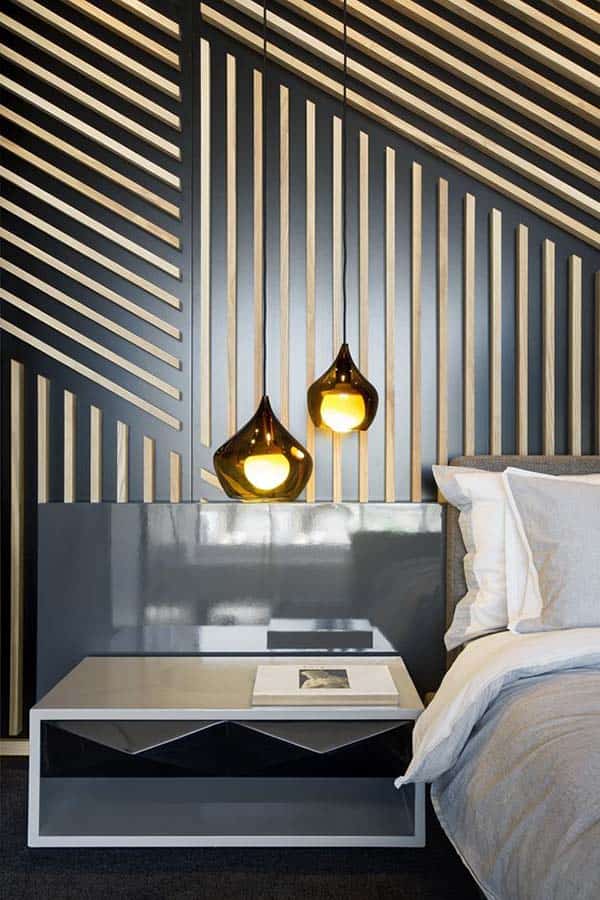
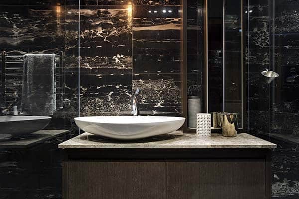
The tables provide storage, the bookshelves act as an installation artwork. Additionally, the furniture was custom designed to t in the available space, ensuring fluidity and circulation. To be aesthetically astute and edit a space does not mean to say any expense was spared. Rielly noted that they infused the space with a sense of opulence through the clever use of luxurious niches such as the herringbone timber and the feature marble accents. This clever use of space, art and design has transformed this penthouse into a sanctuary for city-slickers. “The interior needed to be a place of calm and serenity, therefore less is more was the rule but still allowing for personal expression and individuality to have its place,” Court noted.
Photos: Courtesy of SAOTA



0 comments